fbpx

LET US TRANSFORM YOUR HOME
SCHEDULE A CONSULT

hello

Good Housekeeping

Published in: Good Housekeeping Published: June 2013 “Pulling a Fast One” Anxious to move in, a Florida designer creates a bright and breezy family home in record time.

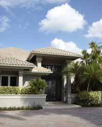
Krista Watterworth isn’t intimidated by tight deadlines. As host of decorating makeover shows on HGTV, the designer revamped rooms in 48 hours – so it’s not surprising that she overhauled her entire Mediterranean-style home in Palm Beach Gardens, FL, in a mere three months. “You get drywall dust in your bra,” jokes Watterworth about the accelerated pace at which she transformed dark Italianate interiors into easygoing, airy spaces perfect for husband Eric, son Griffon, 4, and daughter Skylar, 3. Relying on neutral shades of taupe and cream and unfussy furniture, Watterworth has achieved a family-centered home that’s “lived-in and completely livable.”

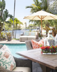
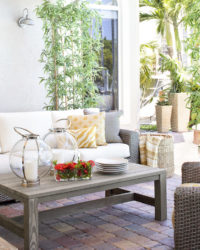
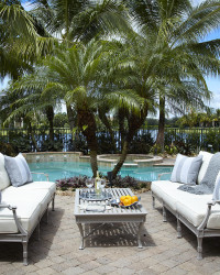
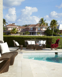
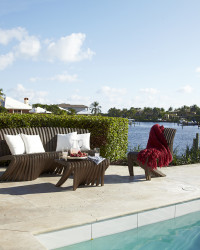
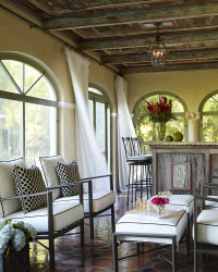
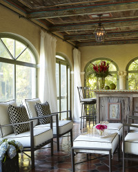
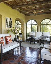
HOT SEATS: Krista Watterworth, above, chose deep, sized-for-sharing woven chairs for her backyard lounge.

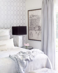
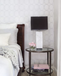
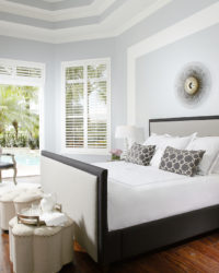
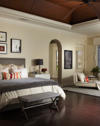
IN PERFECT HARMONY: As a a surprise for her husband, Watterworth had the lyrics to the couple’s first-dance wedding song-Valentine’s Day, by Bruce Springsteen-printed on a wallpaper mural and hung behind their bed. “It adds so much joy and heart to the room,” the designer says. Also soothing: a padded headboard, linen sheets and a linen duvet, and bedside table, all in calm relaxing colors.

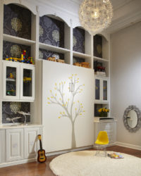
POWER LINES: In the stripe-happy bedroom of Watterworth’s son, Griffon-where daughter Skylar also loves to play-the colors are super bright and the streamlined furniture is kid-proof.

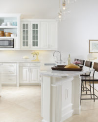
“The island is shaped like a horseshoe, which is so inviting-especially at parties”

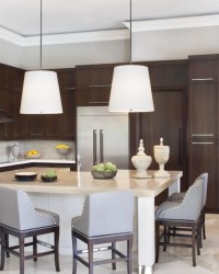
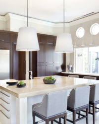
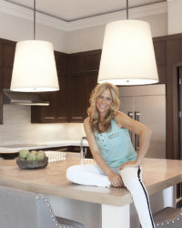
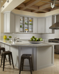
EATING LIGHT: To instantly brighten the kitchen (and stay on budget) Watterworth kept the heavy-looking dark-cherry cabinets, painted them, a creamy vanilla, and then continued that hue on the island’s beadboard. Organic-chic barstools crafted from American walnut play off the tones of the marble backsplash, and pendant lights with sand-colored silk shades cast a soft glow.

“The kids love to pull the threads on this chair-and why not? I don’t want an off-limits home”

FLIGHT OF FANCY: Distressed wooden wings-a lucky find Watterworth spotted in the trash behind a junk store-now have pride of place in the master bedroom. Watterworth paired the found art with a burlap-and-cotton Restoration Hardware tufted wing chair with exposed nailheads. “I love how it’s a pre-destroyed version of a classic style-and the kids can’t ruin it,” she says.

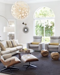
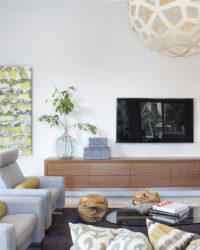
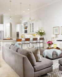
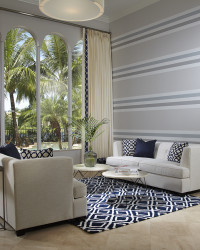
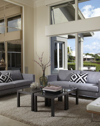
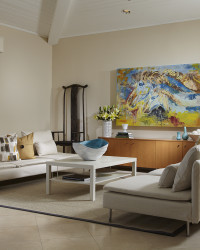
WORD PLAY: A typographic area rug with the names of far-flung cities kick-started the gray-and-taupe color scheme in the sitting room, which includes an easy-clean IKEA leather sofa and a TV-hiding bookcase. Wide stripes painted on its walls, a decorative clock six feet in diameter, and an enormous clamshell on the coffee table balance the room’s cathedral ceiling.


Vanilla Ice Project Season 3

Go VIP or go Home!! This was Season 3 of Rob’s newly flipped house. I staged it and we had fun. A big thank you to Haverty’s Furniture – really beautiful home goods and furnishings. You can watch The Vanilla Ice Project on the DIY Network.


Go VIP or Go Home!

Well it was the third season of The Vanilla Ice Project, and third time’s a charm! We had fun shopping and staging Rob’s latest flip. Pretty fun stuff! Now airing on the DIY Network.


Restaurant Impossible Dinner Bell

Chef Robert Irvine is in Madison, Tenn., to help owner, Tommy, keep the doors of the Dinner Bell Restaurant open. And Robert is just in time, as Tommy’s only two days from having to close the doors on his four-year-old business for good. Robert and his team must clean the restaurant, freshen the menu and fix the staff’s bad habits in two days, before Tommy loses everything. Krista creates an American and Nashville inspired modern space. Red and aqua accents with family style seating and a fresh new look! (Episode: IL0509ZH)

Read more at FoodNetwork.com


Foo-Foo to Rustic Cabin

Recently my show Splurge & Save was put back into syndication, and I had an interesting comment about one of the rooms. Robin from Sylacauga, Alabama specifically wanted photos posted. Robin, your wish is my command! Below you will find the transformation that made the Dews family very happy. A place to bird watch, host weekly card night and display their huge antique bottle collection. Take a look! We did a lot of DIY projects on this one, including using a Bed in a Bag for the new sofa pillow covers, bed skirt for curtains, painted white wicker an espresso brown, made candle holders out of birch branches, and so much more!


Dinner Bell Restaurant

I went to Madison, TN (just outside of Nashville) and rocked out another wonderful episode of Restaurant Impossible. It was really fun working with the crew again, and Robert really helped out Tom (the owner) and his family. They were desperately in need of some serious professional expertise. And in the end, the family was very excited with the entire transformation.


Floridian View

FV-March-2013-CoverBlogPublished in:  Floridian View Magazine

Published:  March 2013

Interior Designer Krista Watterworth: The HGTV Star Shares Her Spring Favorites for Florida Homes

by Patti Light

Krista Watterworth refers to her signature style as “classic contemporary” – a nod to the traditional while embracing cutting-edge, runway-inspired statement pieces. The former star of HGTV’s “Save My Bath” and “Splurge and Save,” she now makes guest appearances on Restaurant: Impossible and focuses on putting her unique stamp on design projects for Krista Watterworth Design Studio, based in South Florida and New York. This month’s Floridian View cover girl, Krista shares tips and strategies for giving your Florida home a stroke of brilliance and a breath of springtime.

FV:      Your design stamp seems to be predominantly clean lines. Did you evolve into this signature?

KW     I did. I think there’s always that moment in a designer’s career where she pinpoints her style, and that’s when you know you’ve arrived. It takes a lot of trial and error. (Laughs) And for me, a lot of that happened on television, so forevermore there’s some of my design work that was a little more daring etched in the cyber sphere of You Tube. You have to be that way in the beginning and learn to take risks and be willing to fail in order to discover your identity as a designer. Now I’m in the peak of my aptitude — I have courage as well as knowledge — and everything’s culminated from my work in television, my education in design, and the people that have inspired me and my philosophy:

FV       What is your philosophy?

KW     My style is Classic Contemporary. I’m from Connecticut so there’s always a nod to history and tradition in my work. I love English architecture and 19th century styling and I like to bring this together with very modern, clean pieces.

FV       You’ve done your own shows, designed for celebrities, and have a string of other credits. What are some of your favorites?

KW     I’ve been very lucky to have been recognized early on in my career, and I have to thank Nancy Glass for that. She was the one who gave me my first show on HGTV. My most recent TV work is with Rob Van Winkle (The Vanilla Ice Project) on HGTV and Restaurant: Impossible on The Food Network. But my real focus is my boutique design studio and growing client list in Palm Beach and NYC. No matter what I’m doing, my work is emotionally connected to the person I’m designing for. It’s the only way I know how to work.

FV:      So what are you bringing into your designs right now?

KW:    Everything is bright and bold but I always route it in nurturing neutrals. Yellow has been the new black this past year; but color is getting even brighter. Polka dots, oversized floral prints, and large geometric patterns: Fun! The Knoll Barcelona chair in red is my most recent favorite – a chair like that makes a statement in any room.

FV:      Where do you get your inspiration?

KW:    Recently? The runway. It subconsciously feeds my design choices. (Rachel Zoe is a secret obsession of mine.) I was looking in a fashion magazine at Oscar de la Renta’s new beautiful line of red leather. That same day, when I was shopping for a client to find a bold statement for the new uber mod kitchen I designed for them, I found these cherry red metal bar stools. It’s amazing just how closely aligned fashion and interiors are.

FV:      So what are the fashion color trends we’ll see reflected in our homes?

KW:    Neon Yellow! Blood orange, cobalt, bright turquoise, lime, fuchsia. The jewel-tones of course never seem to disappear. (Laughs) They’re either in the background, or they’re somehow part of what we say in our homes. People tend to feel safer with these colors, and they’re easier to work with because of their proven longevity. But you can pop them up with trendier colors.

FV:      Even though we don’t go through dramatic seasonal changes in Florida, we still want to give our homes a fresh look for spring. What’s a good starting place?

FW:     The first thing I do with any of my Florida Clients is remove the drapery. In Florida it’s all about the sheers! And the ability to control the intake of light. I tell people don’t obscure the exact reason why live here – the view! We want to feel like we’re outside even if we’re not. This openness visually gives you a sense of square footage. The second tip: Organization is everything. Our home is an outward manifestation of what we feel inside. If you’ve got lots of clutter around, emotionally that affects you.

FV:      So now that we’ve created a lighter space, what are the coolest new textures or pieces to bring into the interior environment?

KW:    Mixing the hard and soft finishes seamlessly. Lace with chrome and stainless steel or rough wood mixed with chenille or velvet. People are living more simply, more casually and they’re more attune to the earth. I’m seeing a growing popularity with eco-friendly, sustainable, and earthy trends. Some of my favorites are Brazilian hardwood, walnut and redwood – and always reclaimed.

FV:      What’s an easy way to create big change?

KW:    I think a great way to give a face lift to your house is through soft goods – throw pillows, drapery, linens and upholstery. This is my wheelhouse: how to get a lot of bang for the buck without renovating. What’s hot on the runways is color that’s kicked up a notch and large geometric patterns. Wallpaper has made a comeback and just an accent wall is enough of a statement. And of course Spring is the time to implement a change, a reawakening.

FV:      You make color look so easy. What are some “rules” to make it work?

KW:    It’s tricky to work with color. It’s not for the faint at heart and it’s something that you can’t take lightly. I think combining colors is where the novice designer can miss the mark. My advice? Hire a professional!

FV:      What common mistakes do people make?

KW:    Committing to seriously to a layout. If you invest in a statement piece like an Eames lounge chair and ottoman (or anything designed by Le Corbusier or Knoll), remember you can put it in one room today and another room tomorrow! (Laughs) Bring some upstairs furniture downstairs, place your bed on another wall, or purchase a new piece of art. You can find original art on line or at art festivals without spending half your savings.

FV:      How can you update a space dramatically – and quickly – using what’s there?

KW:    New lighting can transform a space. Removing outdated wallpaper. Change out area rugs for new ones. Painting furniture is a great way to bring a fresh look. If I am short on time and I have a large piece, like an outdated media hutch, I’ll take it to the auto body shop. There they’re professionally sprayed with a super durable finish in any color. I also have a very talented refinisher I use that does amazing work.

FV:      Let’s say I have a few bucks and a few minutes. What can I do to make a change in my environment?

KW:    It sounds simple but there should always be a vase of fresh flowers in your home, no matter what. The spring flowers are so beautiful and so vibrant. It makes me smile to see a vase of fresh flowers – and it’s about finding joy and happiness in these little moments in your home.

Krista’s Picks


HOT NEW COLORS

“Kicked Up a Notch Hues” Look to the runway for cues:

Neon Yellow

Bright Turquoise

Blood Orange

Lime

Fuchsia

Cobalt


Mix neons with jewel tones to create your own look:

Ruby with bright turquoise

Navy with neon yellow

Emerald with Fuchsia

Amethyst with blood orange


MUST-HAVE DESIGN PIECES
Moooi Random Light

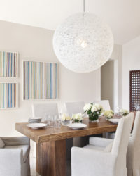
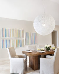
A 41” hanging ball, perfect for the high ceilings in so many Florida homes. “It looks like the moon is rising indoors.”

http://www.ylighting.com/moi-randomlightwhite.html

Eames Lounge Chair and Ottoman

In a variety of leather finishes with a walnut shell, it’s a comfortable expression of modernism. “It’s a piece of art that you can fall asleep in!”

http://www.dwr.com/product/eames-lounge-ottoman-vicenza.do?sortby=ourPicks#.UPdnOIbsbPo

White Carrera Marble

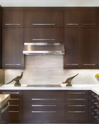
Use as a backsplash, countertop or table top. “It’s the most beautiful element you can add. It’s classic, yet it works in contemporary settings.”


FAVORITE WEBSITES

Soft Goods: Allmodern.com

Lighting: YLighting

Furniture: Design Within Reach

Accessories: ABC Carpet & Home

Rugs: The Rug Company

Media: Bo Concept

Paint: Benjamin Moore

Glassware: Michael C. Fina

Bedding: Restoration Hardware

Upholstery Fabrics: Kravet

Art: UGallery.com


Click thumbnail below to see full article:


Mirror Artwork


Vanilla Ice Season Two


Reno Rehab: Pool Renewal

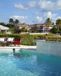
This is just a teaser. It’s a post about an unfinished pool that has major possibilities. The issue: I’m not a landscape artist, and we don’t have a Jamie Durie budget (did someone say hottie?)  The pool and backyard are brand new in two budget conscious ways: new pavers and pool refacing. Wasn’t cheap by any means but a great start. You’ll see more later.

This pool possessed the one thing that is totally wrong about Vegas: fake rocks. Don’t get me wrong I love Vegas, I love the kinetic energy, the chain smokers, the history, the cheese factor (best bachelorette party ever!) But the fake rocks offend my sensibilities, take me out of my comfort zone. It’s like watching a 70s movie with ridiculously bad special effects. Um, not fooling anyone.  I like creating an illusion that feels real, that’s what designing for television is all about. But a home has a different sense of reality, for me it needs to be clean, easy on the eyes, soft and light.

I started simple with the back yard. You shall see more soon! What’s your thing favorite about your backyard?


Reno Rehab: Kitchen Shmitchen

You asked for it! I decided to start a renovation diary about the renovation dramas of my very own dream home! It’s been exciting, stressful, and I’ve realized I’m a bitch of a client. Truth is: stress is part of the game and it feeds my psychosis (which is why I’m totally obsessed and I love what I do). There is some sort of dysfunctional satisfaction from the sweaty drywall dust that accumulates in my bra, and all my nagging doubts about every tiny design decision.
Today I support my own resolution to paint the dark, cherry, very traditional cabinets in our kitchen. Could we afford brand spanking new European kitchen shwag? Uh… no. Thus: cheap and cheerful is my chosen path. After my mother gave me the silent treatment for committing this “never paint wood” sin, I allowed her a time out and admonished this 1950s philosophy. And, quite frankly, I’d be out of a job if I believed it. On any number of design shows I can be seen painting anything from glass to plastic to dead bugs (well not really but I would consider it) so onward and upward.

Well – you decide. We are still in process here but you can already see a huge difference. White reflects light, dark colors absorb it (like a black hole). I am a huge fan of bright light and lots of clean colors. They erase any imperfections, clean the slate and breath life into any environment. But that’s just my opinion. Keep in mind I have no lights on in my photo and all the lights are on in the original photo, and it still looks brighter.