From Dated and Drab to Modern and Fresh: Before & After
This lovely family purchased a beautiful home in a gated country club community that was in need of some serious refreshing! We took the home from drab and dated to modern and fresh! I love how this home turned out. A great before and after story (doesn’t everyone love those?)
The before and after of the kitchen below is truly astonishing. It is a perfect example of how important lighting is to a space. I have a girlfriend who told me she has been trying to convince her husband to switch out the fixture in their entry for years. Finally, she just did it while he was at work, and he could not believe how much it transformed the entire space. He had to see it to believe it! That is the same thing that happened in this kitchen below. We really did minimal work on this kitchen… but switching out lighting made a BIG impact.
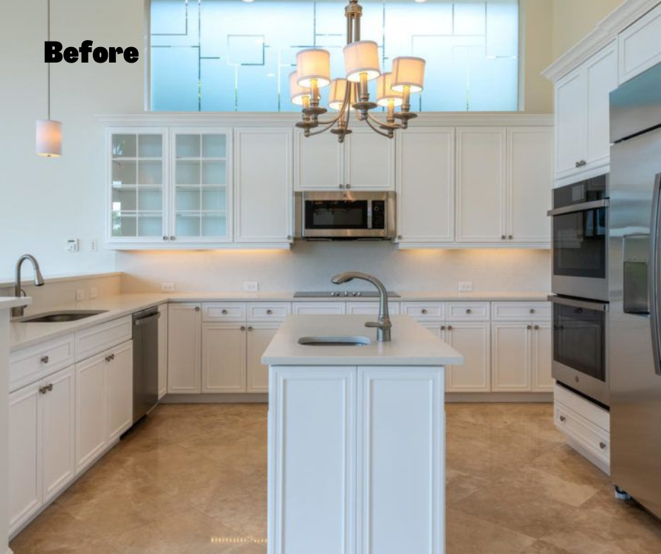
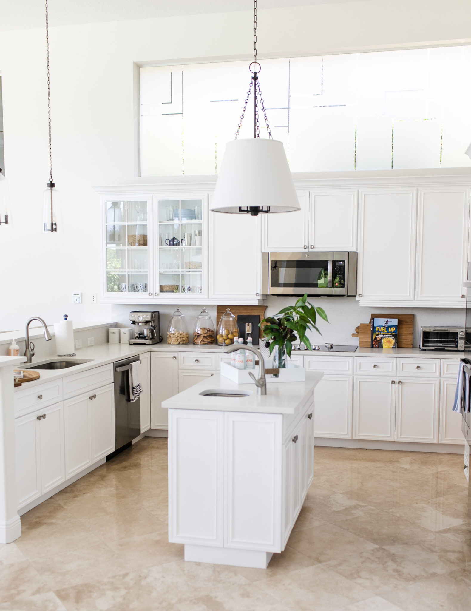
Interior Design by Krista Watterworth Alterman, Photo by Eve Greendale
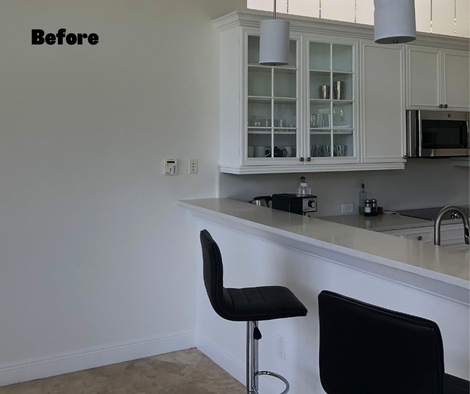
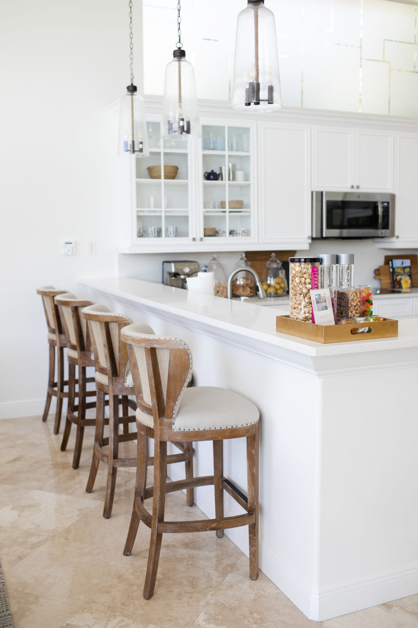
Interior Design by Krista Watterworth Alterman, Photo by Eve Greendale
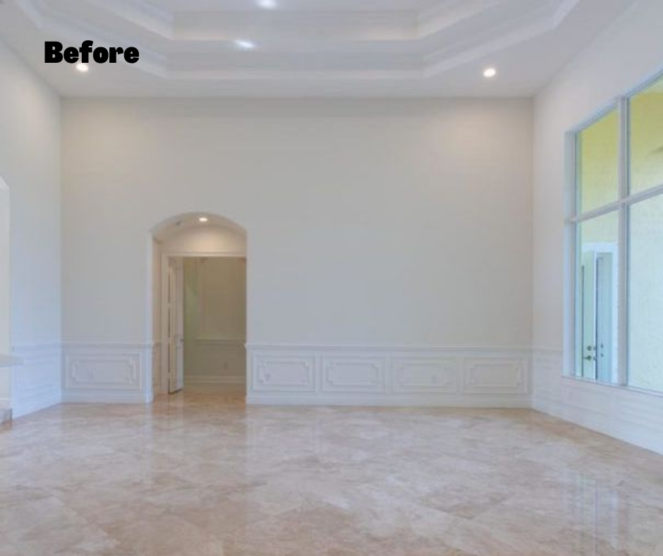
When we started, the living room was a big stark space, like a blank canvas. I wanted to fill the room with warmth and comfort, so I added layered fabrics and textures to create an inviting space where the couple could relax with a book or entertain with friends with cocktails (there is also a custom bar, not shown in these images).
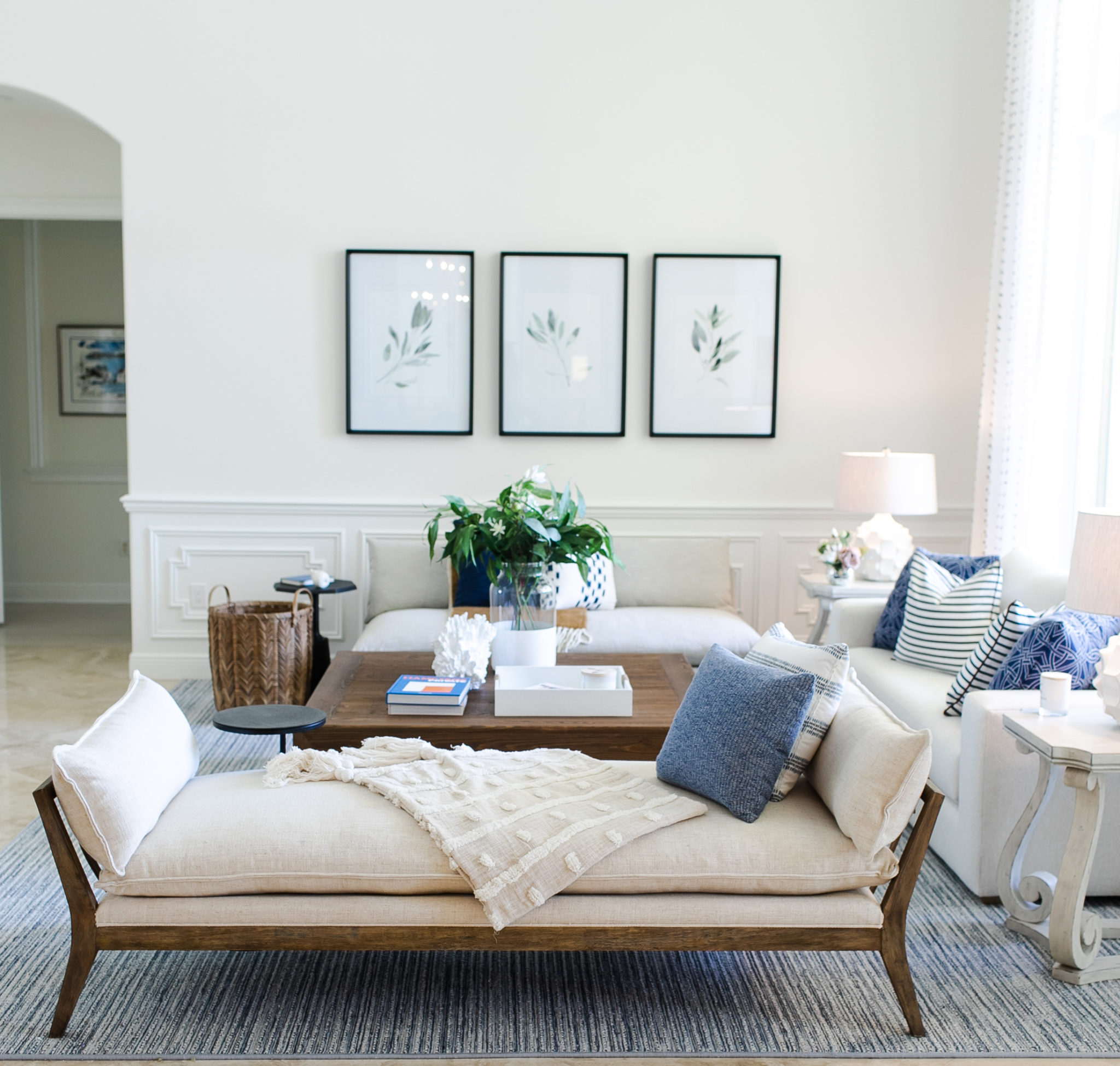
Interior Design by Krista Watterworth Alterman, Photo by Eve Greendale
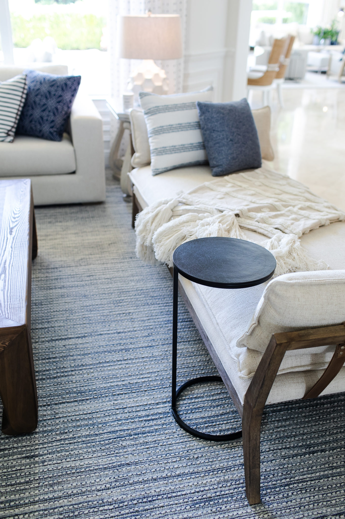
Interior Design by Krista Watterworth Alterman, Photo by Eve Greendale
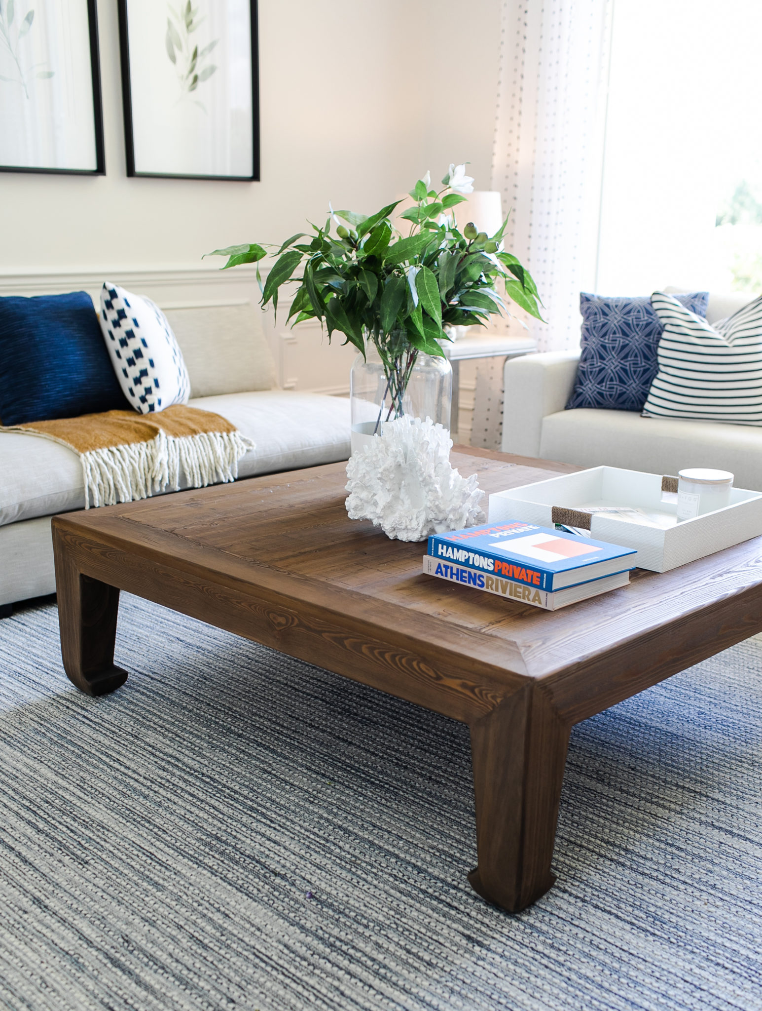
Interior Design by Krista Watterworth Alterman, Photo by Eve Greendale
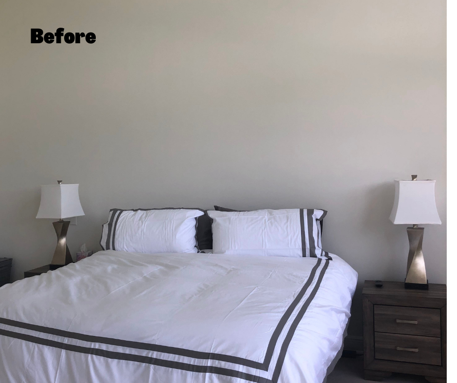
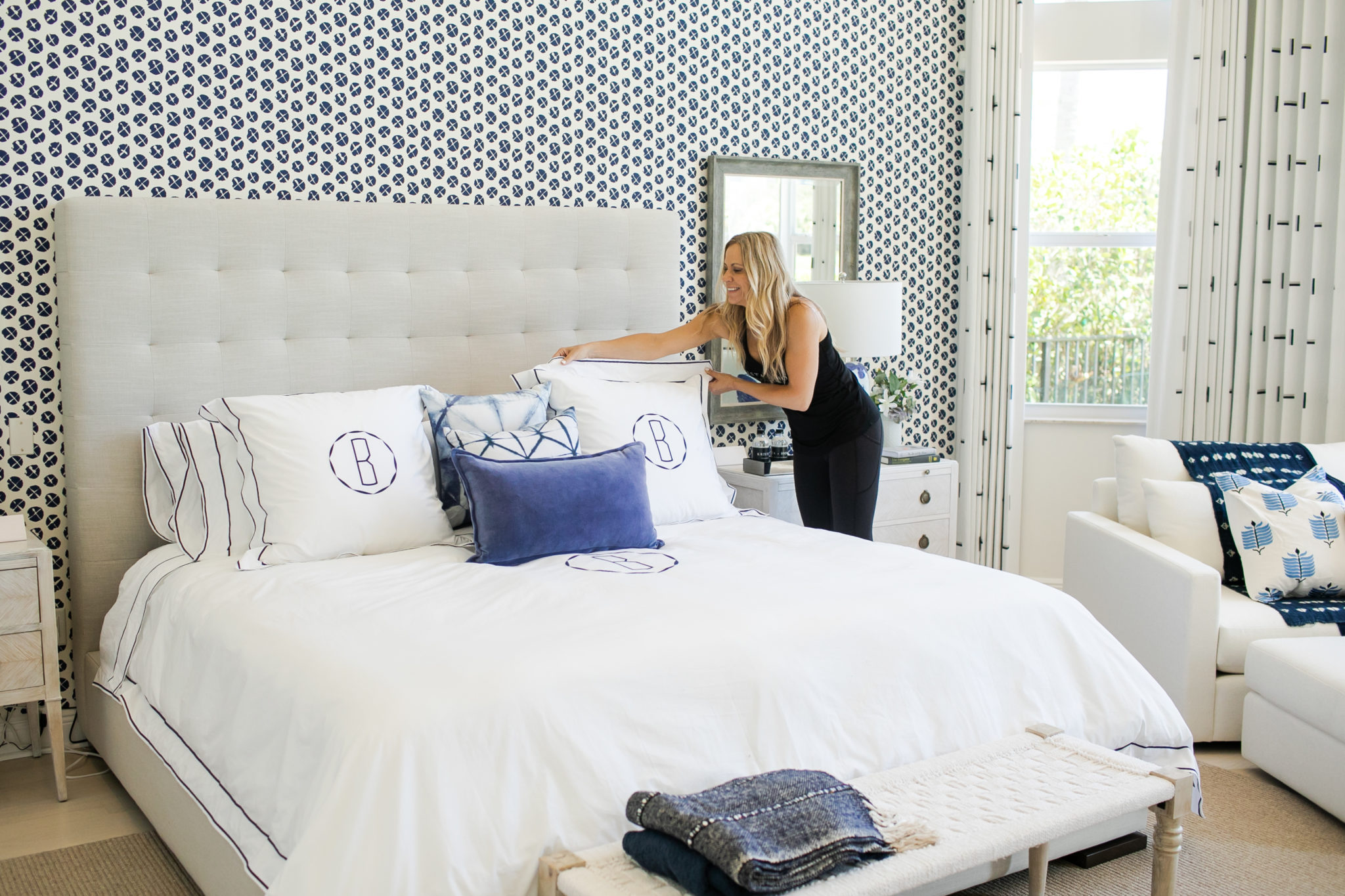
I love this fresh blue and white master bedroom we created! We used crisp whites to balance out the color, and a plethora of yummy fabrics for the pillows, draperies and upholstery.

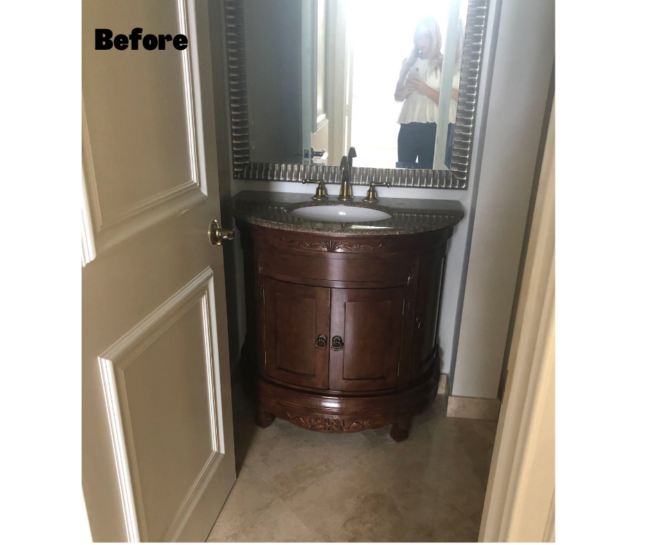
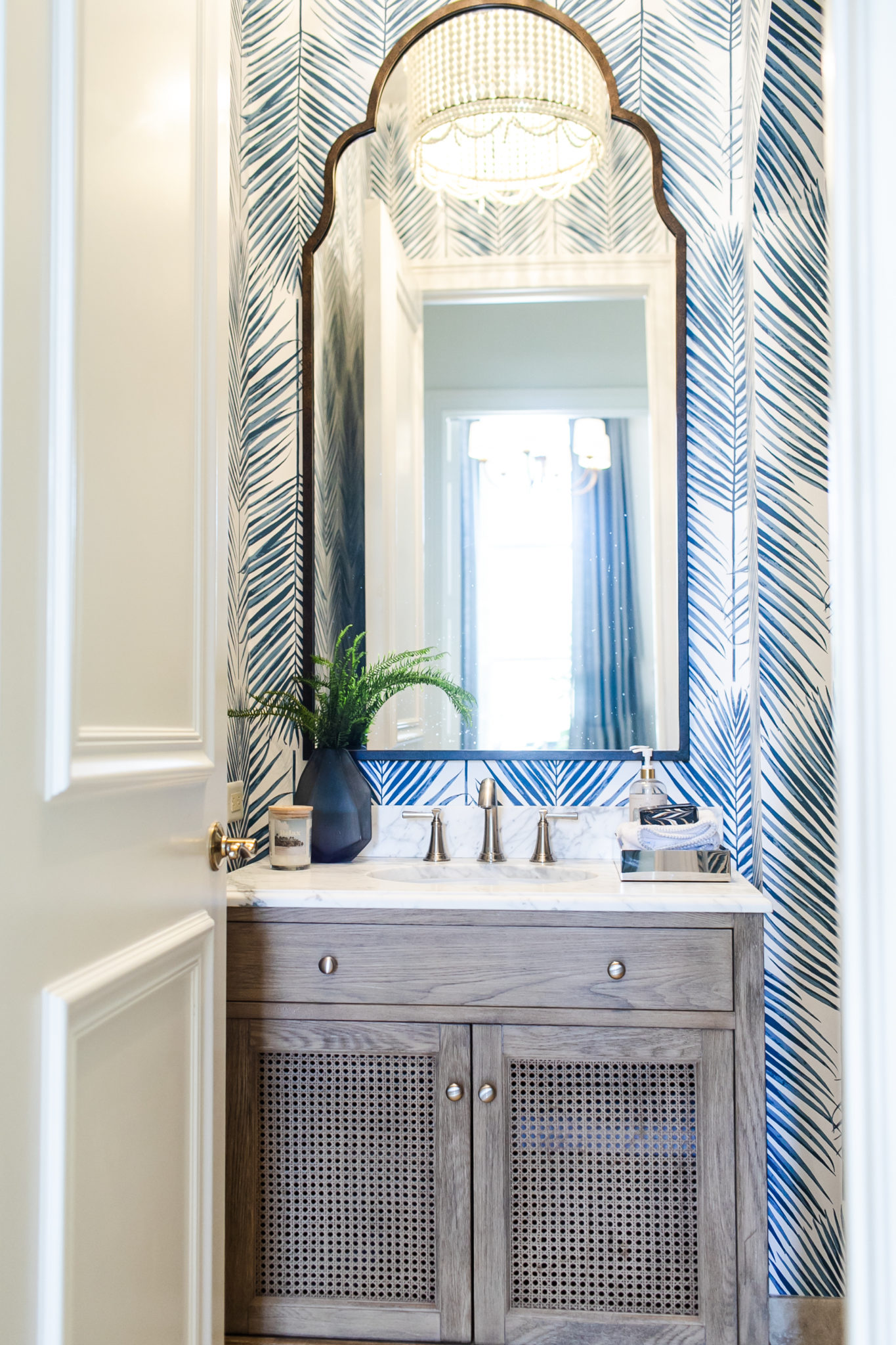
The powder room is always a fun room to take a little bit of a design risk, so we added some fabulous wallpaper. The mood for the design is modern coastal, and I love the texture in the vanity we selected. Better than the old dated and heavy one, right? The powder room is a room where you know guests will be, so it is always fun to go bold,
In the dining room, scale is always important, and you can see how in the “before” photo the table is too small for the space and it is overall lacking warmth. We swapped out the dated chandelier, added some textured wallpaper for warmth, and a rug to ground the space and section off the table. Finally, I love the wood elements we brought in with the reclaimed walnut console and the legs of the upholstered chairs. The addition of the beautiful drapery in happy blue and white carries through the palette we created for the rest of the home. It creates a nice continuity.
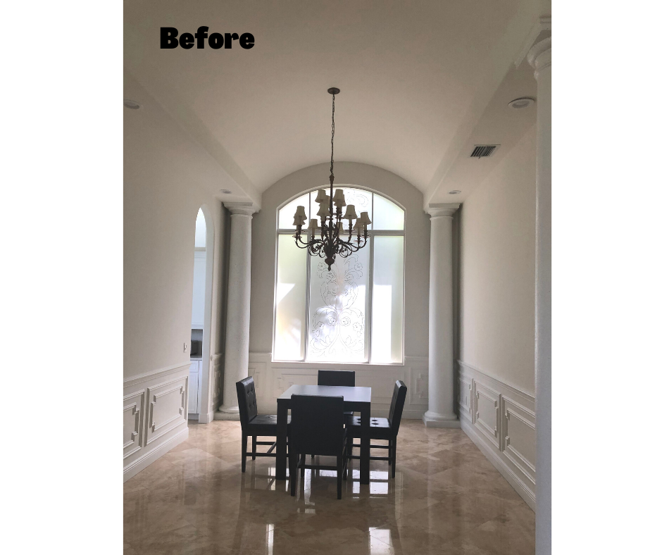
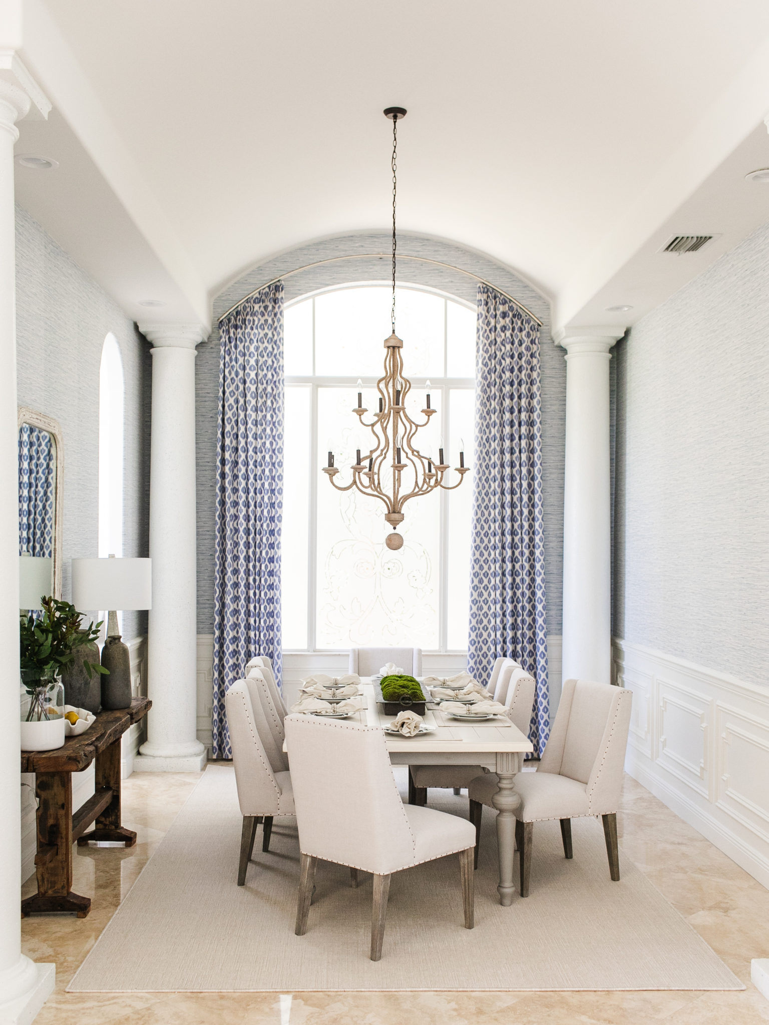
Interior Design by Krista Watterworth Alterman, Photo by Eve Greendale
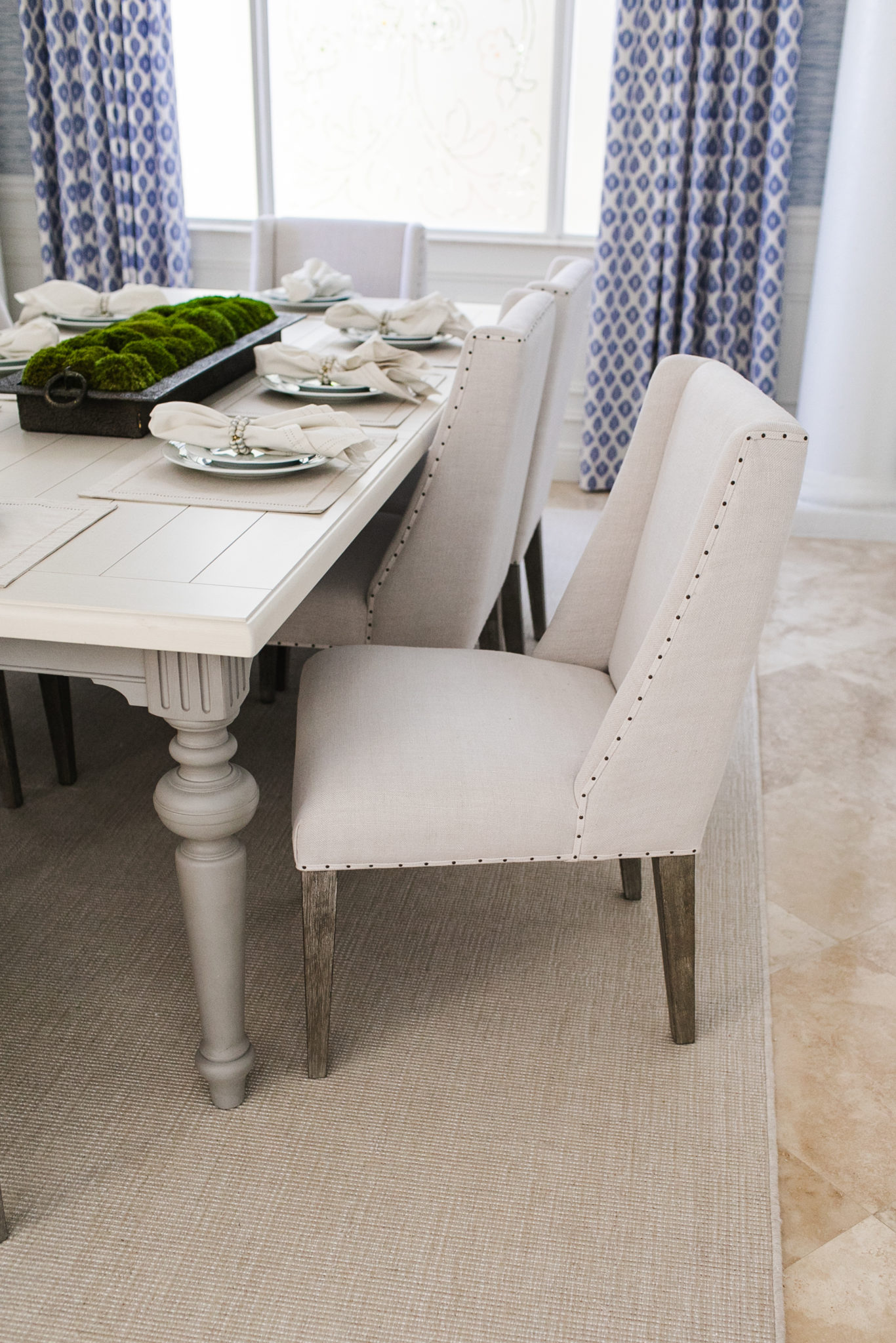
Interior Design by Krista Watterworth Alterman, Photo by Eve Greendale
I hope you enjoyed this fun Before and After story! I am excited as we move on to Phase Two of this project – renovating their FIVE bathrooms! Stay tuned…


Absolutely Amazing
Amazing! Looks beautiful. Thanks for sharing!