My Kitchen Reveal
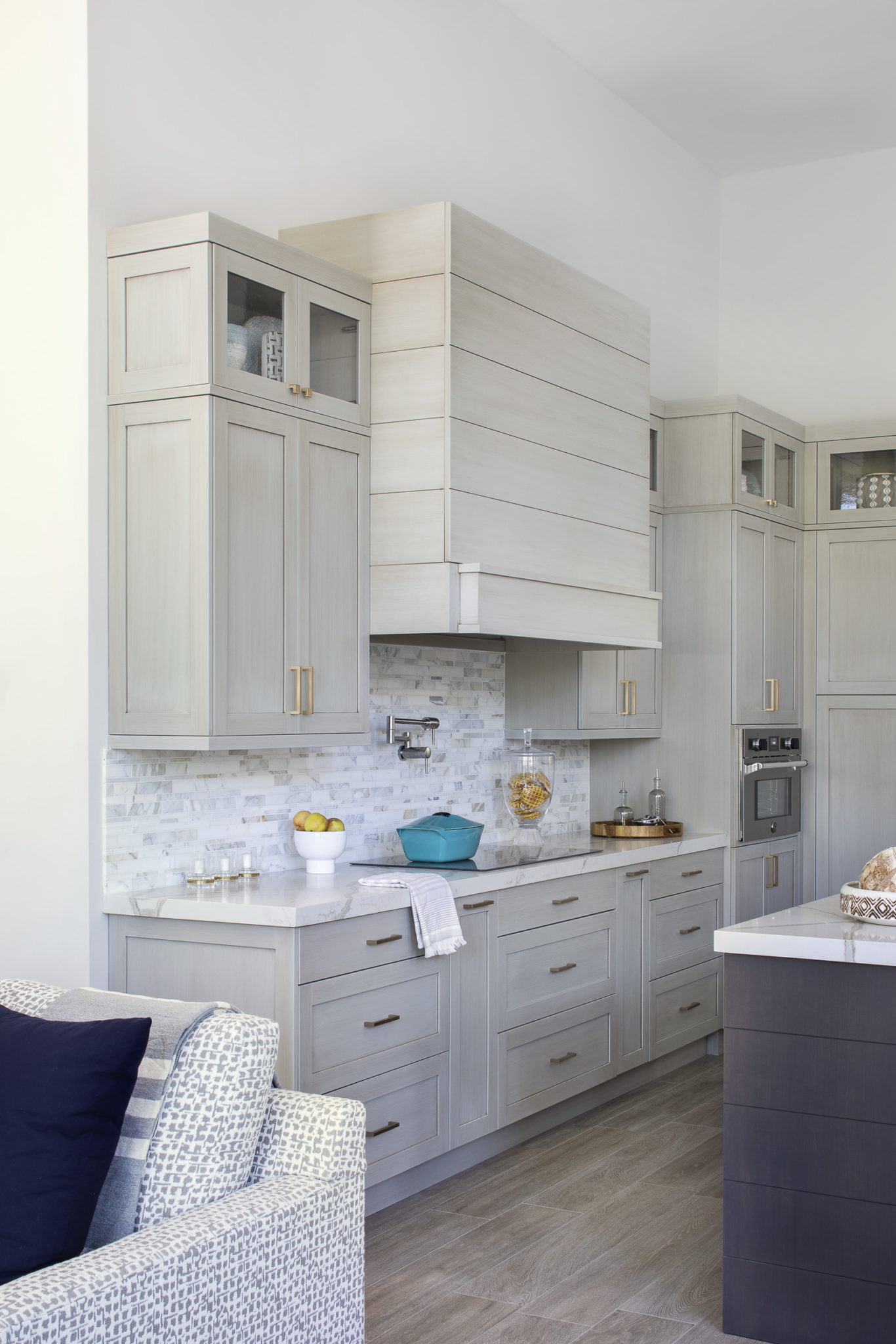
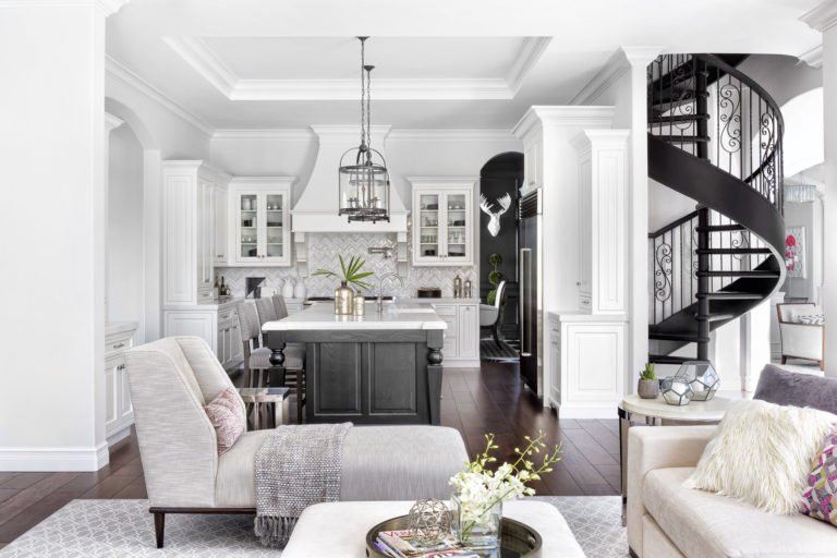
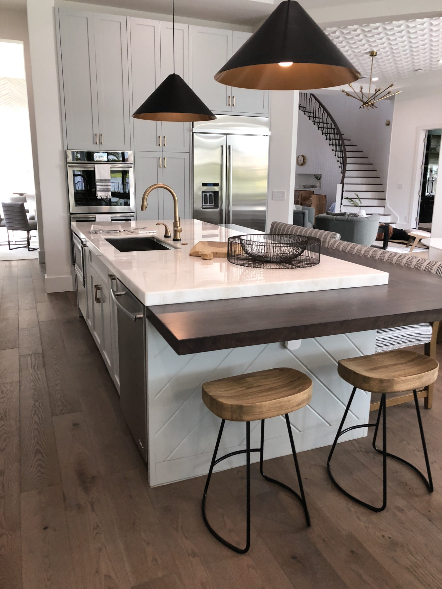
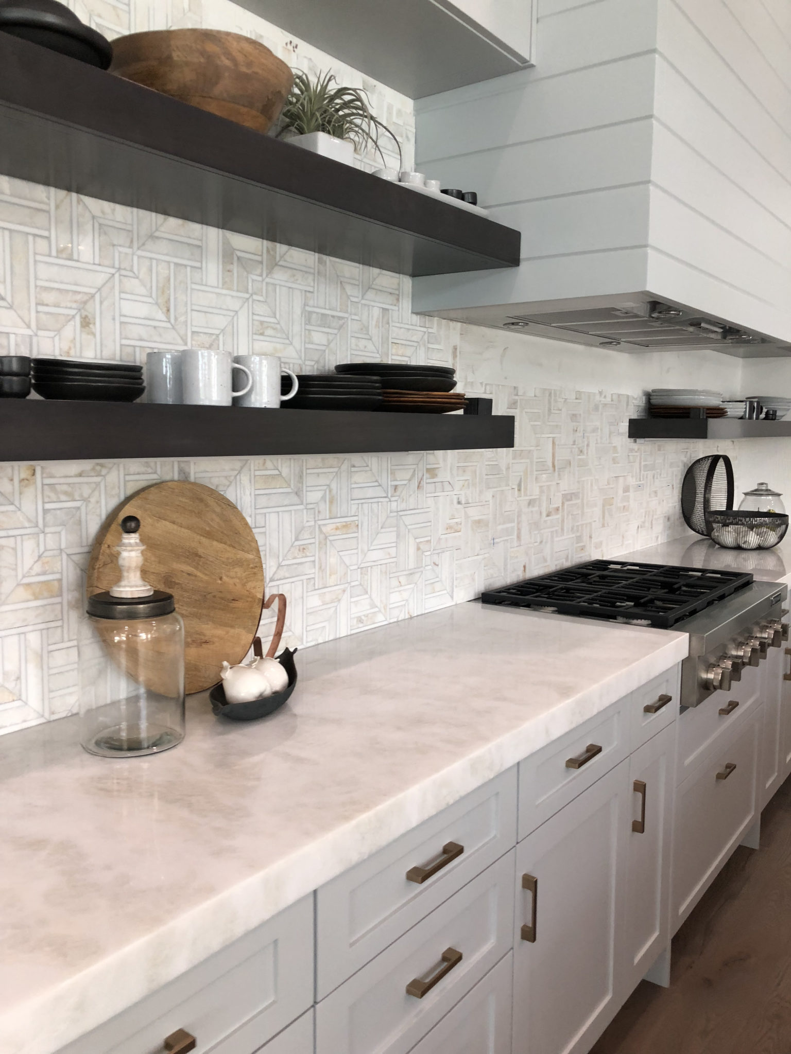
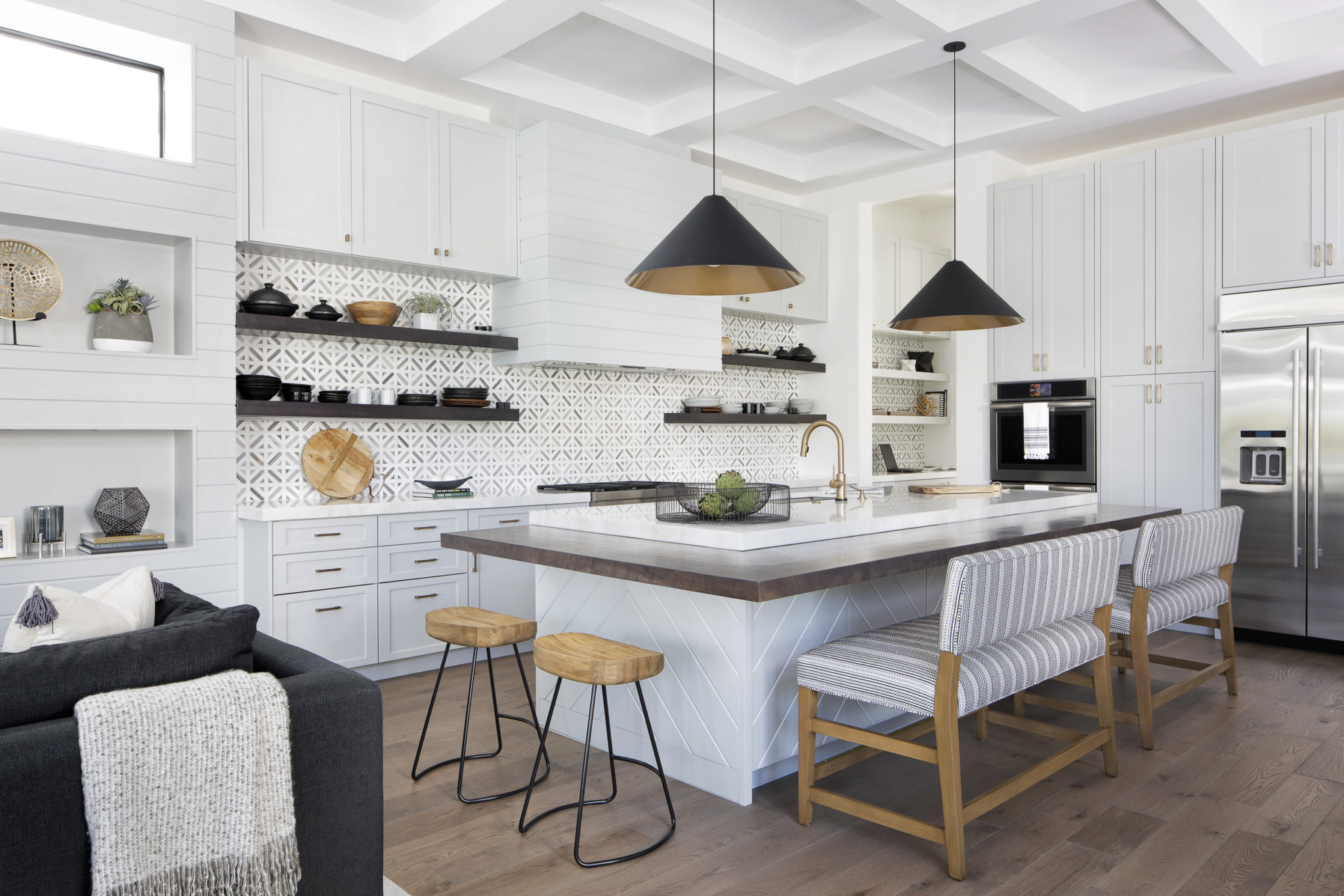
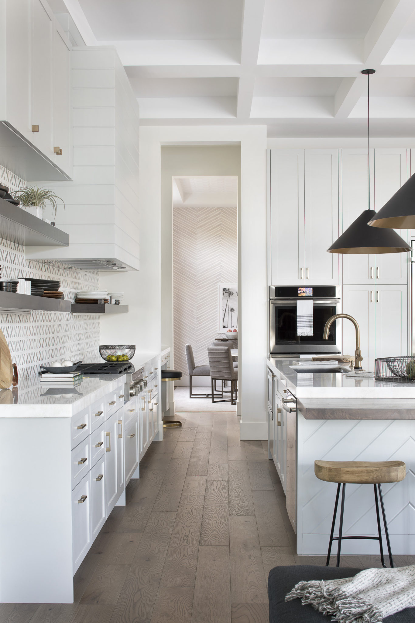
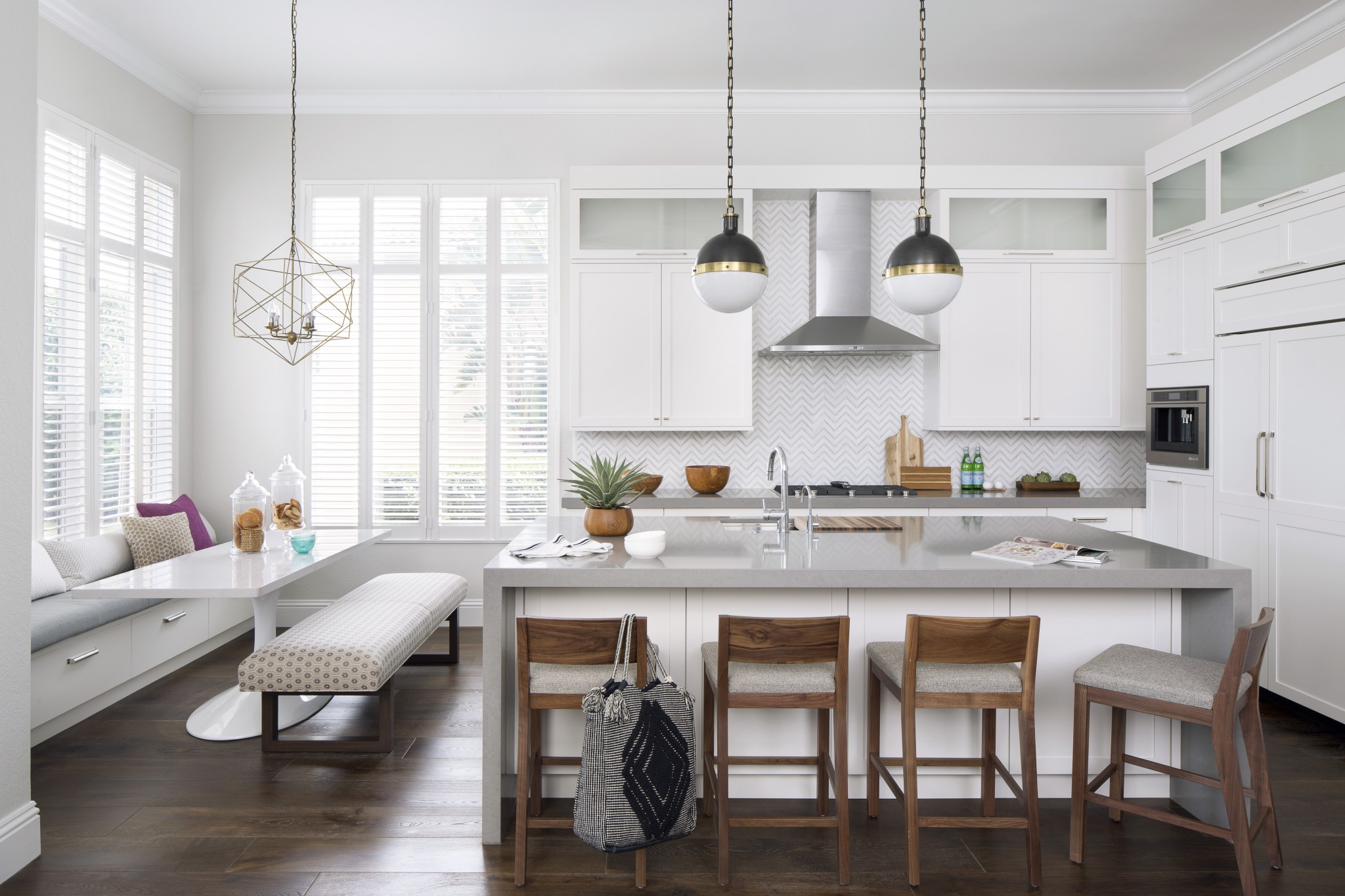
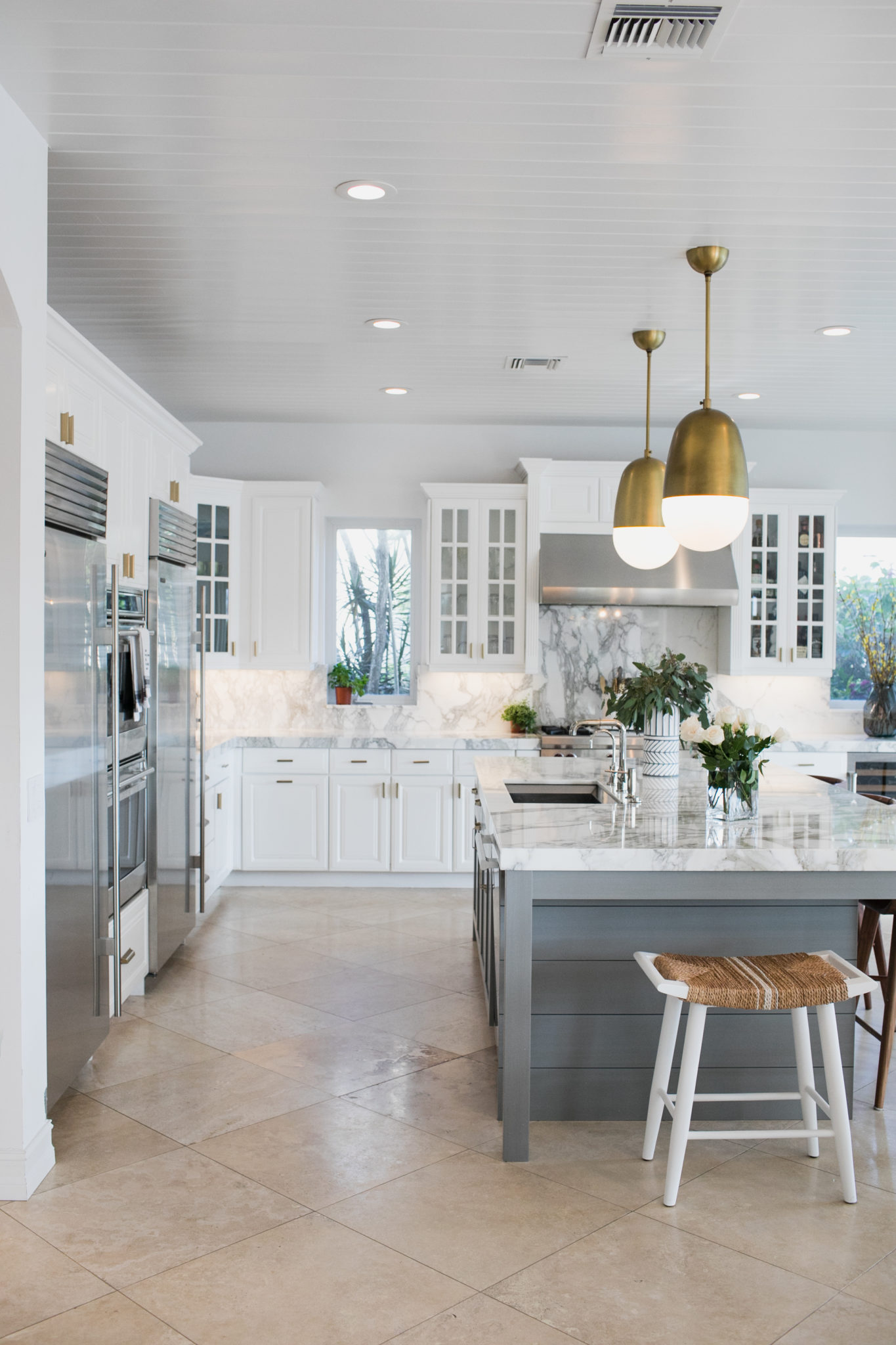
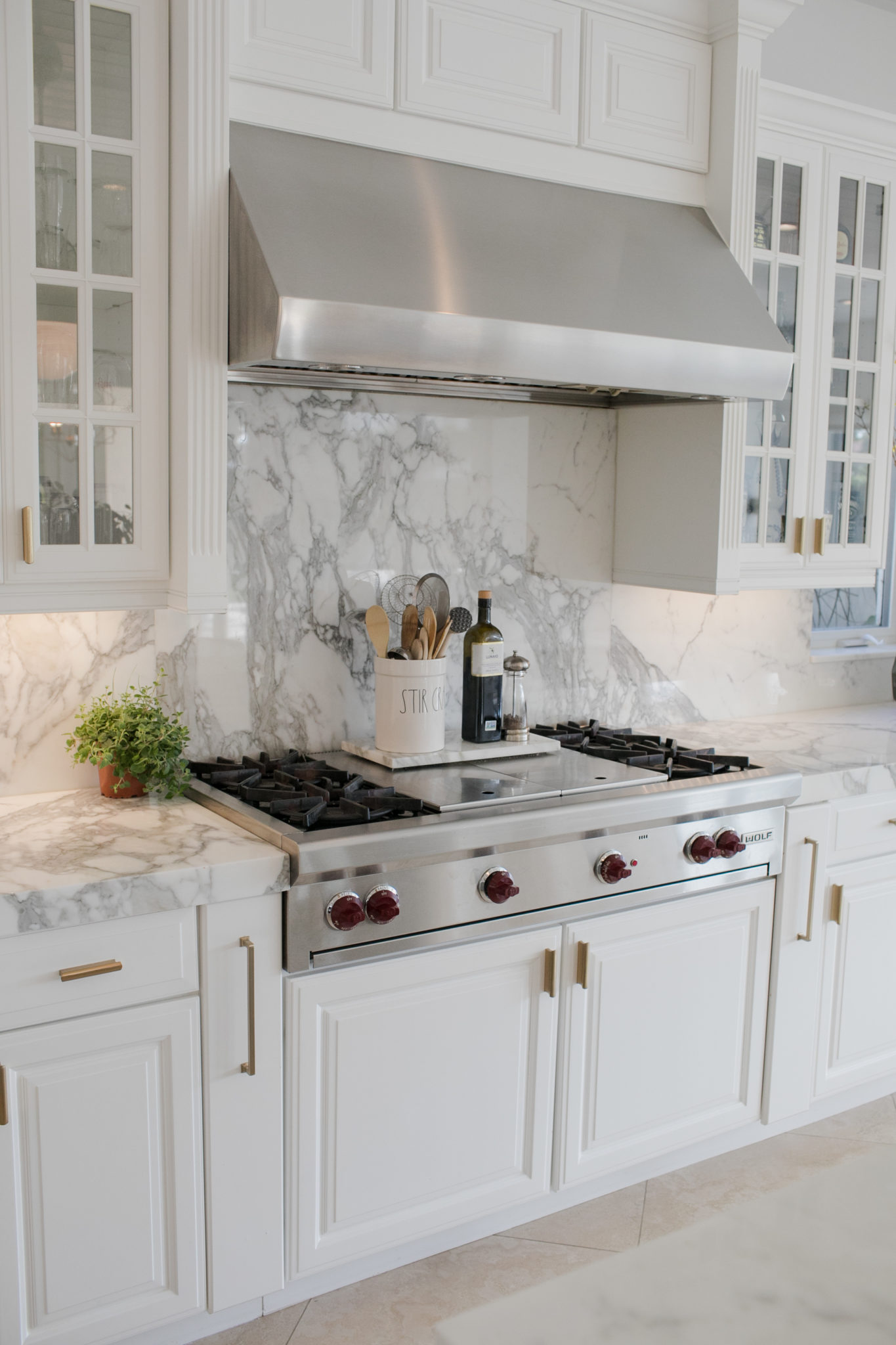
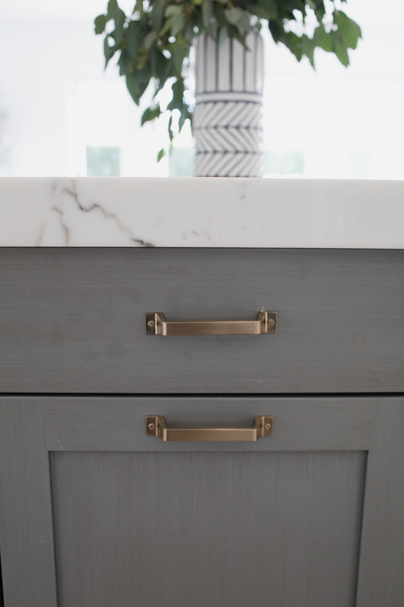
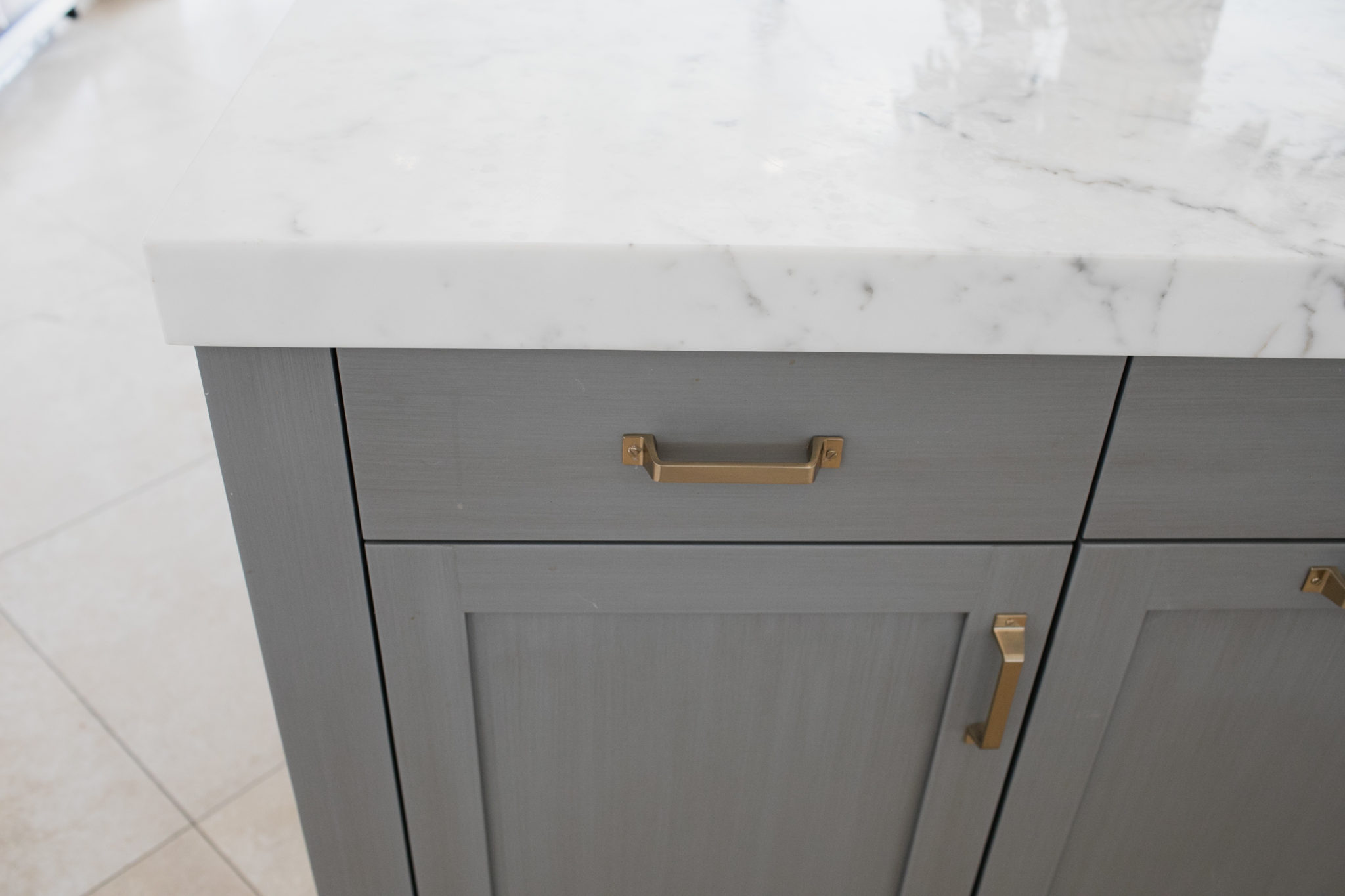
I recently renovated my own kitchen and boy, was it stressful…but I am really happy with the results! I have been thinking about what I wanted to do with this space for awhile. It is the hub of our home and the space where our family probably spends the most time! My vision included LOTS of beautiful marble with extra thick counter tops, luxurious top of the line appliances by Sub-Zero and Wolf, brass accents in the hardware and lighting and a few wood accents to warm everything up. I also added some fresh gray cabinetry to break up all the white in the space and so shiplap on the island and ceiling.
Interior Design by Krista Watterworth Alterman, Photo by Eve Greendale
Interior Design by Krista Watterworth Alterman, Photo by Eve Greendale
Interior Design by Krista Watterworth Alterman, Photo by Eve Greendale
Interior Design by Krista Watterworth Alterman, Photo by Eve Greendale
I have always dreamed of having double fridges! What a luxury and it works so well for our family.
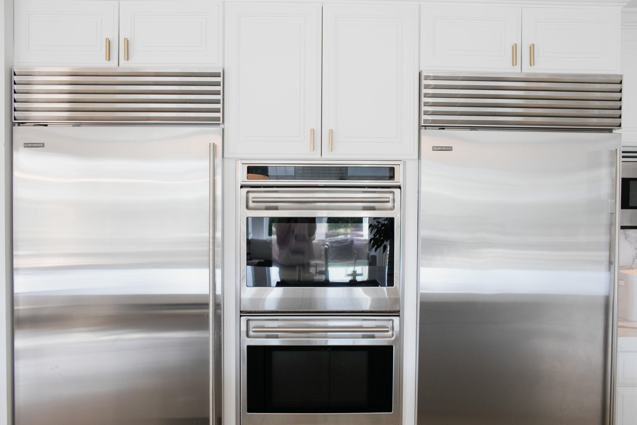
Interior Design by Krista Watterworth Alterman, Photo by Eve Greendale
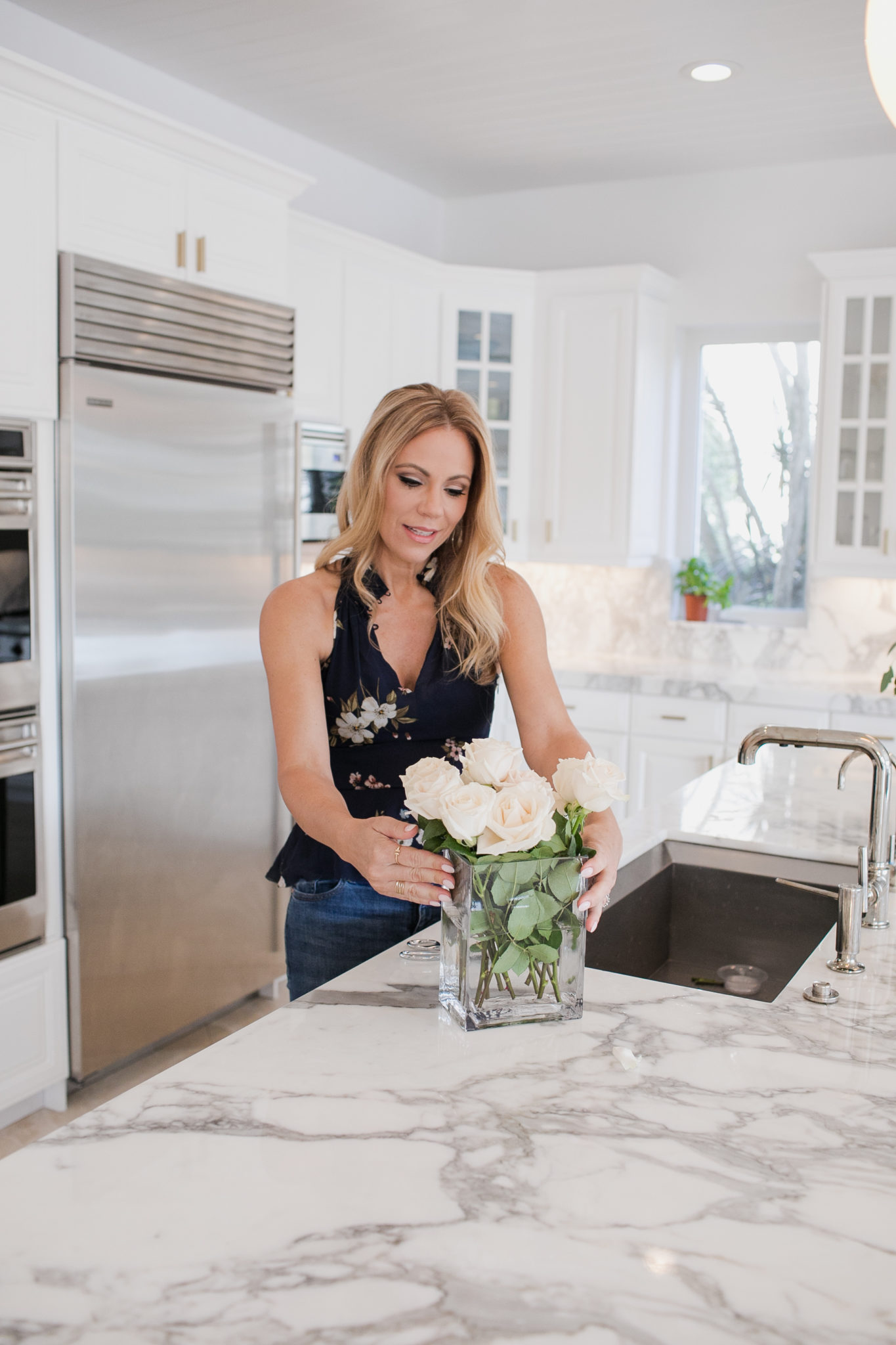
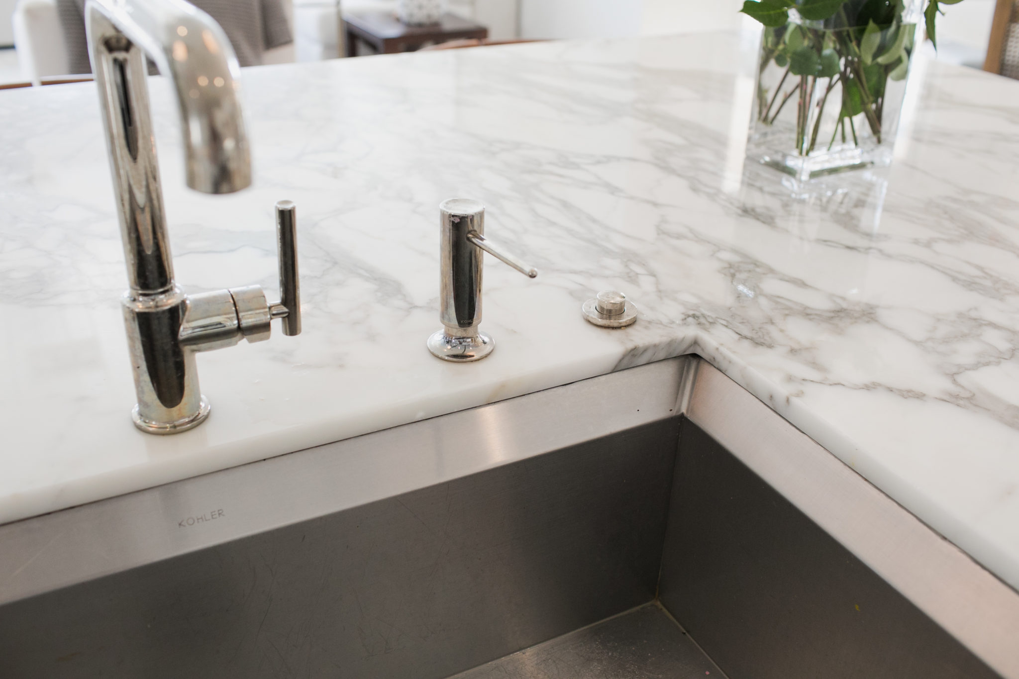
Interior Design by Krista Watterworth Alterman, Photo by Eve Greendale
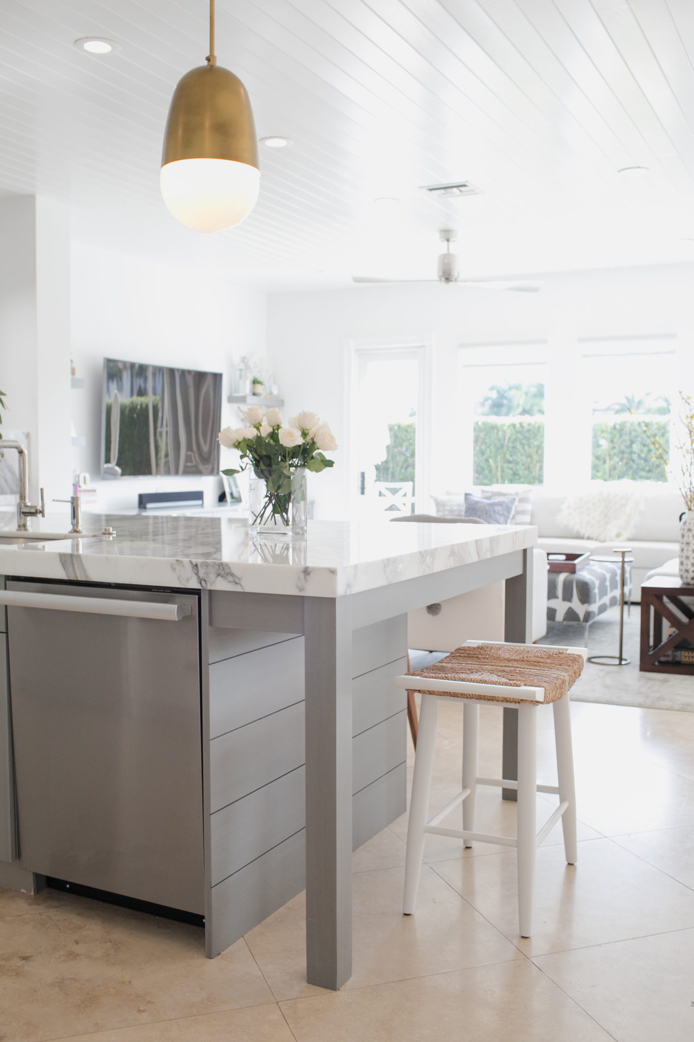
Interior Design by Krista Watterworth Alterman, Photo by Eve Greendale
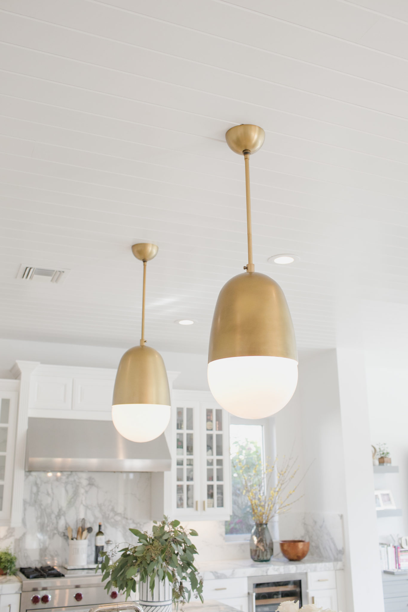
Interior Design by Krista Watterworth Alterman, Photo by Eve Greendale
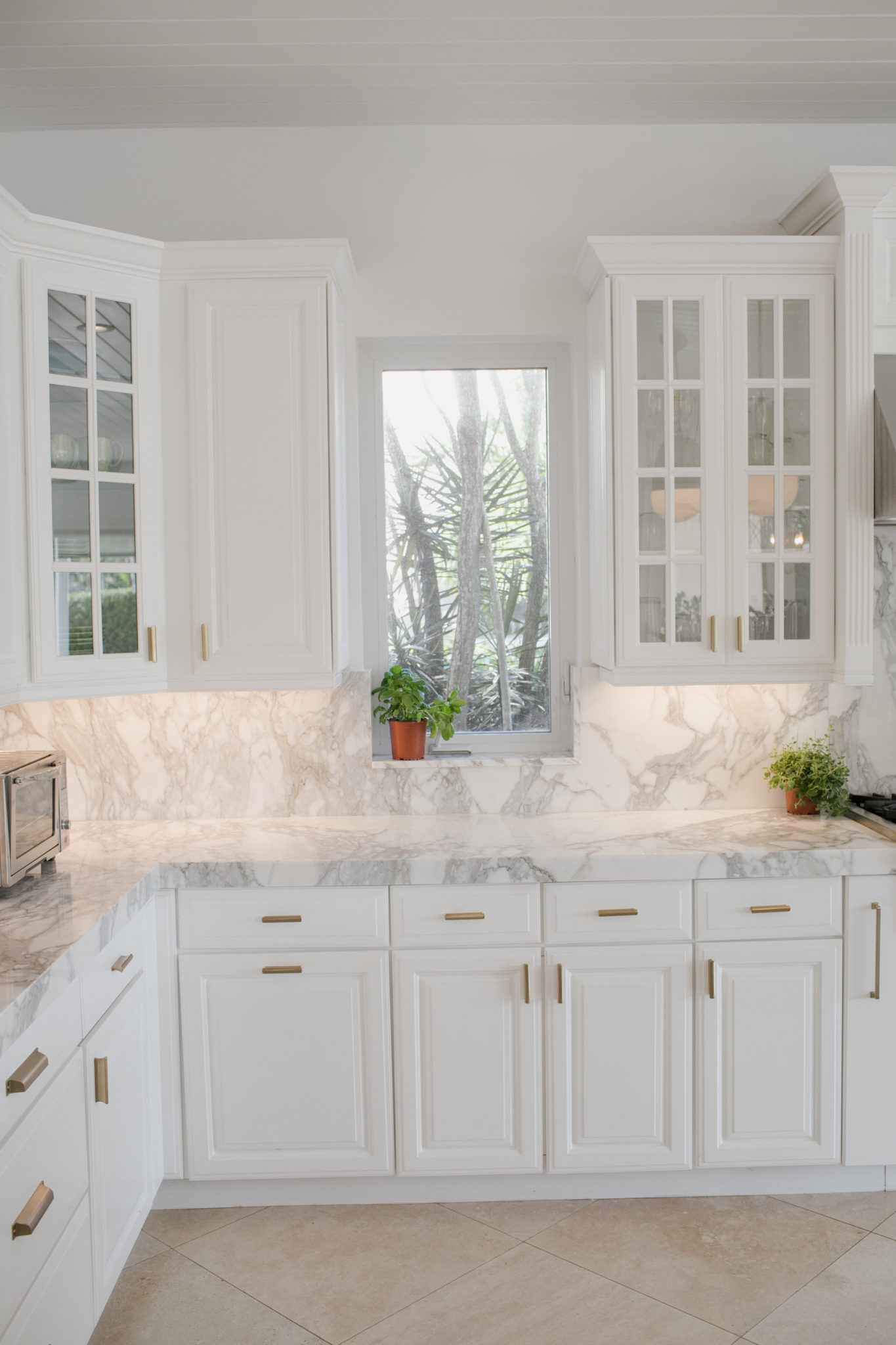
Interior Design by Krista Watterworth Alterman, Photo by Eve Greendale
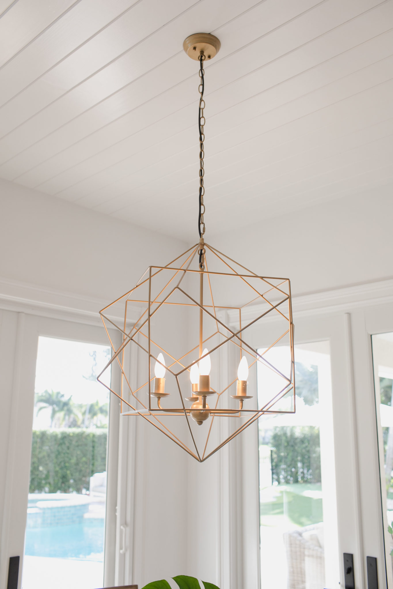
Interior Design by Krista Watterworth Alterman, Photo by Eve Greendale
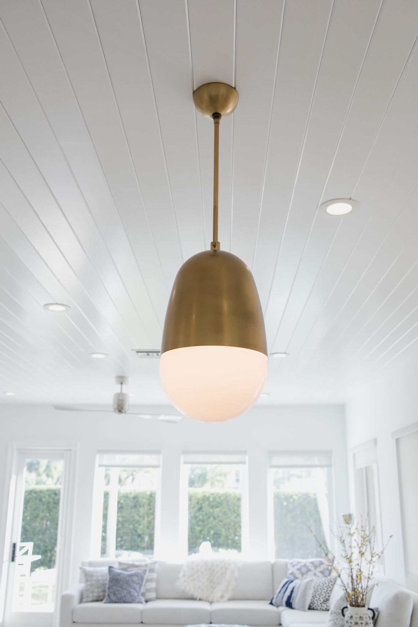
Interior Design by Krista Watterworth Alterman, Photo by Eve Greendale
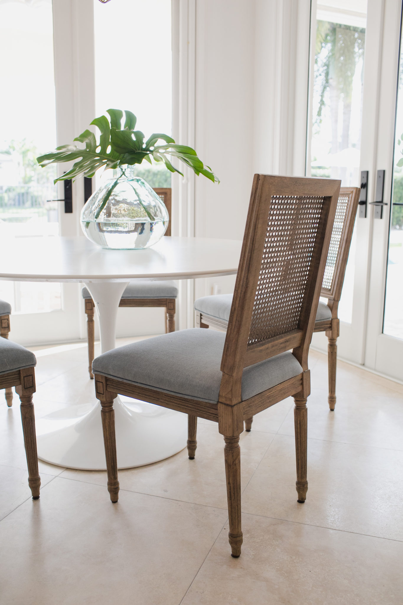
Interior Design by Krista Watterworth Alterman, Photo by Eve Greendale
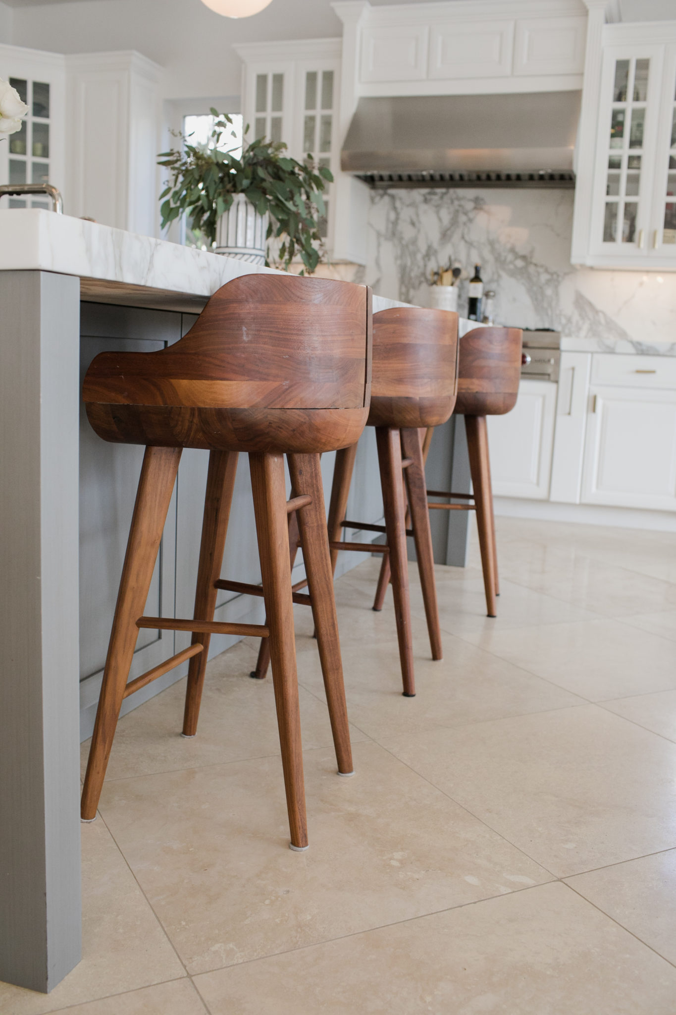
Interior Design by Krista Watterworth Alterman, Photo by Eve Greendale
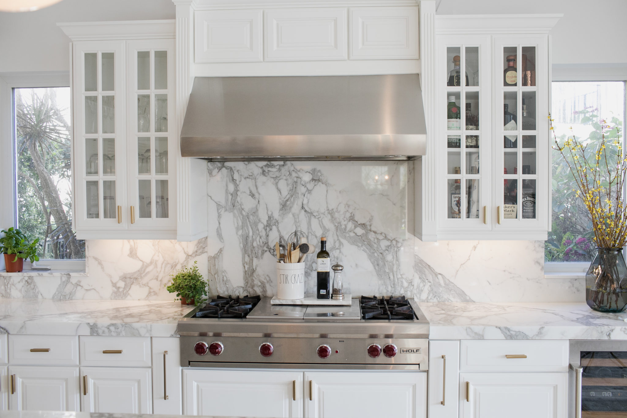
Interior Design by Krista Watterworth Alterman, Photo by Eve Greendale
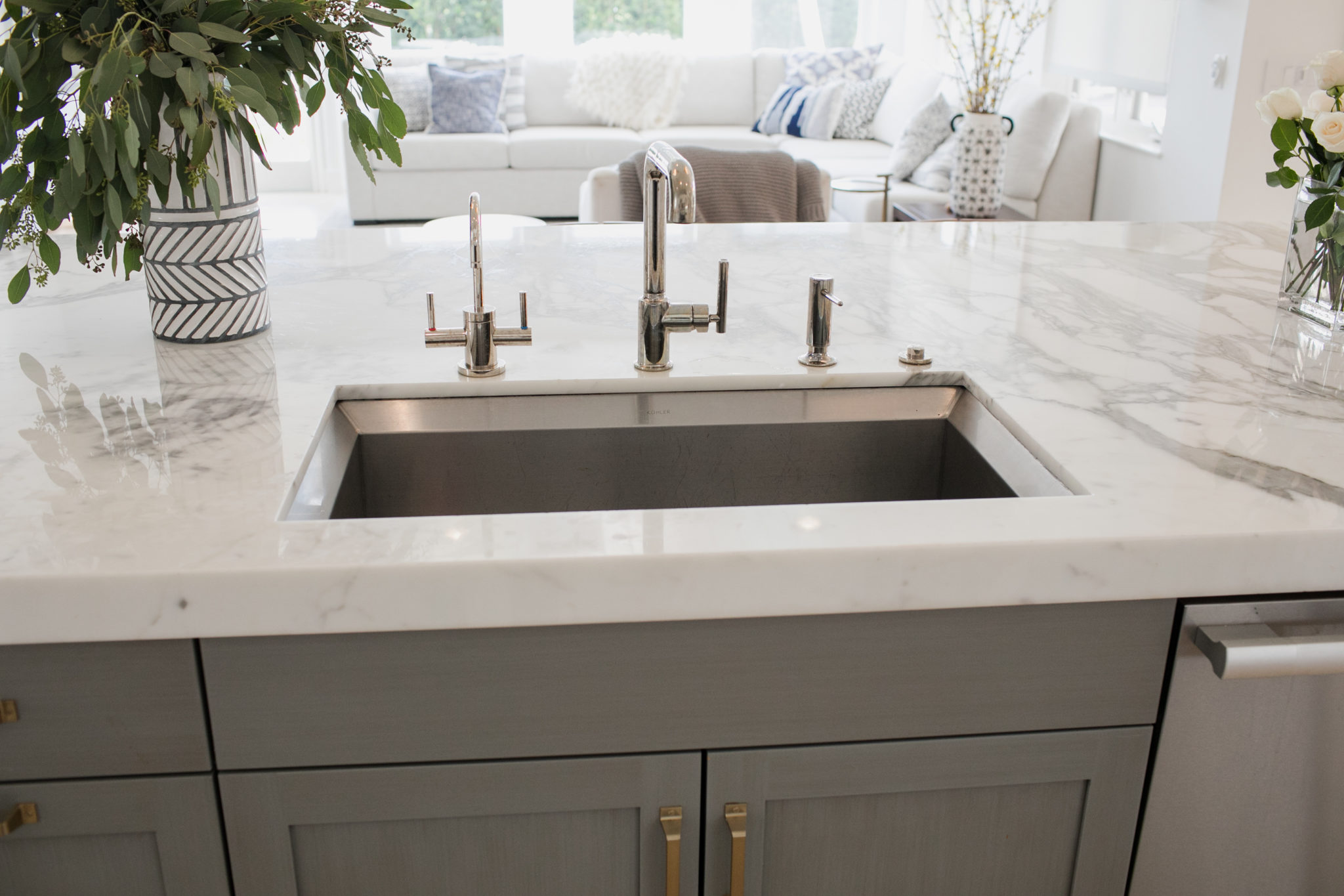
Interior Design by Krista Watterworth Alterman, Photo by Eve Greendale
Joyful Design
I just bought a book, Joyful, by an amazing woman and designer named Ingrid Fetell Lee. Her philosophy (the aesthetics of joy and the intersection of design and delight) are quite inspiring. Her book is about “the surprising power of ordinary things to create extraordinary happiness”. Isn’t that awesome? It’s not only about how to put joy into design, it’s about spotting joy on a daily basis. Yes, yes, YES!

Ingrid Fetell Lee
Our ancestors realized that color was necessary for survival. Being able to differentiate safe food from poisonous, it was a survival tool. Now we associate joy with color because it is associated with life, somewhere deep in our soul we know color keeps us alive and healthy! Isn’t that cool?
My passion for my work comes from creating joy in homes across South Florida (and someday across the country!). It comes from a real place, my childhood home was less than joyful, so a deep need to create pure spaces of happiness is what drives me as a professional. And it is what drives my philosophy on life and business.
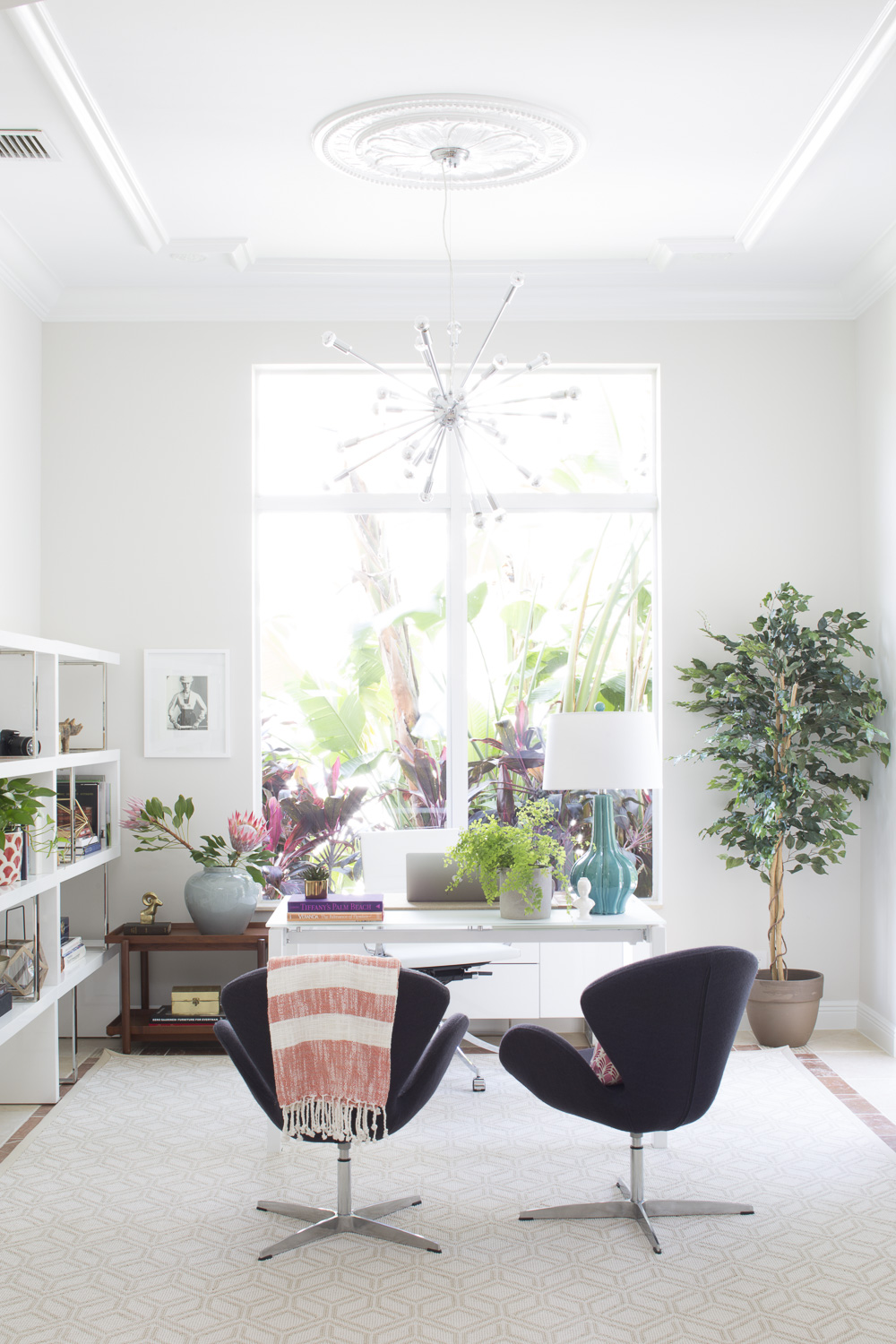
Finding joy in my work is often about color, but sometimes it’s about serenity. Below are some spaces I designed that give me great joy!
Kips Bay Show House Palm Beach 2020-My Favorite Rooms
I had so much fun attending the grand opening of the prestigious Kips Bay Show House Palm Beach last night! It was a very different experience to attend as a guest. Many of you might remember that last year, I was honored to be one of the designers. I designed the master bathroom and dressing room last year. This time, it was lovely to just sip a glass of champagne and wander from room to room to take it all in.
The Show House had a distinctly different vibe this year! I think it was because of the house itself. The architecture and layout was unique and modern. Architecturally, the layout made me think of a Los Angeles home and I just loved this multi-building structure, designed by architect Lars Bolander.
I left the home feeling incredibly inspired as a designer! Congratulations to this year’s crop of amazing artists.
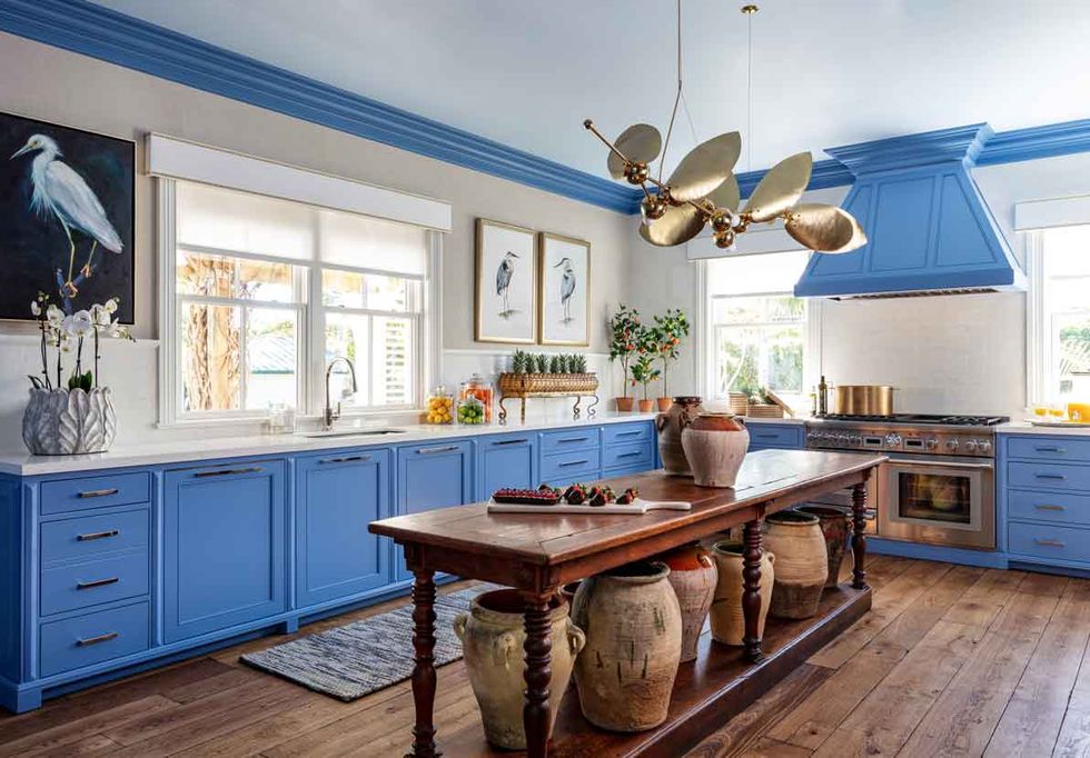
KITCHEN: Interior Design by Sarah Blank
So french and so perfect! The colorful cabinetry was to die for and I loved the antique touches. The chandelier was also a showstopper.
Photography by Nicholas Sargent
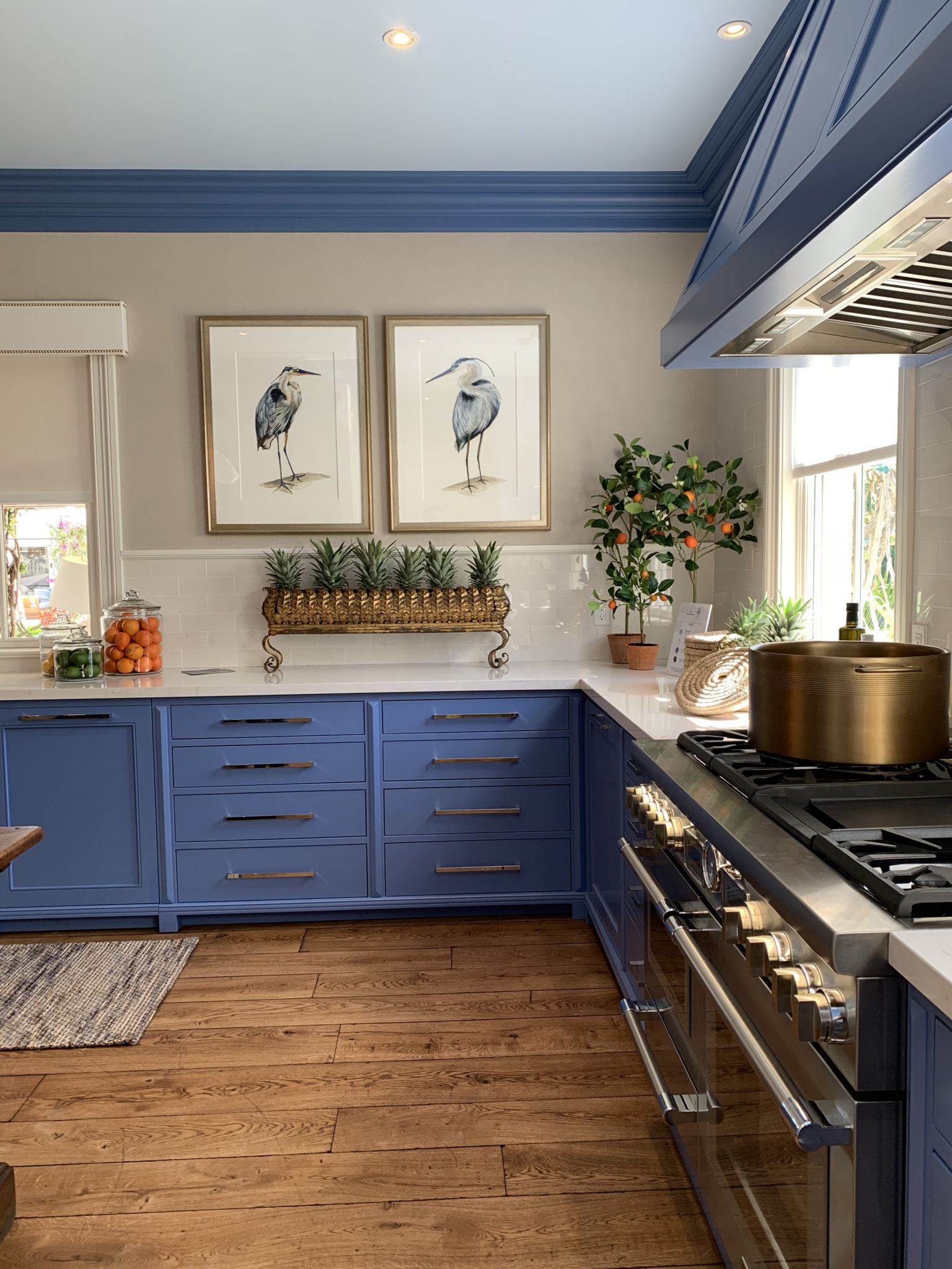
Photo by Jon Gilbert
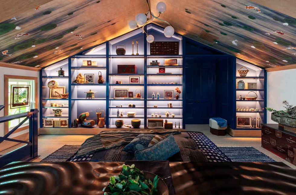
MIDFULNESS RETREAT: Interior Design by Sarah Magness
This loft space is divine. From the lighted bookshelves to the japanese influences throughout, I loved every nook and cranny.
Photography by Nicholas Sargent
MASTER BATH + DRESSING ROOM: Interior Design by Studio B
Color, color, color! All of the patterns and colors work together seamlessly in this happy retreat.
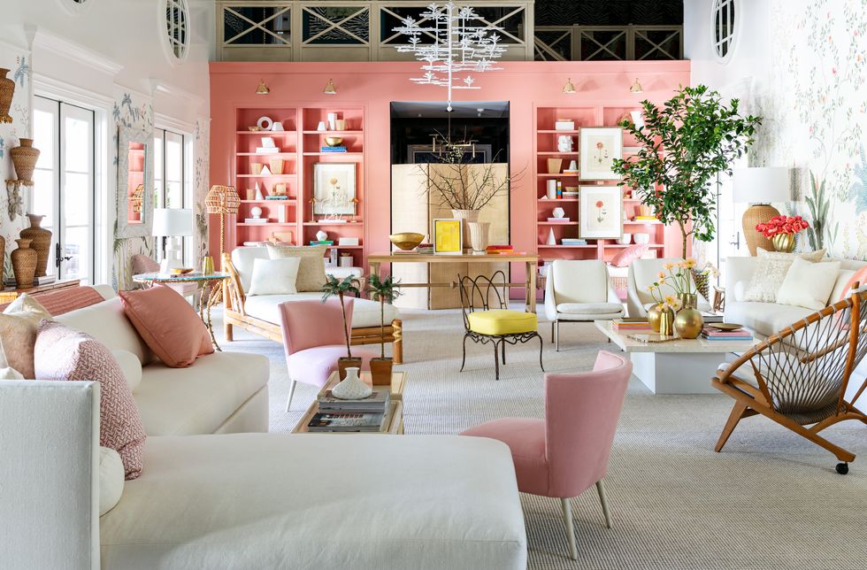
GREAT ROOM: Interior Design by Suzanne Kasler
I have always admired Suzanne Kasler’s work and this great room was so lovely. Clean lines, on=trend blush hues and comfy seating…yes please!
Photography by Nicholas Sargent
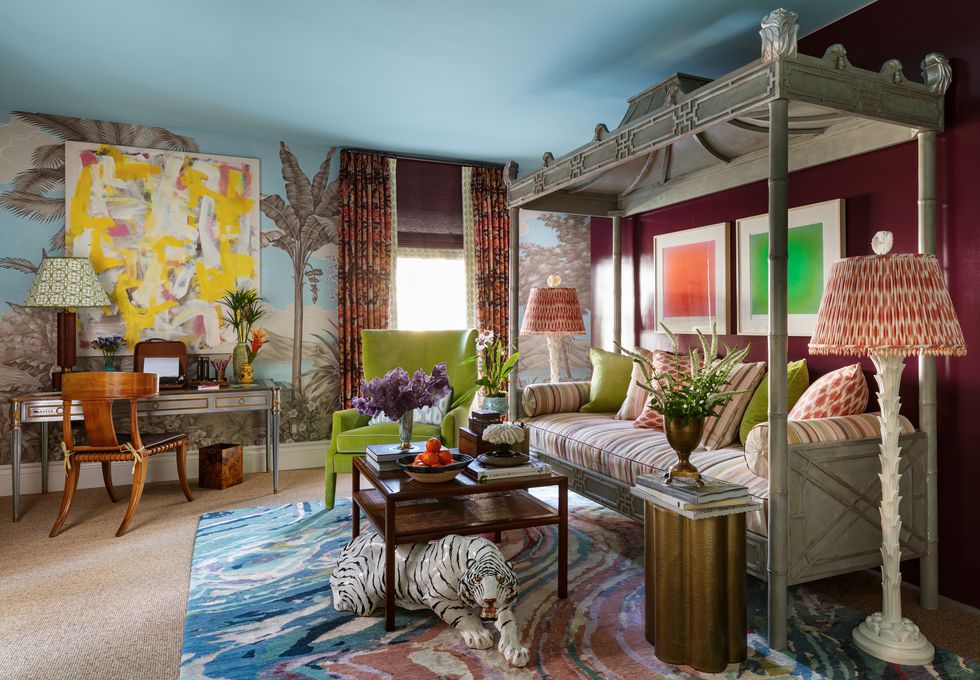
GUEST SUITE: Interior Design by Kevin Isbell
It is so difficult to chose, but I think this one was my favorite!! There were little mysteries and stories in every corner. I read that the designer imagined this to be a writer’s retreat…how cool.
Photography by Nicholas Sargent
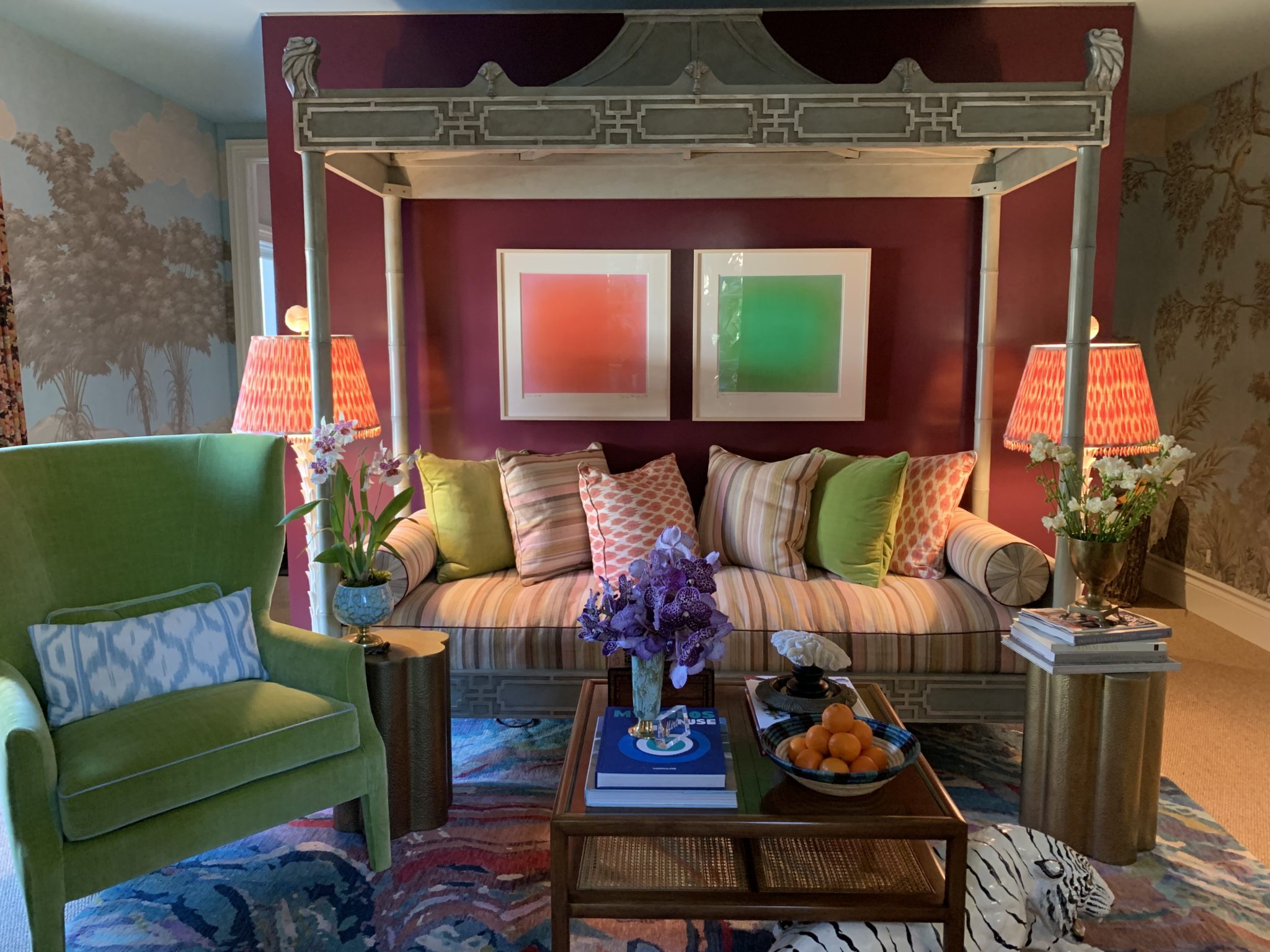
I will leave you with throwback to the master bathroom I designed for the Show House last year! Make sure to check out the Kips Bay Show House through March 1. You can purchase tickets here.
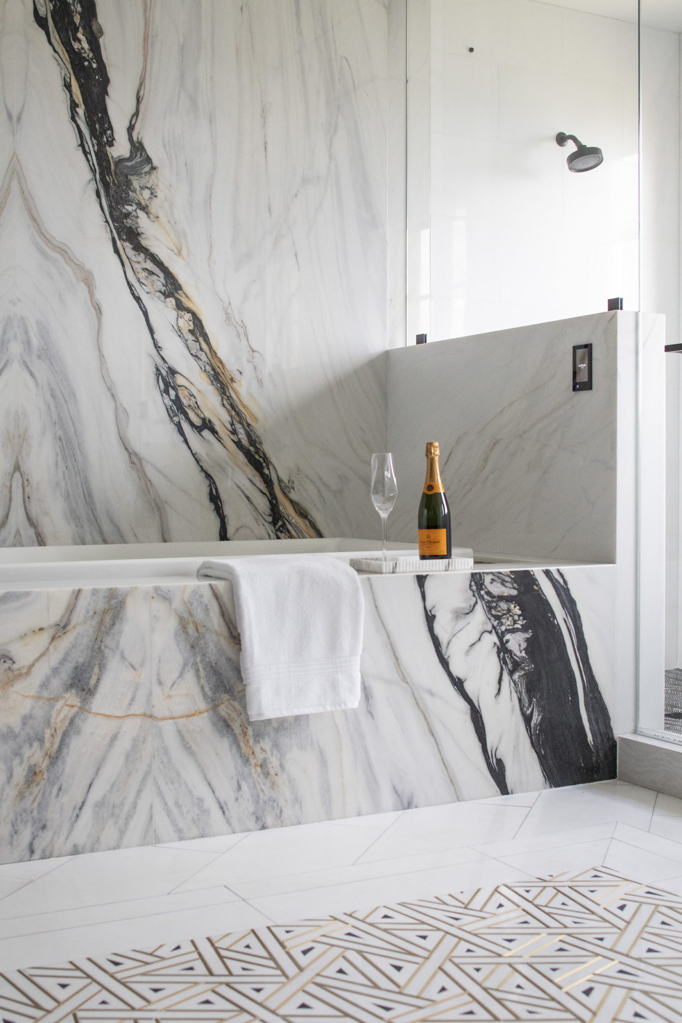
Interior Design by Krista Watterworth Alterman, KRISTA + HOME
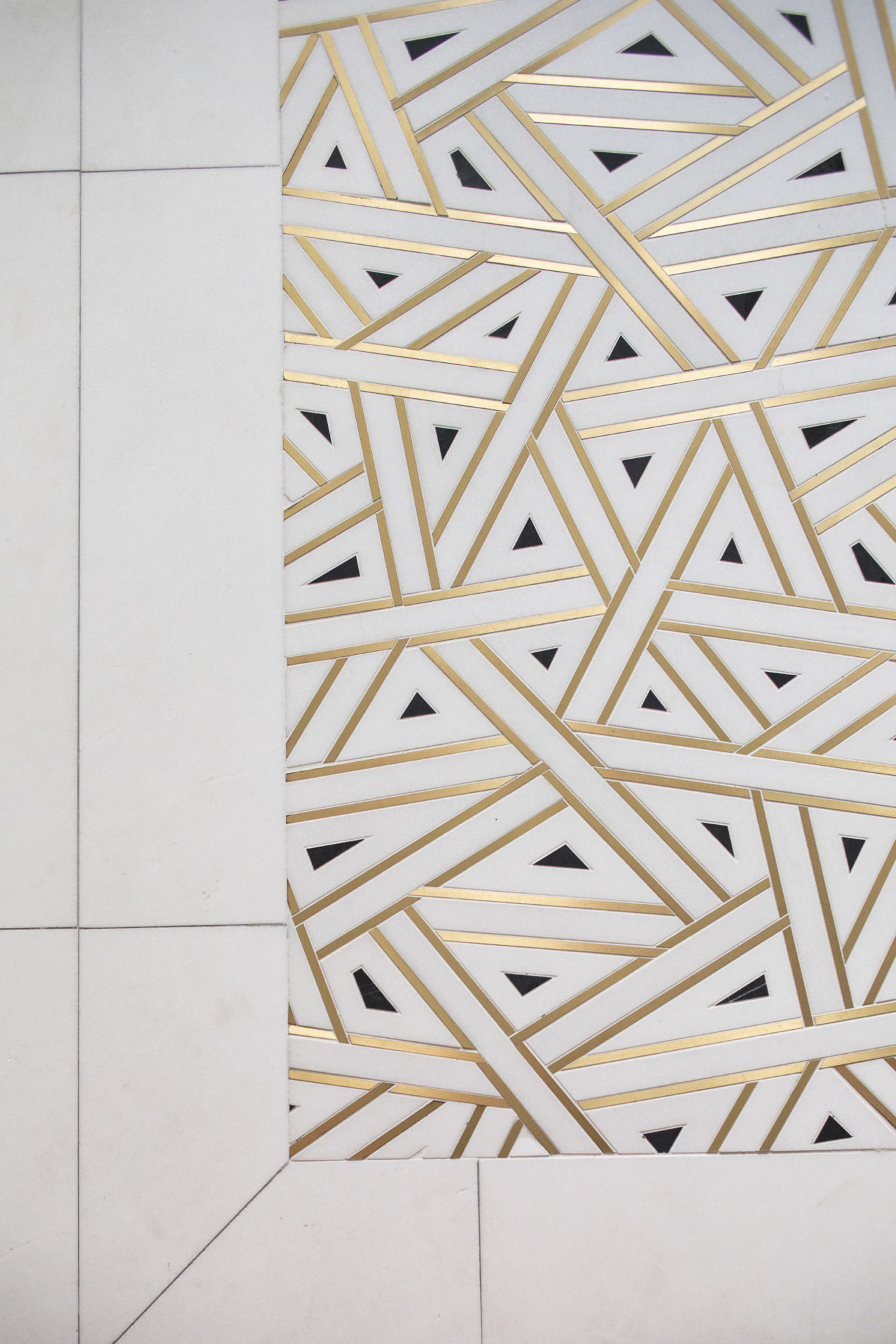
Interior Design by Krista Watterworth Alterman, KRISTA + HOME
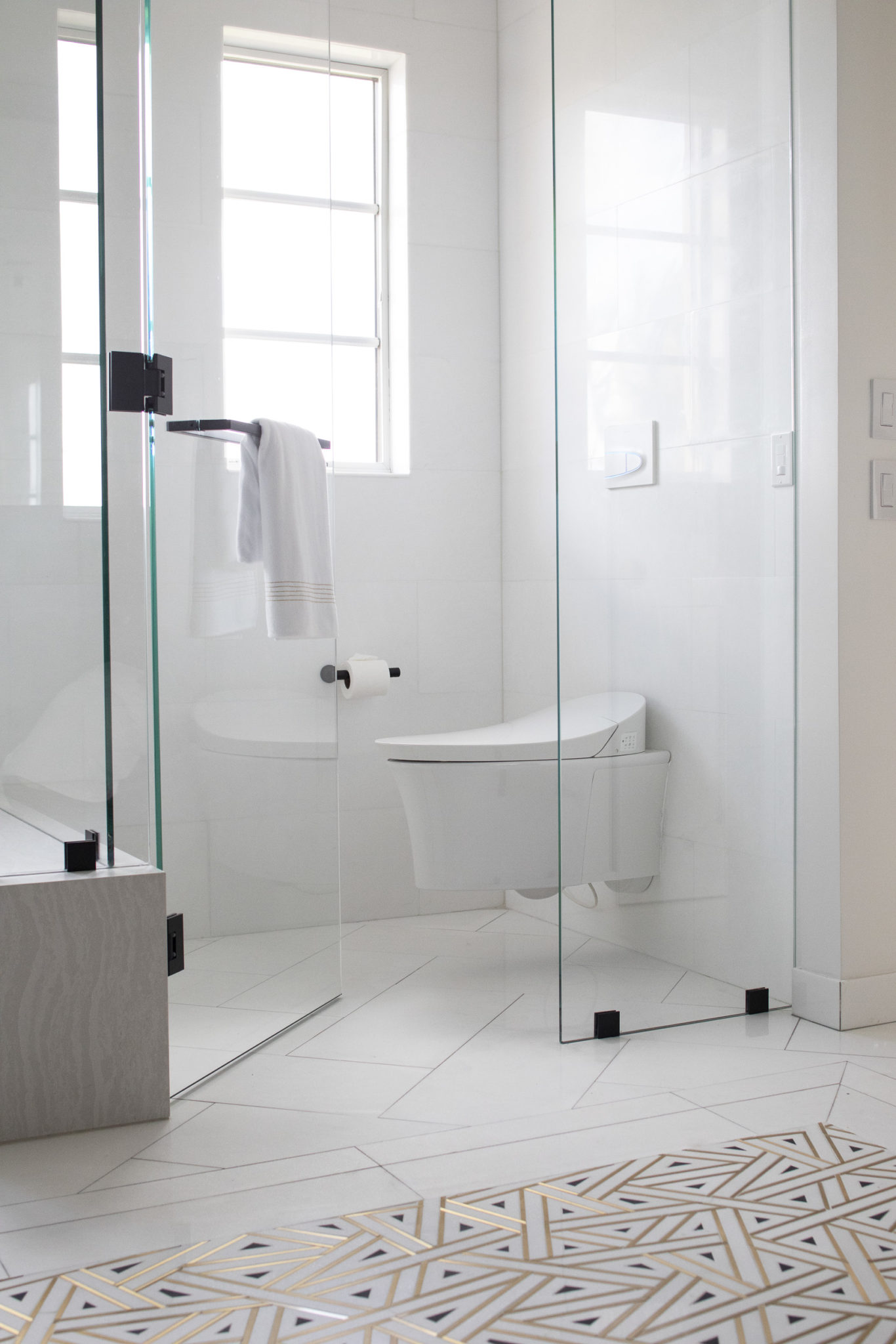
Interior Design by Krista Watterworth Alterman, KRISTA + HOME
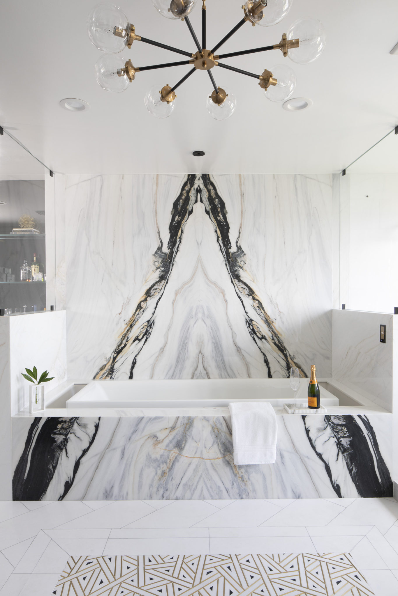
Interior Design by Krista Watterworth Alterman, KRISTA + HOME
Rebel Design
I had the pleasure of listening to a podcast on CLEVER (one of my favorite spots for people of design), and the guest was Bobby Hundreds of The Hundreds: streetwear designer.
Design comes in all forms, and Bobby’s take is that of a rebel. He grew up in an immigrant family with pure joy for punk rock music and skate boarding. He took that passion and grew it into a million dollar brand. That’s inspiring, when creatives infuse their individuality into something completely new.

Image of bobby hundreds from thehundreds.com
My rebel heart is revealing itself in all ways – my work and my design business, and sometimes in the way I parent my children!
Design is a creative force that needs an adventurous spirit in order to be unique. I share a few of my rebellious moments are below… the love of craft and passion for something new sings in my heart every day!
Sometimes it’s about over-layering, other times it’s about mixing styles, colors and patterns. But it’s always about a dream for something that takes me out of my comfort zone:)
Designing The New Palm Beach-Best of 2019
I love how everyone on Instagram is showing their “Top 9” posts of the year! Here are my top posts. I love the variety of these spaces that resonated with my followers. Many different design styles are represented, but you can still see the signature Krista + Home look in each of them. The common thread is livable luxury! That is what I strive to create in each of my designs. Spaces that are livable are so important, but we all want a little bit of luxury in a professionally designed space, right? Here are my top Nine. I am so proud of each of these spaces and I hope you enjoy them!
Award Winning Design Firm
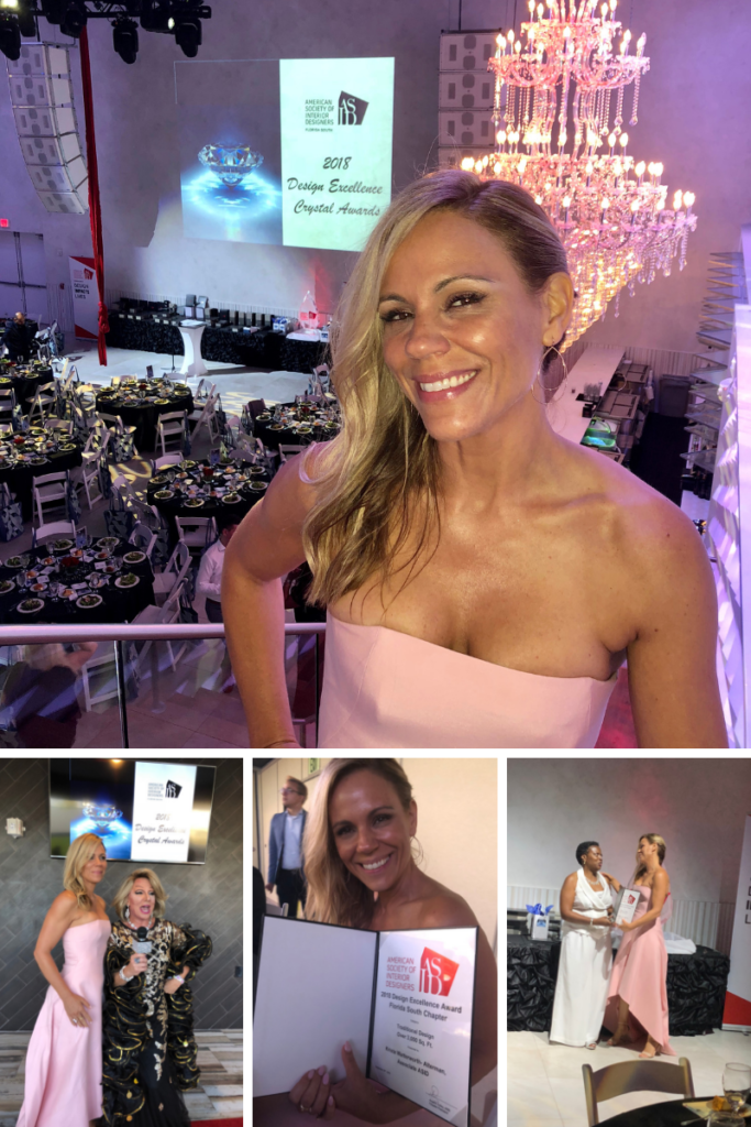
Krista was one of the selected designers for the prestigious Kips Bay Show House in 2019. She won two 2018 American Society of Interior Designers Crystal Awards, a 2018 LUXE Residential Excellence Award and three 2017 American Society of Interior Designers Design Excellence Awards.
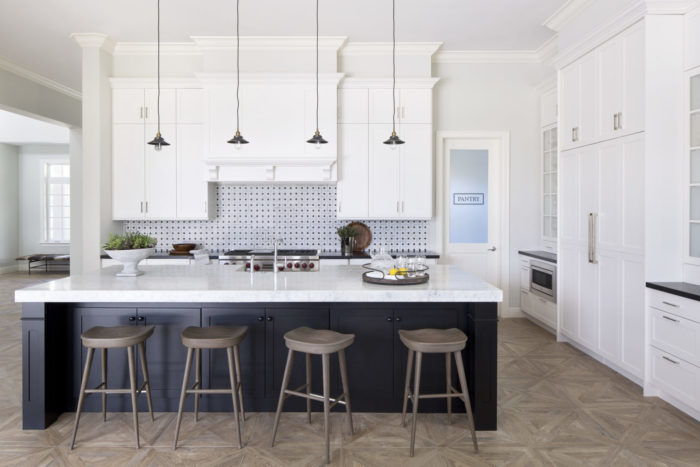
Our Luxe Red Award Kitchen Design
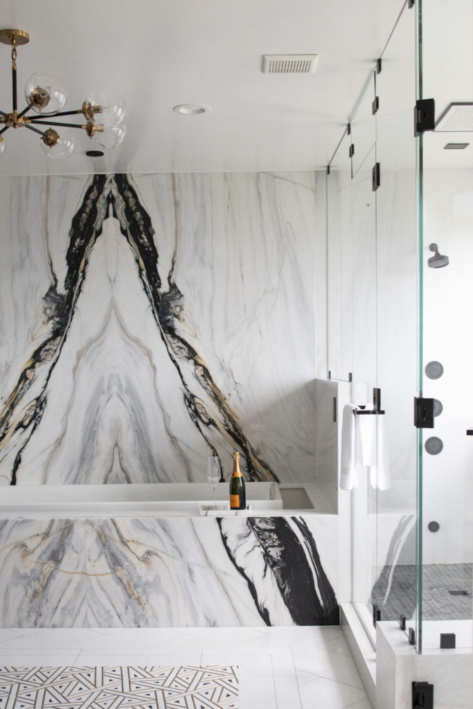
Our Kips Bay Decorator’s Show House Master Suite
Interior Design by Krista Watterworth Alterman, Photo by Jessica Glynn
6 Dining Rooms That Are Perfect For Thanksgiving
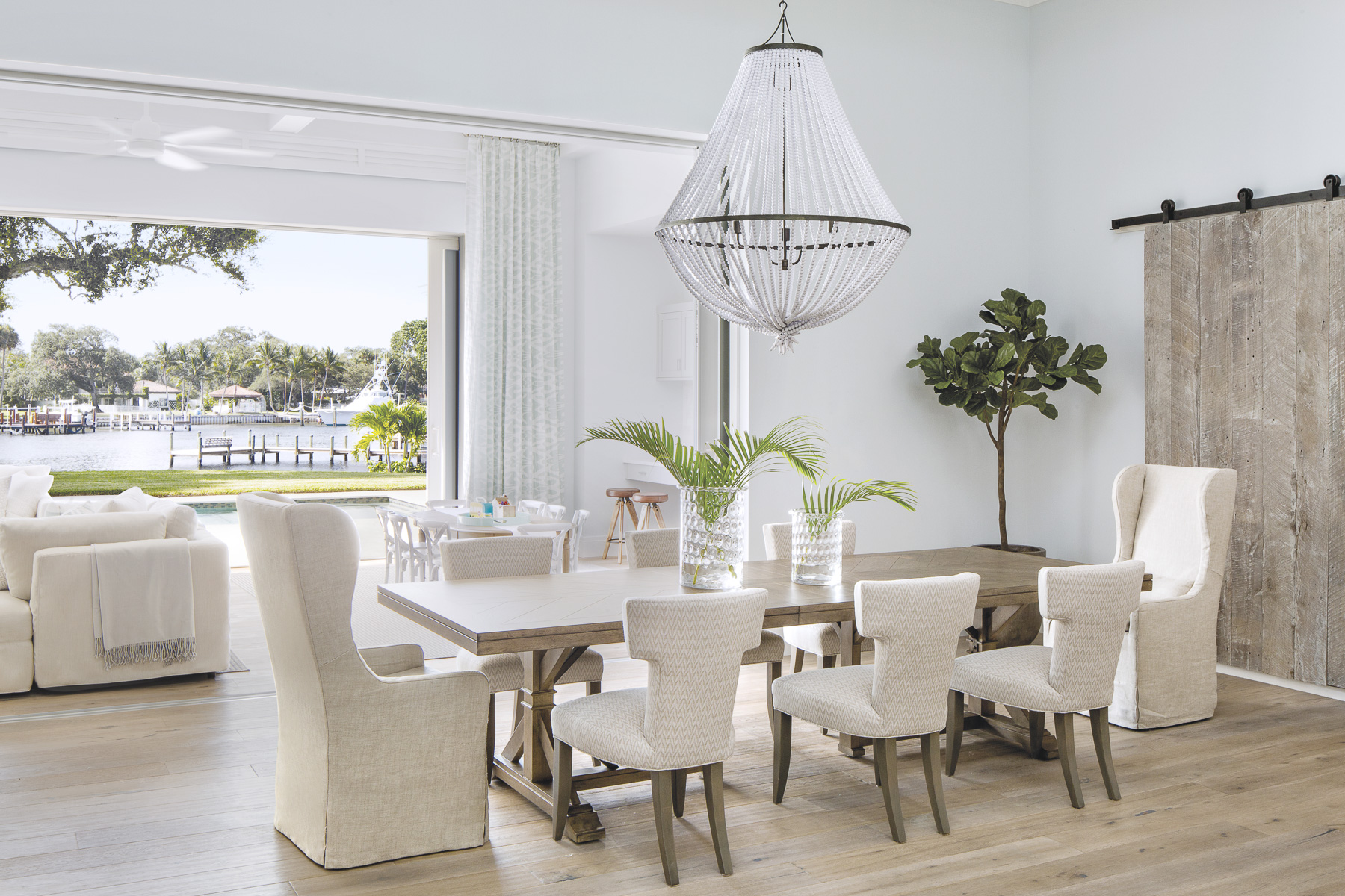
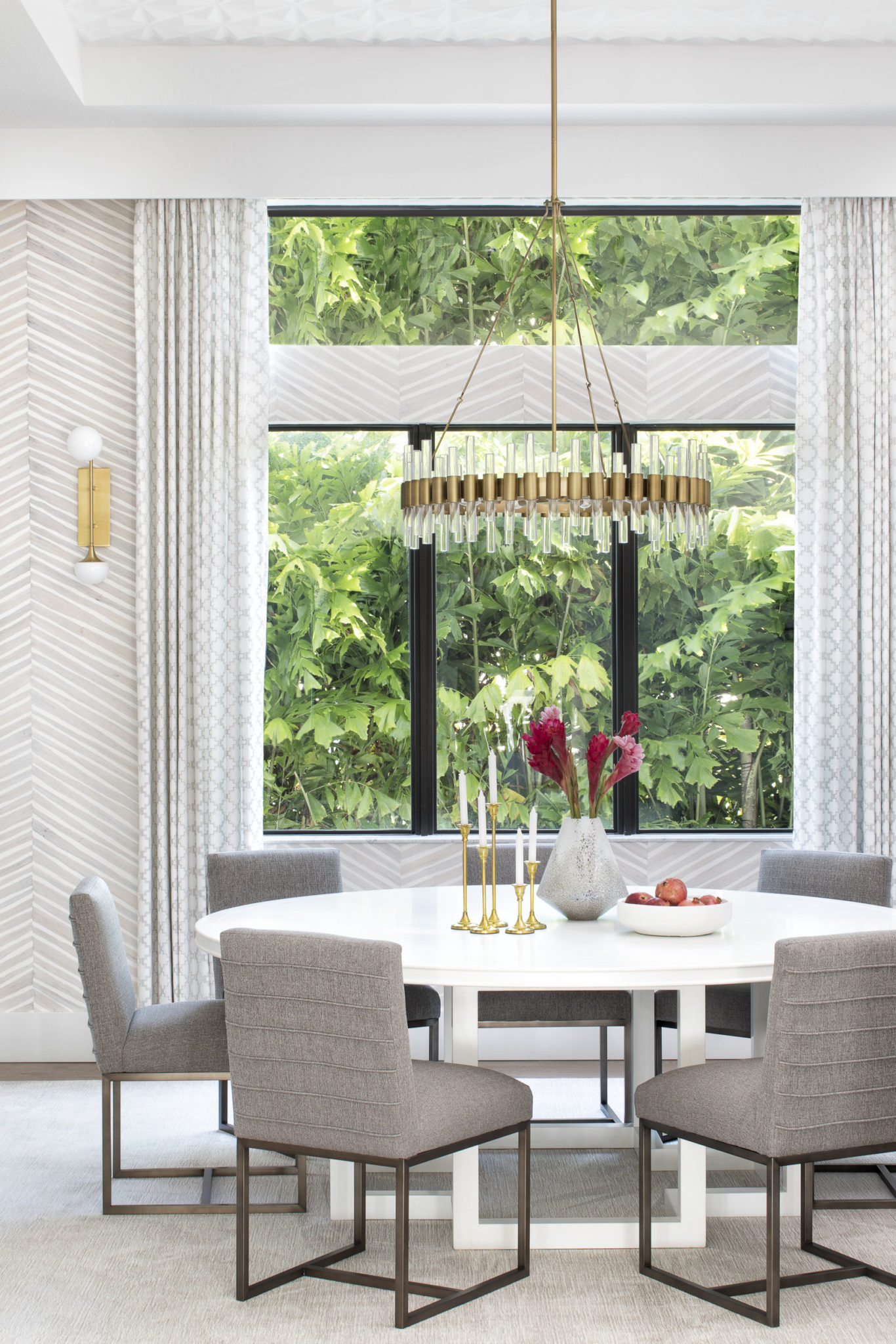
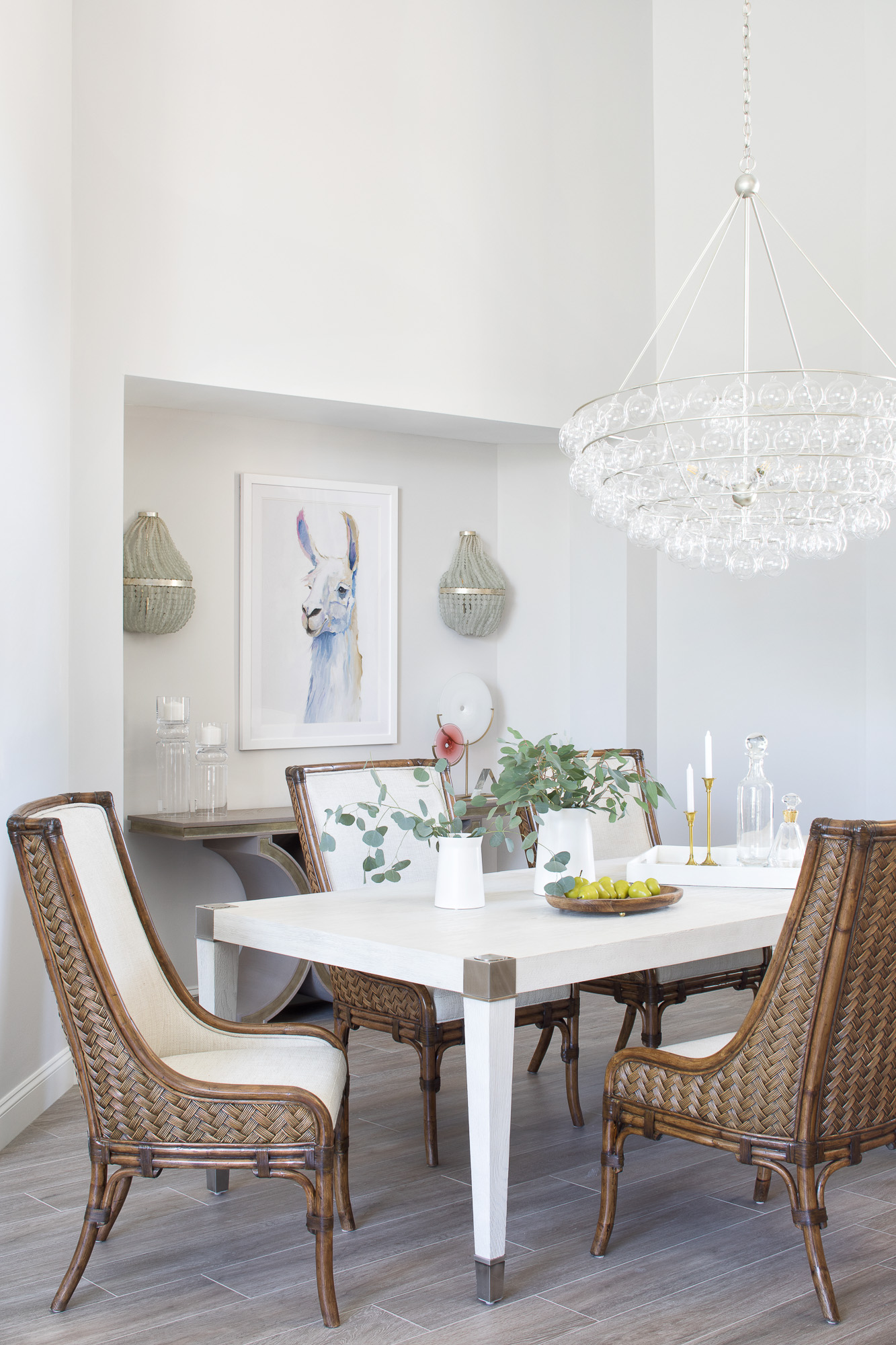
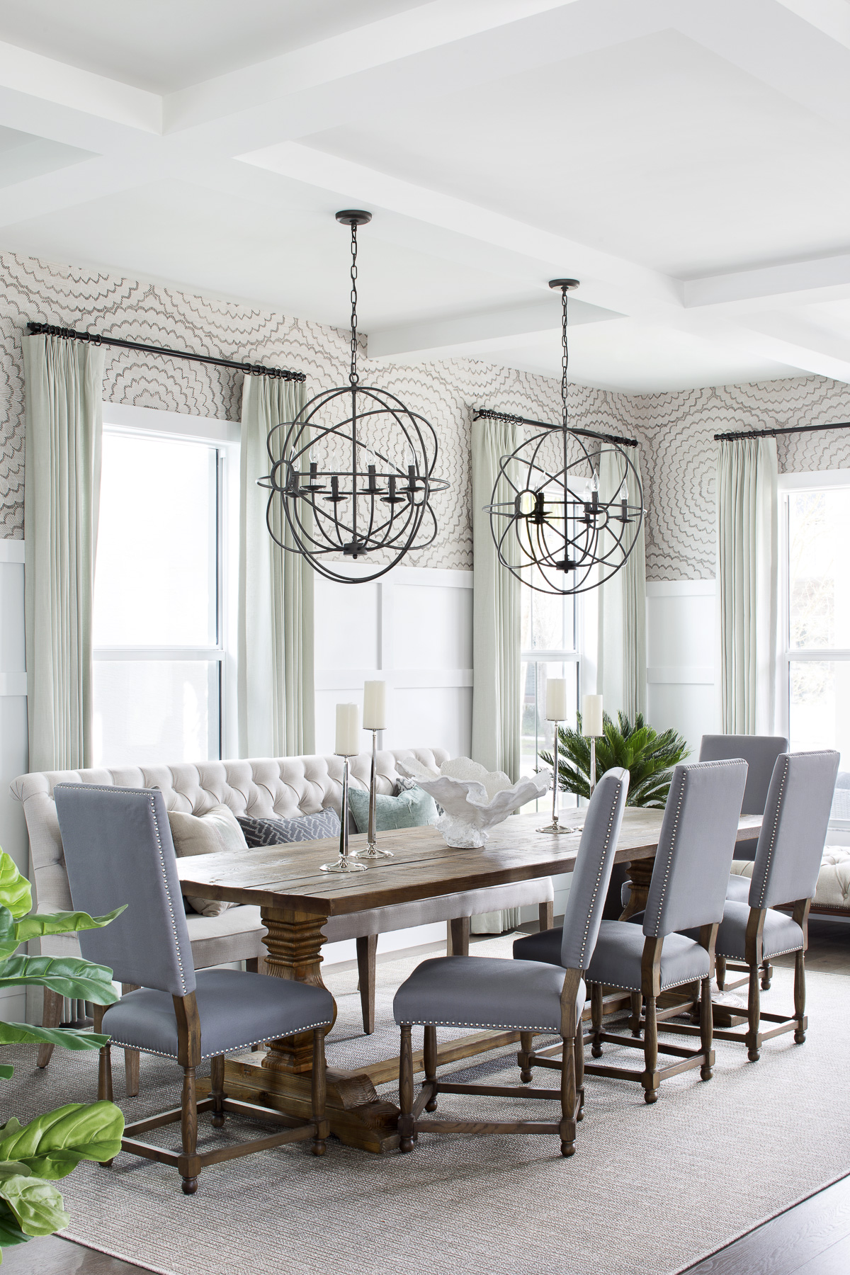
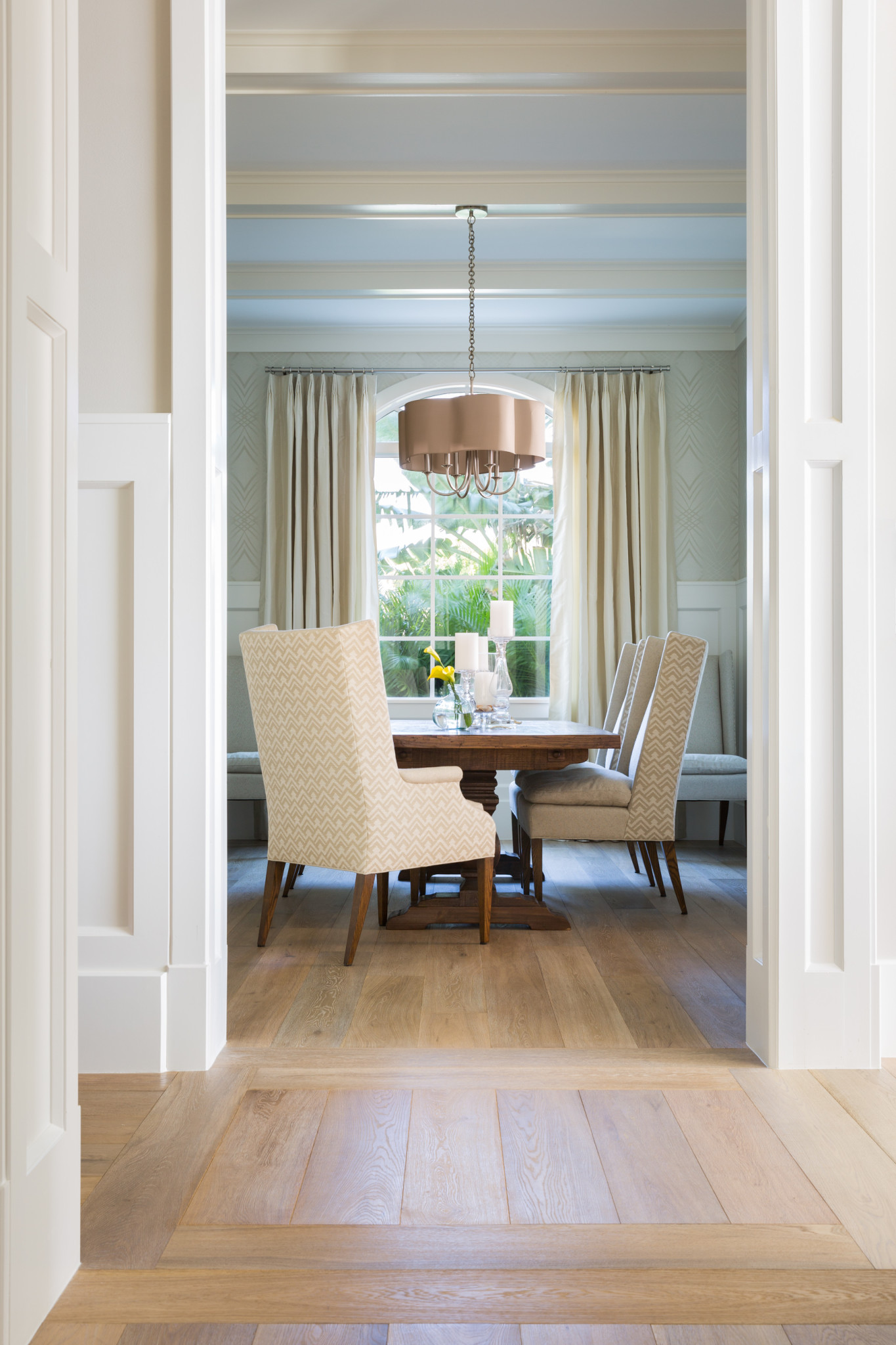
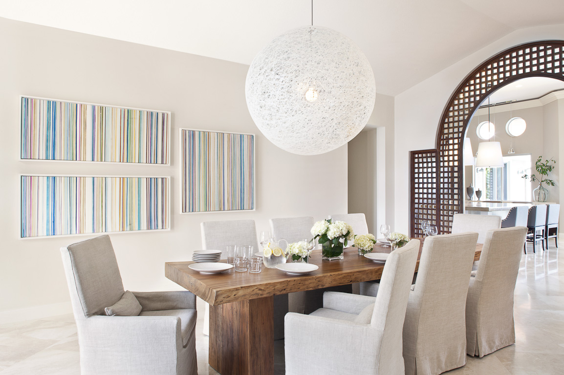
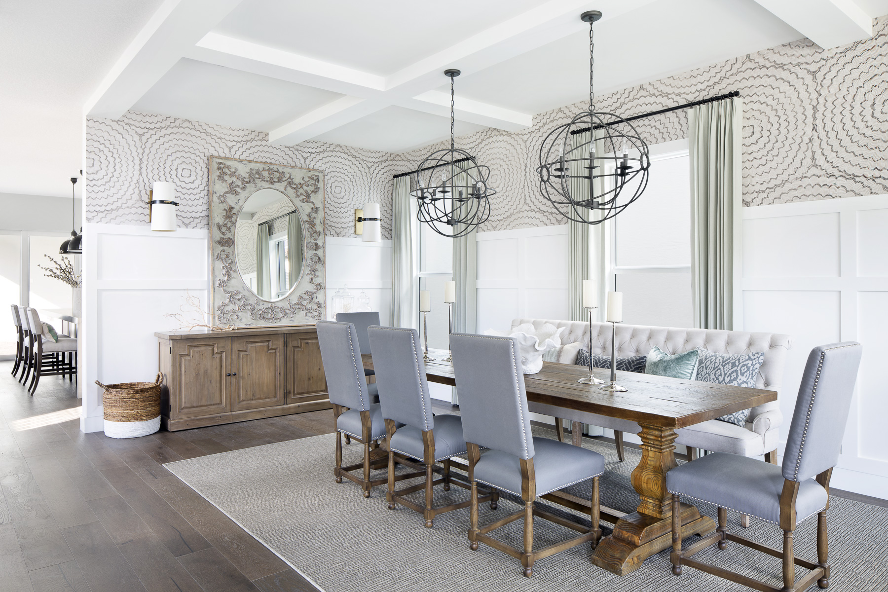
Thanksgiving is only a few weeks away so I thought I would do a post about dining rooms. I know there are a lot of people out there who only use the dining room for special occasions like Thanksgiving. I love to create dining rooms that families use frequently! Dining rooms should be made for celebrations…and that could even be a small victory of a family member…like getting an “A” on a test. I try to encourage my clients not to go too formal or stuffy with this room. My favorite dining room designs exude casual elegance. Here are a few to inspire you:
High Point Recap
My team and I recently returned from High Point, NC where we visited the High Point Furniture Market. “Market” (as it is called in the biz), is the largest home furnishings industry trade show in the world. It is huge! There are over 2000 exhibitors in about 180 buildings. My team and I like to make this trip each year together and it is always fun. We were there for three nights attending educational events, parties and most importantly–walking through the showrooms to check out all of the new products and trends.
What I really love about attending High Point Market is that it really fuels me creatively. I always come back so inspired and excited to design! I have a ton of wonderful content to share from our trip, but I want to start with one of my very favorite stops: Bernhardt Furniture Company! As you know from past posts, I am a huge fan of Bernhardt and I use their products all the time in my designs. During this visit, I was lucky enough to spend some time with the chairman of the company, Alex Bernhardt himself! It was such an honor and I am so inspired by his vision.
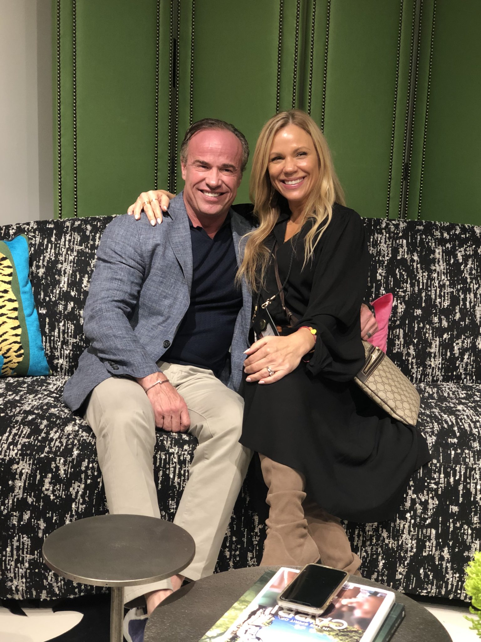
Alex Bernhardt and Krista Watterworth Alterman
There were so many beautiful new products to see at the Bernhardt showroom. Lots of clean lines mingled with materials like reclaimed woods, rustic metals, marbles, and luxurious fabrics.
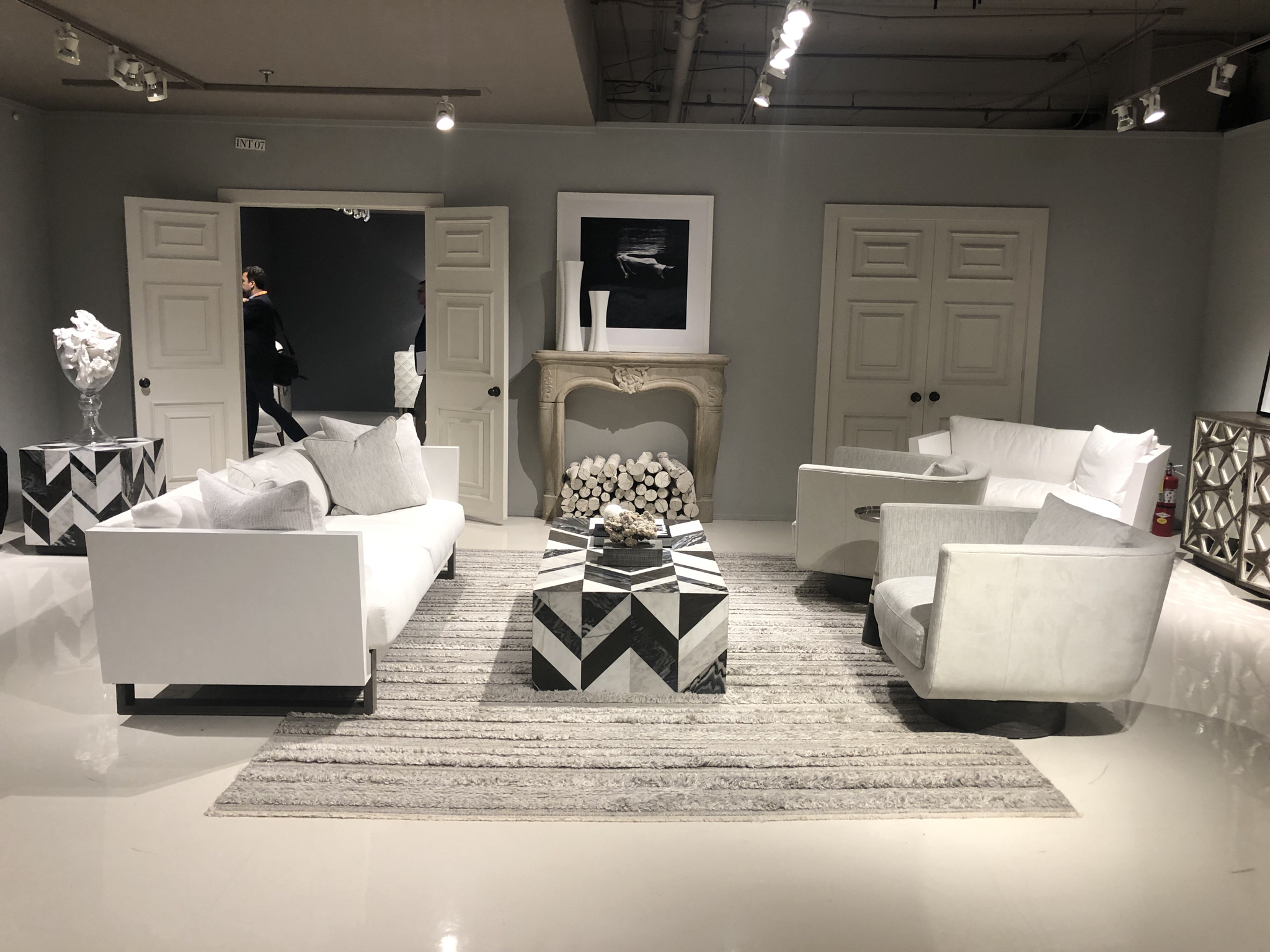
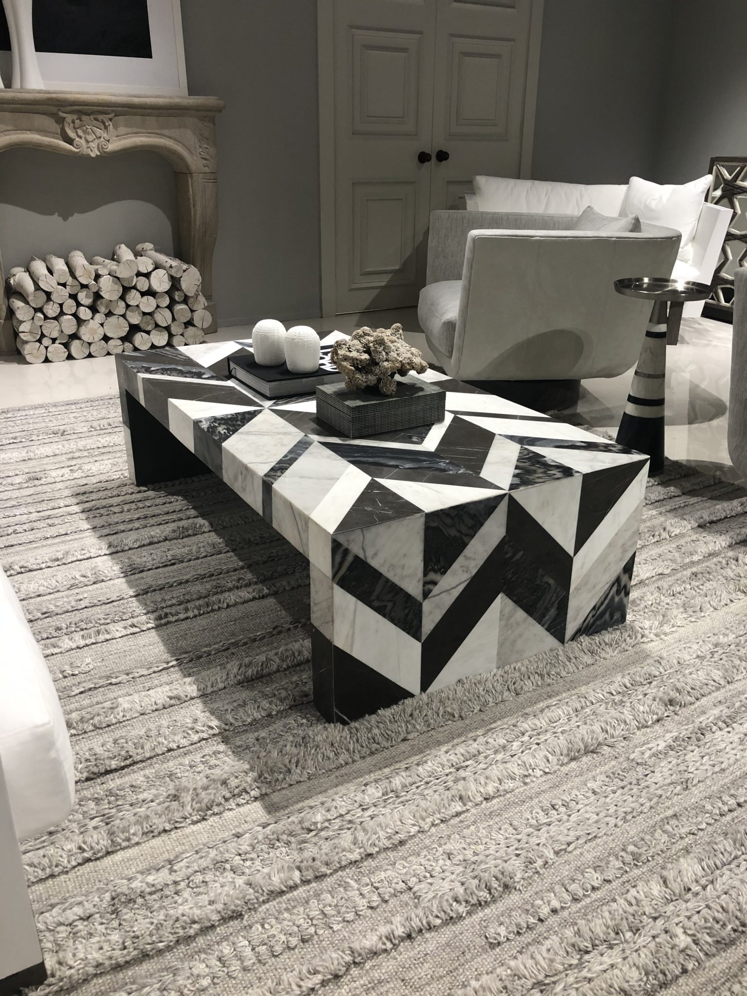
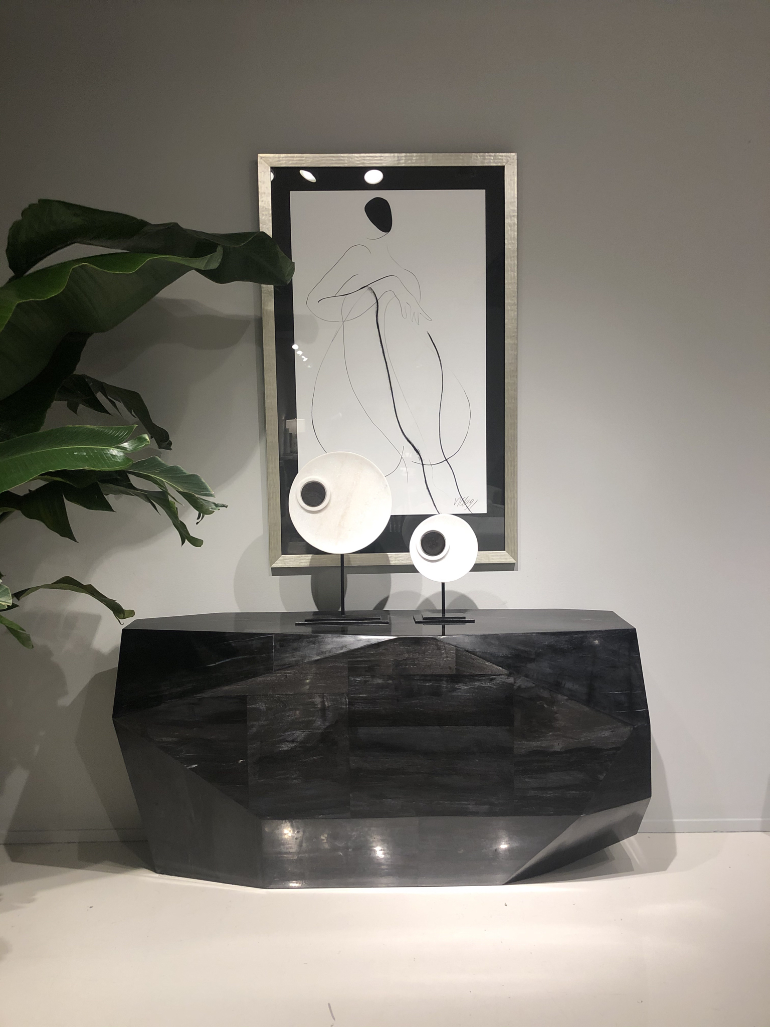
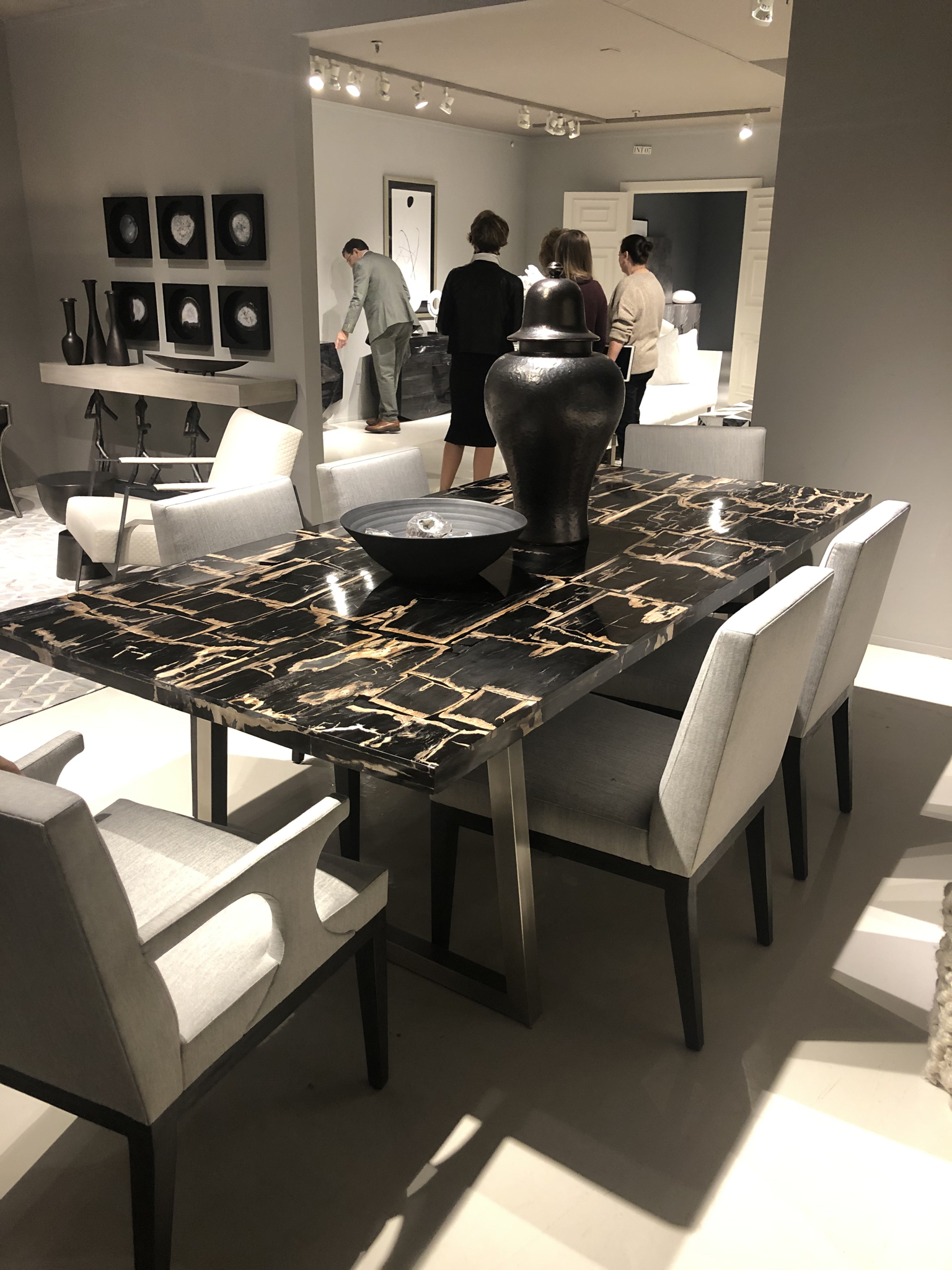
Bernhardt has an ahhhmazing new luxury outdoor line and I will definitely be incorporating it into my designs! Beautiful outdoor furniture can be tricky to find and this line is seriously to die for. It is exactly my taste and a perfect representation of the Bernhardt style.
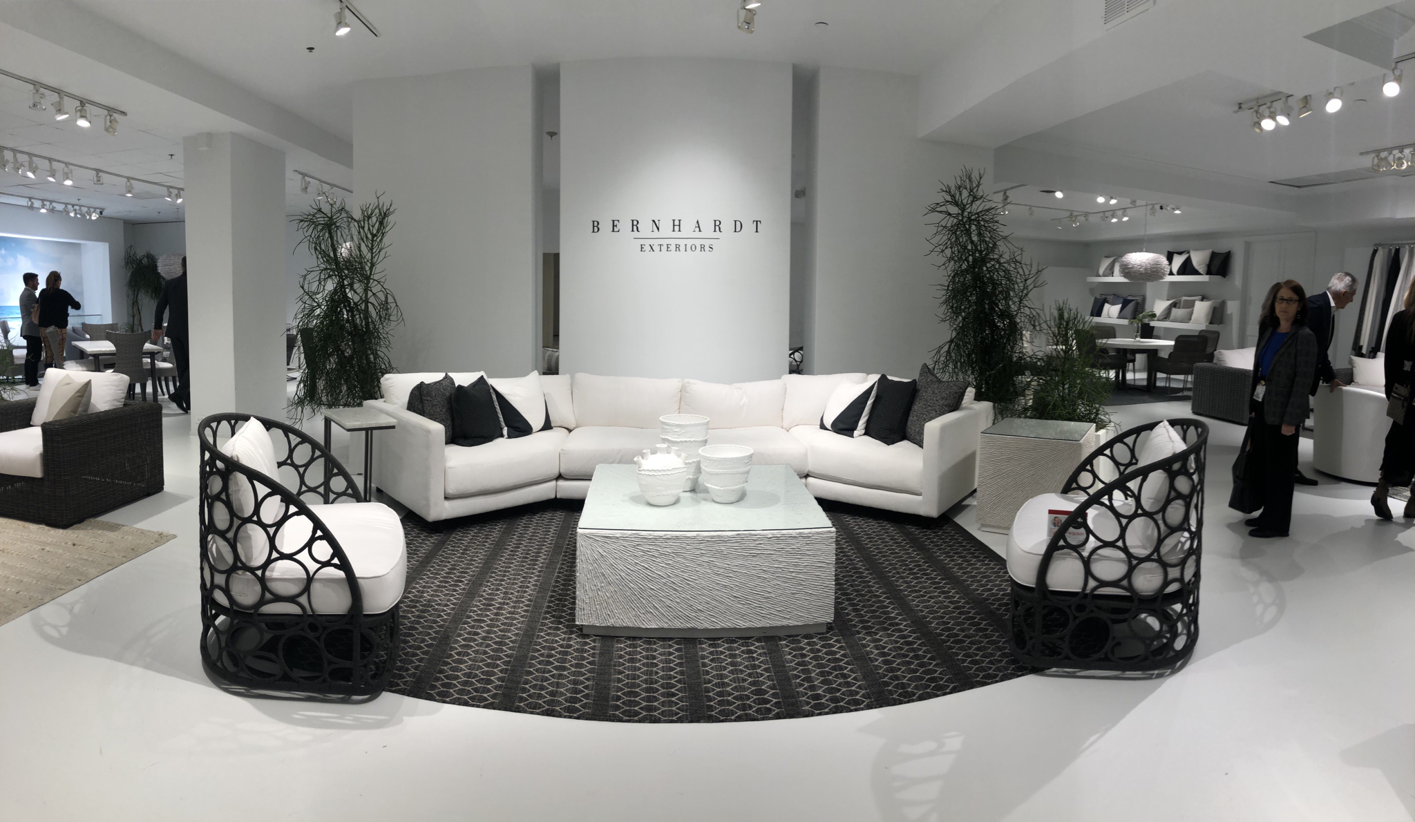
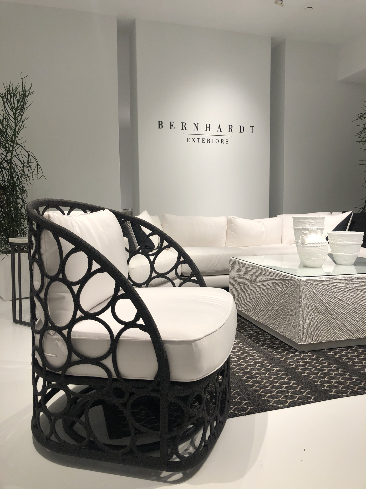
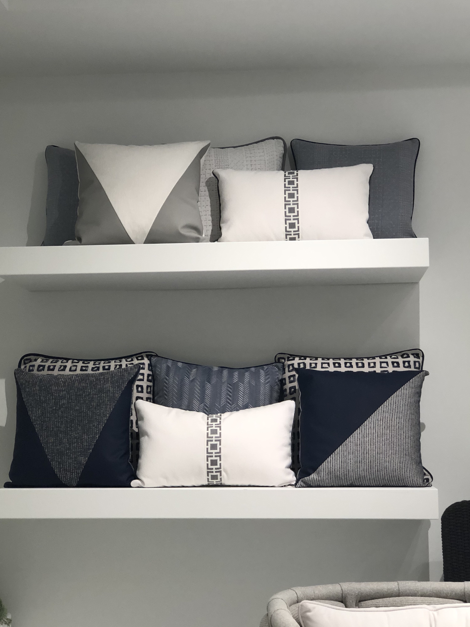
To see more of Bernhardt’s new collections, click here. Stay tuned for Part 2 of my High Point Recap…coming soon!
Rustic Kitchen Reveal
As I mentioned in some of my previous posts about this home, the owners really wanted to avoid that standard builder-grade look. They wanted a home that had a cozy, lived-in look and feel, with some truly one-of-a-kind features. I am truly obsessed with this kitchen! Its definitely one of my favorites. I love the gray hue we added to the cabinets and the pops of black really make a statement. We added shiplap detail to the island and hood, and custom furniture that I designed myself for the bar and breakfast nook!
I love how the wood elements really pop in this space. They make the vibe earthy, comfortable and warm.
Modern Rustic Master Bedroom
This space was truly a white box when I started. Builder grade finishes…carpet and white paint. A blank canvas! The homeowners wanted a modern, cozy and rustic lived-in vibe to the space. My first thought was to do a lot of millwork detailing on the walls. I sketched out my ideas and worked with a wonderful construction company who helped me transform the space.
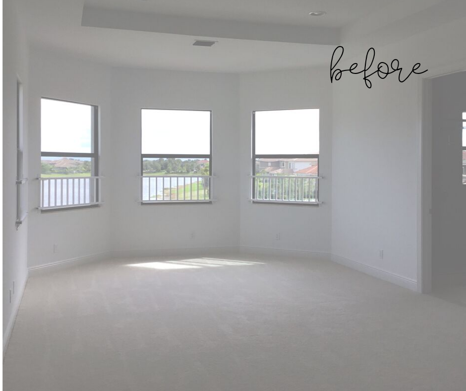
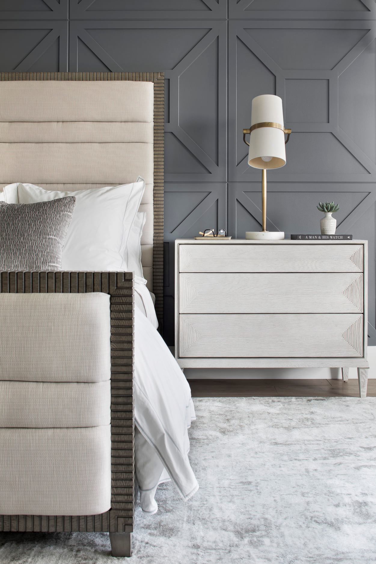
Most of the furniture in the space is sourced by one of my favorite vendors, Bernhardt Furniture Company. They are a family-owned business and their pieces are timeless and high quality. I use Bernhardt in many of my designs. The bed, nightstands and bench below are all by Bernhardt.

The ceiling detail we created really makes a statement! The lighting is all by another one of my favorite sources Arteriors. I love the statement chandelier and the chic lamps on the nightstands.
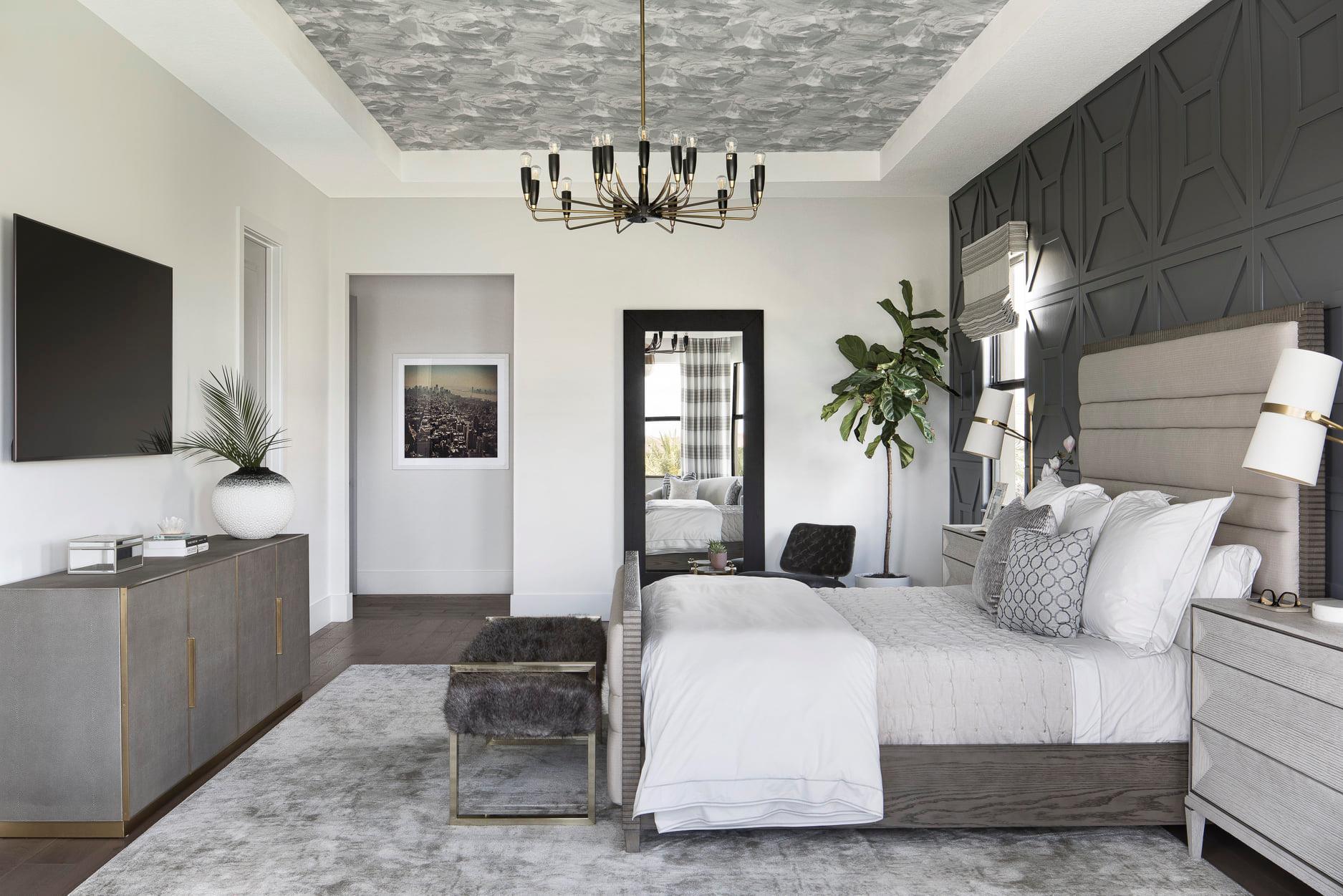
The paint I used on the walls is Benjamin Moore Trout Gray 2124-20. It was the perfect hue for the detailed millwork. Many people would be hesitant to try such a dark color, but I am so glad the homeowners trusted me and went for it!
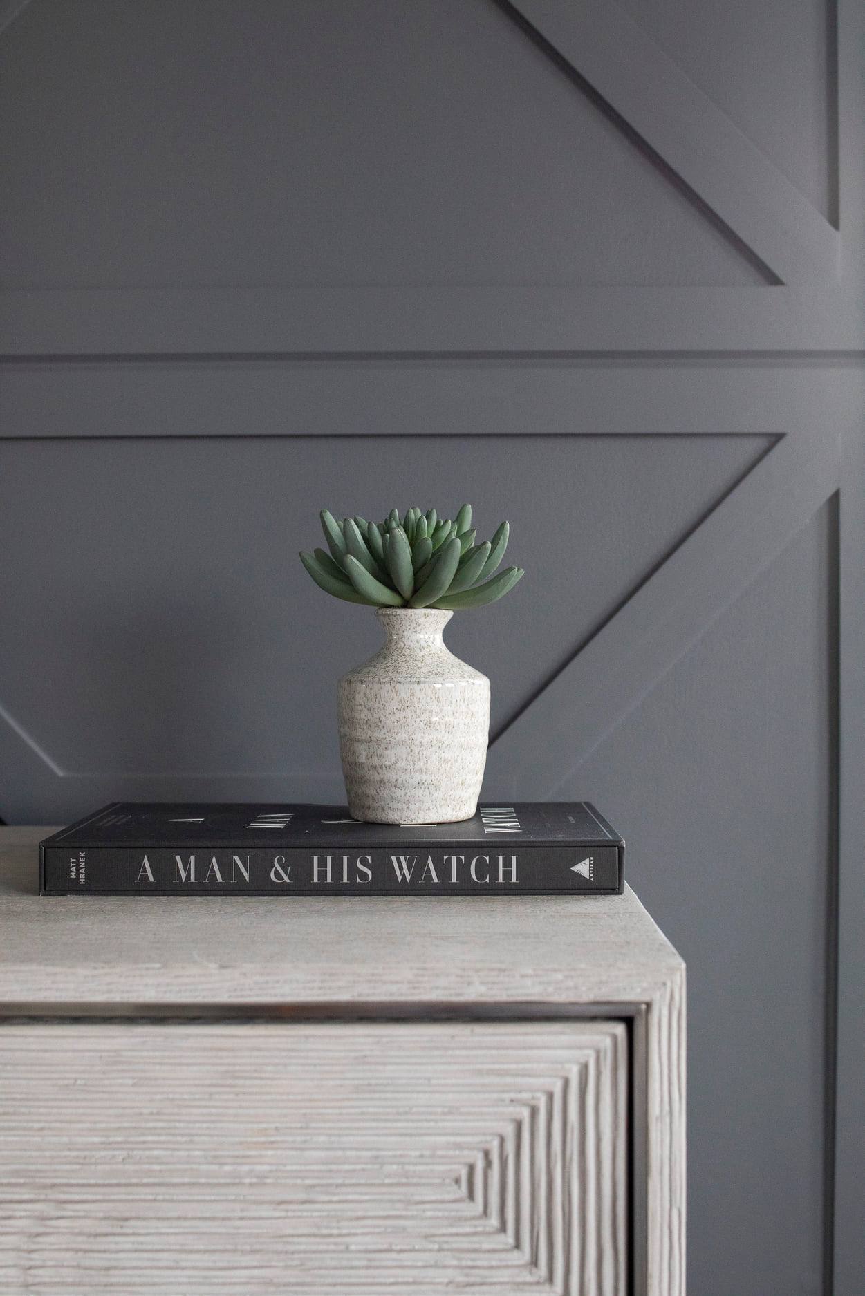
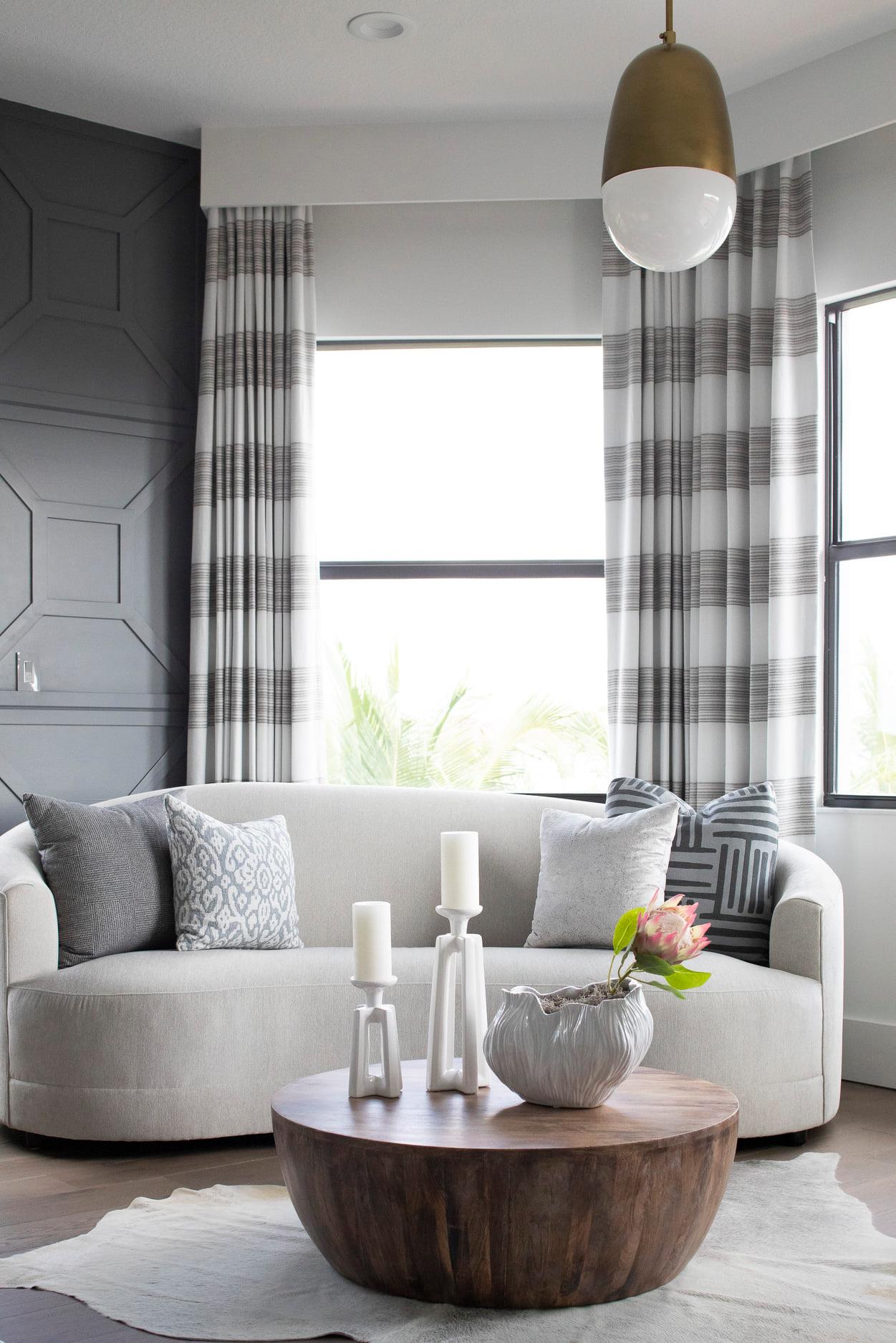
The finished design makes me think of an upscale and luxurious boutique hotel room…one where I would want to stay with my husband!
Modern Rustic Master Bath Reveal
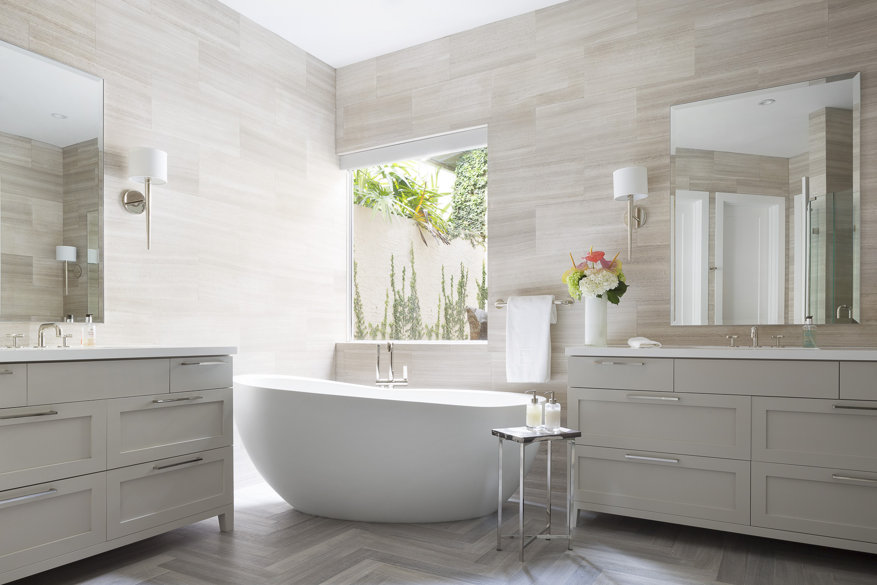
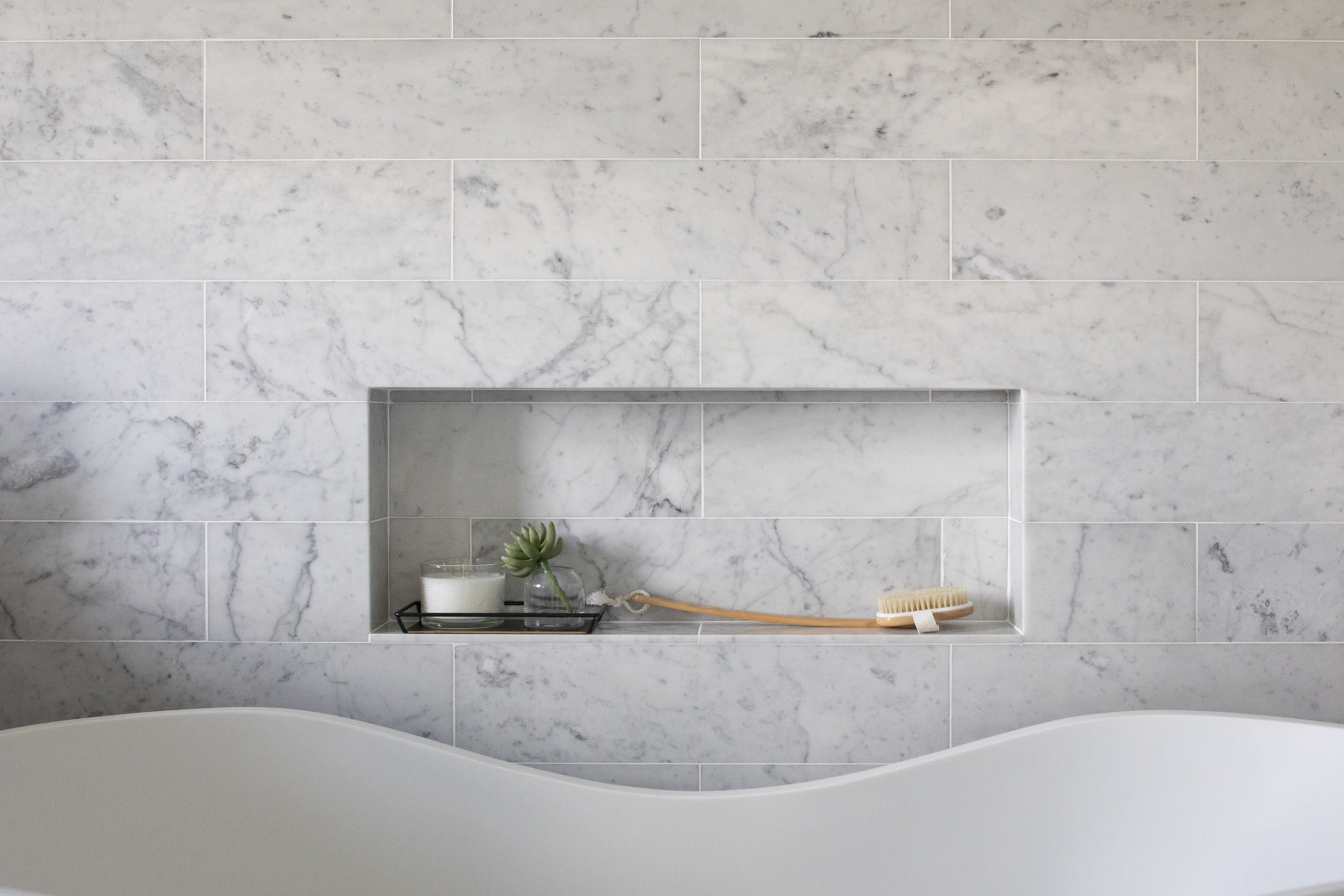
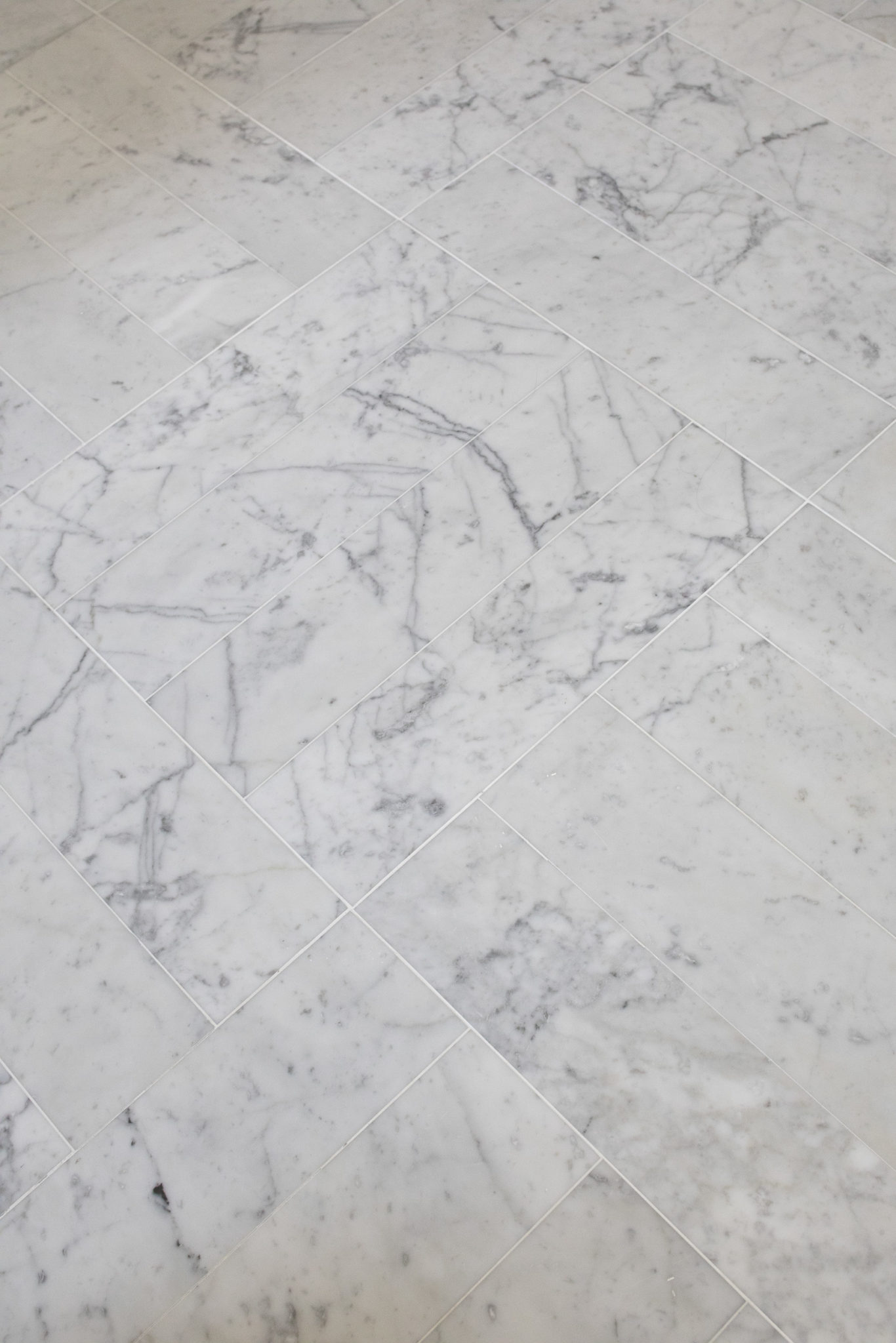
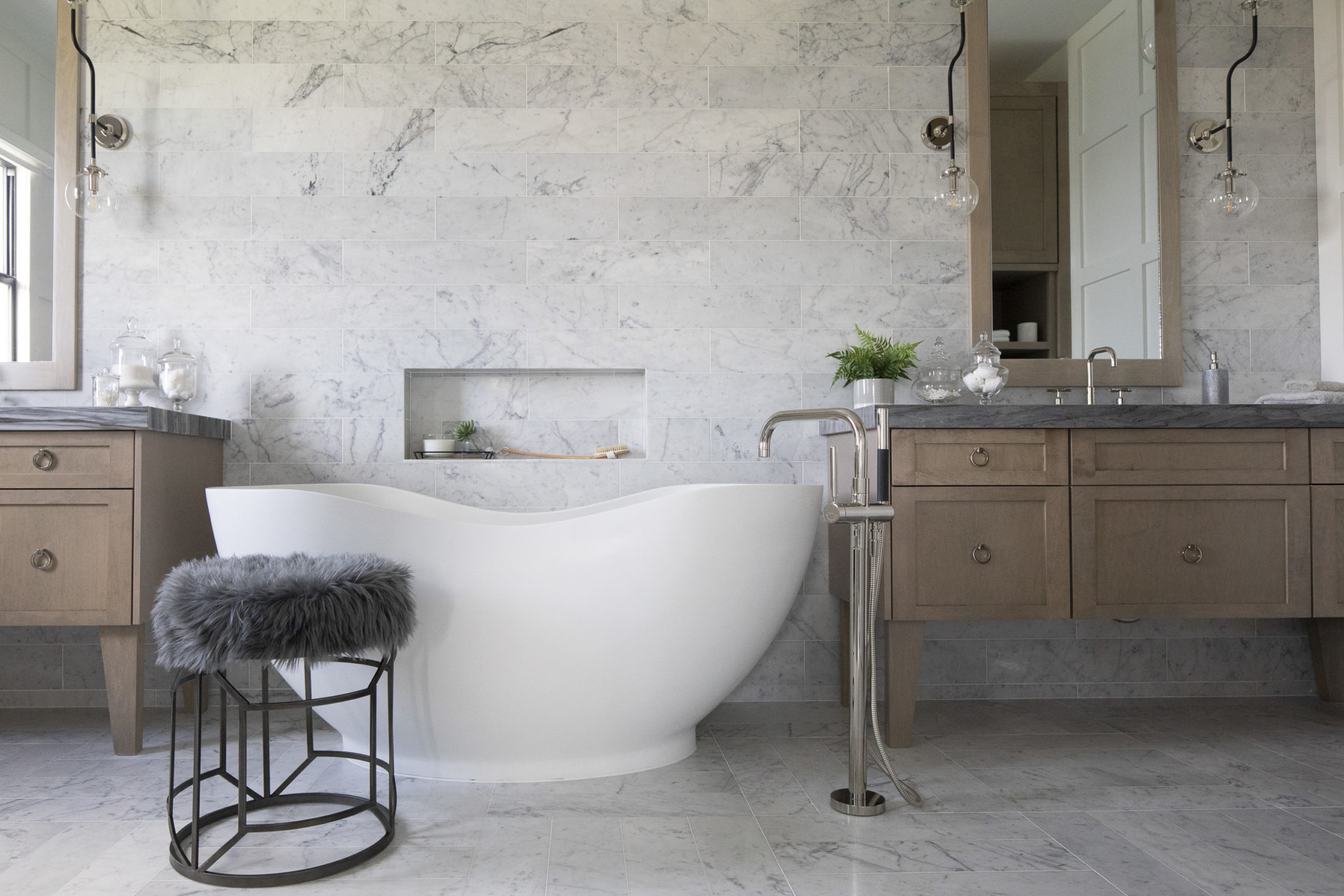
We recently designed this fabulous home in Parkland, Florida. I am so thrilled with the results! This master bathroom is one of my favorites. Surrounded by a blanket of marble, they said, and so it came to be! I even designed these vanities so they would reveal the beautiful Italian Carrera beneath. I told our installer to cut larger tiles into marble “planks of love” – just to see more random veining to give it a wall mural effect. And that tub – calls, beckons, it’s curve say “bubbles await you”. Every inch of this space has been thought through to reveal nuggets of happiness at every corner. Thank goodness for clients who fully trust us to make something fun and fabulous happen.
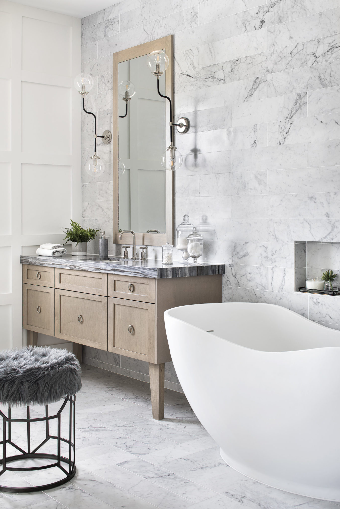
Now that’s make-up lighting! Our client prefers no make-up because she’s naturally beautiful – and can’t be bothered (wish I had that problem!) The marble mixed with some pretty yet simple box molding warms this corner. It’s a space where I want to get ready for the Oscars or give my little baby angels a “tubby” in my PJs. That’s how we make our home work for us – living luxuriously with serious functionality.
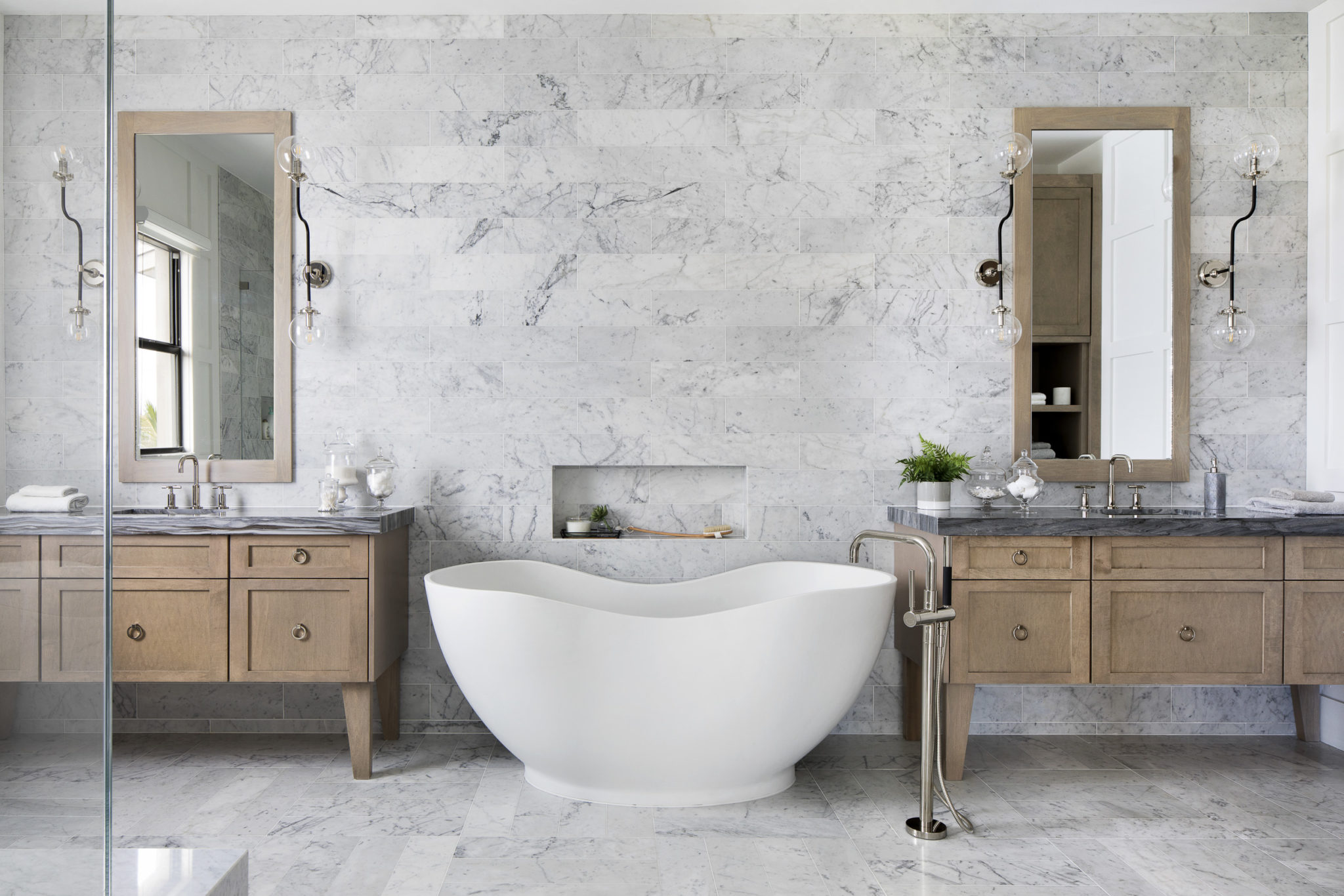
Interior Design by Krista Watterworth Alterman, Photo by Jessica Glynn
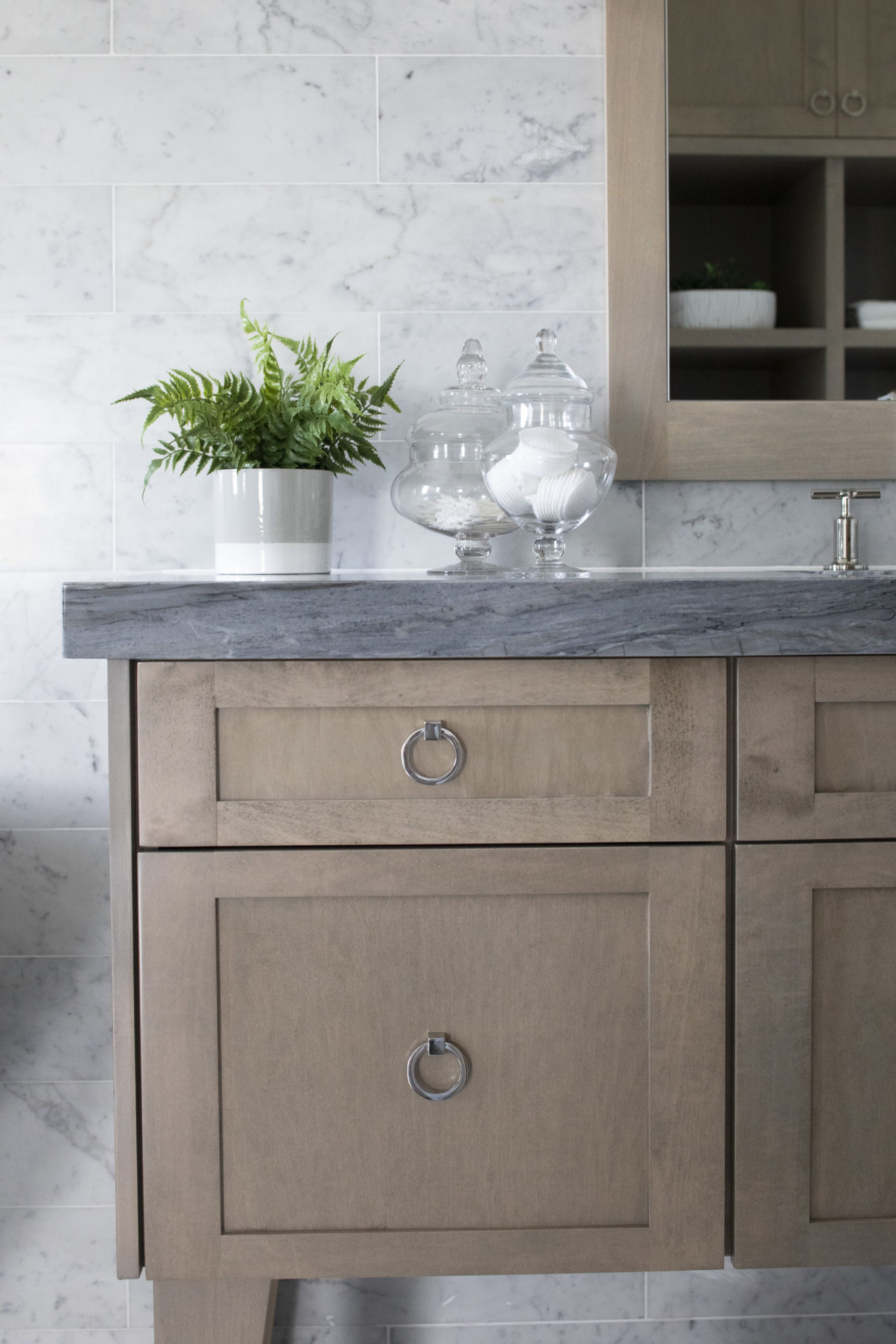
All of the fixtures are by Kohler. They are truly the best! During my television days, I hosted a show on HGTV all about bathrooms and Kohler was a sponsor so I learned all about the company and their products. Kohler is always my first choice for bathrooms! They even make cabinetry…everything you could possibly need to design a luxurious bathroom.
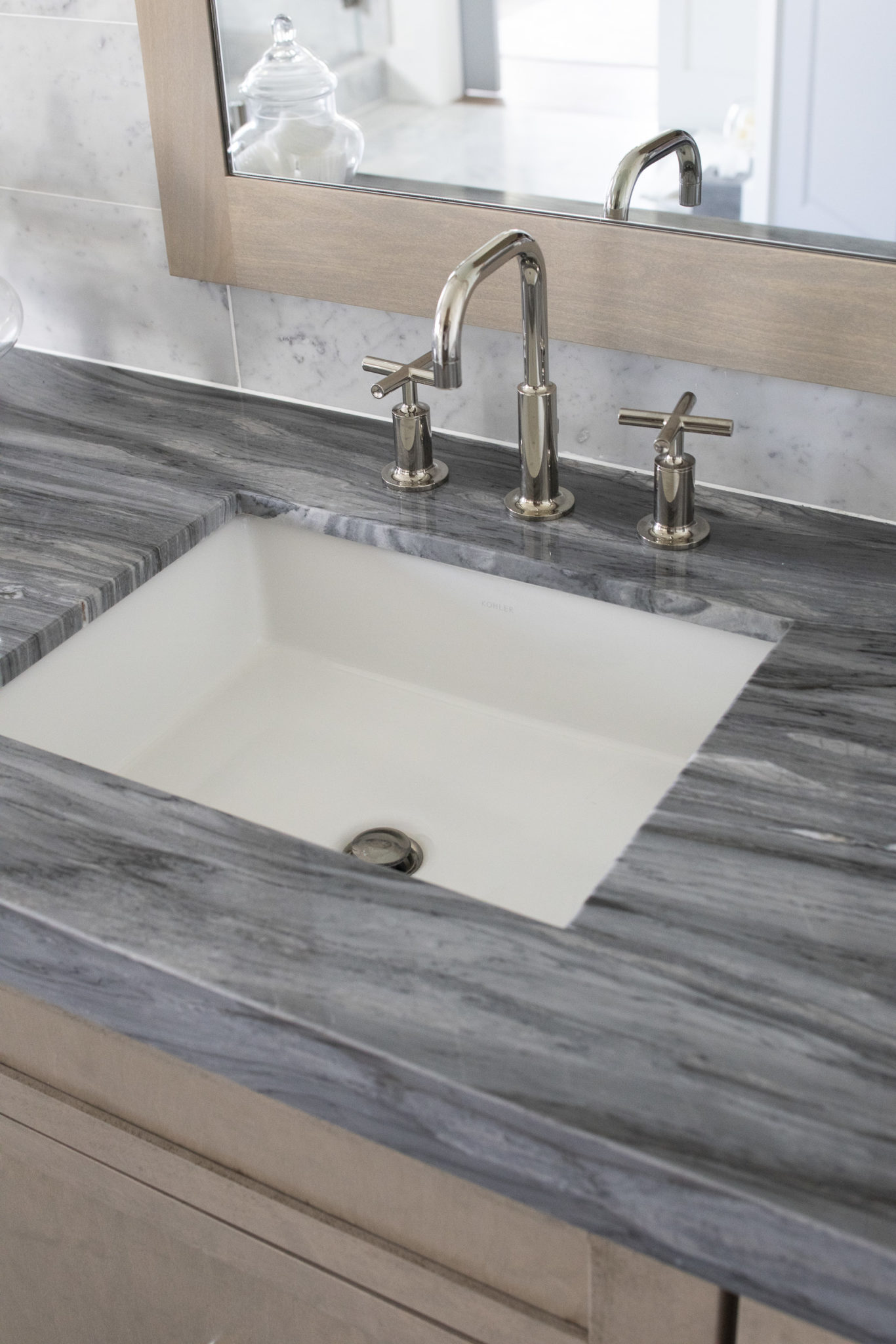
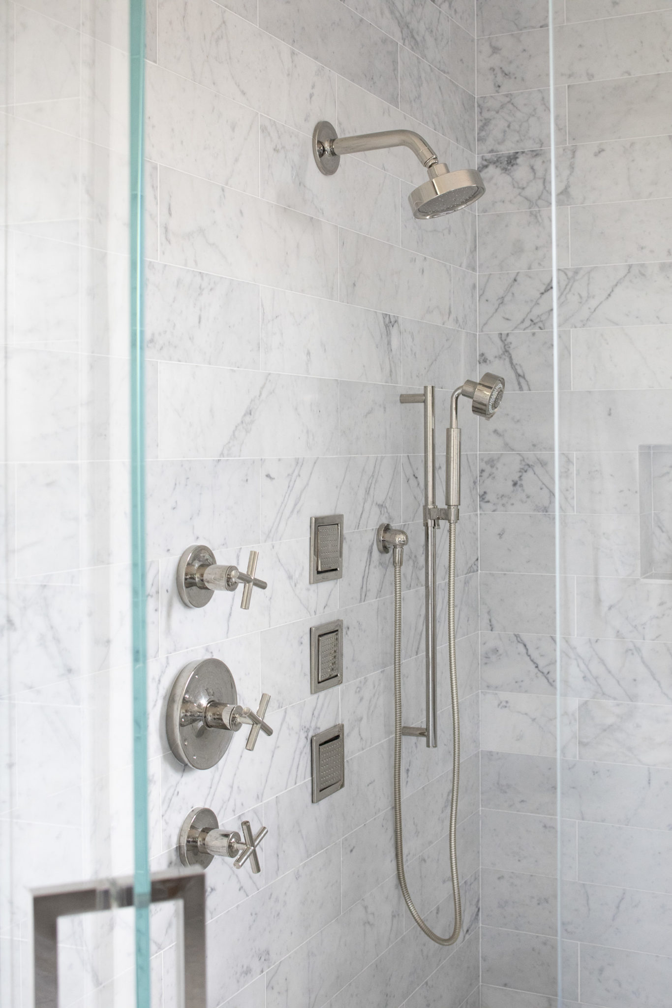
The most beautiful marble…the entire space is marble clad from head to toe!
Stay tuned to the blog to see the reveal of the rest of this home! Coming soon…
The most important space in your life: Your Home
I was thinking about the work I do and how transforming a home can truly change the life of a family. So I decided to do a little research about our homes and how impactful they are in our lives.
We spend a lot of time in our homes.
I think you might be surprised to learn just how much time we actually spend in our homes. According to the Environmental Protection Agency (EPA), the average American spends 87% of their life in their home! That is crazy, right? And working from home is becoming increasingly popular. My husband and many of our friends and contemporaries work out of a home office. According to my research, 46% of those with an advanced degree work from home. It doesn’t surprise me that I get frequent requests for beautiful home office spaces.
Your home should be beautiful, organized and functional.
The most important return on investment in design is what we call a “lifestyle enhancer”. A beautiful and functional home can provide an improved quality of life and long term gratification and pleasure. You can’t really put a price tag on memories, life events, milestones and intimate moments that your home provides. So many special events happen in our homes, with the people that we care most about. It makes sense to create a beautiful and functional space for all of these special memories to unfold.
I’ve heard that a cluttered closet or a cluttered home can mirror what is going on in your life. When you purge your stuff and organize your home, it can carry on to other areas of your life. While I might not agree with everything Marie Kondo says, the whole concept of filling your home with items that spark joy does resonate with me.
Functionality is also important. When I design a home, I really take the time to learn what the function of each room will be for that particular family. It really differs from family to family. It’s important to create spaces that really make sense for the life you are living. For example, don’t feel like you need a formal living room if that is a space you will never use. Think outside of the box and use the space in a way your family will truly enjoy.
We do most of our socializing with our family and friends in our homes.
Birthday dinners, summer barbeques, Halloween parties…some of my favorite events each year take place in our home with our friends and family. Entertaining and sharing our home with friends is something my entire family enjoys. Social connection is so important. It truly can improve physical health and psychological well-being.
This is pretty crazy…a recent article in Psychology Today, said that the lack of social connection is a greater detriment than obesity, smoking and high blood pressure. Strong social connection leads to a 50% increased chance of longevity and a strengthened immune system. In other words, socializing with friends is good for your health!
Most of our self care takes place in our homes.
Everyone talks a lot about self care and how important it is to our well-being. I definitely agree! Our home is the place where most of this happens. In our homes we can relax, meditate, take a bubble bath, read a book, take a nap. There are many studies that show the benefits of self care including:
-Better productivity
-Improved resistance to disease
-Enhanced self-esteem
-Increased self-knowledge
-More to give to others/being your best self

Interior Design by Krista Watterworth Alterman, Photo by Jessica Glynn
Miami Beach Project
I always say that we will travel anywhere for the right project. When a client family that I love told me they were moving to Miami and begged me to do their new home, I couldn’t say no! I really love this family so much and they have great style. Logistically, Miami was definitely a challenge…but the Krista + Home team was up to it! We recently finished up with styling the home for a professional photo shoot and we also shot an episode for a local tv show called The SoFlo Home Project.
Below is a little sneak peek of the design and some behind the scenes snaps from our shoot. Stay tuned to see the beautiful photos and tune in to see a full house tour! Our episode of The SoFlo Home Project will air on Saturday, August 24 on Local 10 in Miami, Broward and select Palm Beach counties.
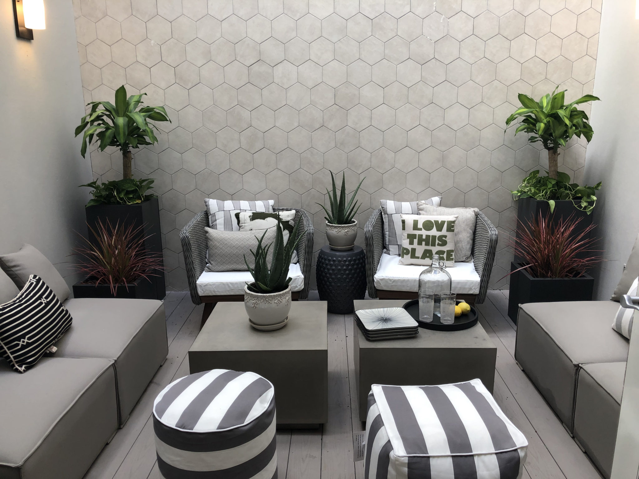
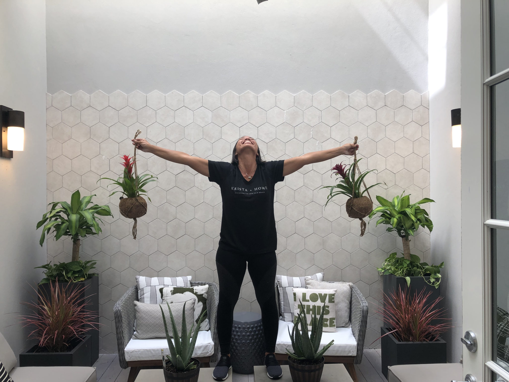
My team worked so hard and I am so thankful for them. Below is my amazing design assistant Joy! We added a lot of beautiful plants to the multiple outdoor spaces including a courtyard and a rooftop with an amazing view. Joy led the charge and was a plant goddess.
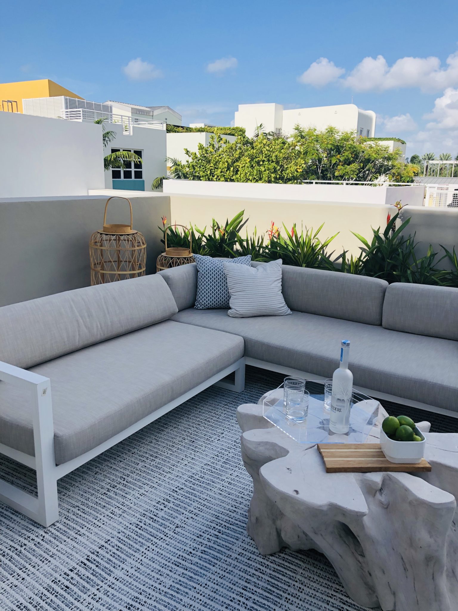
I am obsessed with these beautiful lanterns by one of my favorite designers, Amanda Lindroth. She has a beautiful product line which you can buy online or at her new retail stores in Palm Beach, FL and Charleston, SC.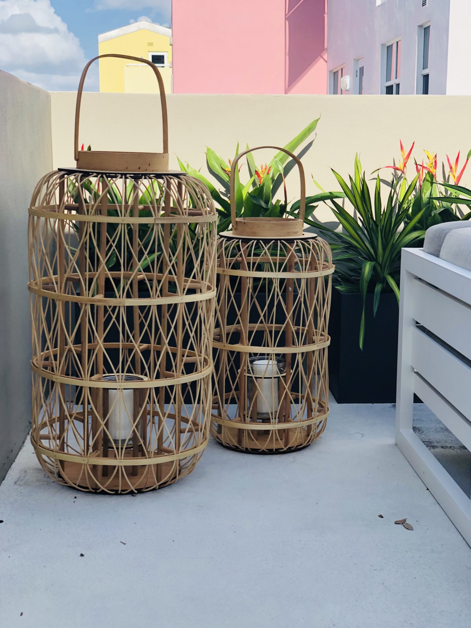 The 4-story townhouse is right on the water with amazing views from almost every room. It was so fun to watch all of the luxury yachts go by while we were working!
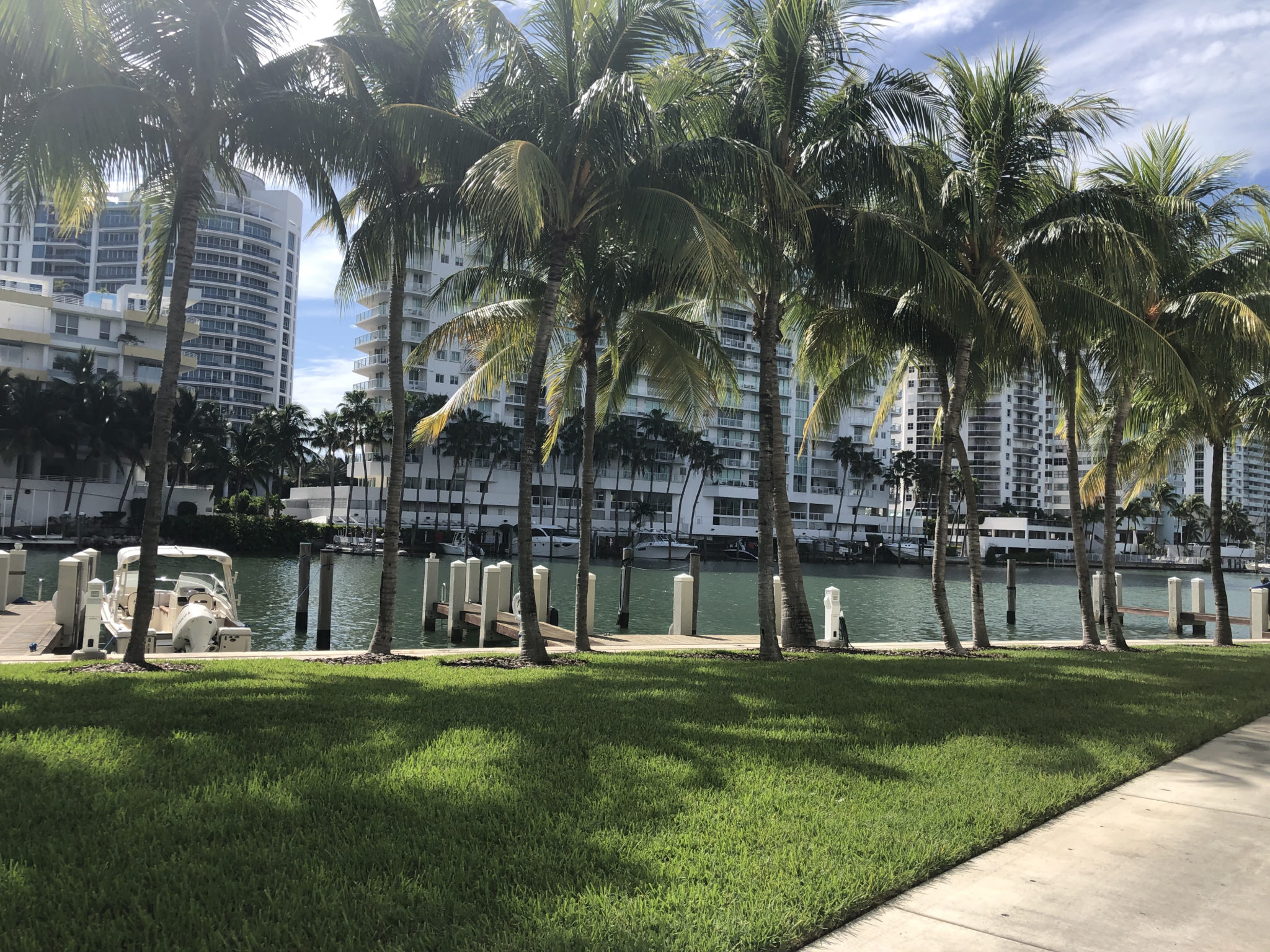
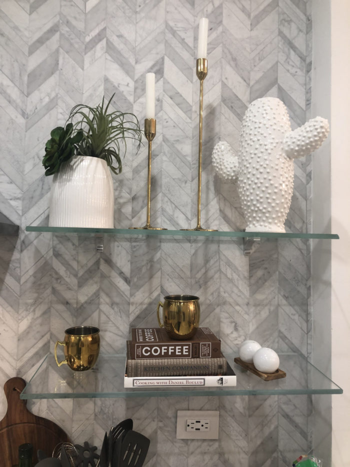
Part of a successful photo shoot is the styling. I like to have my team pack tons of options so I can play with heights and texture and place the perfect accessories in each area of the home.
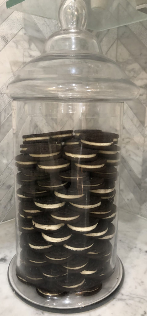
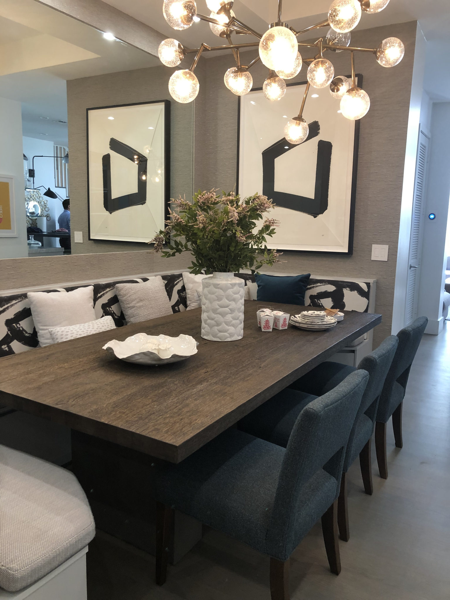
The little details fit the spirit and personality of this family so well. I love the apothecary jars in the kitchen with oreos placed Chloe Kardashian style and the chinese takeout setup we did on the dining table with custom banquette. It all feels authentic and really fits with the “family brand” we created in this design.
Shoutout to Martin Amado, who is the host of The SoFlo Home Project. We had a lot of fun shooting our segments together!
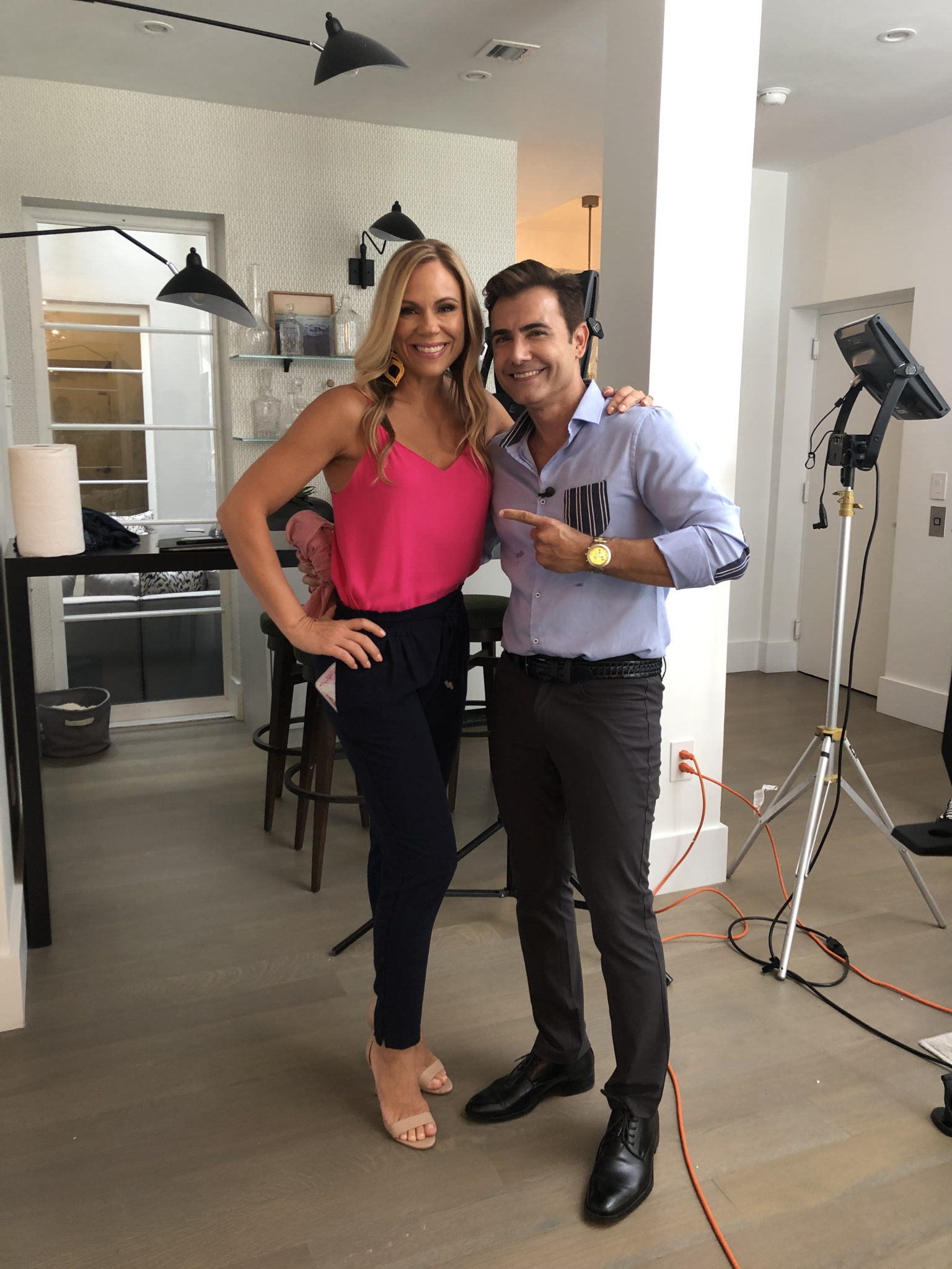
Don’t forget to watch The SoFlo Home Project on Saturday, August 24 at 11am!
A client presentation, an install and an outdoor space to die for….
This was a busy week at Krista + Home! We had two major events…a client presentation and an install! I’m exhausted but elated. Our team is amazing! I’m constantly awe struck at the amount of work and care we put into each home. It is a labor of love, it truly does come from a passionate place – to help people through one of the most stressful times in their lives – moving, building or renovating! I also prepared for another presentation on Monday, but you’ll see that design next week, so stay tuned!
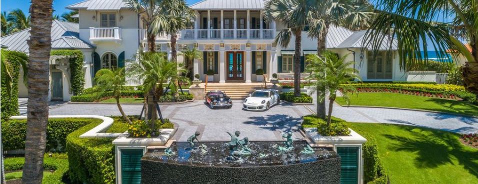
The presentation was for a 12,000 square foot home in Manalapan, Florida. It’s ON THE BEACH! Yes, you heard me right… I’m in love with the project and with this family. It was a large house to design, and I was on a really tight schedule to accommodate the client who really wanted to be able to have an install prior to Thanksgiving. They have been waiting to move into this house for over a year. Unfortunately, another design company couldn’t deliver on time, so Krista + Home swooped in to save the day. Here’s a sneak peek of their eclectic modern home.
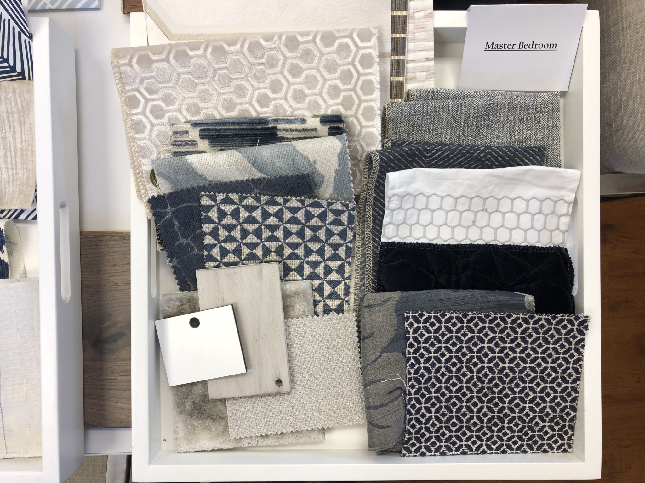
Design Presentation by Krista Watterworth Alterman for home in Manalapan, Florida
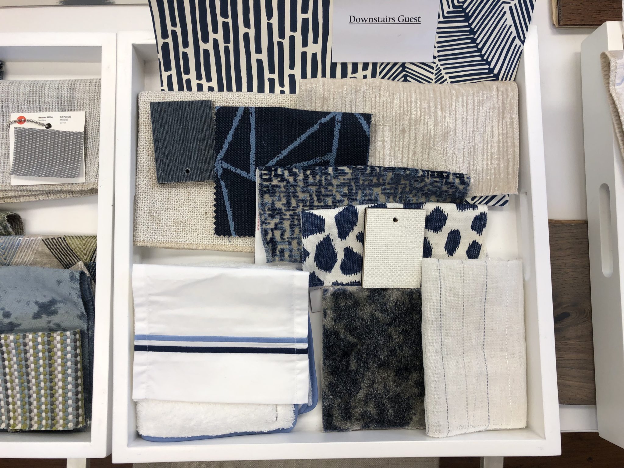
Design Presentation by Krista Watterworth Alterman for home in Manalapan, Florida
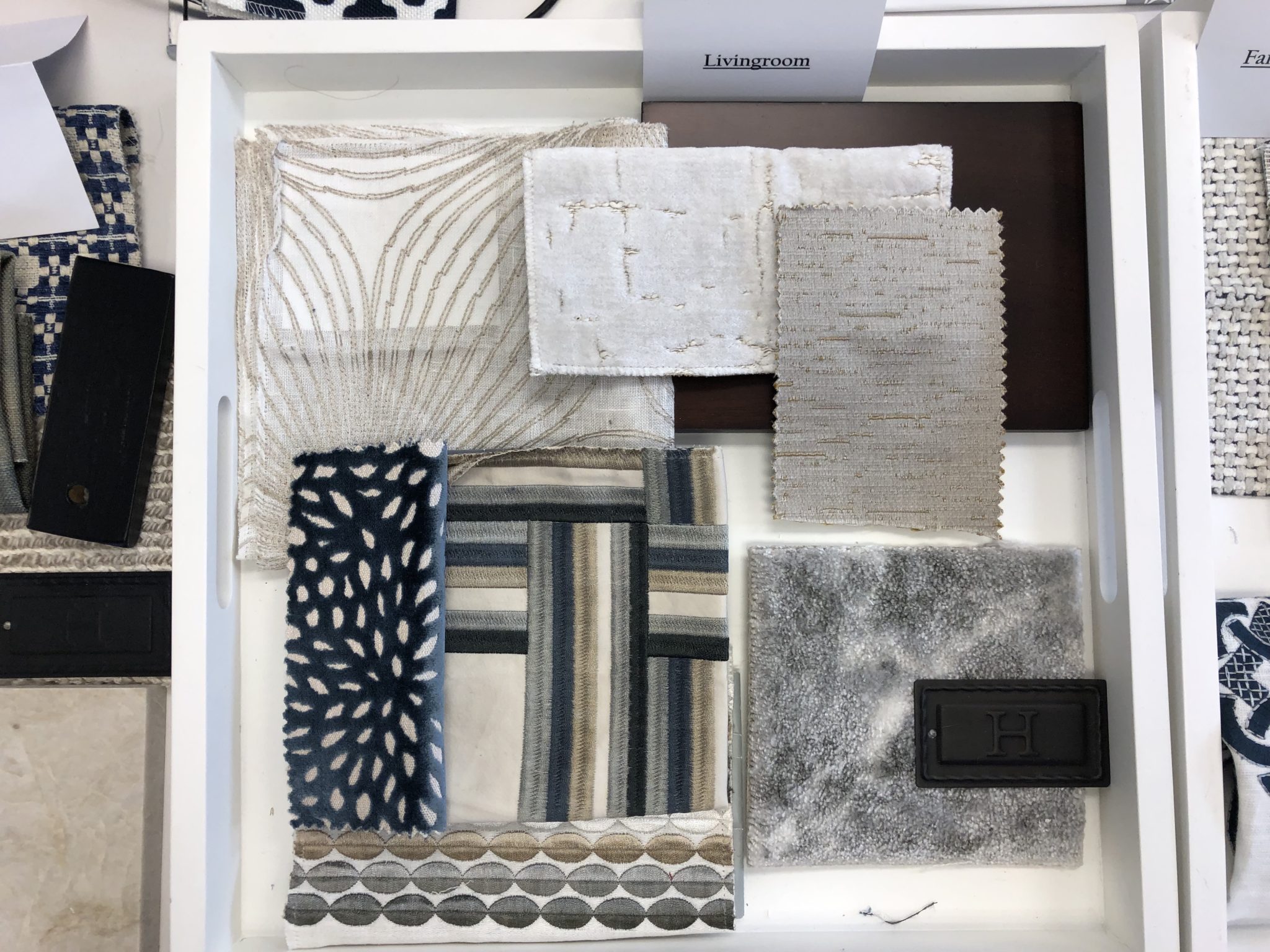
Design Presentation by Krista Watterworth Alterman for home in Manalapan, Florida
Design Presentation by Krista Watterworth Alterman for home in Manalapan, Florida
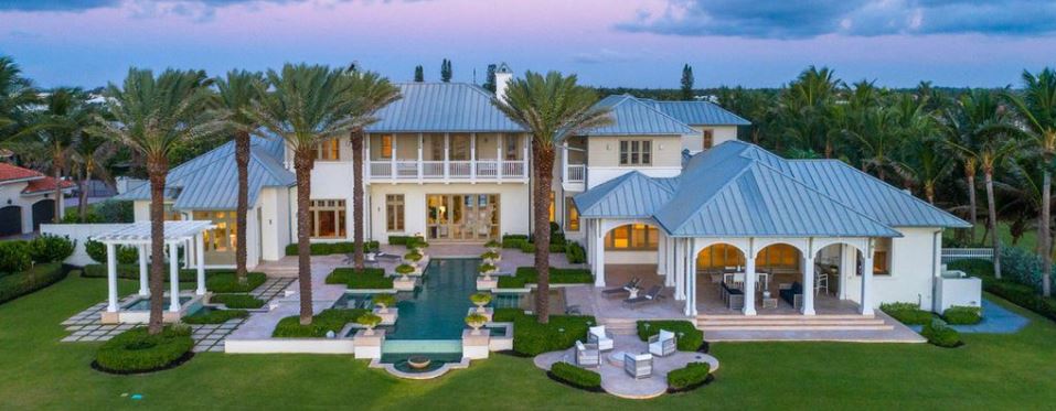
The home has a stunning pool area and overlooks the ocean!
I can’t wait to show you the inside when it is done!
The install was for a lovely family in a 6,000 square foot home in Jupiter, Florida’s Jupiter Country Club. This family needed what we call at Krista + Home “The Full Fifty”. This means they did fifty per cent of their house and got stuck, lost steam and were working with designers that didn’t give them great service and attention. So we went in and finished it off with additional furniture, lighting, artwork and accessories! Many people have this problem, and we have a solution! My favorite room, you ask?? The outdoor living space by far. Take a look…
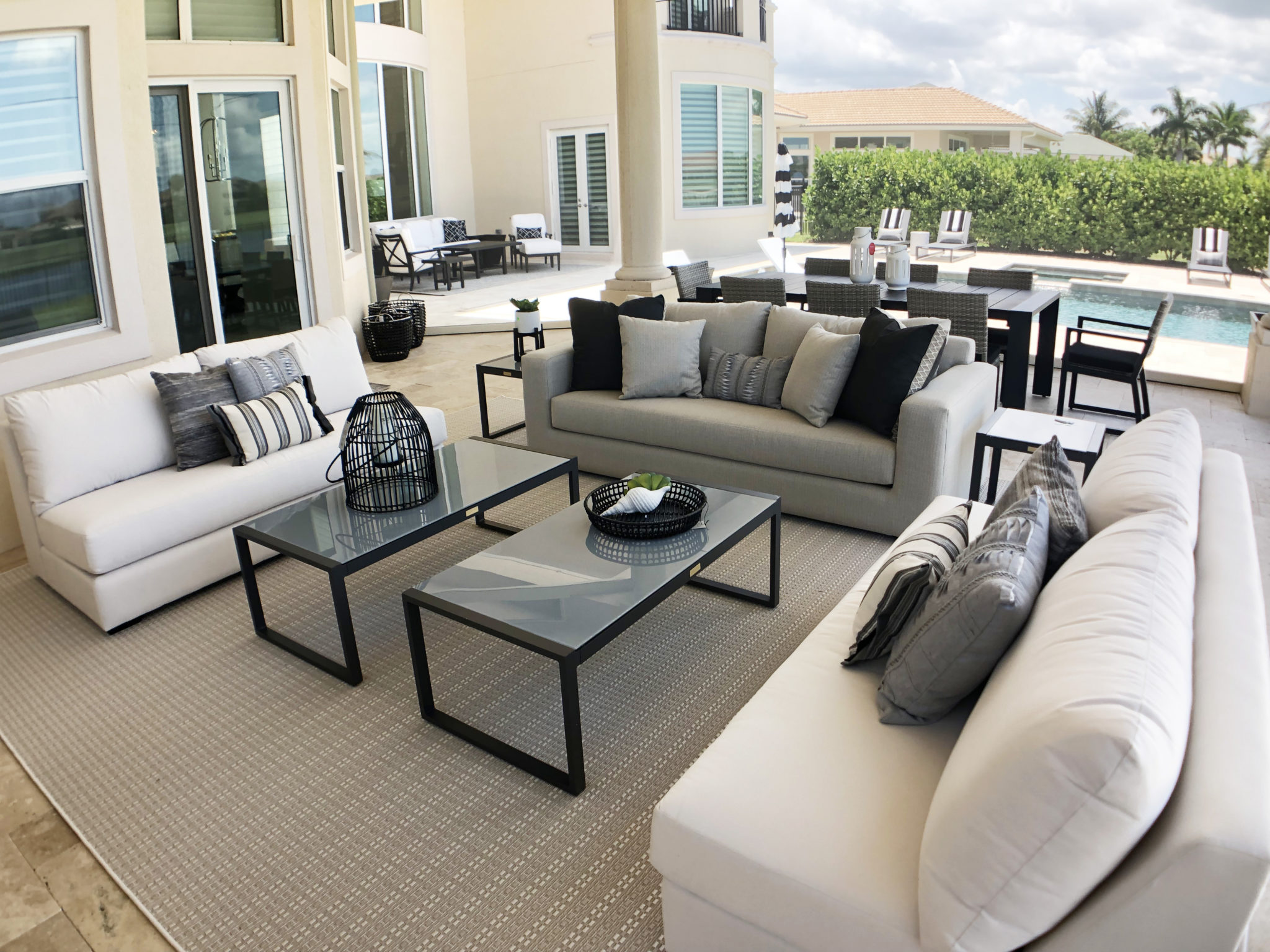
Outdoor space in Jupiter, Florida. Design by Krista Watterworth Alterman, Krista + Home. Outdoor furnishings by Lazar.
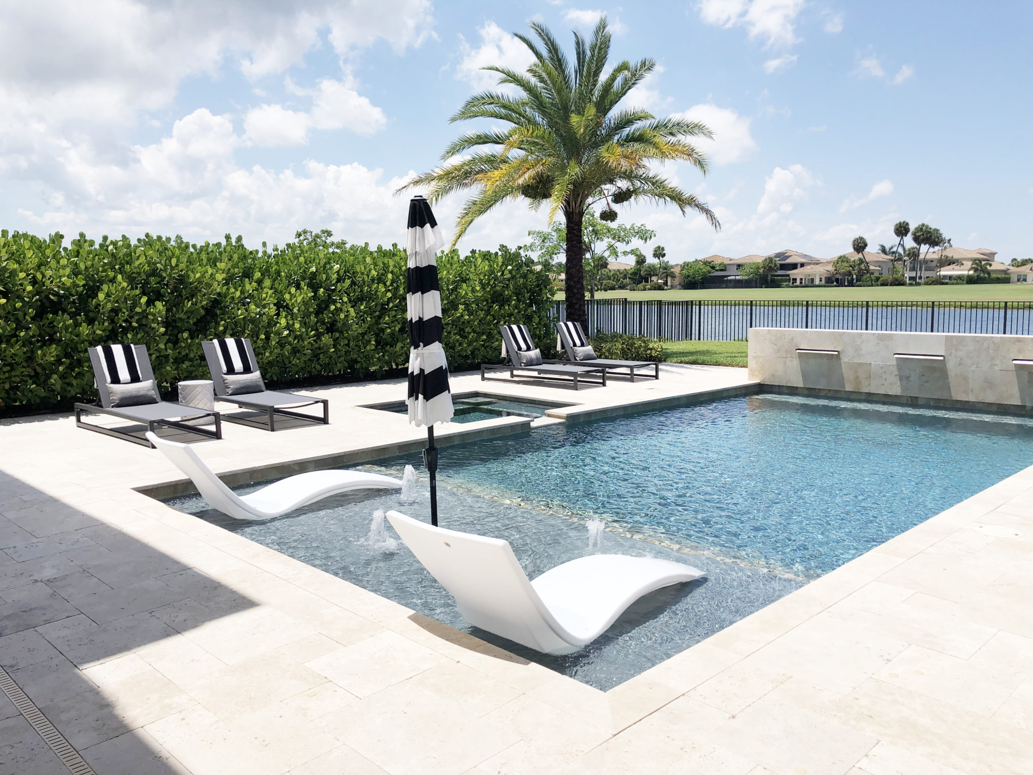
Outdoor space in Jupiter, Florida. Design by Krista Watterworth Alterman, Krista + Home
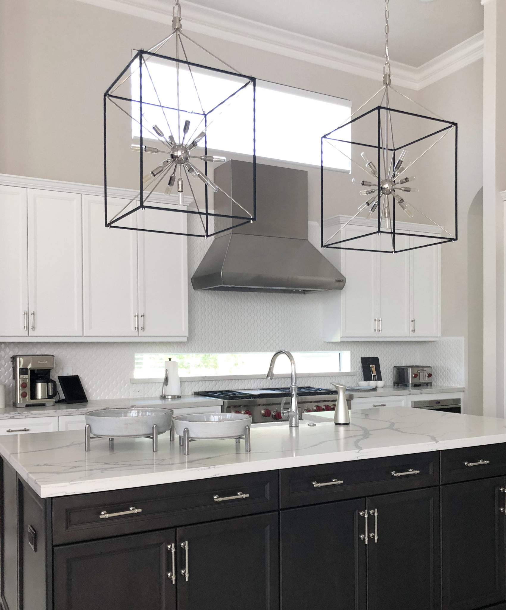
Interior Design by Krista Watterworth Alterman, Krista + Home. Kitchen pendants by Hudson Valley Lighting.
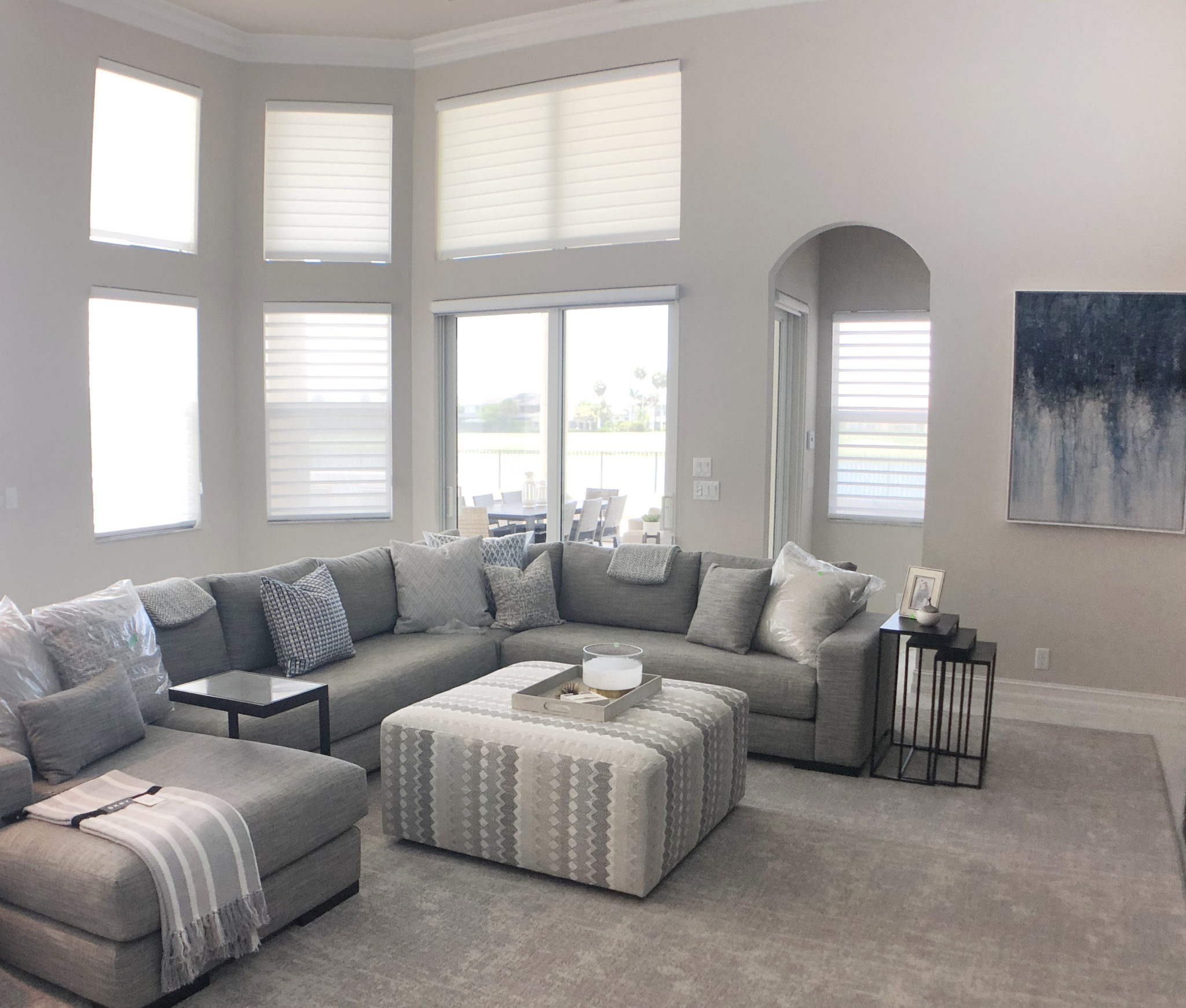
Interior Design by Krista Watterworth Alterman, Krista + Home ~ Sofa by Bernhardt Furniture
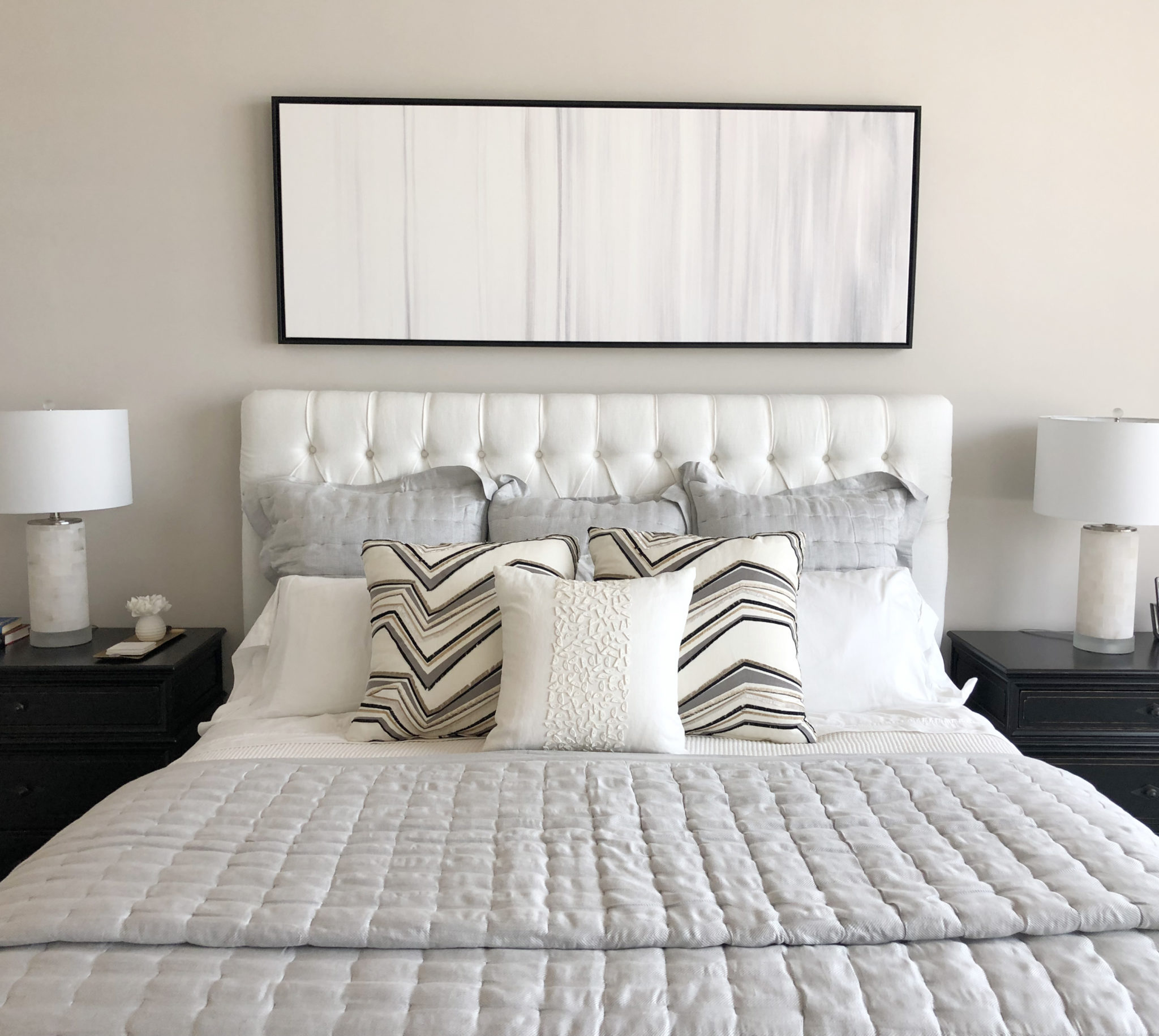
Interior Design by Krista Watterworth Alterman, Krista + Home ~ Bedding by Annie Selke
My Newest Fabric Obsession
I am a bit fabric obsessed so I was excited and honored when asked to be a brand ambassador for an amazing fabric company called S. Harris. What a creative and special company, this is! Their fabric and decorative accessory collections are actually influenced by Art, Fashion, and Travel. How cool is that? So many of the values of this brand align with my own beliefs and what I am trying to achieve with my own company, so being an ambassador for them is a perfect fit.
All of the S. Harris designs in their stunning collections truly come from an organic and artistic place. You can see it in the beauty and craftsmanship of these textiles.

Photo courtesy of S. Harris
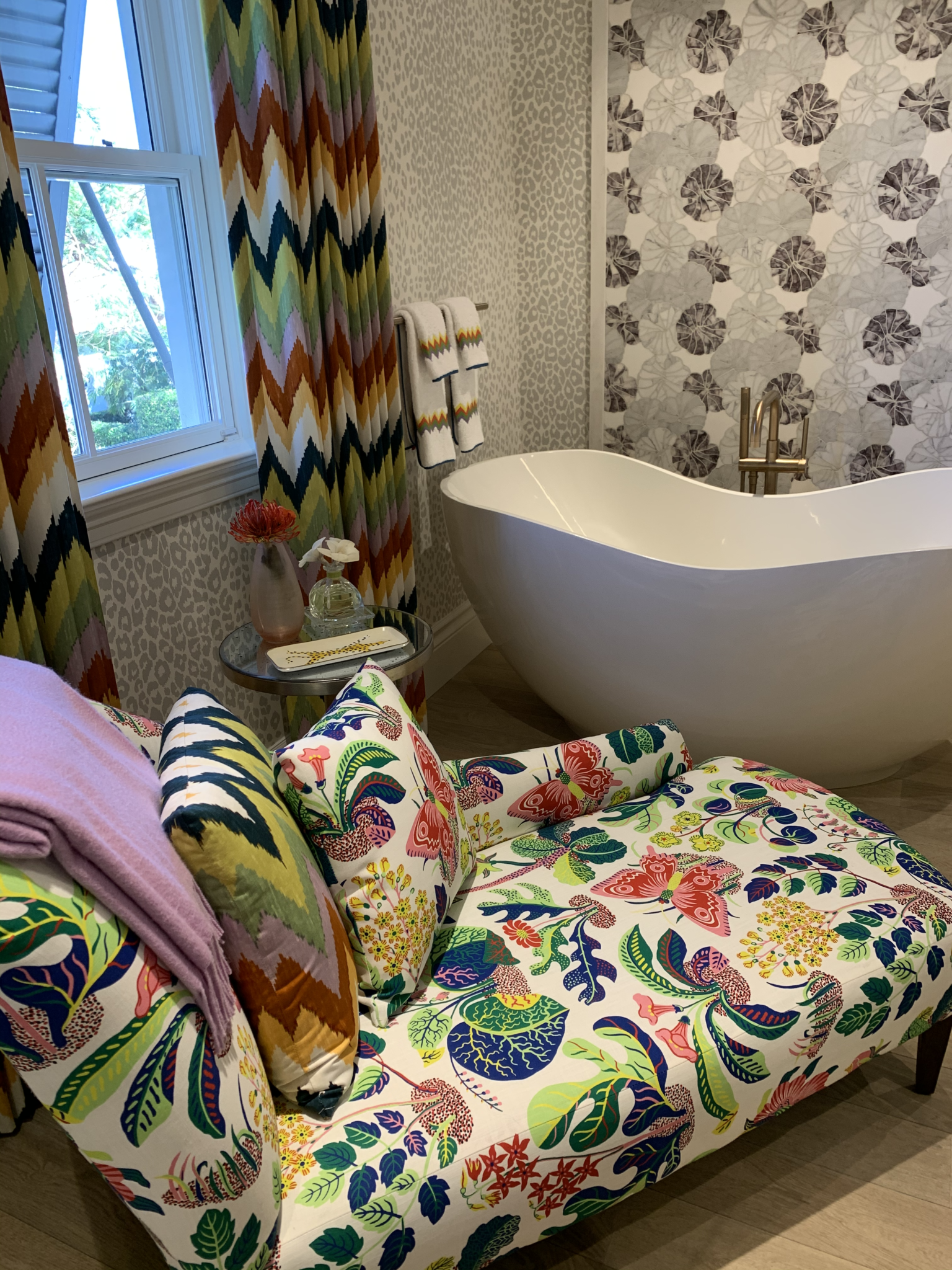
I love their Naturalist Collection, which is a new collection of textiles that are reminiscent of nature in its true habitat: animal skins, floral, botanicals, and textures.
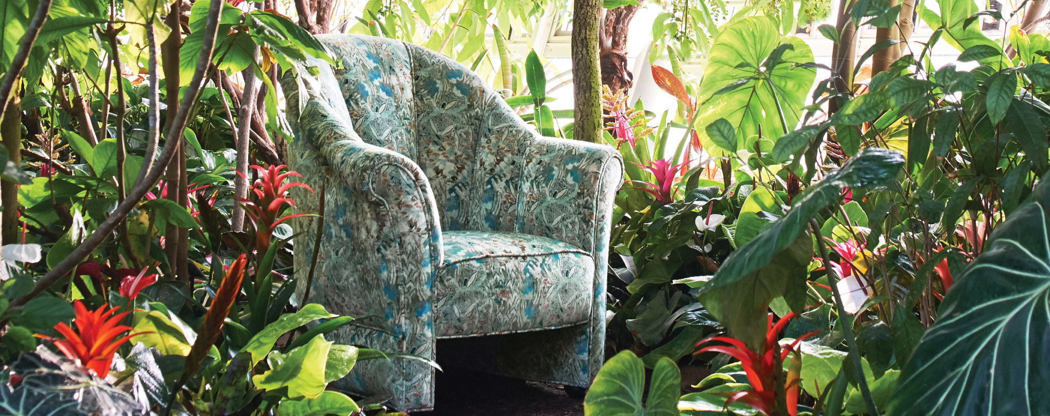
Photo courtesy of S. Harris
Here are a few of my favorite fabrics from the collection. It is easy to picture a beautiful pillow or chair wrapped in these modern and luxurious prints.
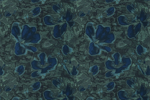
Silk Flora, a silk jacquard offers a rich contrast of shades, complimenting a large floral design.
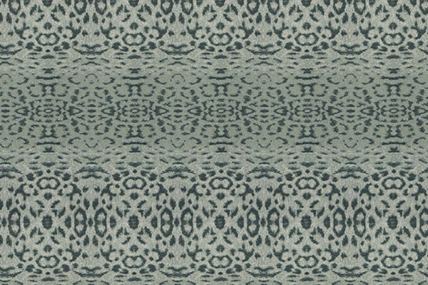
Oken is a kaleidoscope inspired skin in cool, updated colors.
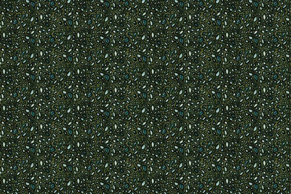
Spotted Leaf is a printed velvet with a tropical take on “dew on a leaf” after the rain.
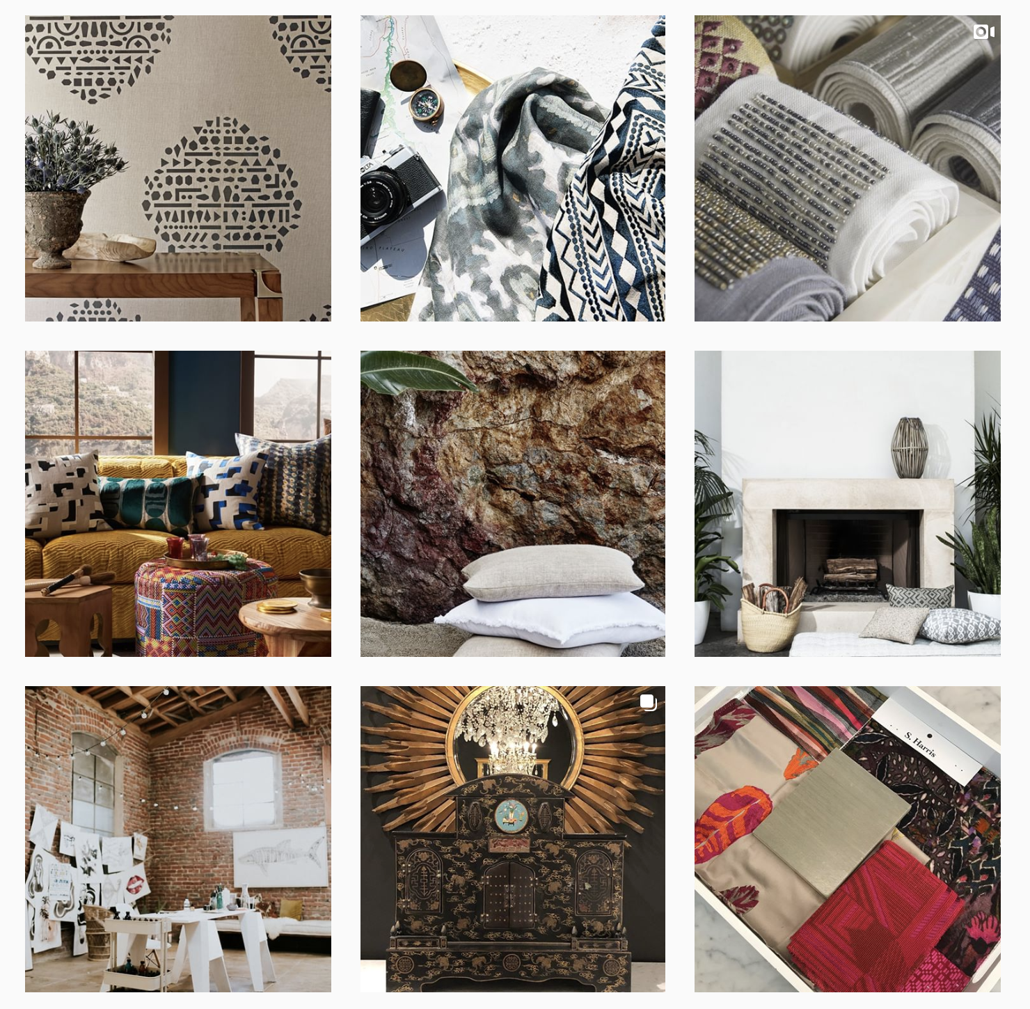
Another beautiful S. Harris collection is titled “Urban Nomad: A Female Artists’ Studio.” This line was inspired by the concept of the studio space where a female artist creates her masterpieces. This collection celebrates the legacy of female artists in America. There are different fabrics inspired by Judith Goodwin, Helen Frankenthaler, Agnes Martin and Ruth Asawa, to name a few. I just love the spirit of these textiles. They are truly beautiful representations of these artist’s spaces. I love that each yard has a story.
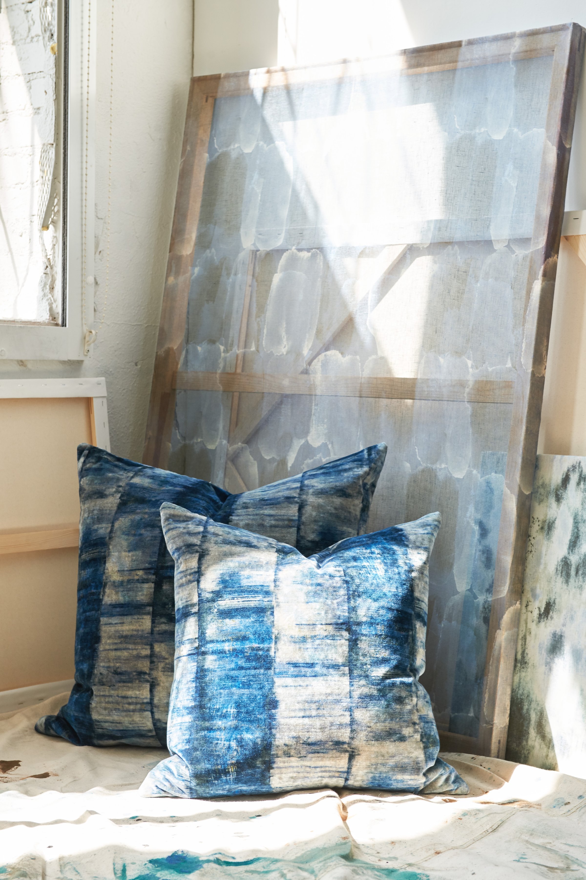
Photo courtesy of S. Harris
If you are a designer, I urge you to explore the world of S. Harris when choosing fabric for your clients. They also have a fun and inspiring instagram account, follow them here.

