Adjunct Professor of Interior Design
I remember walking the halls for the first time as a graduate student at The New School. I struggled to find my way around the city, but thanks to my super smart roommate Sally I learned the subway system in a flash. After graduating with a Masters in Fine Art (at The Actors Studio no less) I returned to study design at Parsons School of Design.
This neighborhood and these buildings became my home away from home. I found myself, my true passion…and my husband Eric. It began a beautiful journey, and now I’m proud to announce that it’s come full circle.

Image courtesy of The New School
When Parsons called recently and asked if I would like to be an Adjunct Professor, I was truly honored and had to accept! I have been teaching an interior design course virtually via Zoom and it has been wonderful to work with these talented students and to share my experiences and expertise. Going back to my roots has really been so inspiring and has even helped me in my day to day design business. I have learned so much.
Teaching at Parsons School of Design has been so rewarding, and I feel like I’ve returned home.
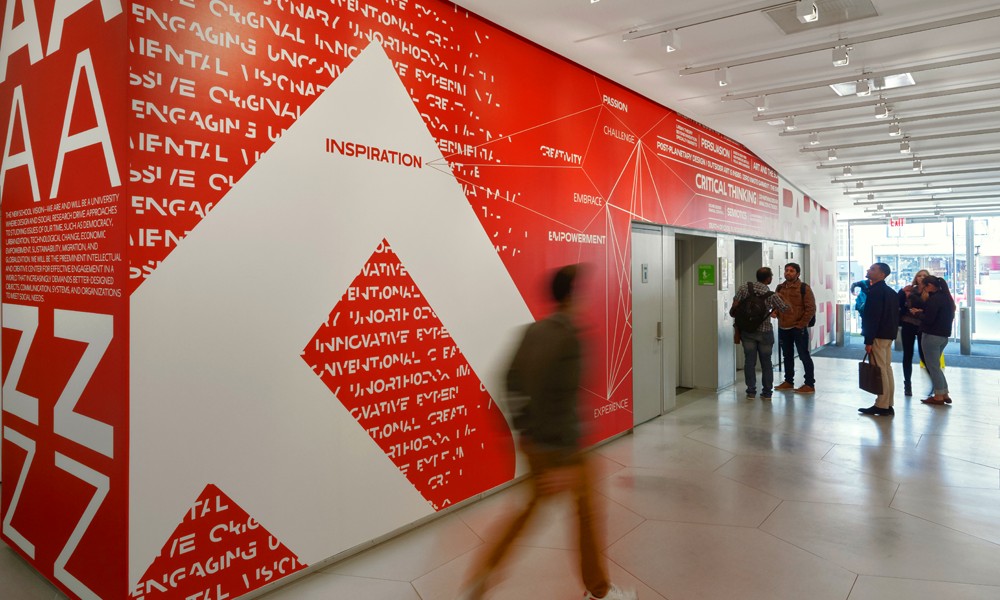
Image courtesy of The New School
A Stylish Home Elevator
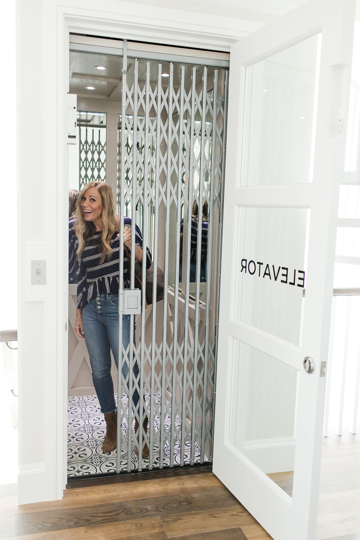
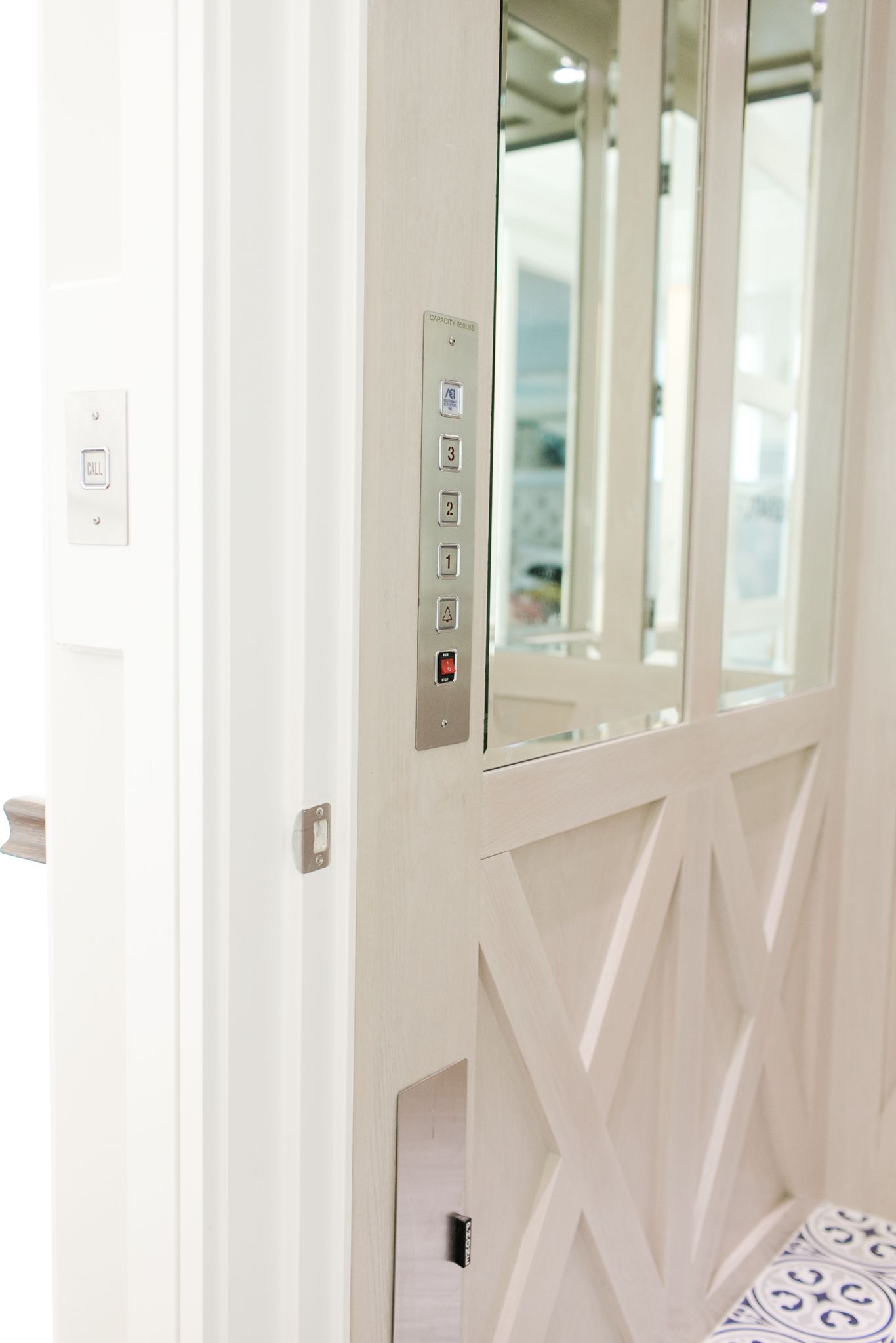
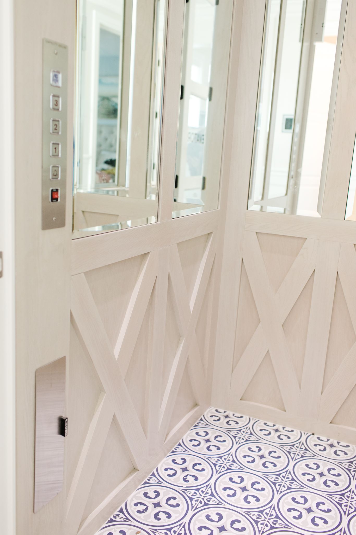
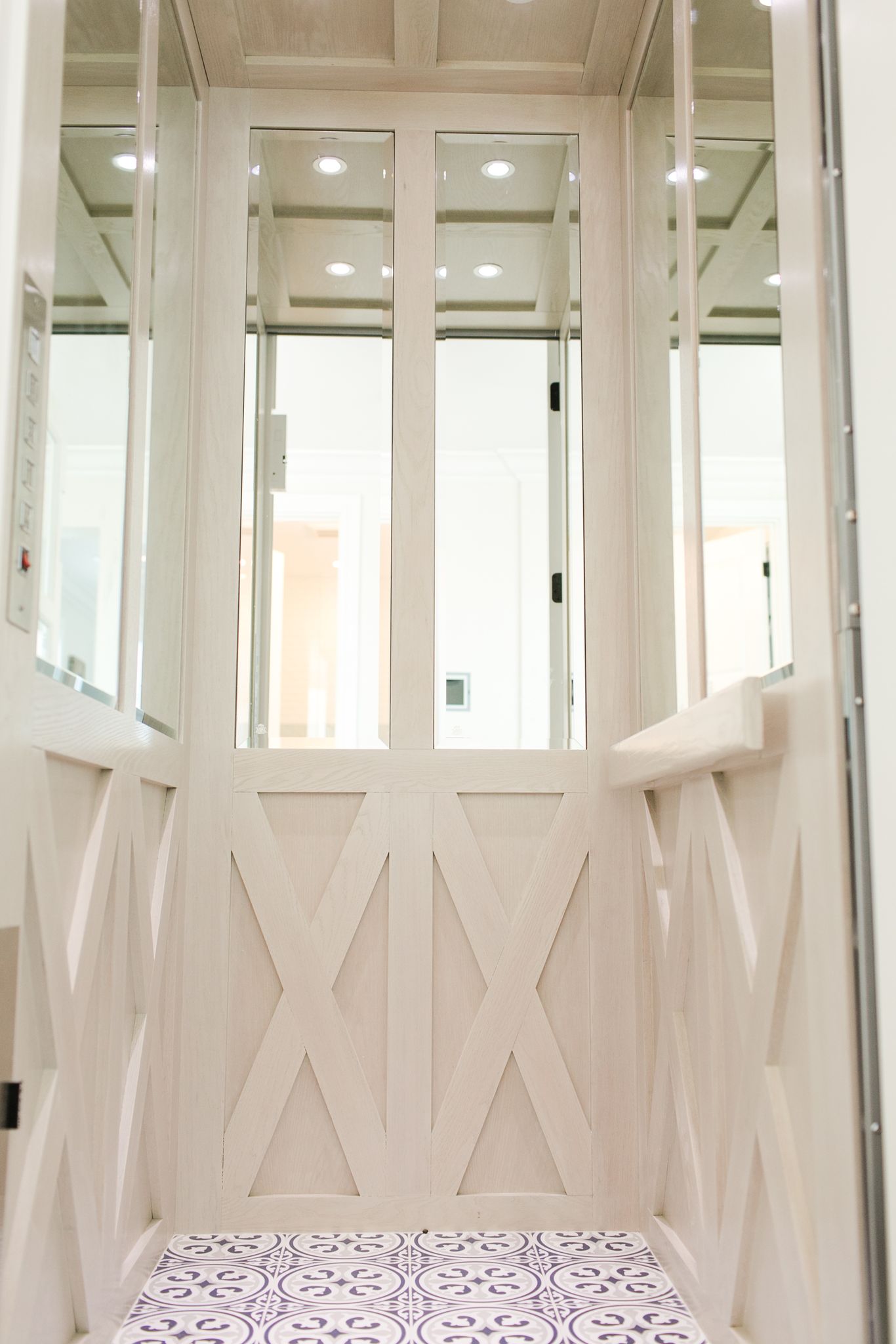
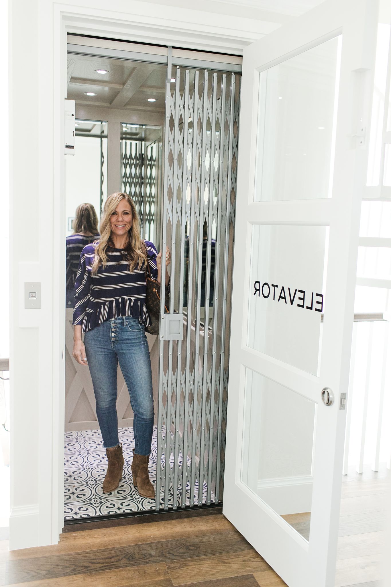
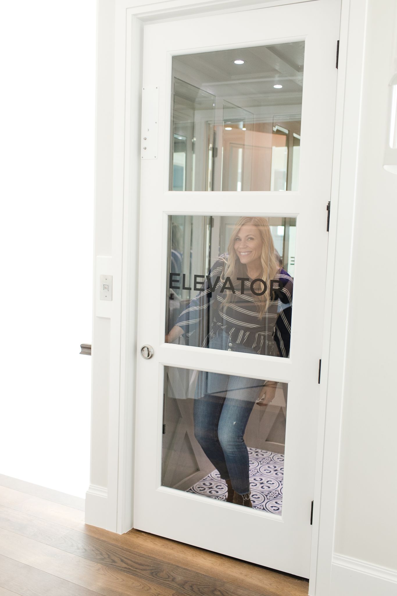
I recently designed a four story beach house in Juno Beach, Florida and the homeowners wanted an elevator. I worked with the builder to create something that matched the rest of the home. We wanted to elevator to have a fun, designer vibe, because why not? There is no reason that an elevator should be boring.
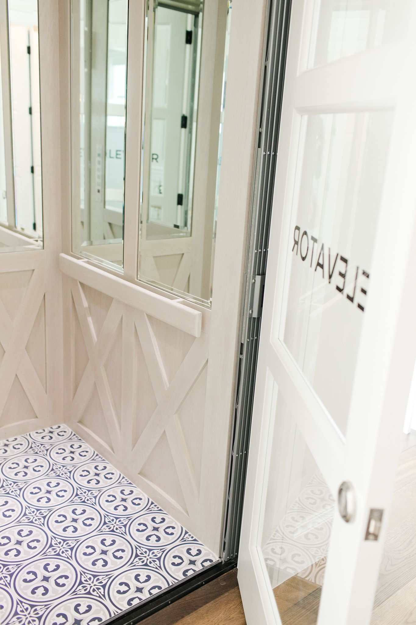
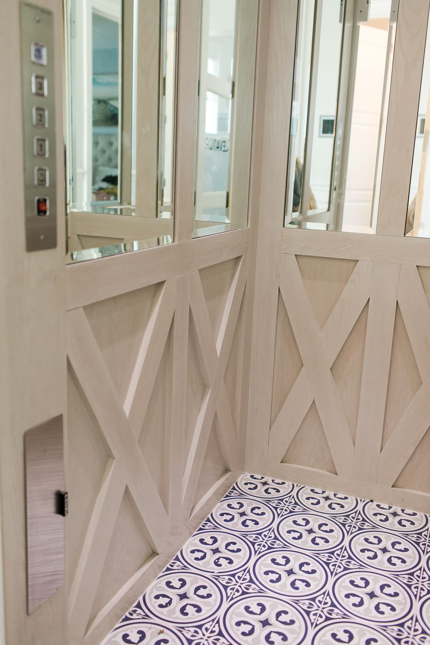
The elevator I created is as beautiful and fresh as the rest of the home. The color palette of blues and creams is consistent with the entire space and many design elements from the rest of the space are echoed here.
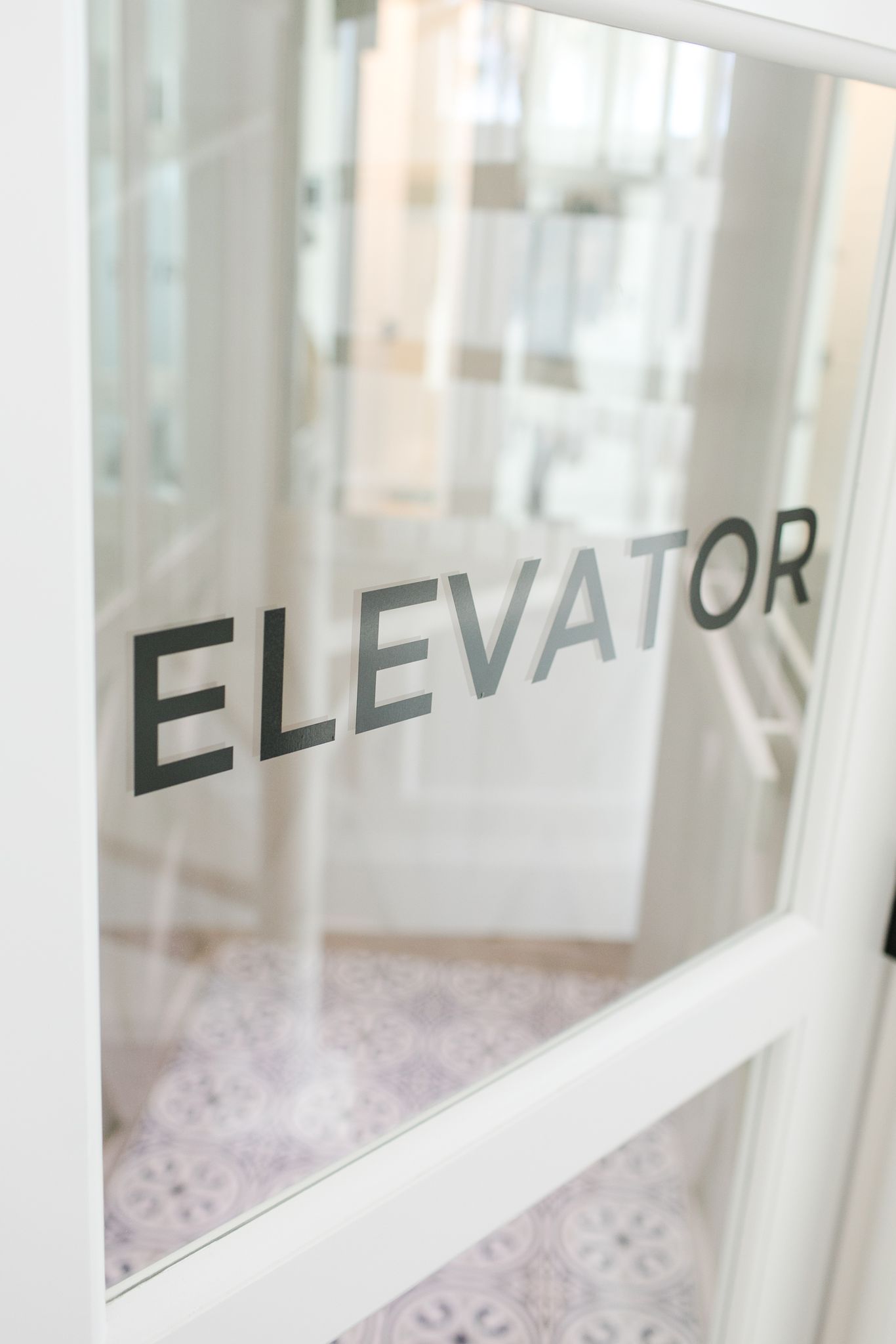
I started with a fun text treatment on the door of the elevator, added some beautiful millwork in a crisscross pattern under the railing and installed some mirrors. Who doesn’t love a little touch up on their way upstairs? :). Even the ceiling has millwork and flattering lighting, of course!
I think the flooring is my favorite part. We did a large statement hand painted tile, that we also placed in the laundry room for consistency. Its a nice little surprise when the elevator door opens.
A Quick and Easy Home Office Makeover
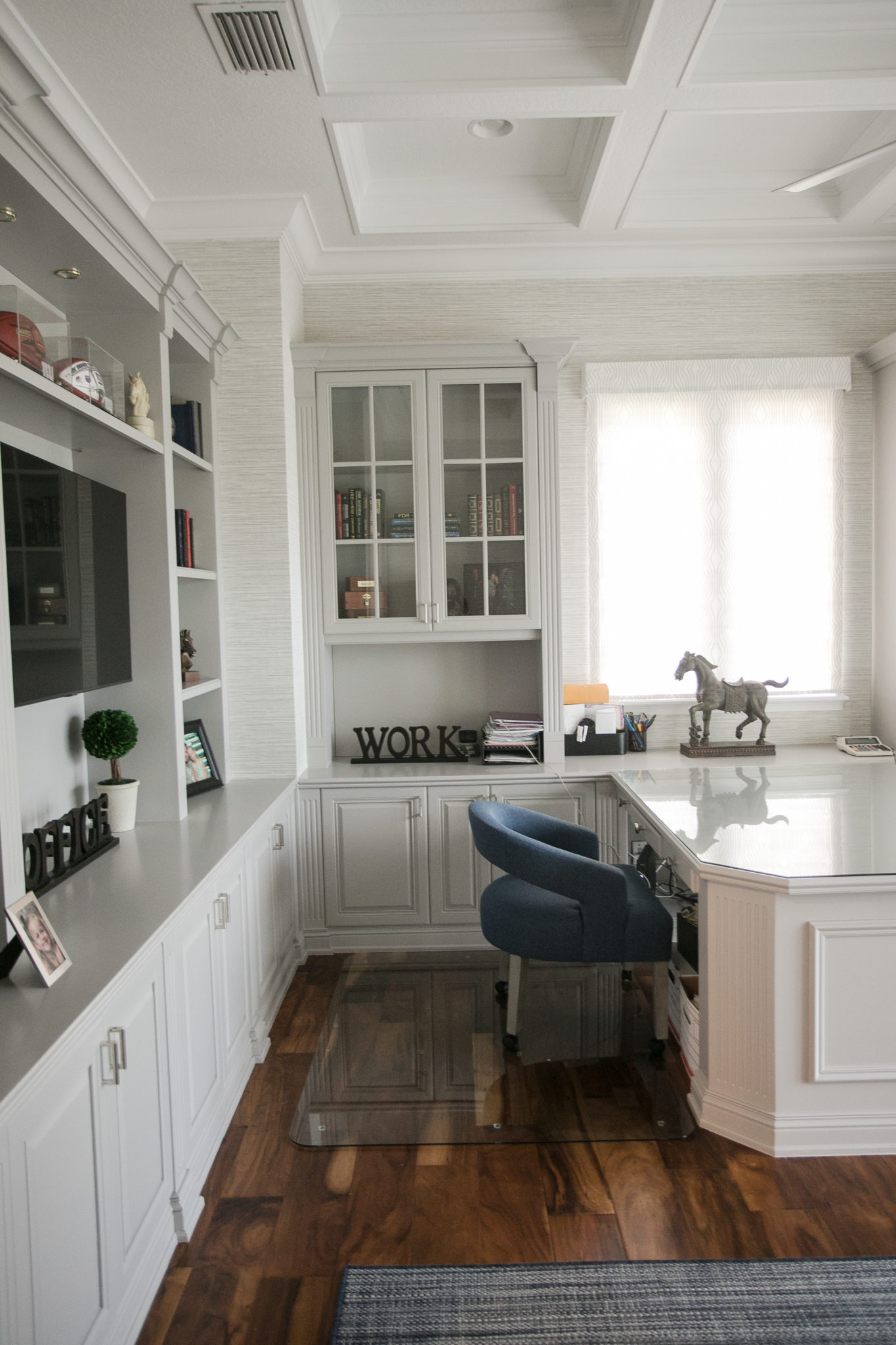
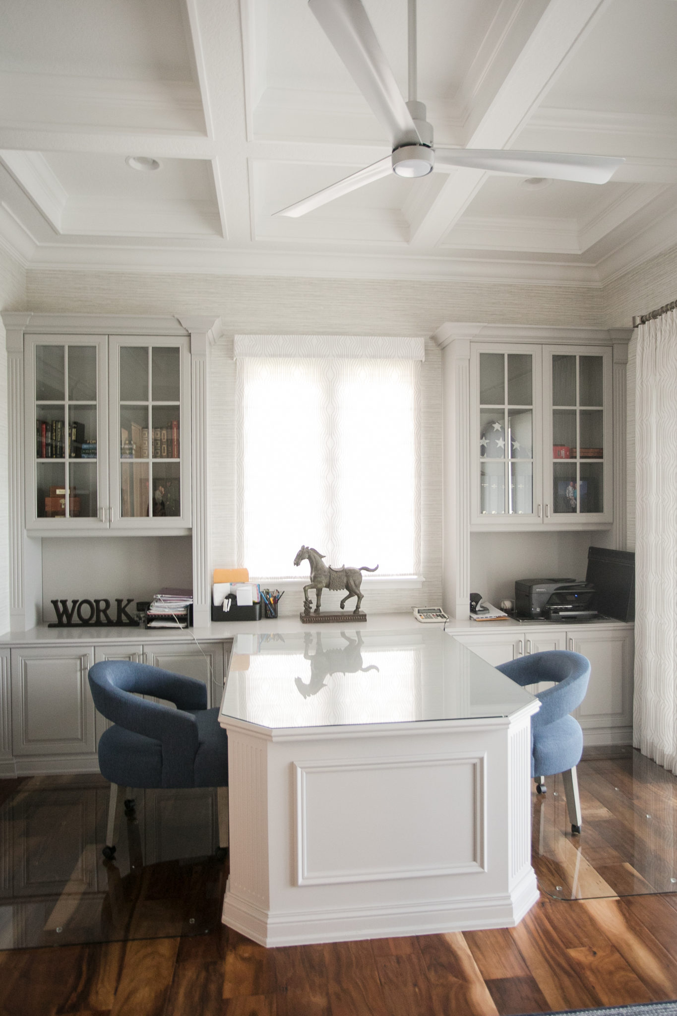
Home offices are so important these days! People want to create beautiful spaces to work from home. We took this home office from dark and dated to light, bright and fabulous! How, you ask? The main way we did it was with….drumroll, please…paint! Lots of it. We painted the built-in bookshelves, desks, ceiling beams and cabinets for a true transformation.
The first photo is the “before” of the space. Scroll down to see the fresh new office we created for our clients!
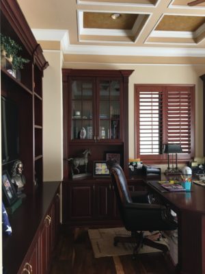
Before
Can you believe what a difference a fresh coat of paint makes? The ceiling alone is impressive. You can now appreciate the architectural details instead of focusing on the dated mustard and beige colors. We also added some wallpaper for a modern touch.
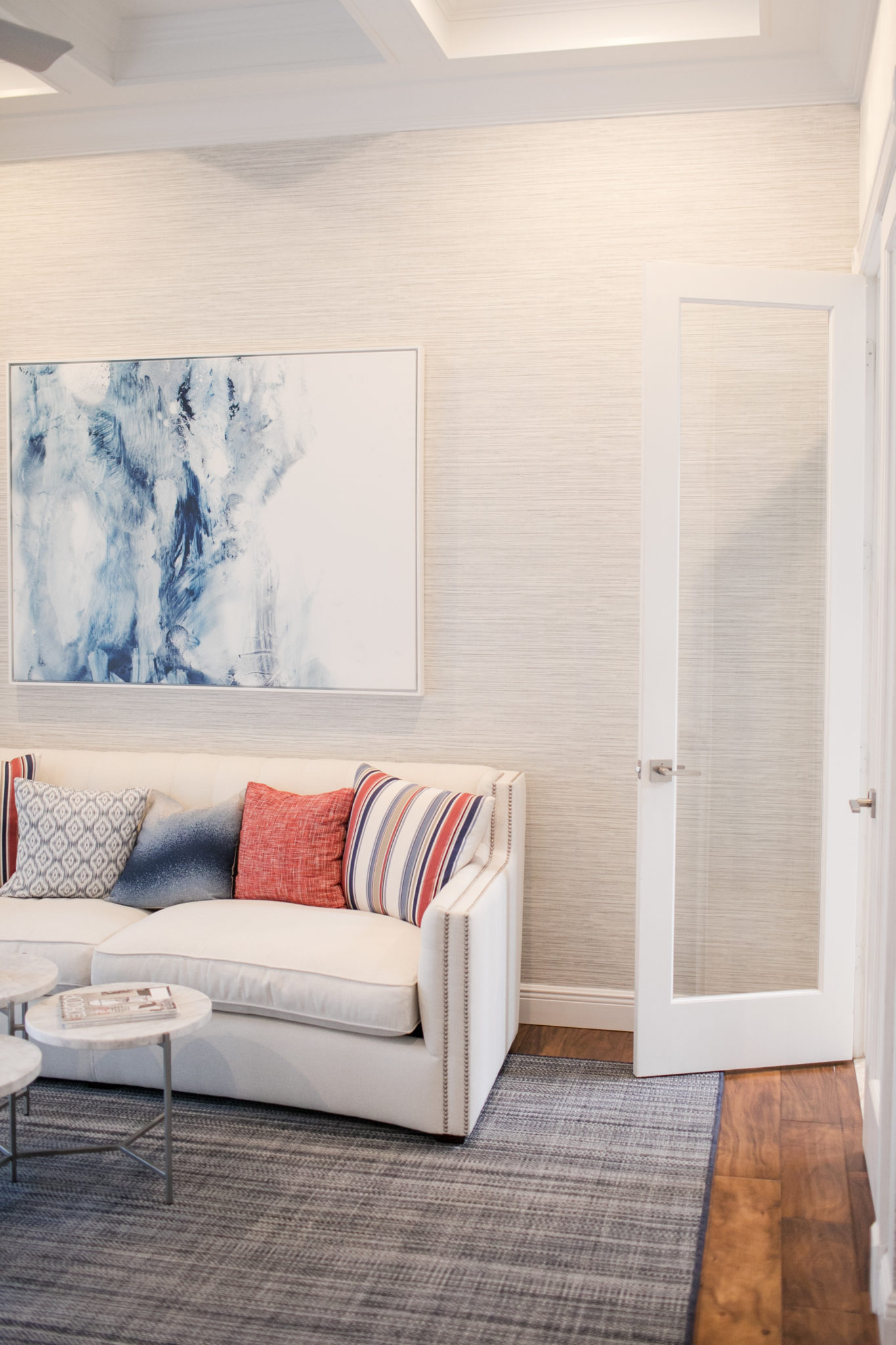
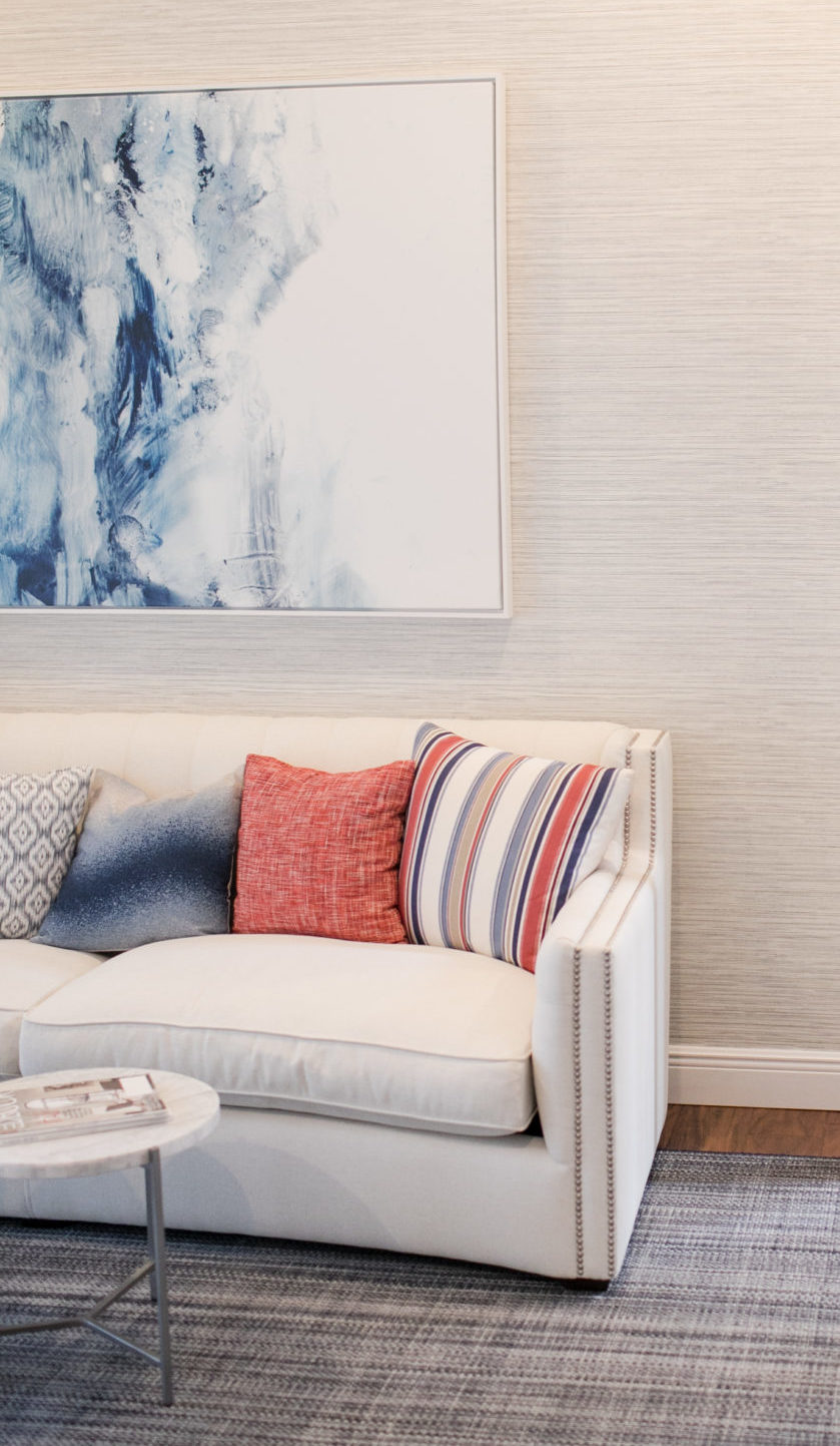
The best home offices will have a little lounge area with a couch. You will see in the “before” photo below that they attempted this. But we made the space sing with a larger sofa, a beautiful area rug, coffee table and modern artwork.
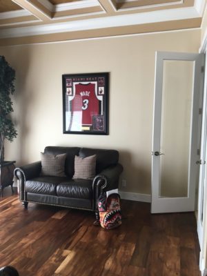
Before
How To Transform Your Kitchen Without Renovating
When I met this fun Boynton Beach family of restauranteurs they told me that they loved the layout of their home and they really loved the “bones” of the house, but that it needed a lot of updating. Full scale renovations, especially for the kitchen and bathrooms, however, can be quite costly. They asked me how they could maximize their budget and get a full refresh without lots of construction and renovating. I get this question a lot in my design firm, which is why we created our Furnishing Service. I always say that it is truly unbelievable what furniture and paint can do. The service also includes floor coverings, drapery and lighting. Add in some accessories and you can see a TRUE transformation of your home! In the kitchen below, we painted the cabinetry and added new hardware. We added some gorgeous wallpaper and replaced the barstools. A cost effective way to get a complete kitchen makeover. The results speak for themselves…
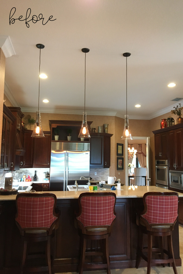
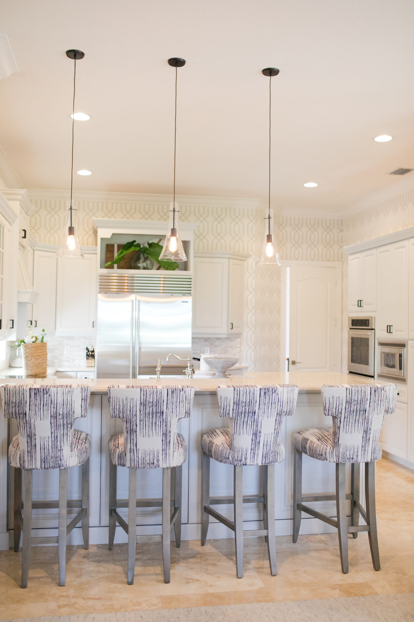
Interior Design by Krista Watterworth Alterman, Photo by Eve Greendale
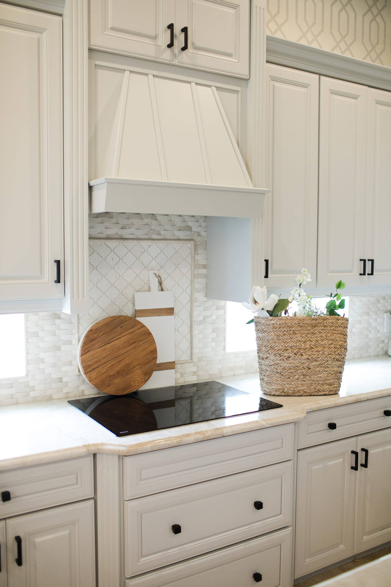
Interior Design by Krista Watterworth Alterman, Photo by Eve Greendale
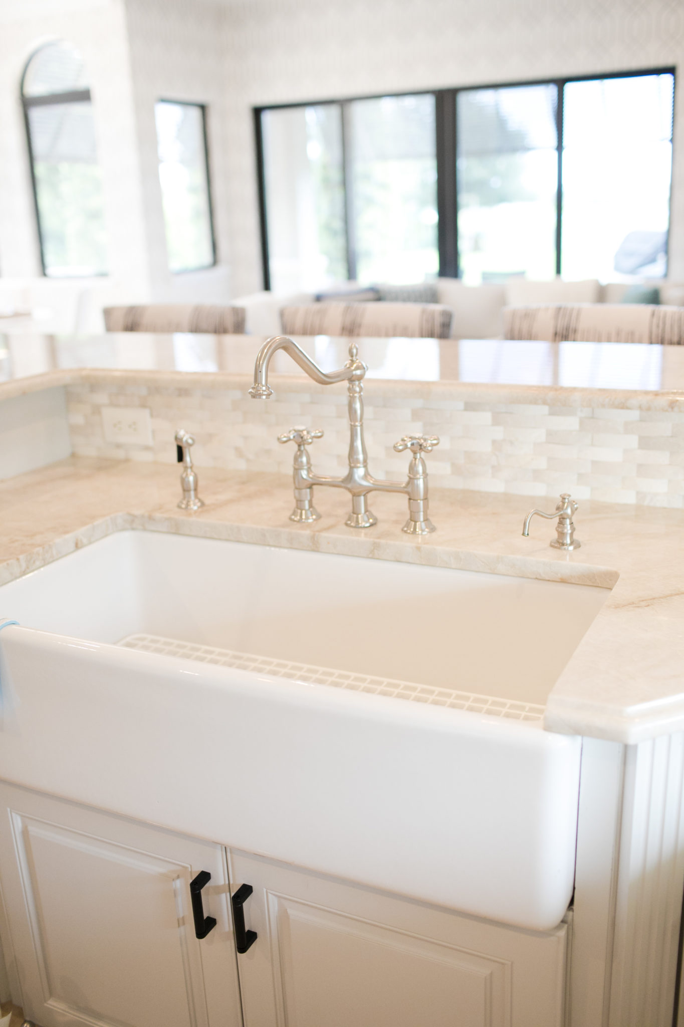
Interior Design by Krista Watterworth Alterman, Photo by Eve Greendale
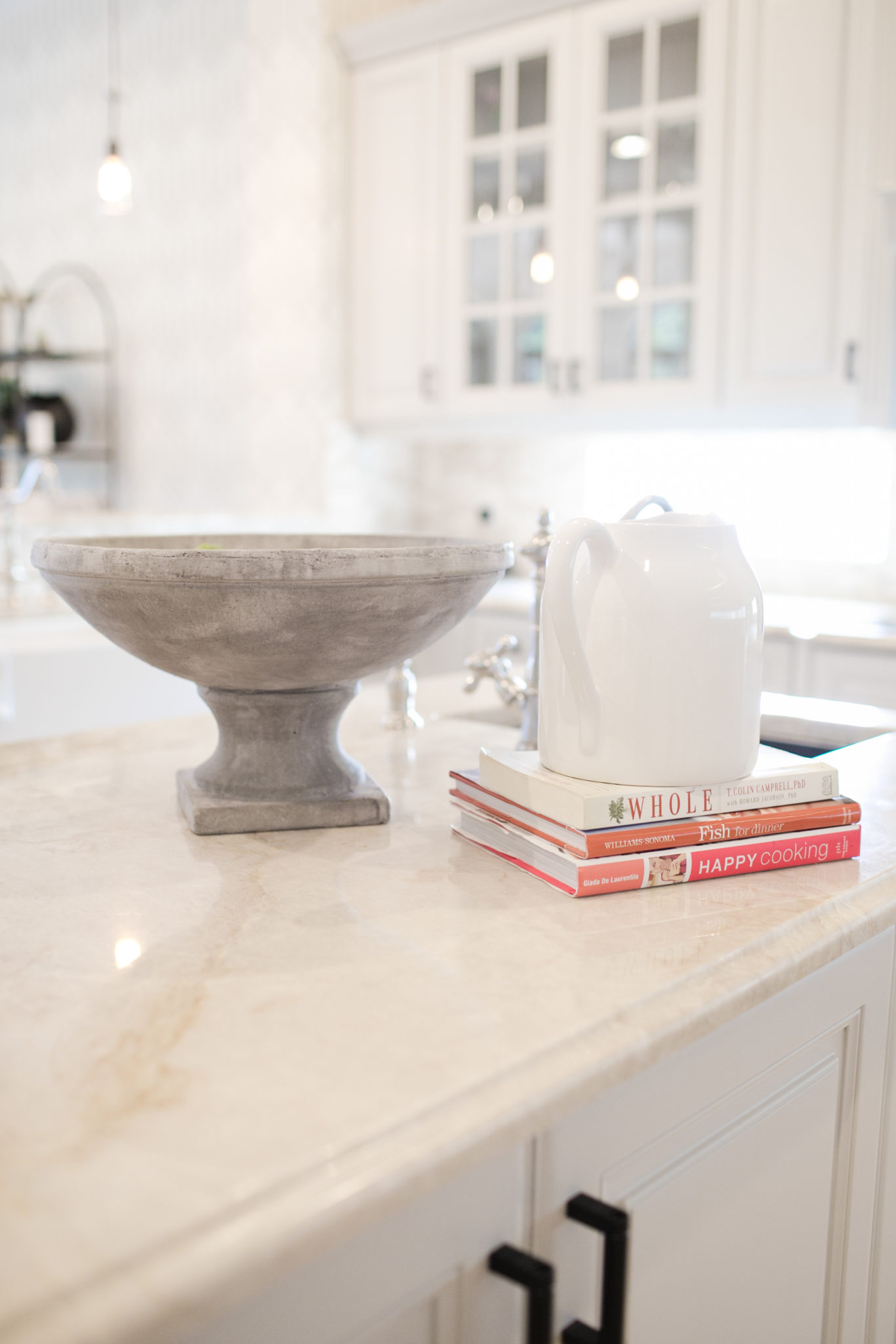
Interior Design by Krista Watterworth Alterman, Photo by Eve Greendale
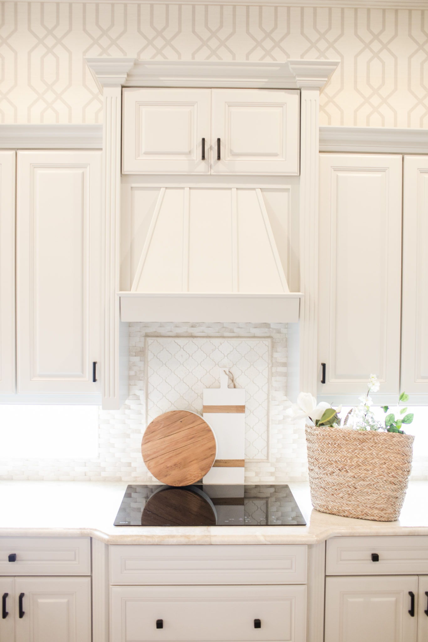
Interior Design by Krista Watterworth Alterman, Photo by Eve Greendale
The original breakfast nook had a built-in banquette. I usually love this type of seating, but all of the dark finishes and pillows made this space feel so heavy. We wanted a light, bright and happy eating area, so we removed the built in and added a beautiful table with chairs upholstered in high performance fabric for easy cleaning.
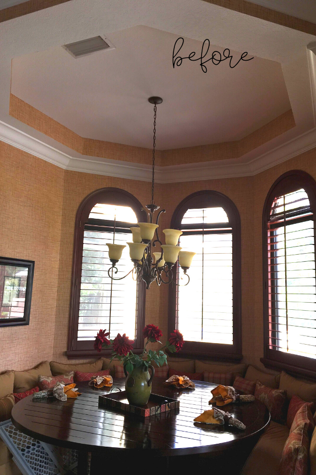
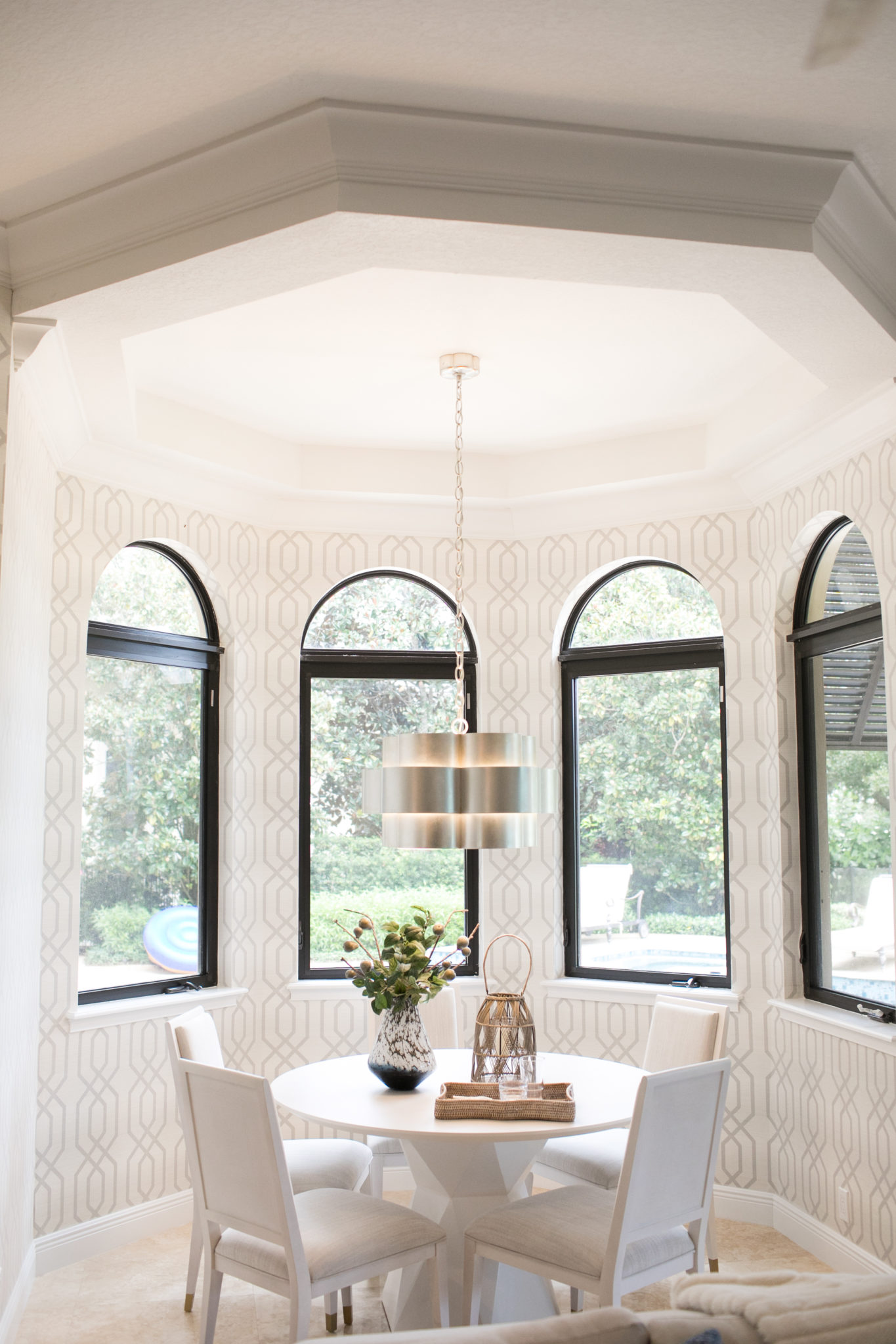
Interior Design by Krista Watterworth Alterman, Photo by Eve Greendale
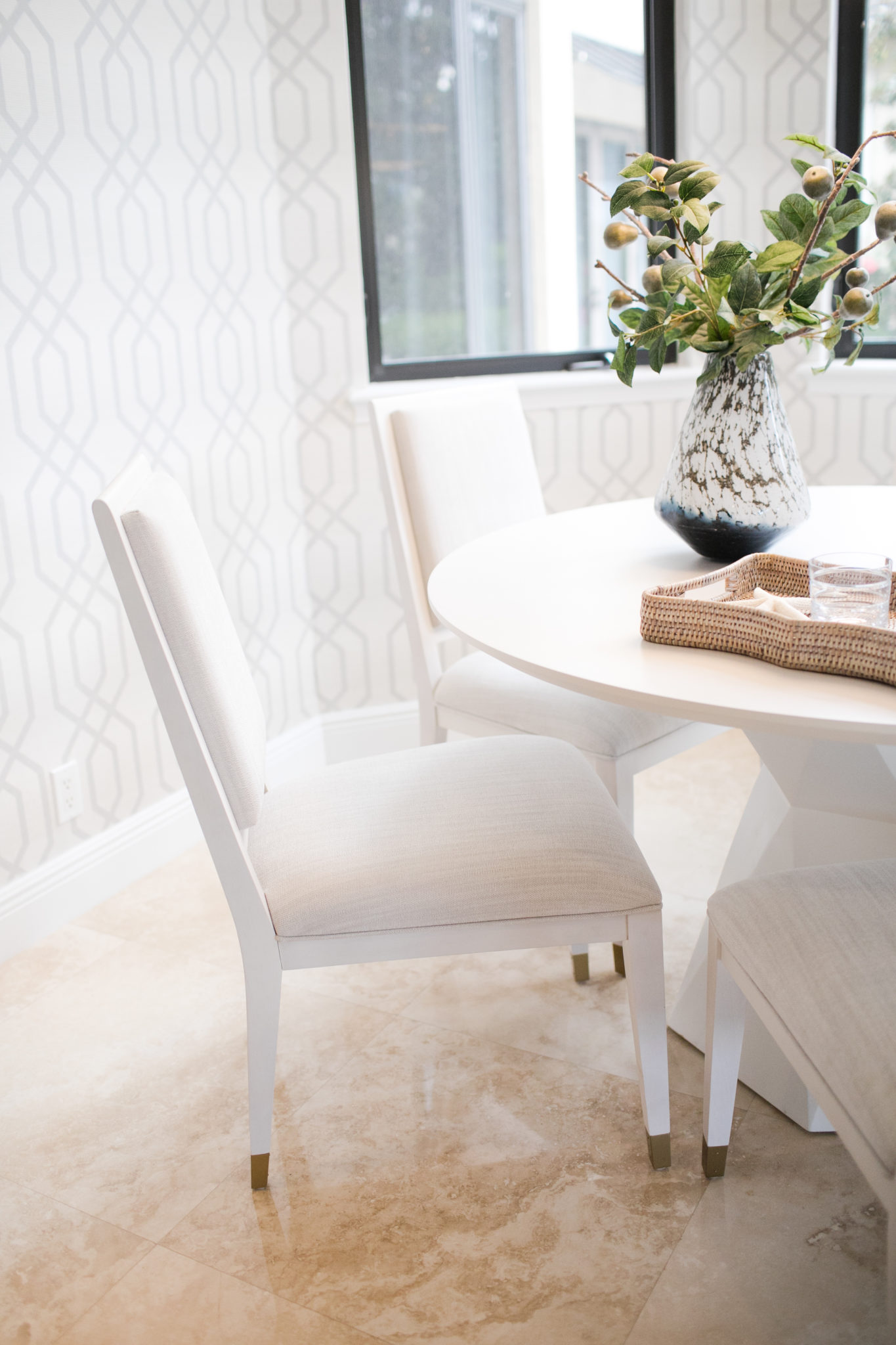
Interior Design by Krista Watterworth Alterman, Photo by Eve Greendale
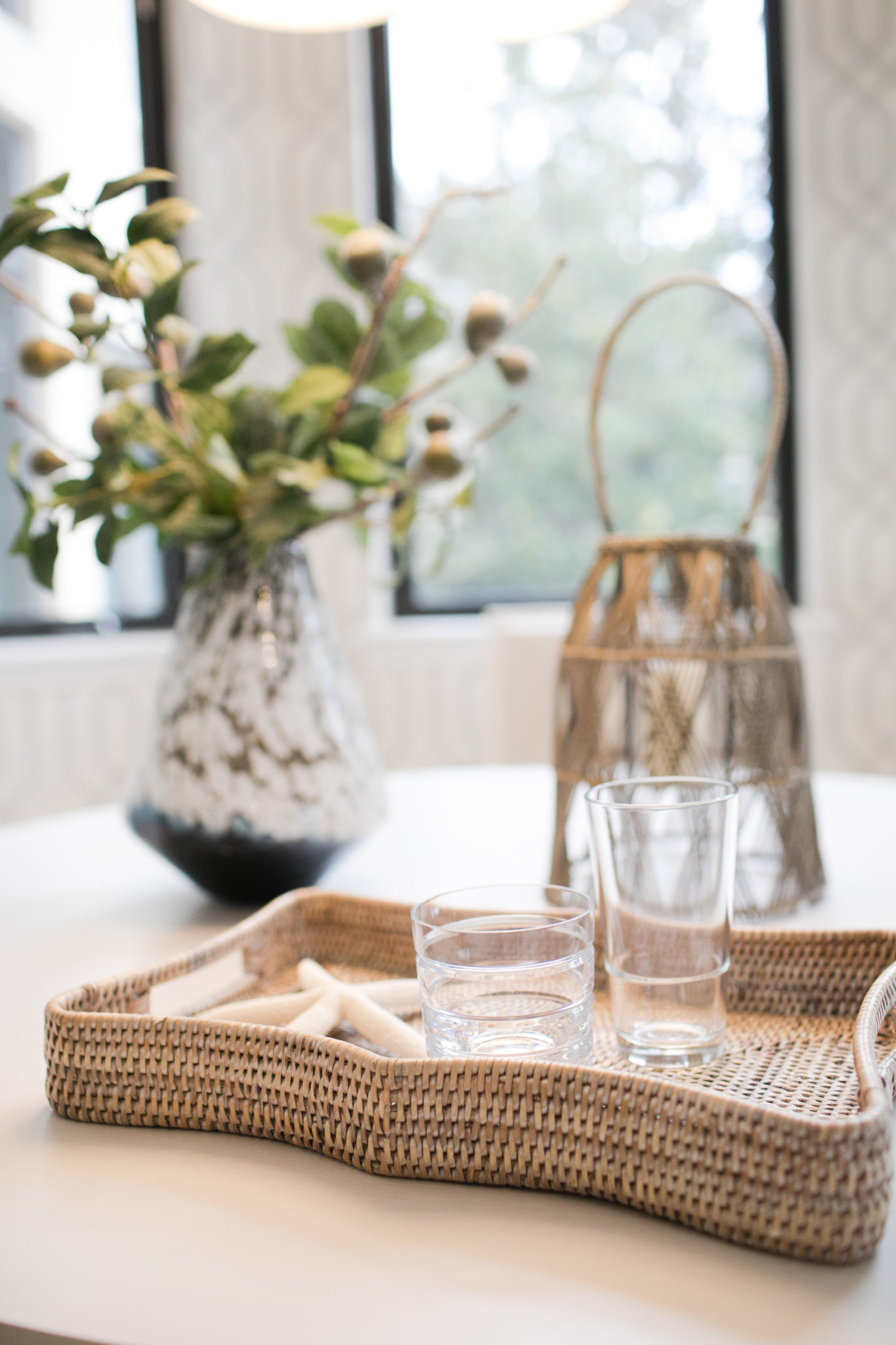
Interior Design by Krista Watterworth Alterman, Photo by Eve Greendale
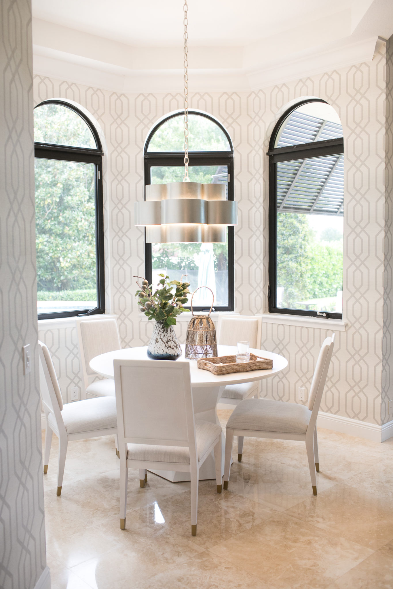
Interior Design by Krista Watterworth Alterman, Photo by Eve Greendale
Cabana Bath: Before and After
In South Florida, many homes have a bathroom off the pool area that we refer to as the cabana bath. The cabana bath is a spot where people can change and shower before enjoying the outdoor areas poolside. This space is important, as it likely will be used by guests, and is often connected to the interior of the home so it doubles as a typical guest bathroom. I recently designed a cabana bath for a family in Boynton Beach, Florida who wanted to change their dark and dated space. The original design was old world/mediterranean style, which was very popular in Florida about 15 years ago. In the “before” photo below you will notice that there is a lot of brown with dark and heavy accents.
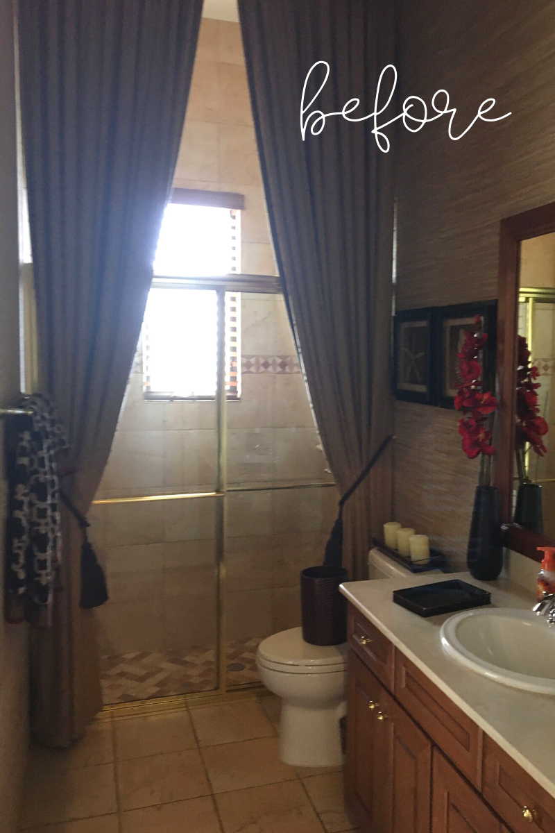
The homeowners wanted something light and bright, a happy and cheerful space. Right up my alley! I chose a fresh blue and white palette for this cabana bath, will lots of fun and coastal design elements. We painted the cabinets a french blue and added gorgeous wallpaper and statement tile on the floor. The marble backsplash adds an organic touch, and the brass accents on the mirror and hardware give the room a current and upscale look. One way that we were able to really maximize the client’s budget was by not replacing the cabinets. I noticed that the cabinets were high quality wood so we simply painted them. What a transformation!
And, now….for the big reveal! Drumroll, please….
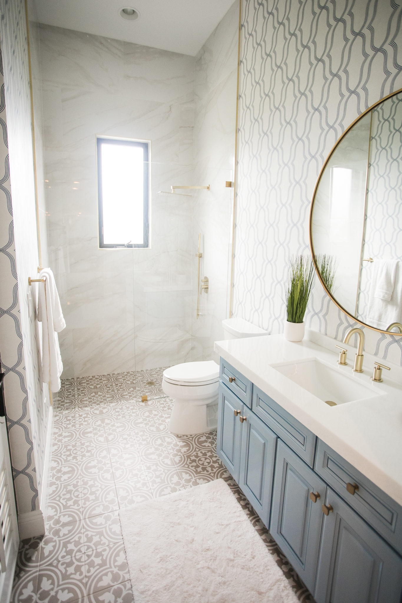
Interior Design by Krista Watterworth Alterman, Photo by Eve Greendale
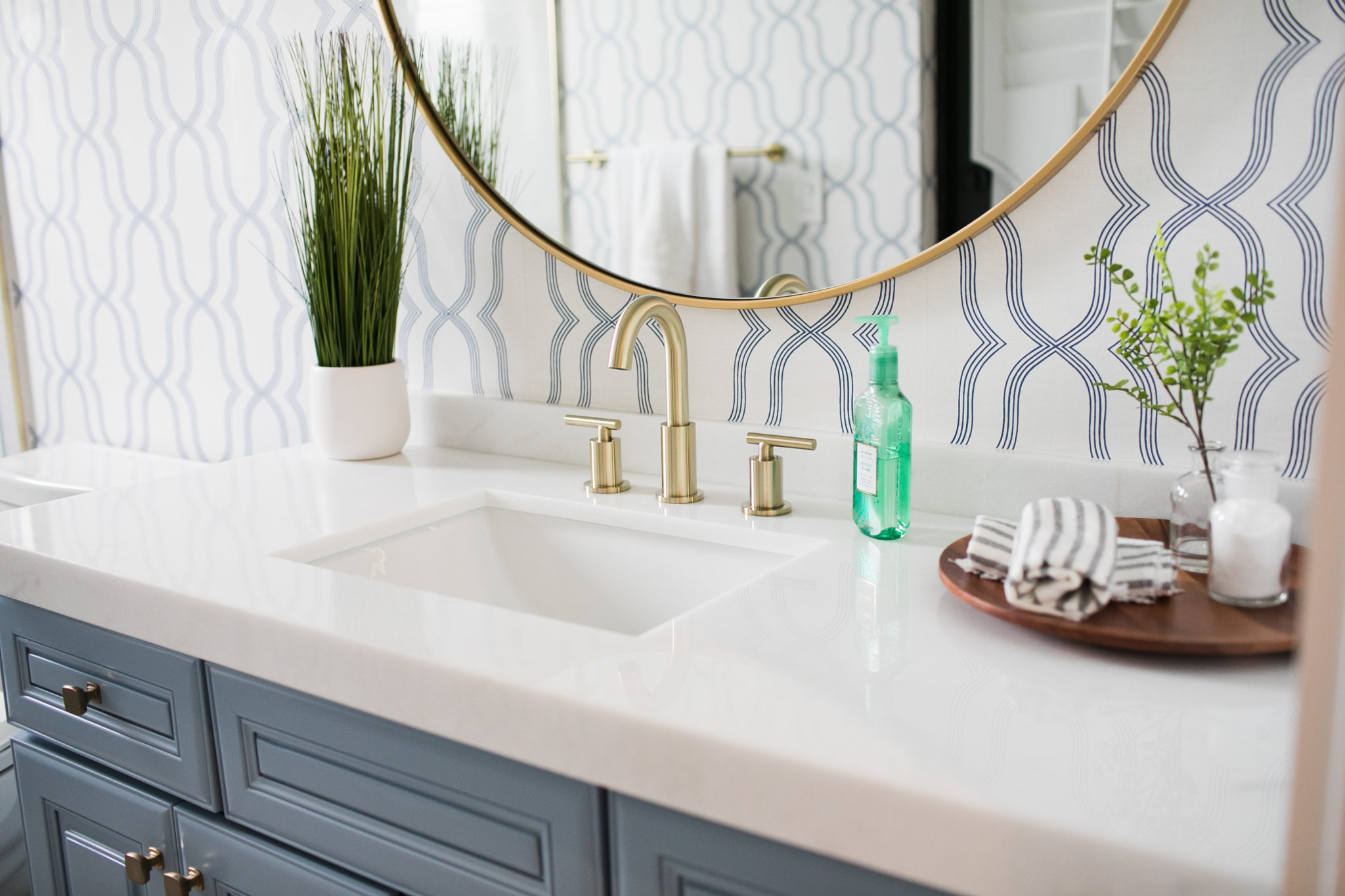
Interior Design by Krista Watterworth Alterman, Photo by Eve Greendale
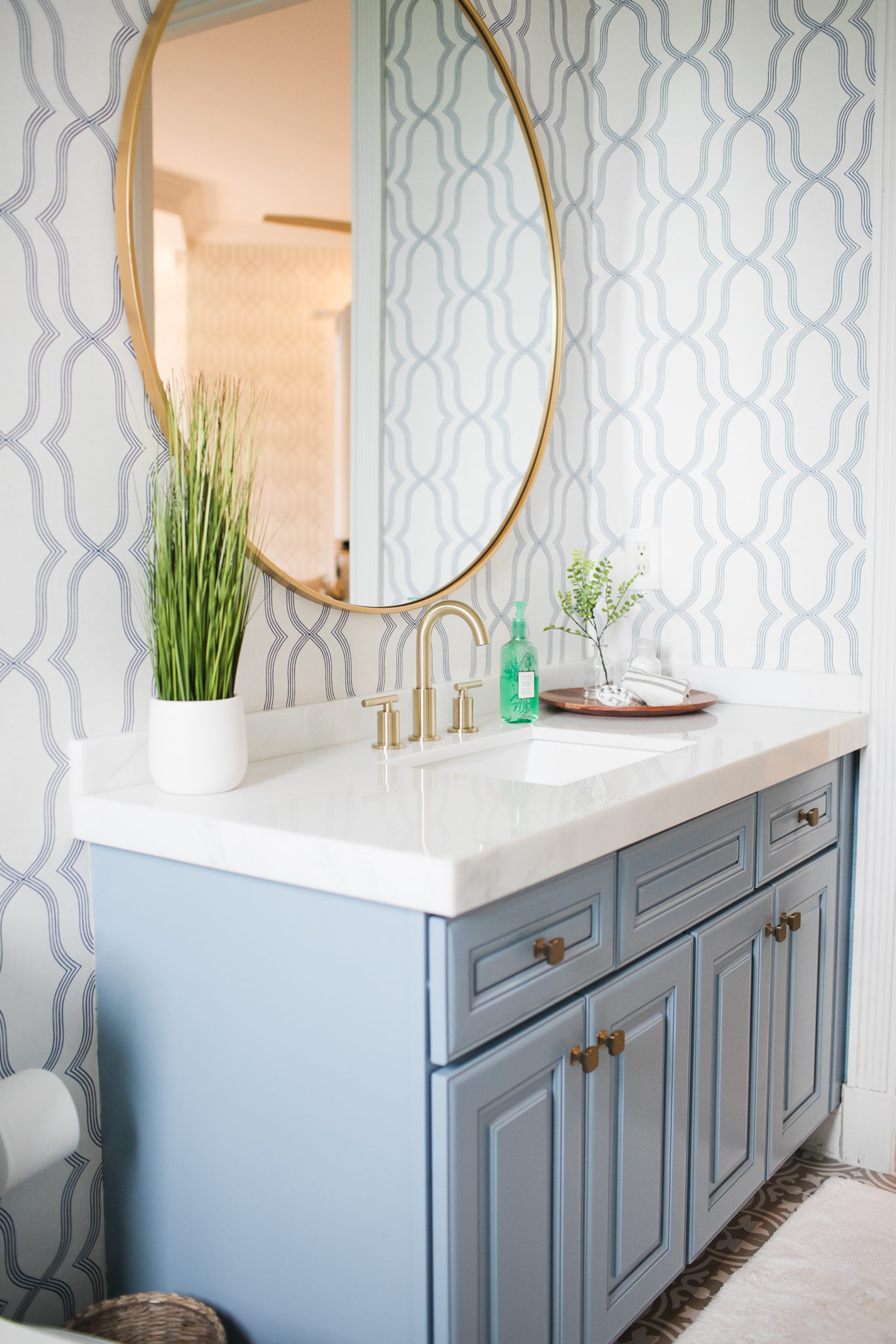
Interior Design by Krista Watterworth Alterman, Photo by Eve Greendale
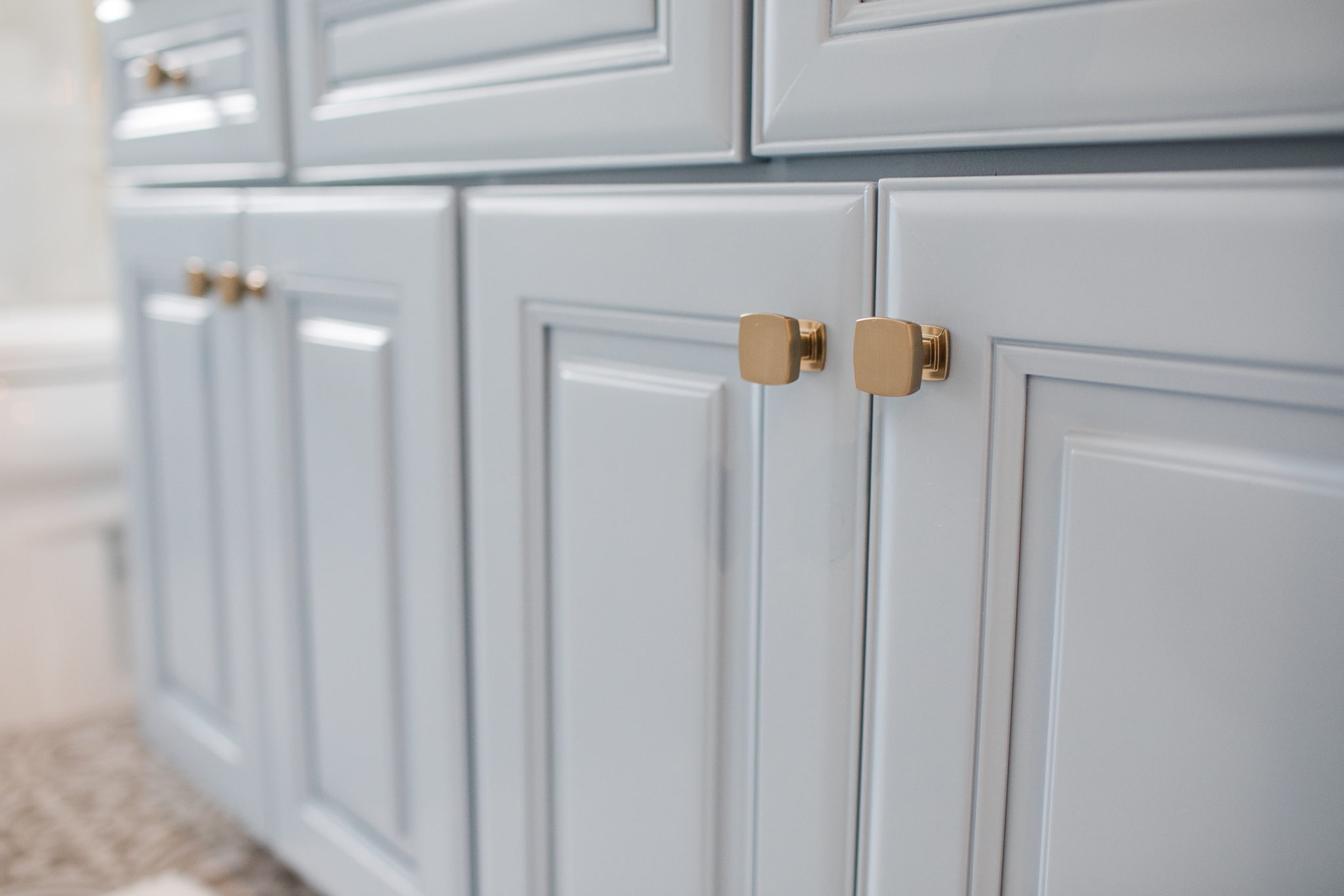
Interior Design by Krista Watterworth Alterman, Photo by Eve Greendale
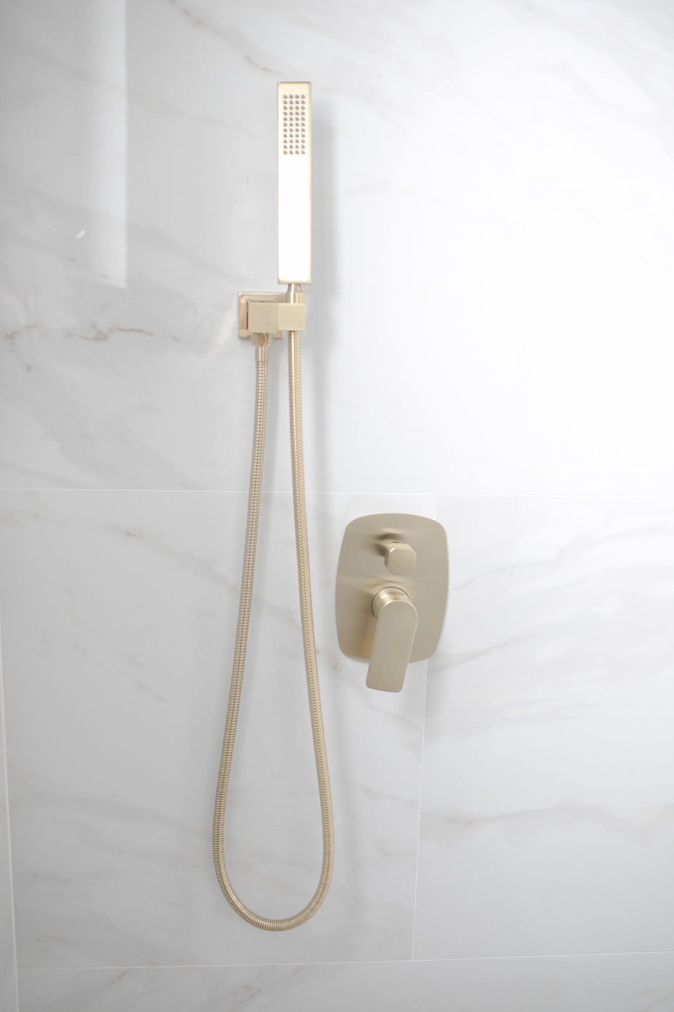
Interior Design by Krista Watterworth Alterman, Photo by Eve Greendale
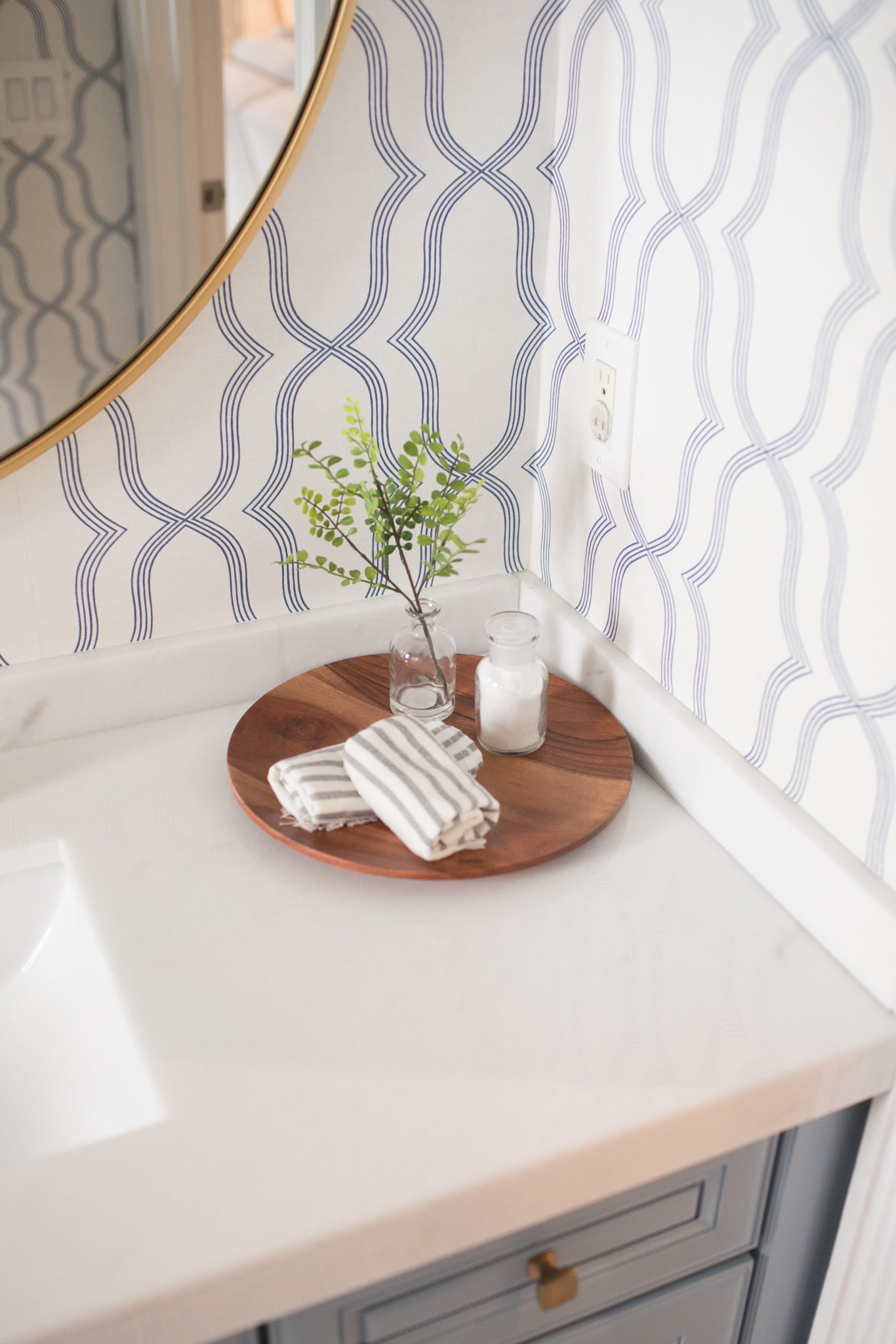
Interior Design by Krista Watterworth Alterman, Photo by Eve Greendale

Interior Design by Krista Watterworth Alterman, Photo by Eve Greendale
Residential Excellence in Design (Double!) Award Winner
We are so honored to have been awarded two 2020 Residential Excellence in Design (RED) Awards by Luxe Interiors + Design magazine. The RED Awards honor excellence, innovation and the best residential architecture, interior design and landscape architecture projects across the country. The award winners were announced last week in a lovely virtual ceremony. My team and I gathered to watch the awards with some Rosé, and we were so excited to hear that we were winners! It is nice to be recognized for your work and it was so fun to celebrate.

There was an extremely impressive panel of judges this year…I have been admiring the work of these individuals for years and am so honored to know that they liked my work!

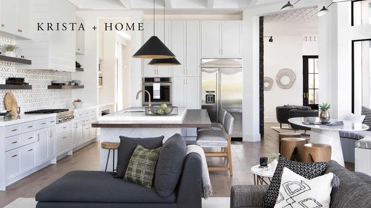
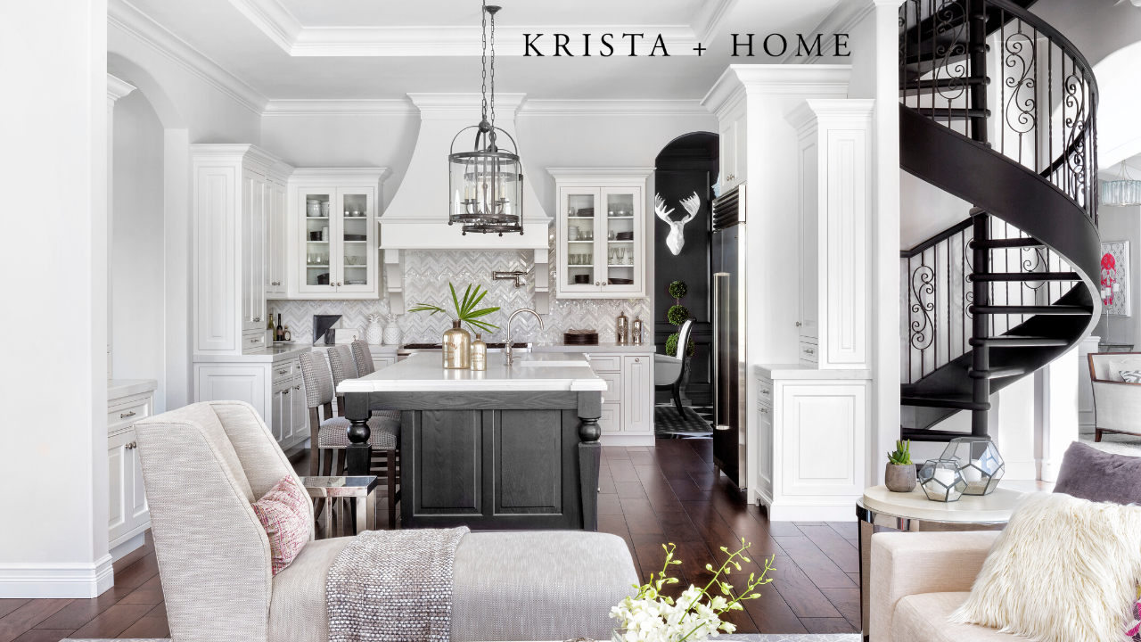
KRISTA + HOME won awards in the Bathroom and Kitchen categories. I am excited to see my projects featured in the upcoming September/October issue of Luxe Interiors + Design! I hope you enjoy these photos of the winning kitchen and bathrooms that I designed.
KITCHEN

2020 Residential Excellence in Design (RED) Award: Interior Design by Krista Watterworth Alterman, Photo by Jessica Glynn
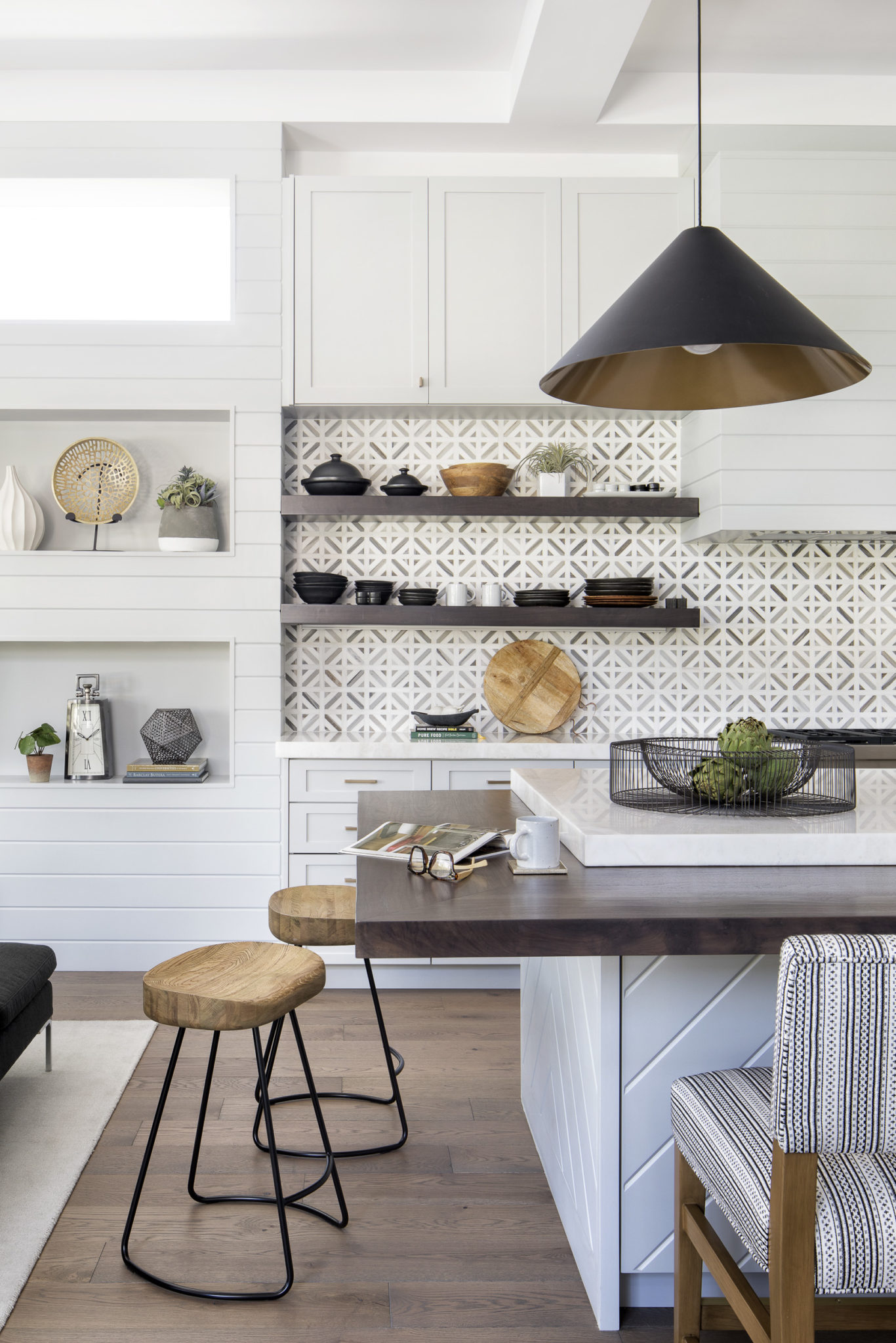
2020 Residential Excellence in Design (RED) Award: Interior Design by Krista Watterworth Alterman, Photo by Jessica Glynn
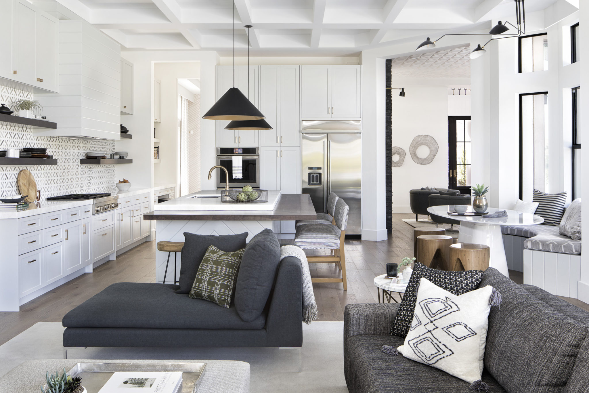
2020 Residential Excellence in Design (RED) Award: Interior Design by Krista Watterworth Alterman, Photo by Jessica Glynn
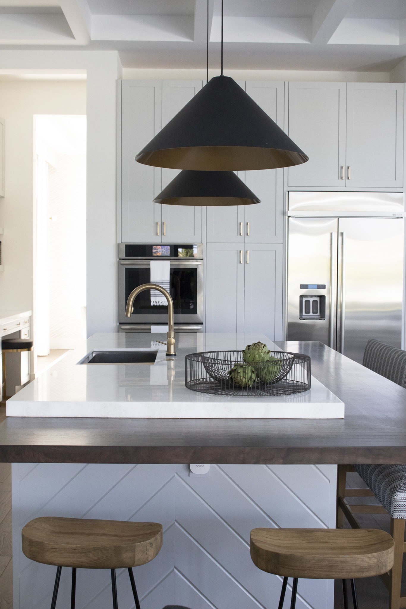
2020 Residential Excellence in Design (RED) Award: Interior Design by Krista Watterworth Alterman, Photo by Jessica Glynn
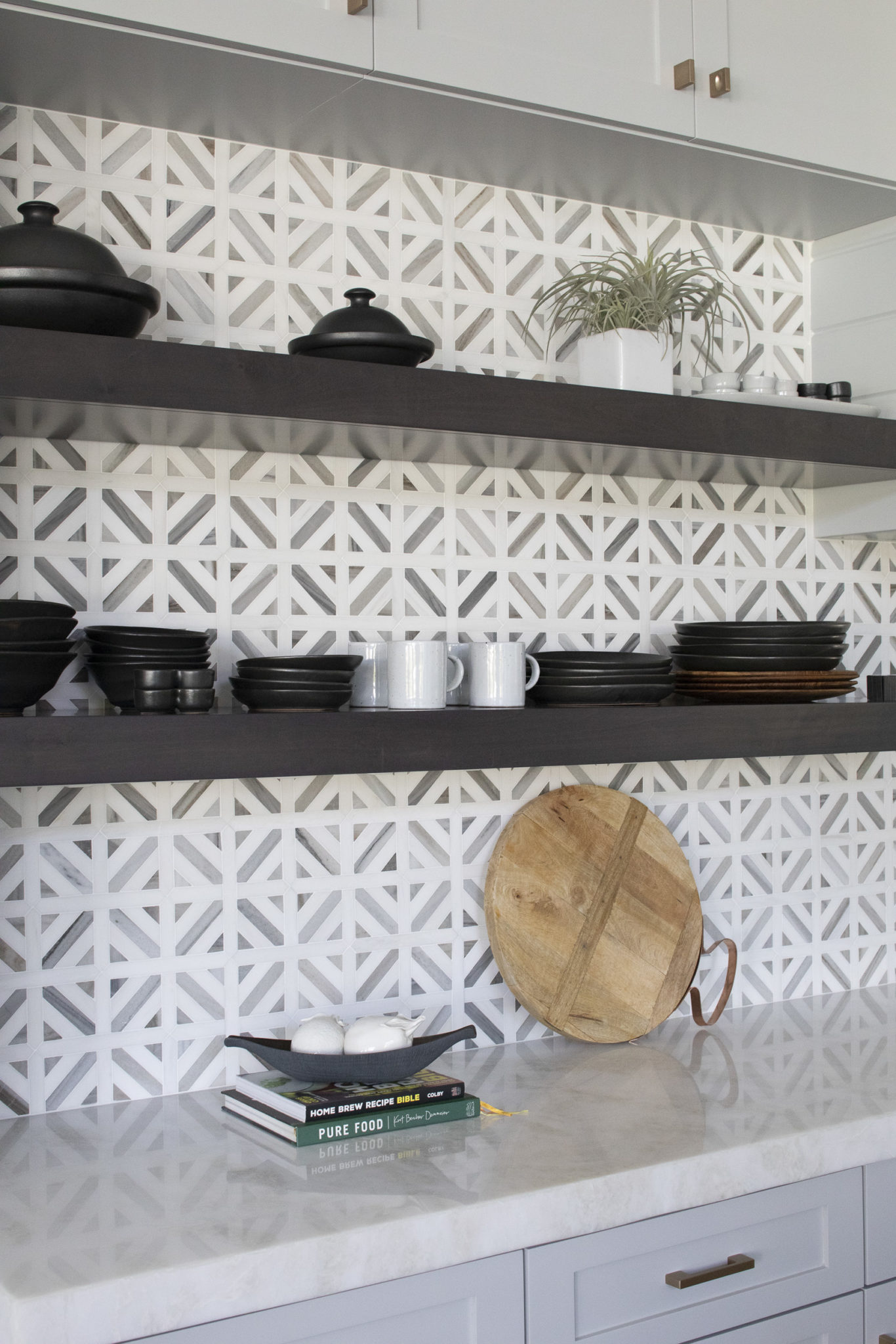
2020 Residential Excellence in Design (RED) Award: Interior Design by Krista Watterworth Alterman, Photo by Jessica Glynn
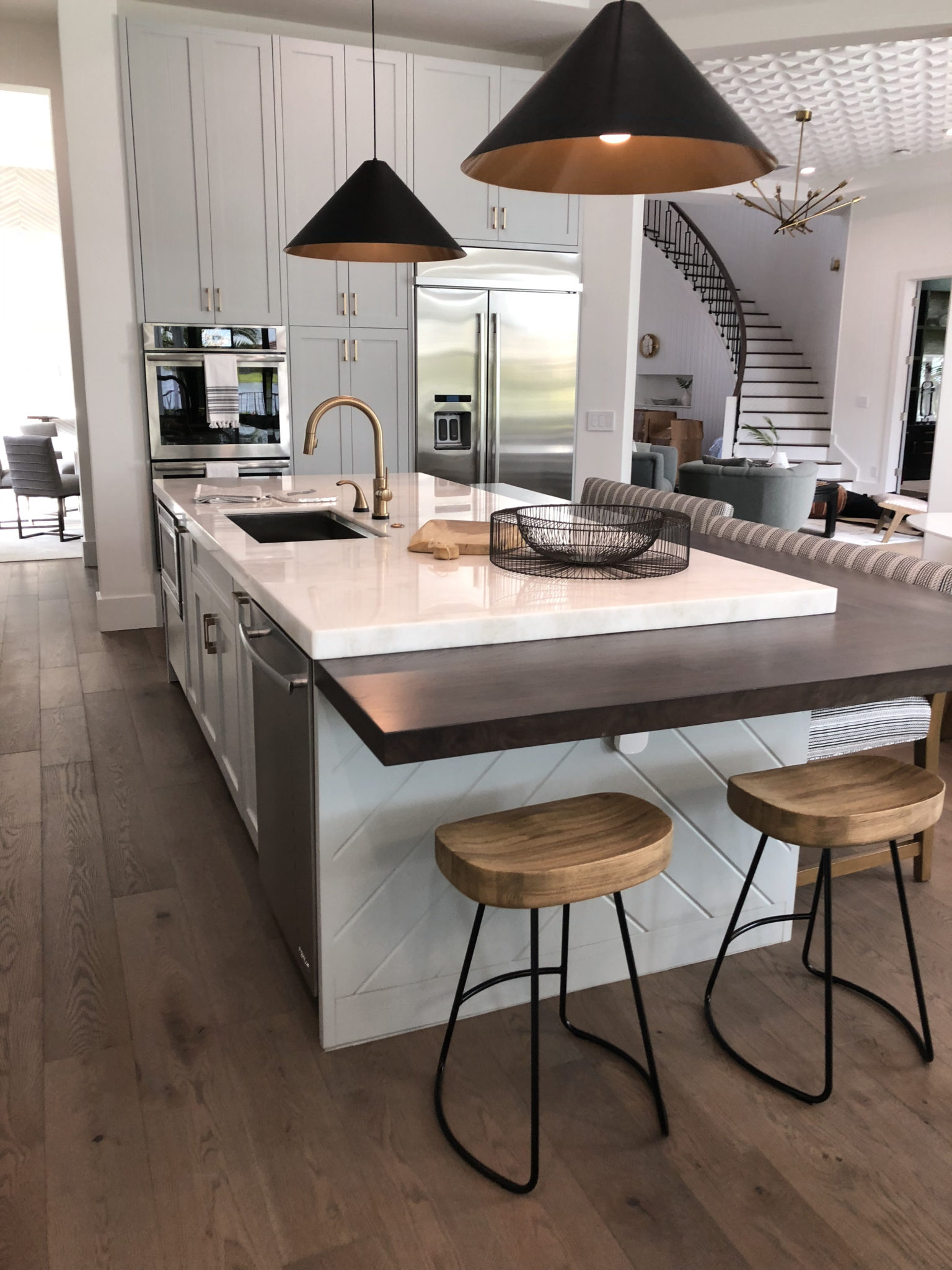
2020 Residential Excellence in Design (RED) Award: Interior Design by Krista Watterworth Alterman, Photo by Jessica Glynn
BATHROOM
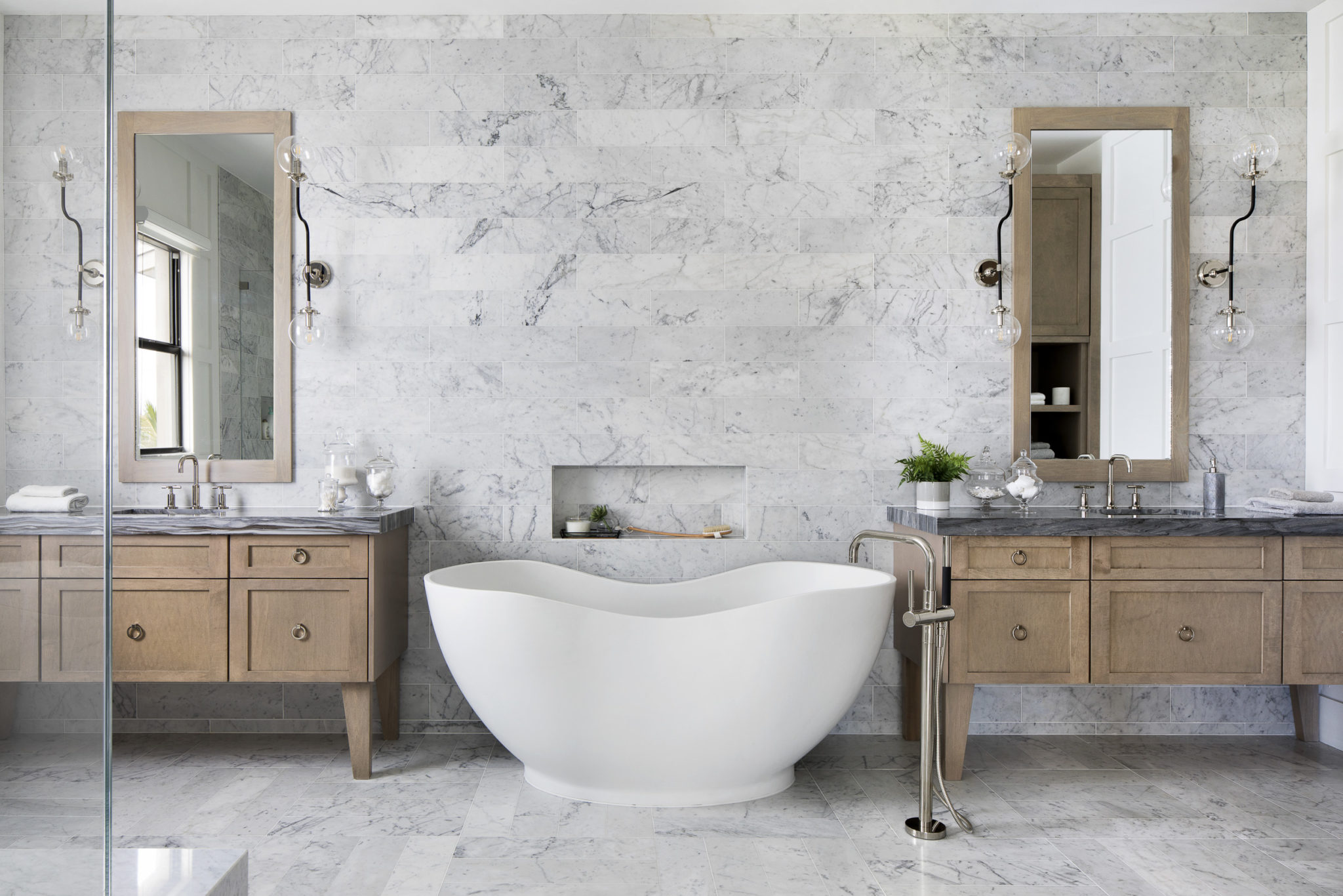
2020 Residential Excellence in Design (RED) Award: Interior Design by Krista Watterworth Alterman, Photo by Jessica Glynn
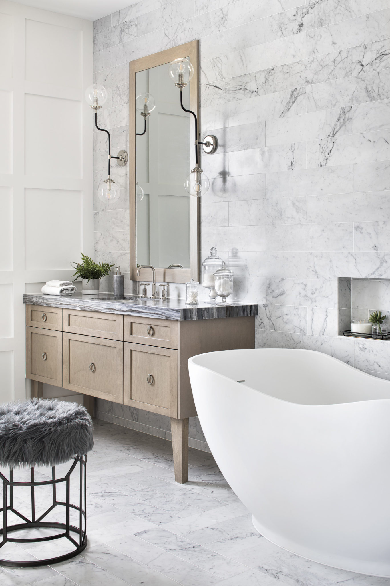
2020 Residential Excellence in Design (RED) Award: Interior Design by Krista Watterworth Alterman, Photo by Jessica Glynn
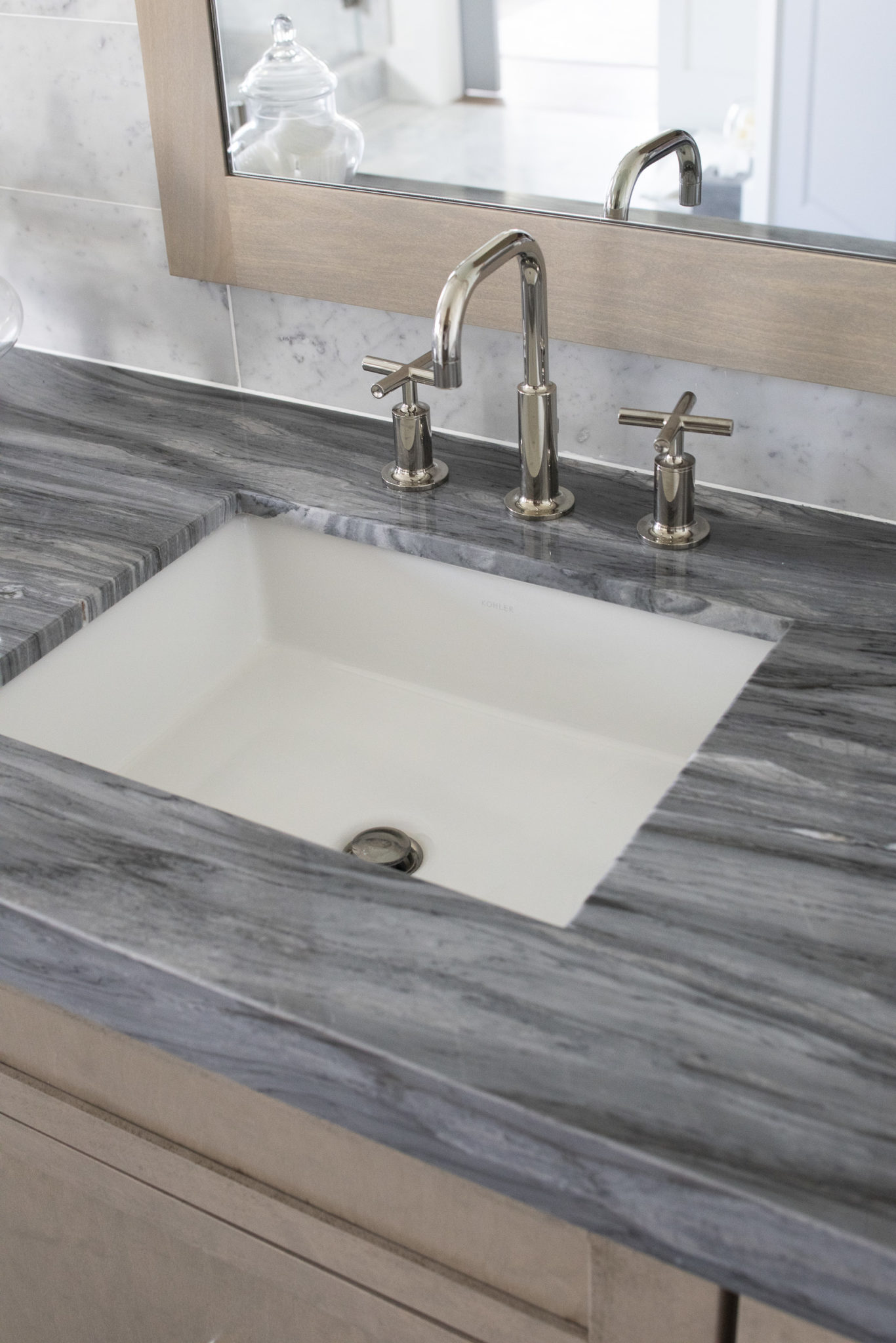
2020 Residential Excellence in Design (RED) Award: Interior Design by Krista Watterworth Alterman, Photo by Jessica Glynn
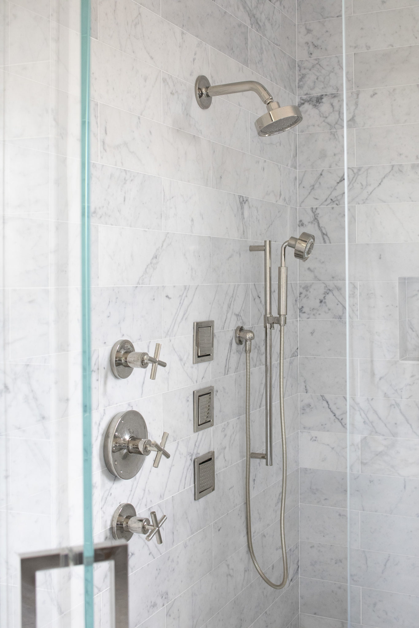
2020 Residential Excellence in Design (RED) Award: Interior Design by Krista Watterworth Alterman, Photo by Jessica Glynn
Why I Love Round Dining Tables
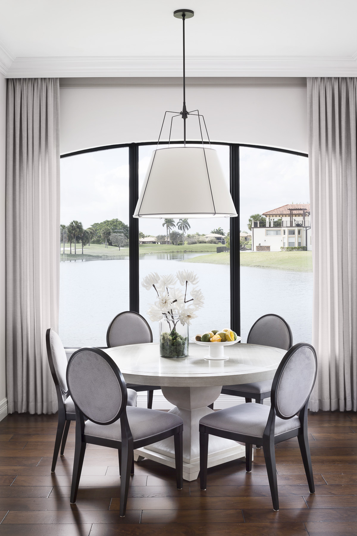
Back in the days of King Arthur a round table meant that everyone seated had equality. There was no “head” of the table and no one person had more importance than another. I love this concept for the modern family! A round table truly is the best option for personal interaction. It fosters great conversation and puts everyone on equal playing field. I love them in restaurants and I love placing them in my designs.
A big bonus to having a round table is that it is easier to get in and out of your chair! Round tables really create better flow in a space than traditional rectangular tables. I also just love the look of a circular silhouette in a room. There are no hard edges or sharp corners.
They are also a great solution for intimate spaces. A round table looks smaller in a room, but it can still provide ample seating. Since there are no corners to take up space, a round table has a smaller footprint in a room. And since they are slightly angled, you are not shoulder to shoulder with other people as you would be at a rectangular table.
So, what size should you get? A general rule of thumb when purchasing a round table is that a 48″ round will seat 4-5 people, a 60″ will seat 6 people and a 72″ will seat 8 people. Make sure to choose some fabulous chairs that are comfortable and easy to clean! I love to use beautiful high performance fabrics on dining chairs to get that livable and luxurious vibe my clients crave.
A Modern Nursery for Baby Girl
This client mom-to-be had definite ideas about how she wanted her firstborn daughter’s space to look. She was so excited to be having a girl and wanted a nursery that was ultra feminine. But she also wanted something modern and fresh, and I definitely agreed with that direction! Blush happens to be a very popular color now in home decor, so I chose a palette that was more on the soft blush side and not the traditional bubblegum pink that you see in many baby nurseries.
Now, I have two little ones of my own so I knew how this space needed to function. It had to be ultra comfortable and soothing, filled with beautiful design elements and soft lighting.
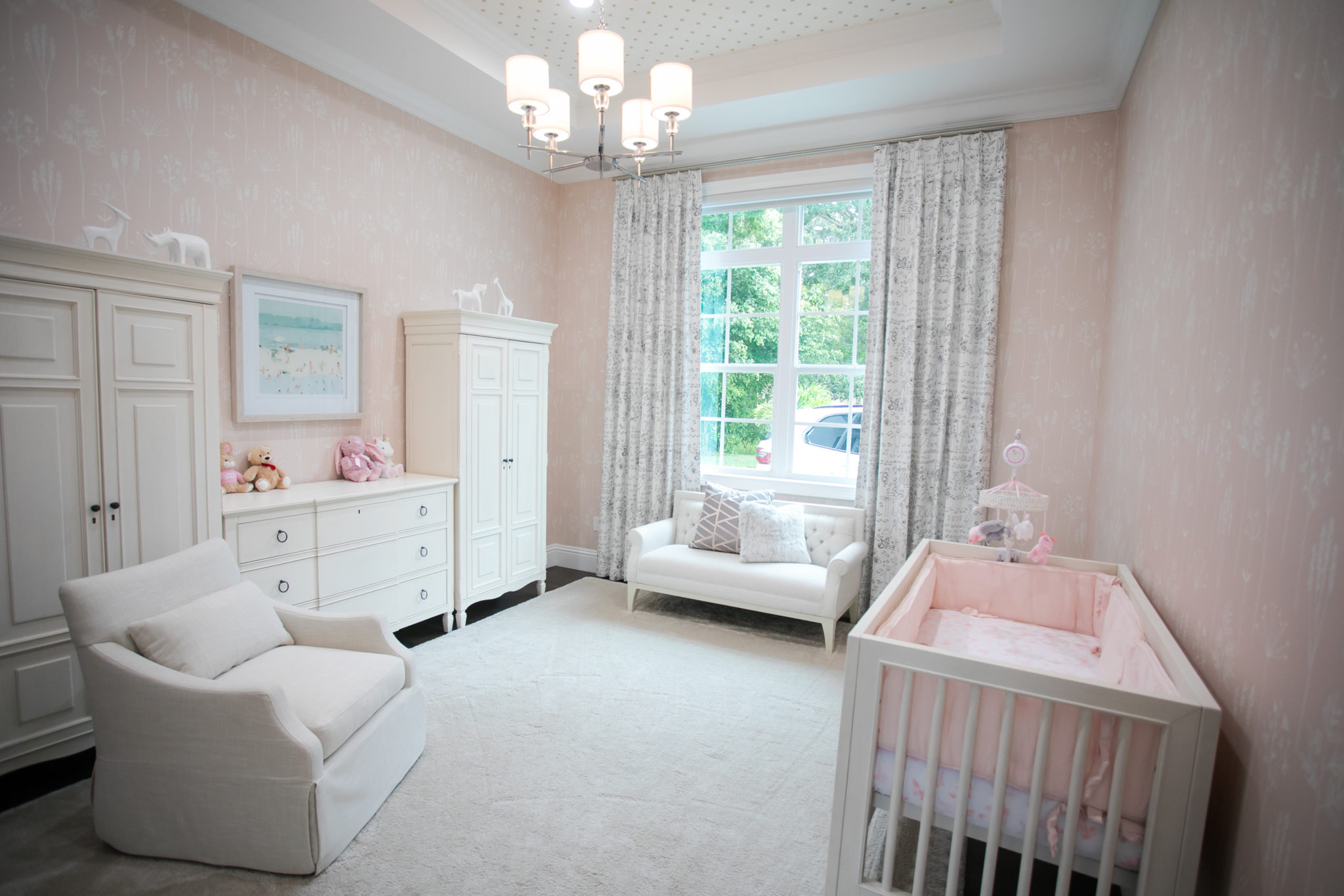
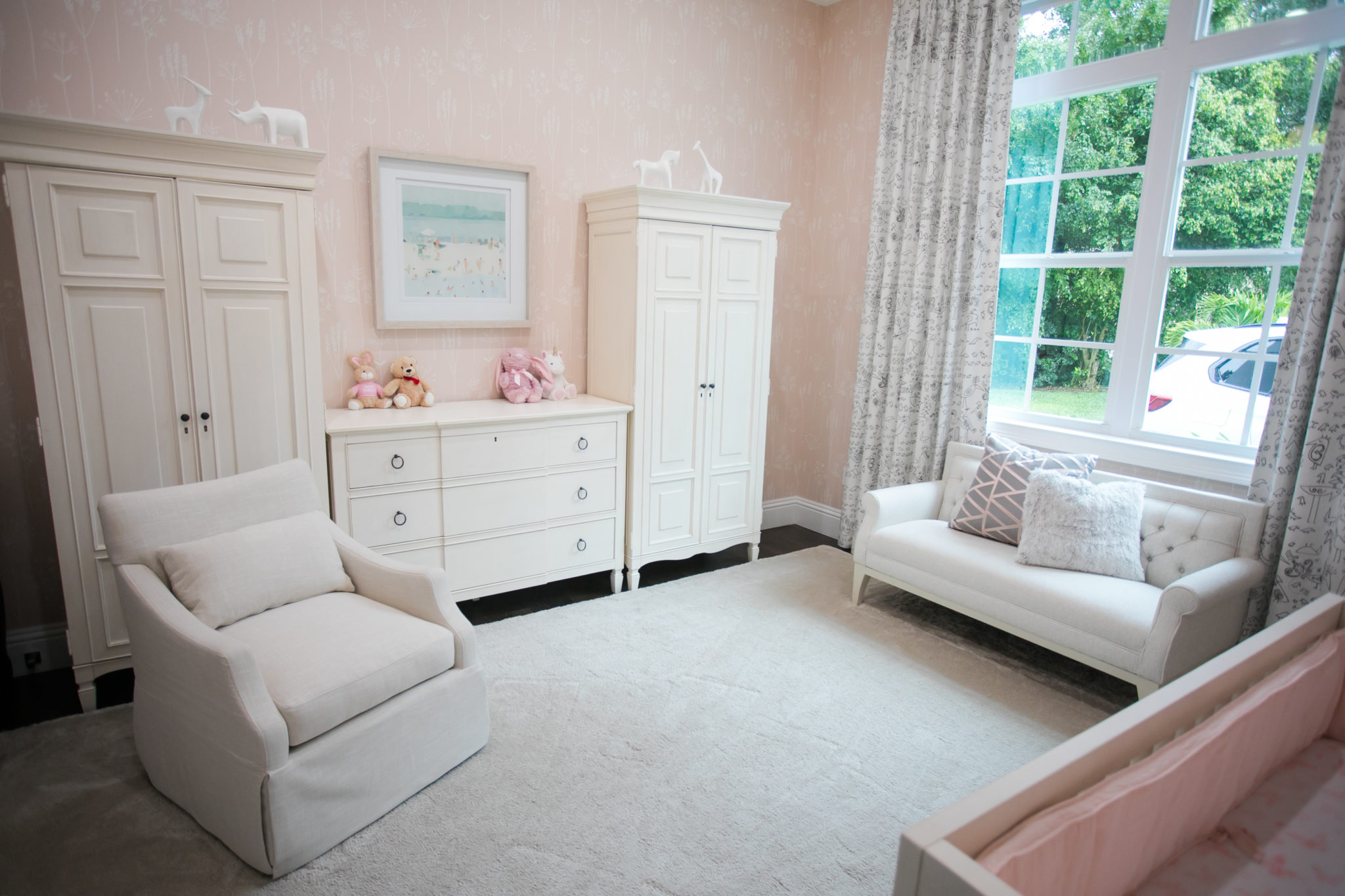
I love the wallpaper detail we did on the ceiling, it really makes a statement! And the elegant chandelier adds a truly feminine touch. We added ample storage with the crisp white matching cabinets and a dresser that can double as a changing table.
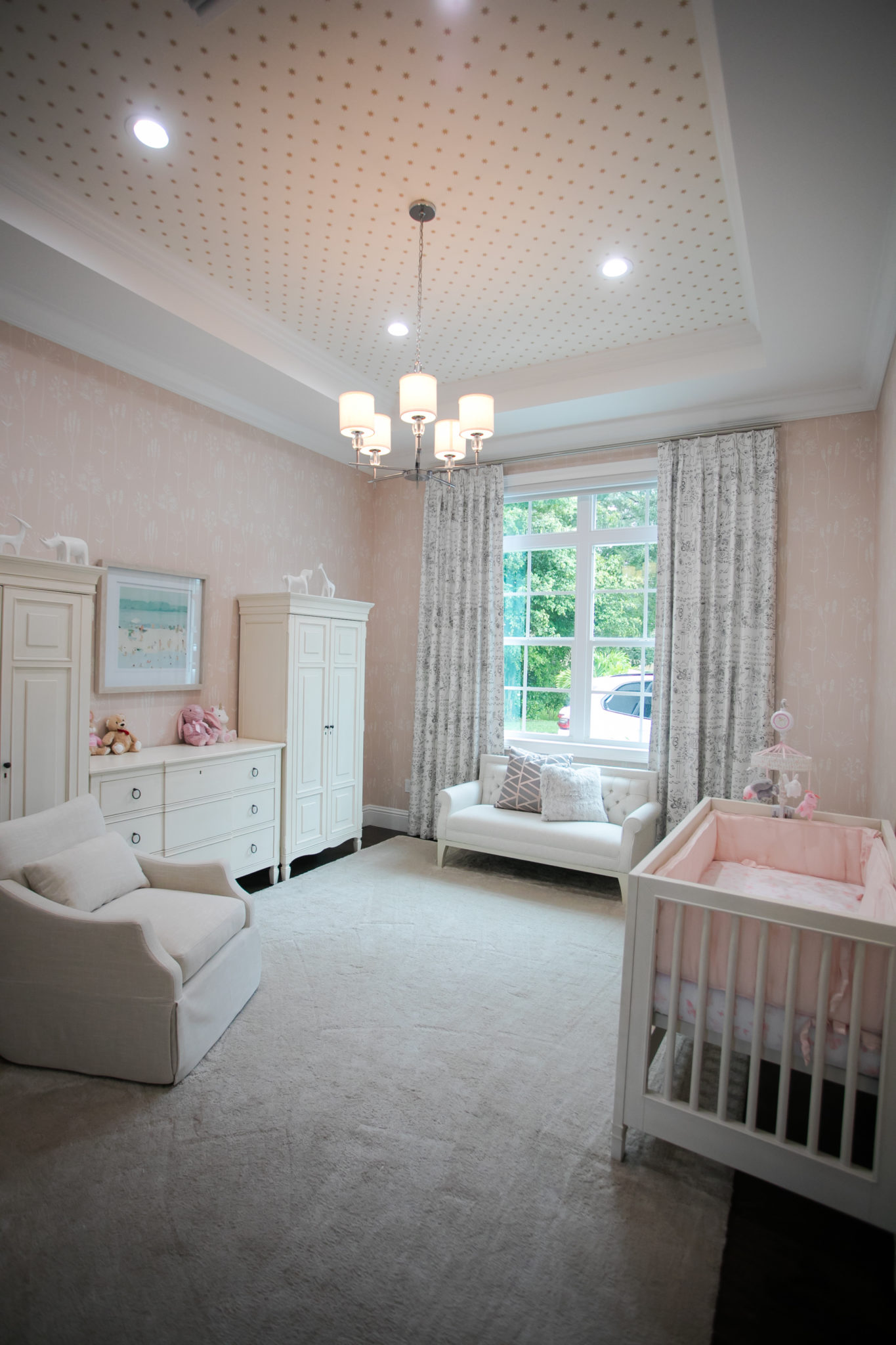
This rug by Stanton carpet is pure luxury for your feet! It is so incredibly soft. It really adds to the vibe of the space, making it feel luxurious and special.
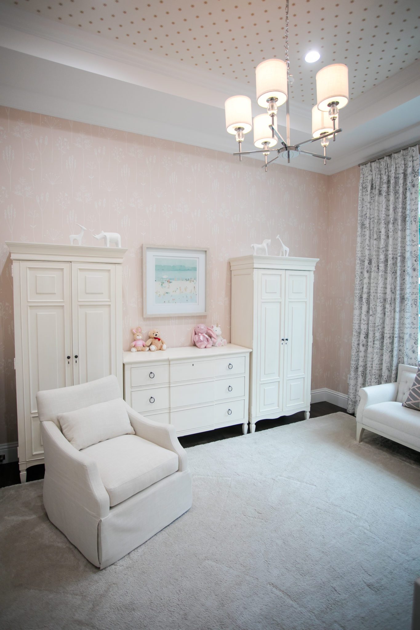
Comfortable seating is a must! I love that there is ample seating for both mom and dad to enjoy baby comfortably. The settee by Bernhardt Furniture works perfectly in this space.
My favorite design element in the nursery might be these drapes! I love the whimsical print and the little pop of black against the white fabric really works with the blush.
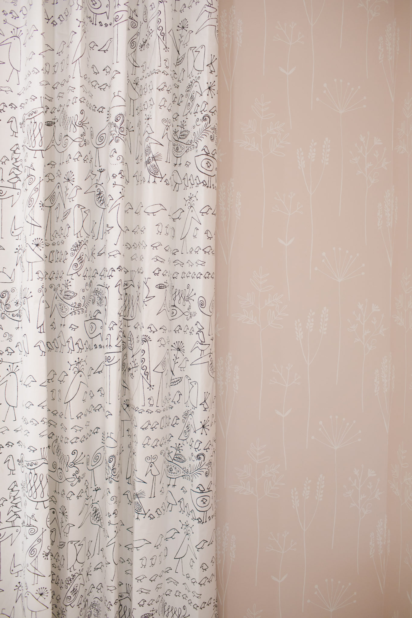
I love wallpaper in children’s spaces and this print really complements the drapery perfectly. A great example of how prints can work together.
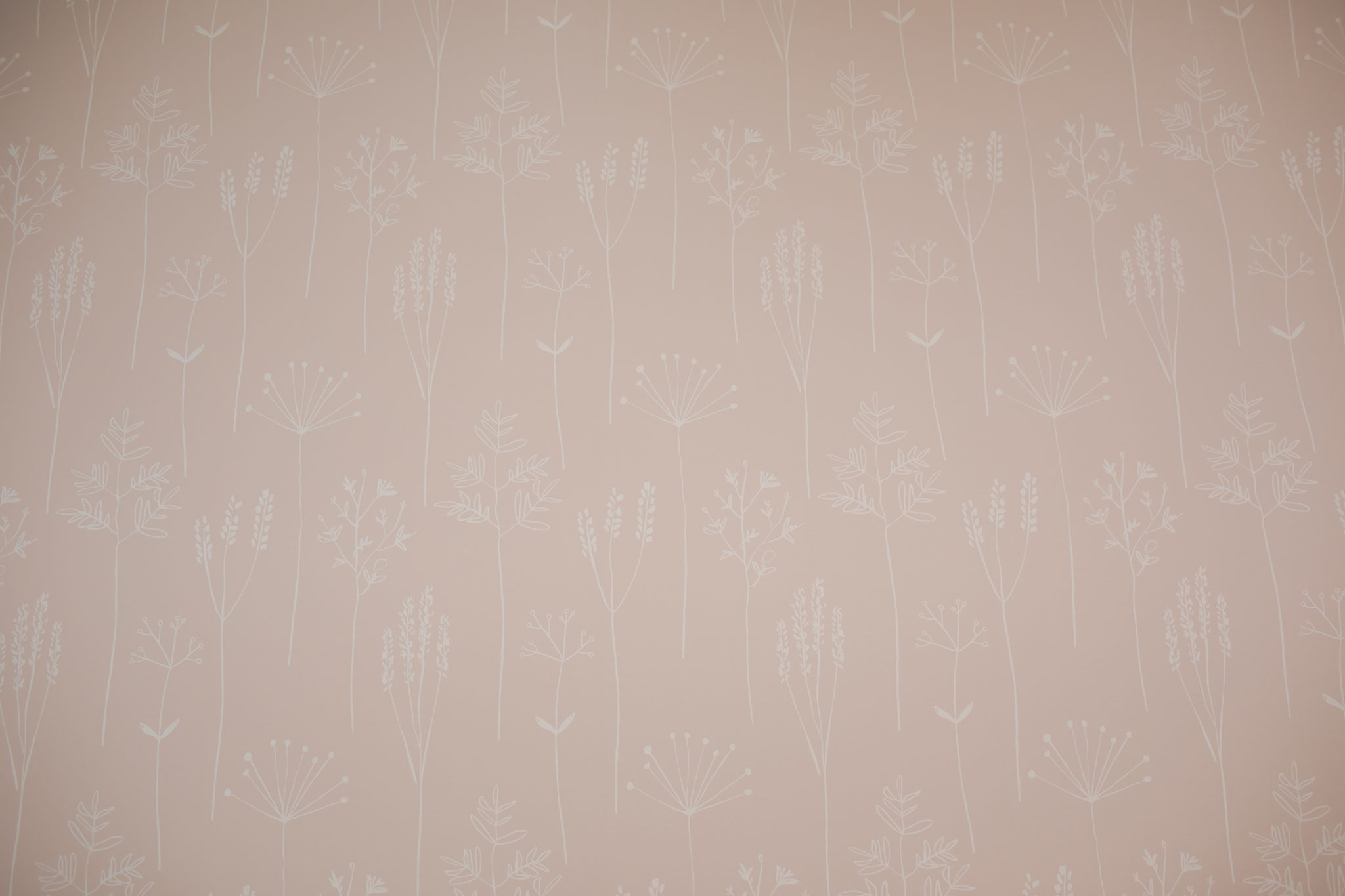

We can’t wait to meet this sweet bundle of joy and hope she loves her nursery!
Settee: Bernhardt Furniture / Wallpaper (wall): Scion / Fabrics: Schumacher/ Rug: Stanton Carpet / Art & Accessories: Uttermost /
Armchair, Cabinets, Crib and Dresser: Universal Furniture
My Favorite Entryway
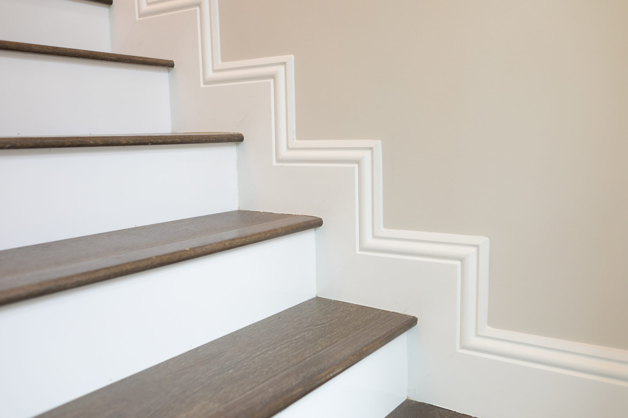
The entryway of a home is so important! It sets the vibe for the entire space. It was such a joy to design the entry for this home in Palm Beach Gardens, Florida. The entry is flanked by a stunning staircase, which is really the perfect backdrop for this space. It adds stunning architectural and artistic detail to the entire entryway. Lots of wow factor!
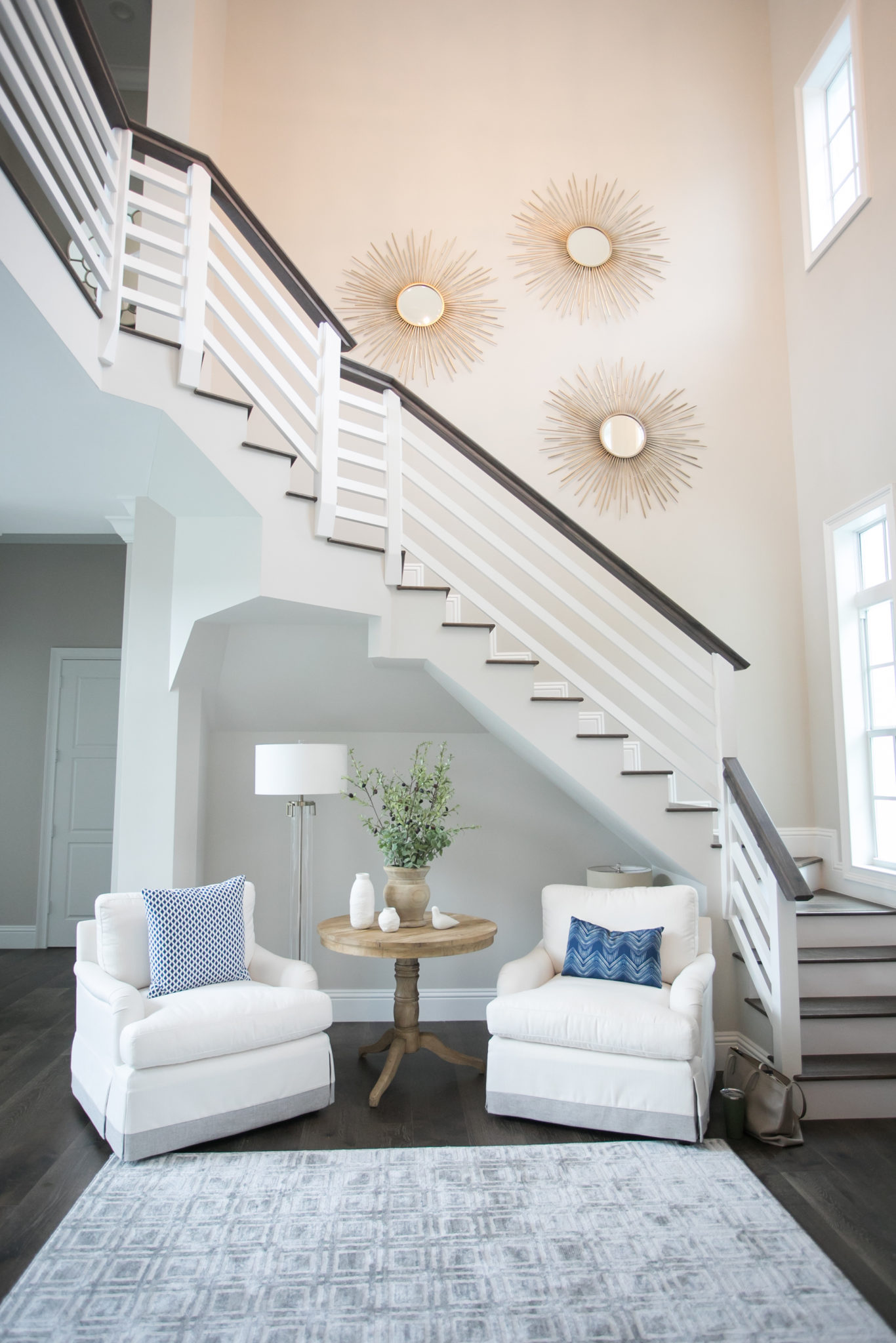
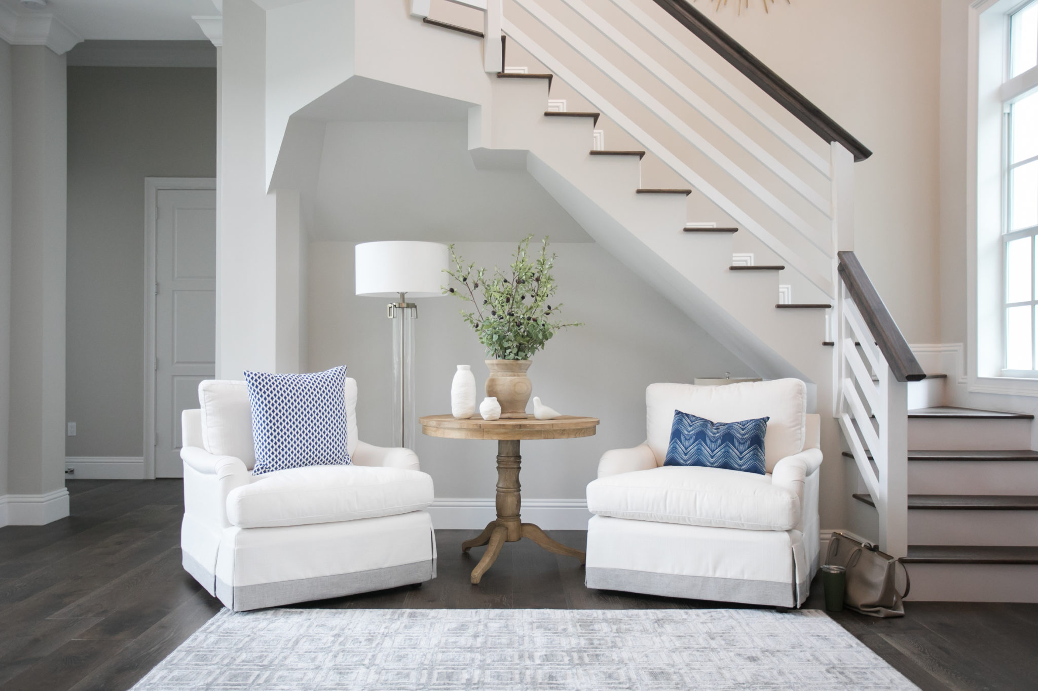
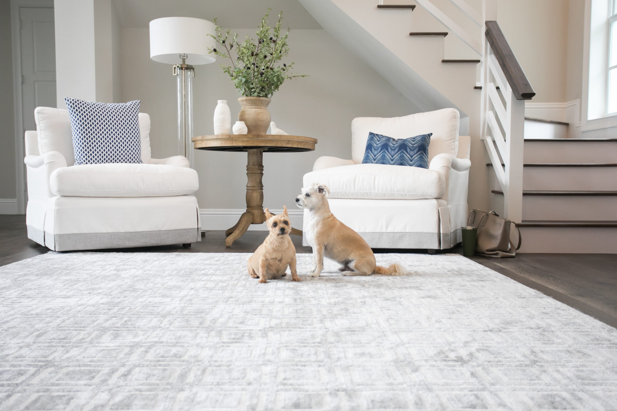
I decided to create a comfortable seating area where the homeowners could sit and enjoy the gorgeous and airy space. It’s the perfect spot to relax with a book or ipad and enjoy the gorgeous view. Not pictured are the floor to ceiling picture windows off the living room.
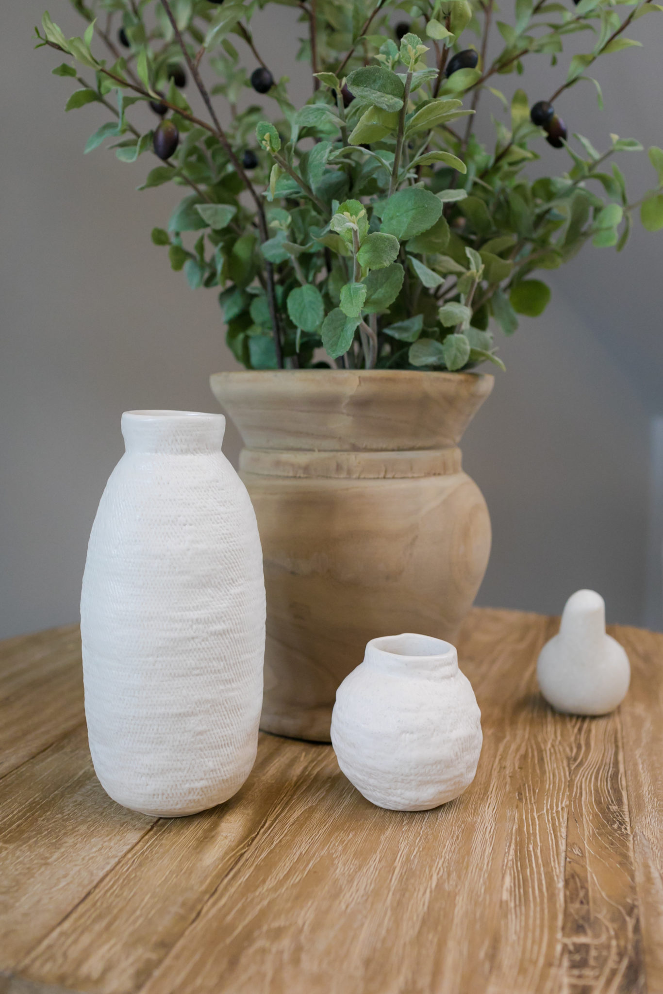
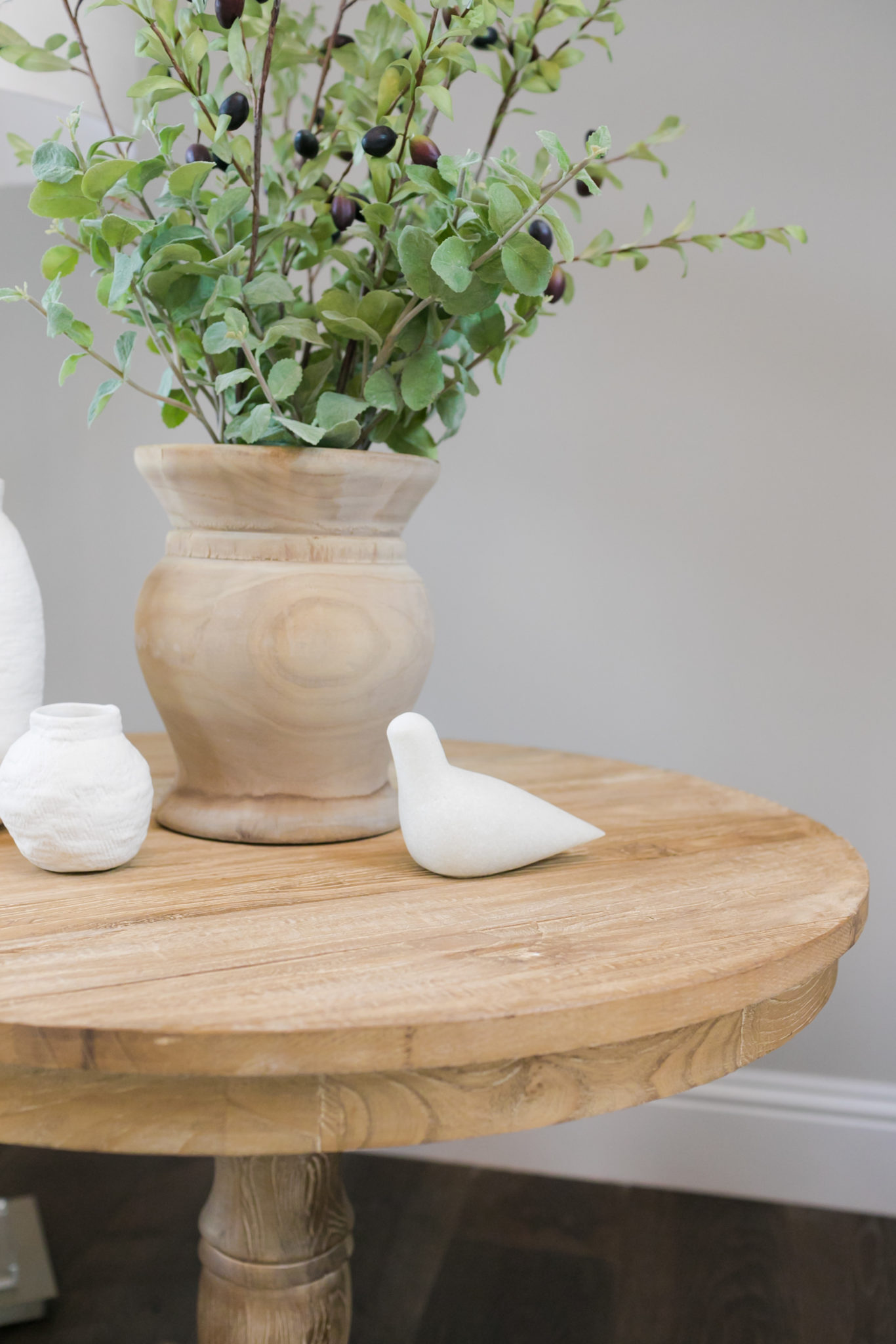
 The final accessories really add that finished look and I love this chunky pottery that we chose to don side tables and shelves throughout the home. The crisp white adds a nice contrast on the farmhouse wood.
During our photo shoot, we had a couple of adorable furry friends following us from room to room. It really added a fun and happy vibe to the shoot. These doggies are the cutest!
The homeowners love blue and white and we added some beautiful blues with the fabrics on the pillows. In the photo below, you also get a peek of the show stopping chandelier…a must for any entryway!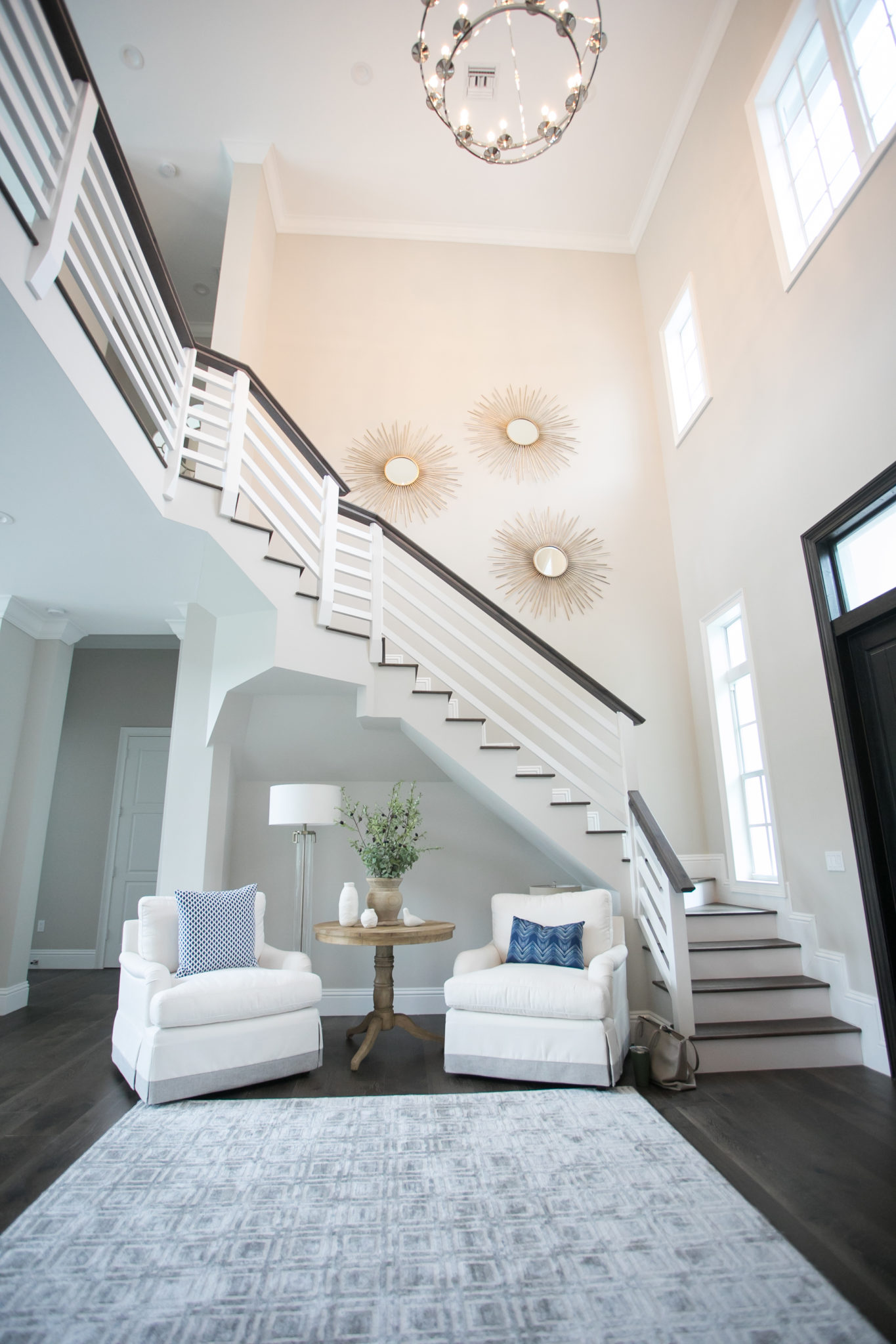
This is one of my favorite entryways, and I can’t wait to show you the rest of this beautiful home! Next up…the nursery.
New Retail Workspace!
I am so excited to report that KRISTA + HOME is growing and moving into a brand new retail workspace! We are stoked about our new location in Palm Beach Garden’s Donald Ross Village, right next to the popular Coolinary Cafe…perfect for team lunches! I brought the family by for a quick tour over the weekend.
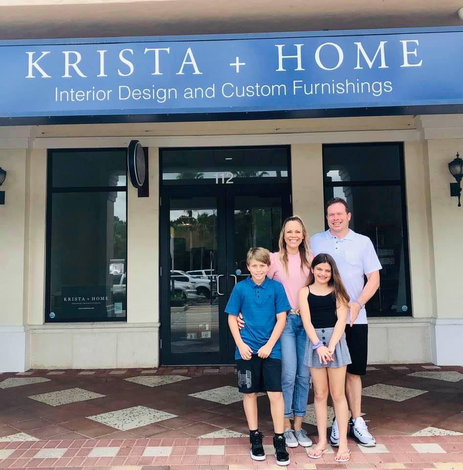
Construction is in progress and I can’t wait to reveal the final space very soon. Here is a sneak peek.
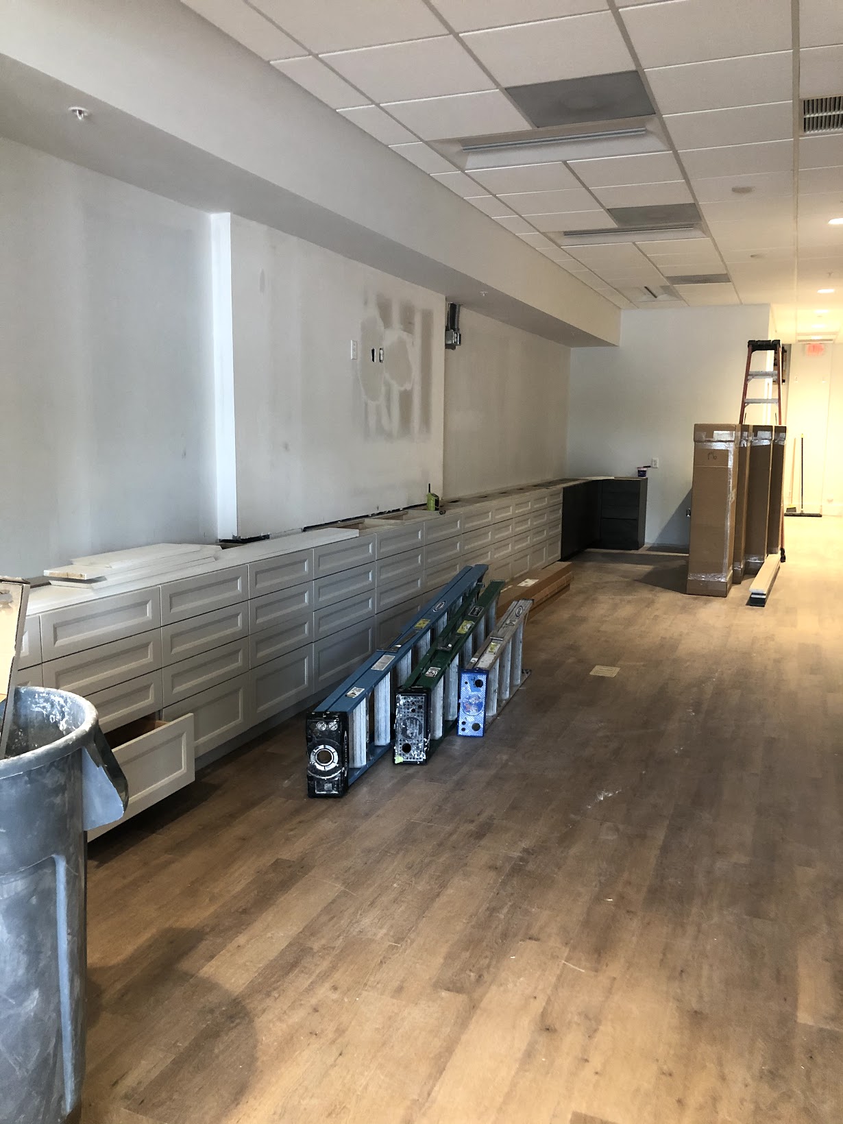
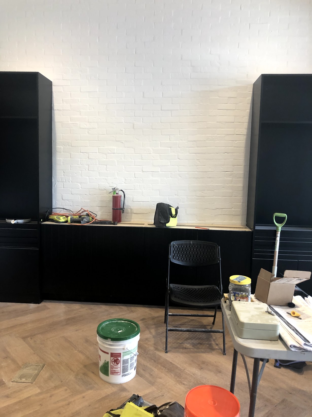

The new space will feature state of the art kitchen and bath by Kohler and SubZero with stunning cabinetry by Rachel Eve and countertops by OpusStone. Custom designed furniture from our Krista + Home line will be available to purchase.
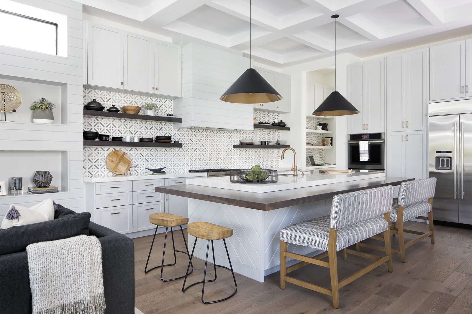
The new space will enable us to move into selling customized and curated product, which I am very excited about. More details coming soon!

The one item that can TRANSFORM a room…
Drapery is my jam!! The one item that can completely transform a space is drapery. Adding drapes immediately warms up a space and gives it a designer look. Drapes are a great way to add a happy snap of color or to add prints and texture to a room. And drapes are, of course, functional. They block light, provide privacy, create darkness and add a layer of insulation to your windows. They can also help with acoustics in a space and block out sound.
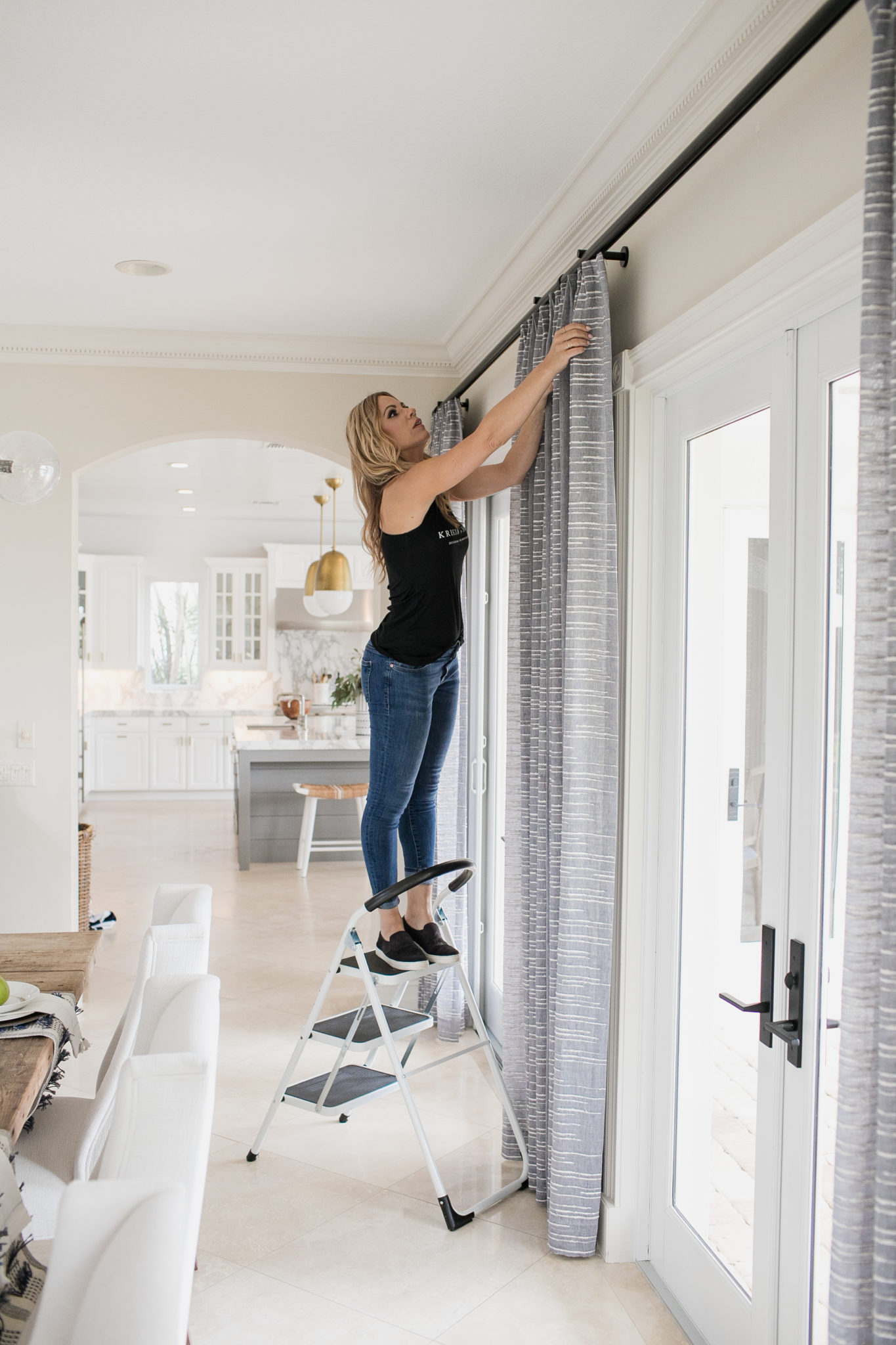
Interior Design by Krista Watterworth Alterman
Most of the drapery that I use for client homes are custom made, but there are many beautiful options available in stores as well. I have been known to purchase from West Elm for my own home. Measure first, though! A common mistake that homeowners make when purchasing store-bought drapes is to buy them without first measuring the height of the wall. I like the drapes to go all the way down to the floor…they should “kiss the floor” as I say!
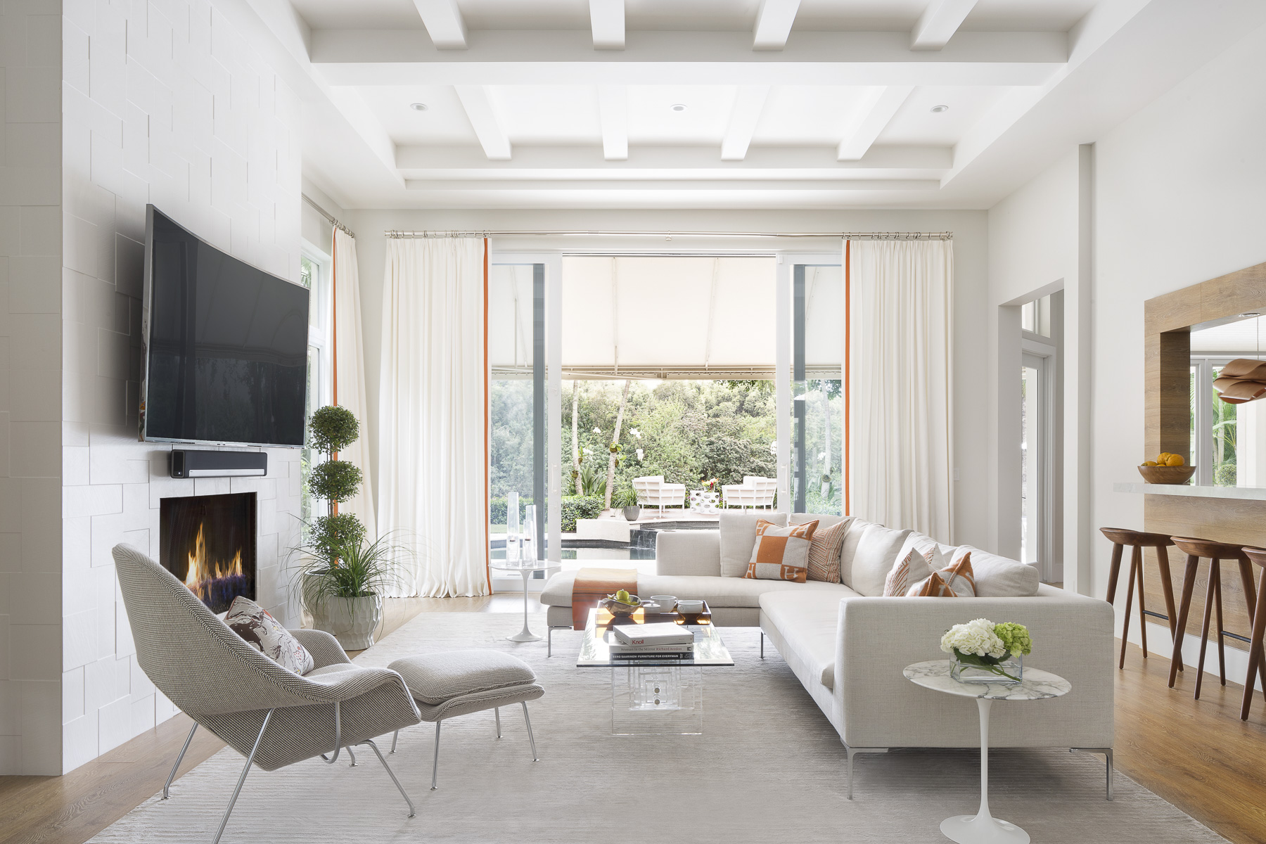
Interior Design by Krista Watterworth Alterman. Photo by Jessica Glynn.
My number one tip for adding drapery is to hang them high! At least 12 inches above the window is the general rule. Never hang them right above the window frame. This lets in less light and can give the space a crowded look.
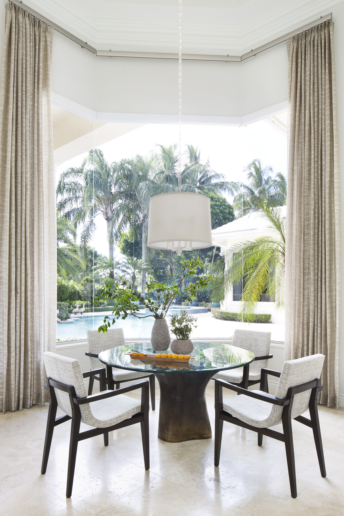
Interior Design by Krista Watterworth Alterman. Photo by Jessica Glynn.
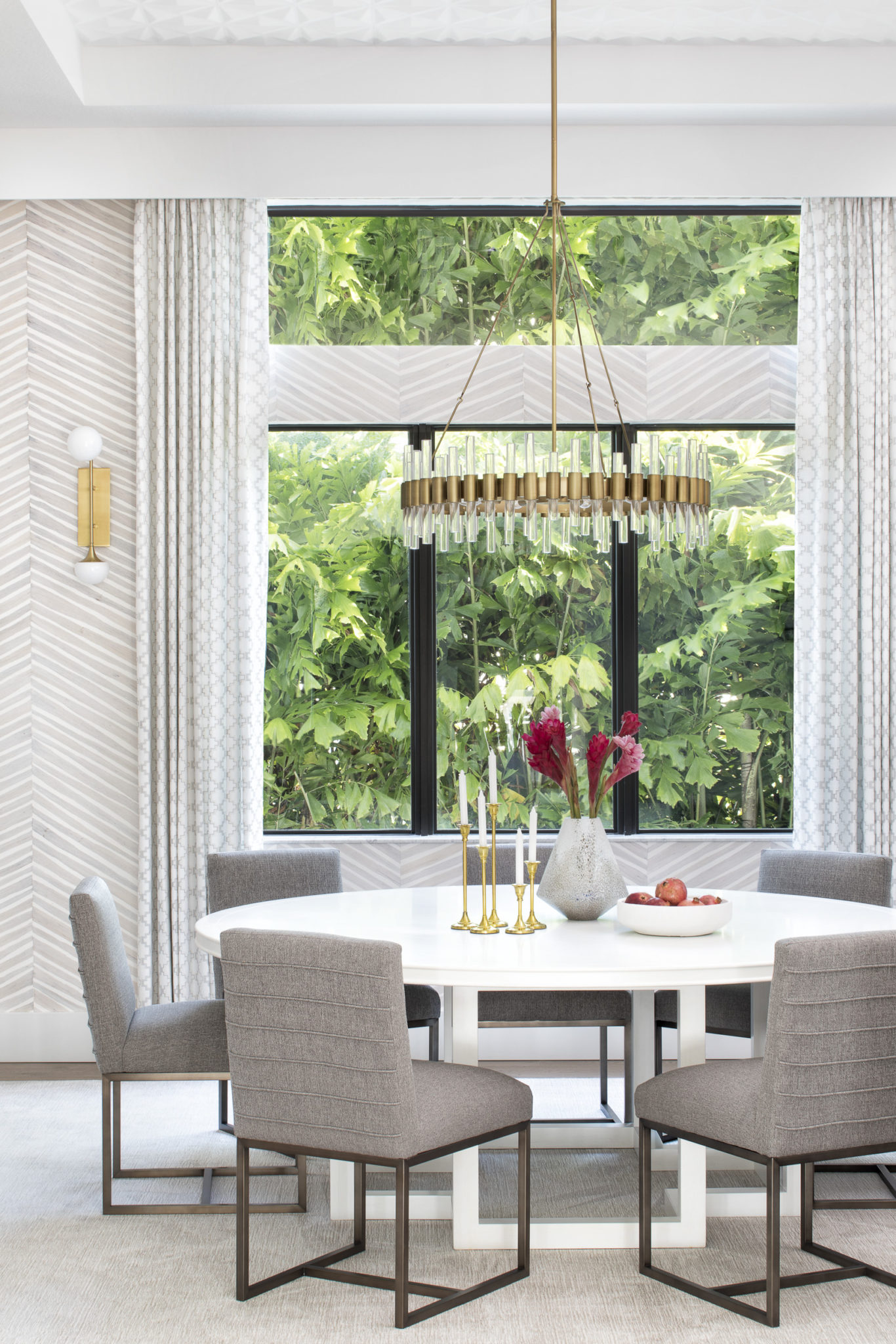
Frame up the view! If you have windows with a view, adding drapes is the perfect accent to really get the most impact. Framing the windows make the windows the focal point of the room, which will add wow factor. Designing in South Florida, many of my clients have beautiful views of the ocean, pool, or beautiful tropical foliage, like in the photo below.
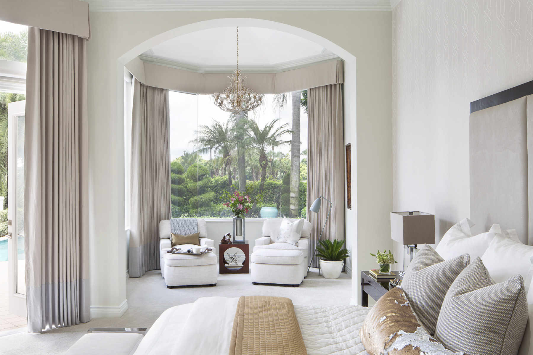
Interior Design by Krista Watterworth Alterman. Photo by Jessica Glynn.
I absolutely love the layering of light and feathery side panels. I am always a fan of sheers, as they create a graceful and soft vibe. They are not great for privacy, however…so keep this in mind when choosing your fabric.
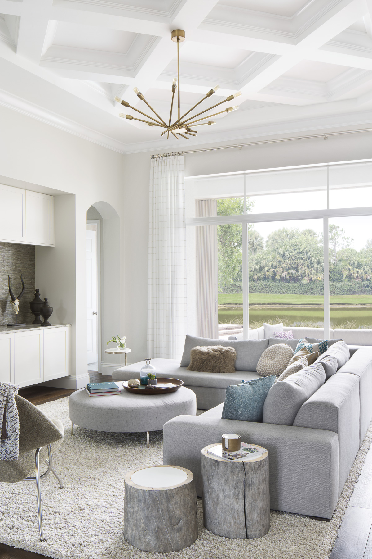
Interior Design by Krista Watterworth Alterman, Photo by Jessica Glynn
How To Create Cozy Spaces In Your Home
While the quarantine has been challenging, I keep hearing about the silver linings and I really love that. People talk about cozying up in their homes with their families and taking a much needed pause to connect with each other. Cozying up with my family has been really wonderful and it made me think about what makes a space cozy. Here are a few tips and some of my favorite cozy rooms from my portfolio.
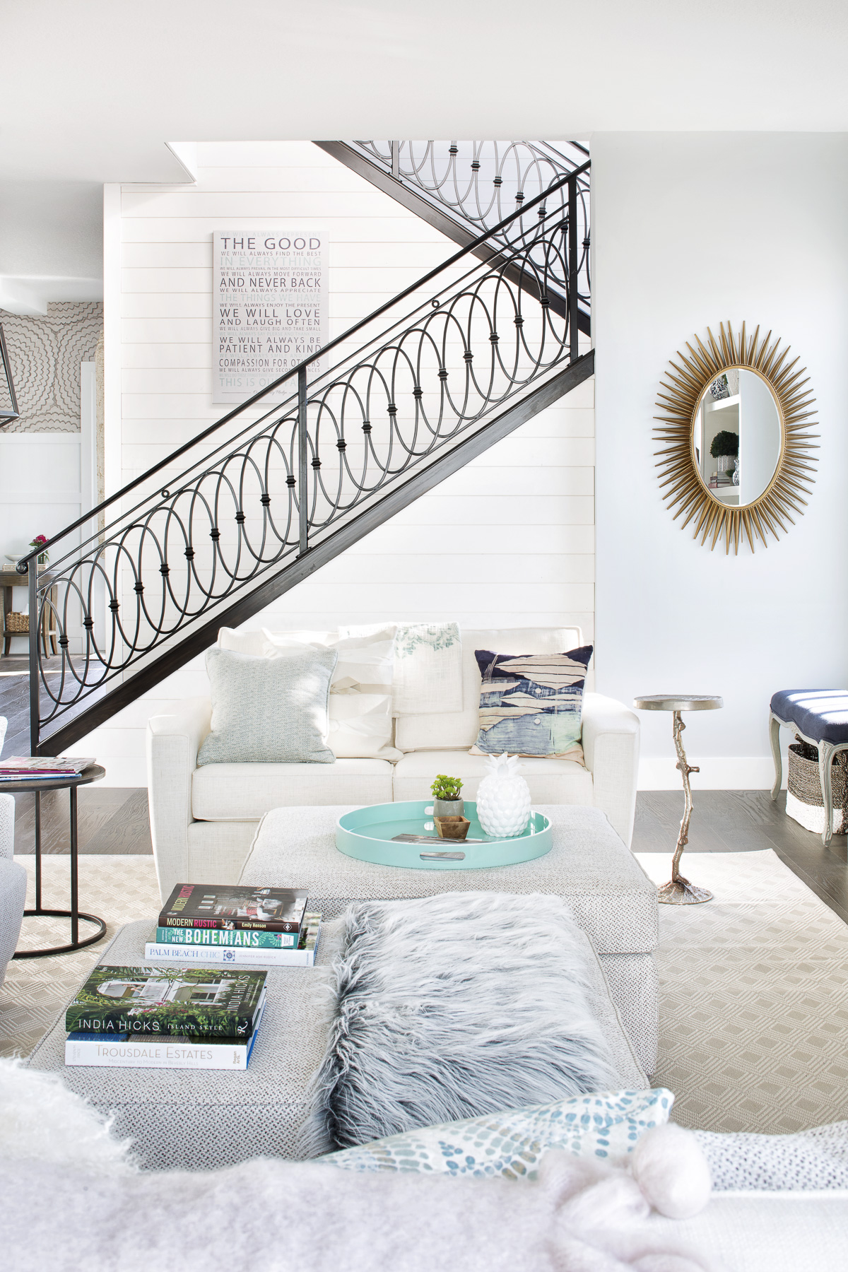
Interior Design by Krista Watterworth Alterman, Photo by Jessica Glynn
Comfort is so important! Pick an ultra comfortable sectional for your family to sprawl out on movie night. There are also many beautiful high performance fabrics available now, which are super practical. I am all about livable luxury…furniture can be high end and still work for families with young children.
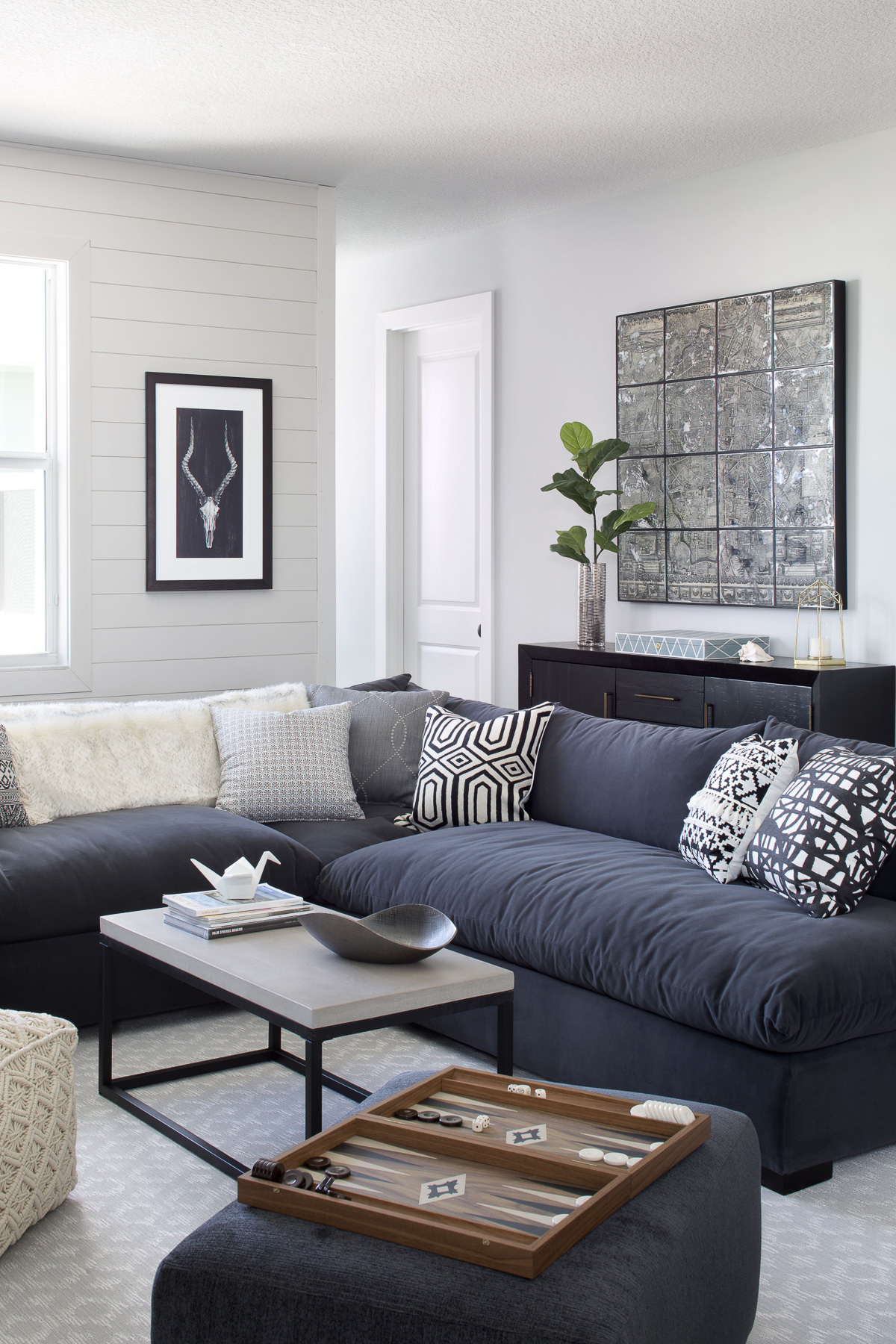
Interior Design by Krista Watterworth Alterman, Photo by Jessica Glynn
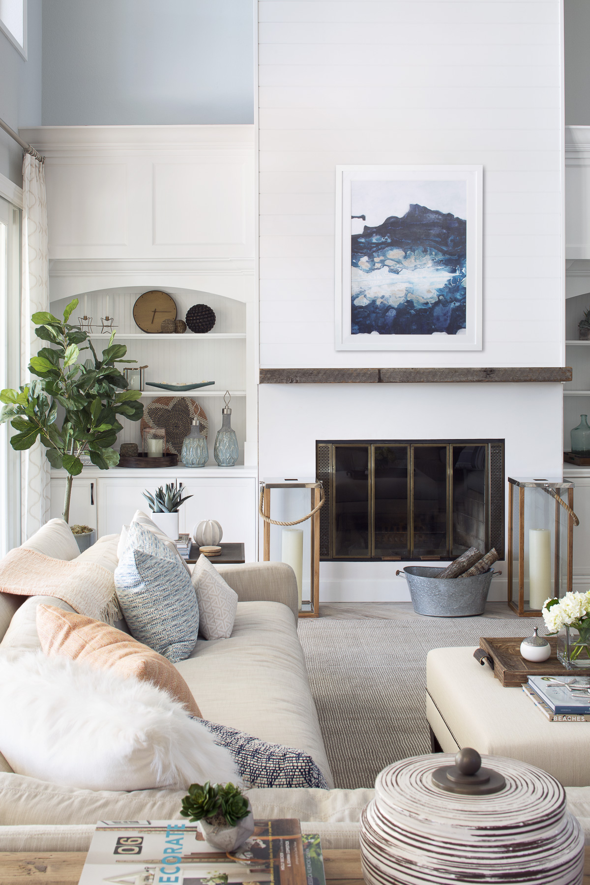
Create warmth with rich, textured fabrics that are cozy to sight and touch. I also like to use a warm palette of neutrals for color. A soft, plush rug will help to anchor the space and create a cozy vibe.
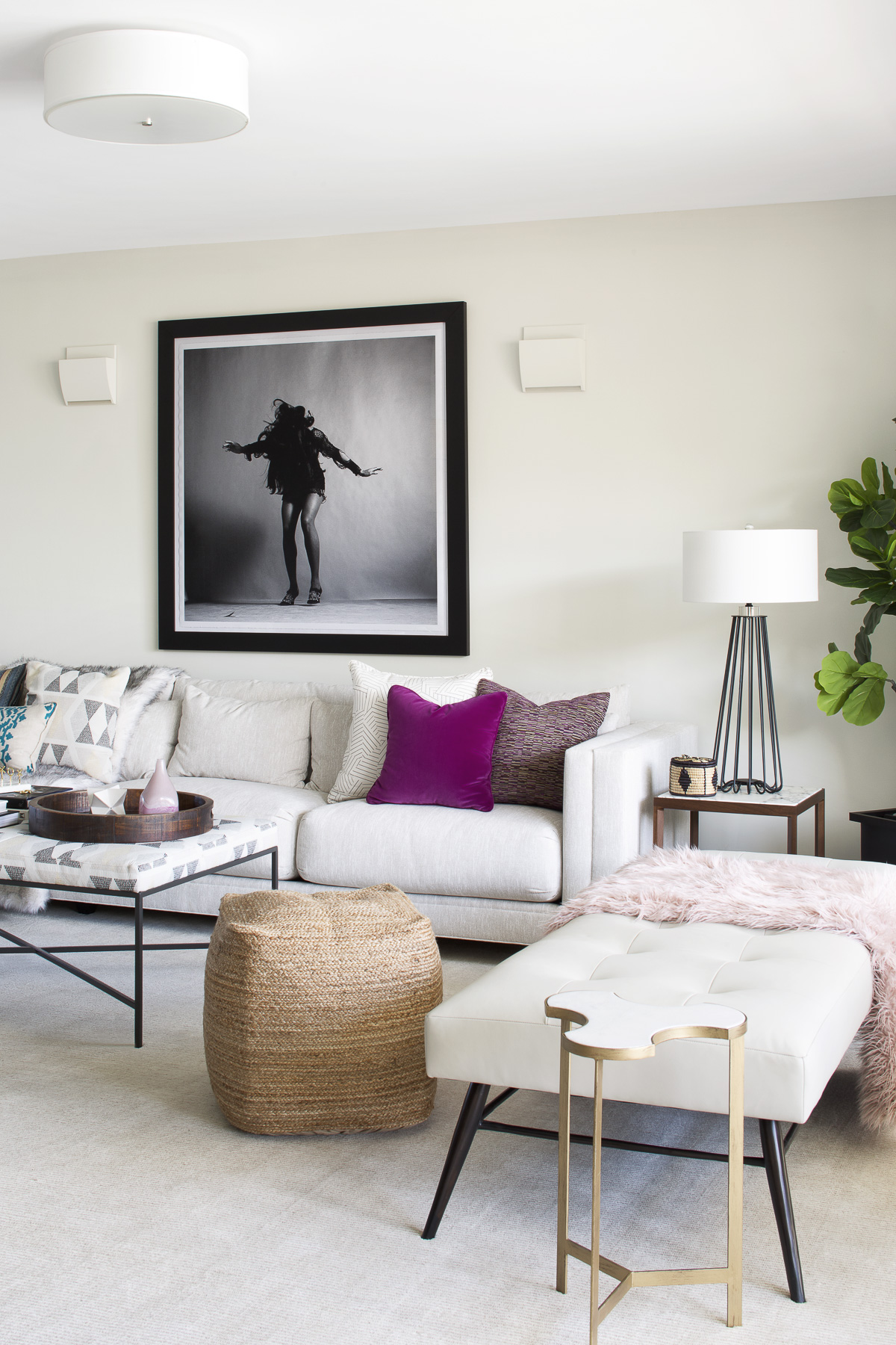
Interior Design by Krista Watterworth Alterman, Photo by Jessica Glynn
Sofas require an abundance of beautiful throw pillows and luxurious throws! For the pillows, look for pieces that are luxuriously overstuffed and use a variety of sizes and shapes to create visual interest.
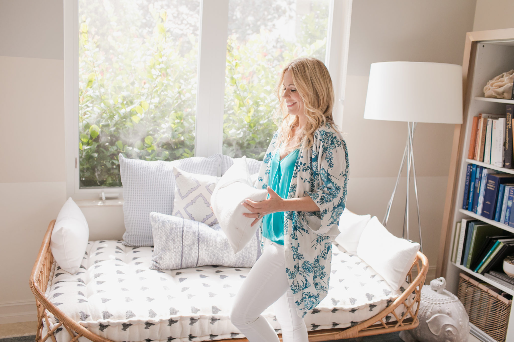
Lighting is key to a cozy space. Install dimmers on your lights and the right light bulbs can make all the difference! For a warm glow, use a soft/warm white bulb that is 2,700 Kelvins or less. A variety of lighting sources is good too…think sconces and shaded lamps of different heights (floor and table).

Interior Design by Krista Watterworth Alterman, Photo by Jessica Glynn
Top 10 Tips for Using Zoom + Free Zoom Virtual Backgrounds
Who is using ZOOM for meetings?? We are! It seems everyone is. This is the state of the world now, so we may as well embrace it. I am encouraging my team to become virtual experts so we can keep our business running seamlessly without missing a beat. Zoom also works great for connecting with friends. I recently had a wine night Zoom with my girlfriends and it was so fun.
So, I know I said ten tips in the title, but I am actually going to give you eleven. My number one tip is….(drumroll, please)….Use a virtual background! They are so fun and you won’t have to worry about the room you are working in being tidy.
For a free gift to my blog readers, I am including several complimentary Zoom backgrounds you can download and use! It’s easy to use these backgrounds, just follow these simple instructions.
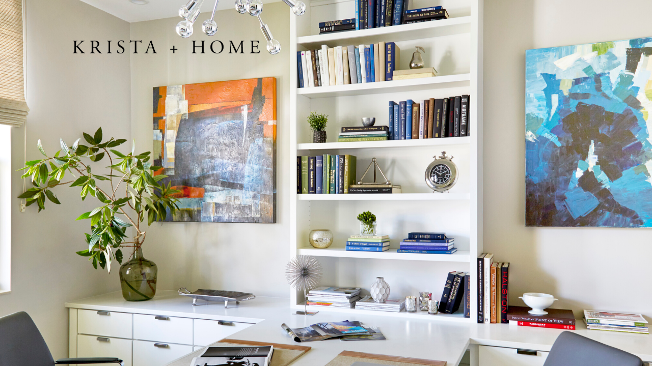
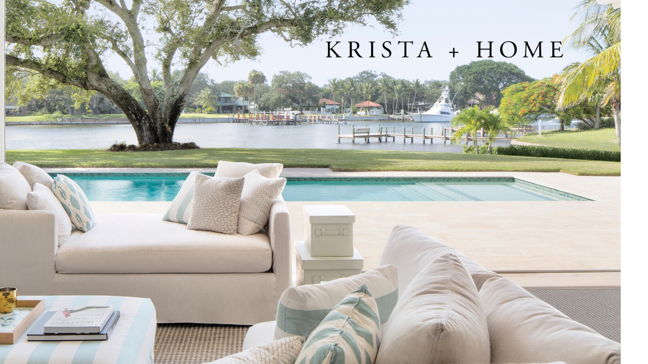
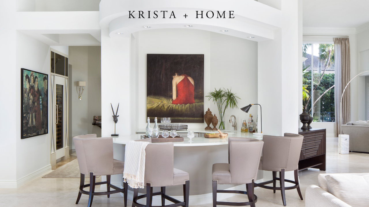
Feel free to use any of the backgrounds below for your zoom meetings. Please note that these backgrounds work best on a computer. We will have another post with versions for your phone coming soon!
MY TIPS FOR USING ZOOM
1. Make sure everyone coming to the meeting knows they need to download Zoom first. Have them test their equipment (video/mic) before the meeting.
2. Use the biggest screen possible for your meeting. I have found a desktop or laptop to be preferable to a phone or iPad
3. This is a BIG one….the mute button is your friend! Remind people to mute until they need to talk. No need for extra noise.
4. Wear pants! In all seriousness. sometimes people forget that everyone can see everything they are doing.
5. If you have a lot of people on it, use the “Raise Hand” option. It is so helpful.
6. Just rolled out of bed and have no makeup on? You can spruce up your appearance in the video settings. Just click “Touch up my appearance”. They will add a filter to your video to smooth out a few wrinkles and provide better lighting…how great is that? Also, if you really don’t want to be on camera you can just have your profile picture show up with audio instead of live video.
7. Have a moderator who checks in that everyone has had the opportunity to speak before moving from point to point or item to item. Some people’s internet connection may mean they need to be audio only and they will otherwise inevitably be spoken over without careful moderation.
8. In the free version of Zoom if there are 3 or more attendees there is a 40 minute wait limit. Plan your meetings accordingly.
9. Turn off your notifications! There is a great app called Muzzle that will do this for you.
10. The recommendation is to start meetings at off times, like 4:14 or 8:47 so as not to overwhelm the system.
I hope you enjoyed these tips and that you will have fun using the virtual backgrounds! Happy Zoom-ing! Feel free to download the free virtual backgrounds below!
Shop The Products in My Portfolio Photos
I have partnered with Wayfair, one of my favorite online resources, to make some of the products (or similar products) from my portfolio photos available to you. Enjoy!
Click to SHOP the Artwork here and here
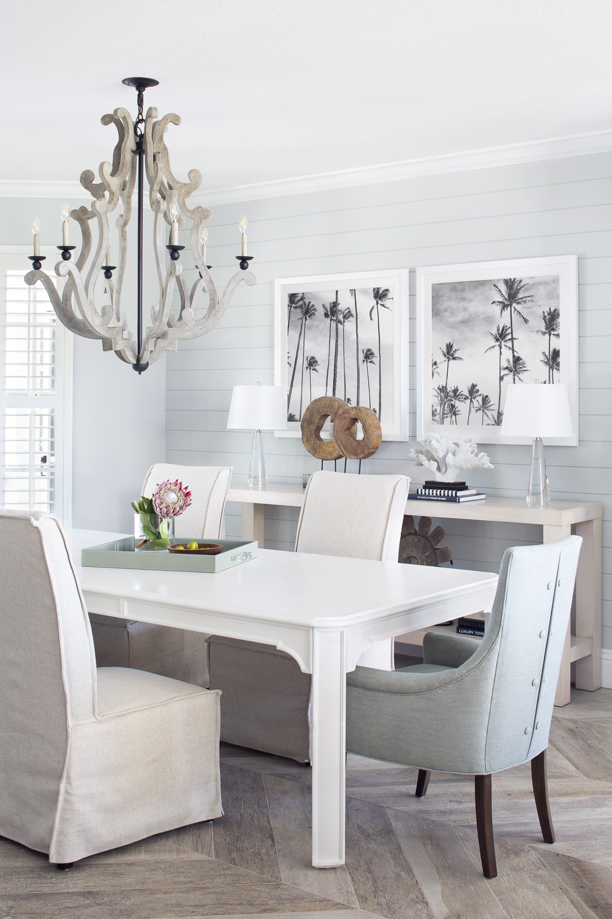
Click here to shop the chandelier
Click here to shop wood sculptures
Click here to shop palm tree prints
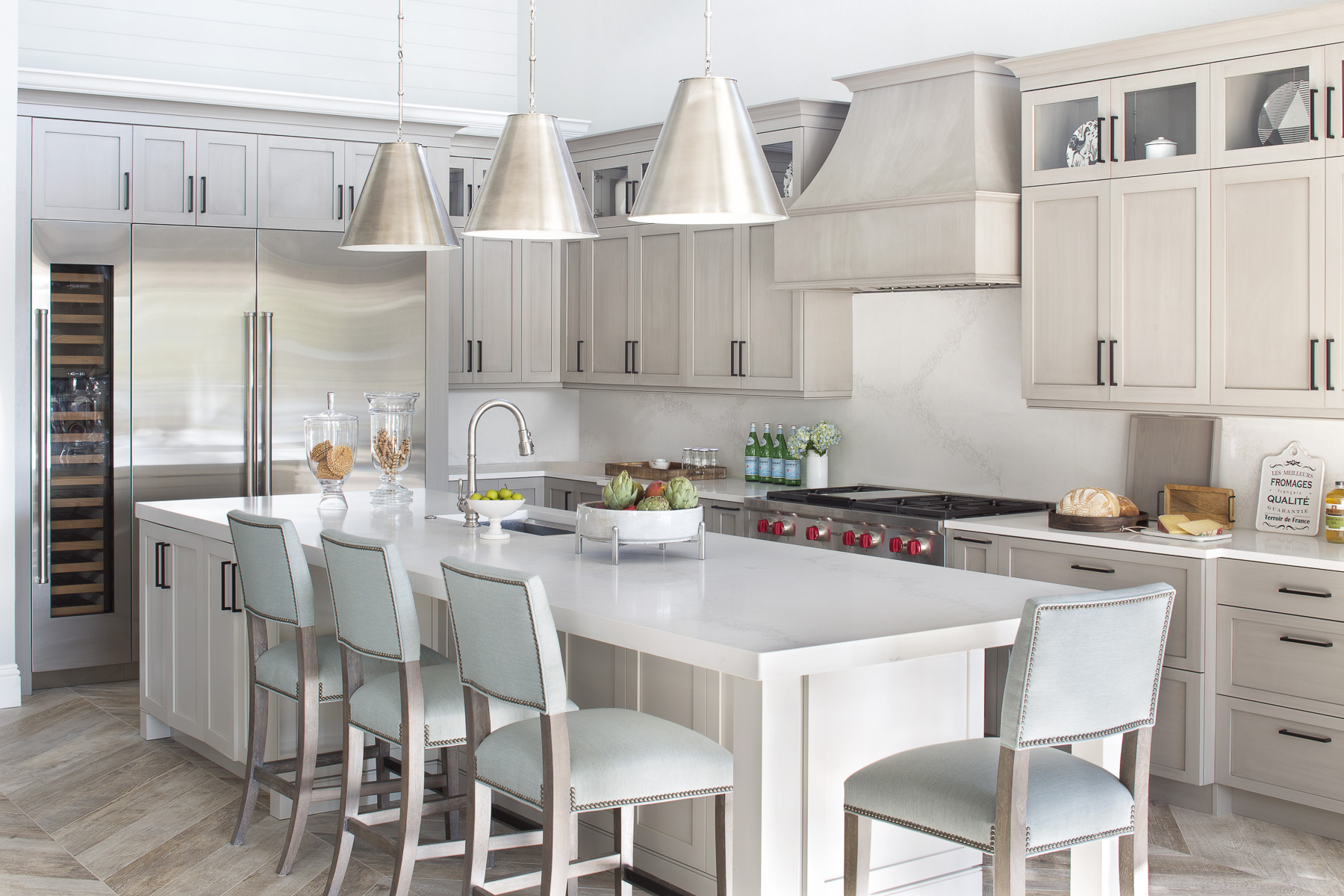
Click here to shop similar barstools
Click here to shop similar pendants
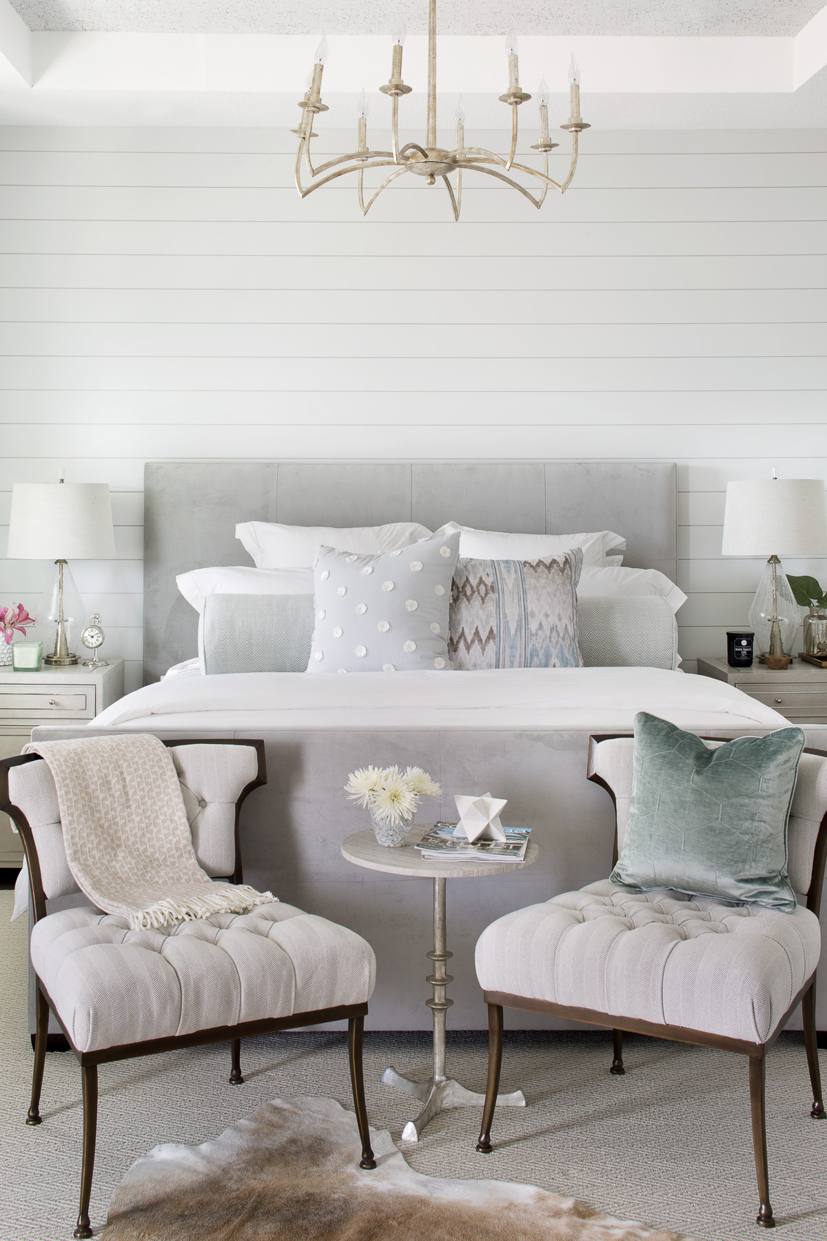
Click here to shop similar rug
Click here to shop similar chandelier
Click here to shop similar lamps
How To Stay Happy And Productive While Working From Home
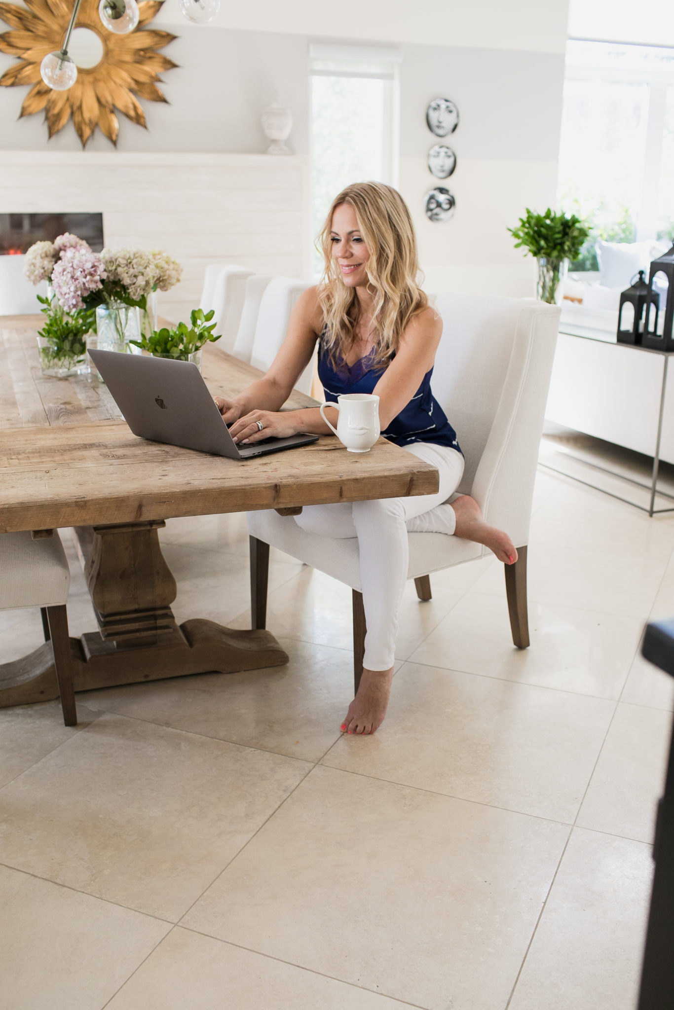
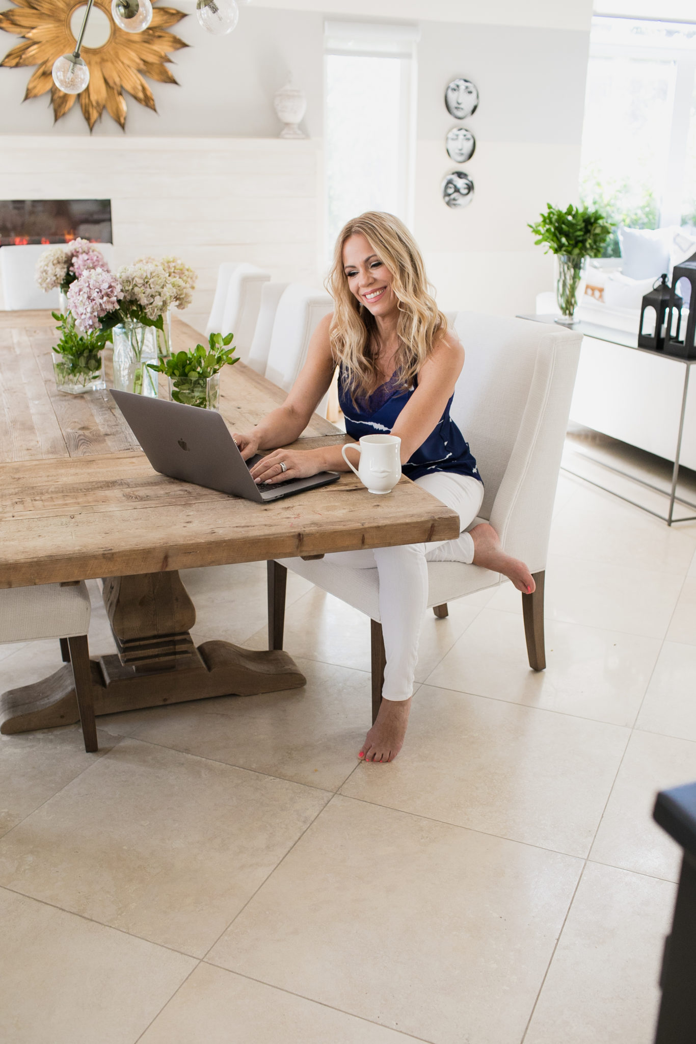
Working from home is suddenly the norm! I know it can be jarring if you are used to going into an office. But there are parts of it that are lovely, and while I typically go into my office I have been known to get some of my best work done at home. I thought that I would share some of my best tips for working at home so we can all stay productive and happy. Feel free to comment if you have some great tips to add!
Make your bed. There are so many studies that say that making your bed every day is the best way to start your day, and when you are working from home this is more important than ever. It sets the tone for the day! While it may be tempting to lounge in your bed with your laptop, it is not the best idea. Enjoy this fun video I made about How To Make A Beautiful Bed.
Get dressed. Okay, so no need to put on a dress or a blazer, but put on some real clothes. That means pants, people! It really helps you to get in the mindset to work. I even put shoes on. It gets me out of lounge mode somehow. Wear something comfortable, but something that you would wear to the office. It really helps and will look more professional on that Zoom call with your team!
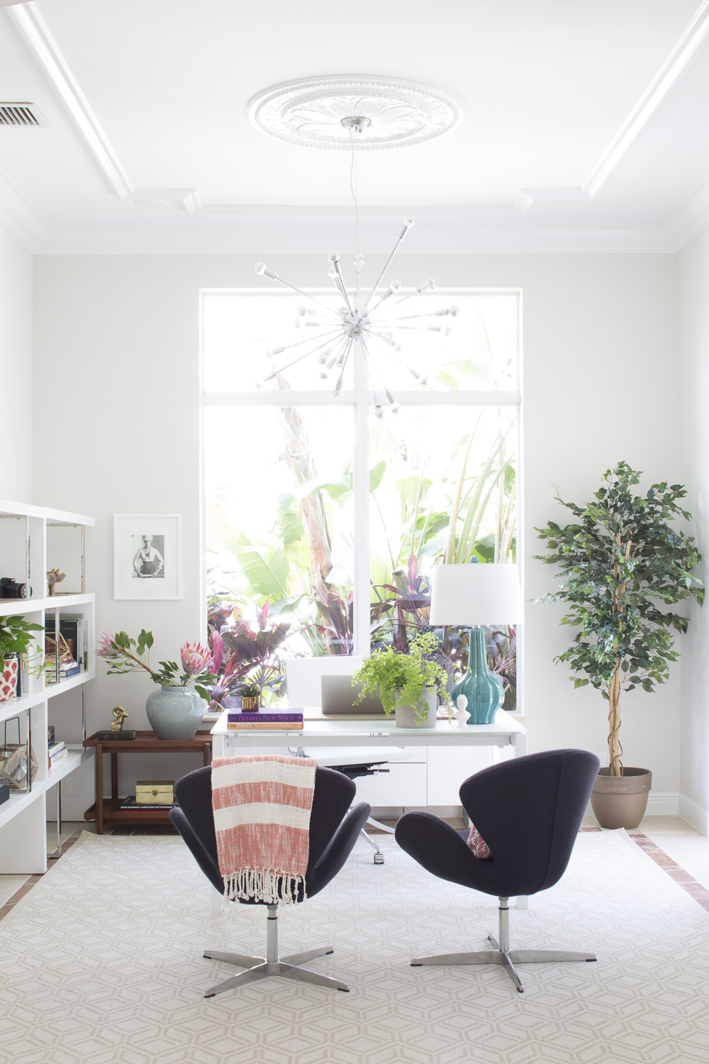
Set up your space. I love designing home offices for my clients. My husband works at home so I know it is important to design a home office to one’s specific needs and preferences. Think about how your work day will go and what you need. A comfortable chair is a must! Do you like to face a window or will it be too distracting? Do you like music or quiet while working? Do you need a tv? Two monitors? How can you set up your desk in an organized way so you can easily access what you need? Lots to think about. If you don’t have the luxury of having a home office, improvise!! Find a quiet space where you can set up shop. There are many schools of thought on this, but many people like to work in a different room from their spouse. Separate family/work as much as you can, right?
Interior Design by Krista Watterworth Alterman, Photo by Jessica Glynn
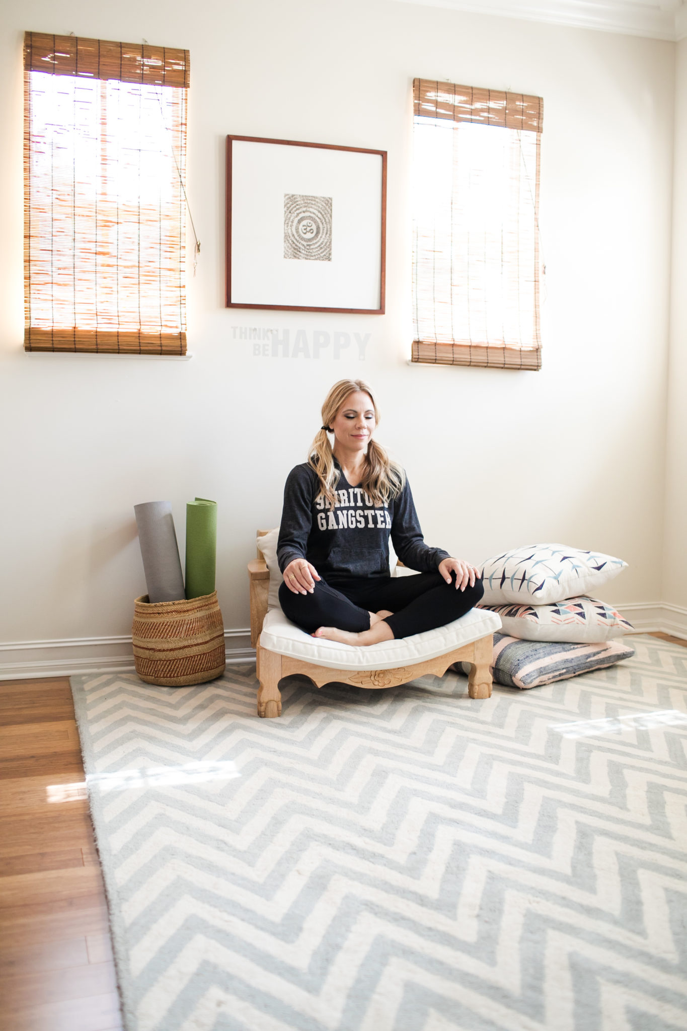
Take breaks. One of the great features of the Apple Watch is the little reminders you get “Time to stand”, or “Time to Breathe”! If you don’t have one, set alarms on your calendar and take frequent breaks. I like to step outside for mine. A quick 15 minute walk can do wonders! Get some Vitamin C whenever possible. And take a proper lunch break. If things get stressful, do a quick meditation. There are many great apps to walk you through it if you need one. One of my favorites is called breethe.
Interior Design by Krista Watterworth Alterman, Photo by Eve Greendale

