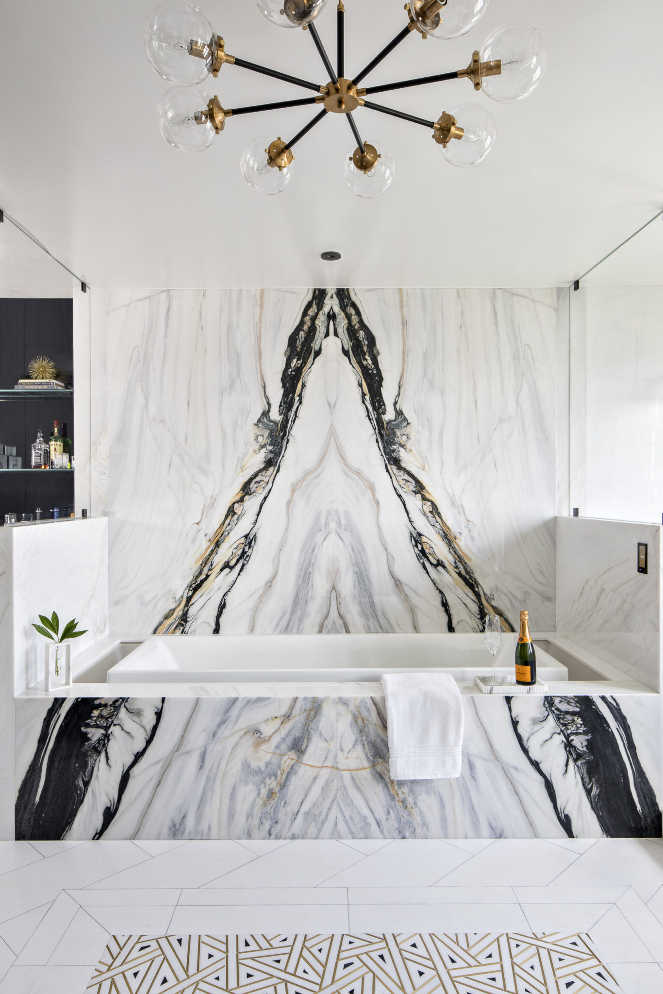
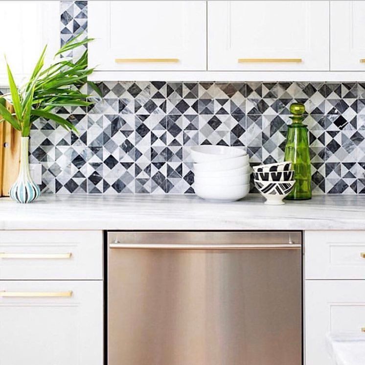
Secret Staging Tips To Sell Your Luxury Home
So most of us know all of the real estate “tricks” for staging a home, right? Eliminate the clutter, take out cumbersome furniture, remove personal photos…these are all great ideas. But, as an interior designer, I believe that you can go further with your staging by doing a few small things that will have a huge impact on the home. Many realtors and homeowners will hire professional home stagers, which is wonderful. But hiring a professional stager is not always necessary. For our interior design business, we are constantly styling for photo shoots and I have learned a lot about what works over the years. Here are a few of my best staging tips to sell your luxury home:
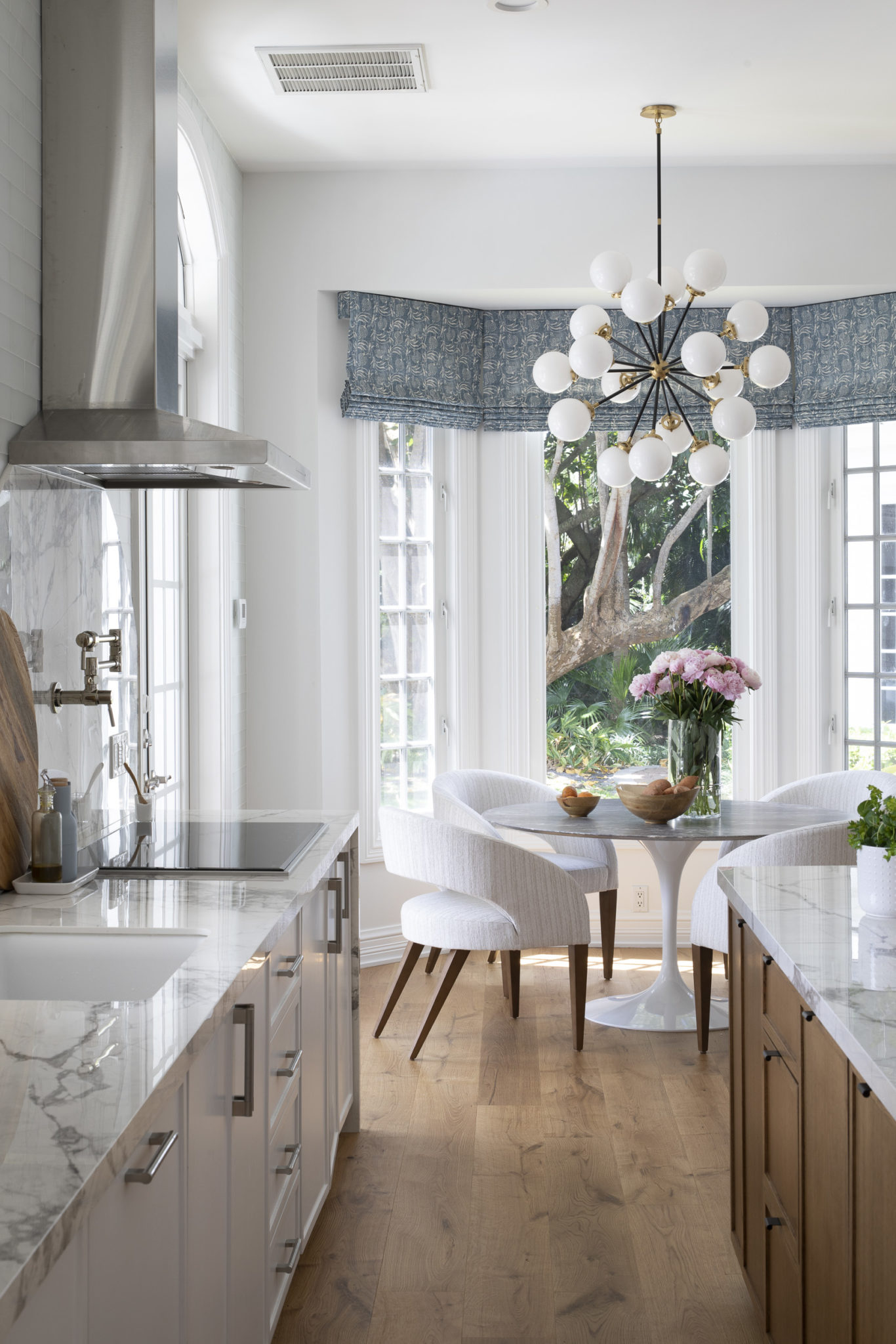
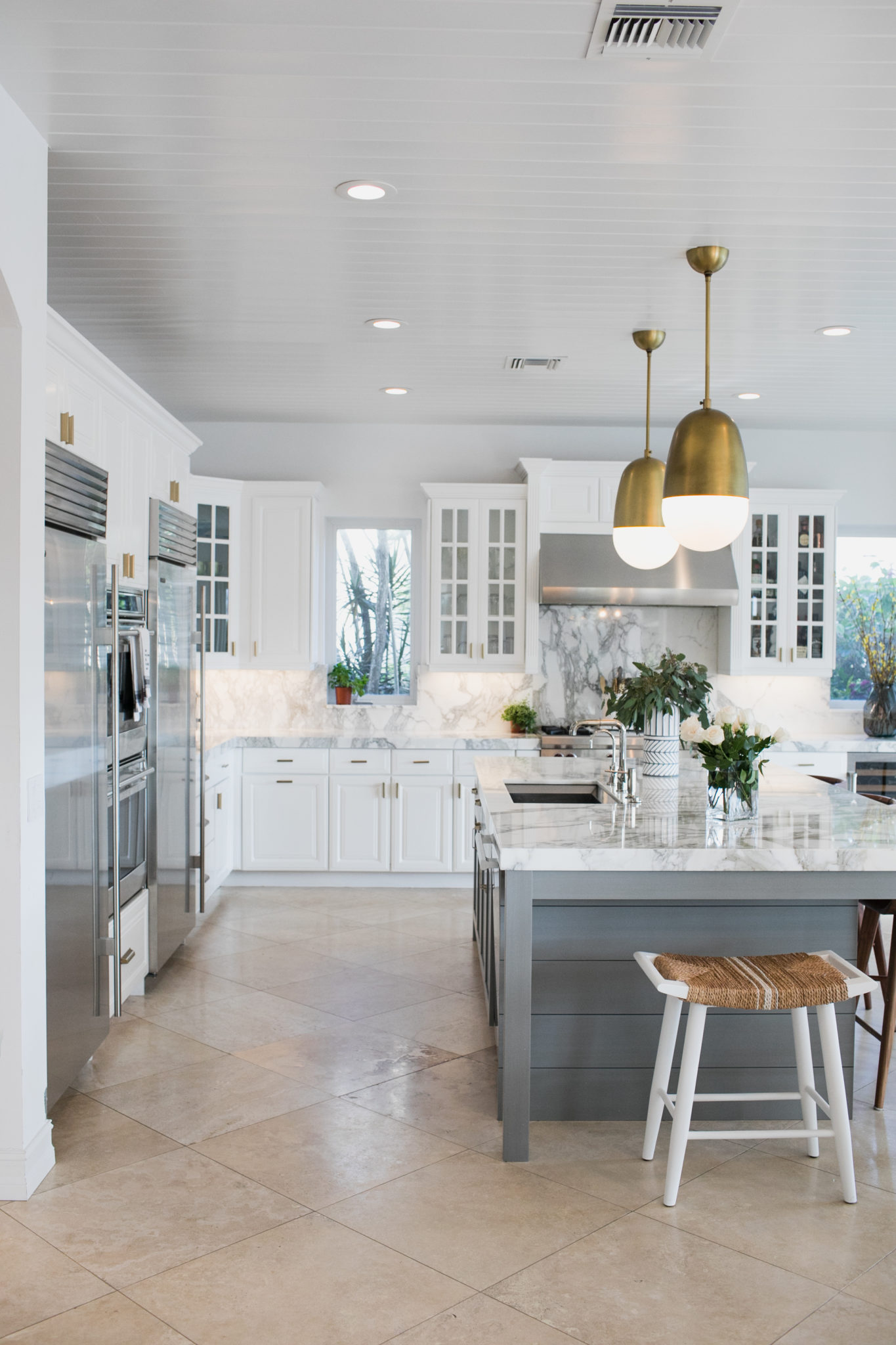
Swap out the lighting. Designer lighting will make a huge difference in the home. A modern pendant or chandelier can change the whole look of the space. Browse Pinterest or interior design portfolios for ideas and purchase new fixtures for each room. Then hire a handyman and swap ’em out!
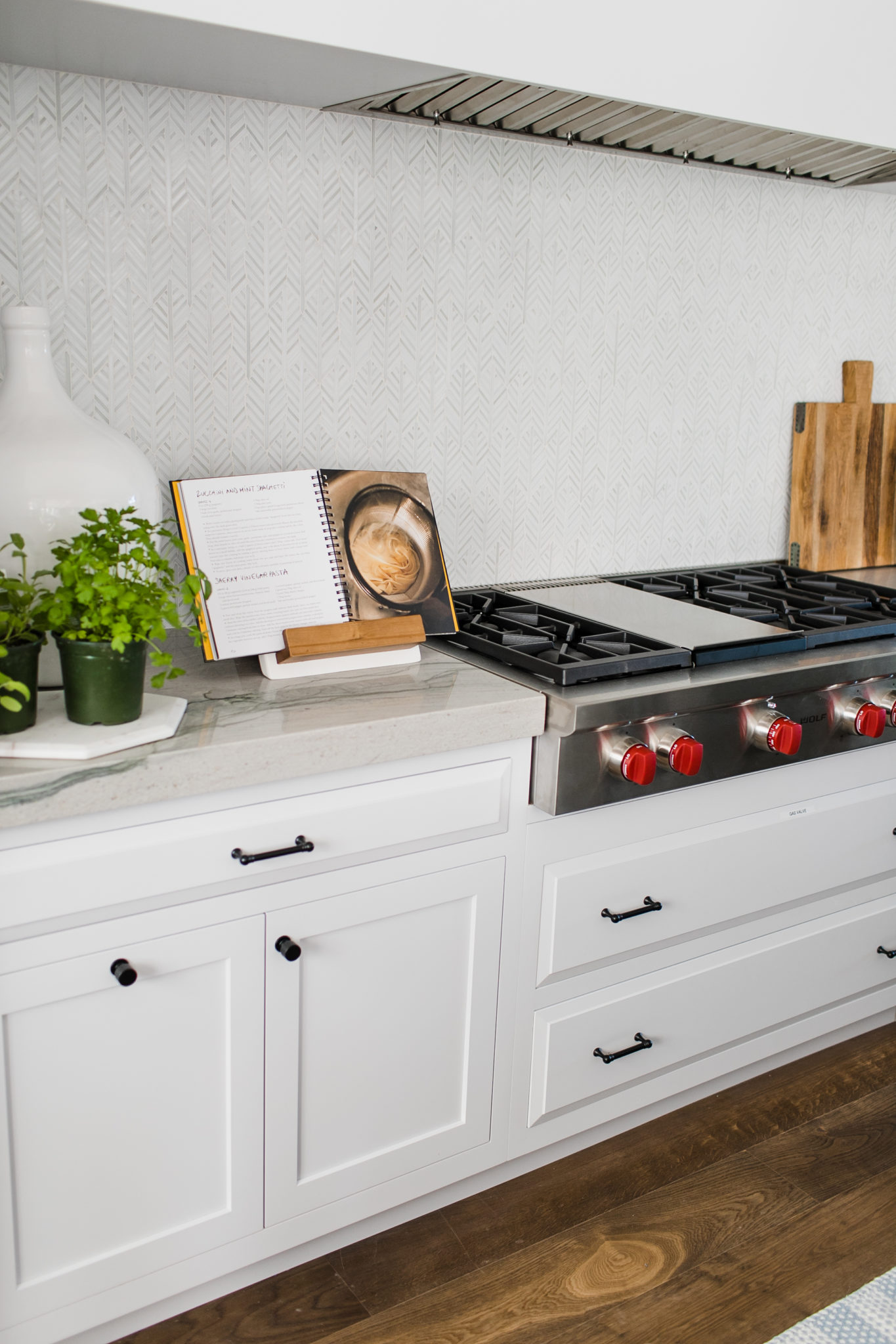
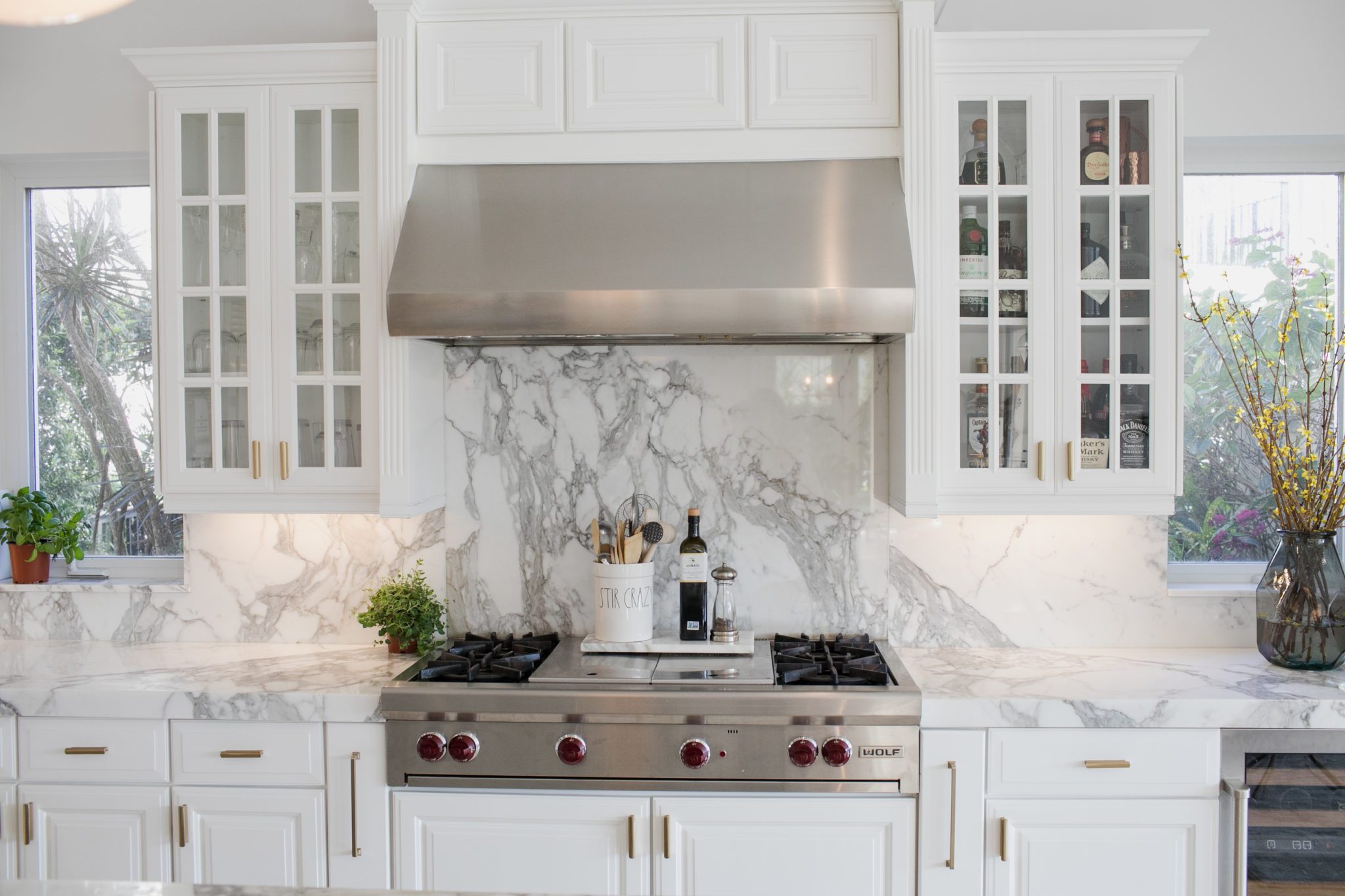
Kitchen accessories. I know most realtors request to have your counters completely cleared. I agree that this is a good idea – you don’t want a lot of clutter. However, placing a few upscale accessories can really warm up the space. Our favorite go-to’s are charcuterie boards and demijohns from Etu Home.
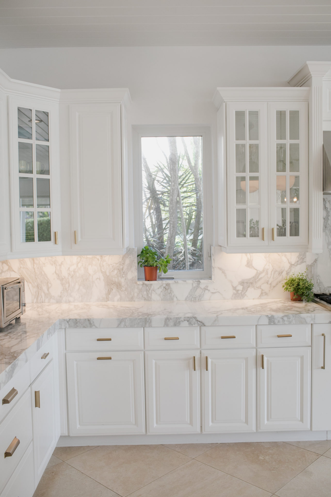
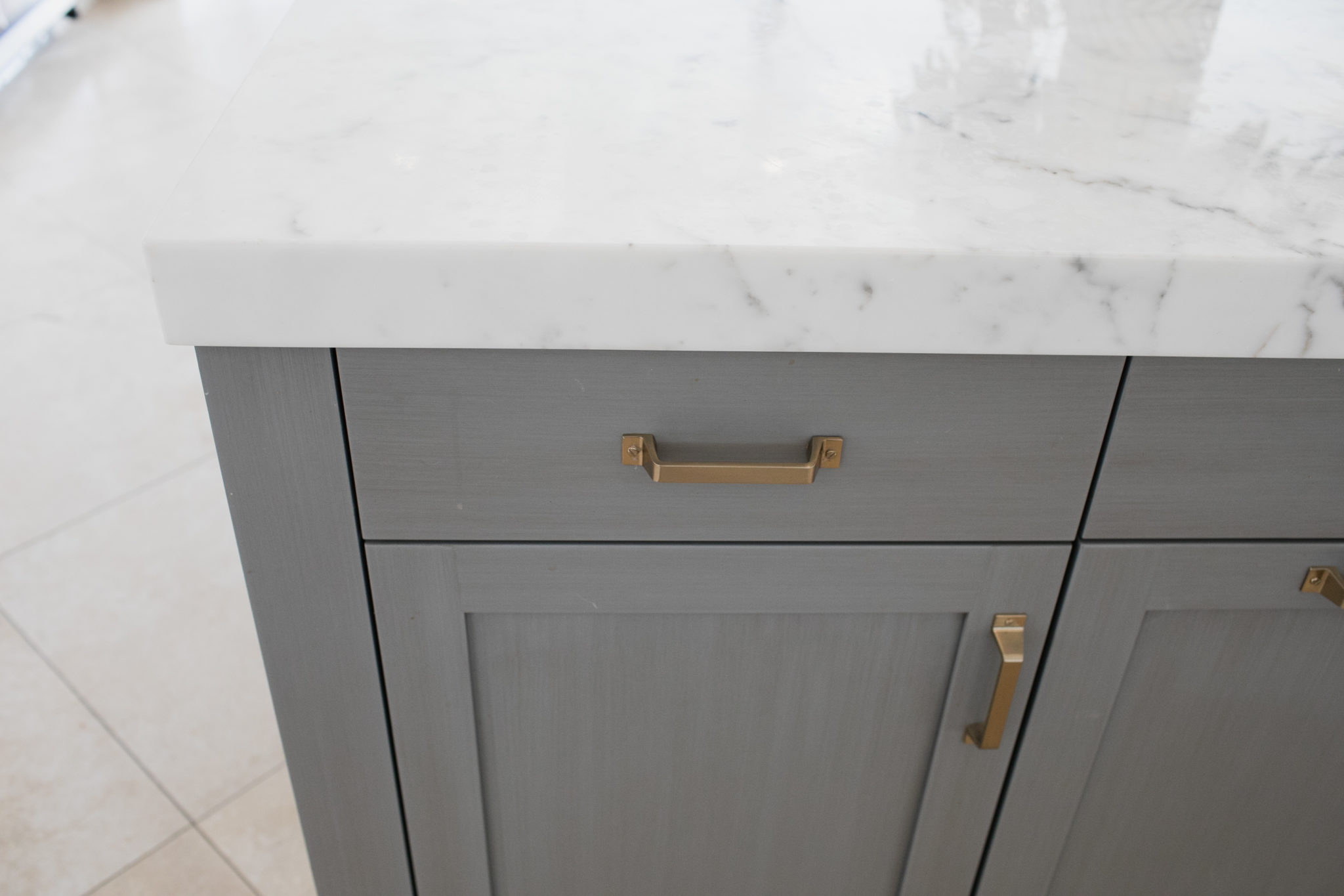
Cabinet Refresh. While we are on kitchens, let’s talk about dated ones. If the homeowners are not willing to do a full blown kitchen renovation, consider having the cabinets painted and/or switching out the hardware. You would be surprised how much a new set of knobs can change things.
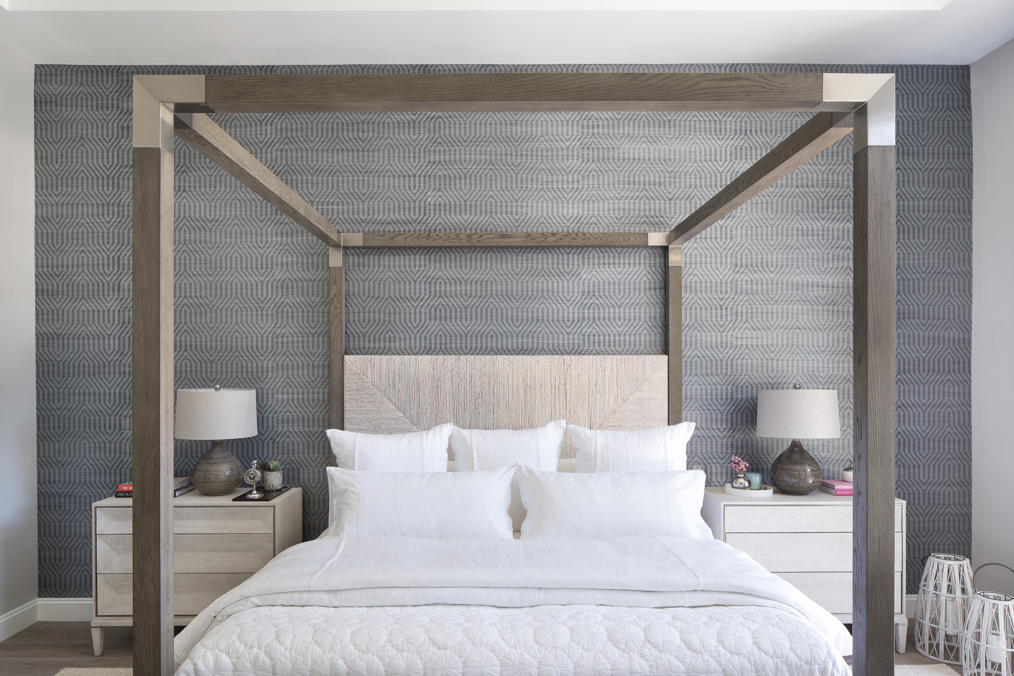
Bedding! It’s a fact. High end clients love high end linens. Our favorites brand is Matouk – pure luxury! White is a classic for bedding, so swap out all of the bedding for something white and upscale. A crisp white duvet and fluffy oversized white towels in the bathroom are perfect.
Greens in nice vessels. You can use good fauxs blooms so you don’t have to worry about watering them. A pop of green is an old trick for interior photos, but having any type of plants or floral always warms up a space in general.
Bathroom Accessories. Think about placing some high end product that your luxury clients will recognize – we love Hermes bath soaps. A crisp white folded robe or two is also a nice touch. Make it feel like the bathroom of a boutique hotel suite.
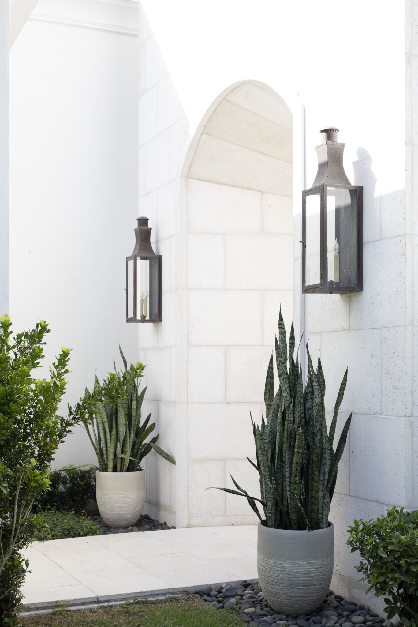
Curb appeal. Don’t neglect the entrance. A fresh coat of paint on the front door and new hardware will do the trick. I love to use modern planters with real plants if possible. Any type of palm or tropical plant works and Arborvitae evergreens are an elegant choice.
Overall, remember that you are really selling a lifestyle, not just a home. A few Chanel shopping bags in the walk-in closet or a bottle of Veuve on the bar makes a statement and makes the luxury buyer feel at home. Happy Selling! I hope you get top dollar.
Trending: Laundry Room Decor
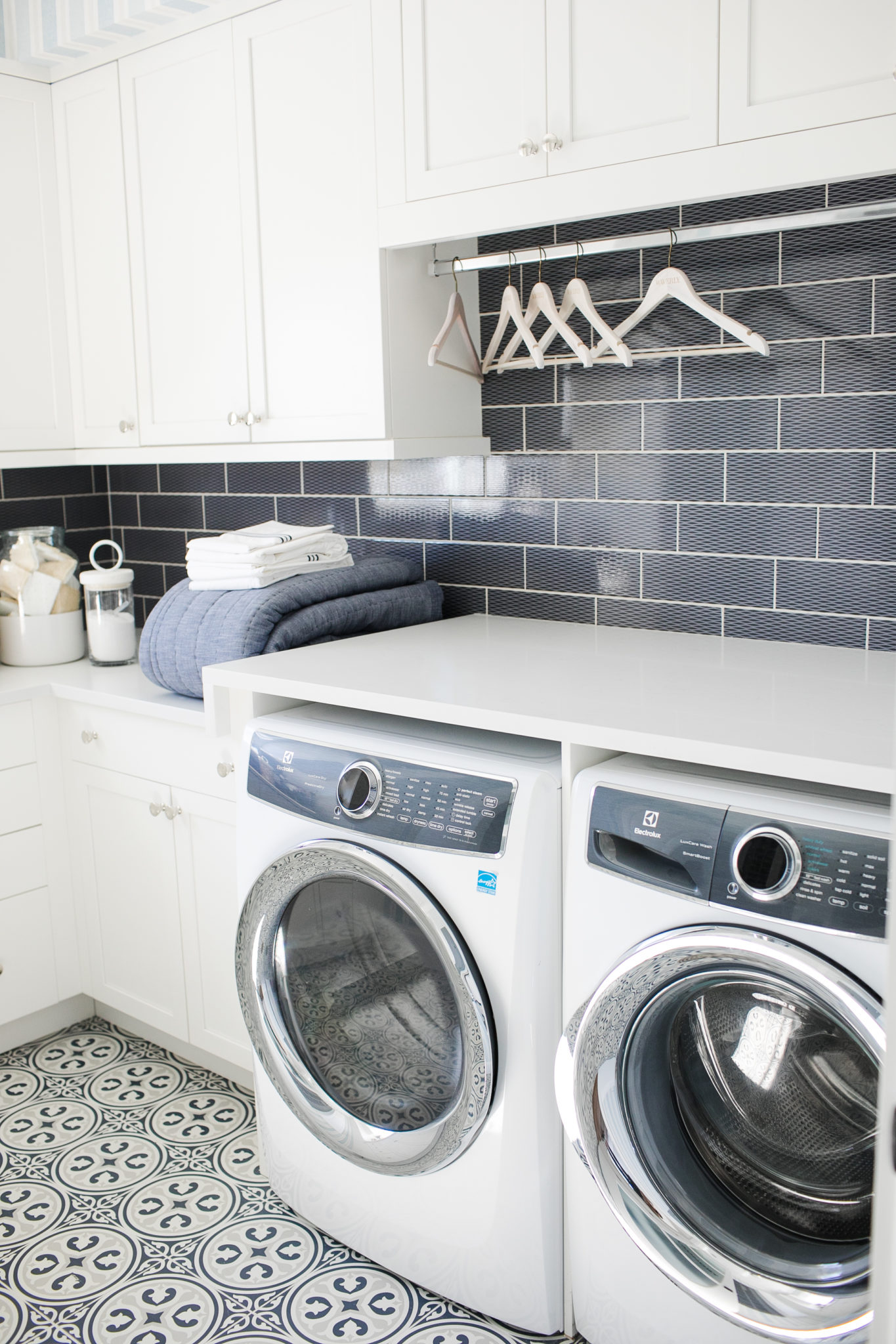
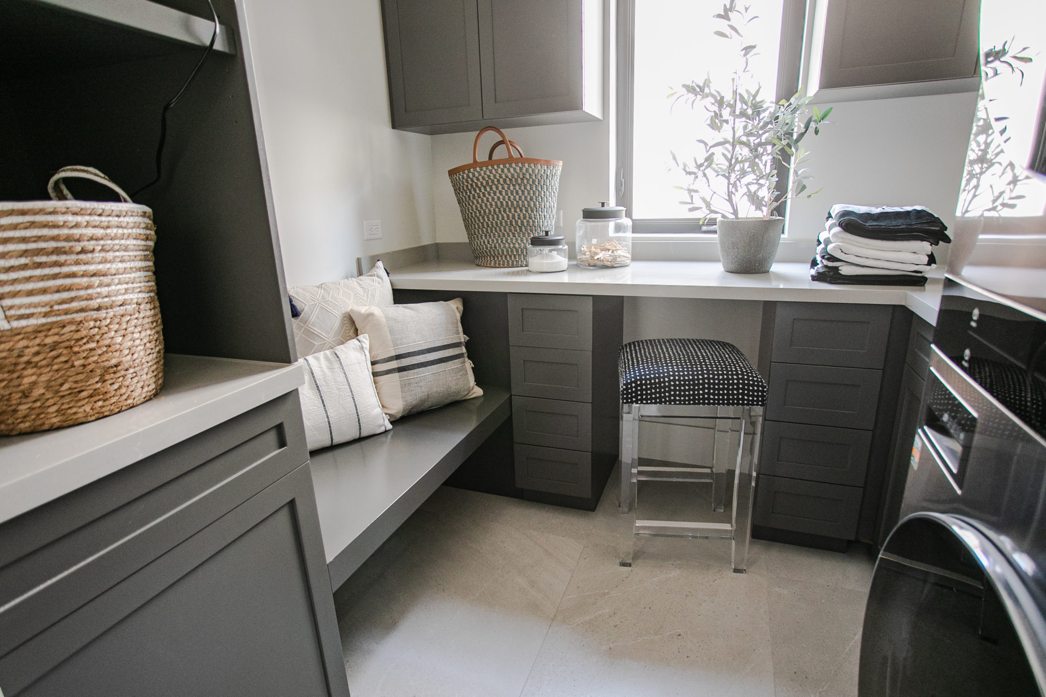
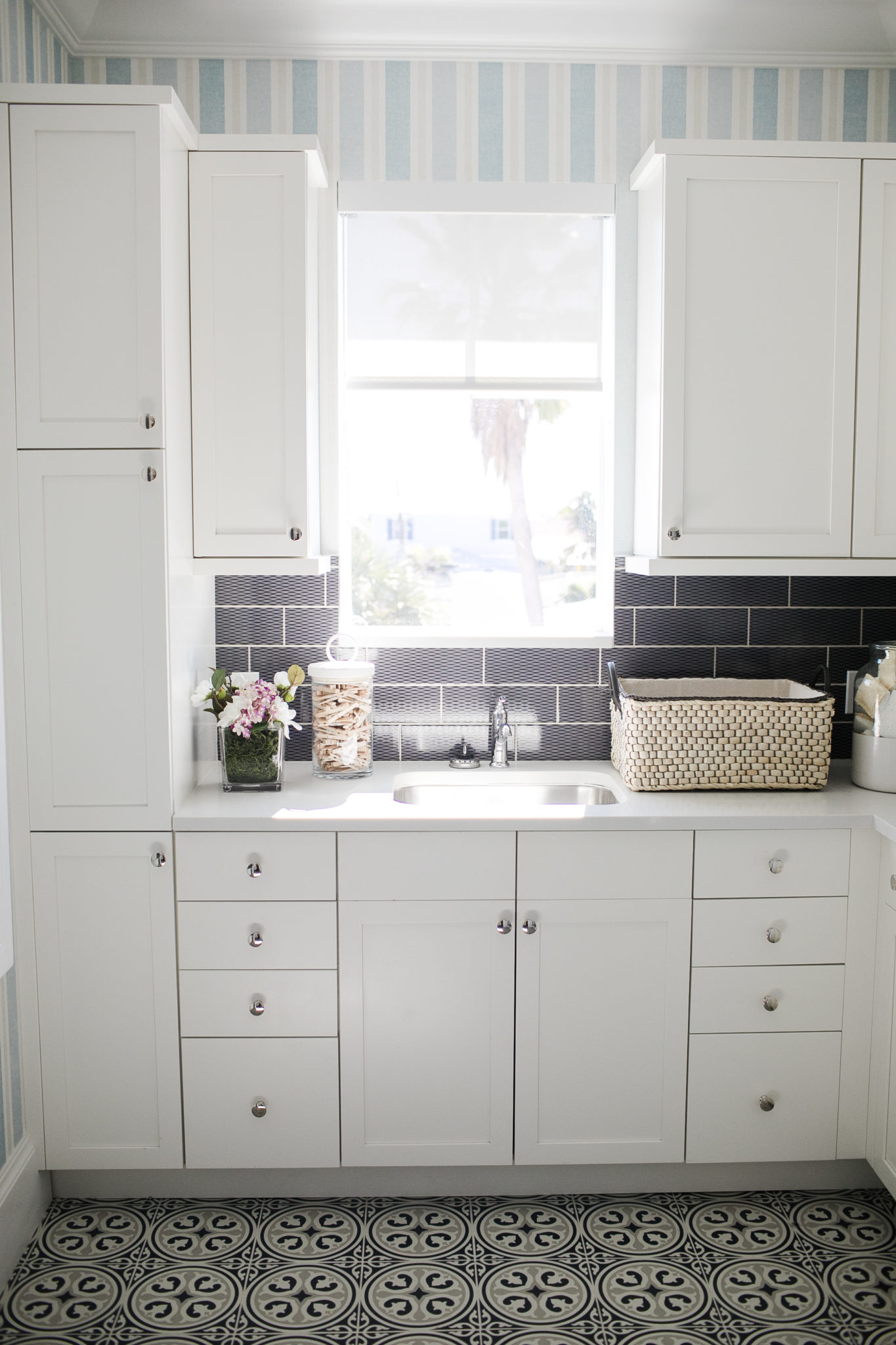
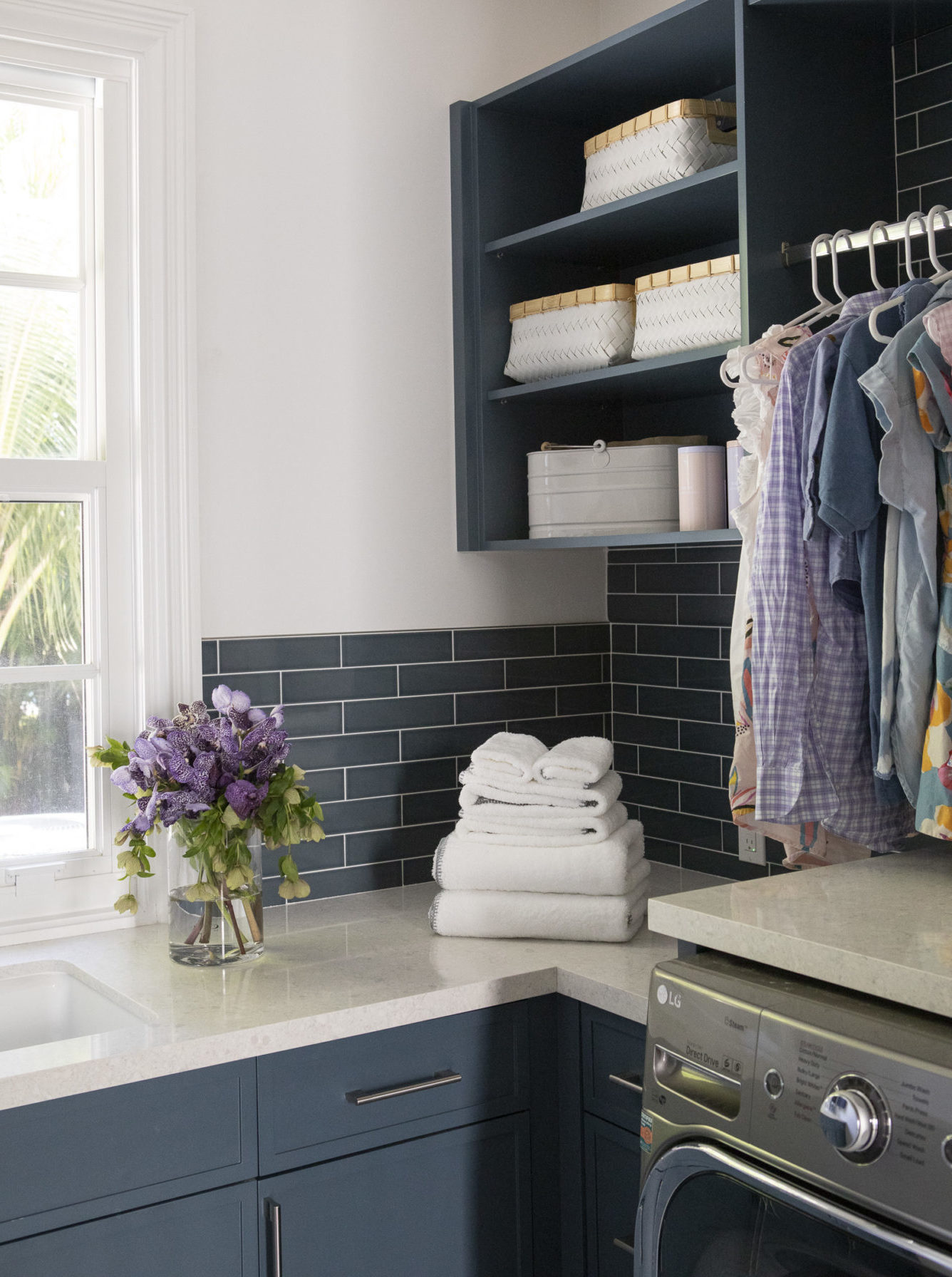
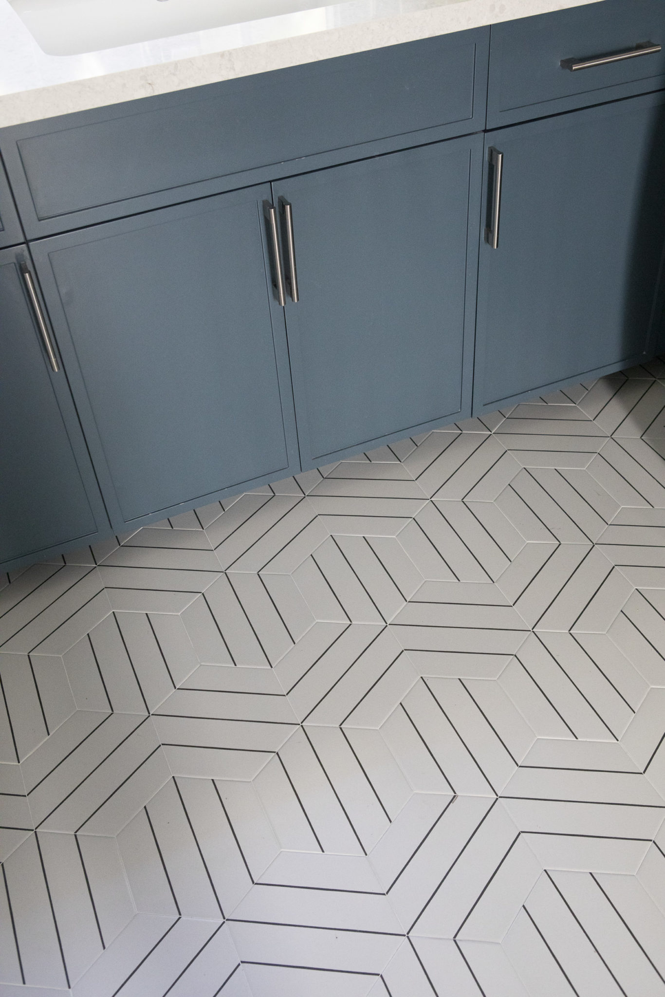
Let’s face it, a lot of us spend a great time of deal doing laundry for our families (I know I do). So why not make the laundry room as beautiful as it can possibly be? We have been getting lots of request for chic laundry rooms and I really love it. It is a great space to add some fun wallpaper and statement flooring. Storage in the laundry room is important. I like to reduce clutter in the living room by installing closed cabinetry or open shelving with woven baskets to store items. Some laundry rooms even have room for a desk – the ultimate place to run a household smoothly! Here are a few favorite laundry rooms from our portfolio.

Interior Design by Krista W. Alterman, Photo by Jessica Glynn
Pillow Party
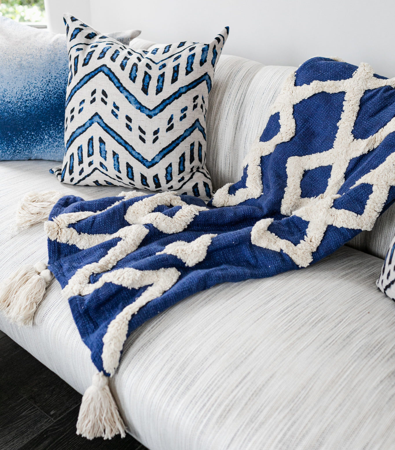
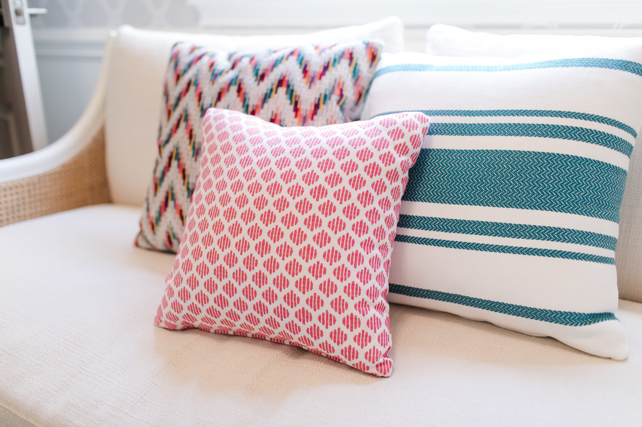
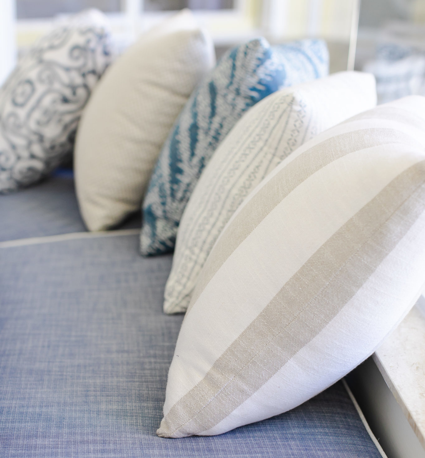
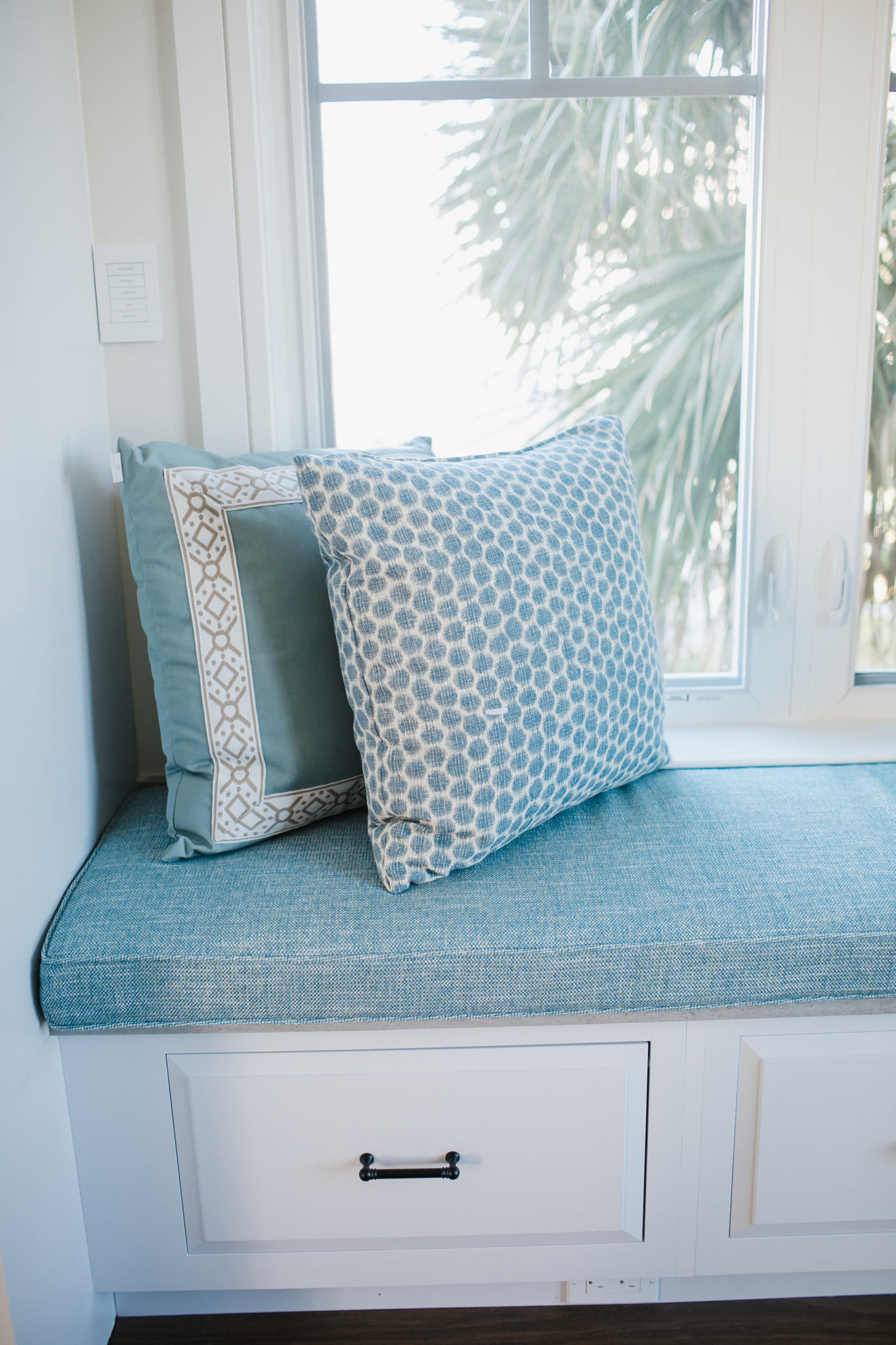
The easiest way to refresh a sofa, bed or chair? Beautiful throw pillows! They can completely transform a space and bring a room to life. Throw pillows will bring the personality, the vibe and style to a room by adding a pop of color, pattern or texture. They are such an important element in home design. Choosing throw pillows is one of my favorite tasks when I am designing a home.
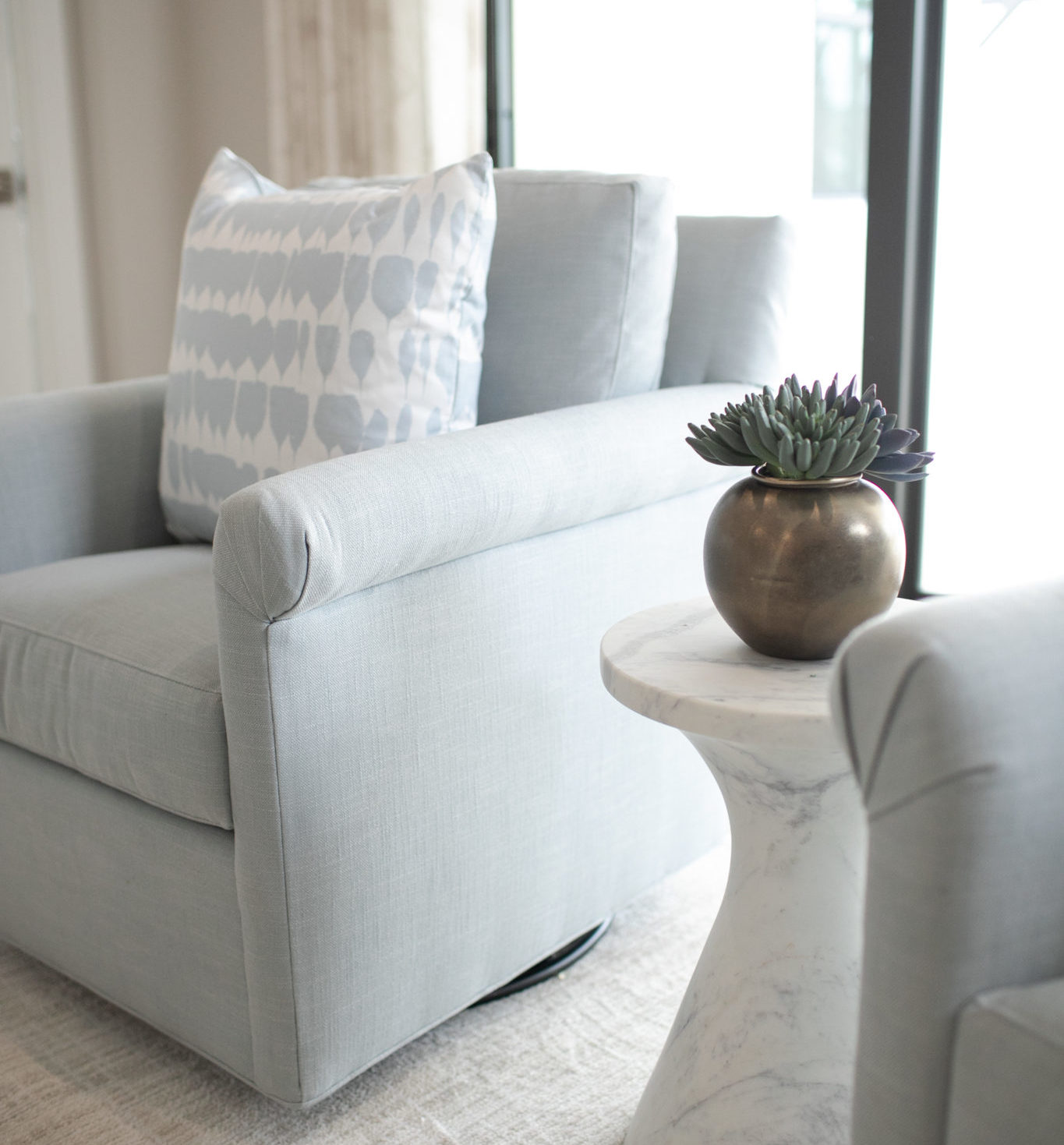
Interior Design by KRISTA + HOME, Photo by Eve Greendale. Pillow by Schumacher.
You can add dimension and warmth to your sofa by layering your pillows. You want to create a look that is balanced, so consider the colors and sizes you use. Alternating pillows with texture and pattern keep the look interesting and inviting. Make sure that you don’t do too many large prints, as that can be overwhelming to the eye. However, a space with no patterned pillows at all can end up looking a bit flat and unfinished.
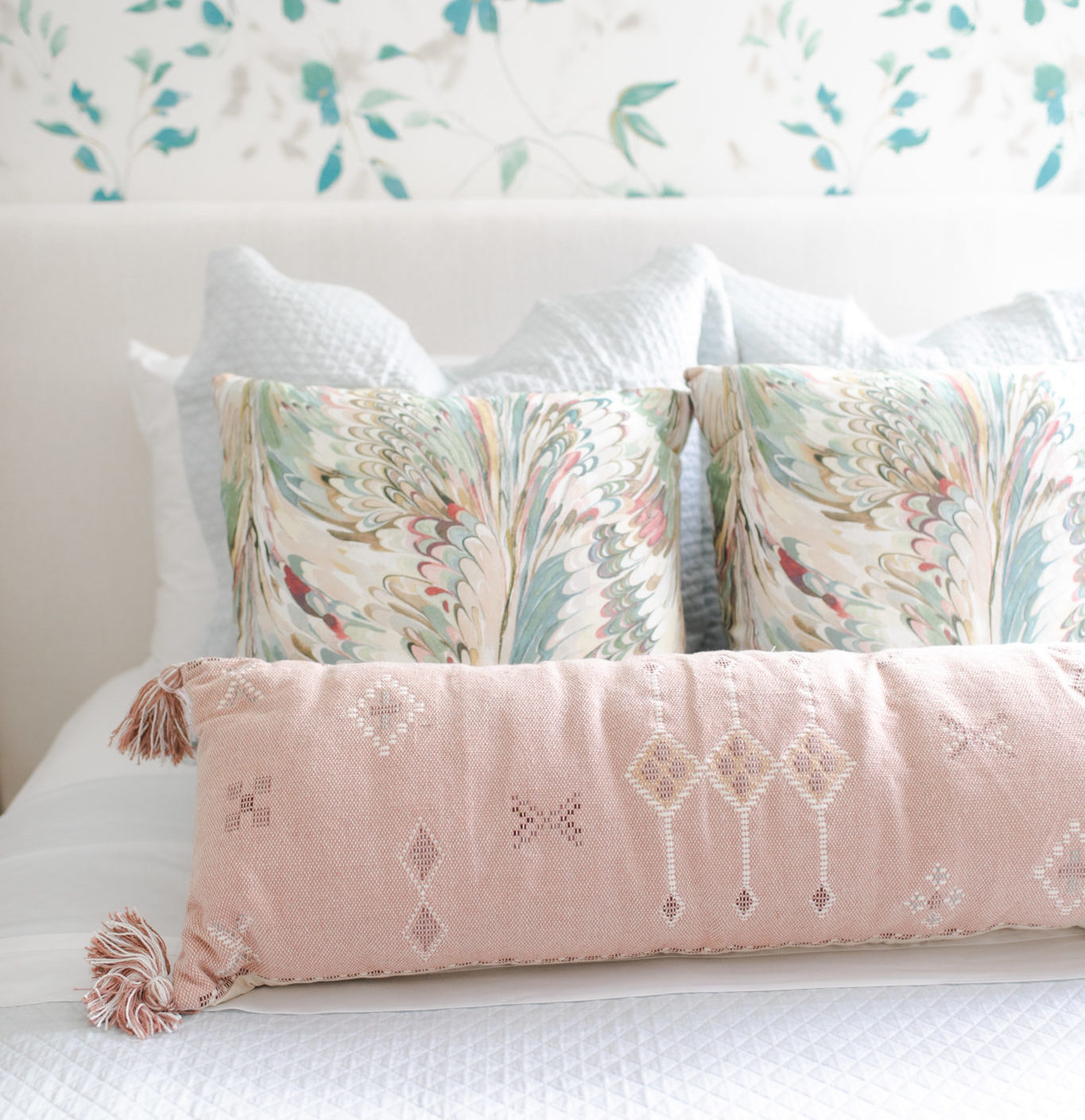
Interior Design by KRISTA + HOME. Photo by Eve Greendale. Patterned pillow by Lee Jofa for Kravet.
You can add a bit of whimsy by choosing throw pillows that have interesting details and trims. Fun options include fringe, tassels, or even organic beads like the pillow in the image below.
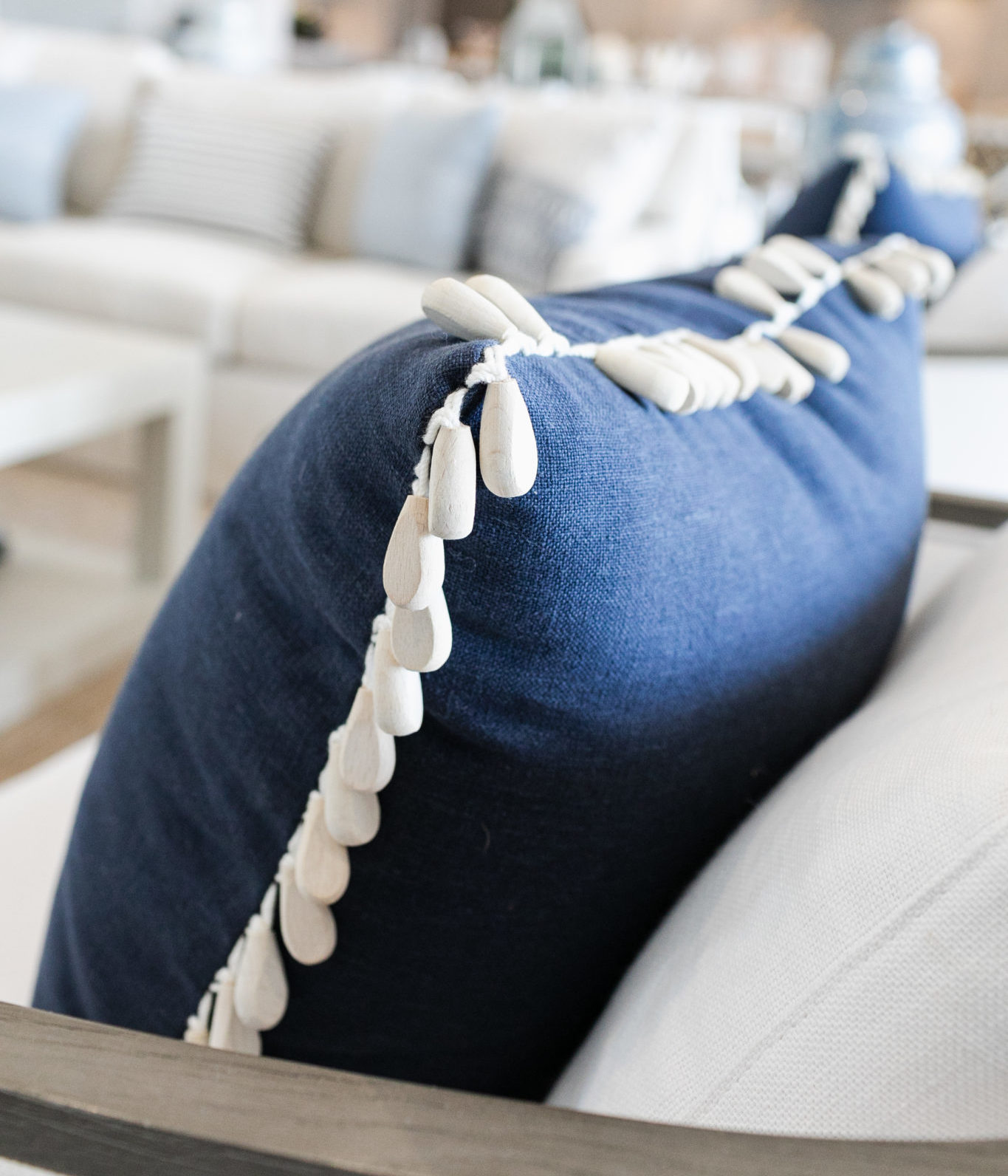
Interior Design by KRISTA + HOME. Photo by Eve Greendale. Pillow by Fabricut with Kravet trim.
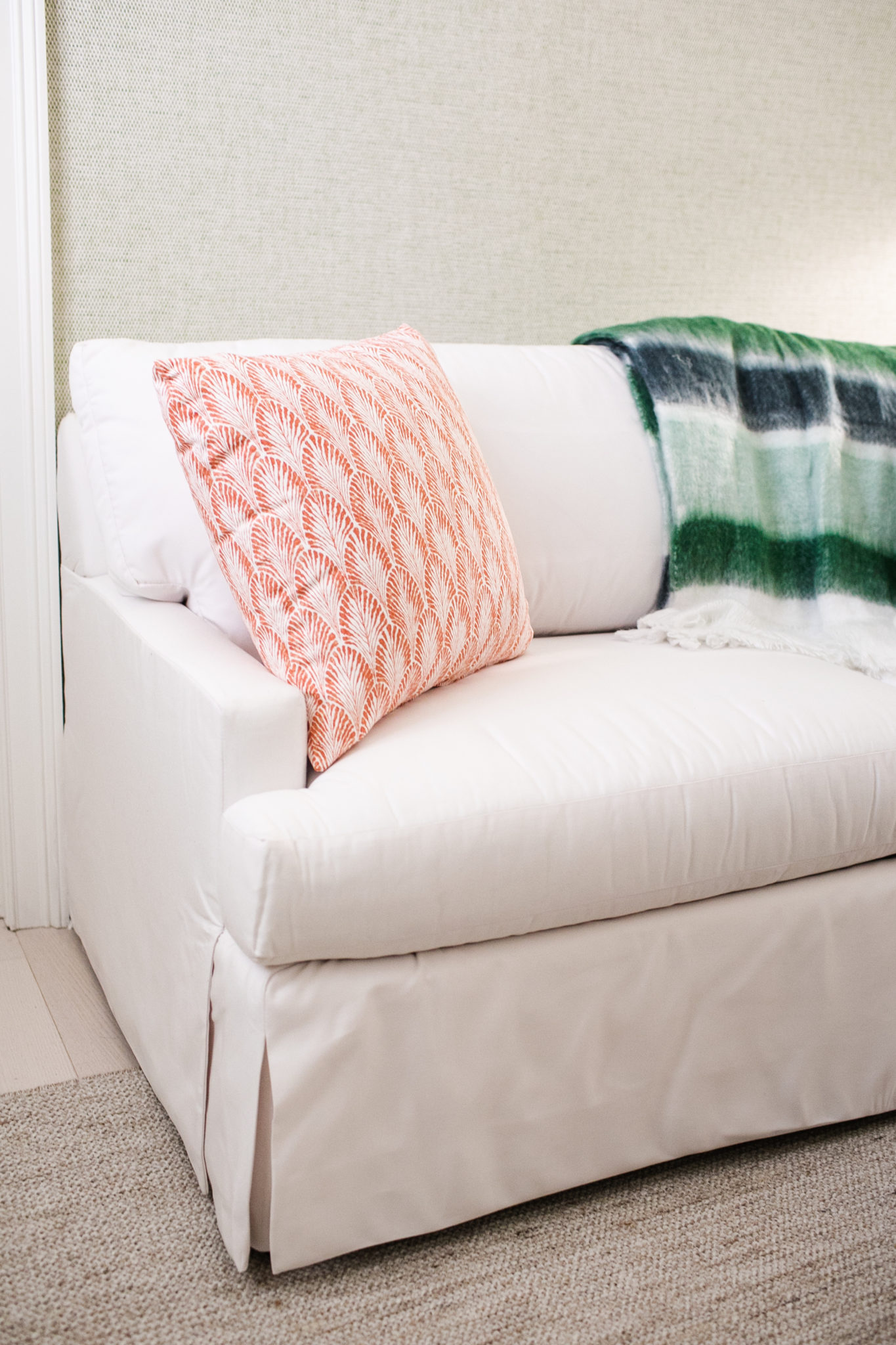
I love using a combination of patterned and solid pillows on a sofa, and I like to pair the pillows with a comfy throw blanket. This is a great way to warm up a space and add comfort and style.
The fill or stuffing of a pillow insert is important. You can choose feather/down, poly or a down alternative. This is a personal preference, as some people prefer a more structured pillow, while others prefer soft and plush options. I like to use a blend for the filling, which allows them to have great shape but still be plumped up.
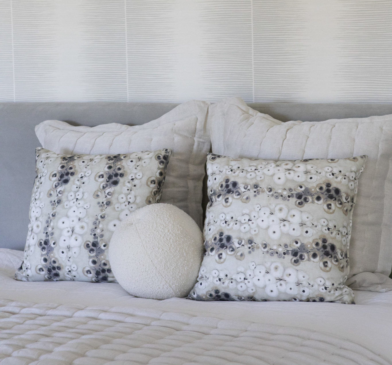
Interior Design by KRISTA + HOME. Photo by Jessica Glynn. Square pillows by Fabricut.
There is nothing like cozying up on the sofa with a soft throw, some plush pillows and a glass of vino after a long day at work. Who is with me?
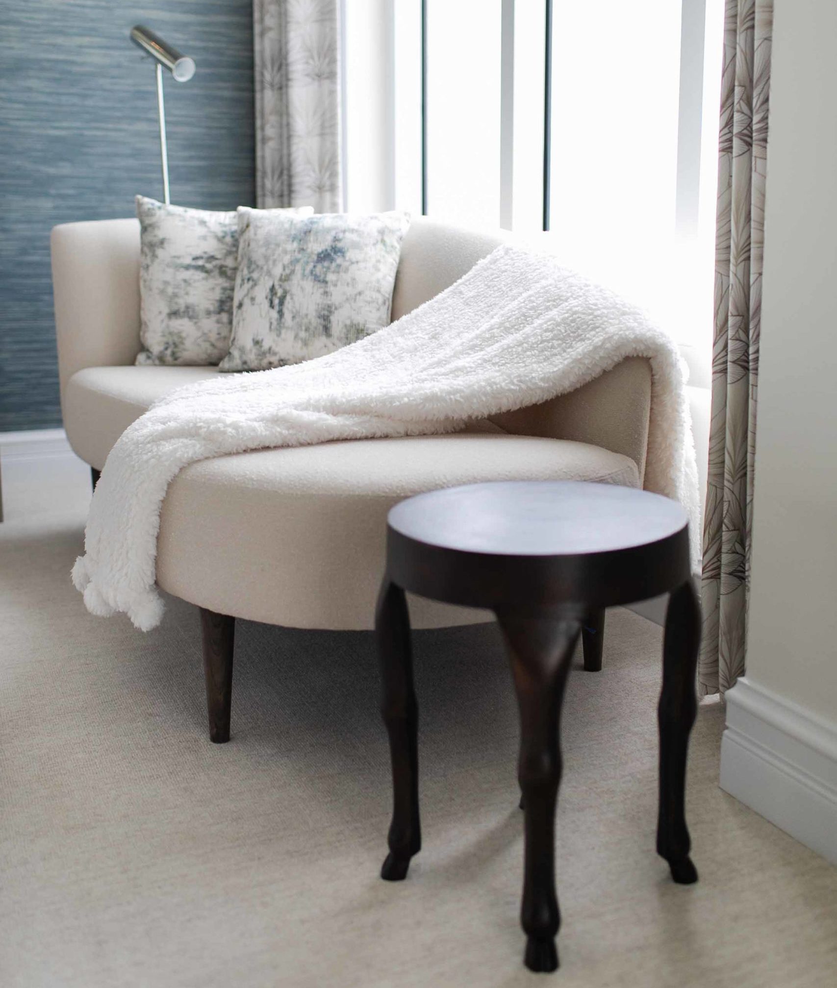
Interior Design by KRISTA + HOME. Photo by Eve Greendale. Pillows by Romo.
A Book Signing with Photographer Jessica Glynn
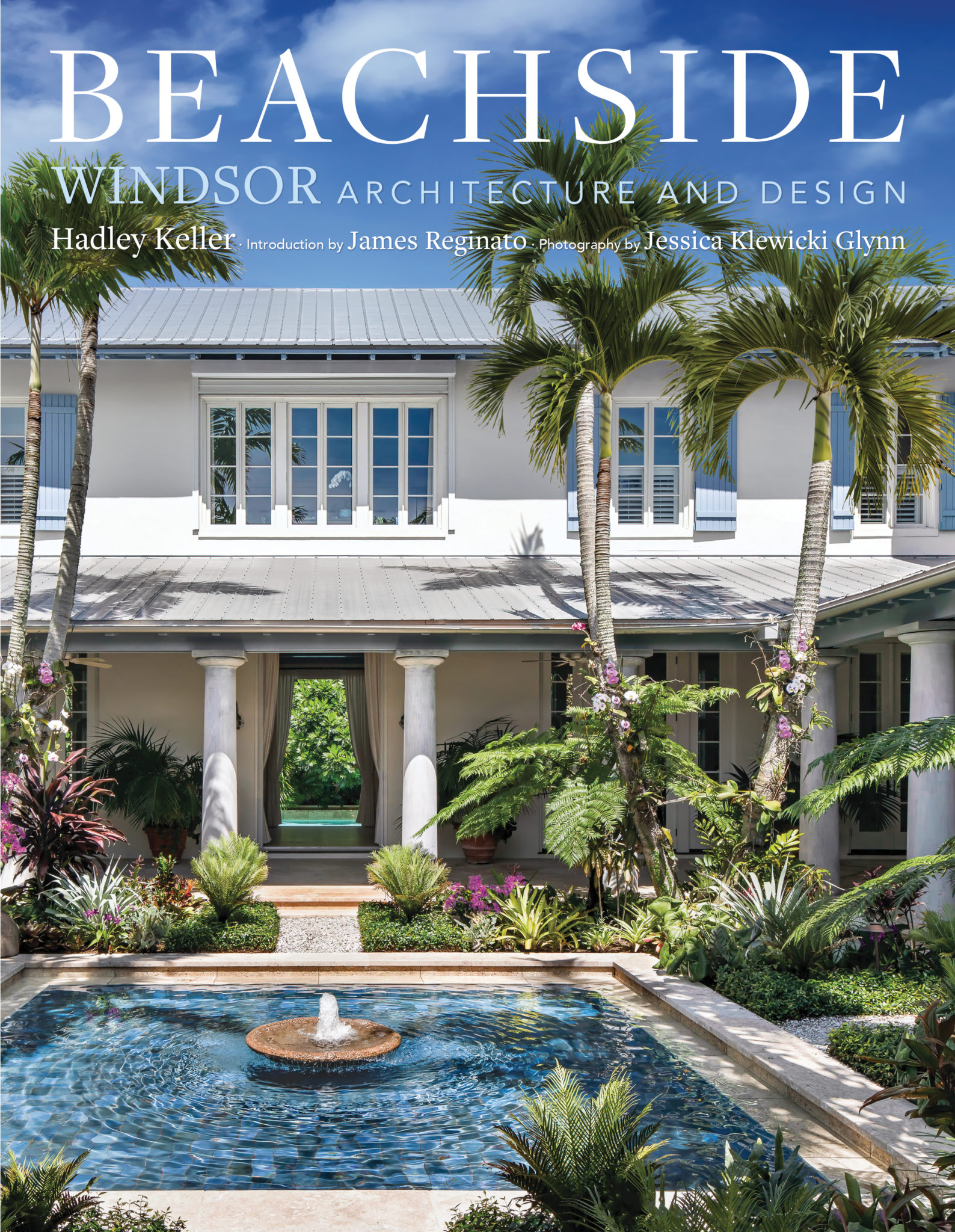
What a wonderful event! We were so honored to host acclaimed architectural and interior photographer JESSICA GLYNN for “Books & Bubbles”, a book signing of her most recent book Beachside: Windsor Architecture and Design.
This gorgeous coffee table book (penned by House Beautiful‘s Hadley Keller) celebrates tropical living at its most chic! It chronicles a planned community called Windsor, which is on a barrier island in Vero Beach, Florida. This sublimely landscaped village, planned by the renowned New Urbanists Andrés Duany and Elizabeth Plater‑Zyberk, boasts houses by A‑list architects and top interior designers, among them John Stefanidis, Steven Gambrel, and Alessandra Branca. The exteriors, Anglo‑Caribbean in style, feature steeply pitched roofs, open eaves, cantilevered balconies, and palm‑shaded courtyards and pools. The interiors, all executed with exquisite craftsmanship and appointed with fine finishes, range in style from traditional to sleekly contemporary. The book is filled with Glynn’s stunning photographs of bougainvillea‑framed entrances, airy open‑plan living-dining rooms, cozy studies, and bedrooms that open onto balconies with sweeping ocean views, Beachside will inspire anyone yearning for a stylish coastal life.
The book is available for purchase at the KRISTA + HOME retail workspace in Palm Beach Gardens. It can also be purchased online here.
The event at KRISTA + HOME was a great way to introduce our new retail workspace to the community in Palm Beach County. We are pleased to offer a carefully curated collection of my favorite accessories and coffee table books. If you are local, please stop by!
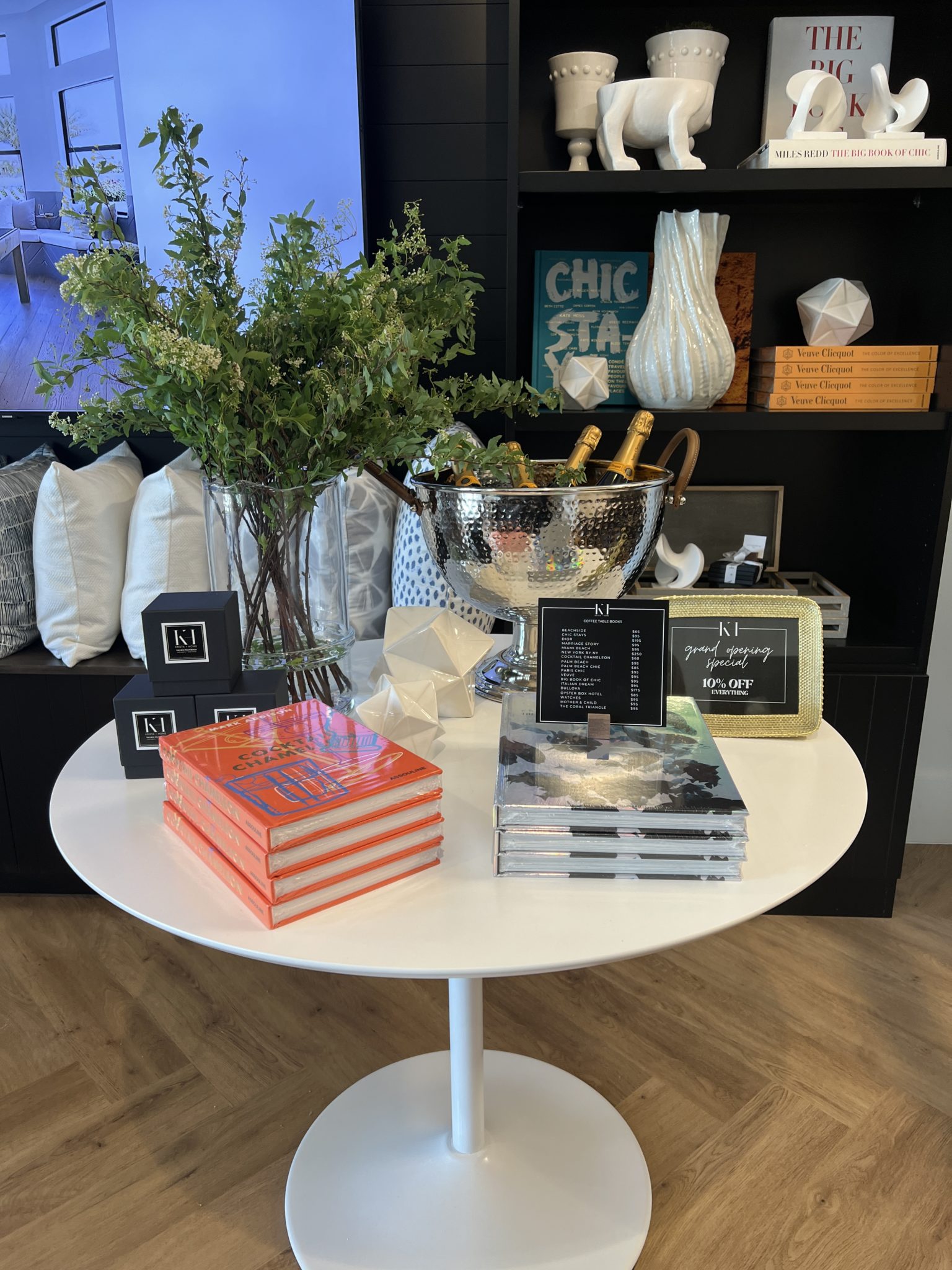
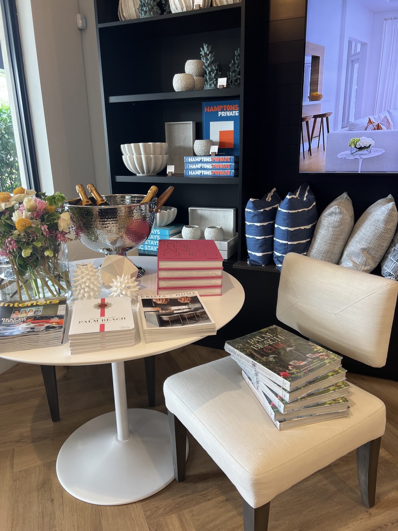
Jessica Glynn and I have been working together for about ten years. She has shot almost all of the images in my portfolio and I love working with her. At the event, Jessica and I sat on a lively panel about decorating with books. The panel was led by JESSE BRATTER who is Editor-in-Chief of Modern Luxury Interiors magazine.
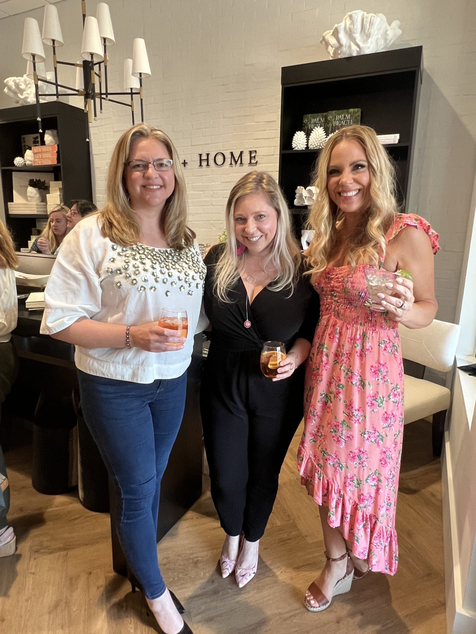
We enjoyed yummy bites and cocktails by FLAVOR AND TASTE and beautiful balloon decor was provided by BROCKIN BALLOONS.
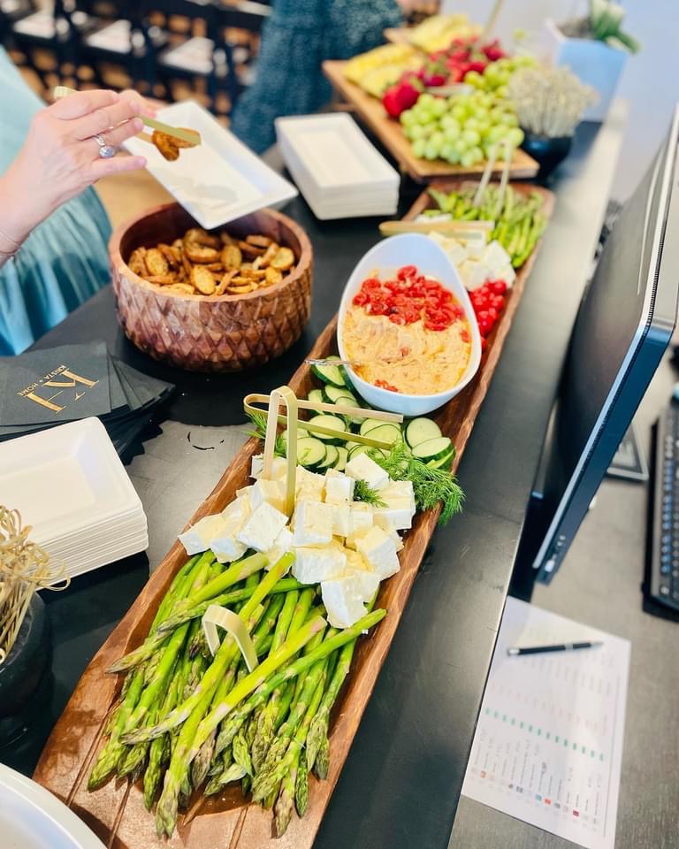
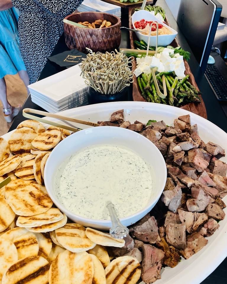
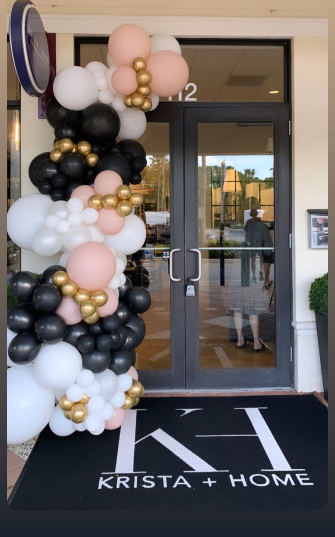
We are excited to have more events in our new space…stay tuned!
Trending: Custom Cocktail Bars In Your Home
One feature that we are hearing homeowners ask for again and again in their renovations and designs is a custom cocktail bar. Cocktail bars are so great for entertaining and they add a fun and decorative element to any living space. Plus, these spaces are functional – what a wonderful way to store and display your glassware and spirits. I love to add beautiful custom cabinetry and open shelving. We also like to add a small fridge and ice maker for crafting the perfect cocktails! Below are a few of my favorite recent custom cocktail bar installations from our portfolio. The bar in the photo below features statement waterfall marble countertops, crisp white shiplap and upholstered bar stools (performance fabric for livability!).
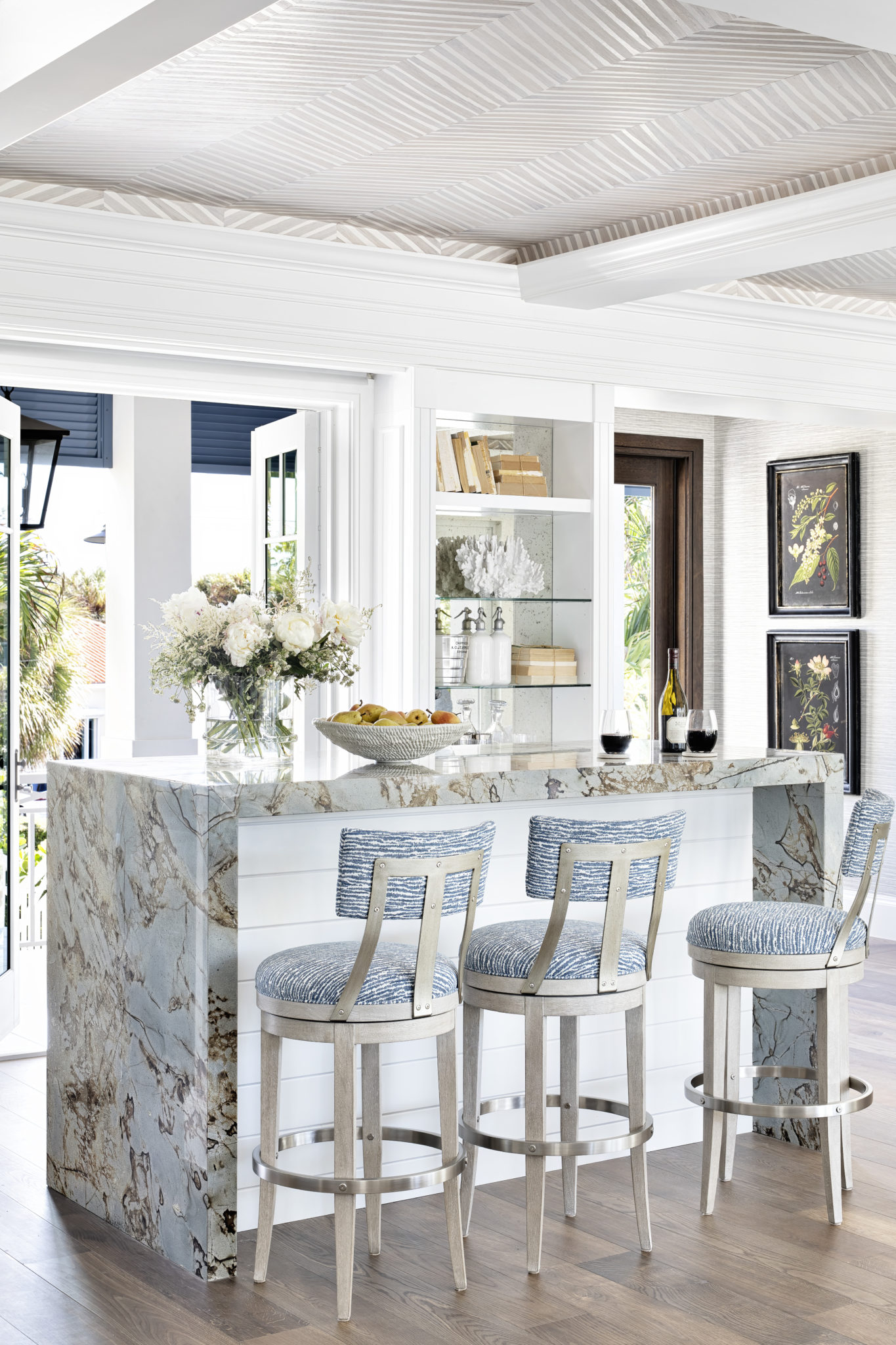
Interior Design by Krista W. Alterman, Photo by Jessica Glynn
A girl walks into a bar…The bar below was designed for a hip, fun couple in Miami Beach who loves to entertain. I designed the sleek bar table, and it is available from The Krista Home Collection.
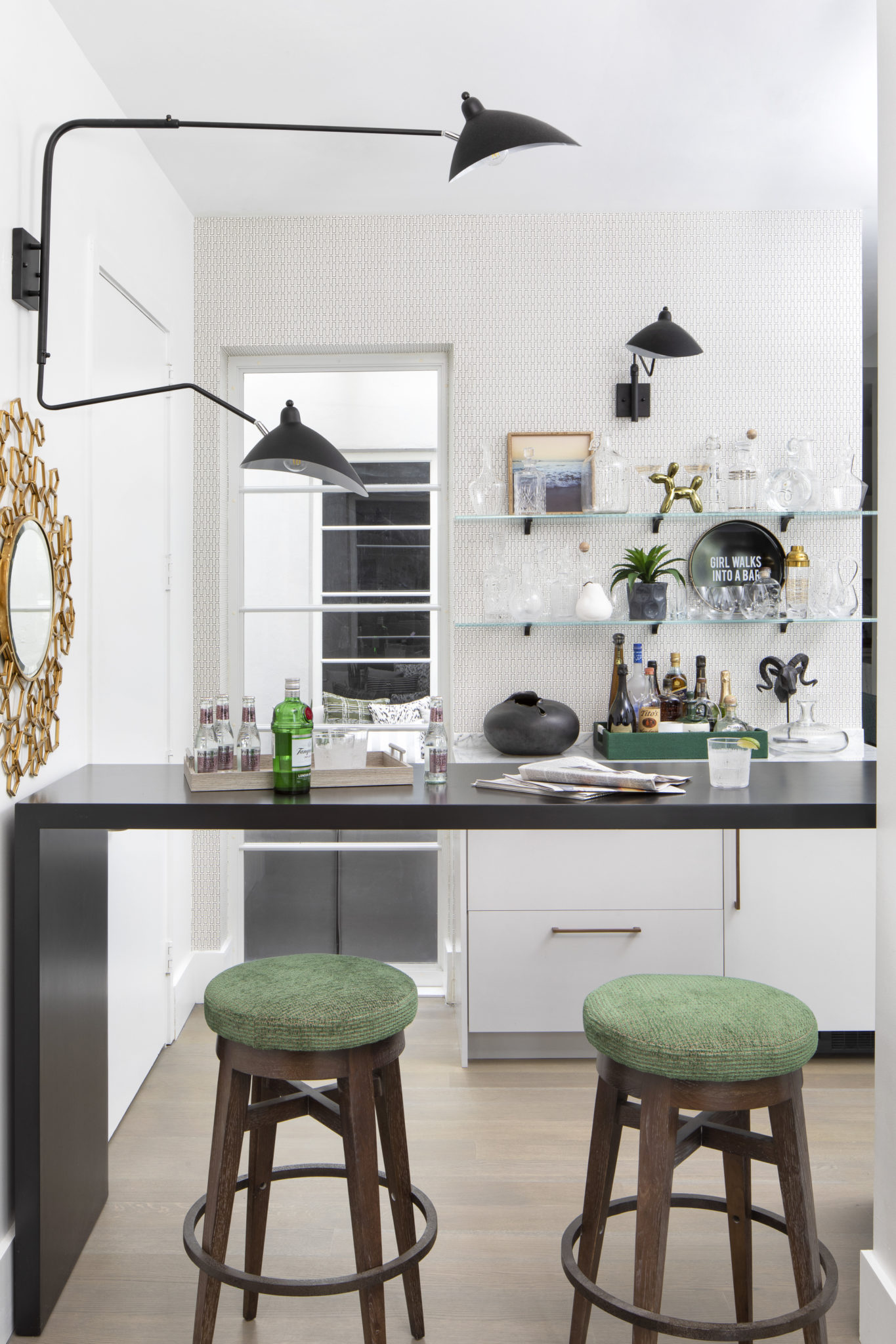
Interior Design by Krista W. Alterman, Photo by Jessica Glynn
Choosing unique finishes for your cocktail bar makes for fun conversation when your guests gather for cocktails. How fabulous is the tile on the bar below? Unfortunately, you can’t see it in this photo, but there is an incredible view of the ocean from this custom cocktail bar in a home we designed in the Ritz Carlton residences in Singer island, FL. Pure luxury!
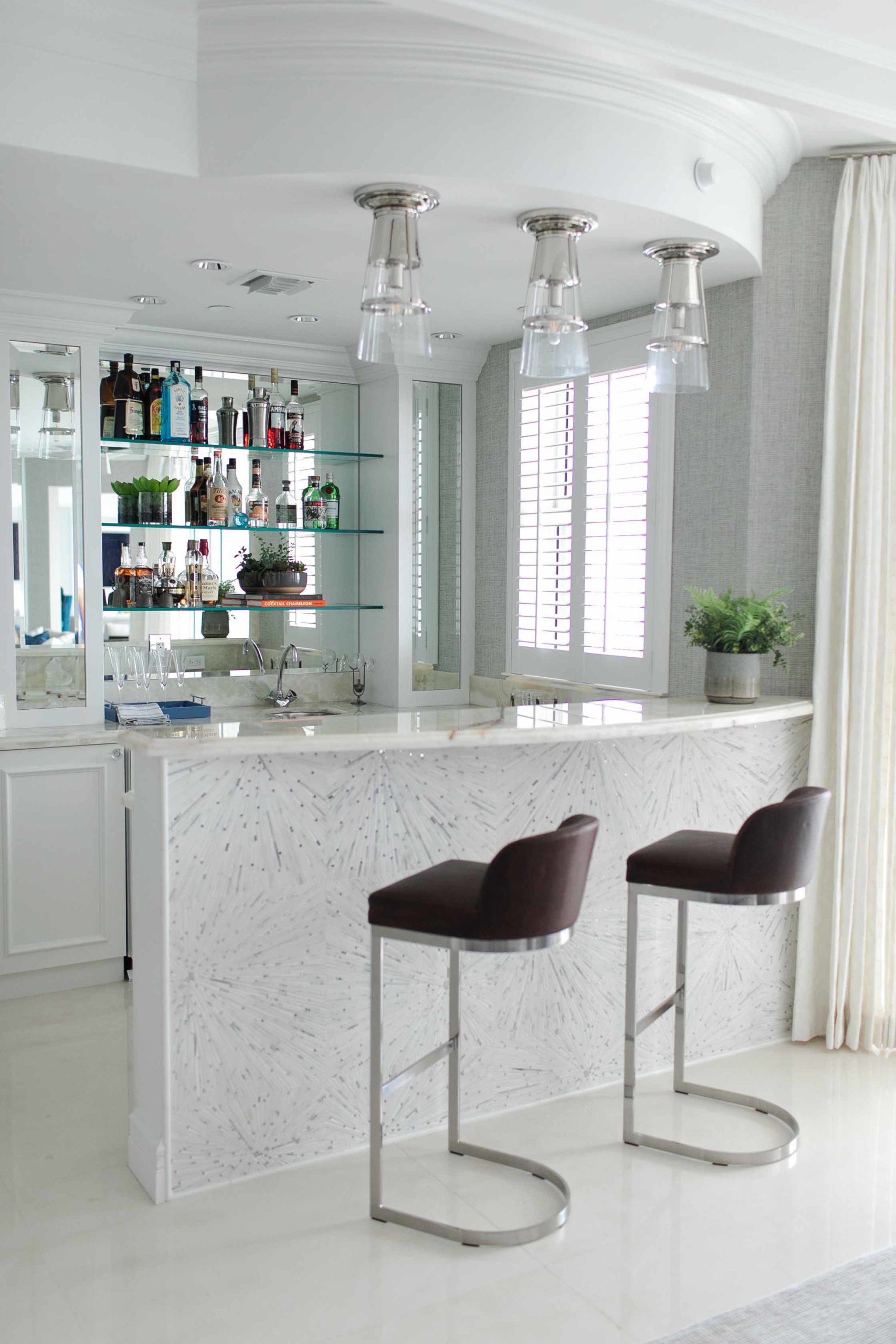
Interior Design by Krista W. Alterman, Photo by Eve GreendaleChoose luxurious and comfortable barstools for your custom cocktail bar! And don’t forget about lighting. In the bar below, I added a fun modern lamp and used the backdrop to feature artwork from the client’s private collection.
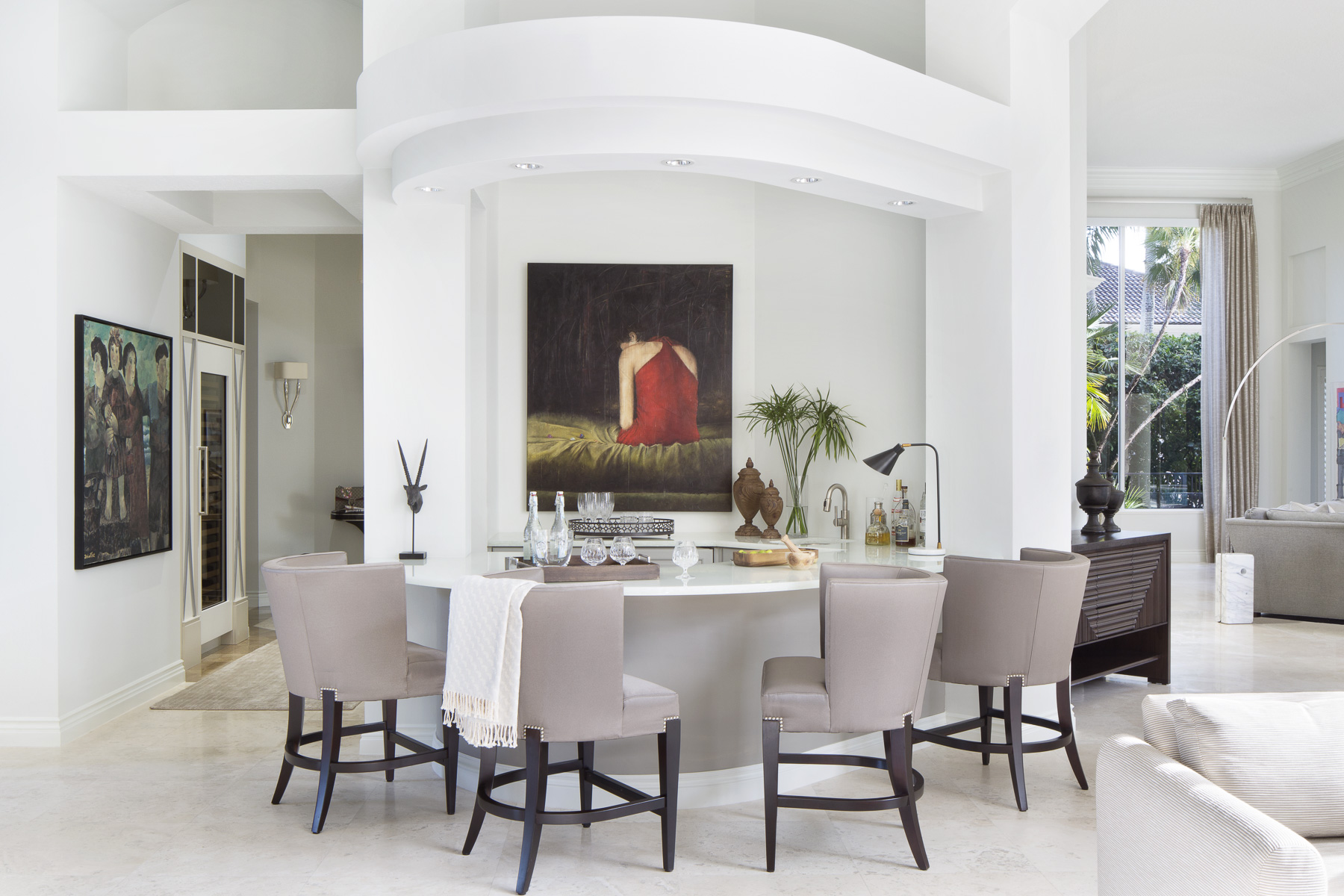
Interior Design by Krista W. Alterman, Photo by Jessica Glynn
A custom cocktail bar doesn’t need to be large. It can be created in a small nook like the bar below, with fresh coastal blue cabinets. Is it 5:00 yet? I am ready for a Paloma!
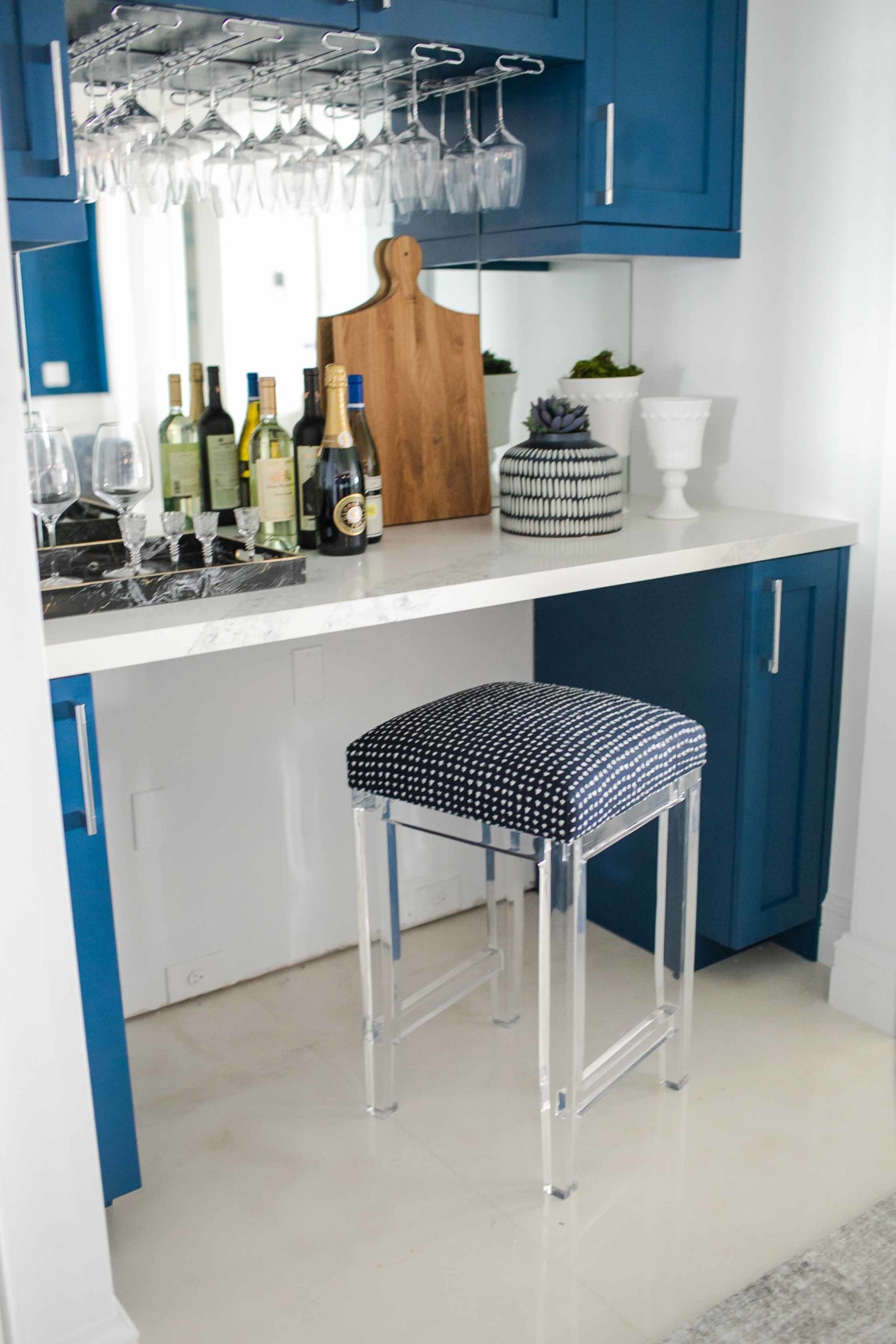
Interior Design by Krista W. Alterman, Photo by Eve Greendale
How Wallpaper Can Transform A Space
Wallpaper is back and hotter than ever! I love using wallpapers in my designs. There are so many gorgeous options available these days, and my design team and I feel like kids in a candy store when we have all of the samples laid out for selections! Wallpaper is such a wonderful way to express your style and it can completely transform a space.
Below is one of most recent designs, where we paired the paper with painted panels to create an elegant guest bedroom. The panels break up the wallpaper a bit, which allowed us to use a dramatic floral print without overwhelming the space. Florals are a big wallpaper trend for 2022. When using florals, the scale of the flowers in the patterns is important. Keep in mind that large prints can make small rooms appear even smaller, so choose accordingly. For smaller rooms, you should use smaller prints.
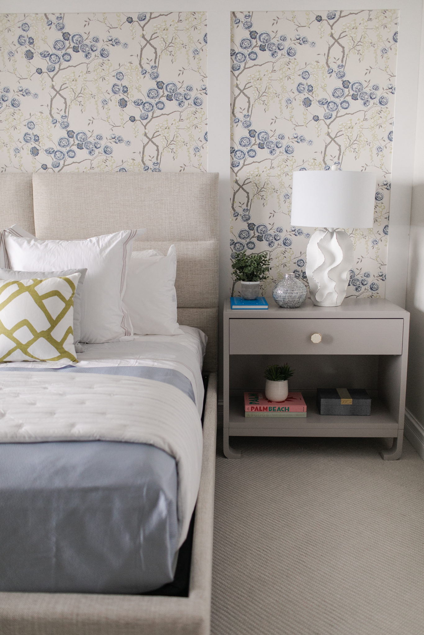
Interior Design by Krista W. Alterman, Photo by Eve Greendale. Wallpaper is by Kravet.
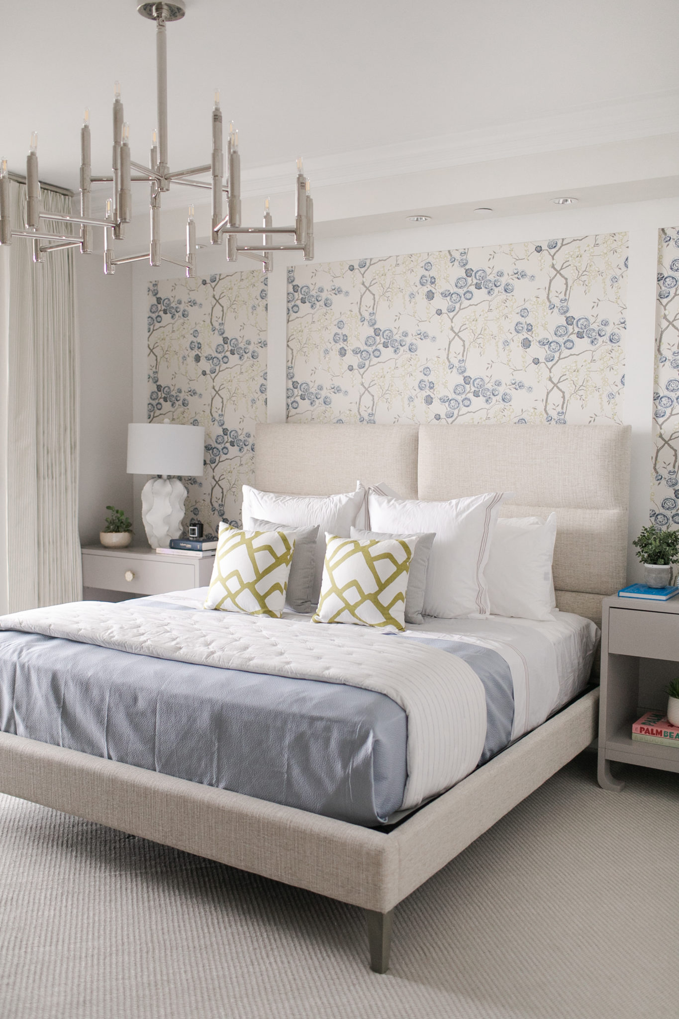
Interior Design by Krista W. Alterman, Photo by Eve Greendale. Wallpaper is by Kravet.
When I choose wallpaper, I always consider the lighting in the space. Dark and textured wallpaper tend to make a room look a bit smaller if there isn’t a lot of natural light. So I always make sure to have gorgeous light fixtures and plenty of lighting installed to ensure a warm glow.
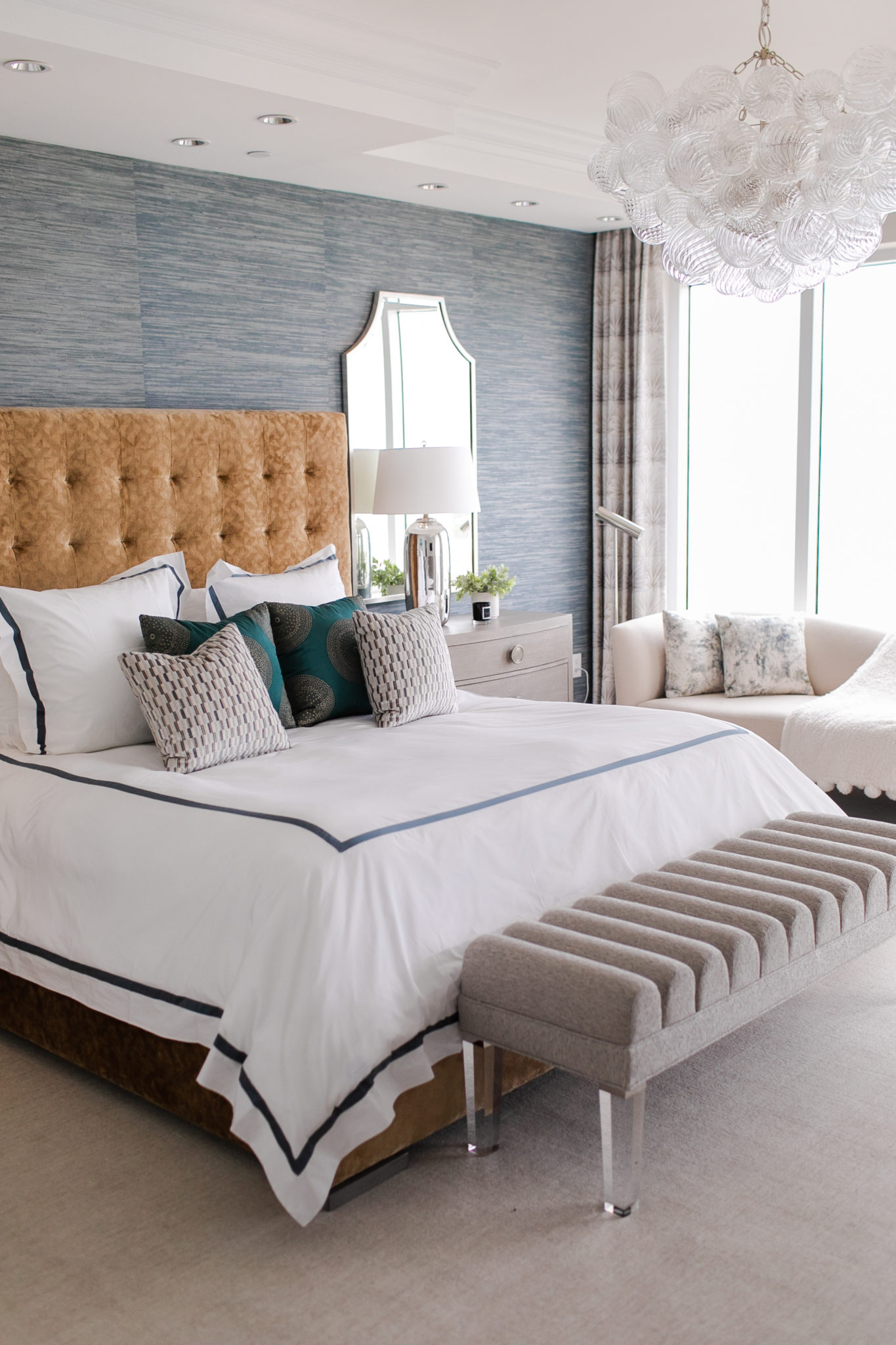
Interior Design by Krista W. Alterman, Photo by Eve Greendale. Dyed Raffia Wallpaper is by Schumacher.
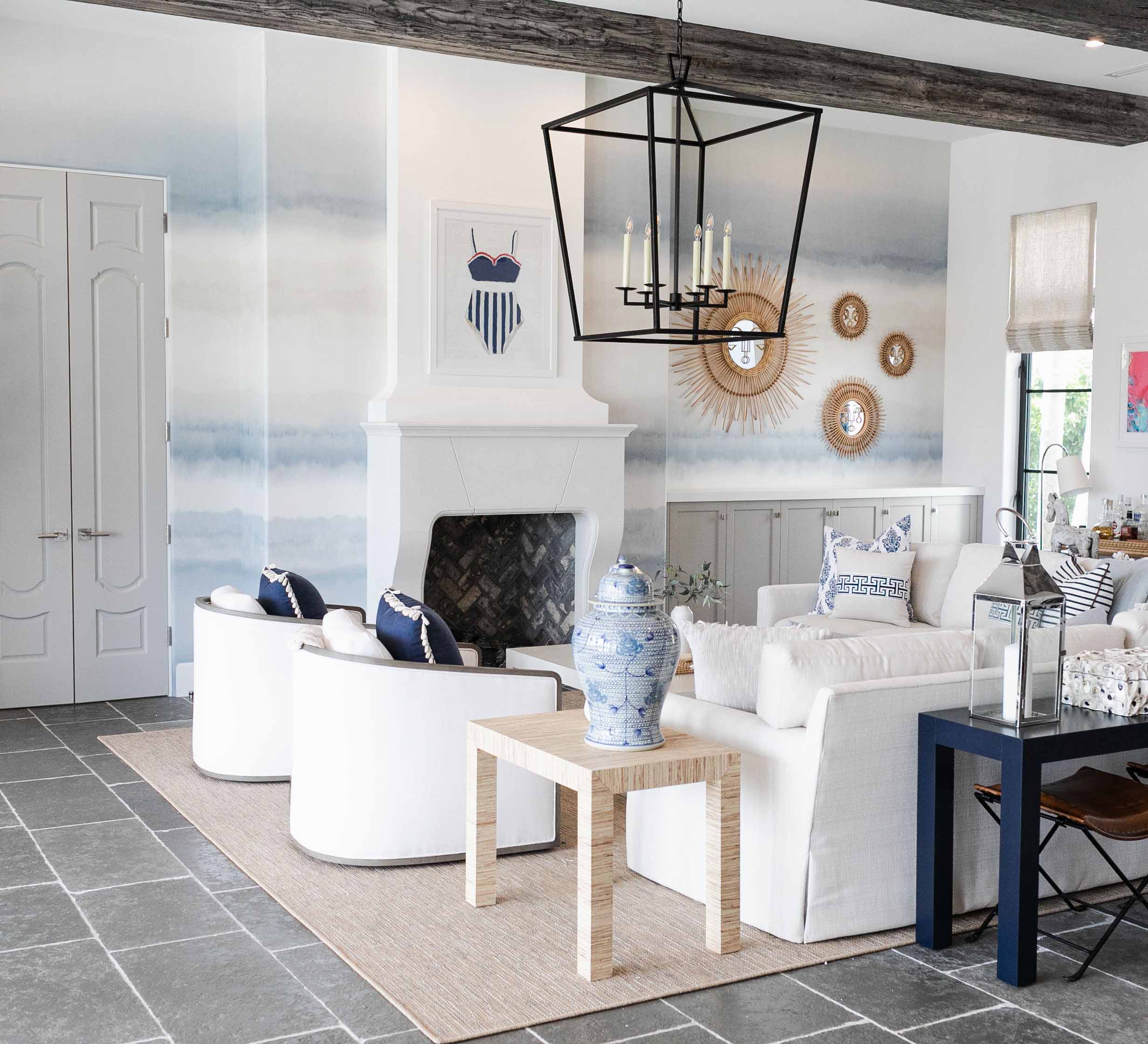
Interior Design by Krista W. Alterman, Photo by Eve Greendale. Wallpaper is by Schumacher.
I like to go bold in the powder room! Its a great place to make a big design statement and do something fun. Since a powder room is small and self contained, you don’t have to worry as much about a loud pattern clashing with other spaces. Also, since you don’t need as many rolls, you can splurge a bit on something truly fabulous.
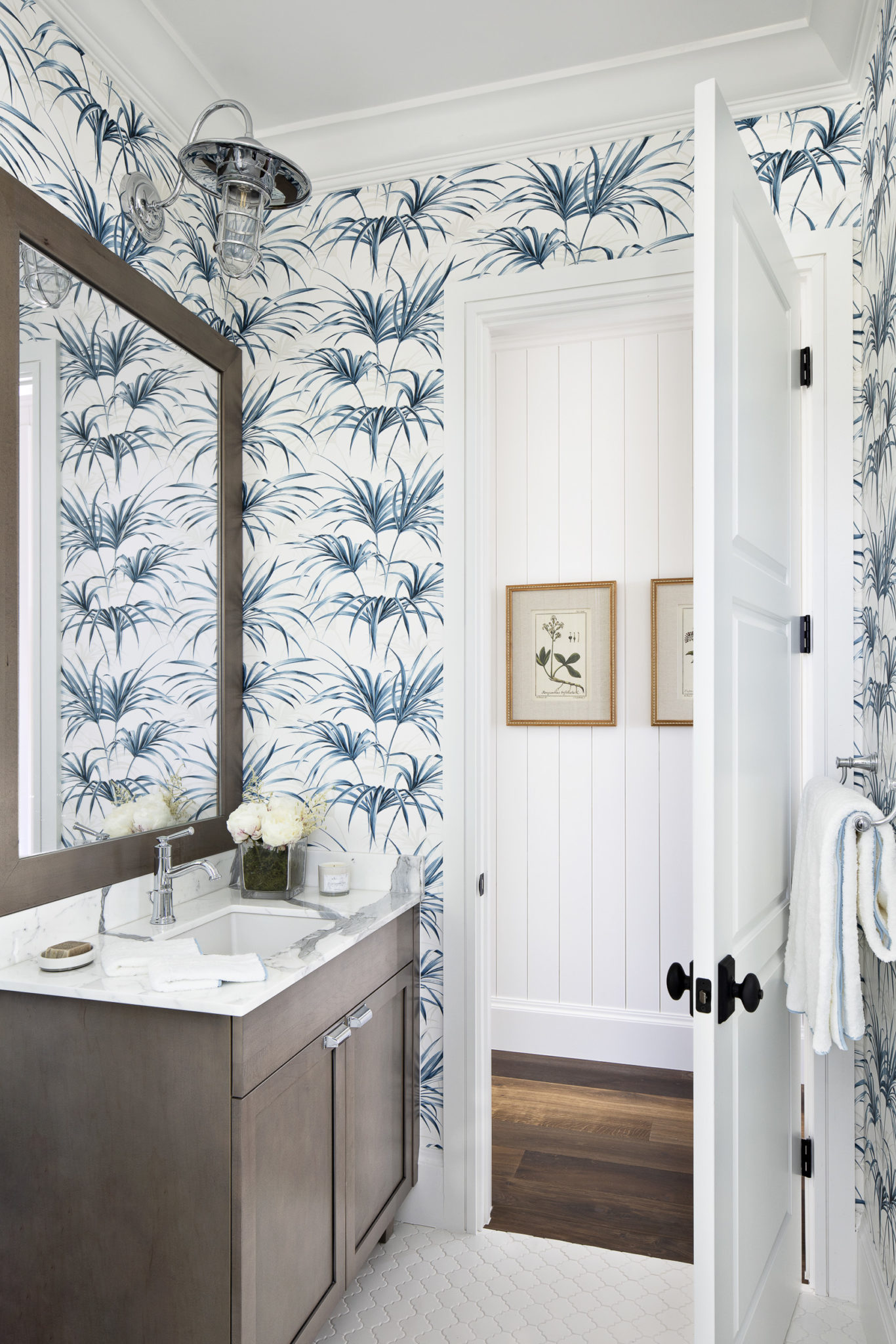
Interior Design by Krista W. Alterman, Photo by Jessica Glynn. Wallpaper is by Wallquest.
Using organic wallpaper really works well in coastal homes. I love using natural materials like we did in this guest room below. The wallpaper is made from organic seagrass. It adds beautiful texture to the space.
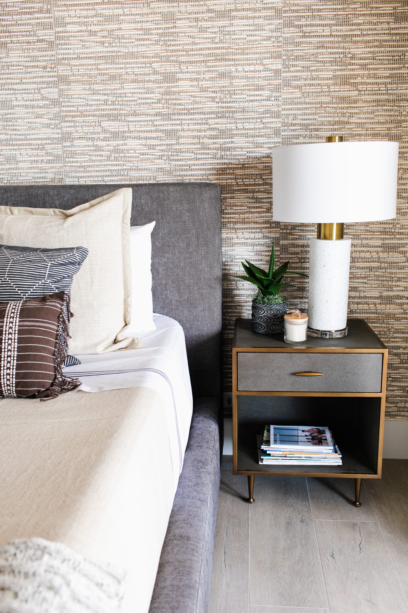
Interior Design by Krista W. Alterman, Photo by Eve Greendale. Wallpaper by Philip Jeffries.
Wallpaper on the ceiling can truly bring drama and wow factor. It is a fun way to add a bit of unexpected character to a room. I tend to look at the ceiling as a fifth wall, it shouldn’t be neglected!
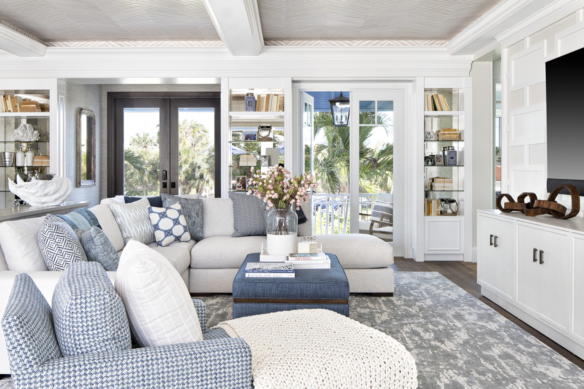
Interior Design by Krista W. Alterman, Photo by Jessica Glynn. Ceiling Wallpaper is by Philip Jeffries.
This is another fun ceiling installation that we did in the Widow’s Walk of a coastal home that leads out to a rooftop deck with views of the ocean. I love how the wallpaper sets the whole tone of the space, giving it a nautical and coastal vibe.
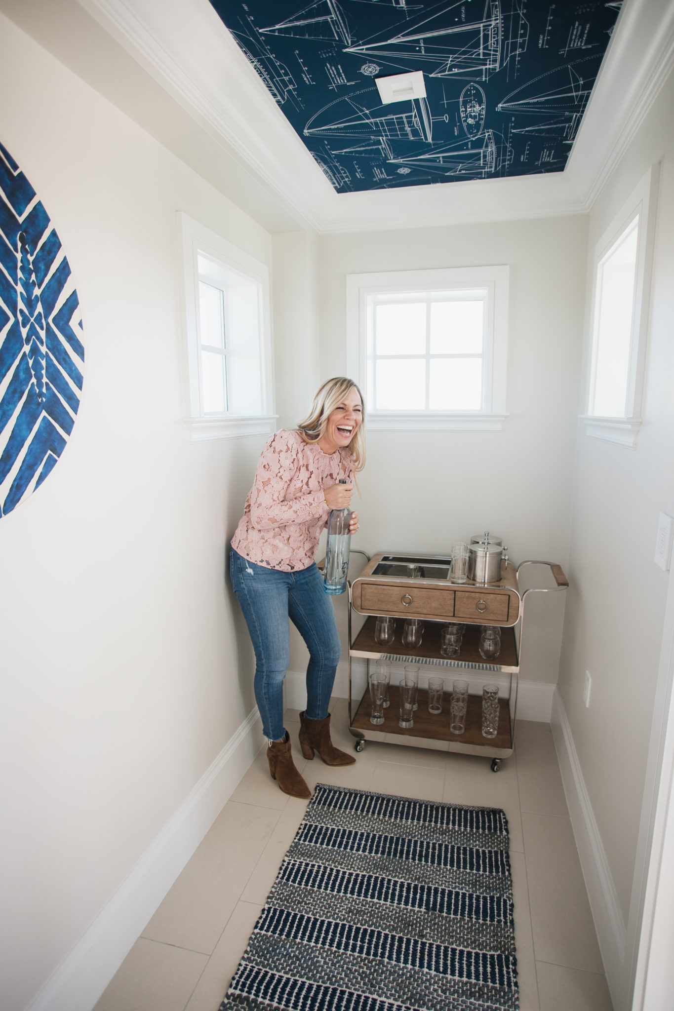
Interior Design by Krista W. Alterman, Photo by Eve Greendale. Wallpaper is by Wallquest.
There are so many stunning choices for wallpaper today, and they just keep getting better and better. Gucci has a line out and we recently used Dolce and Garbana wallpaper in a chic townhouse we designed in Miami Beach.

Interior Design by Krista W. Alterman, Photo by Jessica Glynn. Wallpaper by House of Scalamandre.

Interior Design by Krista W. Alterman, Photo by Jessica Glynn. Wallpaper is by Orlean Wallcoverings.
Modern Balinese Bungalow
This project was a truly a joy to work on. When I first met the client, she had compiled a thick vision book with clippings of the vibe she wanted to create for her complete gut renovation of this waterfront beauty in North Palm Beach. As I looked through her inspiration photos, I noticed that she loved globally inspired pieces and the client told me Bali was one of her favorite places on earth. I decided to call this design “Modern Balinese”. This home is definitely a modern beach house in every way! There are gorgeous views of the water from every window, and a stunning koi pond at the entry.

Interior Design by Krista W. Alterman, Photo by Eve Greendale
In the kitchen, I selected these statement organic pendants by MadeGoods and sleek black cabinetry. The black stone on the backsplash and counters is repeated in different areas throughout the home, as is the wood paneling on the ceiling. The modern barstools are by Palecek.
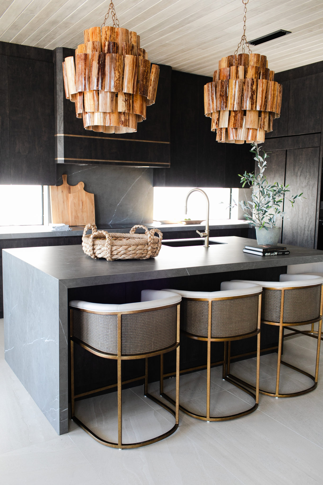
Interior Design by Krista W. Alterman, Photo by Eve Greendale
The couple has four(!) dogs so they did not want rugs in the home. We added a gorgeous wood look tile and comfortable seating to add warmth. We layered lots of texture and wood elements, with organic and earthy accessories.
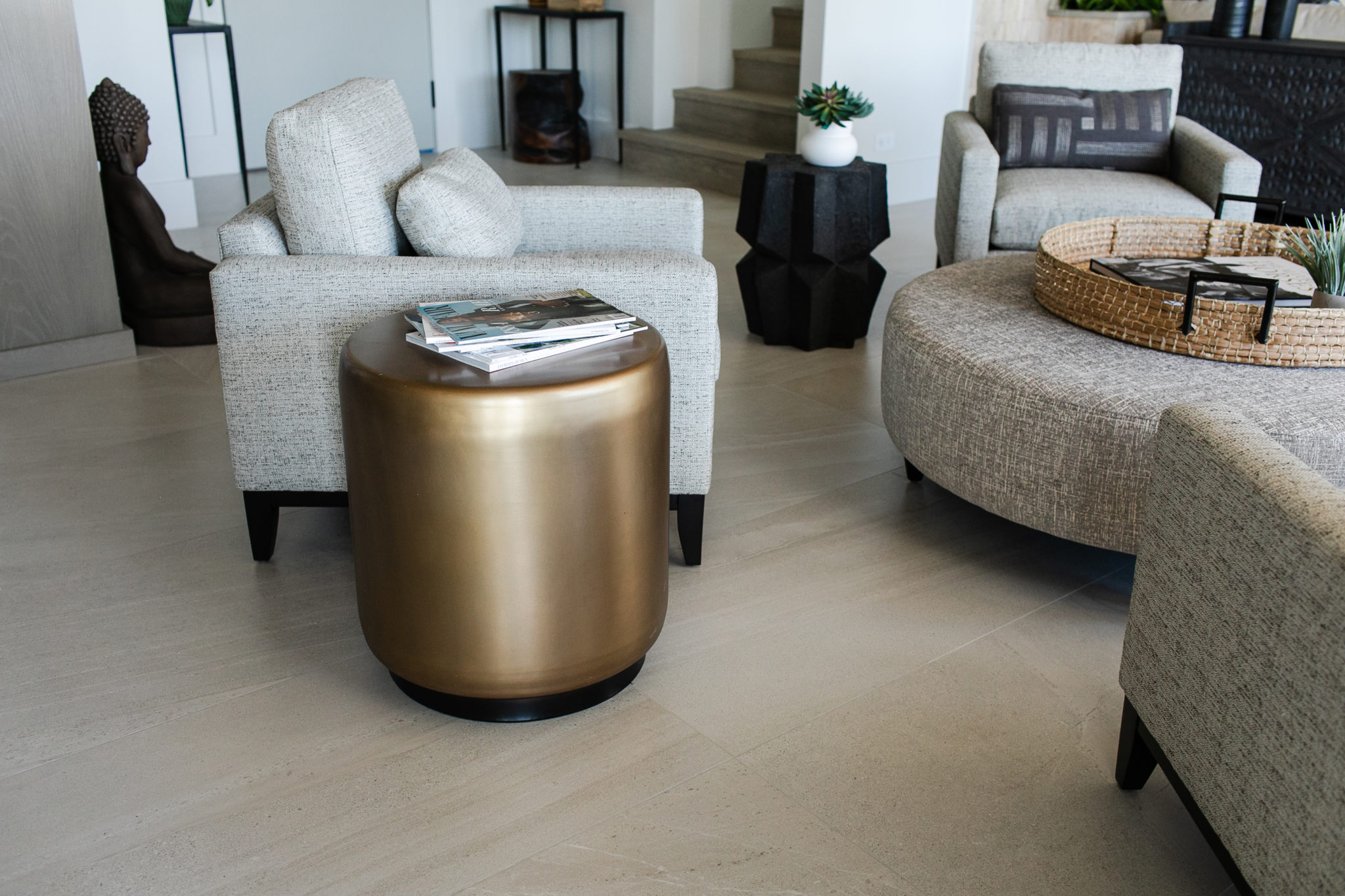
Interior Design by Krista W. Alterman, Photo by Eve Greendale
I designed the dining chairs below and they are available to purchase online as part of my furniture line, The Krista Home Collection. These chairs are extremely comfortable and I love mixing the elegant upholstery with rustic elements.
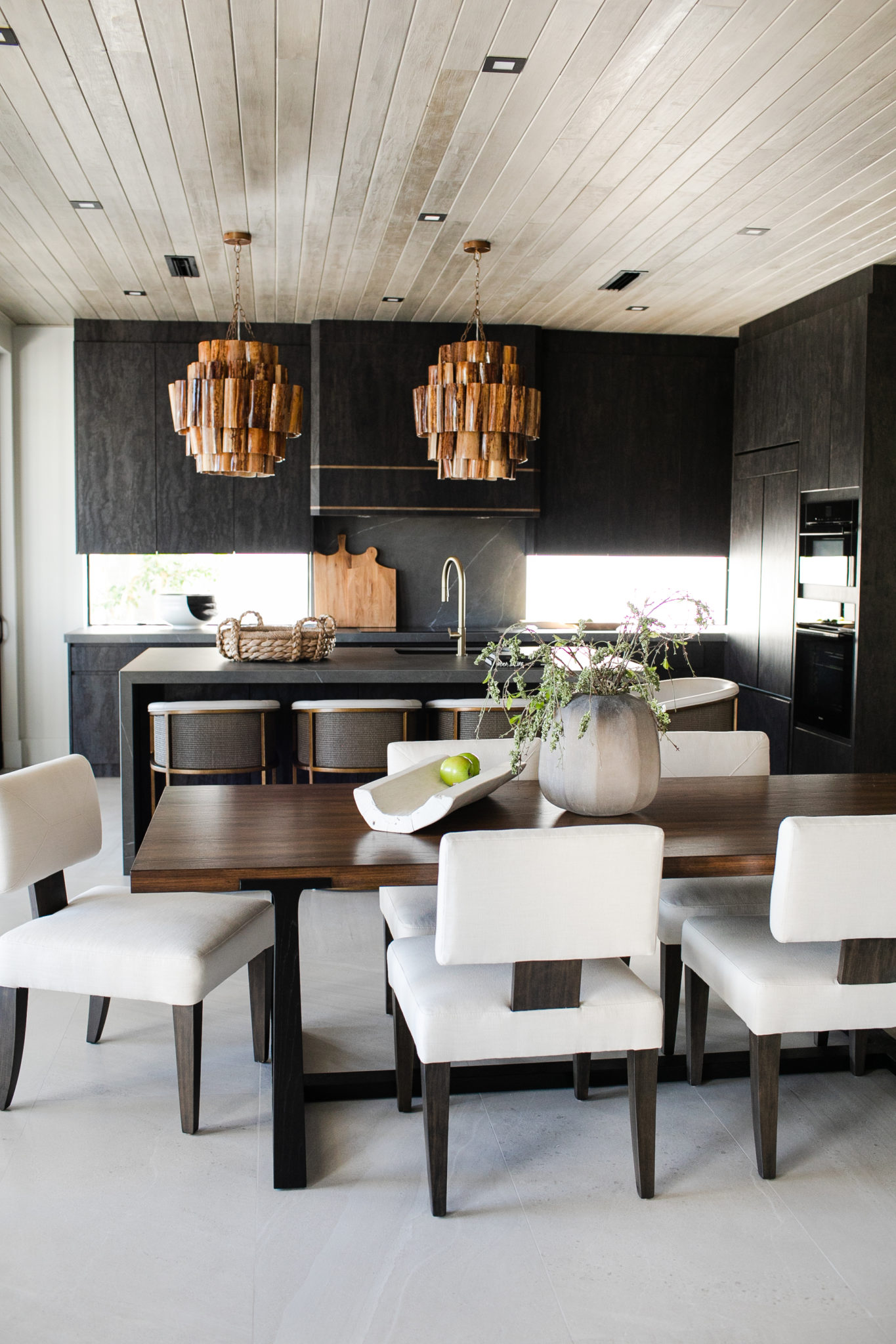
Interior Design by Krista W. Alterman, Photo by Eve Greendale
The master bedroom features organic seagrass wallpaper and a built in fireplace with cozy sitting area. I love the black opium pendants by Forestier Paris and the antique iron four poster bed by Oly Studio.
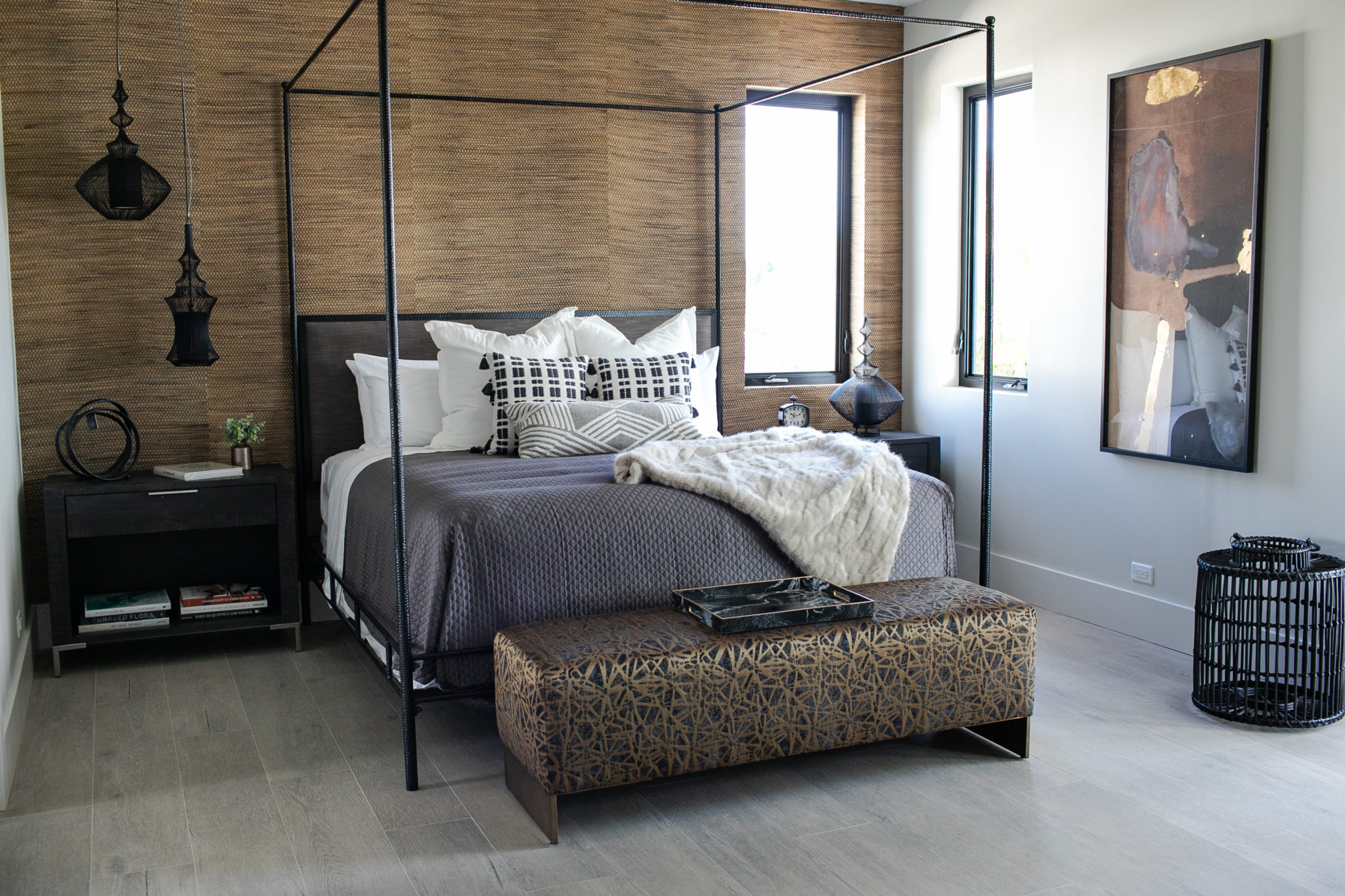
Interior Design by Krista W. Alterman, Photo by Eve Greendale
This home office faces the water and has such gorgeous light. The sliders open up to a beautiful veranda where you can watch the boats go by. The rich wood on the built-in bookshelves add a sleek vibe, making this the perfect spot to work from home.
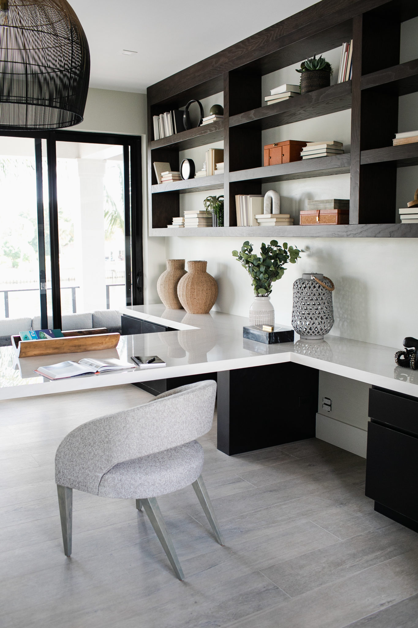
Interior Design by Krista W. Alterman, Photo by Eve Greendale
I hope you enjoyed the tour of this Modern Balinese design! Stay tuned as we will be adding the full project to our portfolio soon.
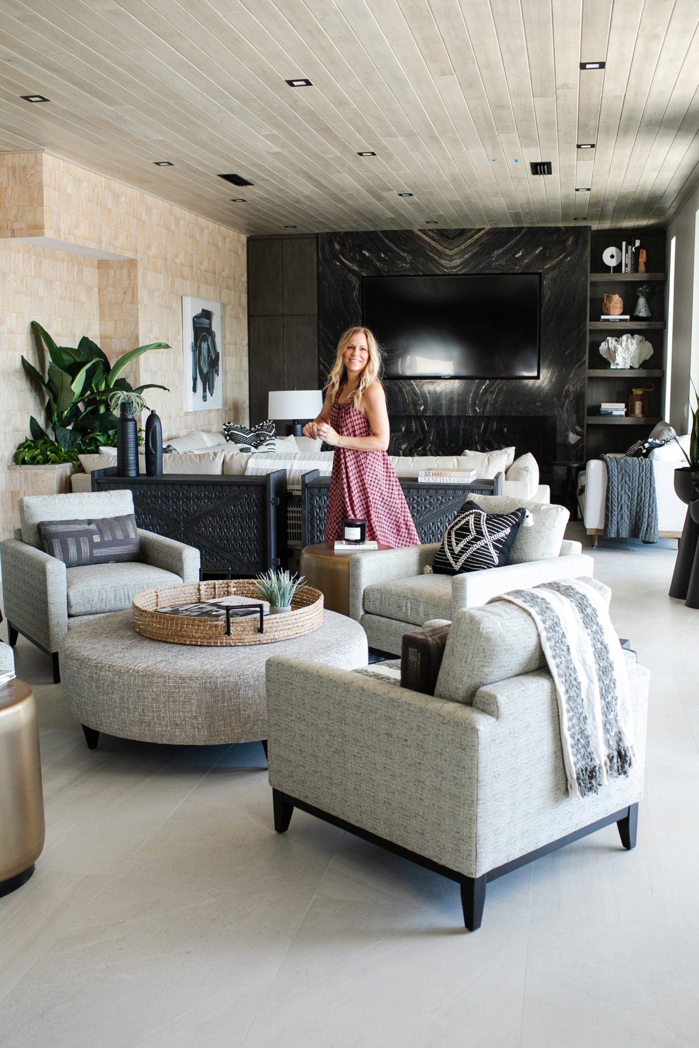
Interior Design by Krista W. Alterman, Photo by Eve Greendale
From Dated and Drab to Modern and Fresh: Before & After
This lovely family purchased a beautiful home in a gated country club community that was in need of some serious refreshing! We took the home from drab and dated to modern and fresh! I love how this home turned out. A great before and after story (doesn’t everyone love those?)
The before and after of the kitchen below is truly astonishing. It is a perfect example of how important lighting is to a space. I have a girlfriend who told me she has been trying to convince her husband to switch out the fixture in their entry for years. Finally, she just did it while he was at work, and he could not believe how much it transformed the entire space. He had to see it to believe it! That is the same thing that happened in this kitchen below. We really did minimal work on this kitchen… but switching out lighting made a BIG impact.
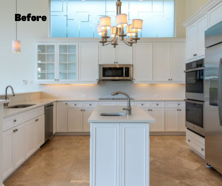
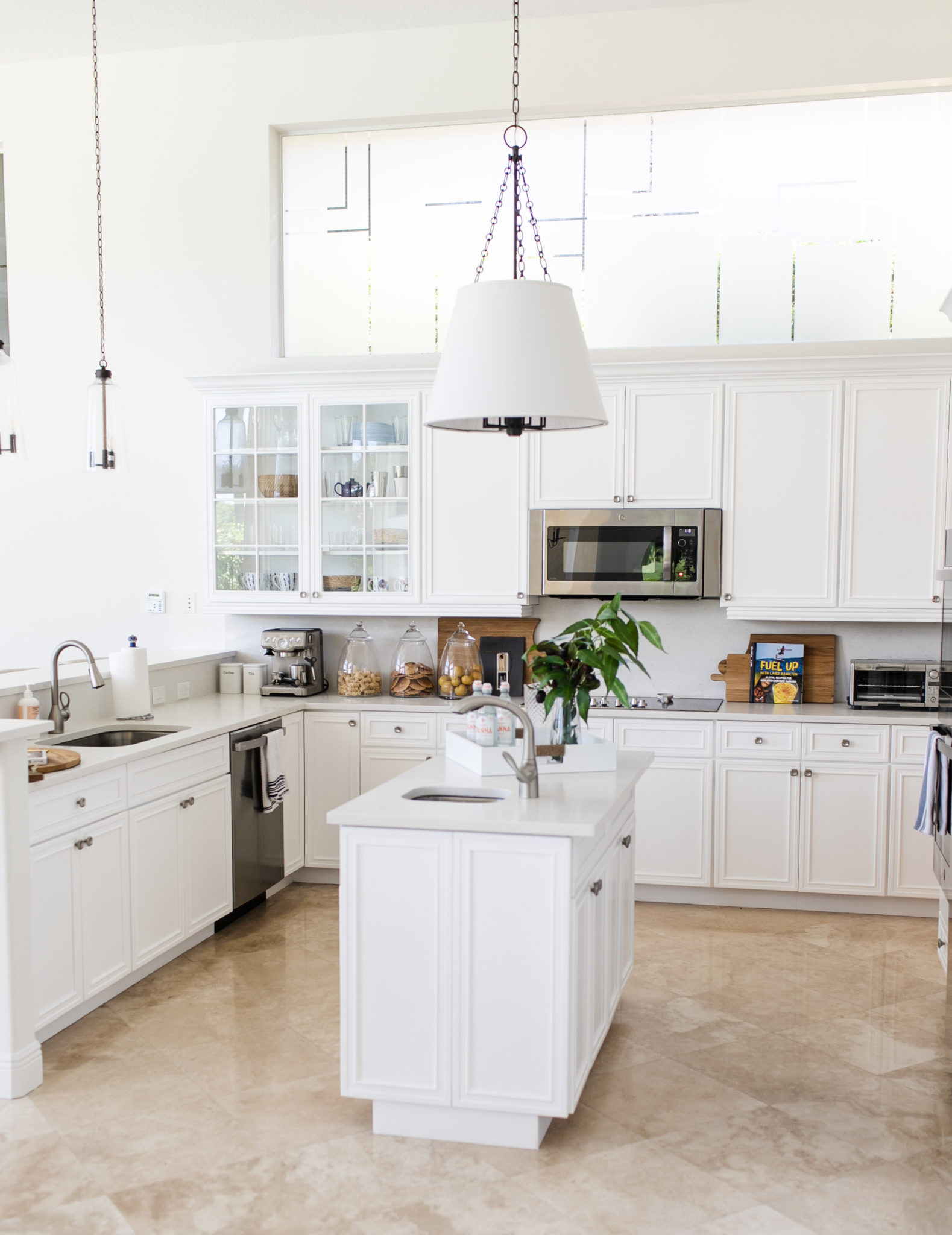
Interior Design by Krista Watterworth Alterman, Photo by Eve Greendale
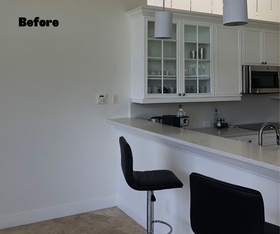
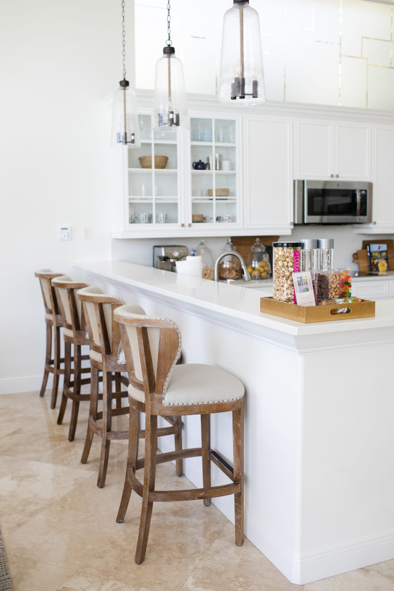
Interior Design by Krista Watterworth Alterman, Photo by Eve Greendale
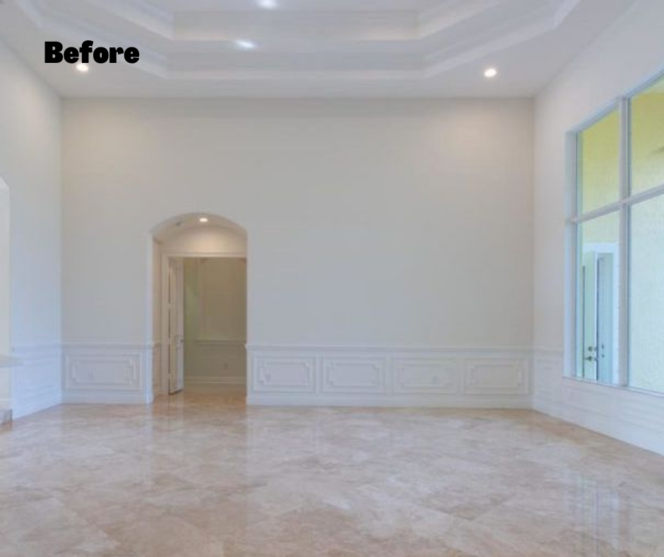
When we started, the living room was a big stark space, like a blank canvas. I wanted to fill the room with warmth and comfort, so I added layered fabrics and textures to create an inviting space where the couple could relax with a book or entertain with friends with cocktails (there is also a custom bar, not shown in these images).
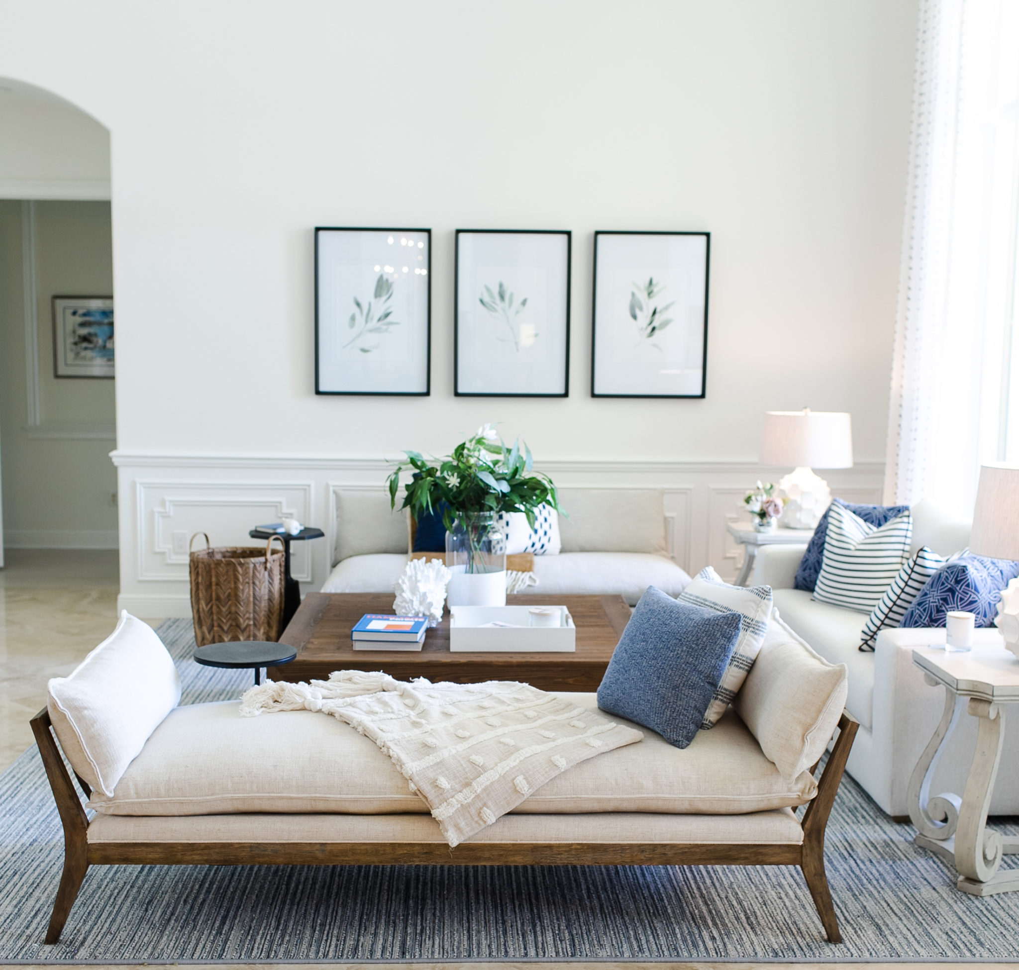
Interior Design by Krista Watterworth Alterman, Photo by Eve Greendale
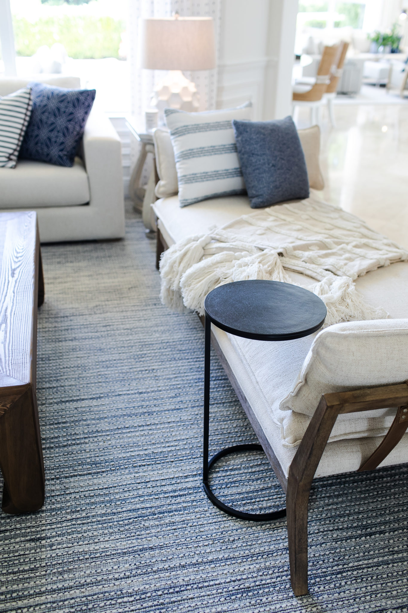
Interior Design by Krista Watterworth Alterman, Photo by Eve Greendale
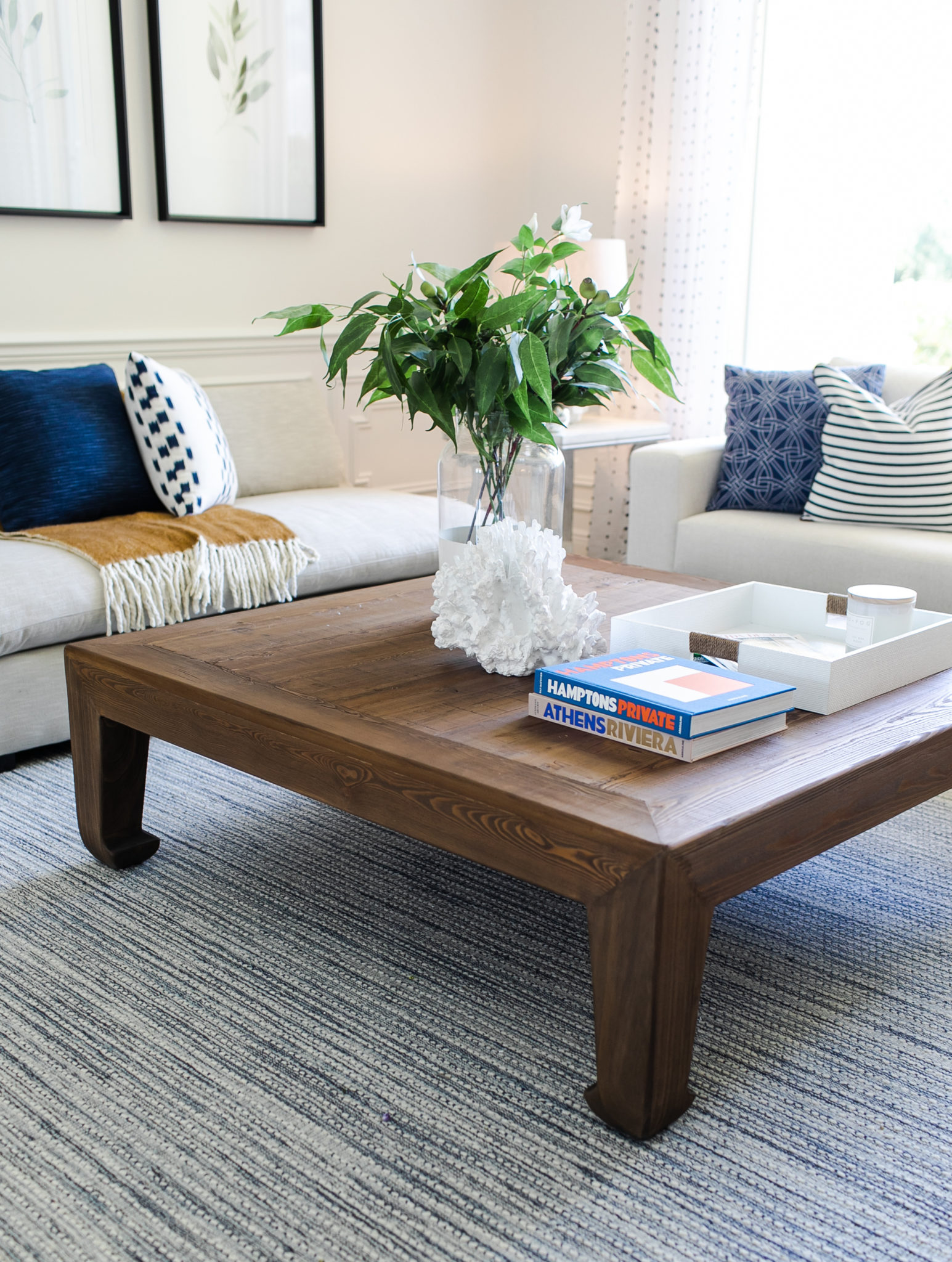
Interior Design by Krista Watterworth Alterman, Photo by Eve Greendale
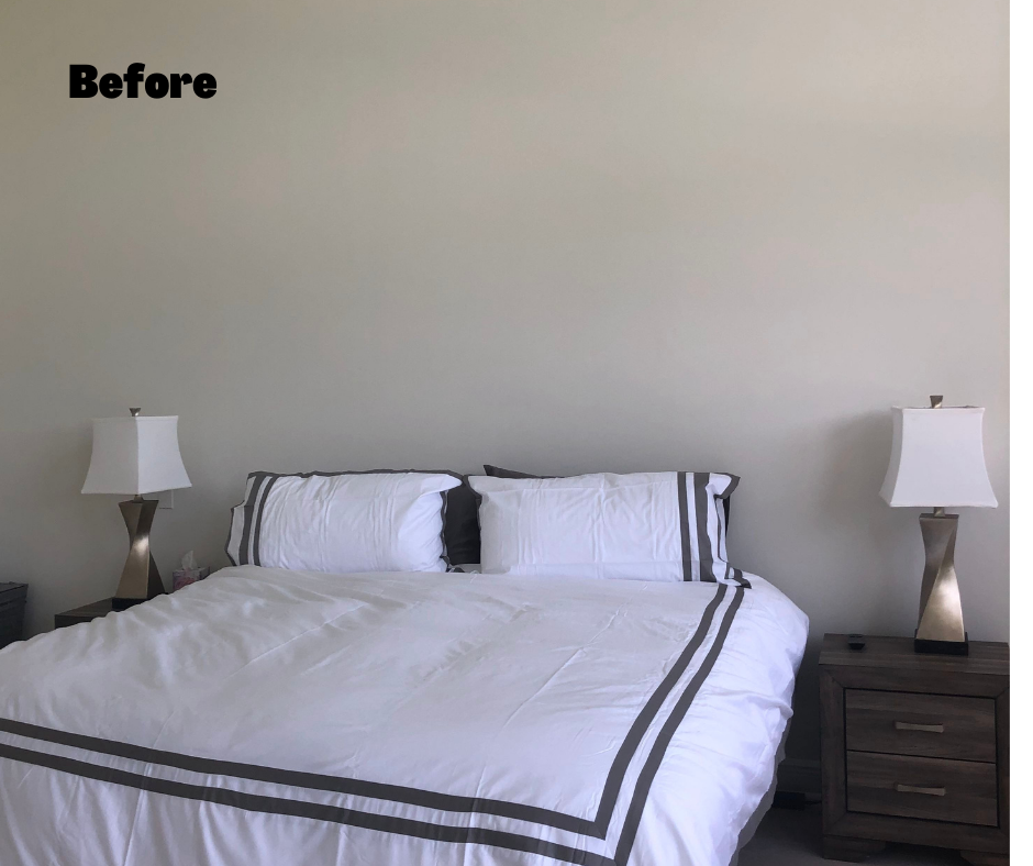
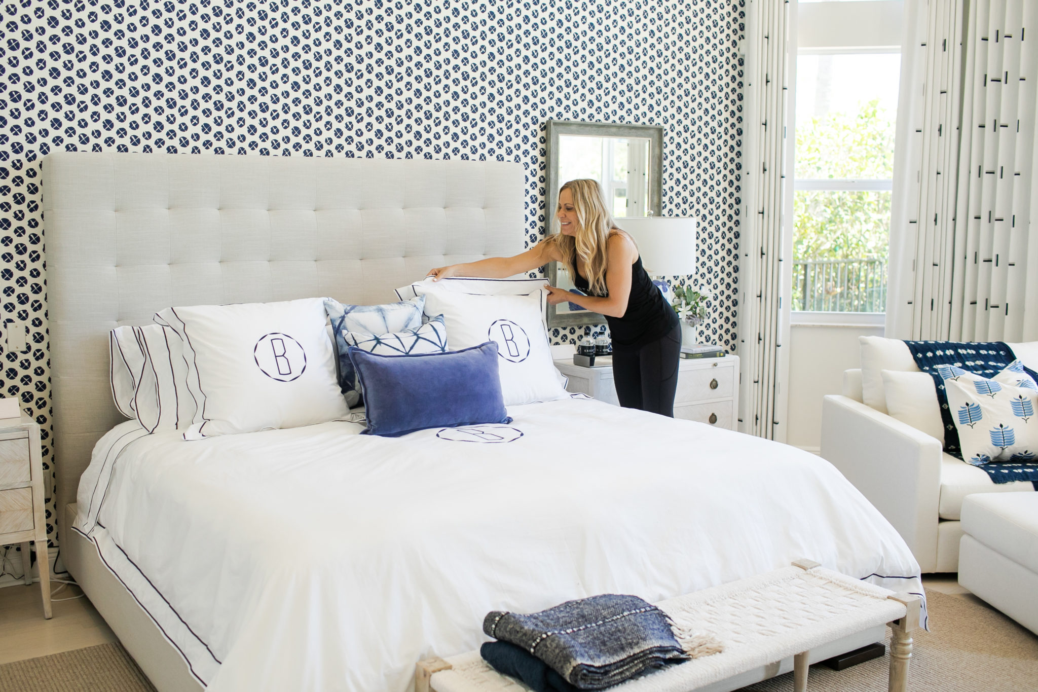
I love this fresh blue and white master bedroom we created! We used crisp whites to balance out the color, and a plethora of yummy fabrics for the pillows, draperies and upholstery.

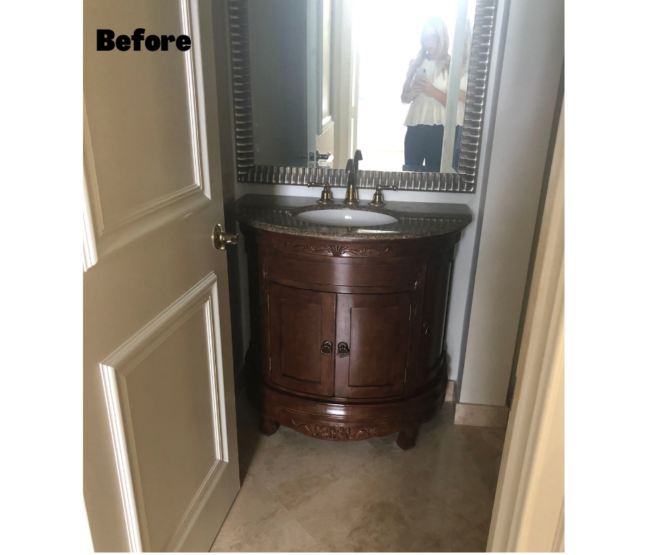
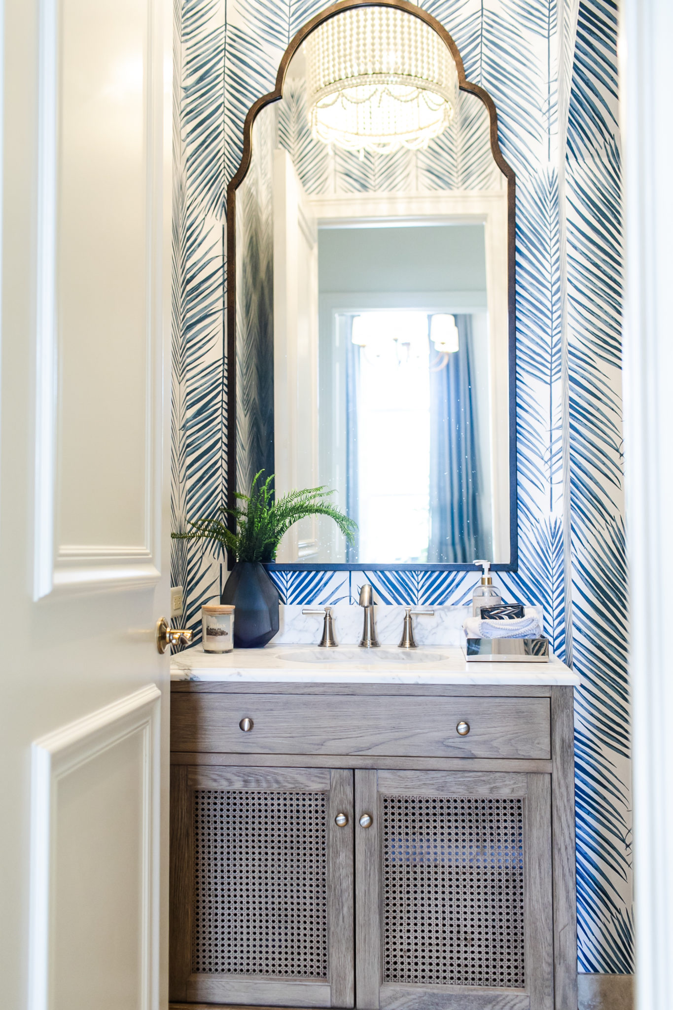
The powder room is always a fun room to take a little bit of a design risk, so we added some fabulous wallpaper. The mood for the design is modern coastal, and I love the texture in the vanity we selected. Better than the old dated and heavy one, right? The powder room is a room where you know guests will be, so it is always fun to go bold,
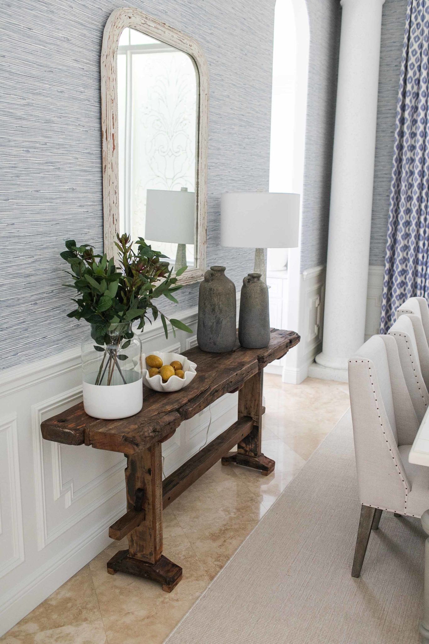
In the dining room, scale is always important, and you can see how in the “before” photo the table is too small for the space and it is overall lacking warmth. We swapped out the dated chandelier, added some textured wallpaper for warmth, and a rug to ground the space and section off the table. Finally, I love the wood elements we brought in with the reclaimed walnut console and the legs of the upholstered chairs. The addition of the beautiful drapery in happy blue and white carries through the palette we created for the rest of the home. It creates a nice continuity.
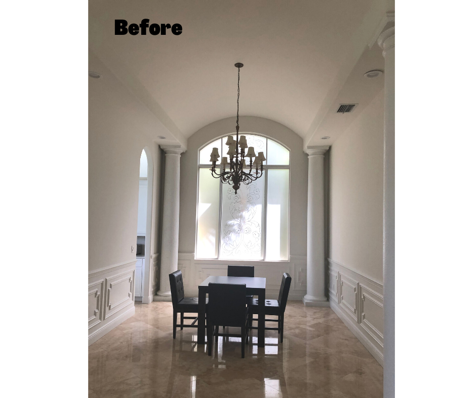
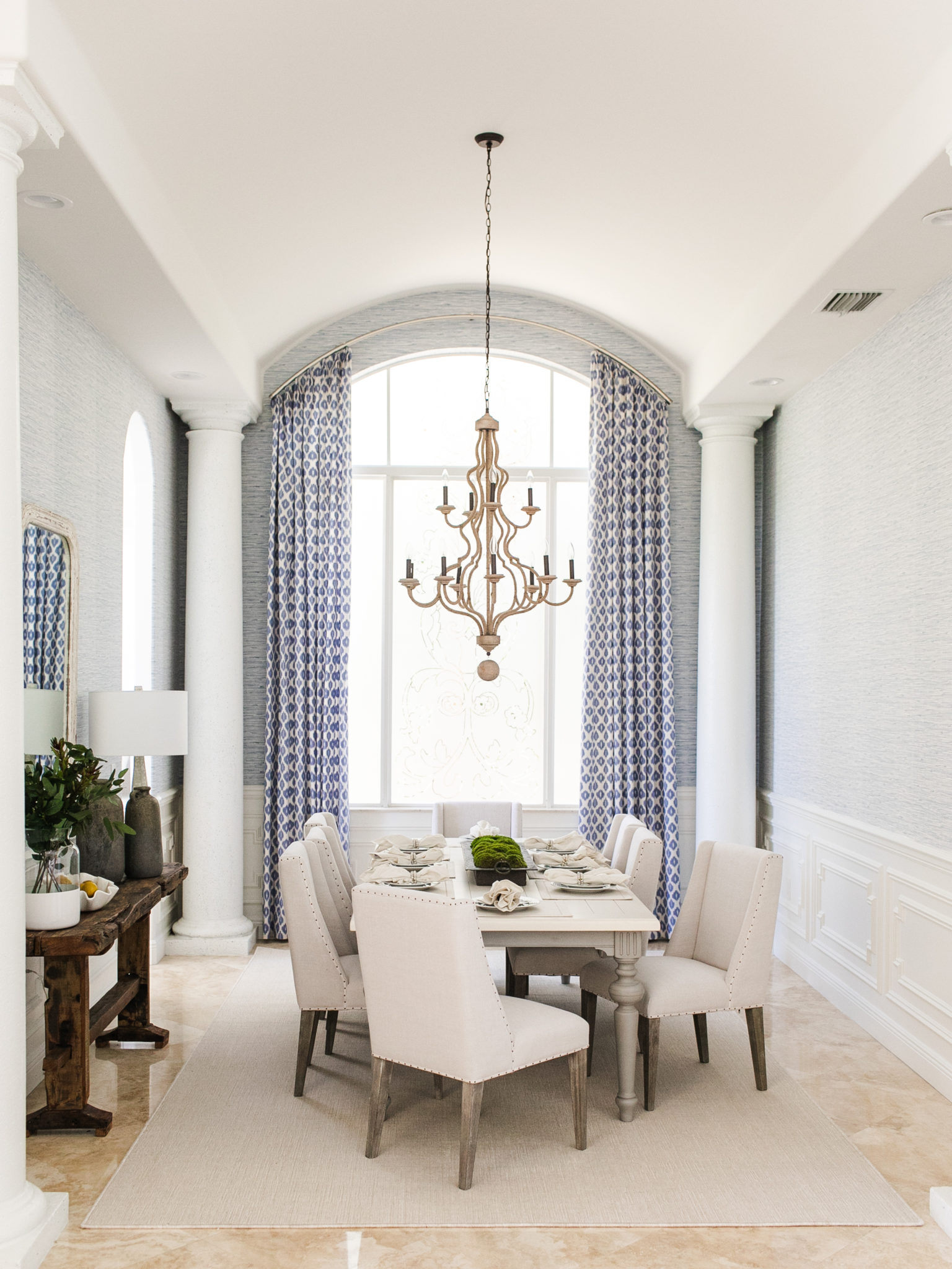
Interior Design by Krista Watterworth Alterman, Photo by Eve Greendale
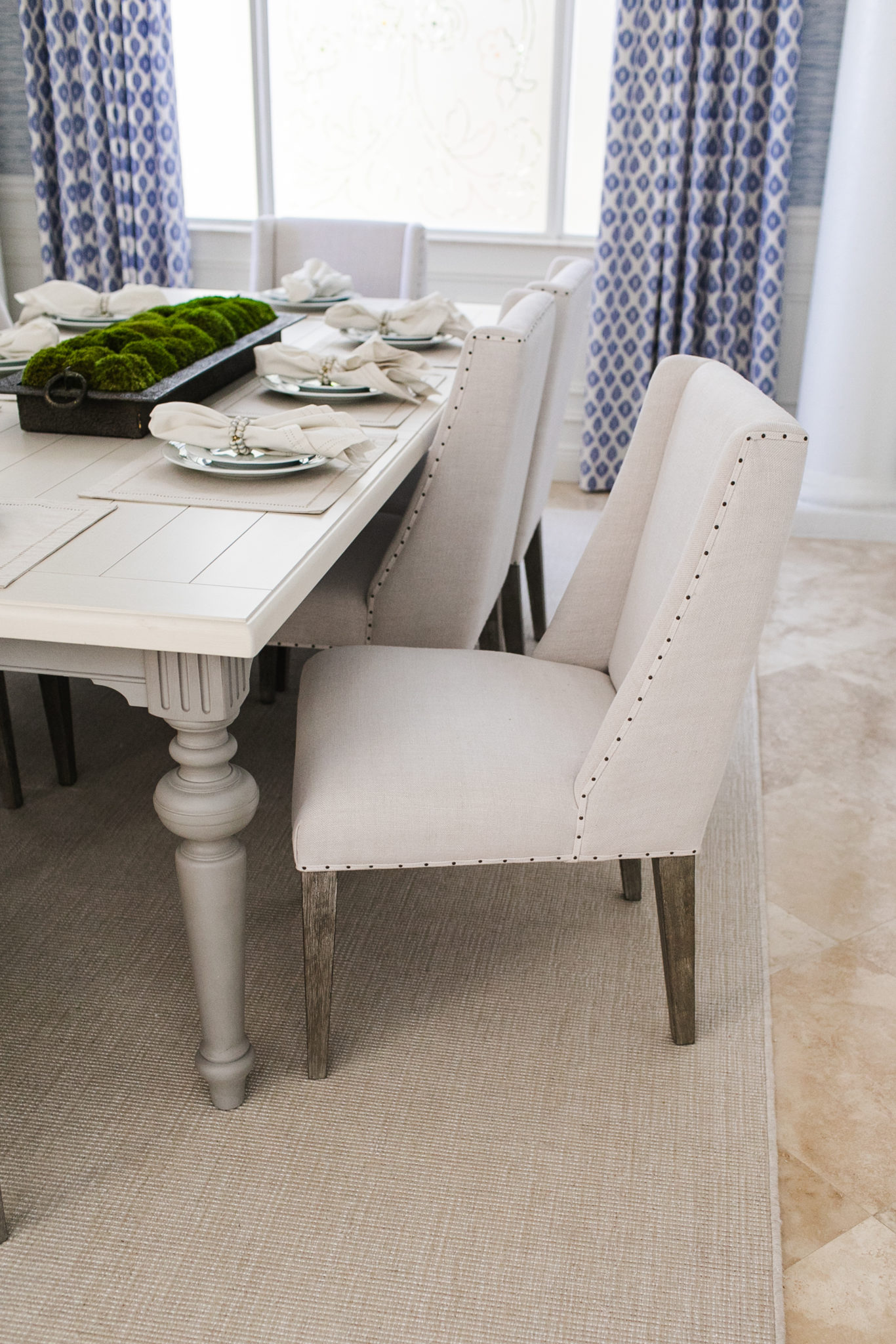
Interior Design by Krista Watterworth Alterman, Photo by Eve Greendale
I hope you enjoyed this fun Before and After story! I am excited as we move on to Phase Two of this project – renovating their FIVE bathrooms! Stay tuned…
2021 Design Excellence Award – Traditional Bathroom Design
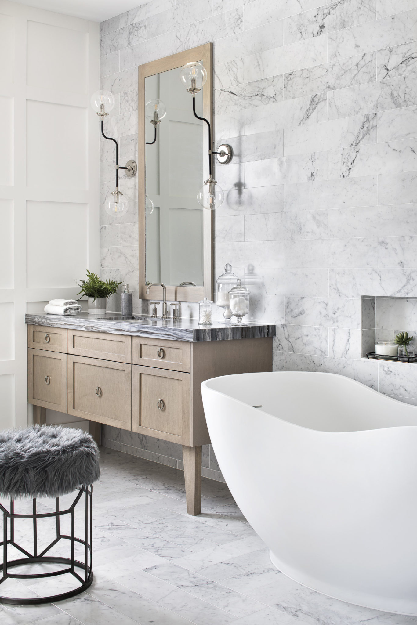
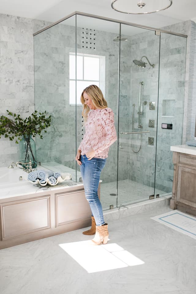
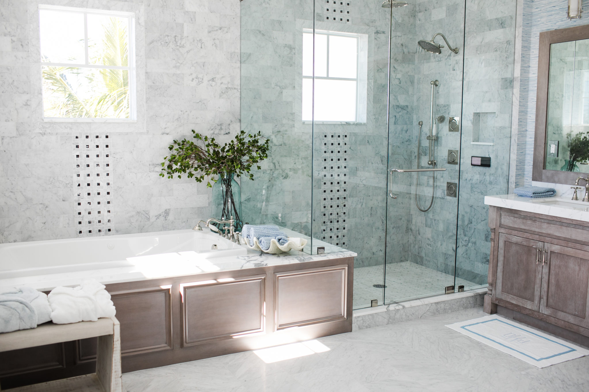
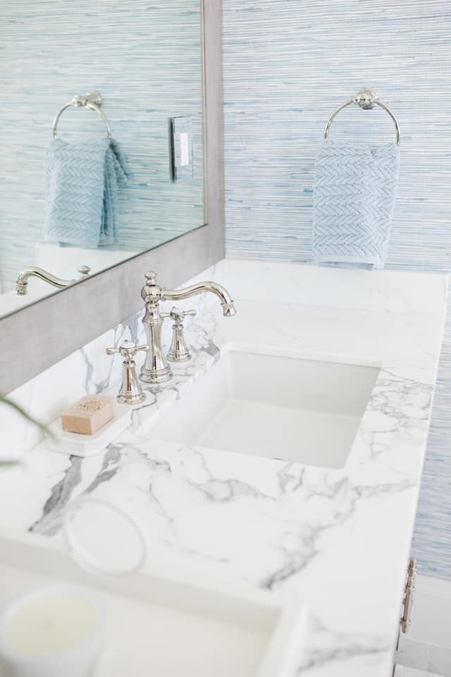
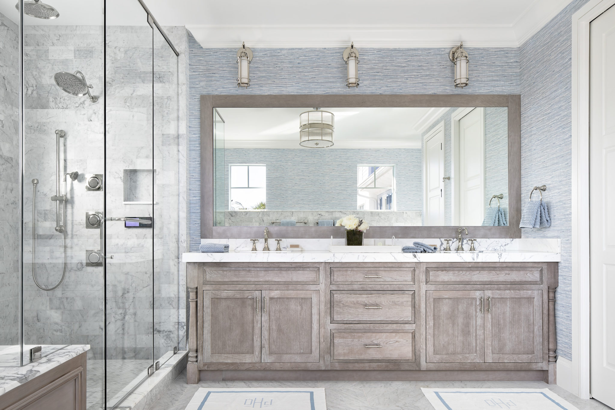
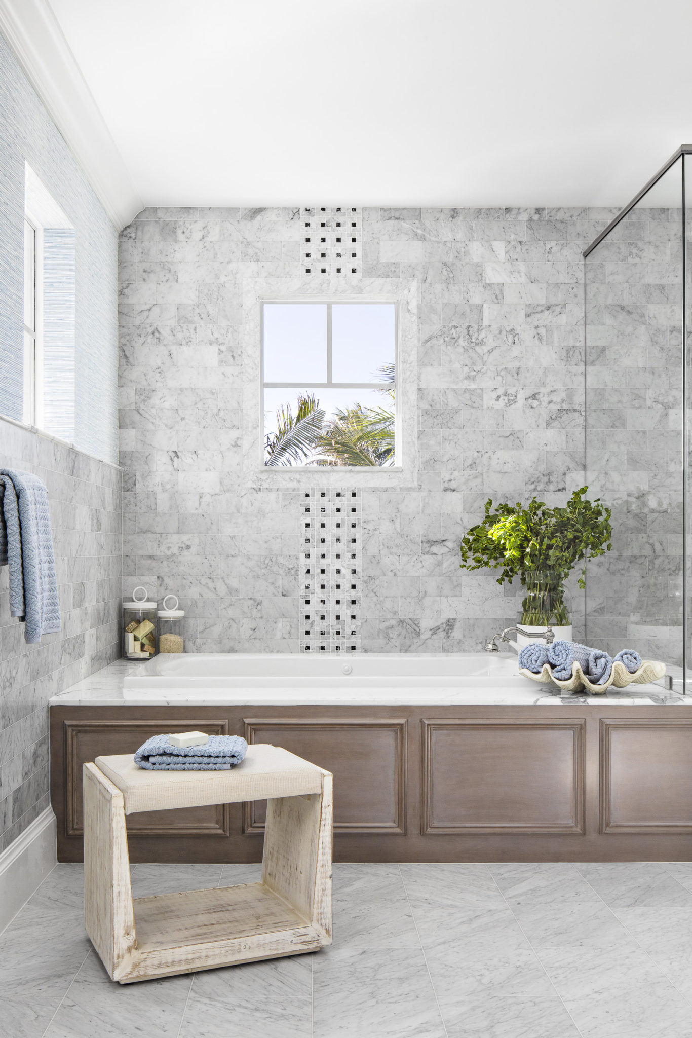
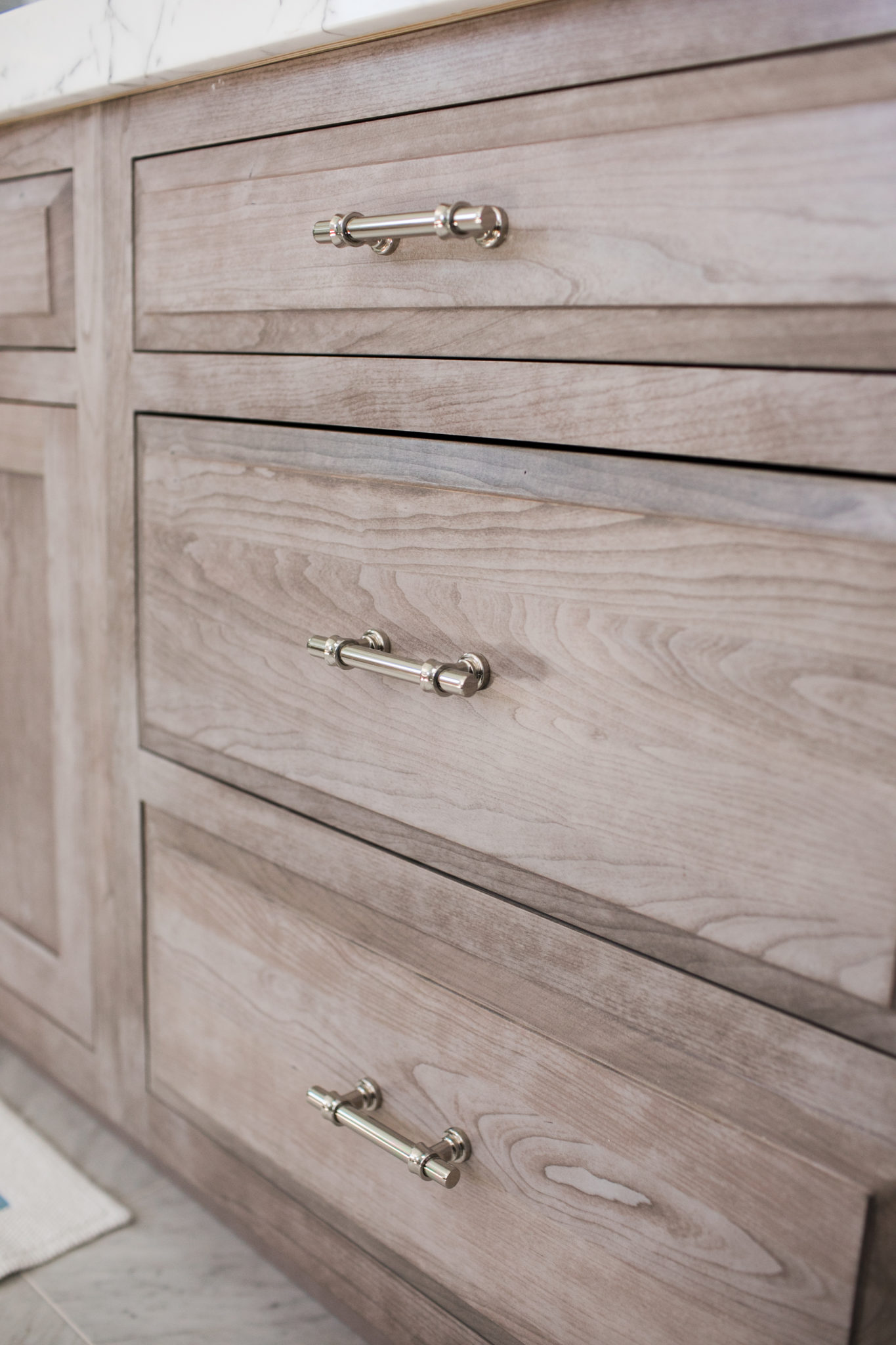
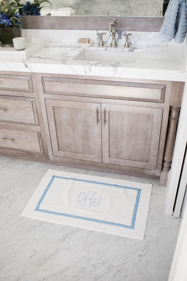
We are so honored and excited to have won a 2021 Design Excellence Award from the American Society of Interior Designers (ASID). We won in the category of Traditional Bathroom Design. This coastal and fresh master bath was designed for a beach home in Juno, Florida. I love the soft blues and organic materials we used throughout.
The textured wallpaper is by Wallquest, the lighting is by Hudson Valley Lighting and the marble is by Stone Gallery USA.
How To Mix and Match Throw Pillows
A sofa without throw pillows is like a blank canvas to an artist! Mixing and matching the right combination of throw pillows will create a designer look and can truly transform a space. Throw pillows serve a variety of purposes. They can be used to accentuate a seating unit or upholstered piece of furniture and can serve as an anchor for the entire decor in a room. Pillows are also used to provide comfort! There is nothing like snuggling up on a sofa with the perfectly overstuffed throw pillow. People often ask me how to mix and match pillows, so I thought I would share a few tips.
Choosing throw pillows may seem easy, but it is actually an art! The right combination of throw pillows on your sofa, bed or chair is everything. With so many choices available, it can be tempting to just buy some pillows and be done with it, but there are actually some good rules to follow when selecting out your throw pillows. Choosing the perfect pillow combination can be a daunting task. The possibilities are endless – size, shape, material, etc., but don’t worry! Mixing and matching fabrics can actually be fun.
I like to choose a combination of colors for my throw pillows; three is a good number to start with. Then, I select patterns. My go-to’s are usually a stripe, a textured/solid and a pattern. But sometimes, I will switch it up! If you choose a bold print for one of your patterns, start with that pillow first and go from there.
In a living room, I usually choose five different fabrics for pillows. Typically, 3-4 throw pillows for the sofas and 1-2 throw pillows for the chairs.
It is great to vary the sizes of the pillows on a sofa. I layer them, with 18″ to 24″ squares. It is nice to include a lumbar pillow, too. The lumbar size will add some variety, and they add comfort as well – always a bonus!
I find that choosing pillows is very personal. I like to match the personality of the room with the personality of the pillows.
Mixing up your throw pillow patterns can give your room a more fun and unique look. You can make the most of your space and show off your personality by choosing a series of pillows that match but have nothing in common.
Finally, make sure to use a down or down alternative insert, so cozy! If you are buying inserts and pillow covers separately, make sure the insert is at least 2″X 2″ larger than the size of the cover.
Perfect Blue and White Bedroom Retreat
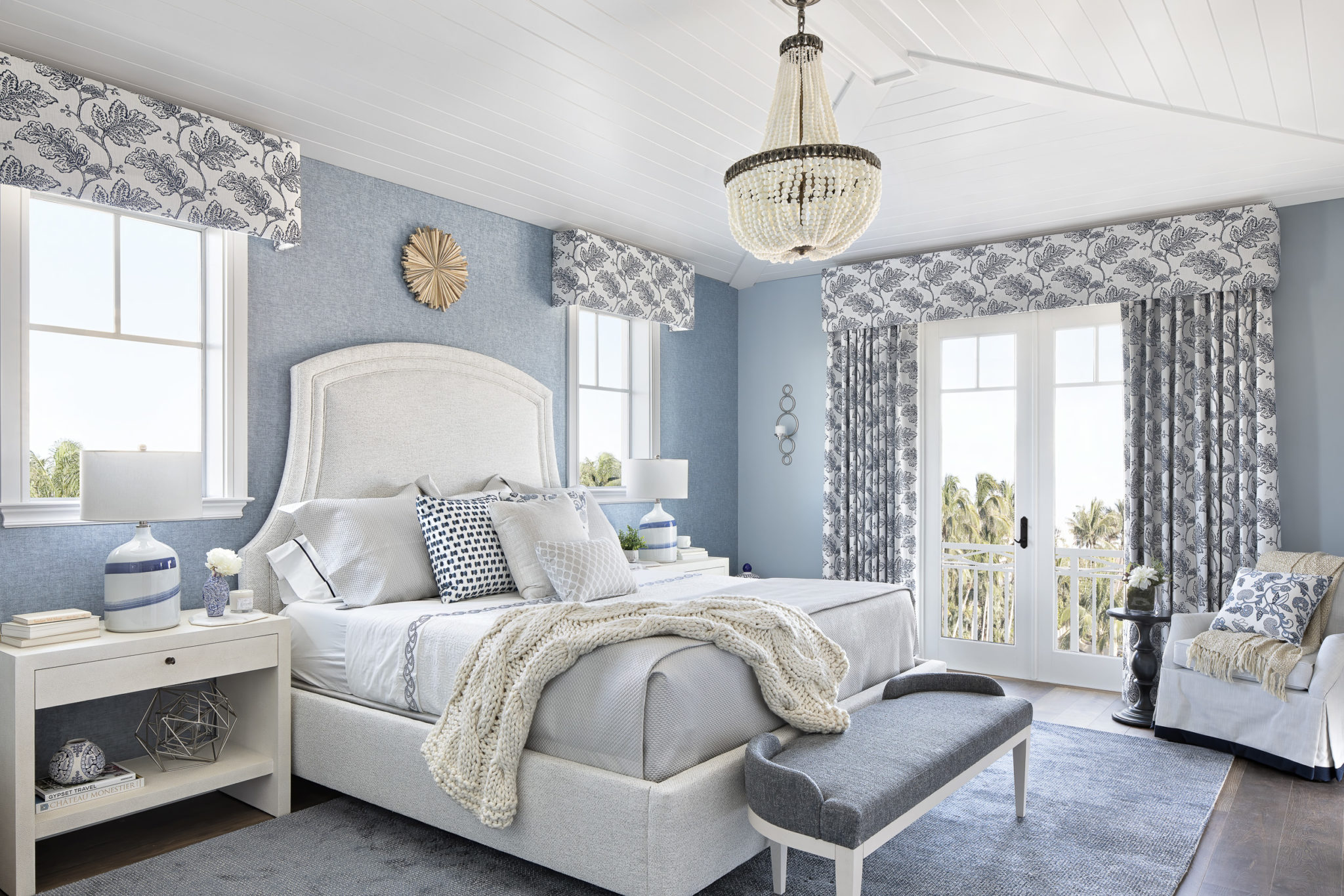
There is something about blue and white. It is just one of those color combinations that is so elegant, classic and versatile. I designed this crisp blue and white bedroom retreat for a wonderful couple who recently relocated to Juno Beach, Florida from New England.
The vibe for this entire home was French inspired. I refer to it as “Classic Coastal meets South of France” and this bedroom definitely fits that description! I loved mixing the classic coastal elements, like the crisp white shiplap with an abundance of designer patterned blue and white fabric. I added antique accessories and a hand beaded chandelier as the focal point to the space. We wanted to space to look current, so we added fun wallpaper and texture with the luxury rug and linens.
This bedroom retreat reminds me of a luxurious suite you might find in an upscale country inn…elegant but cozy and welcoming.
I hope you will enjoy this visual tour of the space! Scroll down to the bottom for all of the sources.
Interior Design by Krista Watterworth Alterman. Photo by Jessica Glynn
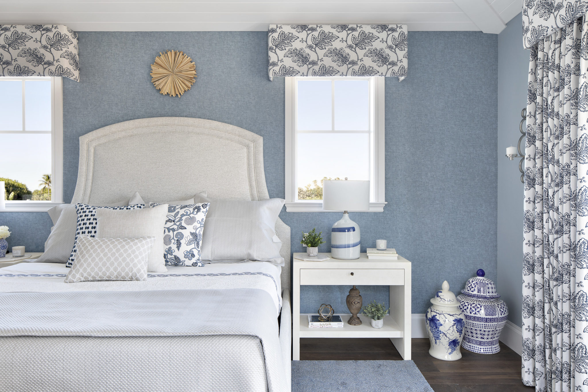
Interior Design by Krista Watterworth Alterman. Photo by Jessica Glynn
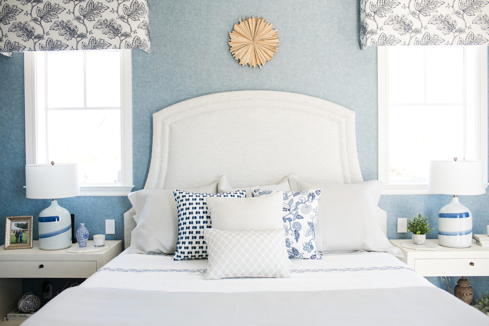
Interior Design by Krista Watterworth Alterman, Photo by Eve Greendale
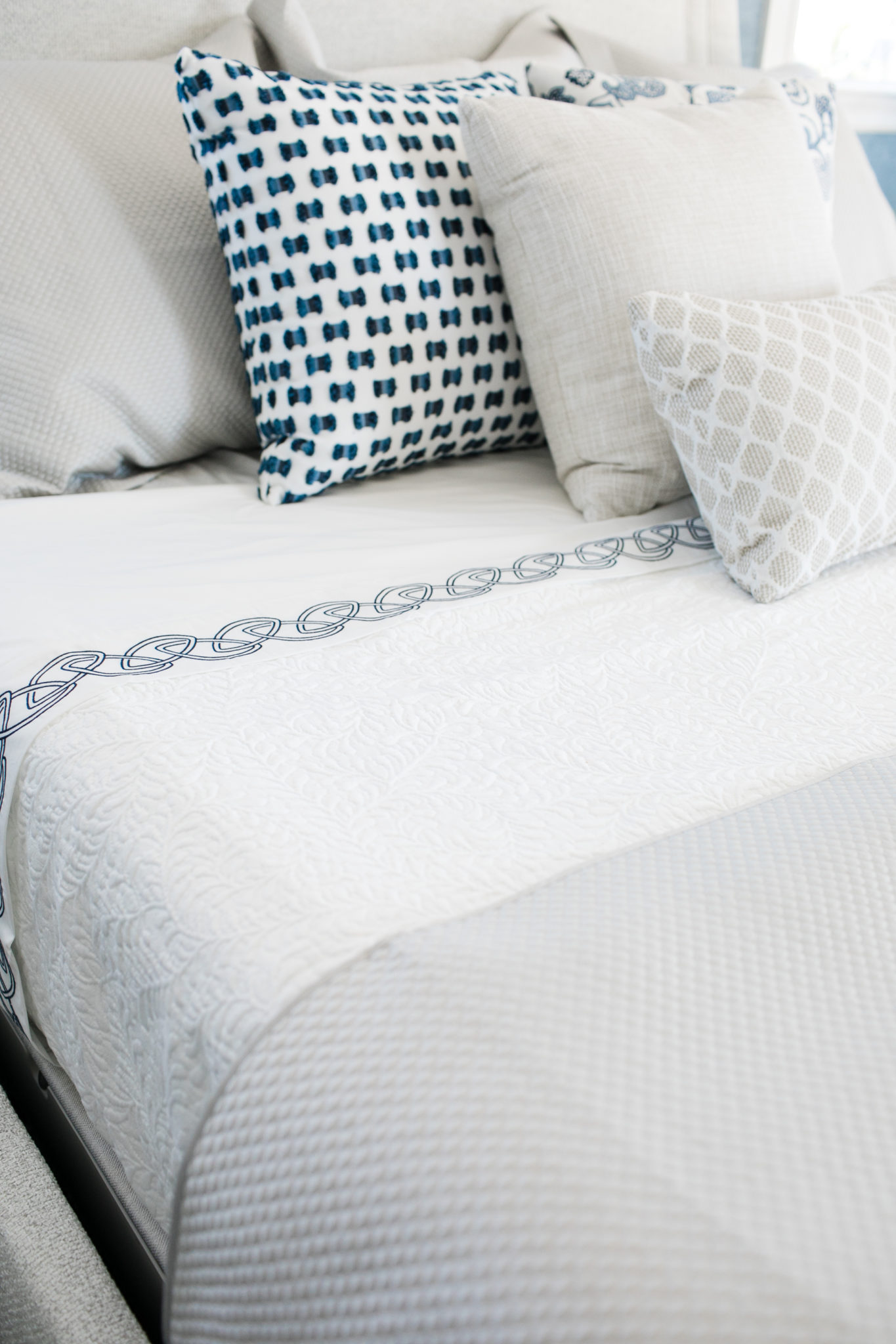
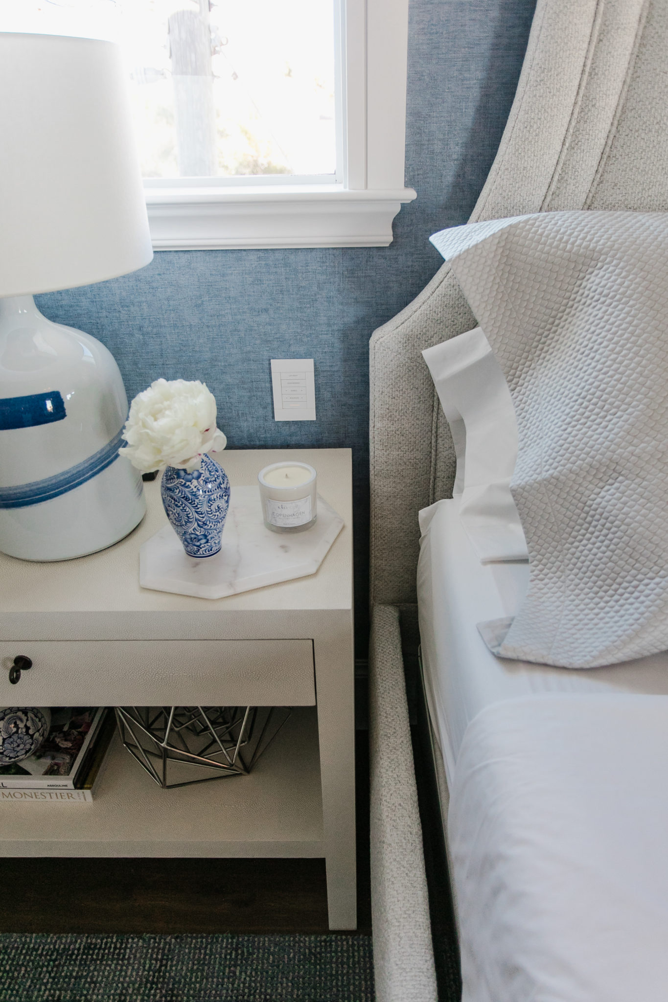
Interior Design by Krista Watterworth Alterman. Photo by Eve Greendale
SOURCES:
Drapery: Stout
Wallcovering: Orlean
Nightstands: Century Furniture
Lamps: Currey & Company
Rug: Stanton Carpet
Bed: Bernhardt Furniture
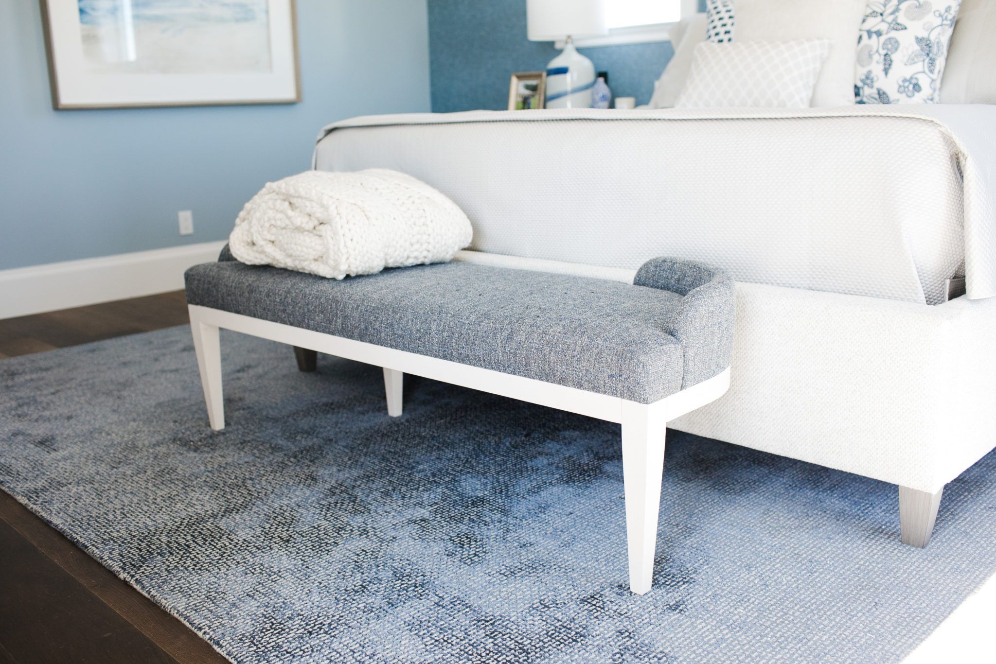
Bench: Bernhardt Furniture
Chandelier: Currey & Company
Side Table: Lexington Home
Armchair: Century Furniture
Linens: Matouk
Console: Asian Accents of Palm Beach
My Favorite Natural Stone: Marble
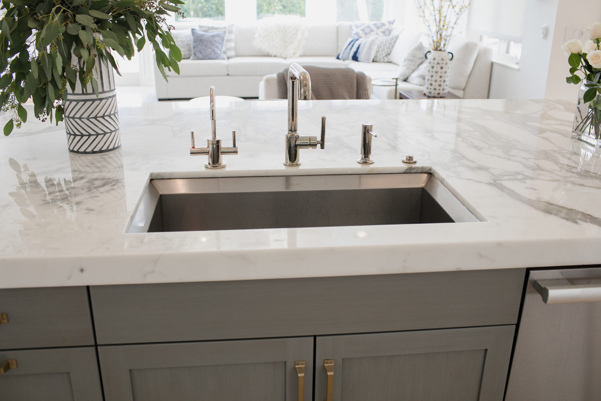
Marble is always my first choice for materials due to its stunning beauty, durability and wide array of textures, colors and patterns. Once your marble is installed, it will stay beautiful for years to come. To me, it is the ultimate choice for a luxurious home and I love using it in my designs whenever possible.
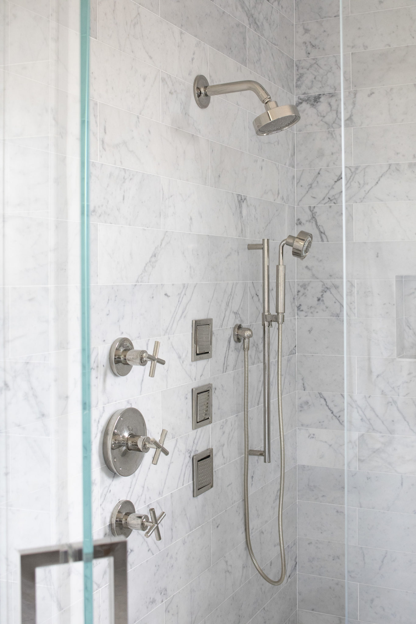
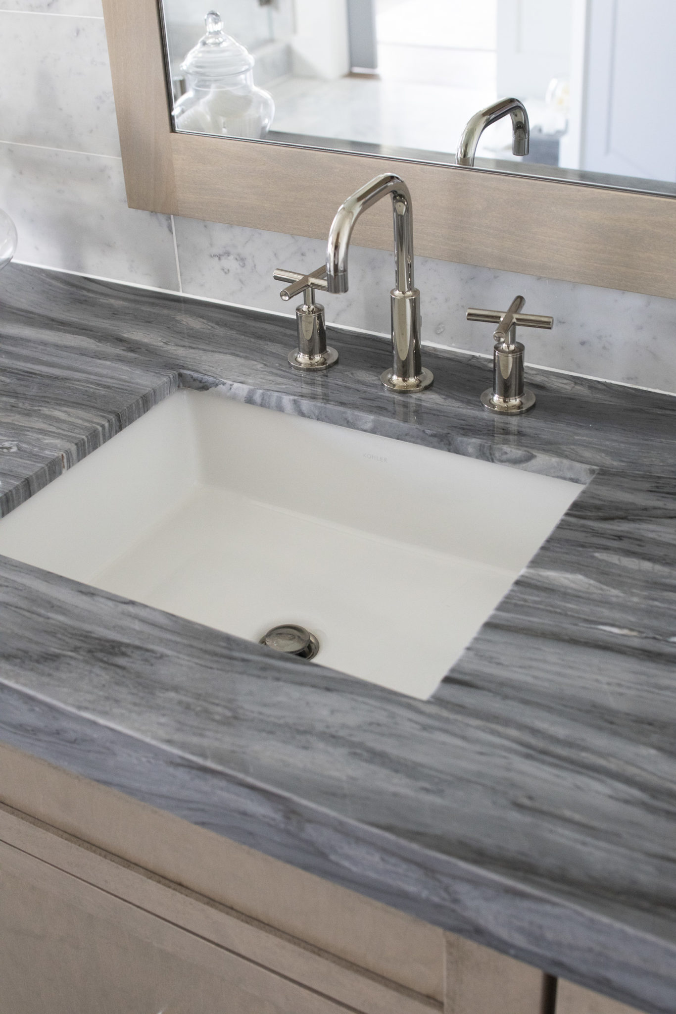
There is just something about the warmth, beauty and character of a natural stone that just resonates with me! I put it in kitchens, bathrooms, home bars and entryways. It can be used on floors, fireplaces, countertops and backsplashes and walls.
Some people are hesitant to use marble because they worry about cleaning and durability. Another great (and natural) option is Quartzite. Also, there is a new sealing product out now that is a game changer for marble! It is called Azerocare by Antolini. This product guarantees that if applied, your marble will not scratch or stain.
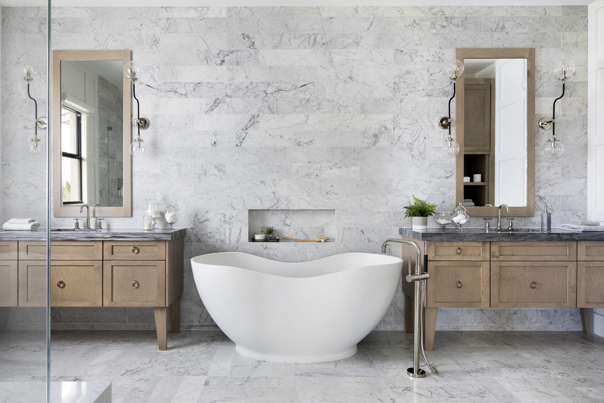
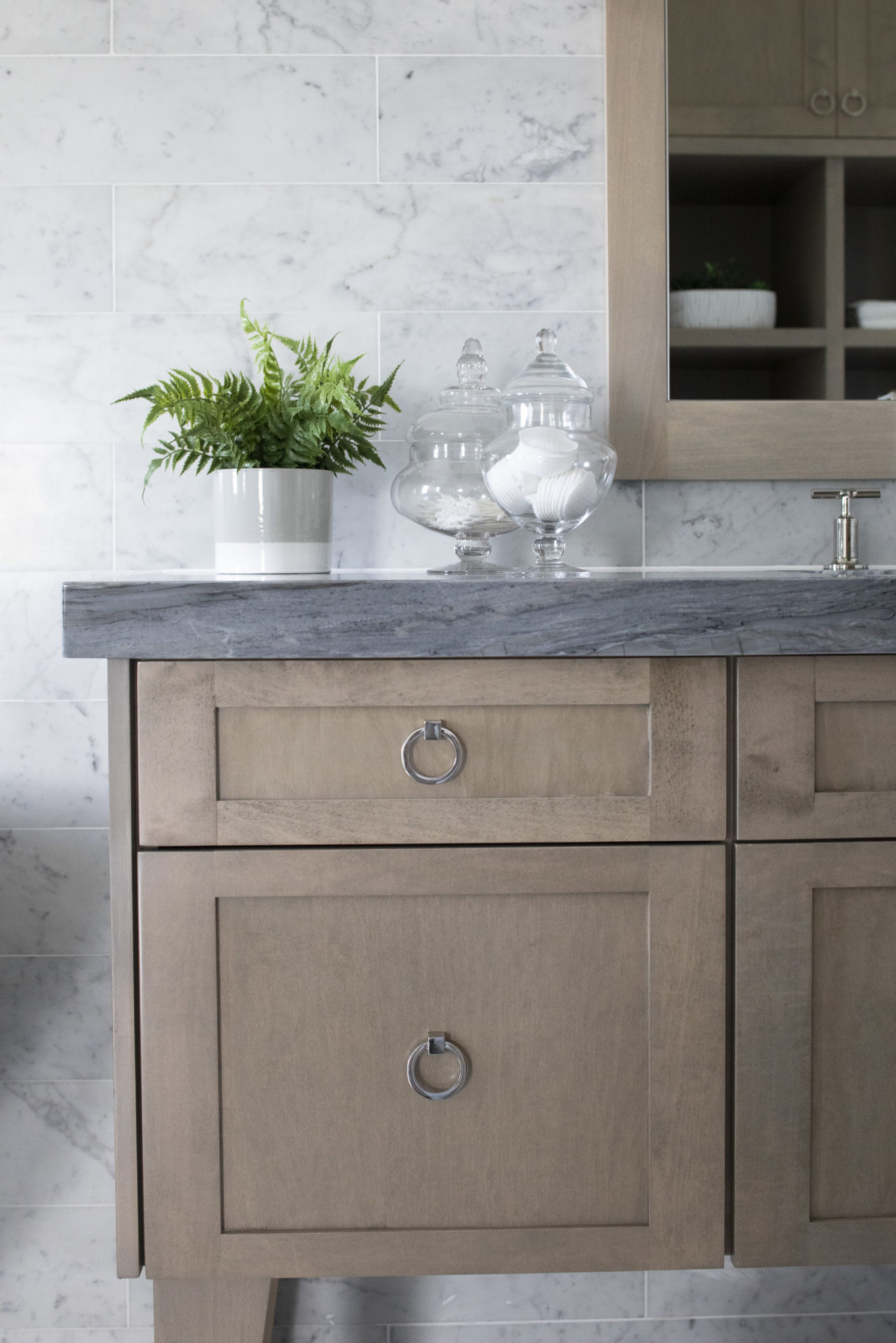
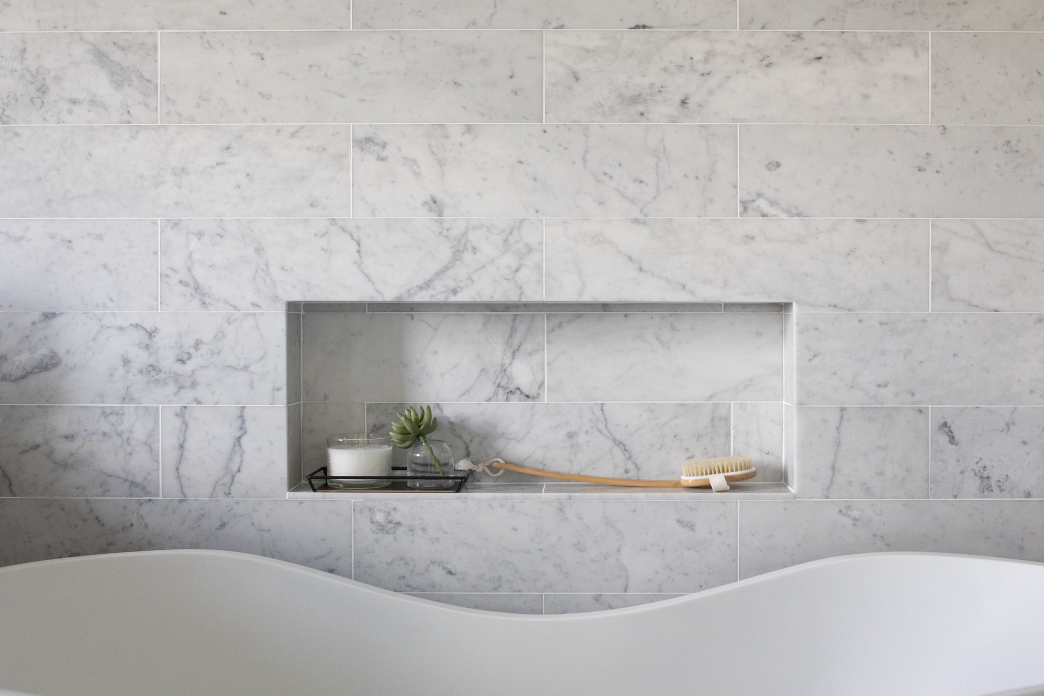
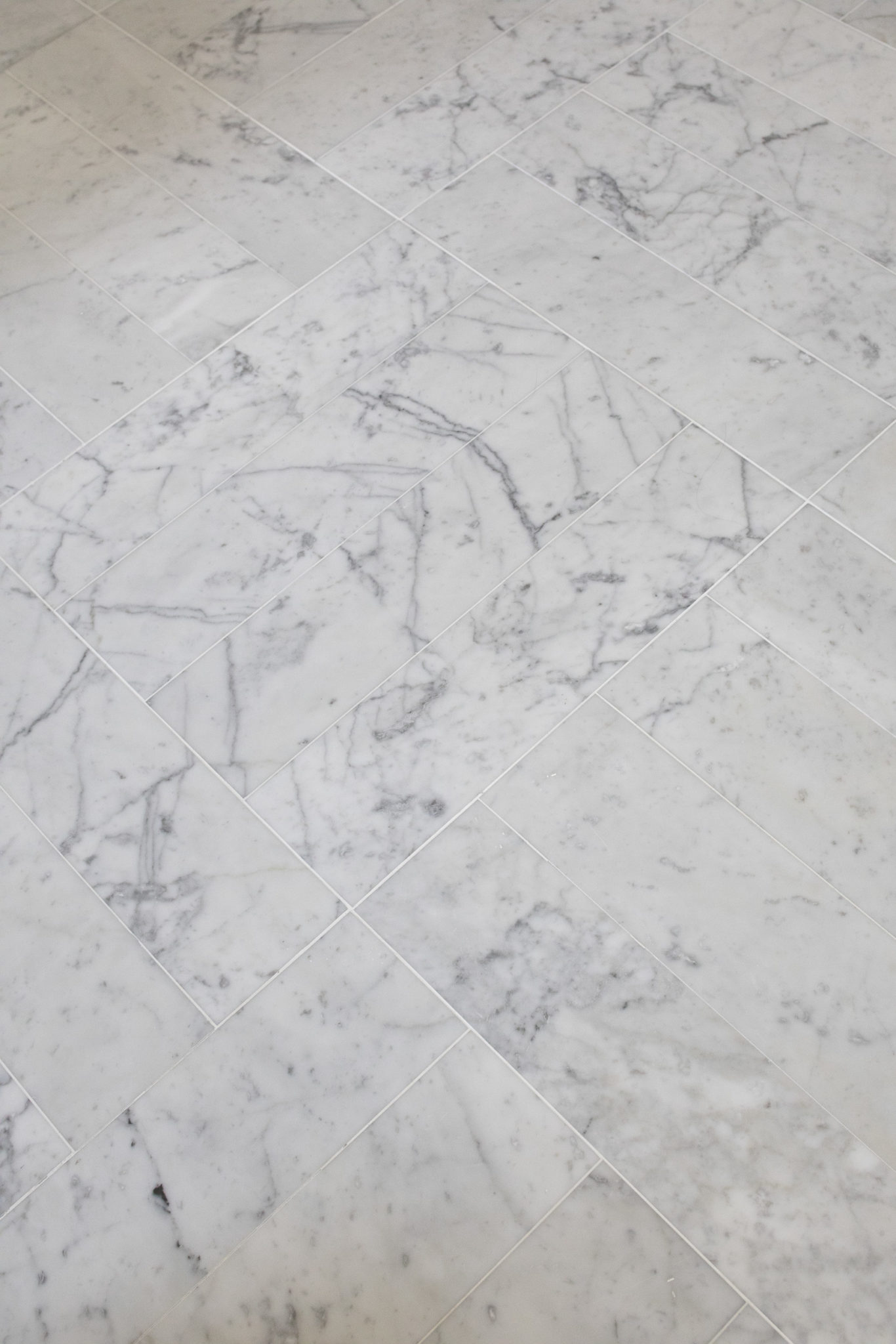
The bathroom below is marble fabulous! We used marble on the walls, floors and counters. So beautiful, right?
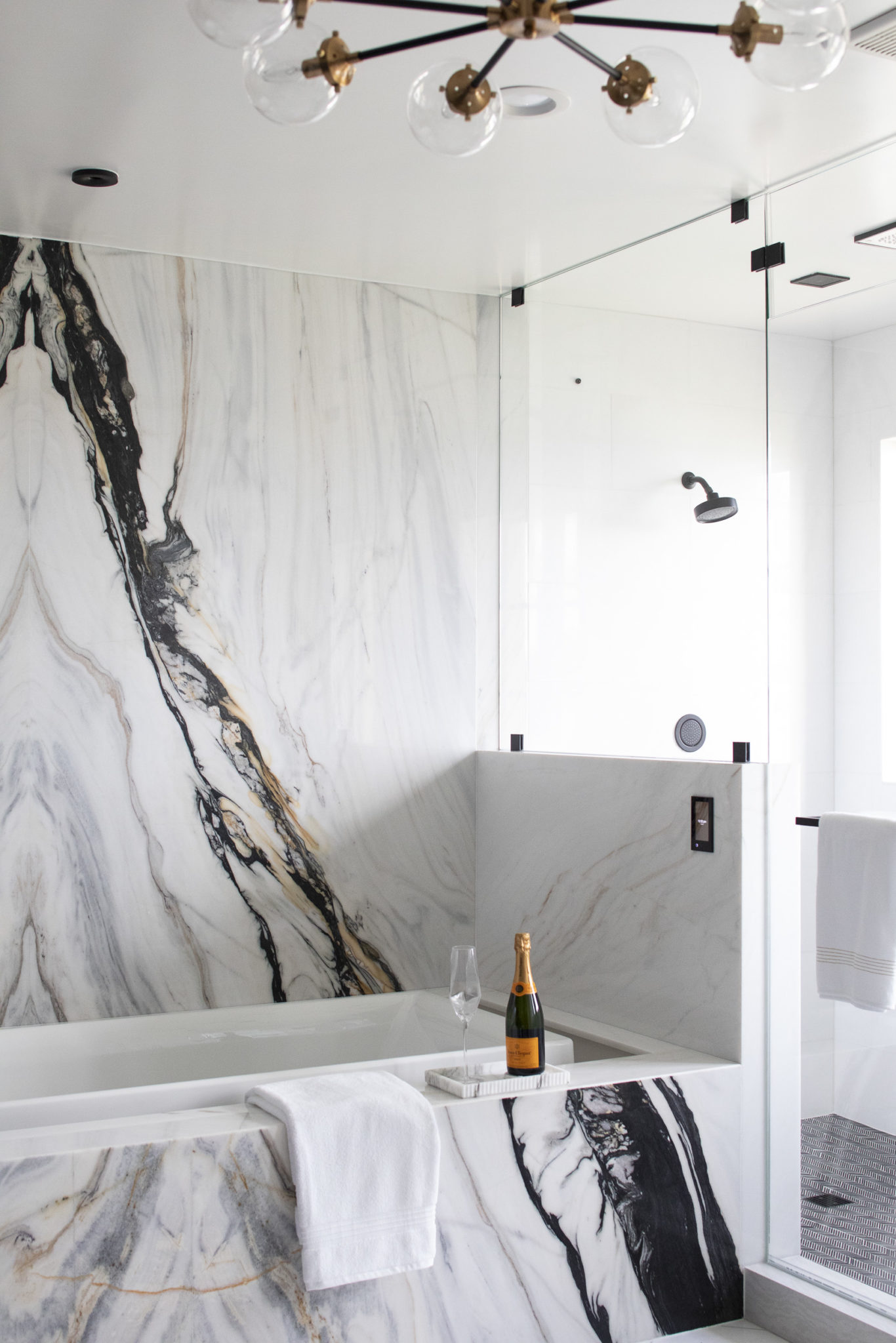
Bookmatched marble truly makes a statement! Bookmatching is the practice of matching two or more marble surfaces so that they mirror each other, giving the impression of an opened book. I used this technique in the master bathroom I designed for the Kips Bay Show House in Palm Beach, Florida.
Pro Tip: A great way to seal your marble is to use Stain Proof Plus, always my go-to! And, I love Opustone, which is a local company we use to source marble.
Tween Boy Spaces – Miami Cool
I have said it before – the key to designing for kids is to get them involved. This is especially true for tweens and teens! I love it when homeowners pay close attention to their kid’s spaces and don’t want to scrimp on furniture or materials. I recently designed a waterfront urban coastal townhouse in Miami for a wonderful family with two tween boys. I loved working with this family, because they have great style and they agreed with me that the kids’ spaces should jive with the design of the rest of the home.
Designing for tweens can be tricky. You want to choose pieces and styles that will have some staying power, but they should still function for who they are before they enter those teen years. The cool factor is very important here! Try choosing neutral pieces to anchor the room (like a bed, desk, etc) and then you can switch up the accessories later if you need to. Now, if you are going to invest in nice pieces, you want to make sure that it is something your child really likes and not just something that you are fond of. In this day and age kids spend a lot of time in their rooms and I think it is important to create their own little oasis where they feel safe and happy.
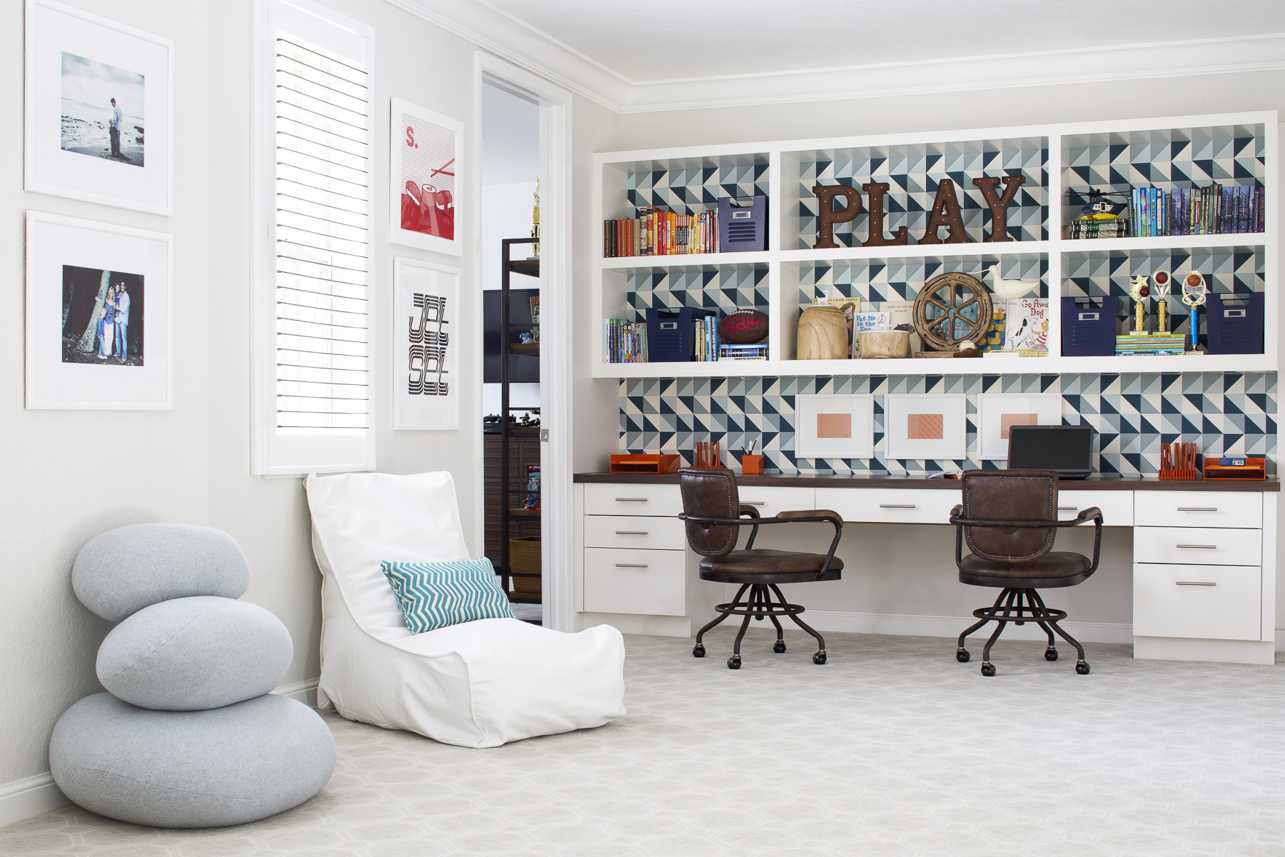
The game room below is fun and comfortable but most definitely high on style! From the Dolce and Garbana wallpaper textured wallpaper to the structured sofas and modern artwork, this is a space for kids that does not disappoint. The vibe is upscale but cool, kind of like a hip boutique hotel.
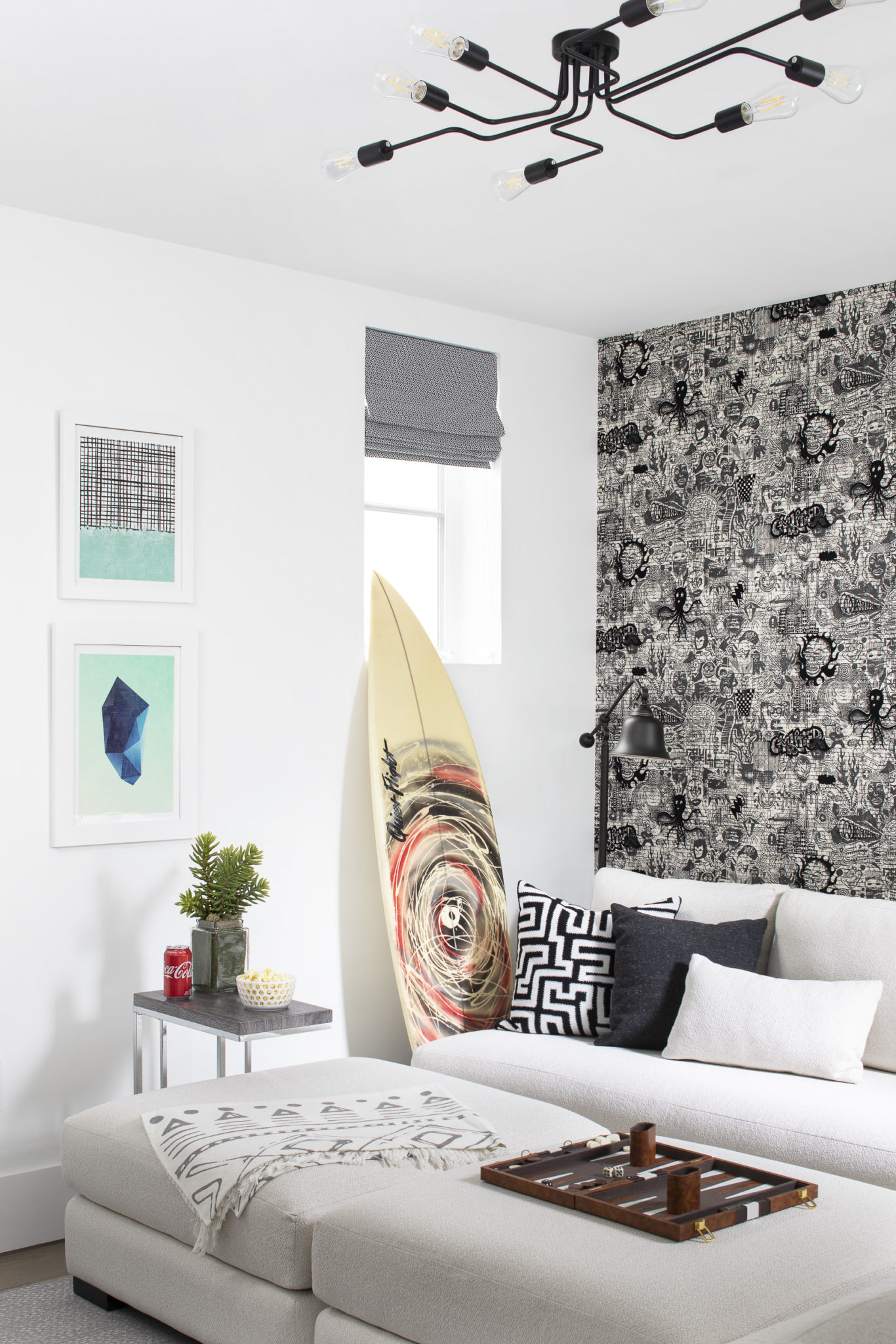
Interior Design by Krista Watterworth Alterman, Photo by Jessica Glynn
The little guy who inhabits the bedroom below is obsessed with all things music. He is super creative so I wanted to add some fun pops of color throughout. The dresser is from Four Hands and the wallpaper is by JF Fabrics. I love the large knot pouf that I found from a cool artisan on Etsy.

Interior Design by Krista Watterworth Alterman, Photo by Jessica Glynn
If you have an impressive sneaker collection, you need a place to display the shoes, right? That was the top request from this tween. I have a son around the same age so I understand the importance of sneakers! We added a masculine leather bed and textured moody wallpaper to get the right vibe. The modern sconces give it an upscale and clean look.
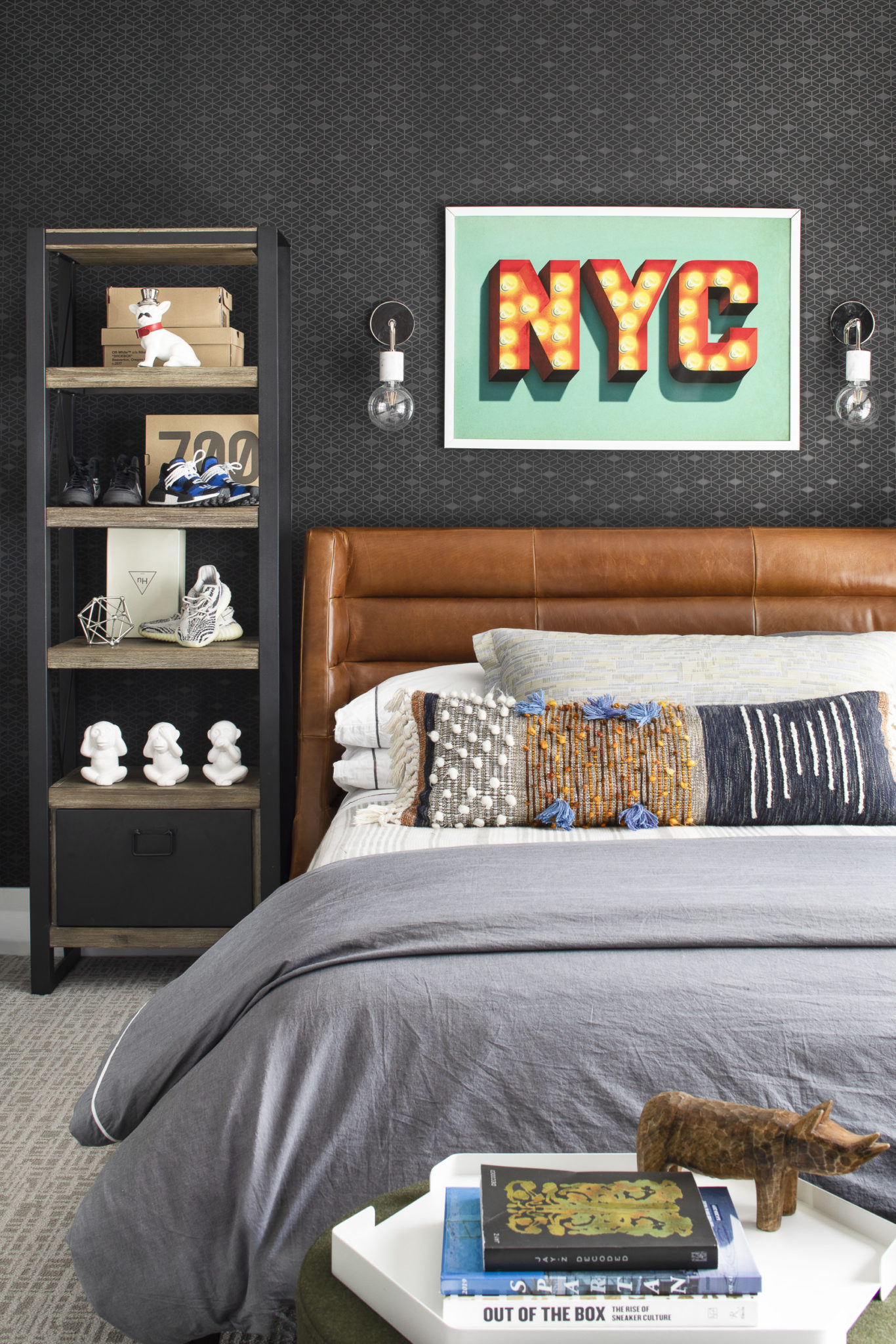
Interior Design by Krista Watterworth Alterman, Photo by Jessica Glynn
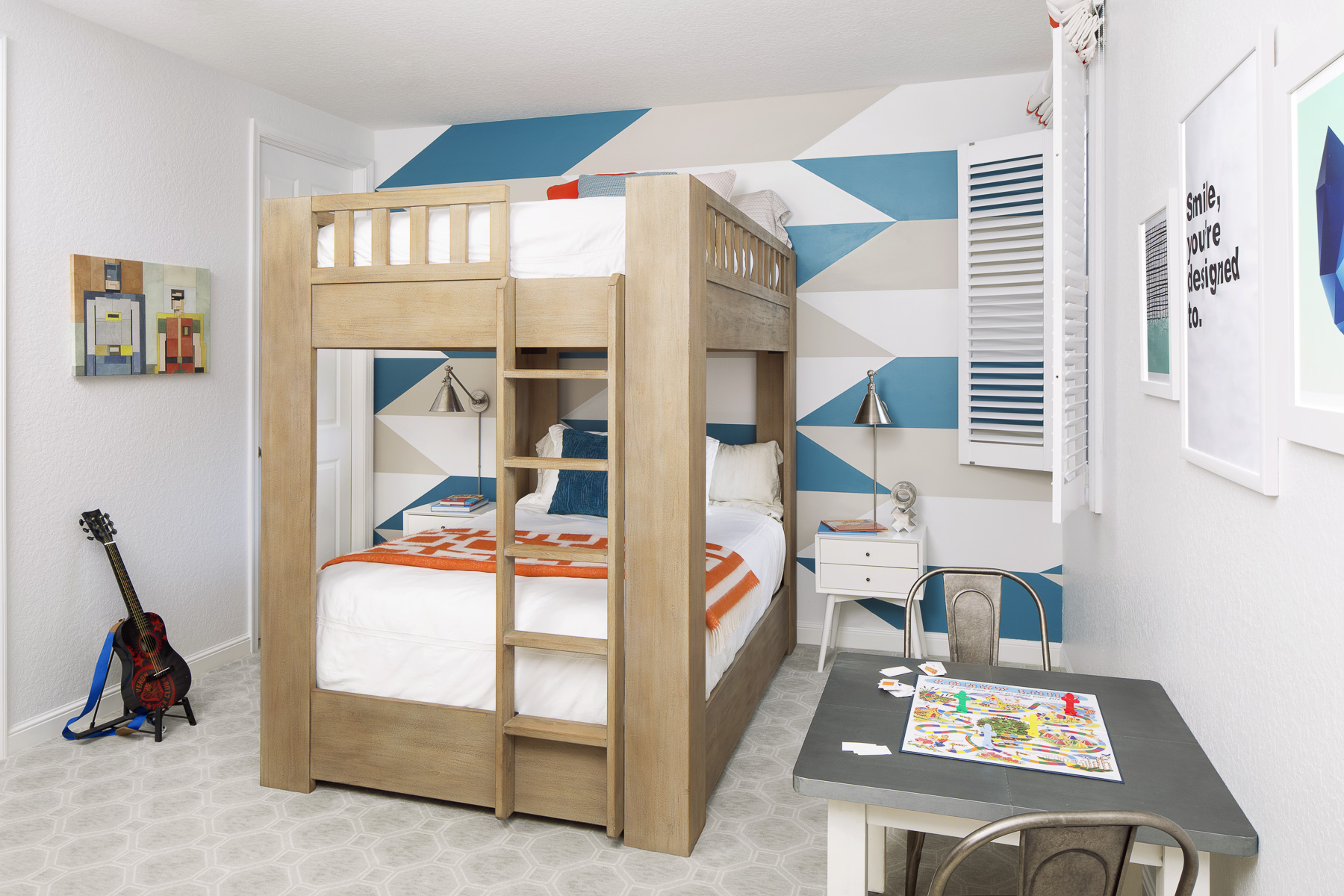
This is the second home I have designed for this family! I thought I would share the boy’s rooms from their first house to see how their style has evolved as they have grown.
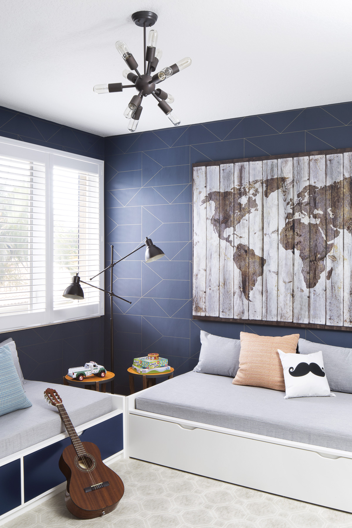
Interior Design by Krista Watterworth Alterman, Photo by Jessica Glynn
Interior Design by Krista Watterworth Alterman, Photo by Jessica Glynn
Interior Design by Krista Watterworth Alterman
Recognize the artwork in the shot below? He liked it so much that he wanted to include it in his new room.
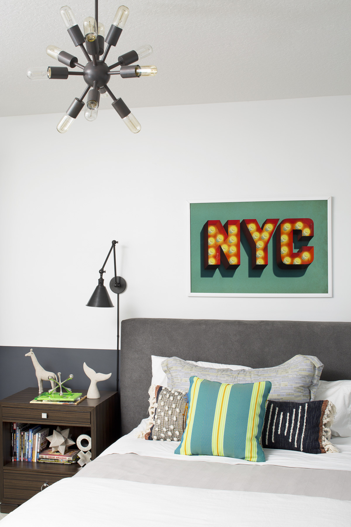
Interior Design by Krista Watterworth Alterman, Photo by Jessica Glynn
Coming Soon: New Tile Collection with Tilebar!
I am so excited about the upcoming launch of my newest collaboration with TileBar. The new collection, which will be available in April is called “The New Palm Beach”.
As I have mentioned in other posts, “The New Palm Beach” is our signature style at Krista + Home. It is a fresh take on the iconic subculture and introduces a new design style that can be implemented anywhere. This style blends classic elements with modern touches; a soft, neutral palette with pops of bright color; and a luxurious look that’s livable. My version of coastal décor is subtle, organic and fresh. At Krista + Home we deliver this style with a passion for serving our clients to the very last detail, from beginning to end- maintaining this true Palm Beach Tradition.
Photo by Nick Mele
The designs for this tile was inspired by botanical elements in Palm Beach. The collection includes mosaics in brick, floral and leaf. Materials used are Black Jade, Rose Desert and Calcutta Gold.

This tile can be installed so many places…as backsplash, on a kitchen wall or floor, on a bathroom wall or floor. I especially love it on a shower wall or floor! There are many outdoor options as well including using it for your pool, patio floor, or on any outdoor wall or floor. Below see some of my sketches and renderings for a sneak peek!
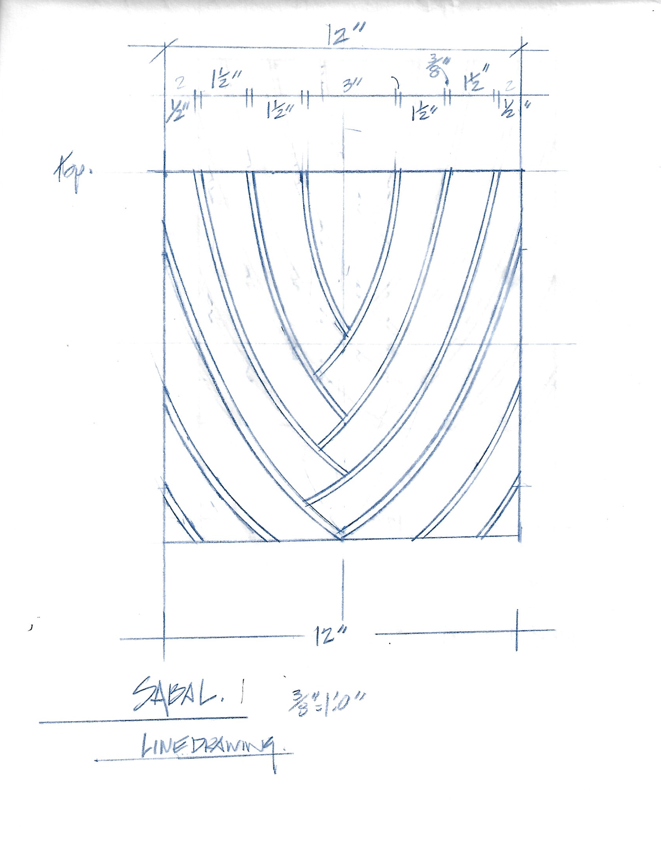
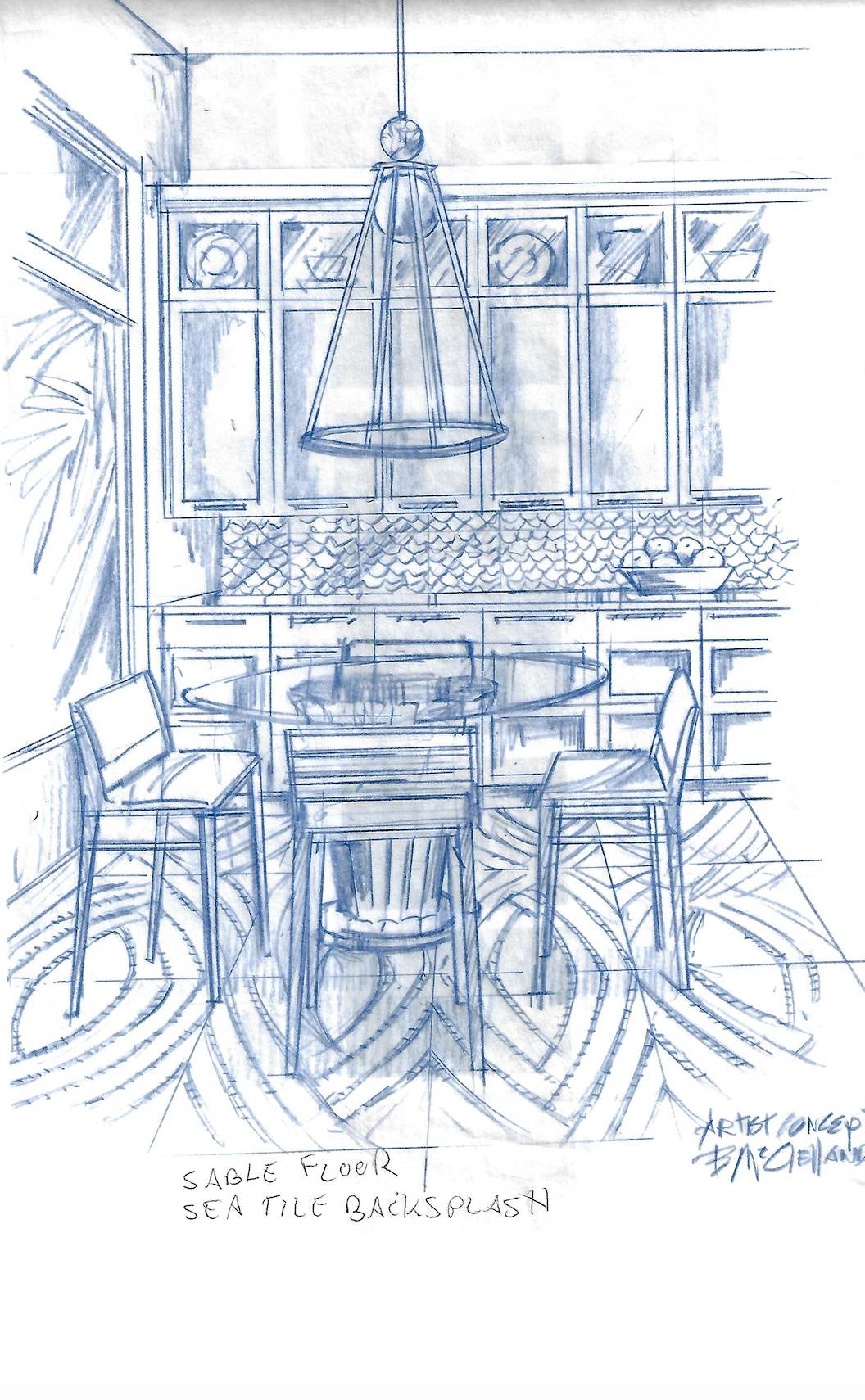
This collection is a follow up to my previous collection at TileBar, “Eighty by Krista”. A homage to the 1980’s, these designs are still available and are quite popular. Below is a “Kiss” marble tile from the collection.
My new collection is quite different and I can’t reveal too much, but let’s just say for those blush decor lovers out there….I see you! Stay tuned for the launch of The New Palm Beach tile collection, which will be available for sale on my website and at Tilebar! More photos and information to order are coming very soon.
How To Style A Coffee Table
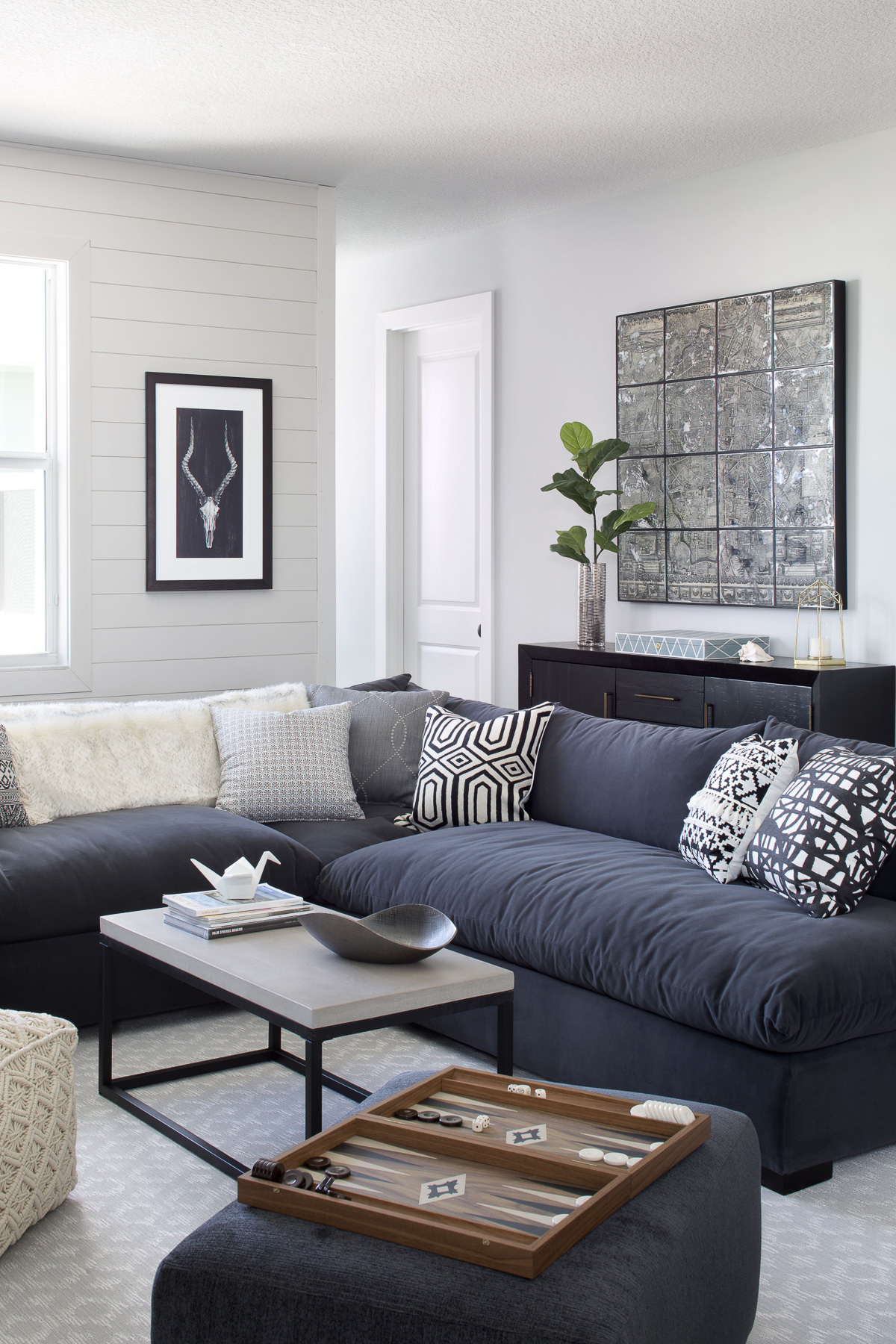
Styling is such an important part of home design, and it is one of my favorite parts of the process. The right objects on your coffee table can truly set the entire vibe of the space, details are everything! Have fun and try different things. I like to refresh my coffee tables each season to spice things up. Here are a few tips and ideas for how to style your coffee table like a designer:
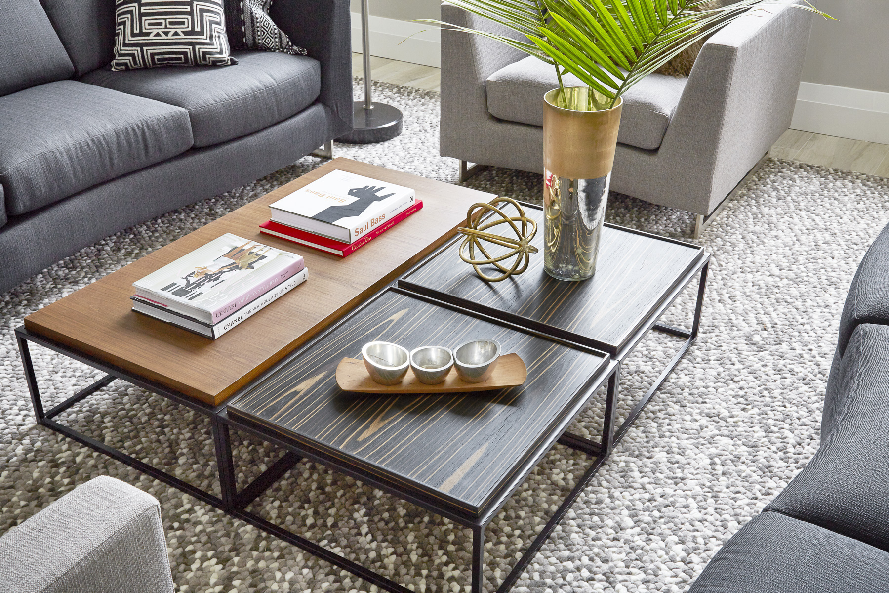
Interior Design by Krista Watterworth Alterman, Photo by Jessica Glynn
Start with something green! A plant or floral can anchor the table and give the eye a focal point. The plants can be real or faux. I am amazed at how good the faux plants and florals have gotten lately…it’s truly hard to tell the difference.
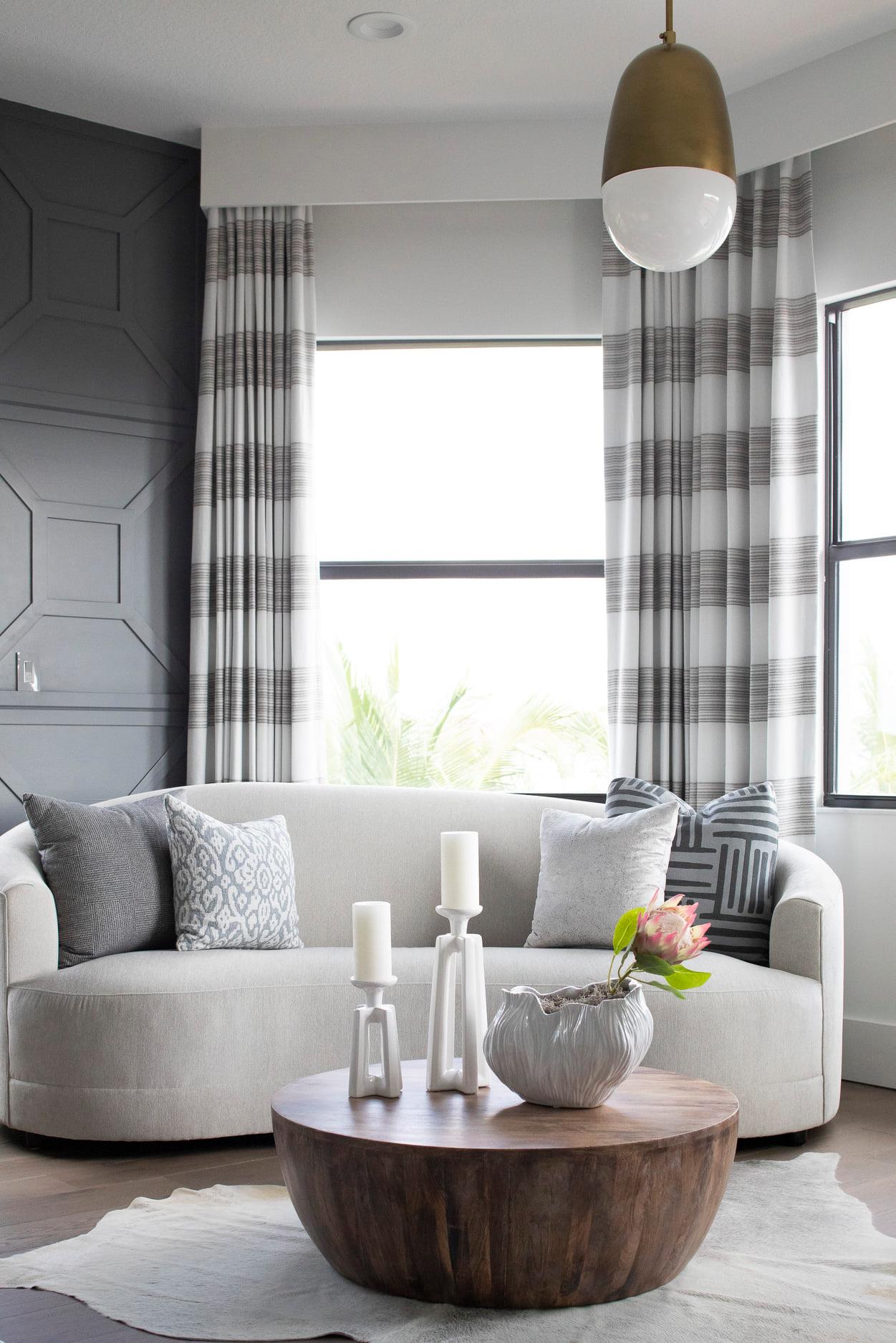
Interior Design by Krista Watterworth Alterman, Photo by Jessica Glynn
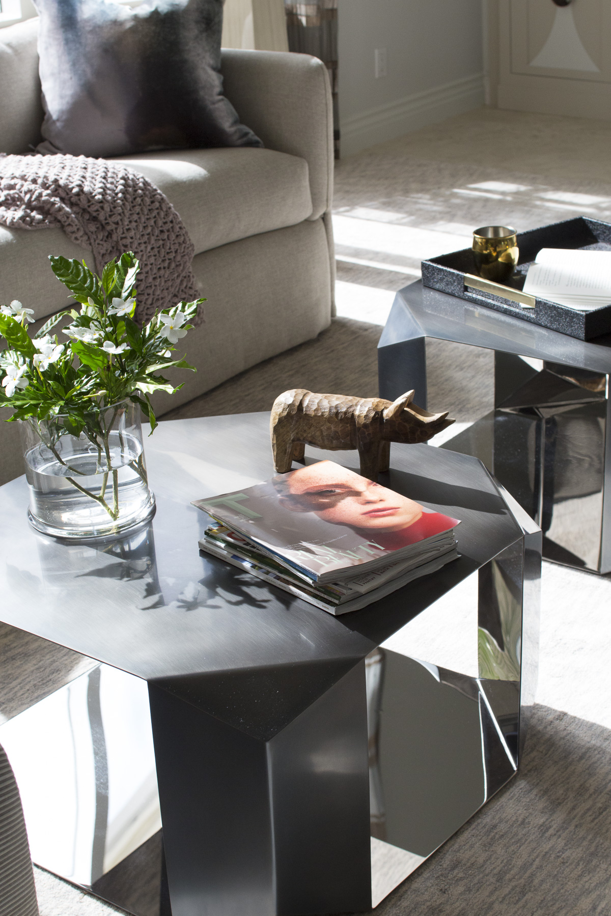
Vary the shapes and textures of your decorative objects. I love sculptural pieces and always like to add one that is a bit unusual or fun…something unexpected. An heirloom or something collected while traveling could act as a conversation starter and gives personality to the space.
Interior Design by Krista Watterworth Alterman, Photo by Jessica Glynn
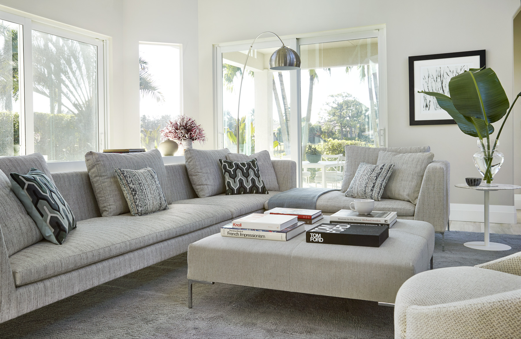
My favorite item for coffee tables? Books! I have a slight obsession with beautiful coffee table books. They are so fun to flip through and double as a great decorative element. Stack them!
Interior Design by Krista Watterworth Alterman, Photo by Jessica Glynn
A great way to organize objects on your coffee table is by using trays. The trays can hold remotes, coasters, candle lighters, etc. They especially work great on ottomans to provide a firm surface.
Interior Design by Krista Watterworth Alterman, Photo by Jessica Glynn

