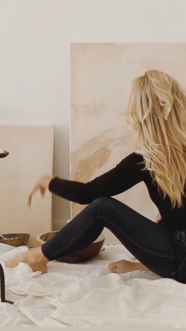
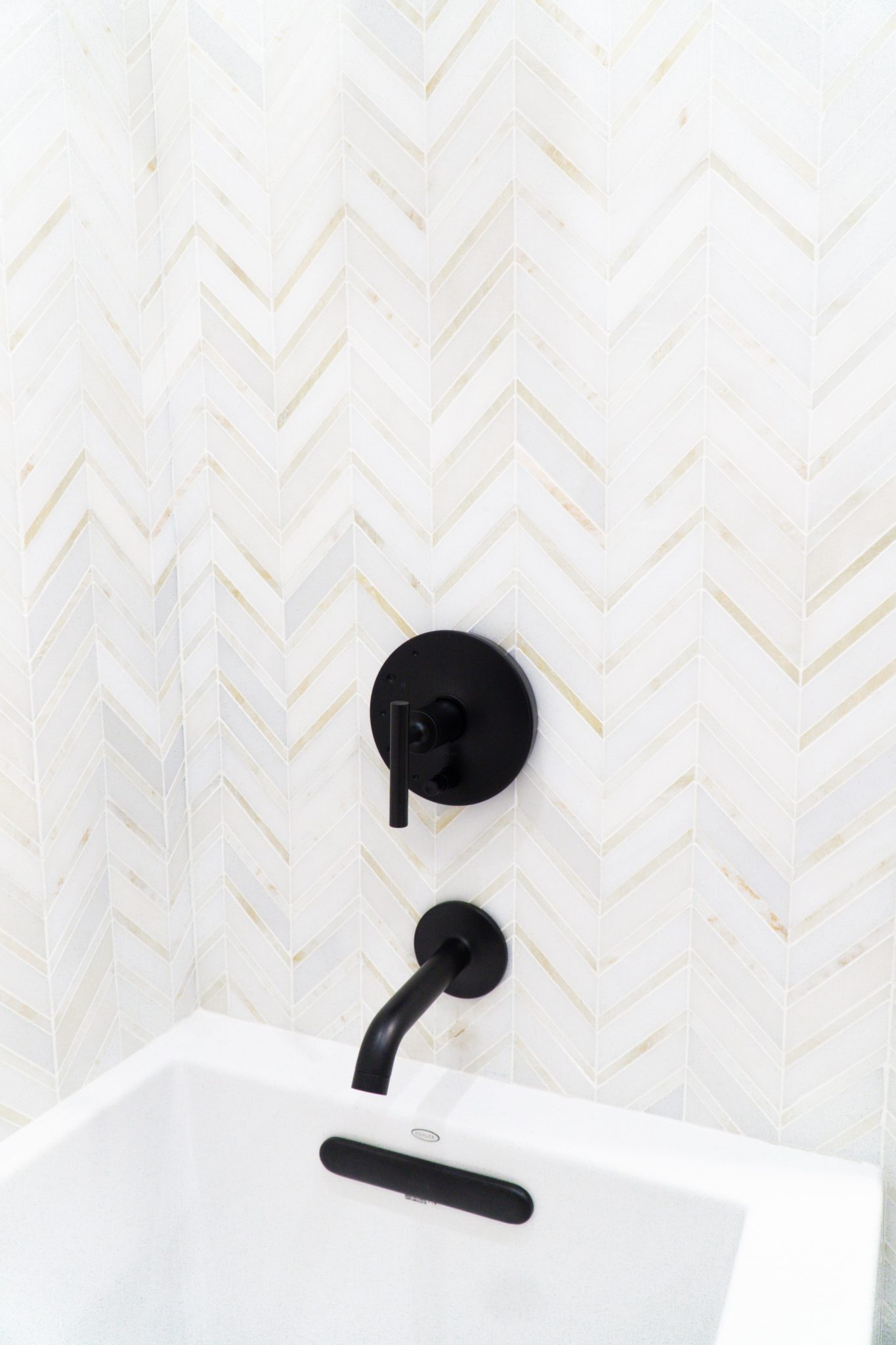
3 Interesting Facts About Interior Design
Did you know that the first interior decorator in the country was born in 1865?
Elsie de Wolfe is widely regarded as the first professional interior designer and a pioneer in the field. Her innovative ideas and contributions played a pivotal role in shaping the modern profession of interior design. Elsie de Wolfe’s design philosophy was centered around creating interiors that were not only aesthetically pleasing but also reflected the personality and lifestyle of the occupants. She believed that homes should be comfortable, functional, and tailored to the needs and tastes of the individuals living in them. In 1905, Elsie achieved widespread recognition with her redesign of the Colony Club in New York City. This exclusive women’s social club had a significant impact as it marked one of the first times a woman had been commissioned for such a prestigious project. Her fresh and unconventional approach to design, which included light colors, comfortable furniture, and an emphasis on individuality, challenged the prevailing norms of the time.
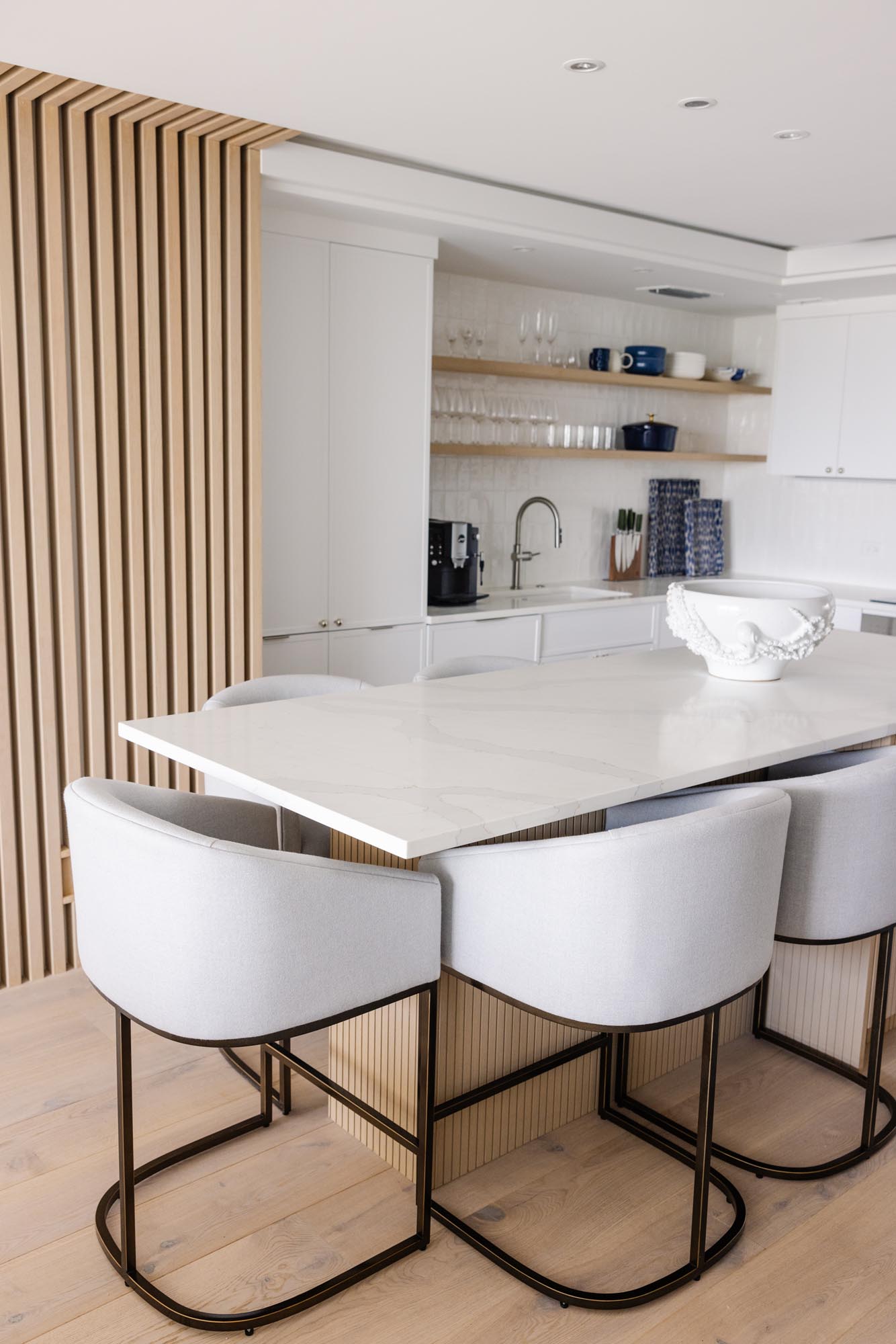
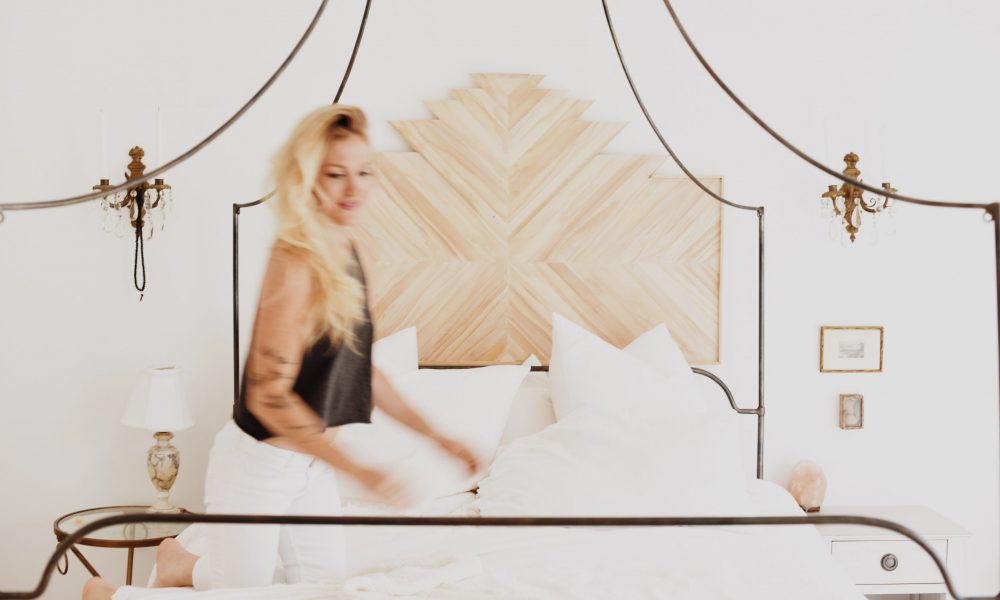
Interior design by KRISTA + HOME, Photo by Eve Greendale
For the past 10 years, Benjamin Moore’s White Dove OC-17 has been the most popular white paint color.
Benjamin Moore’s White Dove OC-17 is a highly popular and widely used white paint color – it is a designer’s favorite and we use it in many of our projects! It is known for its versatility and ability to complement various design styles, making it a favorite choice among homeowners and designers alike. Its warm undertones and soft, neutral appearance contribute to its widespread appeal. My personal favorite Benjamin Moore color is “Decorator’s White” CC-20.
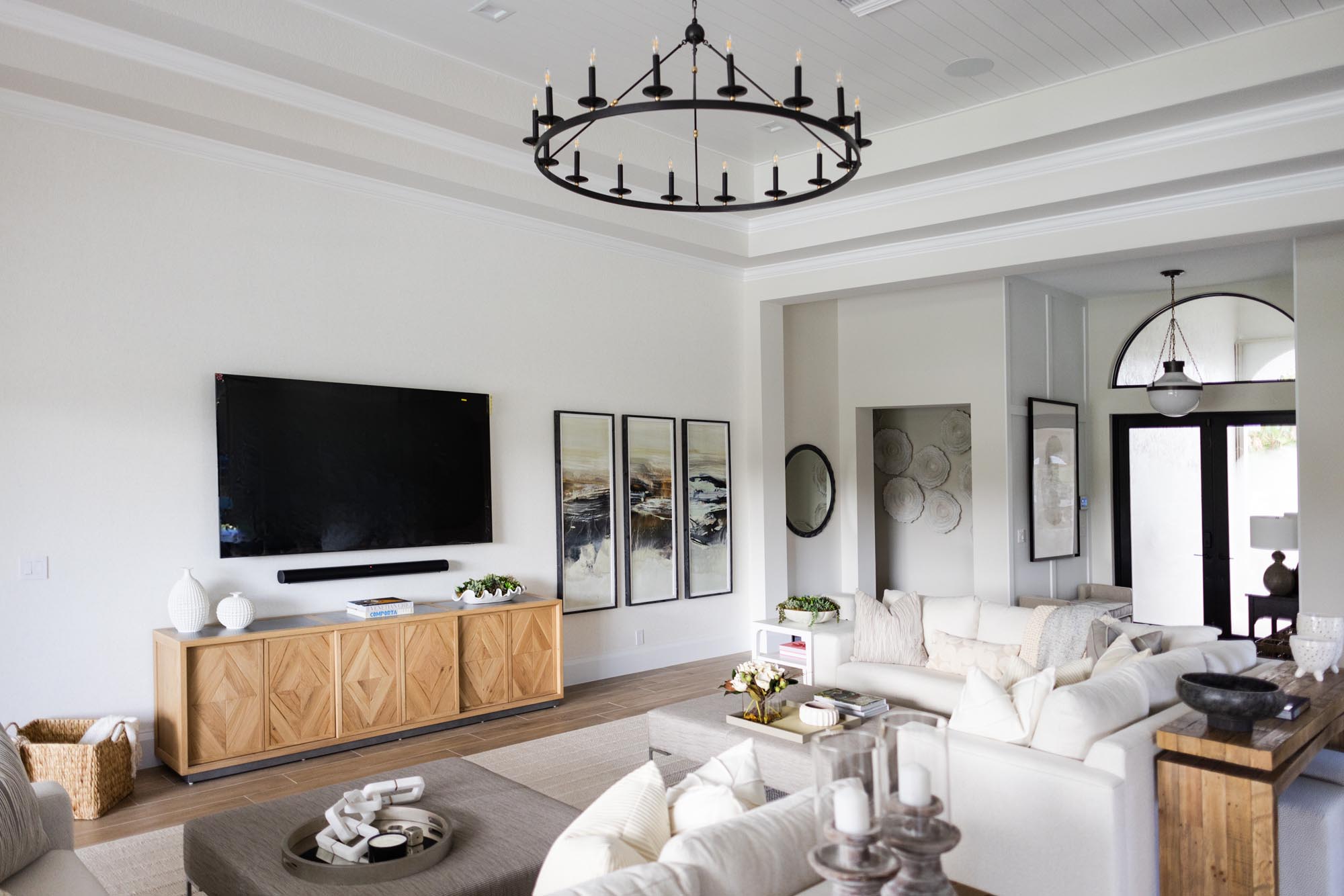
Interior design by KRISTA + HOME, Photo by Eve Greendale
Using natural materials in your home is not just aesthetically pleasing – they last longer and are sustainable!
Many natural materials are known for their durability and longevity. For example, hardwood floors, stone countertops, and leather furniture can withstand the test of time and often improve in appearance with age, adding character to the space.
The use of natural materials aligns with sustainable design practices. Renewable resources such as bamboo, cork, and responsibly harvested wood contribute to a more eco-friendly approach. Additionally, many natural materials have lower environmental impact during production and disposal compared to some synthetic alternatives. We love using organic, natural materials and use them in our designs whenever possible.
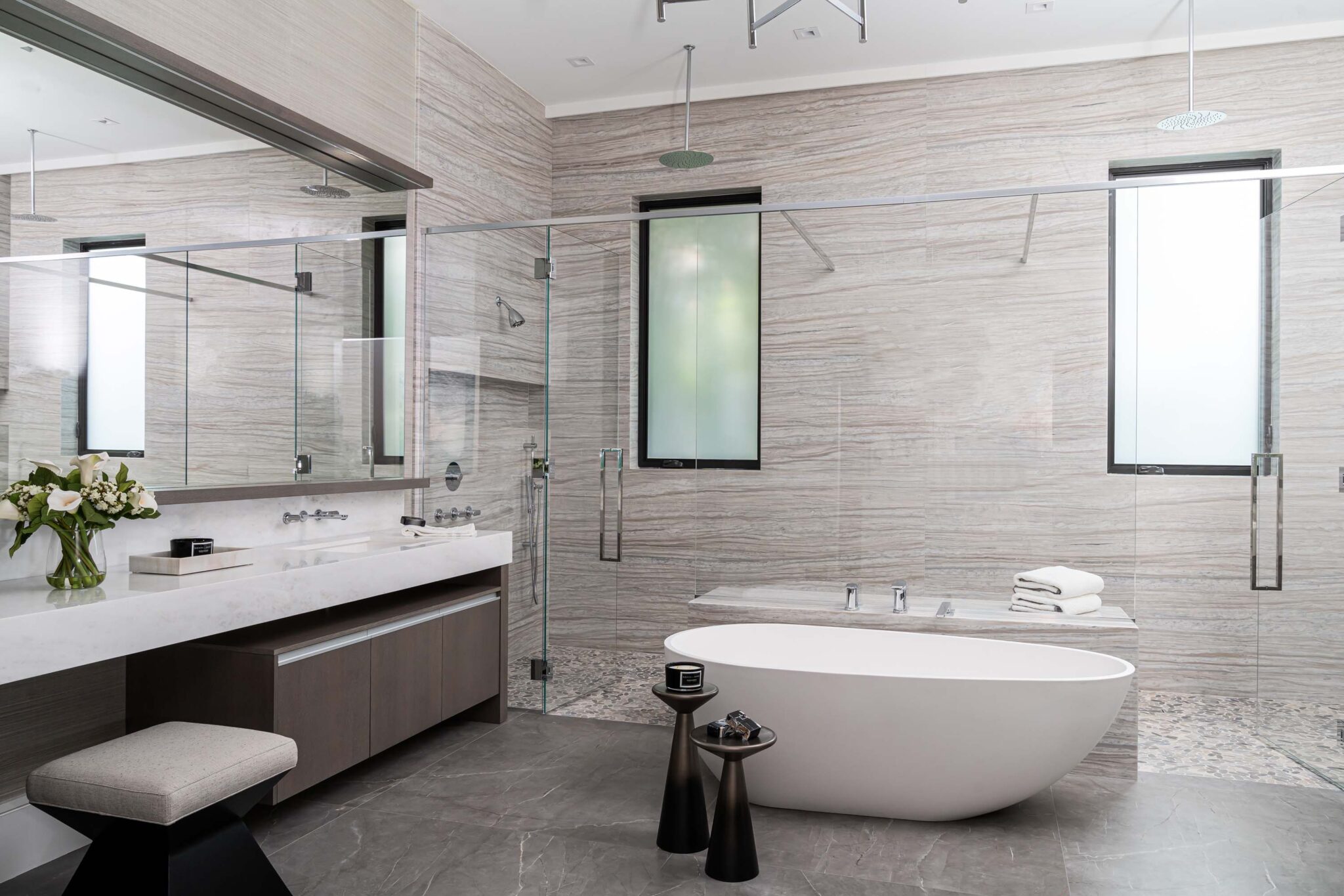
Interior design by KRISTA + HOME, Photo by Venjhamin Reyes
Maximizing Your Project: A Guide to Effectively Working With Your Contractor
Embarking on a home improvement or interior design project is an exciting journey, and finding the right contractor is crucial to its success. At KRISTA + HOME, a luxury interior design firm in Palm Beach, Florida, we understand the significance of a strong partnership between homeowners and contractors. In this blog post, we’ll explore key strategies on how to most effectively work with your contractor, ensuring a seamless and successful collaboration.
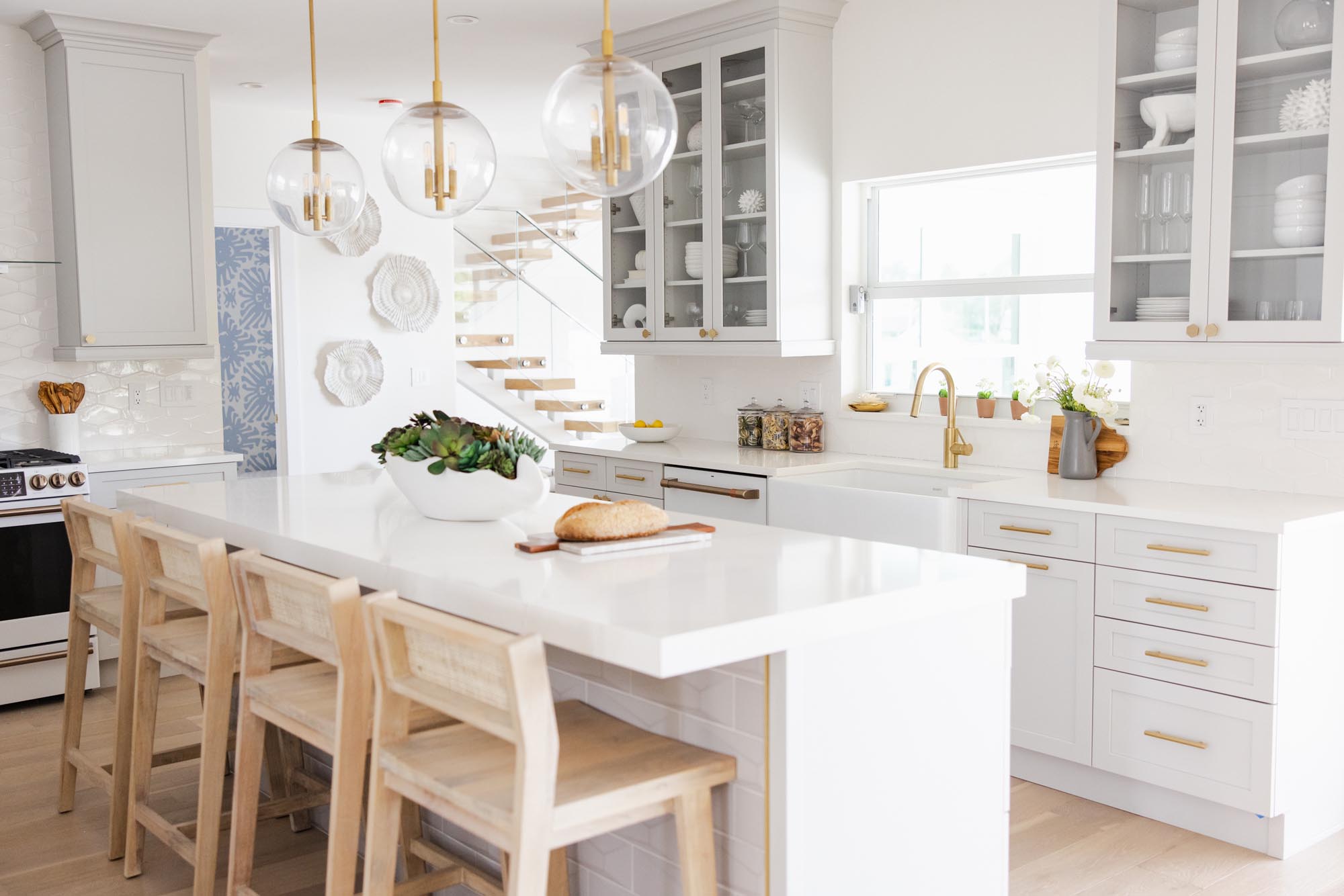
Establish Clear Communication Channels: Open and clear communication is the cornerstone of any successful project. Clearly articulate your goals, preferences, and expectations from the outset. Regular updates and progress meetings help maintain transparency and ensure everyone is on the same page. At KRISTA + HOME, we prioritize transparent communication to guarantee that your vision is fully realized.
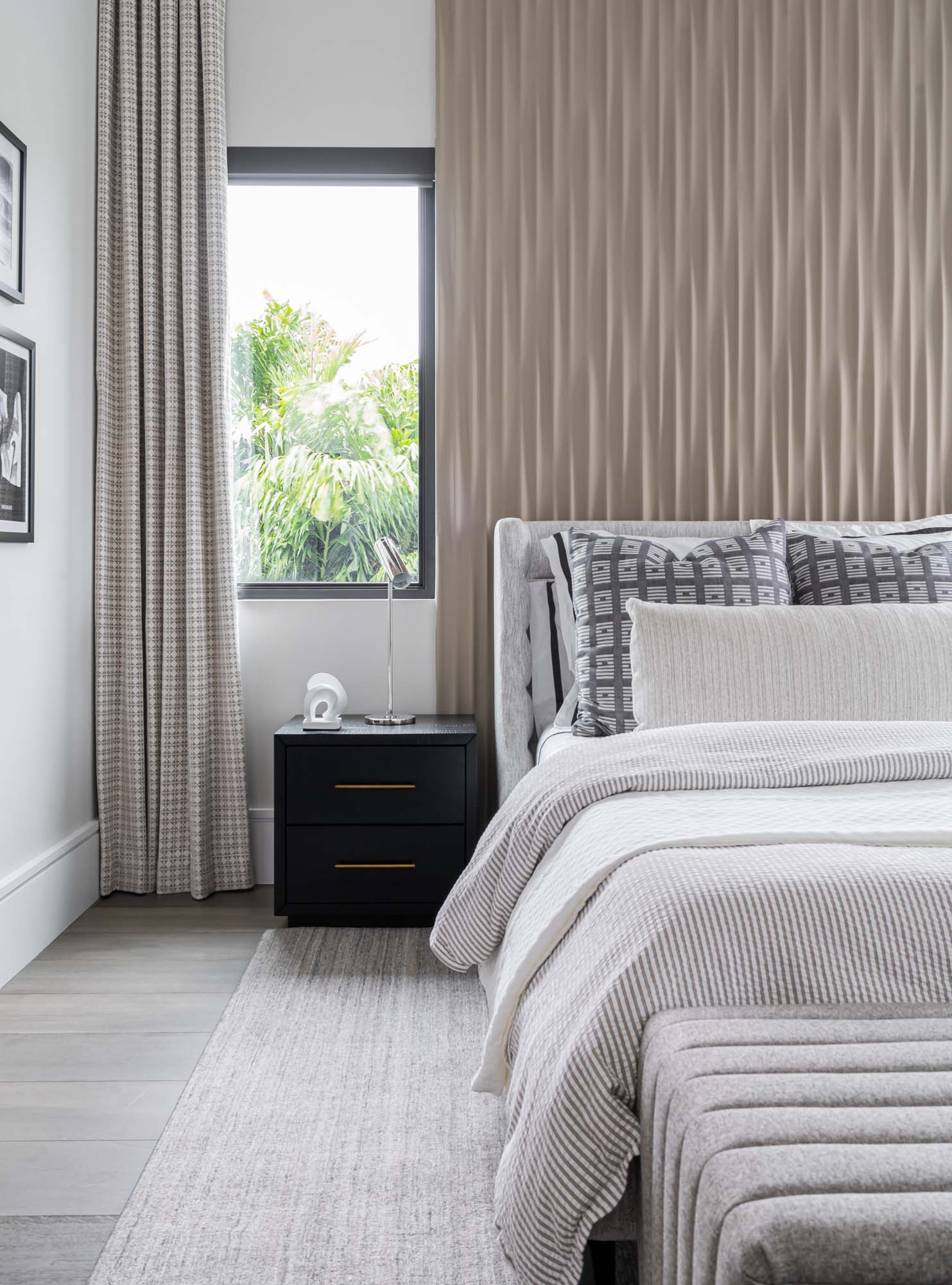
Interior Design by Krista W. Alterman, Photo by Venjahmin Reyes
Choose Someone You Trust: Trust is paramount when selecting a contractor. It’s crucial to work with someone who not only understands your vision but also has a proven track record of delivering quality work. At KRISTA + HOME, we have established relationships with trusted contractors that we can recommend based on their reliability, craftsmanship, and professionalism. Alternatively, we are more than happy to collaborate with contractors of your choice, ensuring a cohesive and efficient project execution.
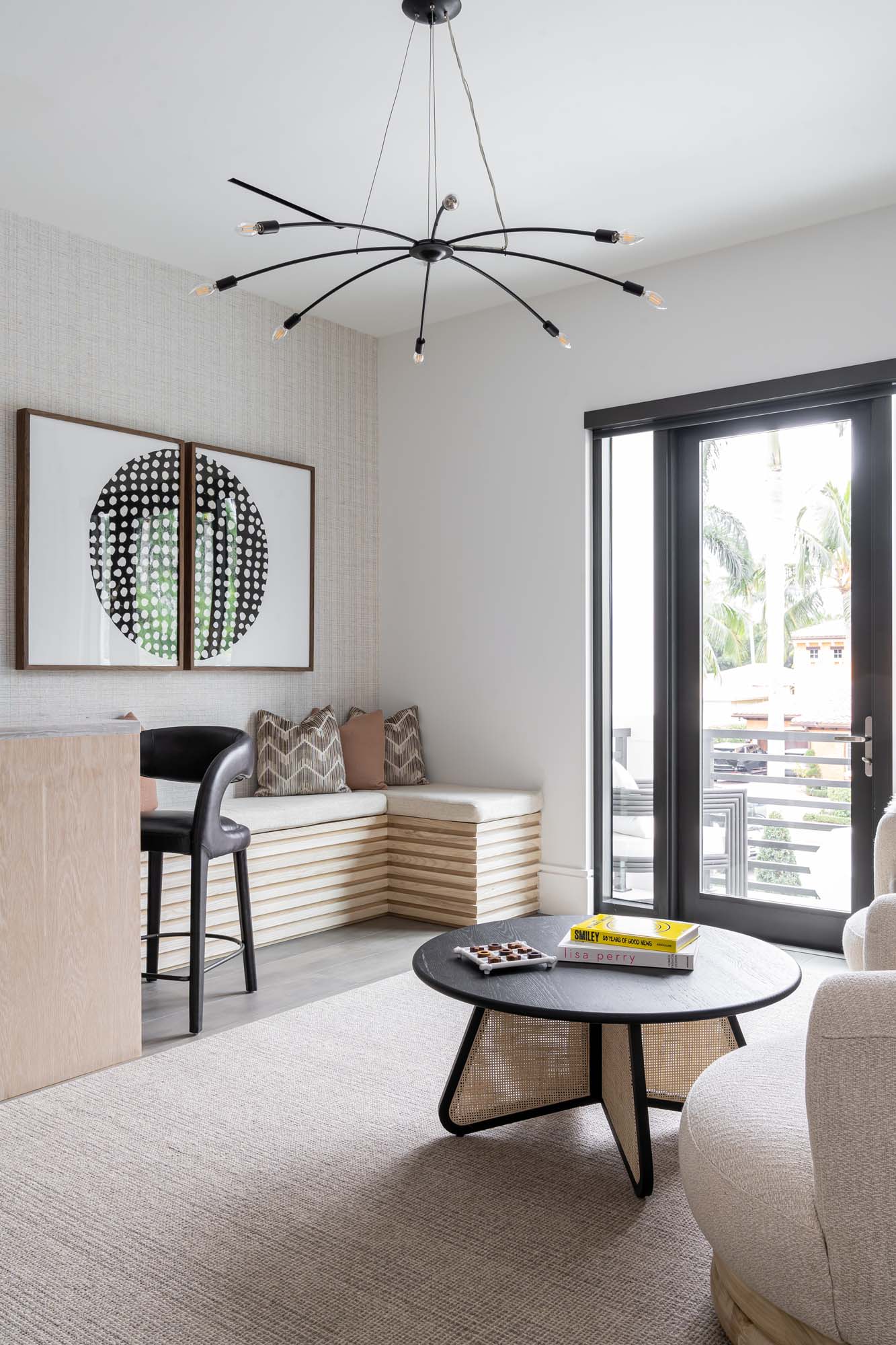
Interior Design by Krista W. Alterman, Photo by Venjahmin Reyes
Define Roles and Responsibilities: Clearly define the roles and responsibilities of both parties involved in the project. This includes outlining who is responsible for what tasks, timelines, and decision-making processes. This clarity helps prevent misunderstandings and keeps the project moving smoothly. Our team at KRISTA + HOME works closely with contractors to establish these guidelines, ensuring everyone is aware of their responsibilities.
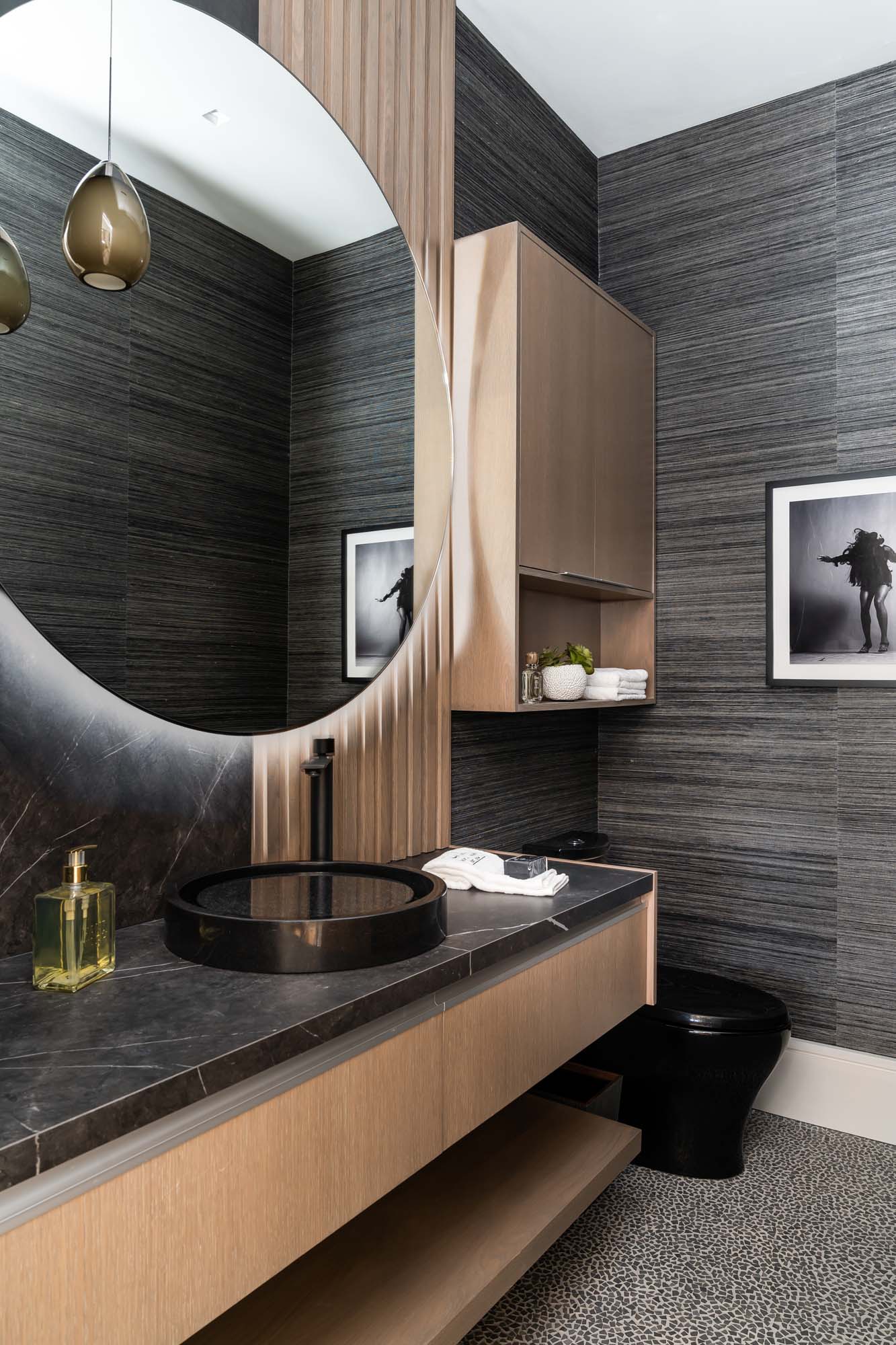
Interior Design by Krista W. Alterman, Photo by Venjahmin Reyes
Budget Management: Establishing a realistic budget is key to a successful project. Work closely with your contractor to determine costs, materials, and any potential unforeseen expenses. Our team at KRISTA + HOME collaborates with contractors to create a detailed budget that aligns with your vision while ensuring that quality is never compromised.
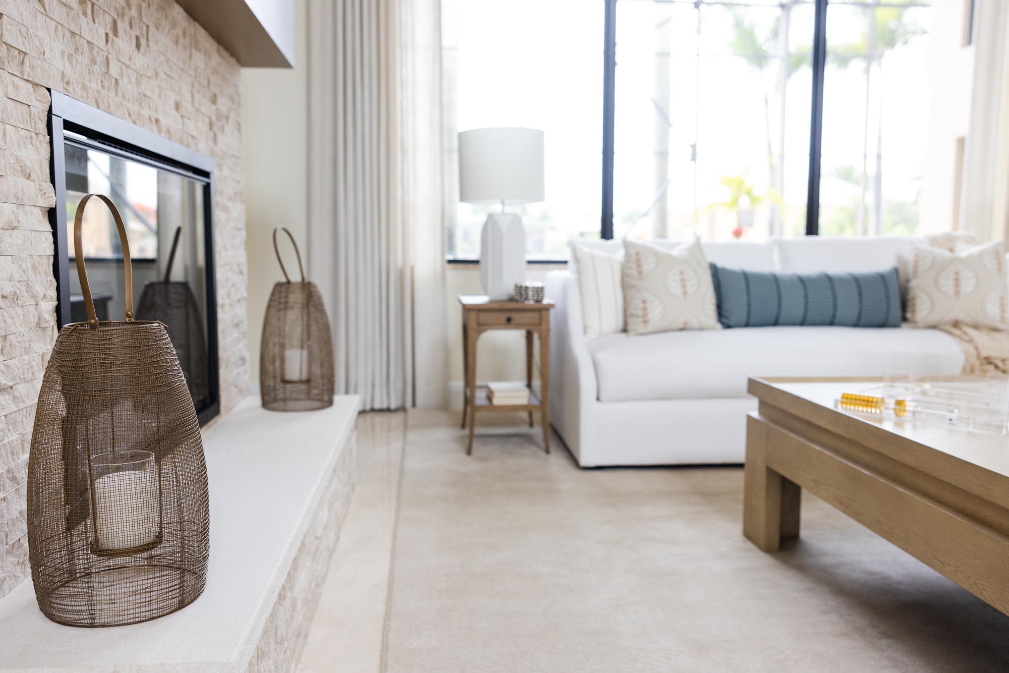
Interior Design by Krista W. Alterman, Photo by Eve Greendale
Flexibility and Problem Solving: No project is without its challenges, and flexibility is essential for navigating unexpected issues. A successful collaboration involves a proactive approach to problem-solving. At KRISTA + HOME, we work closely with contractors to address any unforeseen obstacles, ensuring that the project stays on track and meets your expectations.
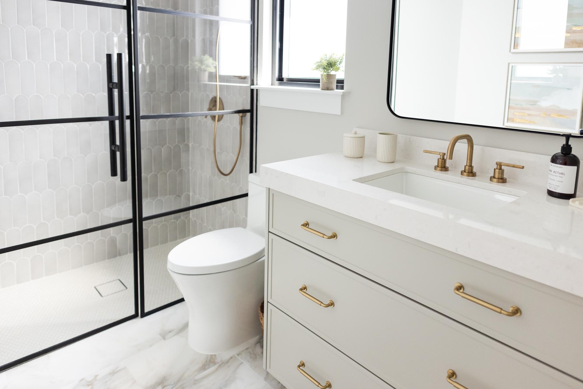
Interior Design by Krista W. Alterman, Photo by Eve Greendale
Working effectively with your contractor is a key element in turning your interior design dreams into reality. At KRISTA + HOME, we prioritize strong communication, trust, and collaboration to ensure a seamless and successful partnership. Whether you choose a contractor from our list of trusted partners or bring in your own, we are dedicated to making your project a stunning success. Contact us today to begin your journey toward a beautifully designed home that reflects your unique style and personality.
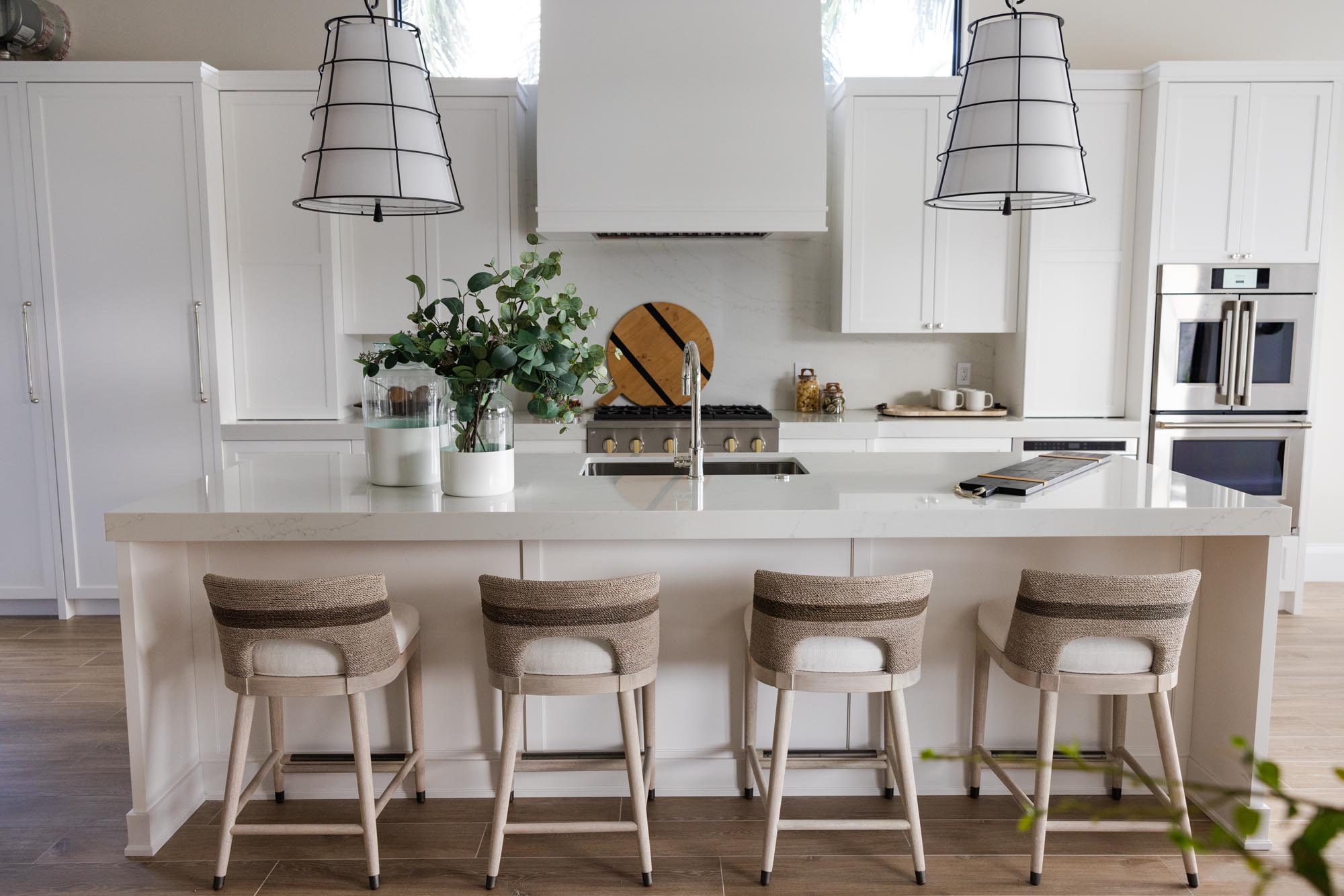
Interior Design by Krista W. Alterman, Photo by Eve Greendale
Is it worth it to work with an interior designer?
In the world of high-end residential interiors, the decision to work with an interior designer is not just about aesthetics; it’s an investment in the art of living. As a luxury interior design firm in Palm Beach, Florida, at KRISTA + HOME we understand the unique challenges and aspirations of our clients, and we believe that the value we bring goes beyond creating visually stunning spaces. Let’s explore the question: “Is it worth it to work with an interior designer?”

Interior Design by KRISTA + HOME. Photo by Eve Greendale
Tailored Expertise: Crafted for You
Luxury interior design is an intricate dance of creativity, functionality, and a deep understanding of design principles. Interior designers bring a wealth of knowledge and experience to the table, offering a unique blend of artistic vision and technical expertise. From selecting the finest materials to creating bespoke furniture pieces, every aspect of the design is meticulously curated to align with your tastes and lifestyle.
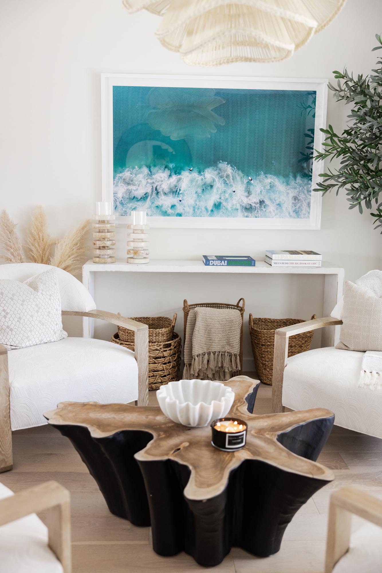
Interior Design by KRISTA + HOME. Photo by Eve Greendale.
Time is of the Essence: Efficiency in Design
Time is a luxury, and a skilled interior designer can save you plenty of it. Navigating the world of high-end furnishings, custom finishes, and artisanal craftsmanship can be overwhelming. An interior designer streamlines the process, leveraging their industry connections to source the finest materials efficiently. This not only accelerates the design timeline but also ensures that every element is carefully chosen to contribute to the overall opulence of the space.
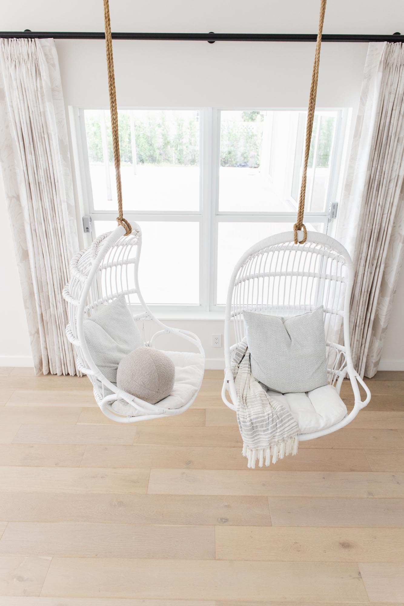
Interior Design by KRISTA + HOME. Photo by Eve Greendale.
Investment in Quality: Adding Value to Your Property
Luxury interior design is not just an expense; it’s an investment that adds significant value to your property. A well-designed home stands out in the real estate market, attracting discerning buyers who appreciate the attention to detail and craftsmanship. Quality materials and thoughtful design contribute to the longevity of the space, making it a timeless masterpiece that transcends trends.
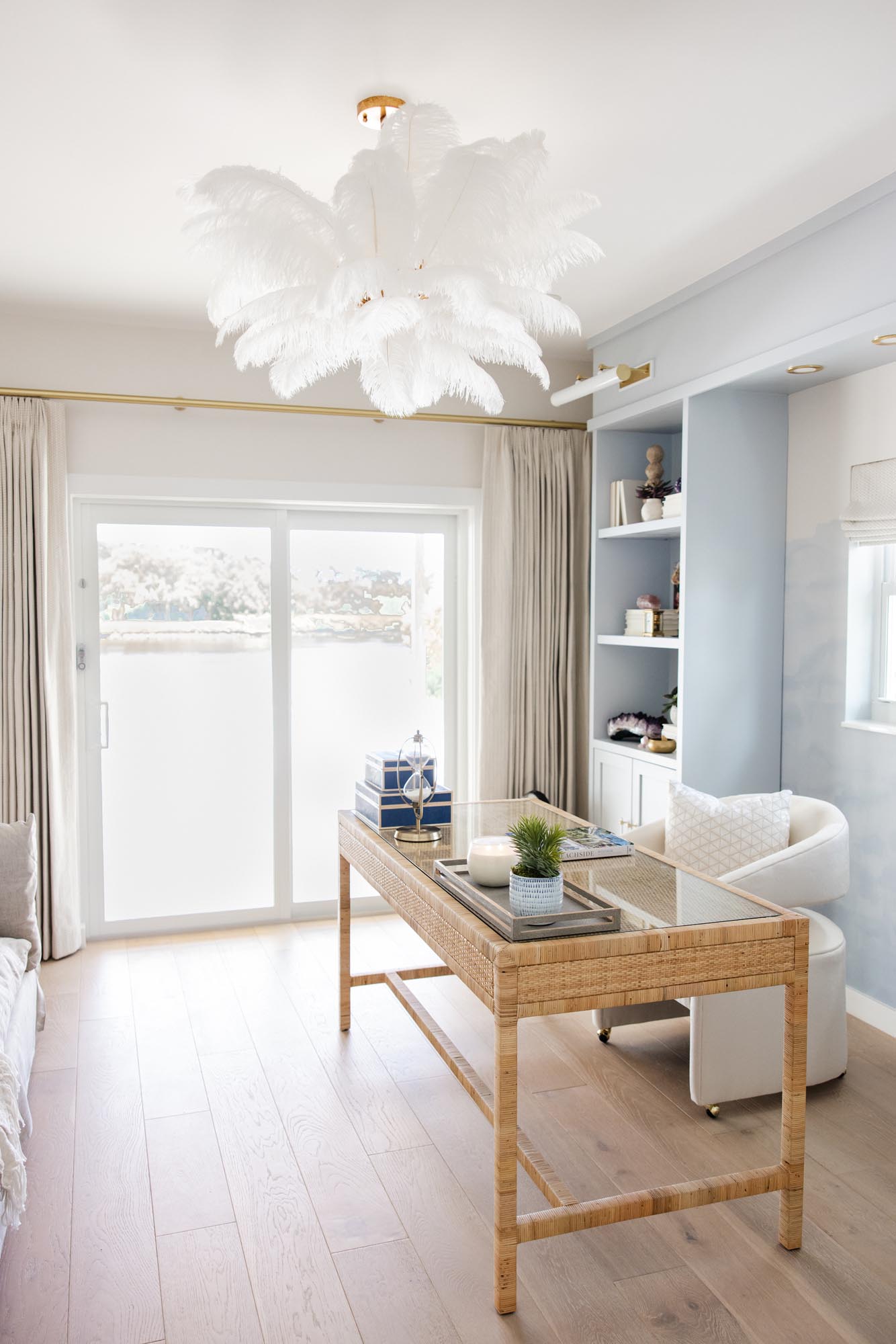
Interior Design by KRISTA + HOME. Photo by Eve Greendale.
Personalized Lifestyle Integration: Beyond Trends
While trends come and go, a luxury interior designer focuses on creating a timeless aesthetic tailored to your individual lifestyle. Your home should be a reflection of your personality, tastes, and aspirations. Interior designers work closely with clients to understand their unique preferences, ensuring that every element of the design harmonizes with the client’s lifestyle and enhances their daily experience.
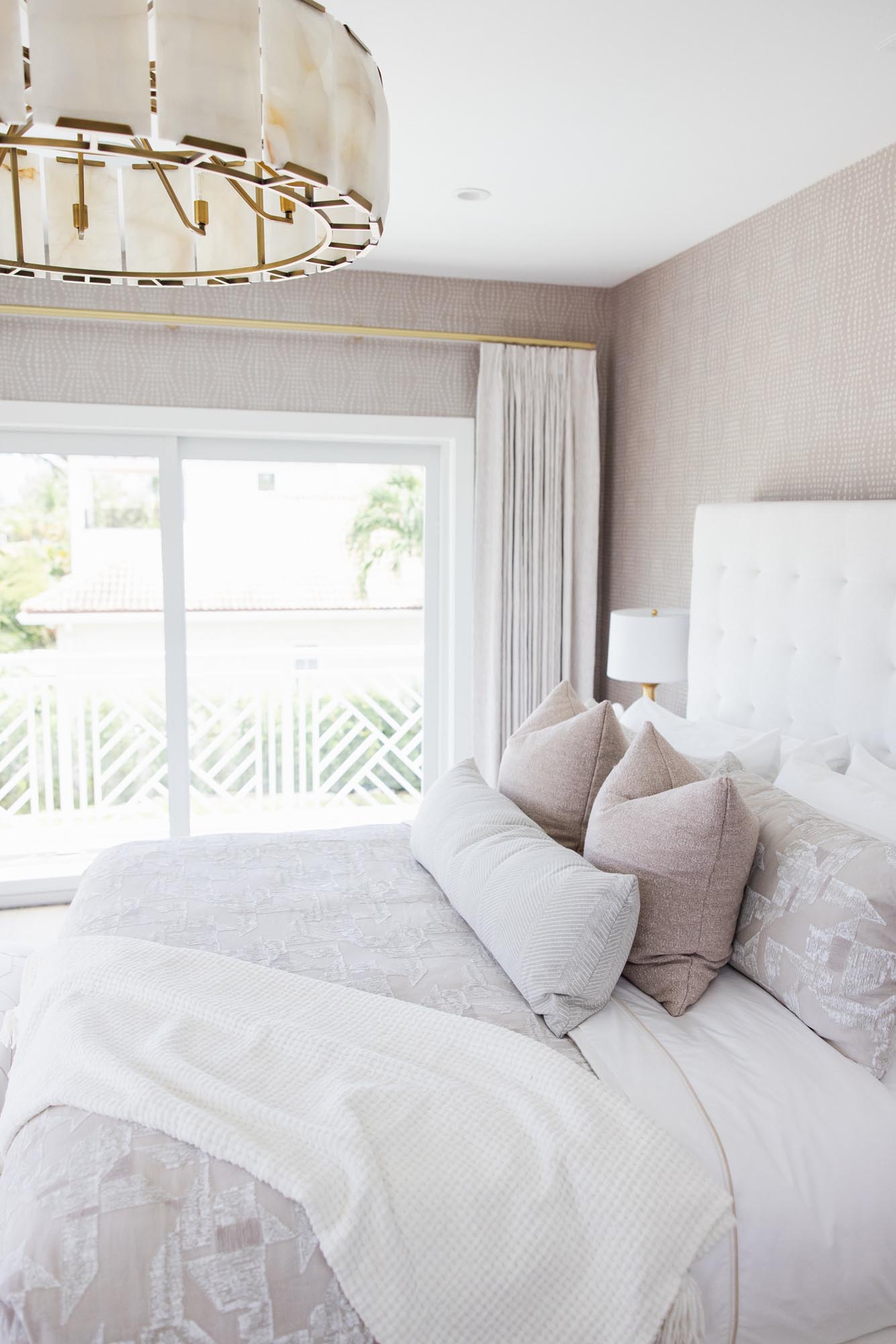
Interior Design by KRISTA + HOME. Photo by Eve Greendale.
The Stress-Free Elegance: Enjoy the Process
Designing a luxury interior should be a delightful journey, not a stressful one. An interior designer acts as a project manager, coordinating every aspect of the design process, from concept to completion. This allows you to relax and enjoy the transformation of your space without the burden of managing the myriad details that go into creating a luxurious home.
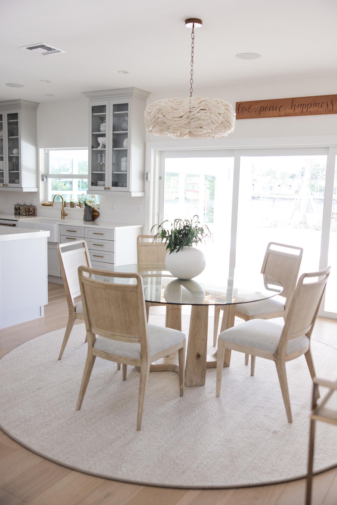
Interior Design by KRISTA + HOME. Photo by Eve Greendale.
In conclusion, the decision to work with a luxury interior designer is a resounding “yes” for those who seek not just a beautiful space, but an elevated lifestyle. The expertise, efficiency, and personalized touch that a designer brings to the table make the investment worthwhile, resulting in a home that is a true masterpiece of luxury living.
Top 3 Things To Consider When Building A Custom Home
Building a custom home is a dream for many, a chance to bring your unique vision to life and create a space that truly reflects your personality and lifestyle. As a luxury interior design firm, we understand the importance of this process and have had the privilege of working with numerous clients to turn their dream homes into reality. In this blog post, we’ll delve into the top three considerations when embarking on the journey of building a custom home.
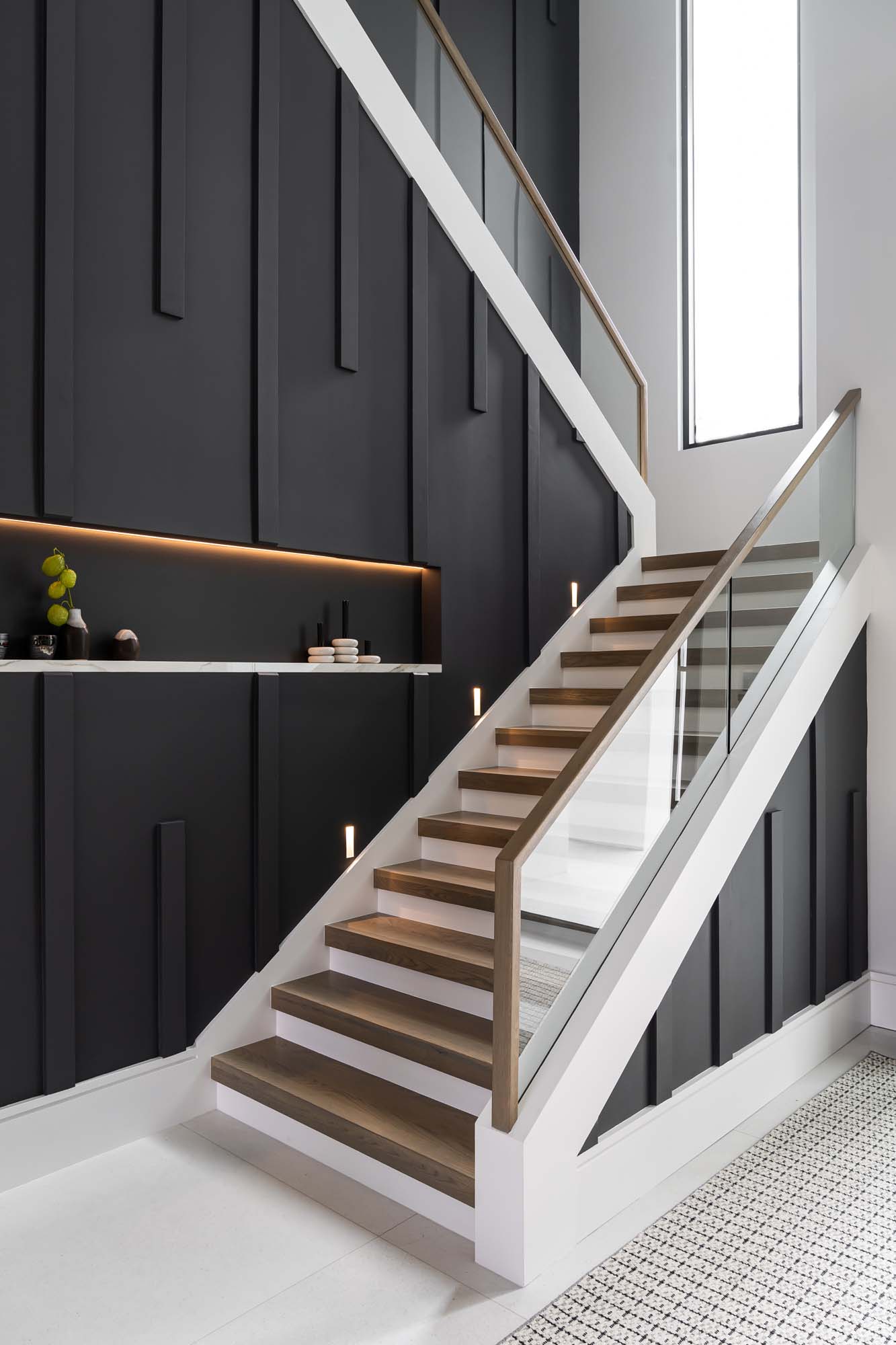
Interior Design by Krista W. Alterman, Photo by Venjhamin Reyes
Visionary Collaboration:
Building a custom home is a collaborative endeavor that involves architects, builders, and interior designers working seamlessly together. It’s crucial to establish a strong, communicative relationship with your design team from the outset. As a luxury interior design firm, we take pride in our ability to seamlessly integrate our expertise with that of architects and builders, ensuring a harmonious and cohesive design throughout every aspect of your home.
Our approach involves in-depth consultations with clients to understand their vision, preferences, and lifestyle. We then work collaboratively with architects to ensure that the design not only meets aesthetic expectations but also aligns with structural and functional requirements. This collaboration results in a home that not only boasts luxurious interiors but also stands as a testament to the seamless integration of design and architecture.
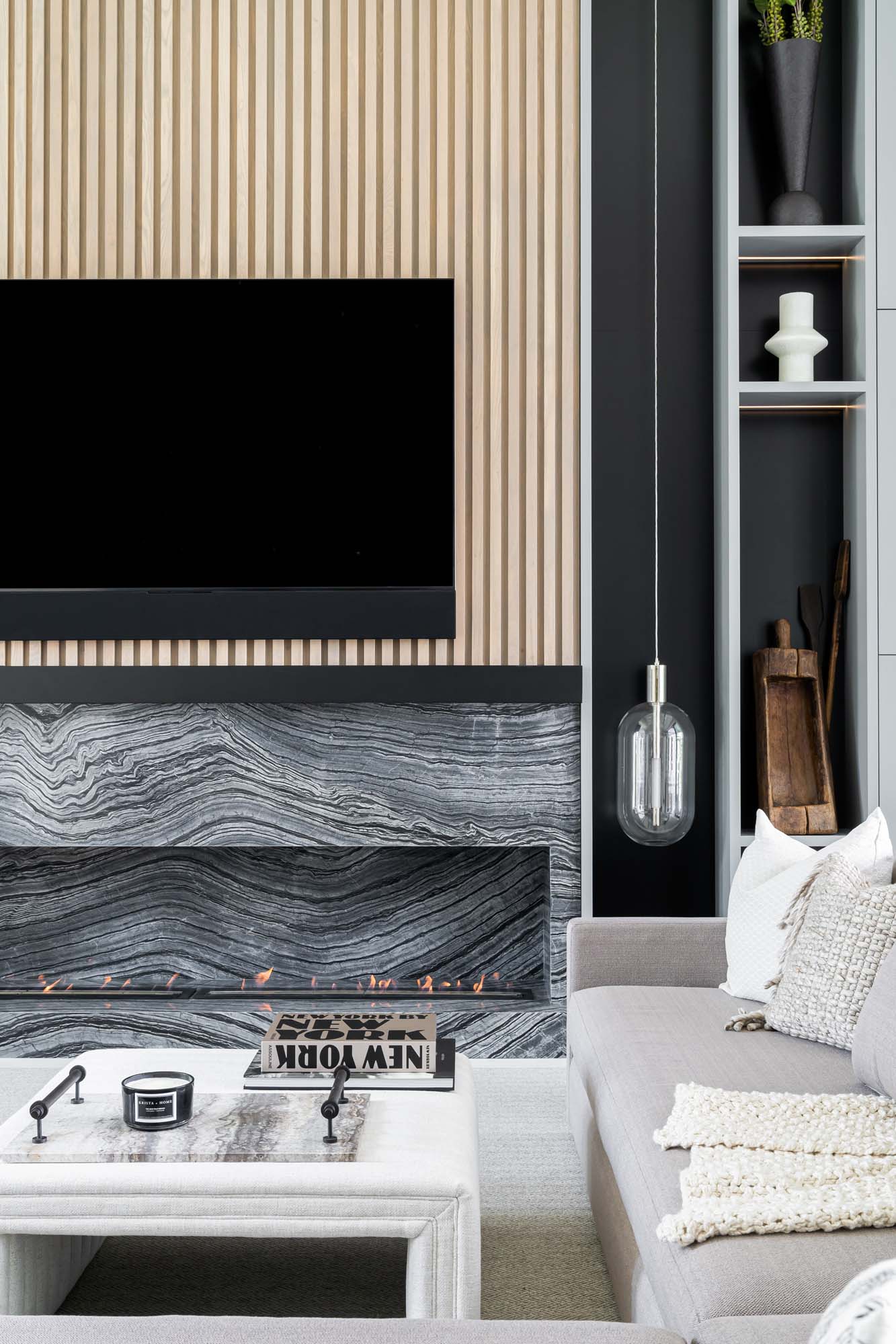
Interior Design by Krista W. Alterman, Photo by Venjhamin Reyes
Timeless Elegance vs. Trendy Glamour:
One of the challenges in custom home design is striking the right balance between timeless elegance and trendy glamour. While it’s tempting to incorporate the latest design trends, it’s essential to consider the long-term appeal of your home. As a luxury interior design firm, we specialize in creating spaces that exude timeless sophistication, ensuring that your custom home remains a symbol of refined taste for years to come.
During our collaborations, we guide clients towards selecting materials, finishes, and furnishings that not only align with their current aesthetic preferences but also have enduring appeal. Our meticulous attention to detail and extensive knowledge of materials allow us to create interiors that stand the test of time, providing a timeless backdrop for evolving styles and trends.
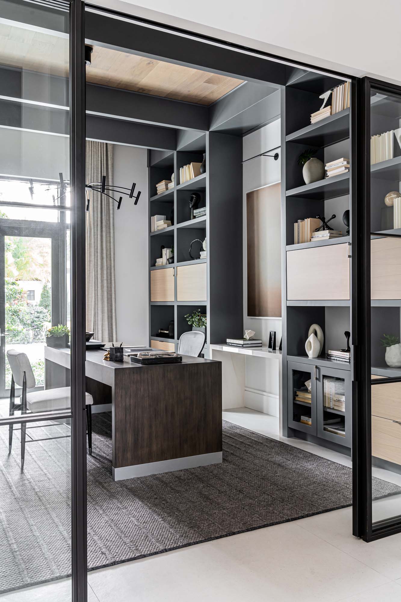
Interior Design by Krista W. Alterman, Photo by Venjhamin Reyes
Functionality and Lifestyle Integration:
Luxury doesn’t just lie in aesthetics; it’s also about enhancing the functionality of your living spaces. When designing a custom home, it’s essential to prioritize the integration of your lifestyle and daily routines into the overall design. We work closely with clients to understand their unique needs, whether it’s a dedicated home office, a state-of-the-art kitchen, or a tranquil spa-like bathroom.
Our focus on functionality ensures that every element of the design serves a purpose, contributing to a home that not only looks exquisite but also enhances the day-to-day lives of its occupants. From innovative storage solutions to ergonomic furniture selections, our design process is centered around creating a space that seamlessly integrates luxury with practicality.
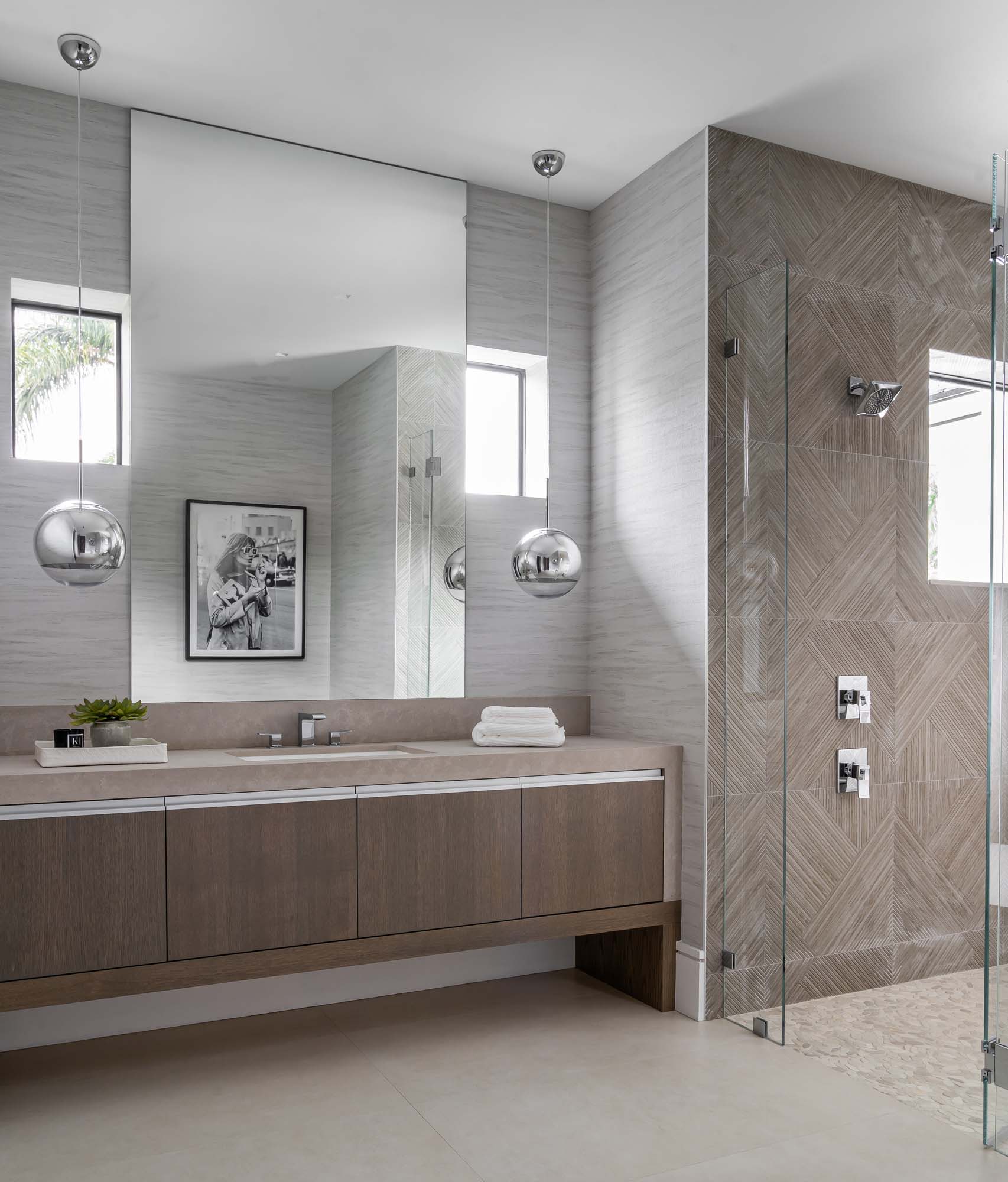
Interior Design by Krista W. Alterman, Photo by Venjhamin Reyes
Building a custom home is an extraordinary undertaking, and by considering these top three factors – visionary collaboration, timeless elegance, and functionality – you can embark on this journey with confidence. As a luxury interior design firm, we take pride in our ability to transform dreams into reality, crafting homes that are not only visually stunning but also tailored to the unique lifestyles of our clients. If you’re ready to embark on the journey of building your custom home, we’re here to turn your vision into an opulent reality.
Creating The Perfect Dining Room For Thanksgiving
As Thanksgiving approaches, many of us are eagerly anticipating the joy of gathering with loved ones around a beautifully set table to share a delicious meal. At KRISTA + HOME, we understand the significance of creating a dining space that not only reflects your style but also sets the stage for unforgettable moments. Here are some of the elements that we think really contribute to the perfect Thanksgiving dining room, from the choice of tables to statement chandeliers and captivating wall decor.
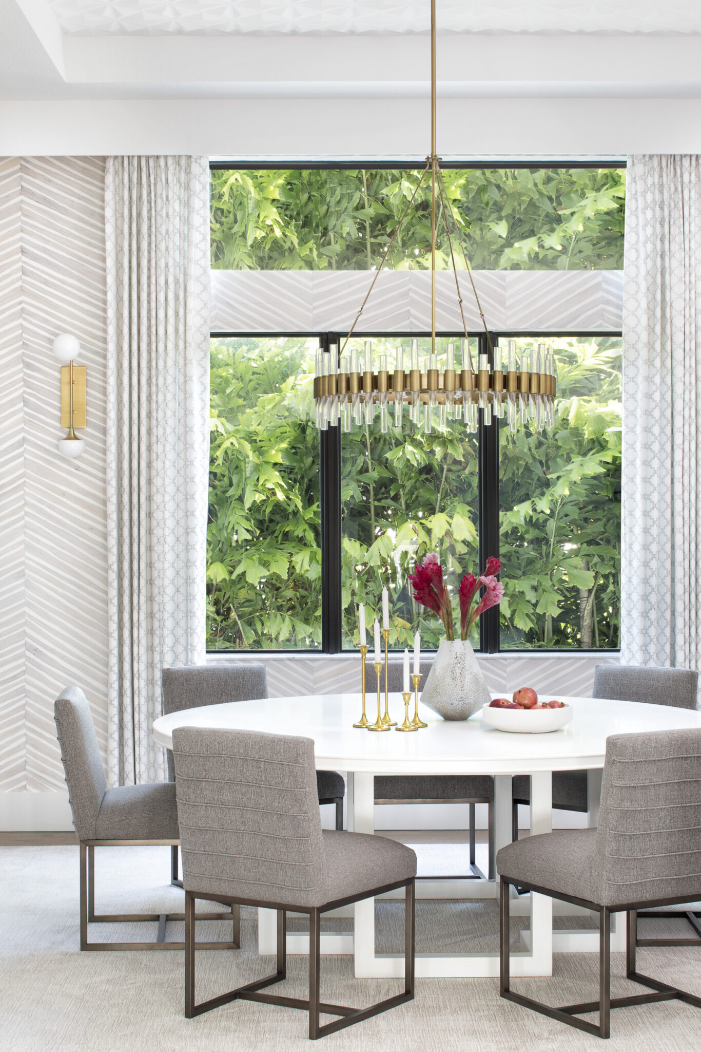
Interior Design by KRISTA + HOME, Photo by Jessica Glynn
Choosing the Right Table
The centerpiece of any dining room is undoubtedly the table, and when it comes to Thanksgiving, selecting the right one is crucial. Rectangular tables offer a classic and formal look, providing ample space for larger gatherings. They create a sense of symmetry, making it easier to arrange place settings and showcase your carefully curated tabletop decor.
On the other hand, round tables foster an intimate atmosphere, encouraging conversation among guests. They are ideal for smaller gatherings, allowing everyone to engage in the festivities without feeling distant. Ultimately, the choice between a rectangular or round table depends on the size of your space and the number of guests you plan to host.
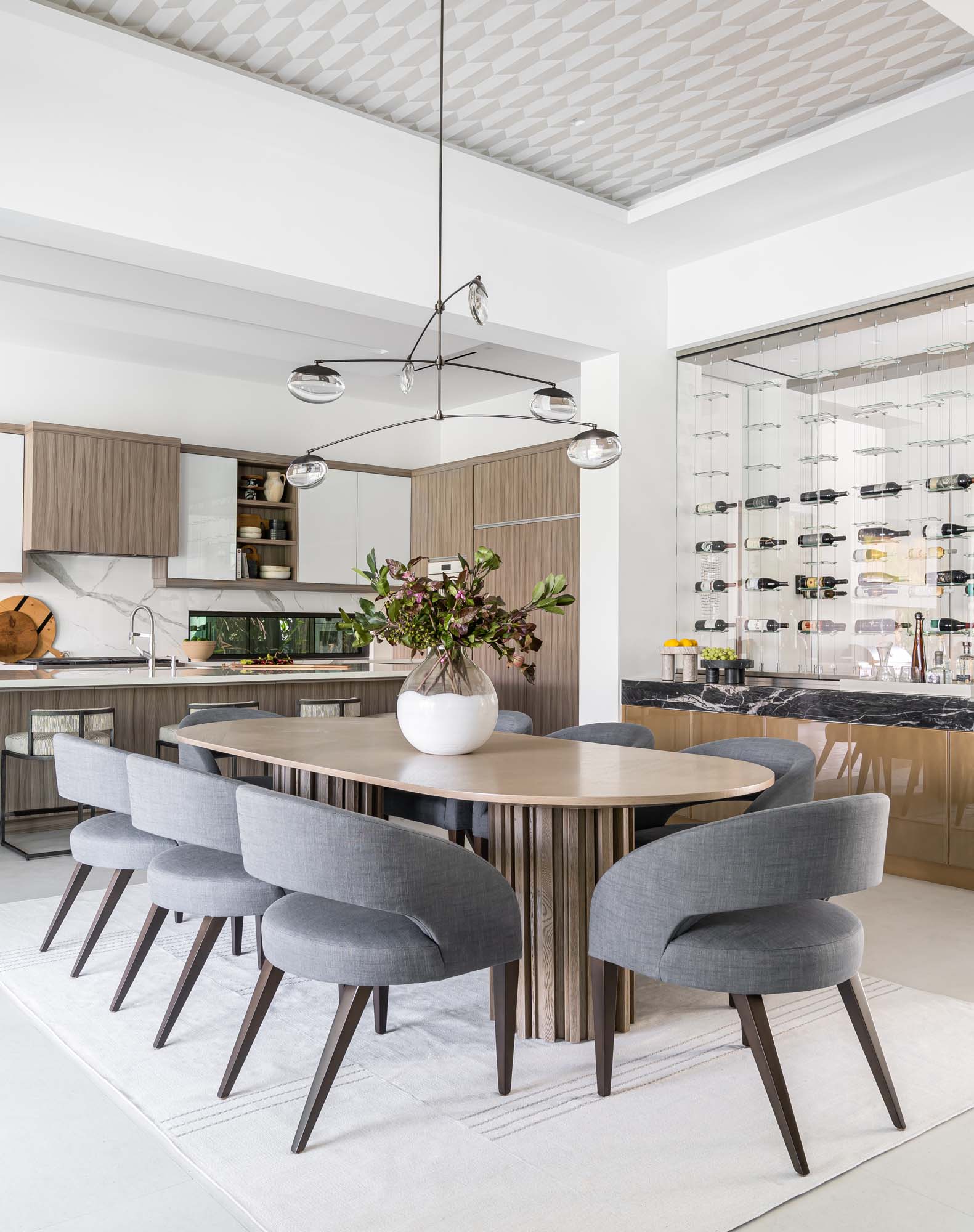
Interior Design by KRISTA + HOME, photo by Venjhamin Reyes
Statement Chandeliers
A well-chosen chandelier can elevate the entire dining experience, and Thanksgiving is the perfect occasion to make a statement. Consider a chandelier that complements the overall design of your dining room while adding a touch of grandeur. Whether it’s a modern, minimalist fixture or a classic crystal chandelier, the right lighting can set the mood and enhance the visual appeal of your space.
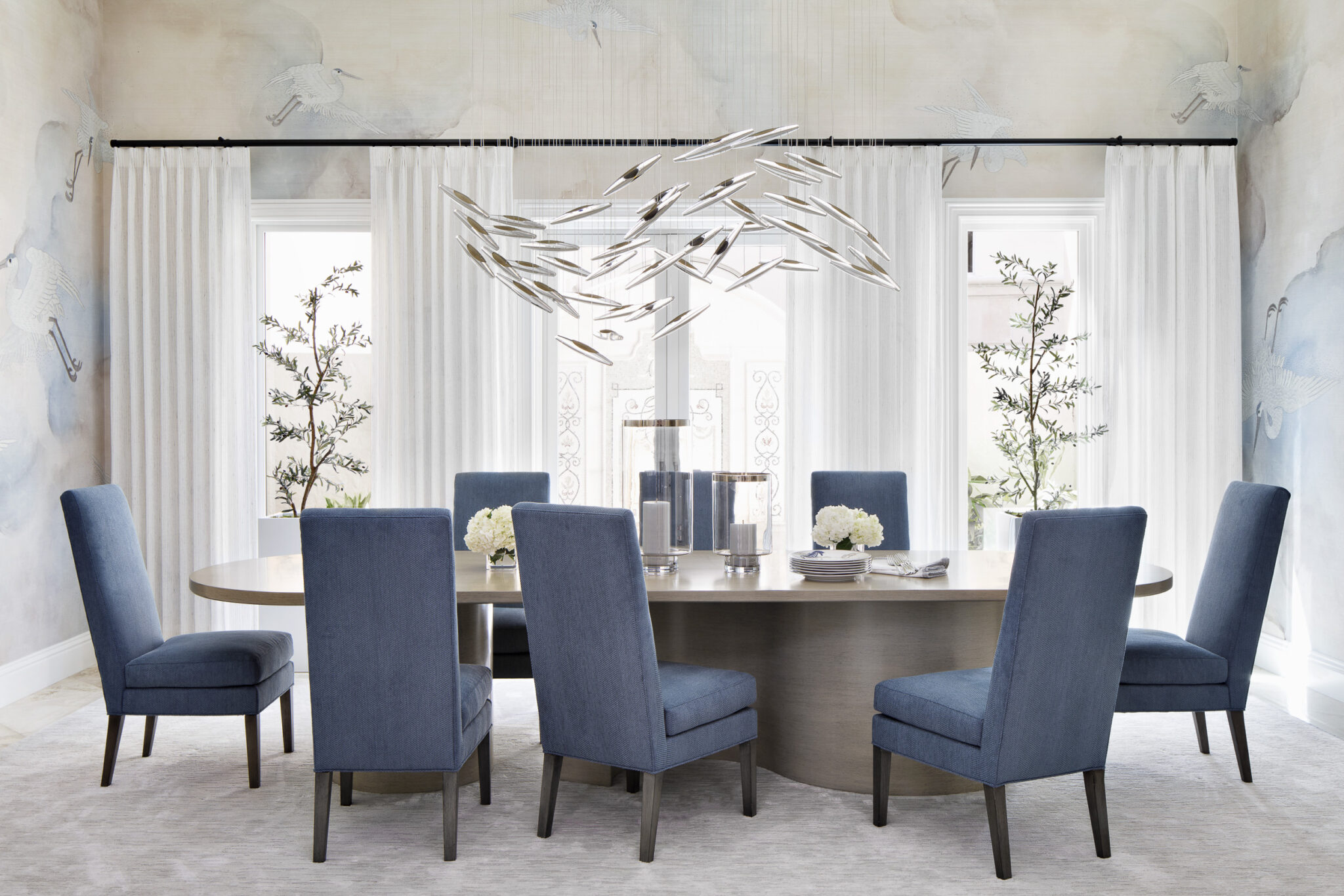
Interior Design by KRISTA + HOME, photo by Jessica Glynn
Wall Decor: Millwork and Wallpaper
The walls of your dining room play a significant role in creating a warm and inviting atmosphere. Incorporating millwork, such as wainscoting or paneling, can add texture and visual interest. This timeless feature provides a sense of sophistication and serves as an elegant backdrop for your dining area.
Alternatively, wallpaper can infuse personality and style into the room. Consider rich, autumnal hues or subtle, nature-inspired patterns to evoke a sense of warmth. Wallpaper can be applied to an entire wall or strategically used as an accent, creating a focal point that enhances the overall aesthetic.
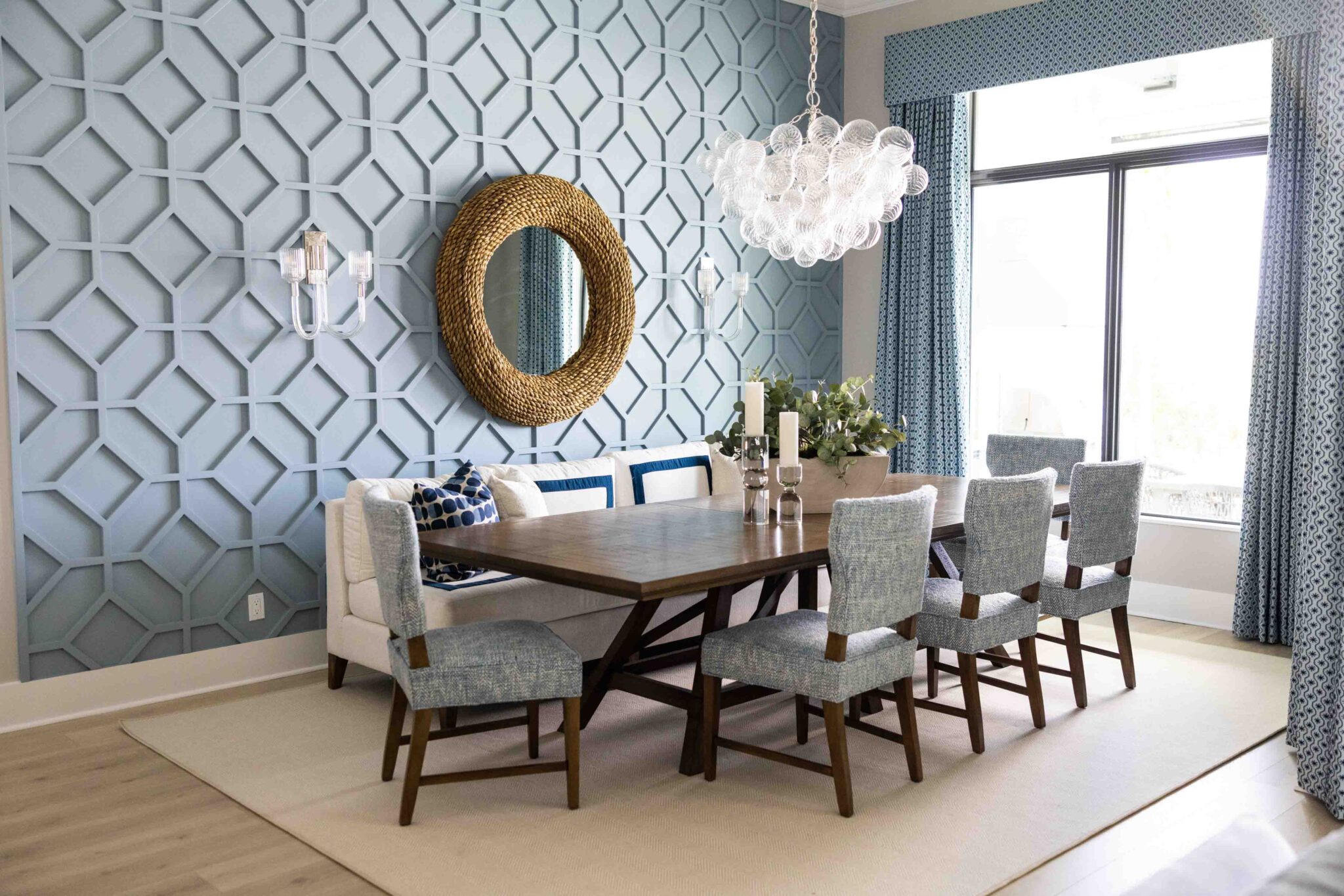
Interior Design by KRISTA + HOME, photo by Eve Greendale
Personal Touches
No Thanksgiving dining room is complete without personal touches that reflect your unique style. Incorporate seasonal decor like centerpieces with autumnal flowers, gourds, and candles. Mix and match table linens, incorporating warm tones and textures to add depth and visual interest.
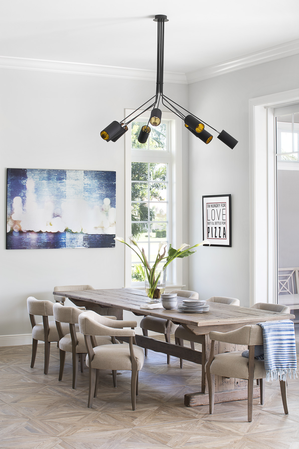
Interior Design by KRISTA + HOME, photo by Jessica Glynn
As you prepare to host Thanksgiving in your home, remember that the perfect dining room is a combination of thoughtful design elements and personal touches. Whether you opt for a rectangular or round table, a statement chandelier, or captivating wall decor, let your dining space tell a story that resonates with you and your guests.
Before and After: Country Contemporary
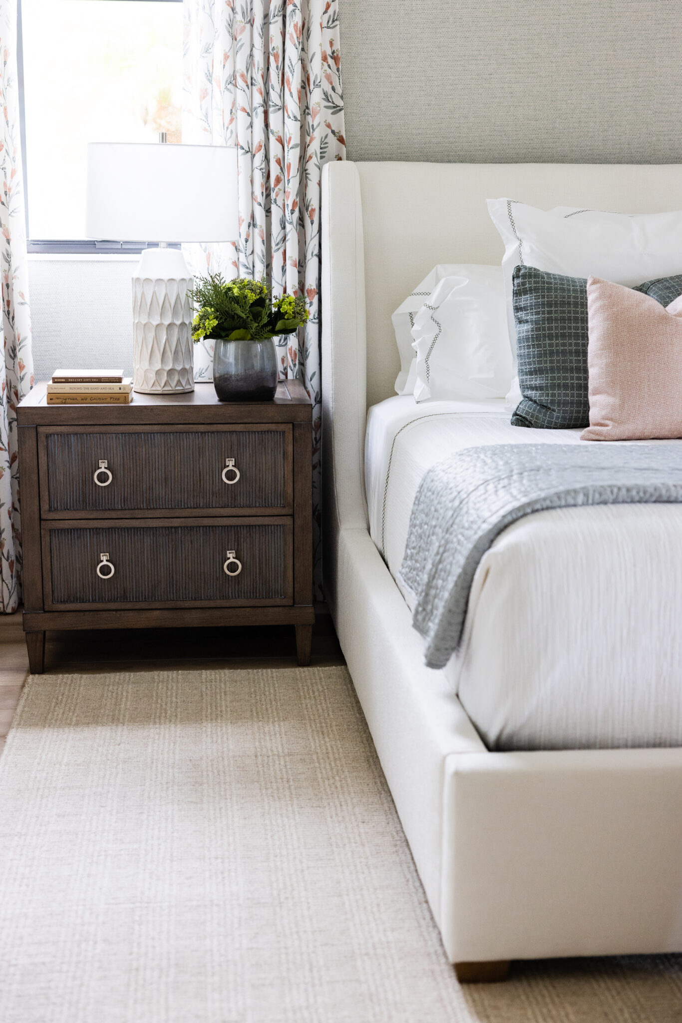
Before and After stories are my favorite! I love creating true transformations for our clients. It is so rewarding. We transformed this dark, dated, heavy, Tuscan style home in Wellington, Florida to a stunning, modern oasis. The client did not want a blue, coastal look – she wanted something more contemporary with traditional elements. Check out the results below! The photos really speak for themselves…
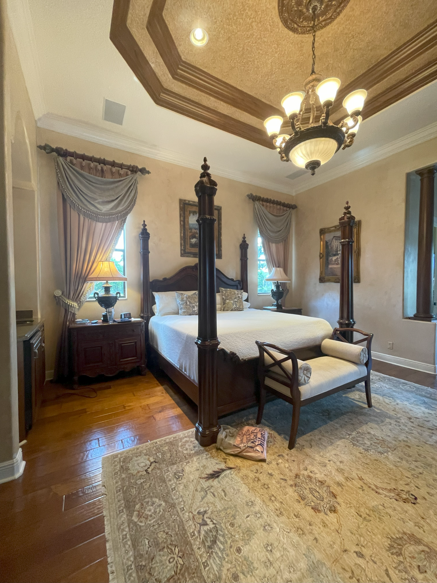
BEFORE
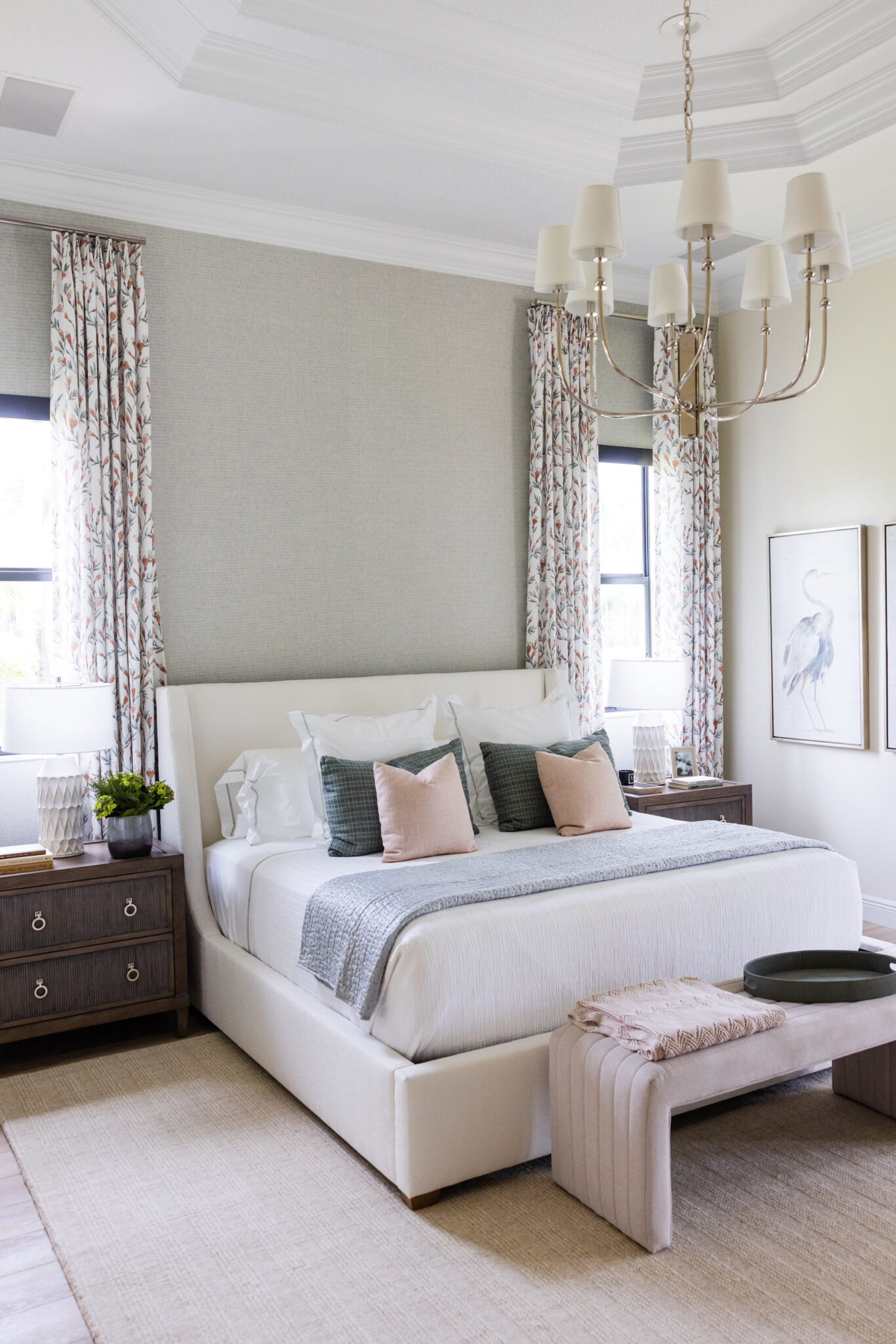
Interior Design by KRISTA + HOME, Photo by Eve Greendale


Interior Design by KRISTA + HOME, Photo by Eve Greendale
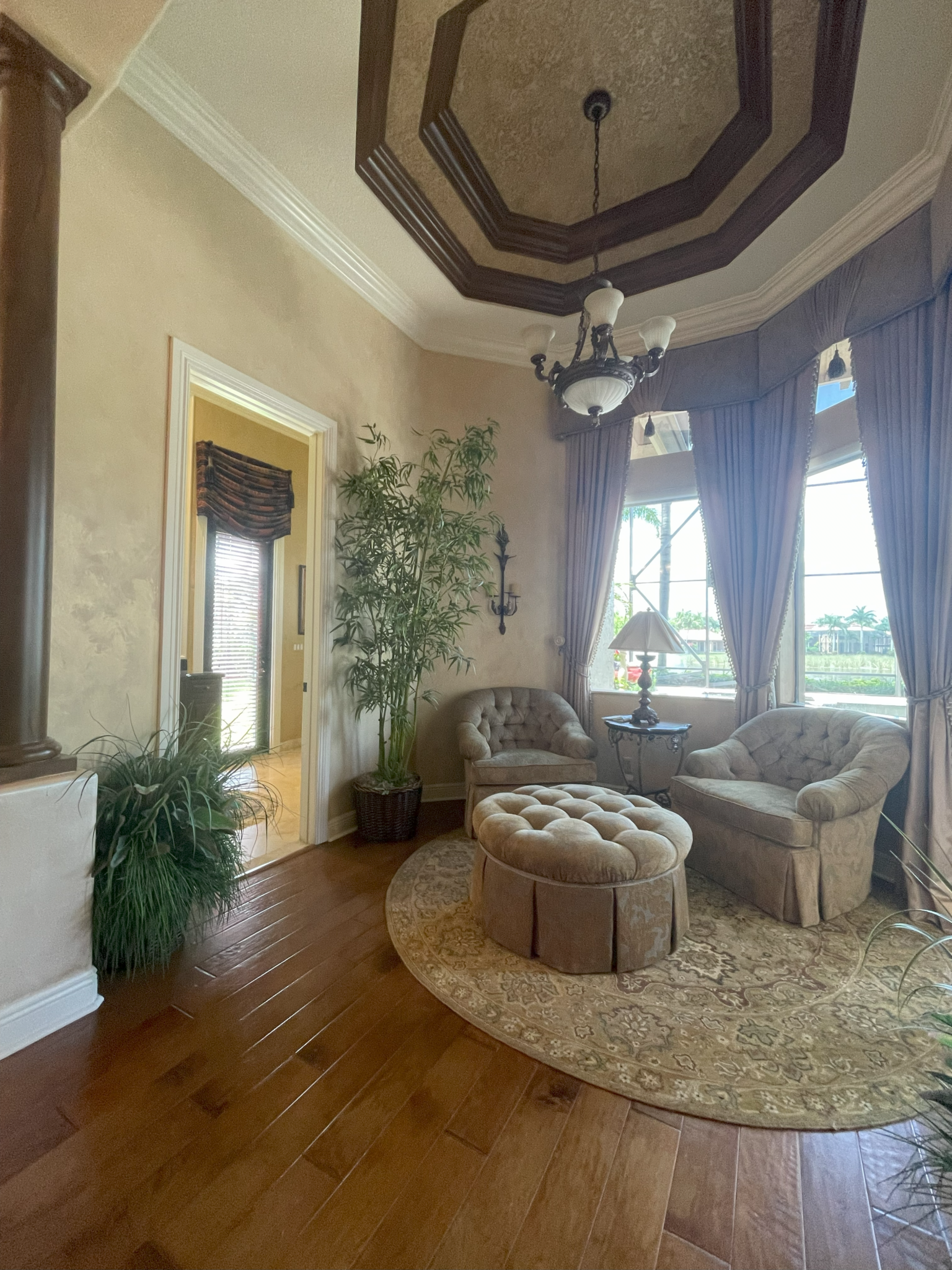
BEFORE
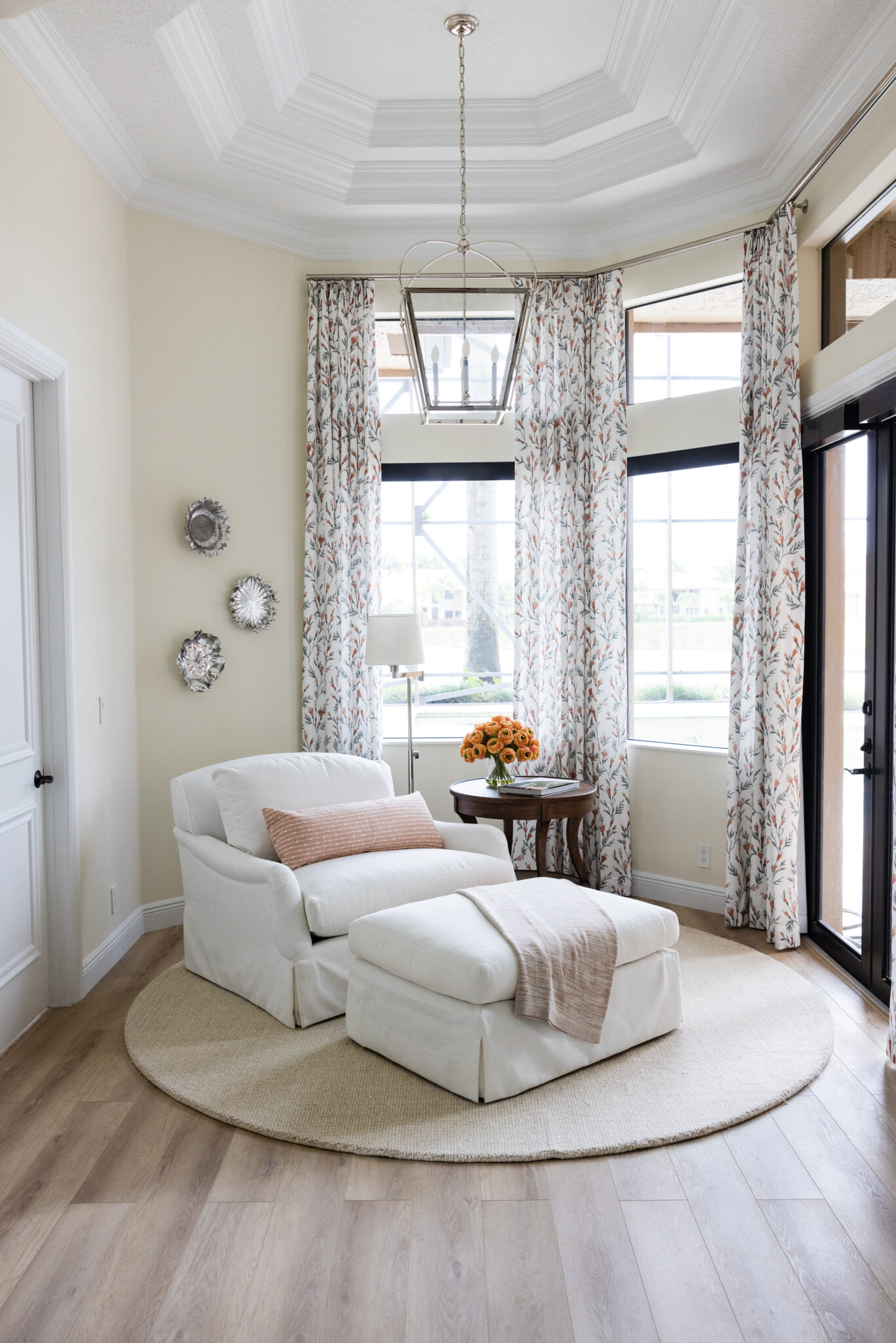
Interior Design by KRISTA + HOME, Photo by Eve Greendale
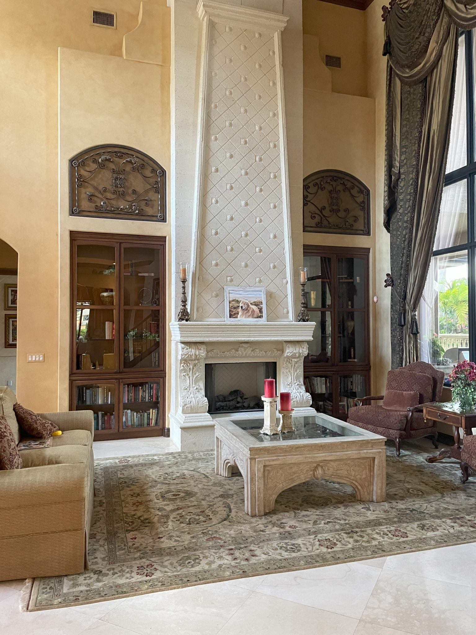
BEFORE
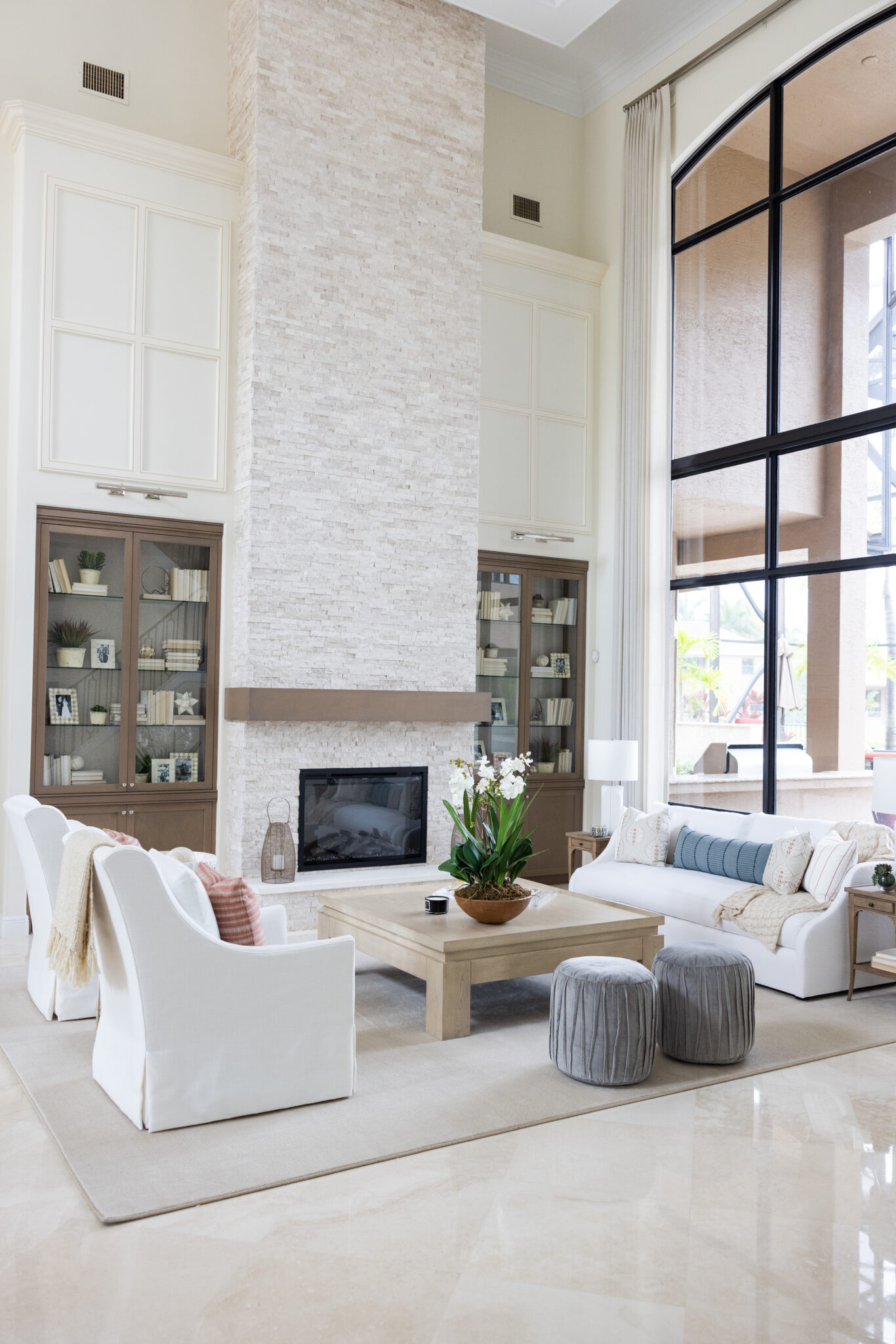
Interior Design by KRISTA + HOME, Photo by Eve Greendale
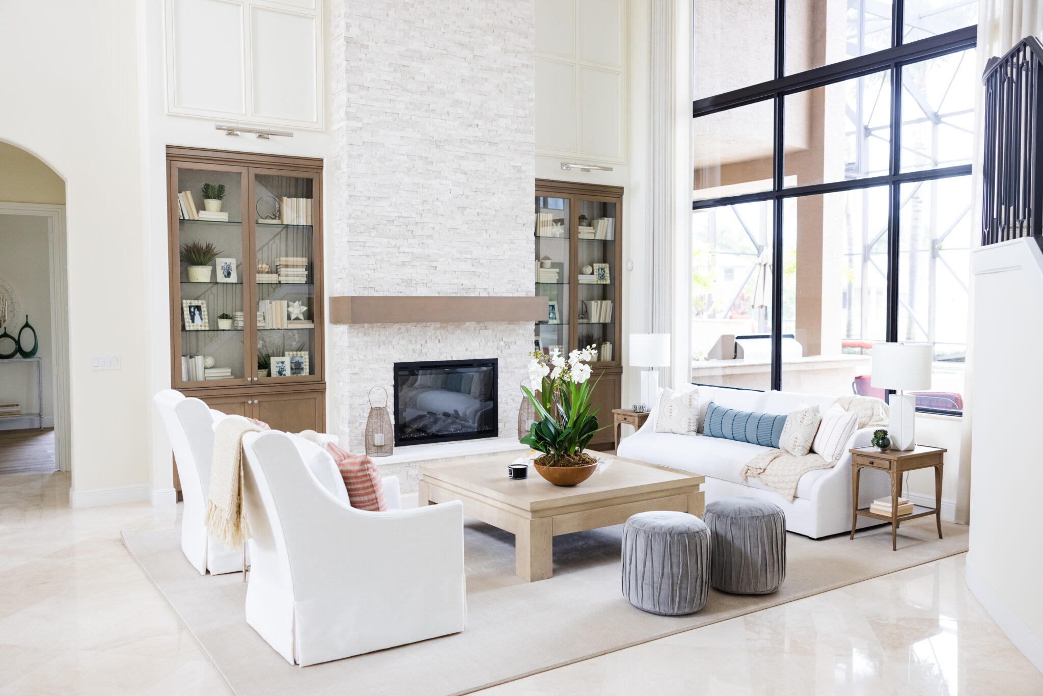
Interior Design by KRISTA + HOME, Photo by Eve Greendale
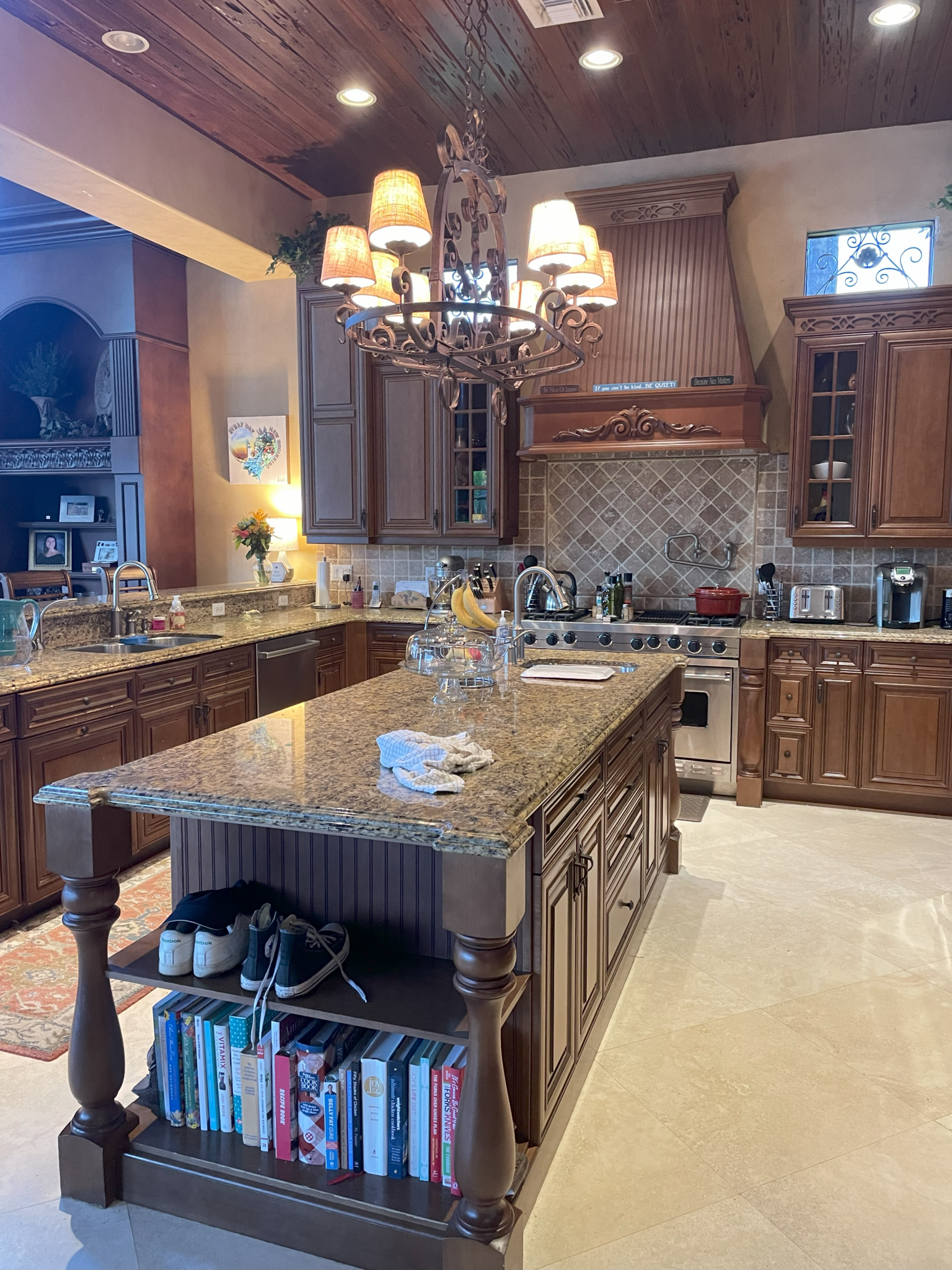
BEFORE
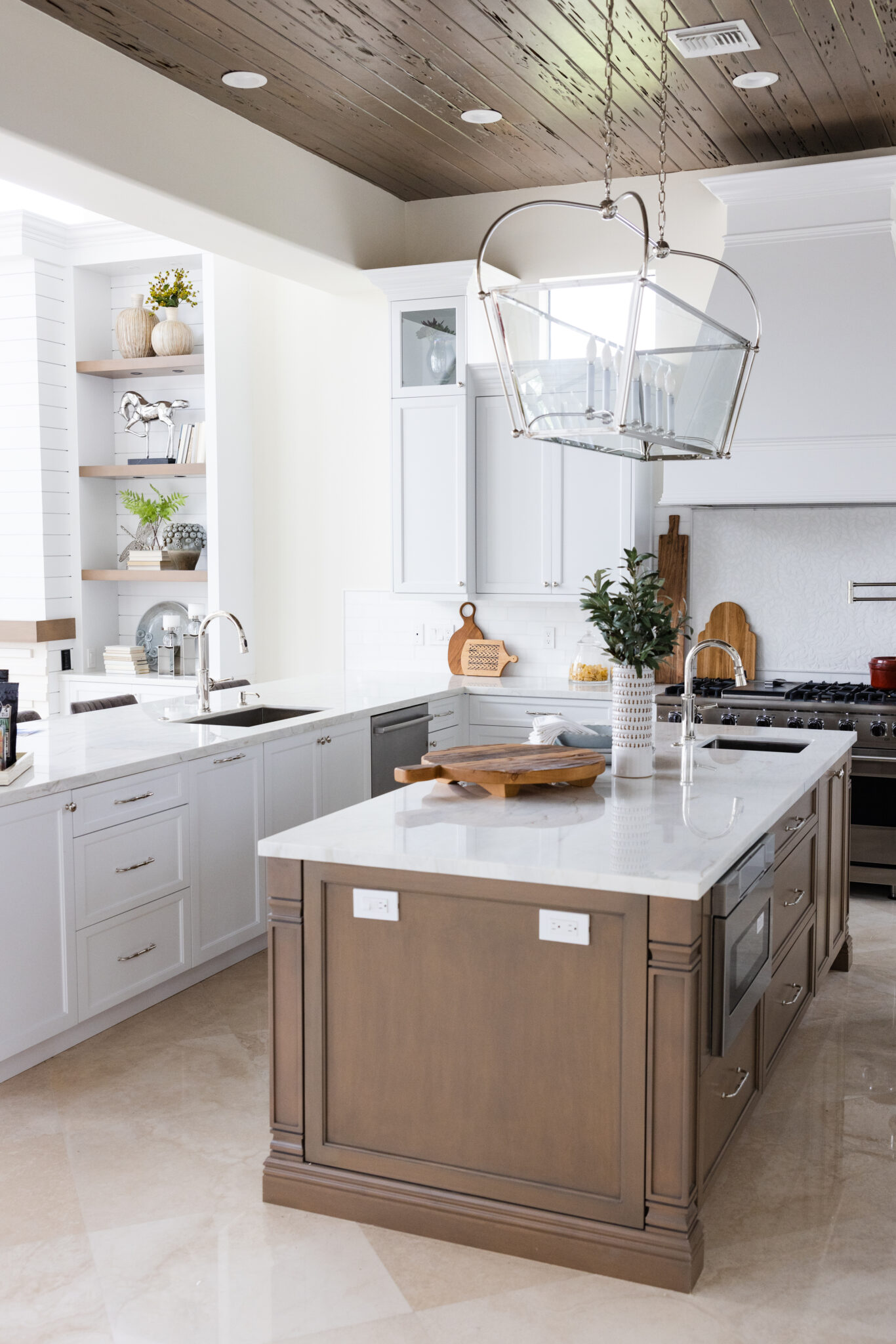
Interior Design by KRISTA + HOME, Photo by Eve Greendale

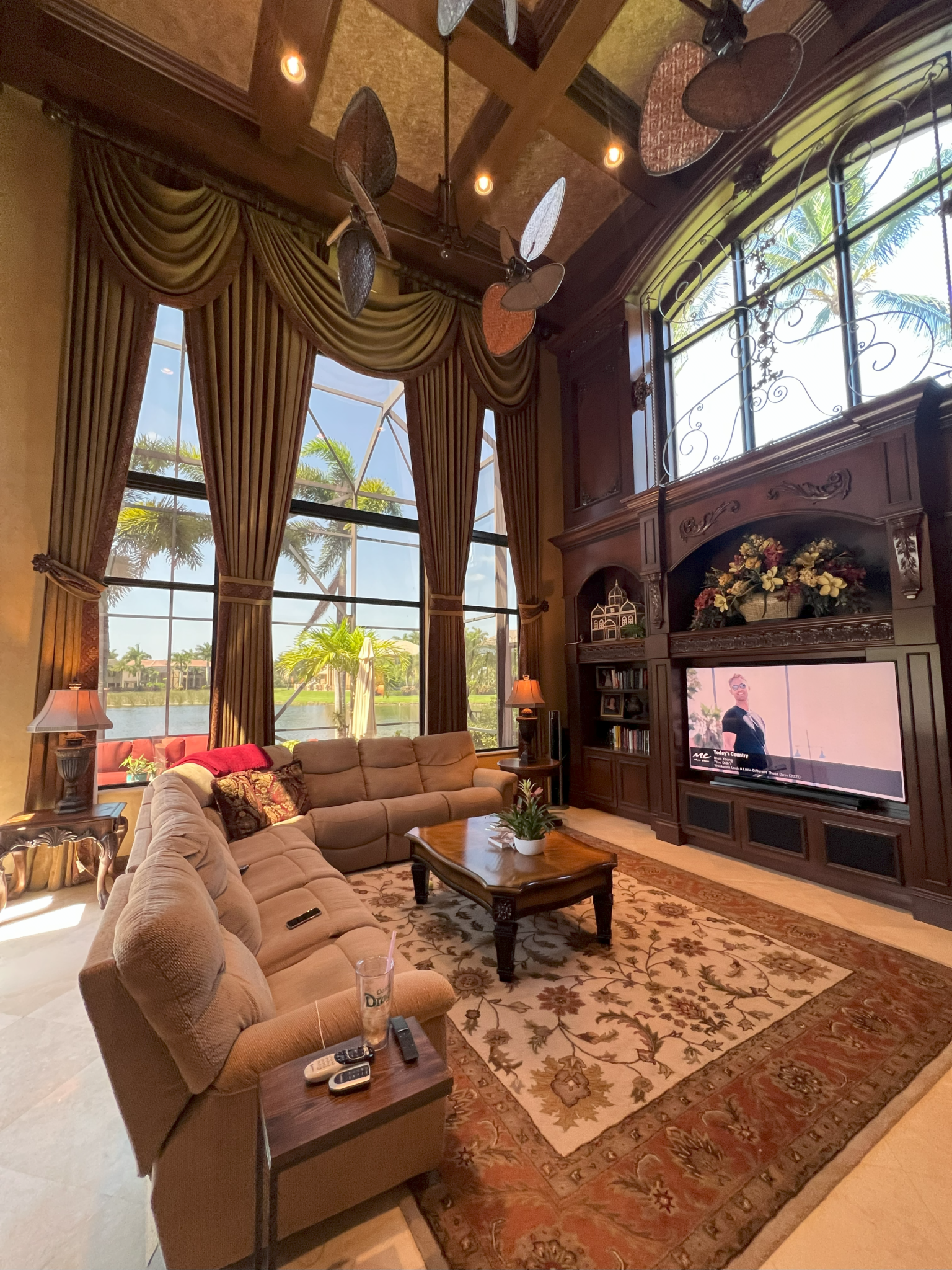
BEFORE
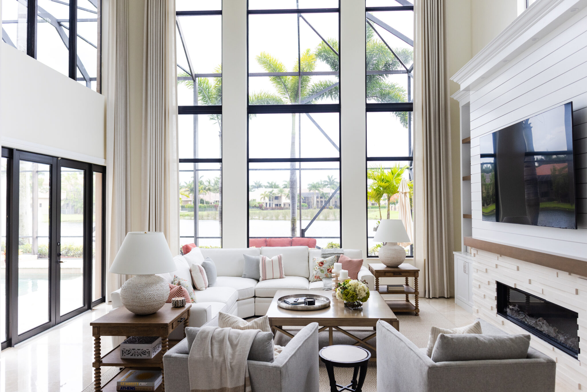
Interior Design by KRISTA + HOME, Photo by Eve Greendale
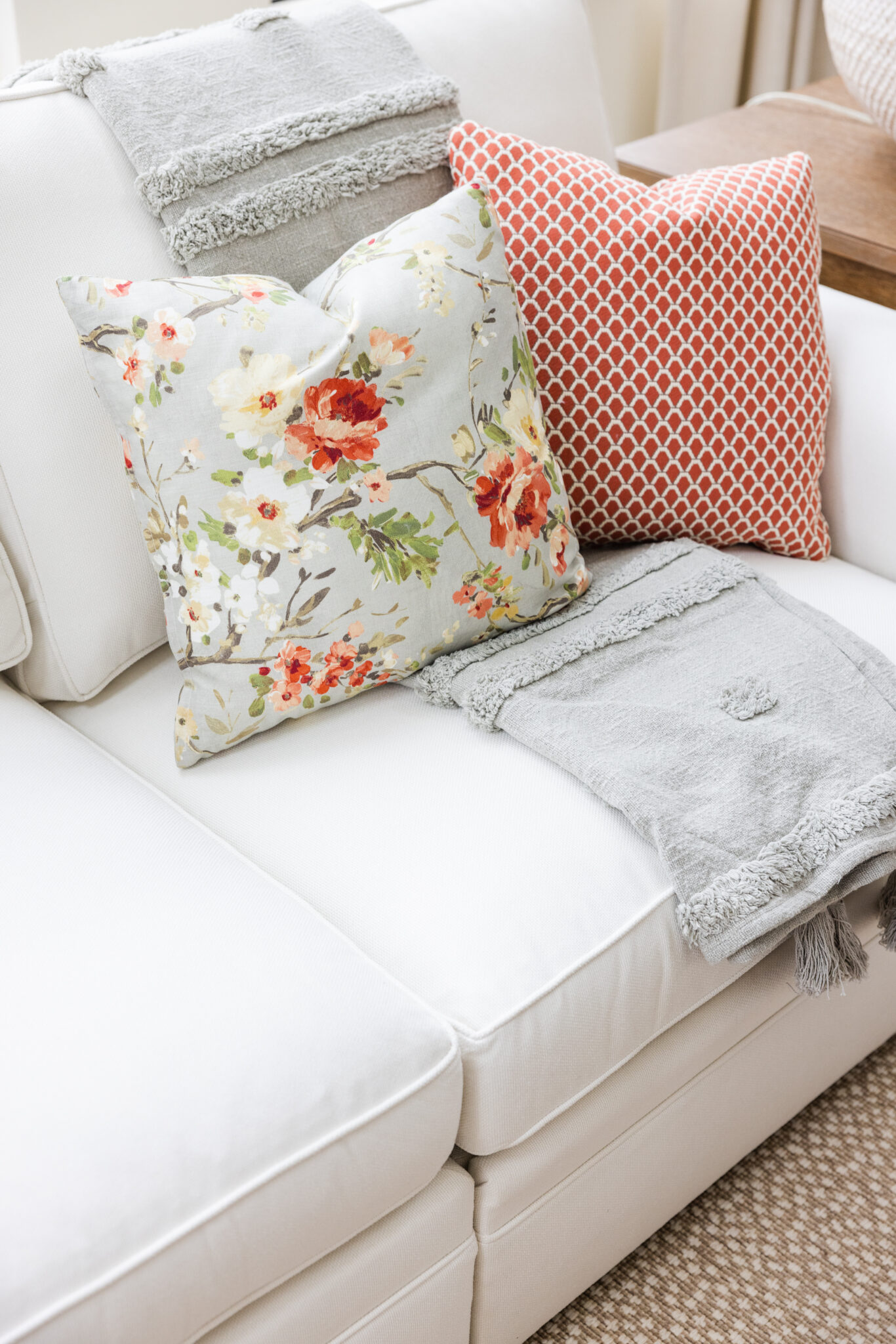
Interior Design by KRISTA + HOME, Photo by Eve Greendale
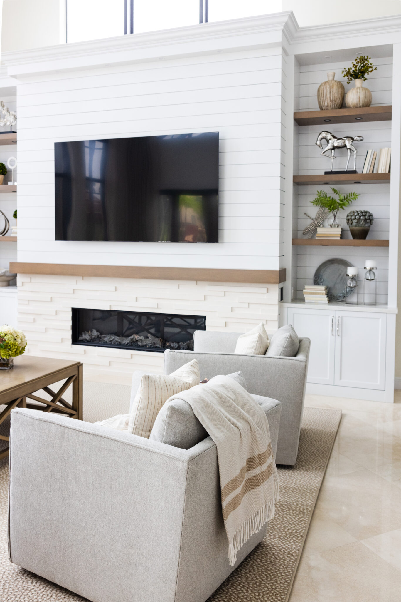
Interior Design by KRISTA + HOME, Photo by Eve Greendale

CHIC FAUX FLORALS FOR YOUR HOME
Adding a touch of nature to your home brings life and freshness to any space. While fresh flowers are beautiful, they have a limited lifespan. That’s where faux florals come in. Not only can they be enjoyed for much longer than fresh flowers, but they also provide a low-maintenance solution for adding a pop of color and elegance to your home decor. Here are some tips and ideas for incorporating chic faux florals into your living space.
Fauxs for Longevity: One of the main advantages of faux florals is their longevity. Unlike fresh flowers that require constant care and eventually wither away, faux florals can maintain their beauty for an extended period of time. This makes them ideal for areas where fresh flowers may not thrive, such as shelves or other places with limited natural light.
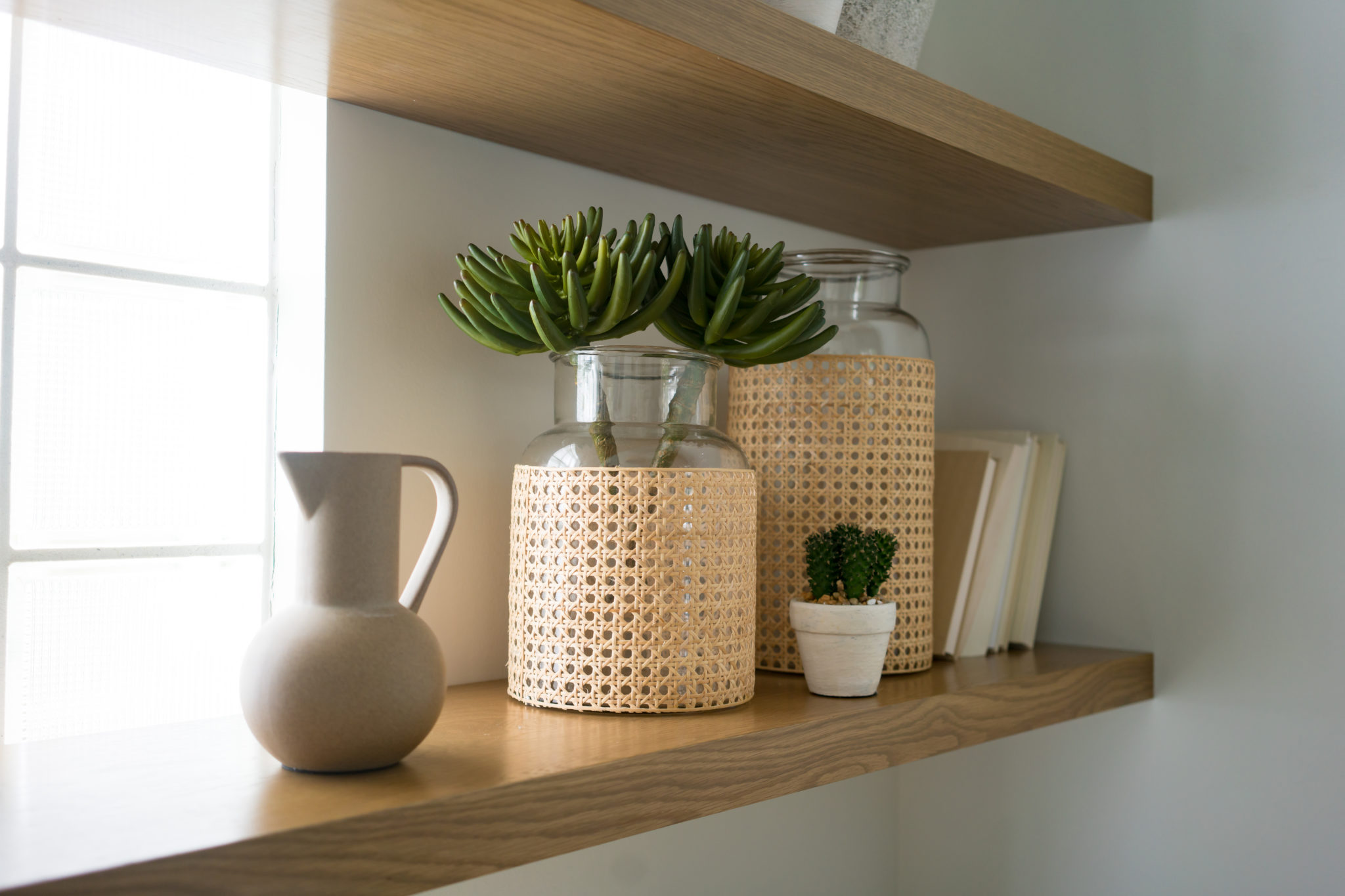
All-in-One Bloom with Greens: To achieve a cohesive and realistic look, opt for faux floral arrangements that feature all one type of bloom with accompanying greenery. This creates a clean and elegant aesthetic that mimics the simplicity of real flower arrangements. By focusing on a single type of flower, you can create a visually pleasing focal point without overwhelming the space.
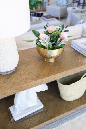
Embrace Neutrals and Color Coordination: When selecting faux flowers, it’s best to lean towards neutral tones. Neutrals blend seamlessly into any home decor style and provide a timeless appeal. However, if you do choose flowers with pops of color, be sure to repeat that color somewhere else in the room. For example, if you opt for bright pink flowers, incorporate a pink throw or cushions to tie the room together.
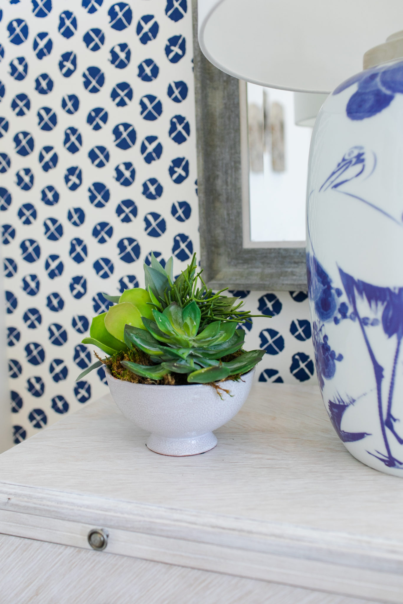
Use Ceramic Vases: One of the challenges with faux florals is disguising the stems, which can sometimes give away their artificial nature. Utilize ceramic vases to hide the stems effectively. The solid base of a ceramic vase not only adds a touch of elegance but also conceals the less realistic aspect of the arrangement, making it look more authentic.
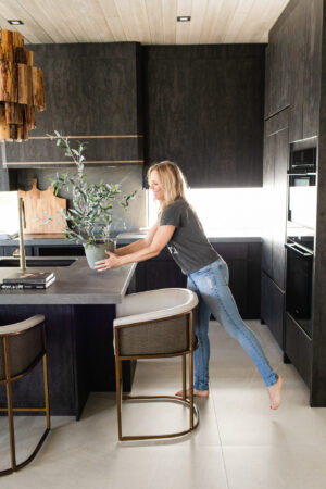
Conceal with Preserved Moss and Rocks Another way to mask the stems of faux florals is by utilizing preserved moss and rocks. These natural elements can be strategically placed around the base of the arrangement to create a more organic and lifelike appearance. Not only do they provide additional texture and visual interest, but they also add an earthy touch to your decor.
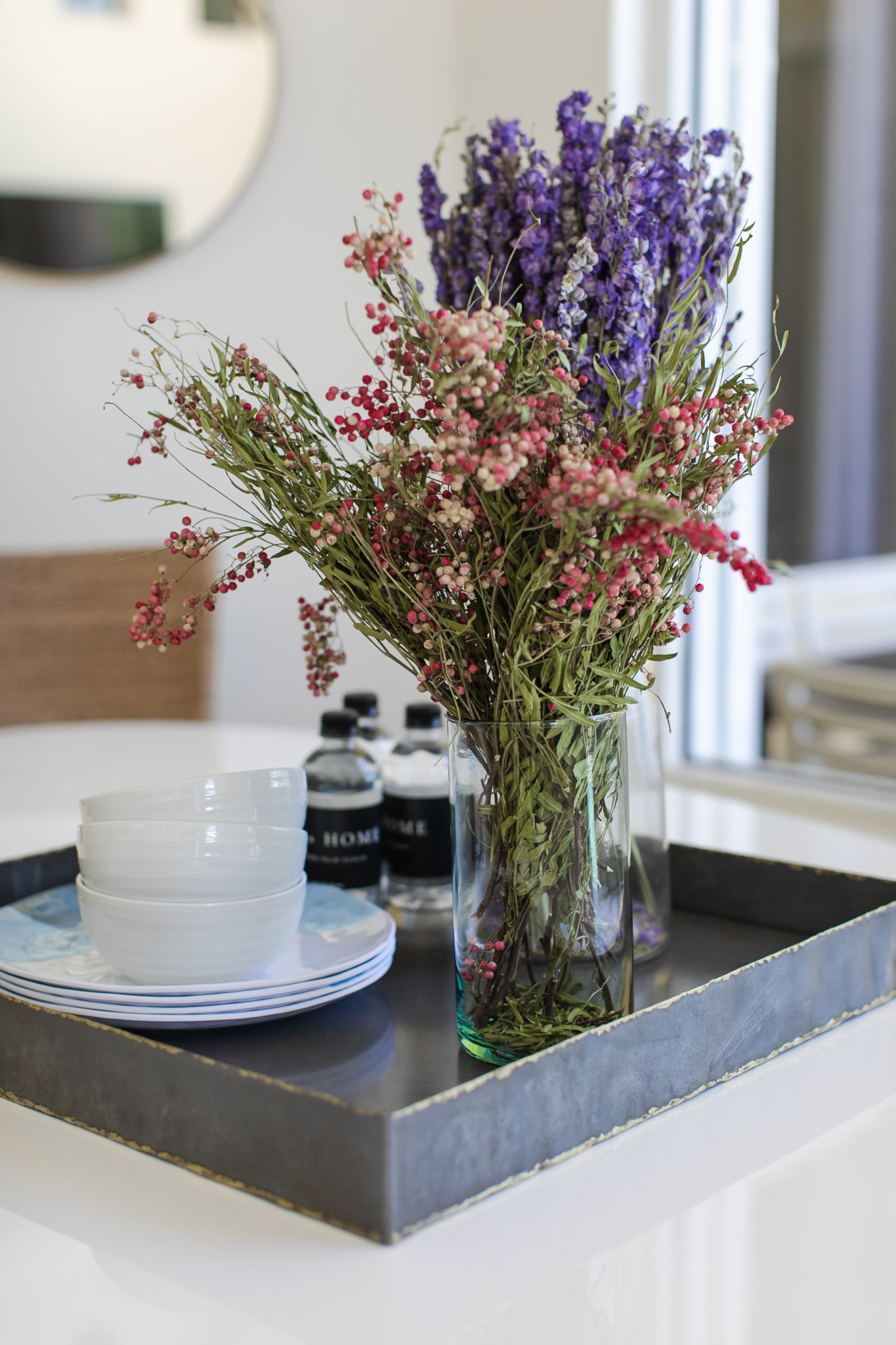
Match Florals to Home Style: Consider the overall style of your home when creating faux floral arrangements. If you have a farmhouse-style interior, opt for rustic flowers like sunflowers or daisies. For a tropical-themed home, incorporate vibrant blooms such as orchids or hibiscus. And for a modern aesthetic, go for minimalist arrangements with sleek and structured flowers like calla lilies or succulents. Adapting the florals to your home’s style ensures a cohesive and harmonious look.
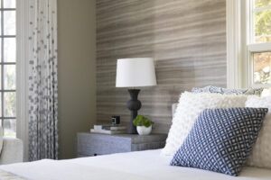
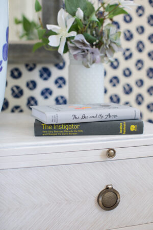
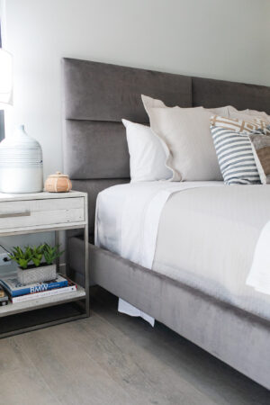
Small Florals for Nightstands: When creating floral arrangements for nightstands or bedside tables, it’s essential to consider both feminine and masculine aesthetics. Whether it’s a color wave that appeals to both genders or a combination of flowers with varying shapes and textures, strive for balance and versatility. This approach ensures that the floral arrangements complement the overall decor of the bedroom while appealing to everyone’s tastes.
“BEST RENOVATION” – WINNER OF FLORIDA DESIGN MAGAZINE’S SEAGLASS AWARD
We were so pleased and honored to win a 2023 Florida Design Seaglass Award for “Best Renovation” this year. Our team recently attended the awards ceremony at the Ben Hotel in West Palm Beach for a fun evening celebrating interior design throughout Florida. The awards were sponsored by Florida Design Magazine, and one of my favorite design icons, Tom Filicia, was a judge and the keynote speaker for the event.

The project that we won this award for is one of my favorites. When I met the clients, I realized right away that they had chic sensibilities and great taste. They moved to South Florida from Manhattan, where they had been living in a modern loft in the West Village during the pandemic. They purchased a 5560 sft waterfront home in Florida that they wanted to make their forever home for the family. The waterfront property was truly stunning, and the house reminded me more of a home you would see in Westport, Connecticut than one you would find in South Florida. As I worked with this couple to create their home, I began to refer to them as “The New Traditionalists”.

This home needed a complete refresh. Here are some “Before” photos to give you an idea of what it looked like when we first toured the space.
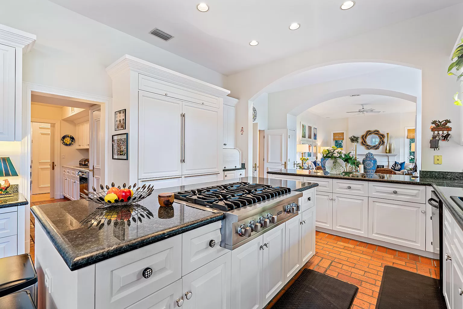
BEFORE
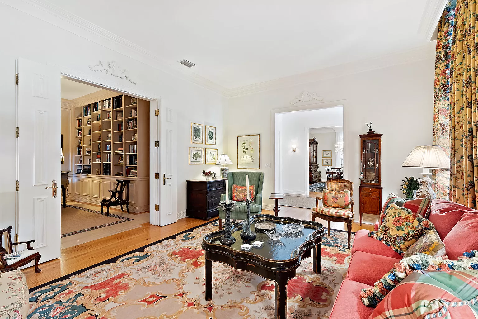
BEFORE
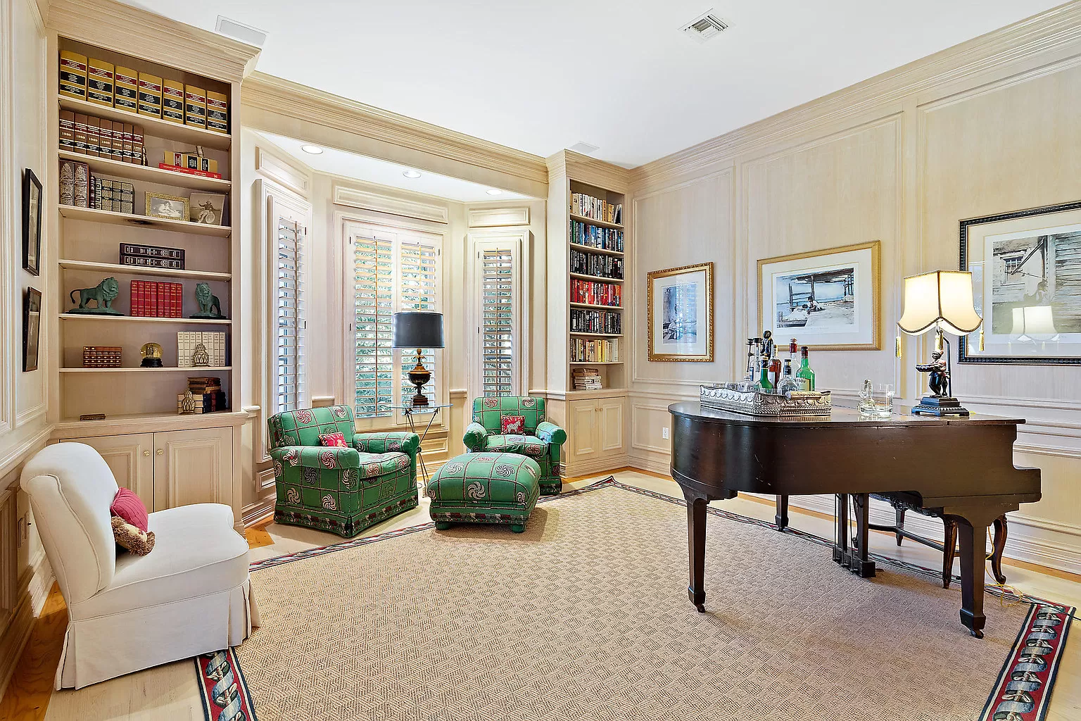
BEFORE
A design challenge was that they wanted to hang onto the traditional elements of the home but infuse it with modern touches, since their taste was more mid-century modern. They also wanted me to build the design around their interesting and eclectic art collection. I used the art as inspiration when choosing color, and settled on a rich palette of mustards, charcoal grays and lavenders and pinks. We even painted the walls of the library/music study lavender, which really adds character and charm to the room. The library/music study is anchored by an antique piano that is very special to the homeowner and she said lavender was her favorite color. The homeowners wanted a home that was open, inviting and relaxing.
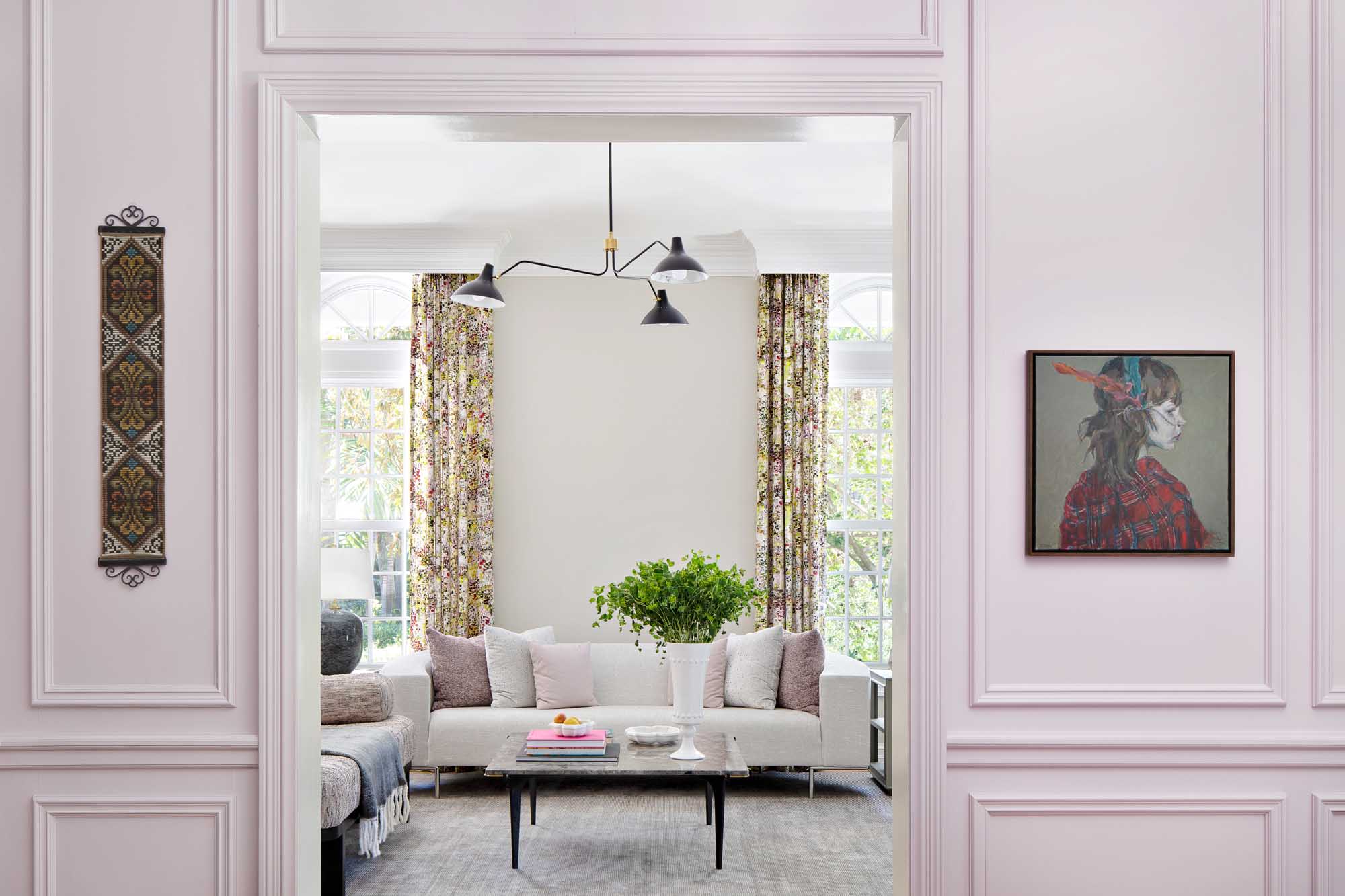
Interior Design by KRISTA + HOME, Photography by Jessica Glynn
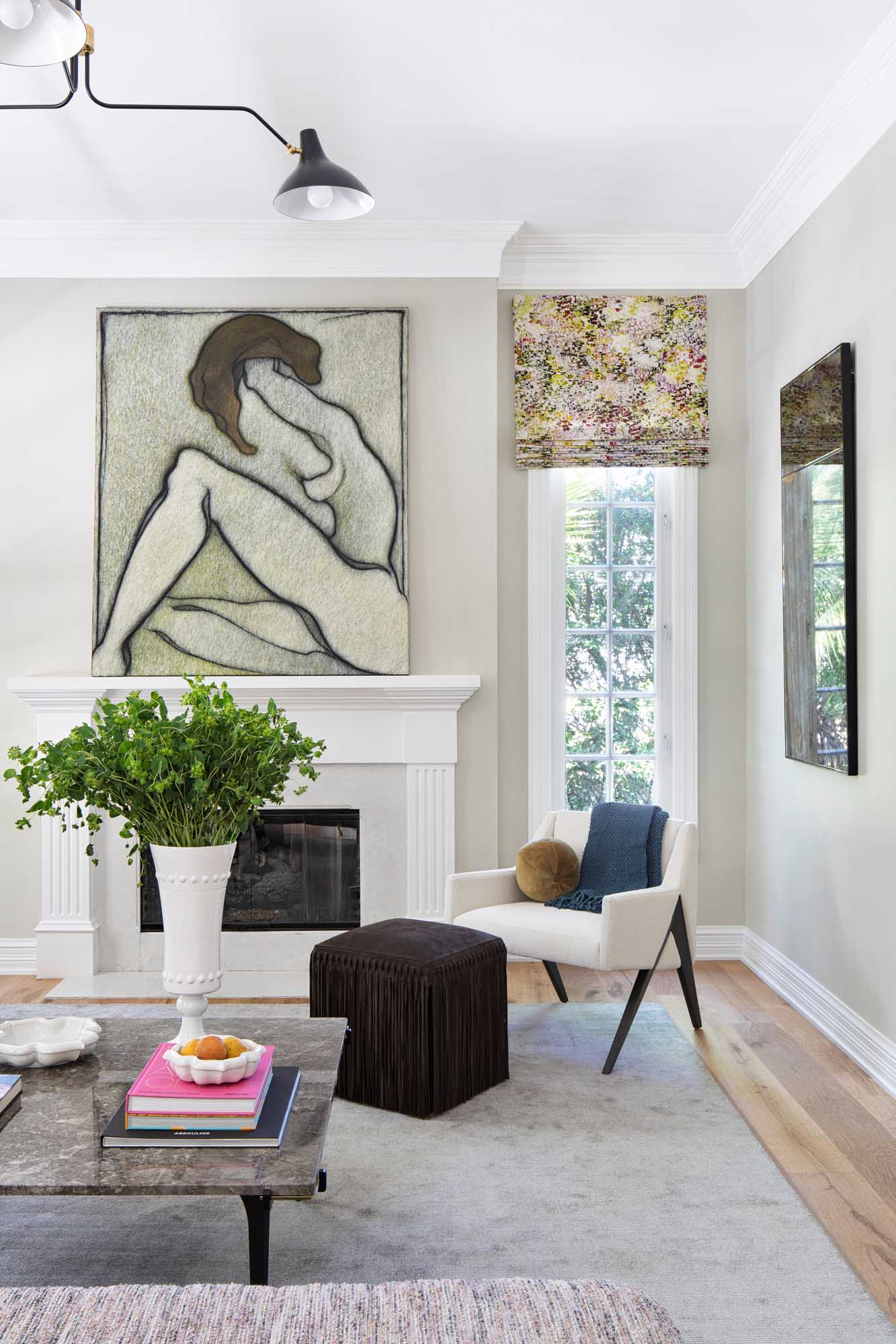
Interior Design by KRISTA + HOME, Photography by Jessica Glynn
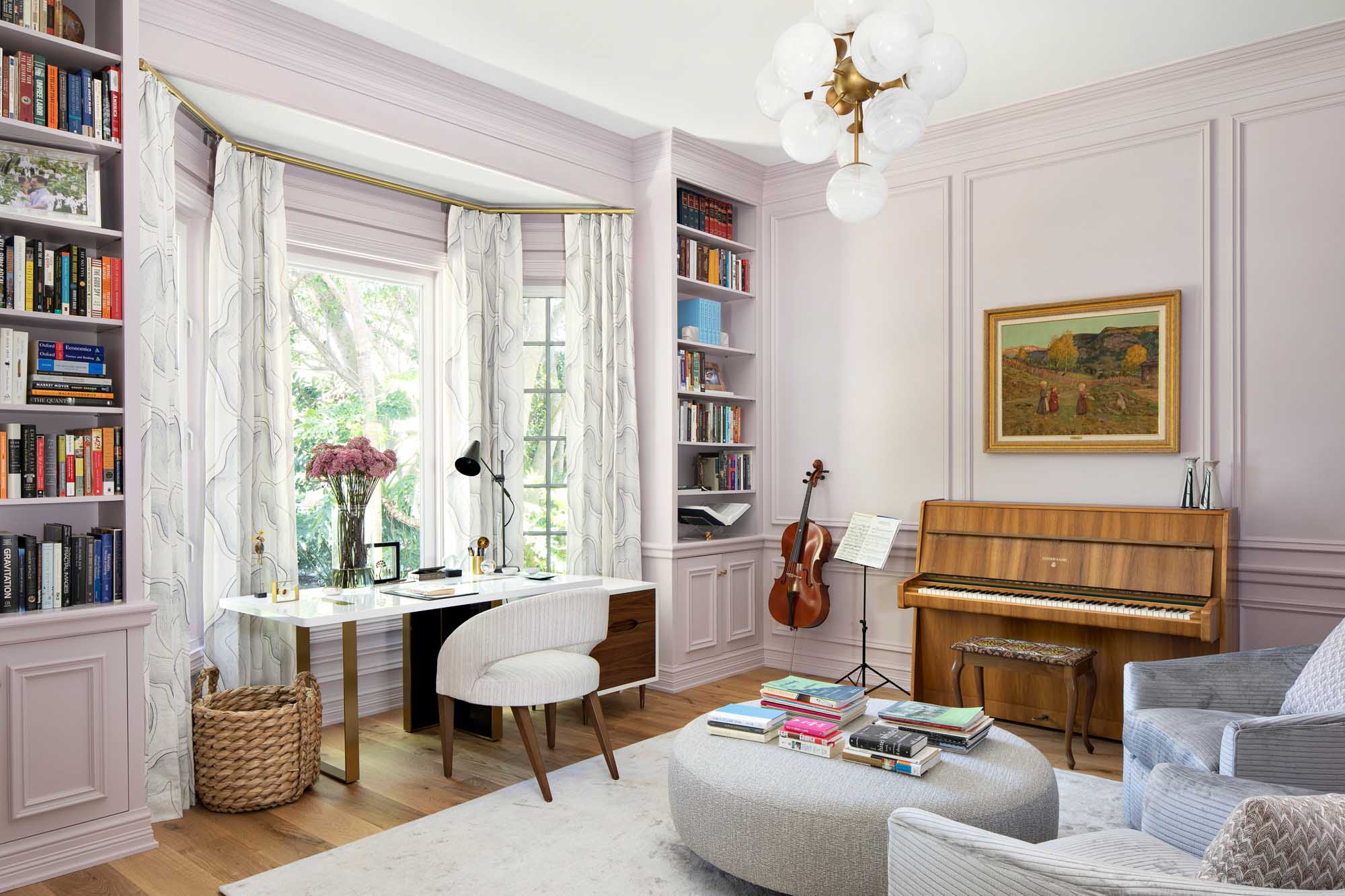
Interior Design by KRISTA + HOME, Photography by Jessica Glynn
We replaced the flooring throughout, and took down several walls to open up the main living areas. We kept and restored some of the traditional elements of the home, while infusing the design with modern touches. We did a complete renovation of the kitchen and added a butler’s pantry and wet bar.
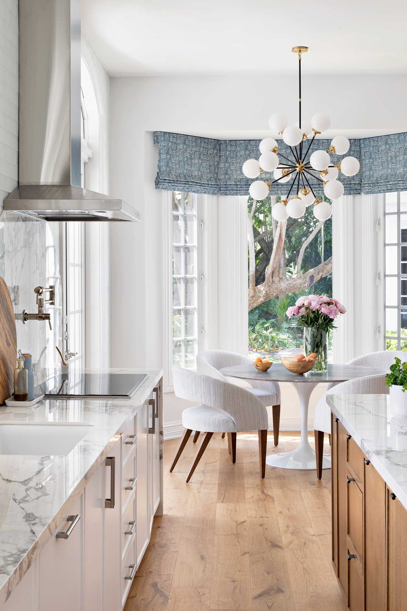
Interior Design by KRISTA + HOME, Photography by Jessica Glynn
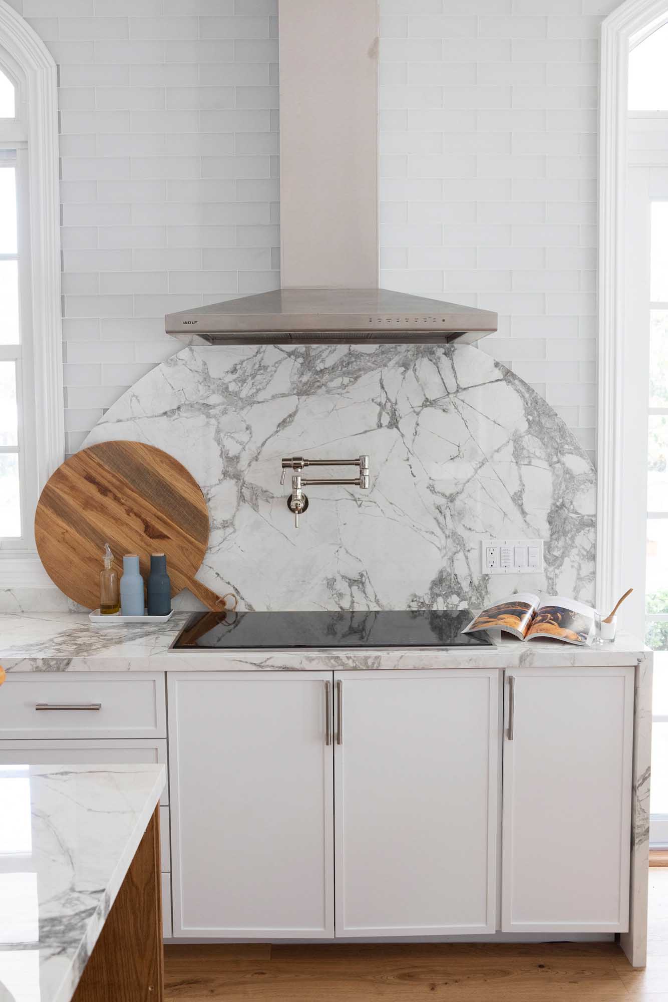
Interior Design by KRISTA + HOME, Photography by Jessica Glynn
I created a wow moment with dramatic lighting on the winding staircase in the entry and utilized wallpaper throughout, on accent walls and ceilings to add visual interest. There is an abundance of detailed millwork throughout. I chose rich wood finishes with pops of color throughout.
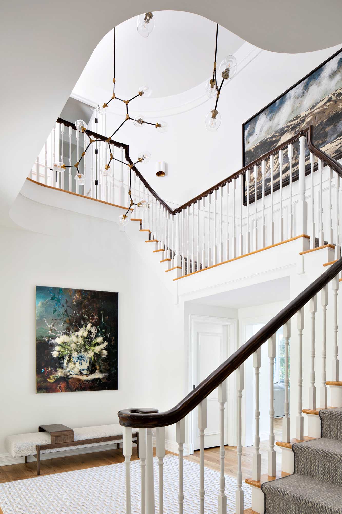
Interior Design by KRISTA + HOME, Photography by Jessica Glynn
Our design included furnishings, window treatments, lighting, rugs and accessories for the entire home. The family loves to entertain, so we designed a custom extra-long dining table with seating for ten.

Interior Design by KRISTA + HOME, Photography by Jessica Glynn
I designed a truly magical outdoor space for them. We used Janus et Cie furnishings throughout the outdoor space for the lounge, outdoor dining area and pool seating. We designed a large gazebo with a working fireplace and state of the art summer kitchen. I think I created a truly special home for the family, where they can gather and connect with the ones they love and enjoy the space for years to come.
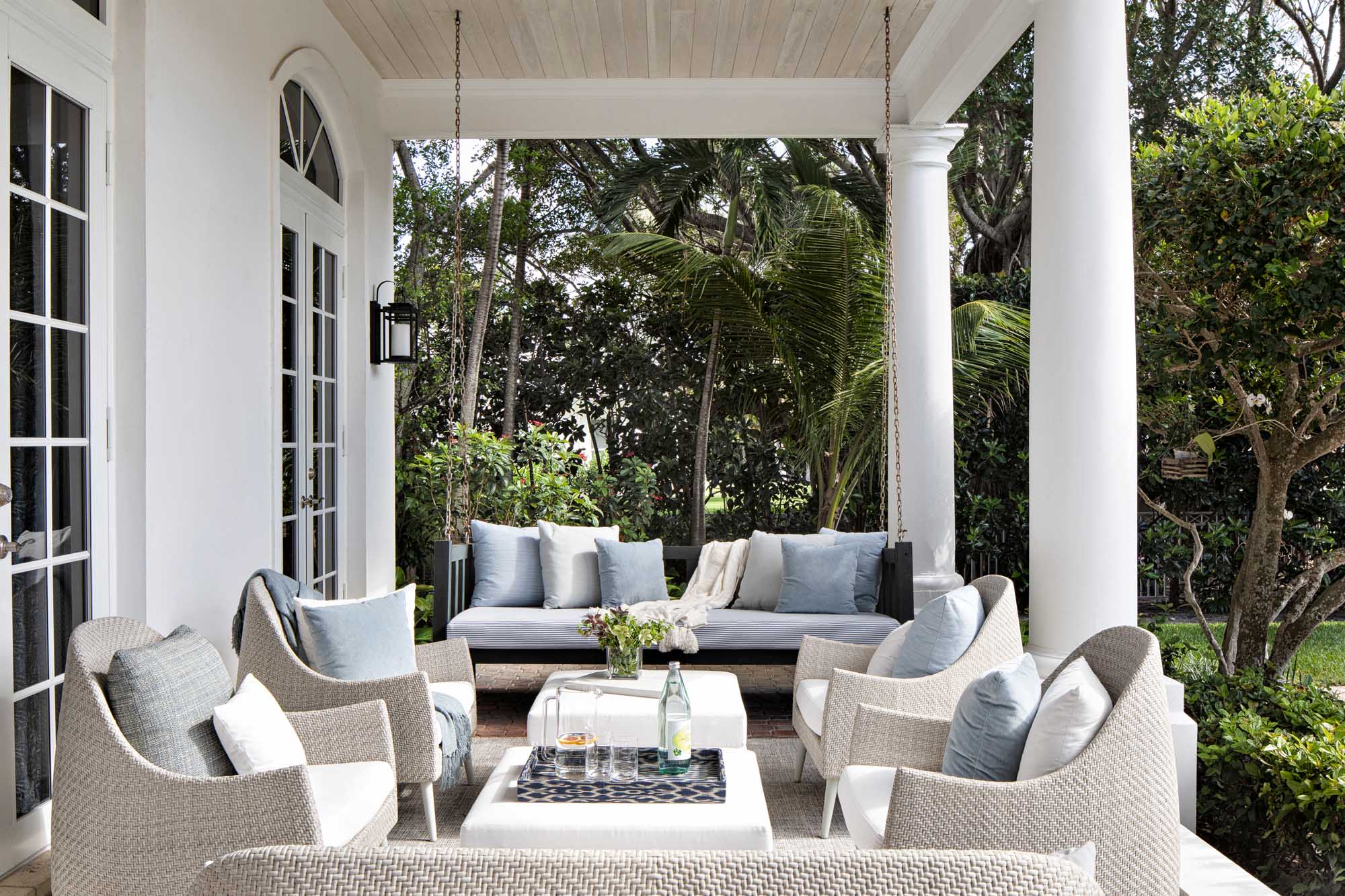
Interior Design by KRISTA + HOME, Photography by Jessica Glynn
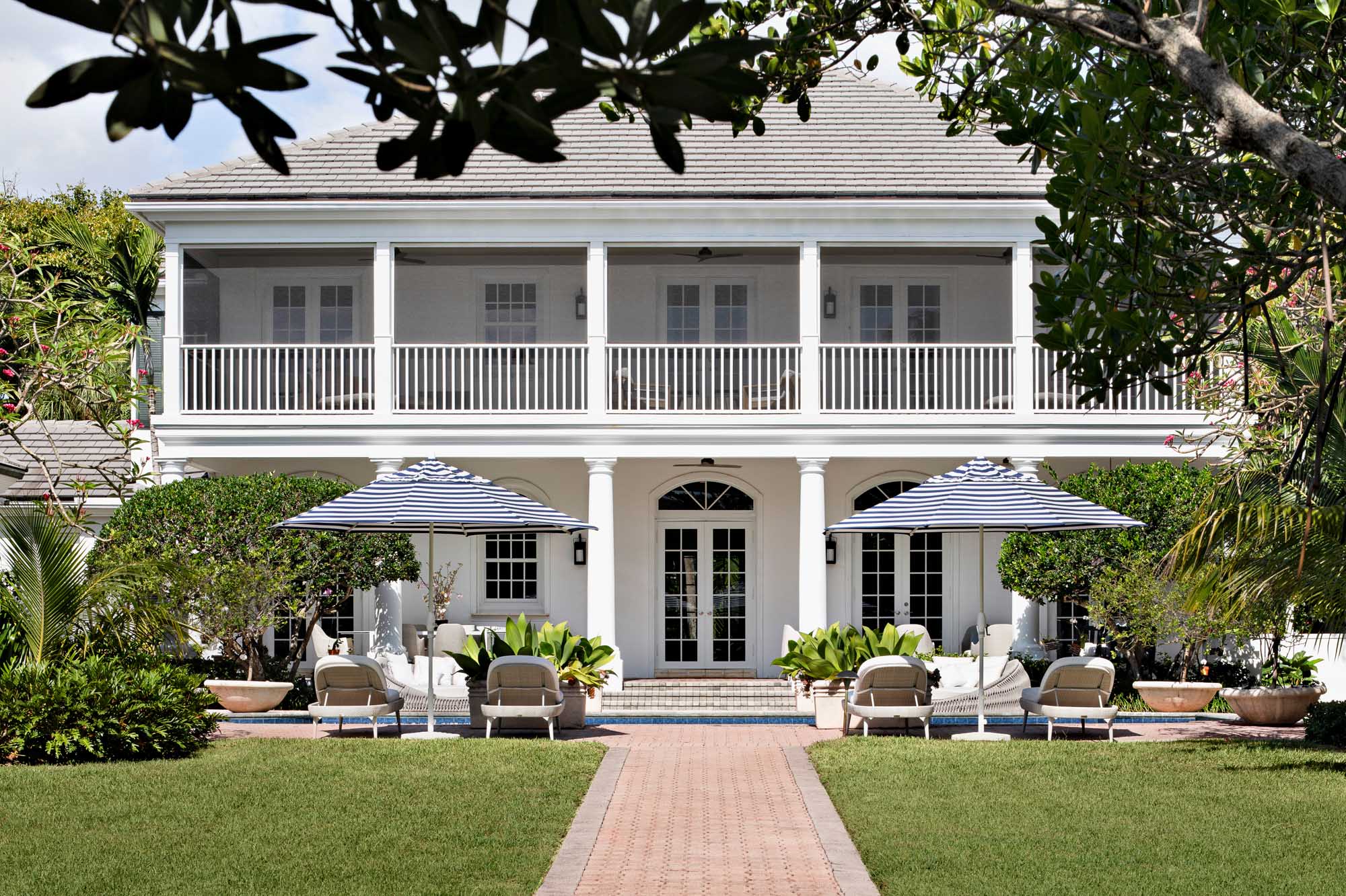
Interior Design by KRISTA + HOME, Photography by Jessica Glynn
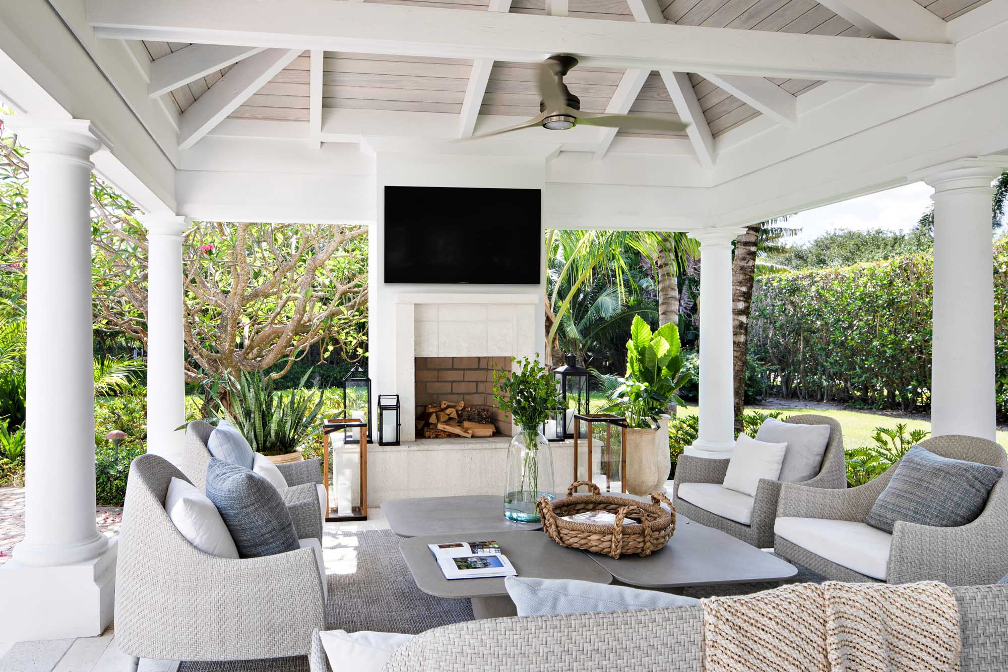
Interior Design by KRISTA + HOME, Photography by Jessica Glynn
Conceal with Style: Tips for Hiding Electrical Cords in Your Home Decor
When it comes to decorating your home, attention to detail is key. From choosing the right color palette to selecting the perfect furniture, every element contributes to creating a cohesive and inviting space. However, one often overlooked aspect of home decor is electrical cords. Unsightly cords can quickly disrupt the aesthetic of a well-designed room. But fear not! With a little creativity and planning, you can easily hide those pesky cords and maintain a clean and clutter-free look. Here are some tips for concealing electrical cords in your home decor.
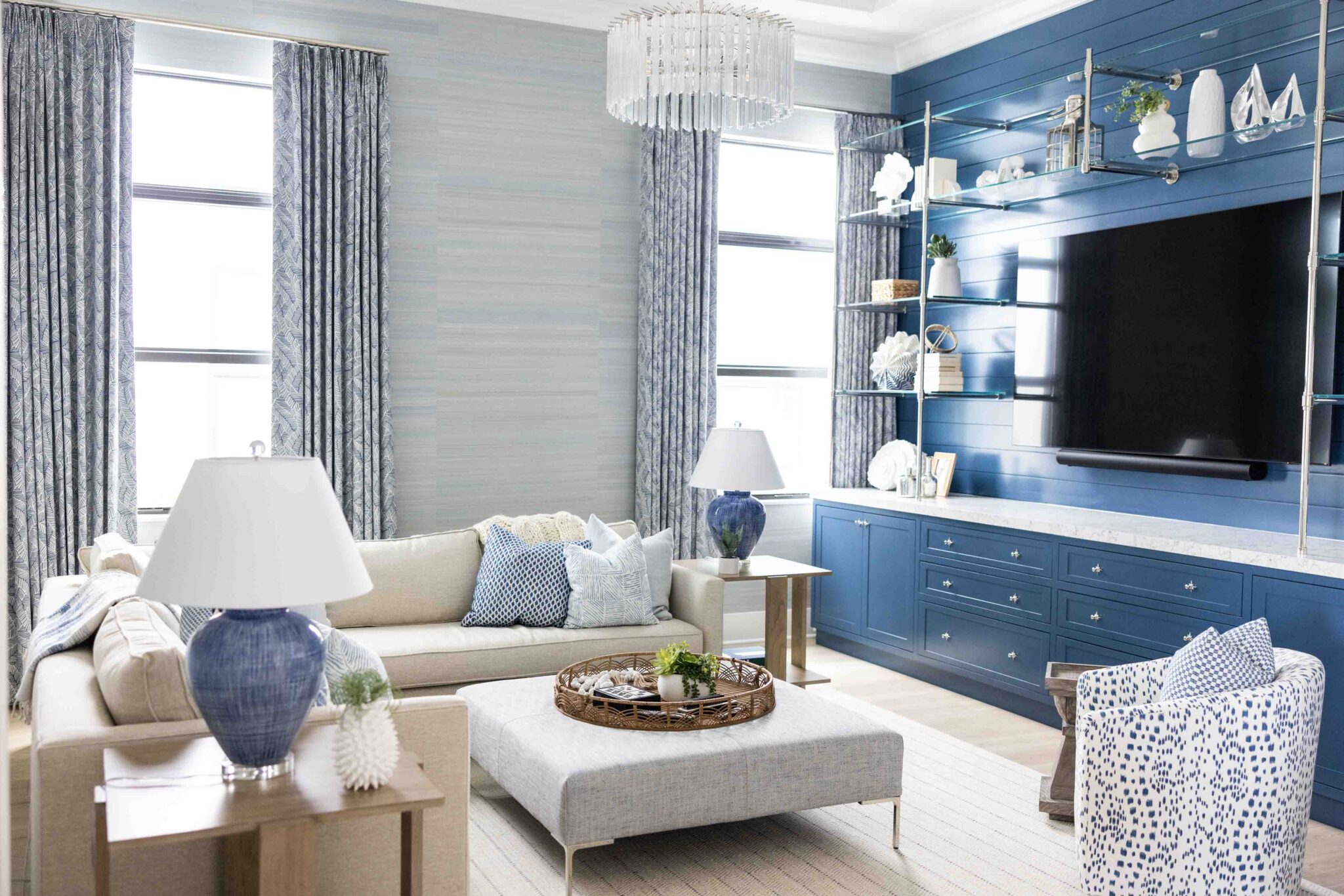
Use Cord Covers or Raceways Cord covers or raceways are a great solution for hiding cords along walls or baseboards. These sleek and low-profile covers come in various colors and materials, such as plastic or paintable options, allowing you to match them to your wall color or blend them seamlessly with your decor. Cord covers or raceways can be easily installed with adhesive backing, and you can run multiple cords through them to keep them neatly organized and hidden from view.
Utilize Furniture and Decor Items Another clever way to hide cords is to use your furniture and decor items strategically. For instance, you can place a bookshelf, a console table, or a large potted plant in front of an outlet to conceal the cords behind them. You can also use decorative items, such as baskets, boxes, or decorative trays, to corral and hide cords on a coffee table or a media console. Just make sure to choose items that complement your decor style and blend seamlessly with the overall aesthetic of the room.
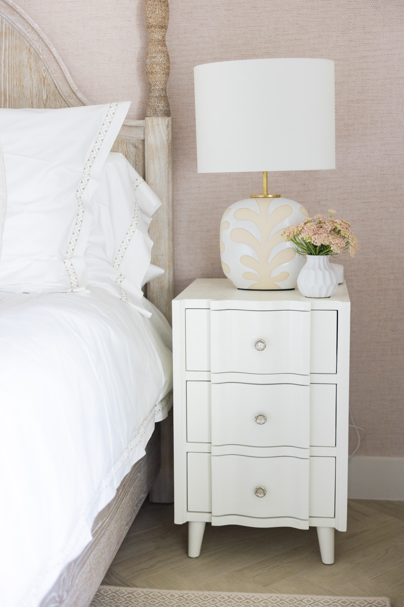 Incorporate Cordless Lighting With advancements in technology, cordless lighting options have become more readily available and affordable. Consider opting for cordless lamps or wall sconces that are powered by batteries or rechargeable bulbs. These wireless lighting options can provide the same amount of illumination as traditional lamps or fixtures, without the need for cords. They can be easily moved around and positioned wherever needed, giving you more flexibility in your decor arrangement while keeping cords out of sight.
Use Cord Clips or Hooks Cord clips or hooks are a simple and affordable solution for keeping cords organized and hidden. These small devices can be attached to the back of furniture or along baseboards, and they provide a discreet way to route cords and keep them neatly in place. You can also find cord clips or hooks that are paintable, allowing you to match them to your wall color for a seamless look.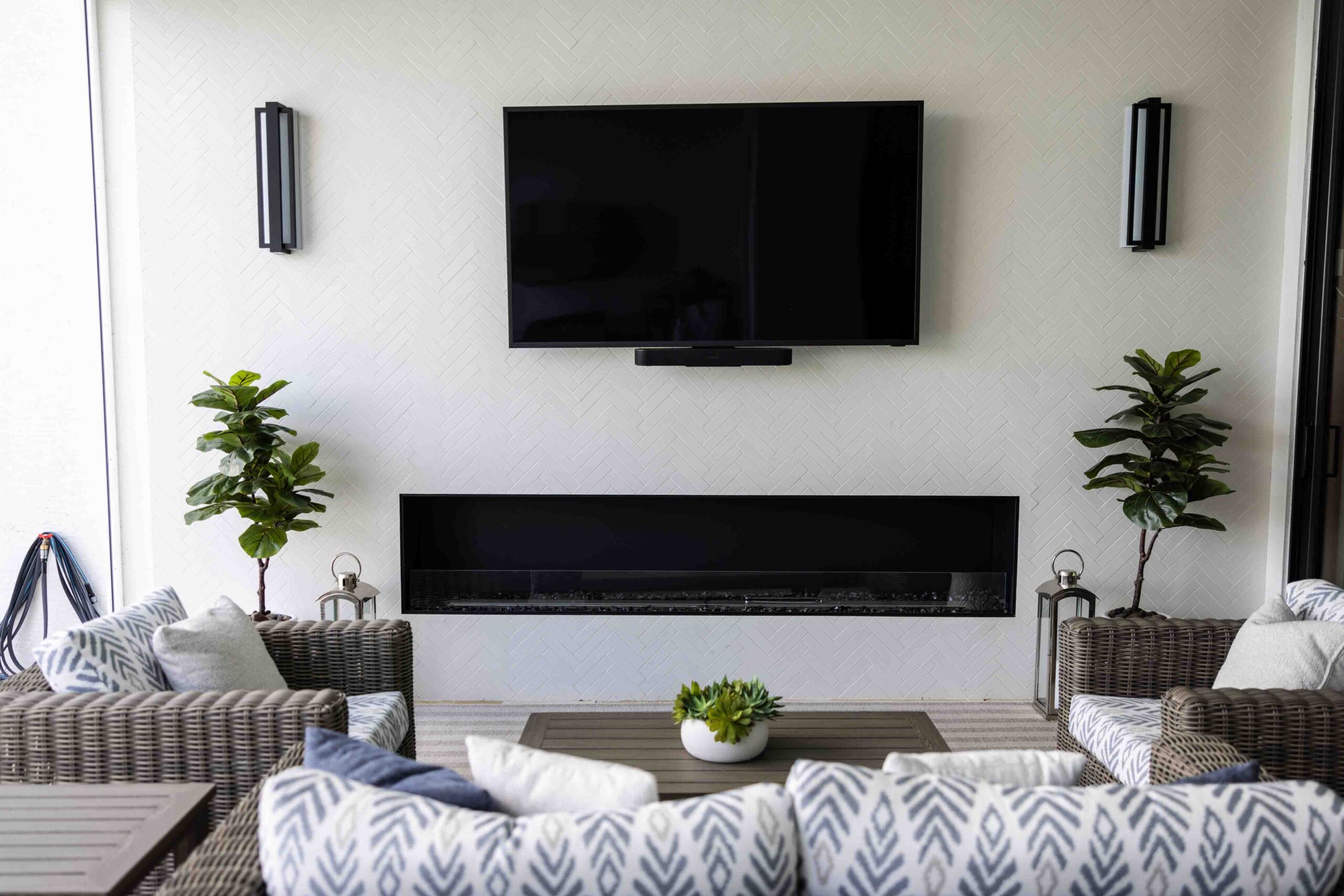
Consider In-Wall Cord Concealment For a more permanent and seamless solution, you can consider in-wall cord concealment. This option may require some DIY skills and knowledge of electrical work, so it’s important to consult a professional if you’re not confident in your abilities. In-wall cord concealment involves running the cords inside the walls by cutting a hole behind the TV or other devices, routing the cords through the wall cavity, and then patching and painting the hole to blend it with the wall. This method provides a clean and minimalist look, eliminating visible cords altogether.
Opt for Cordless Appliances or Devices Another effective way to reduce the number of cords in your home is to opt for cordless appliances or devices whenever possible. For example, you can choose cordless vacuum cleaners, cordless charging pads for your devices, or cordless speakers for your audio system. By eliminating the need for cords altogether, you can significantly reduce the clutter and hassle of dealing with cords in your home decor.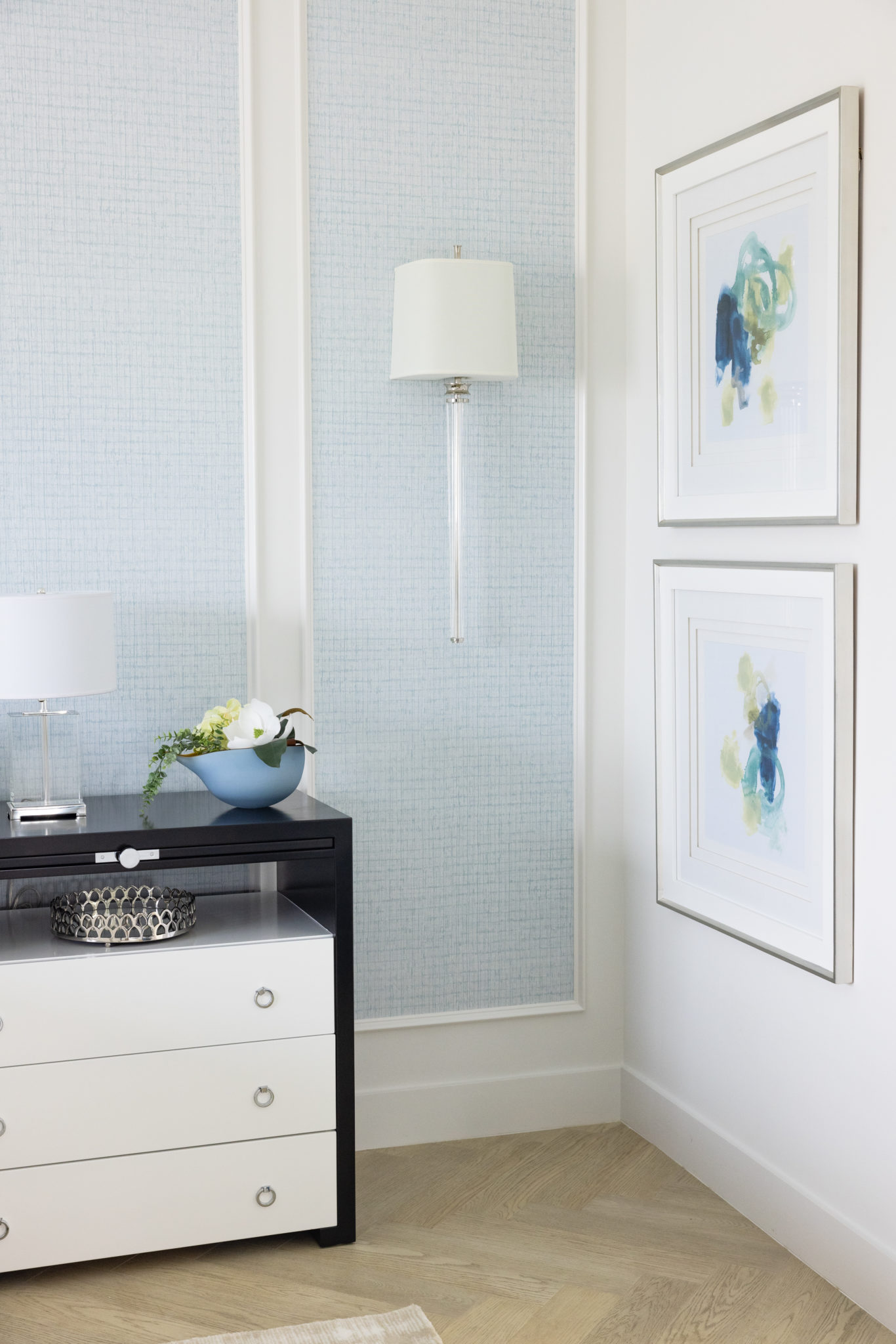
In conclusion, hiding electrical cords in your home decor is not only possible but also easy to achieve with some creativity and planning!
BEACHY BUNK ROOM GLAM
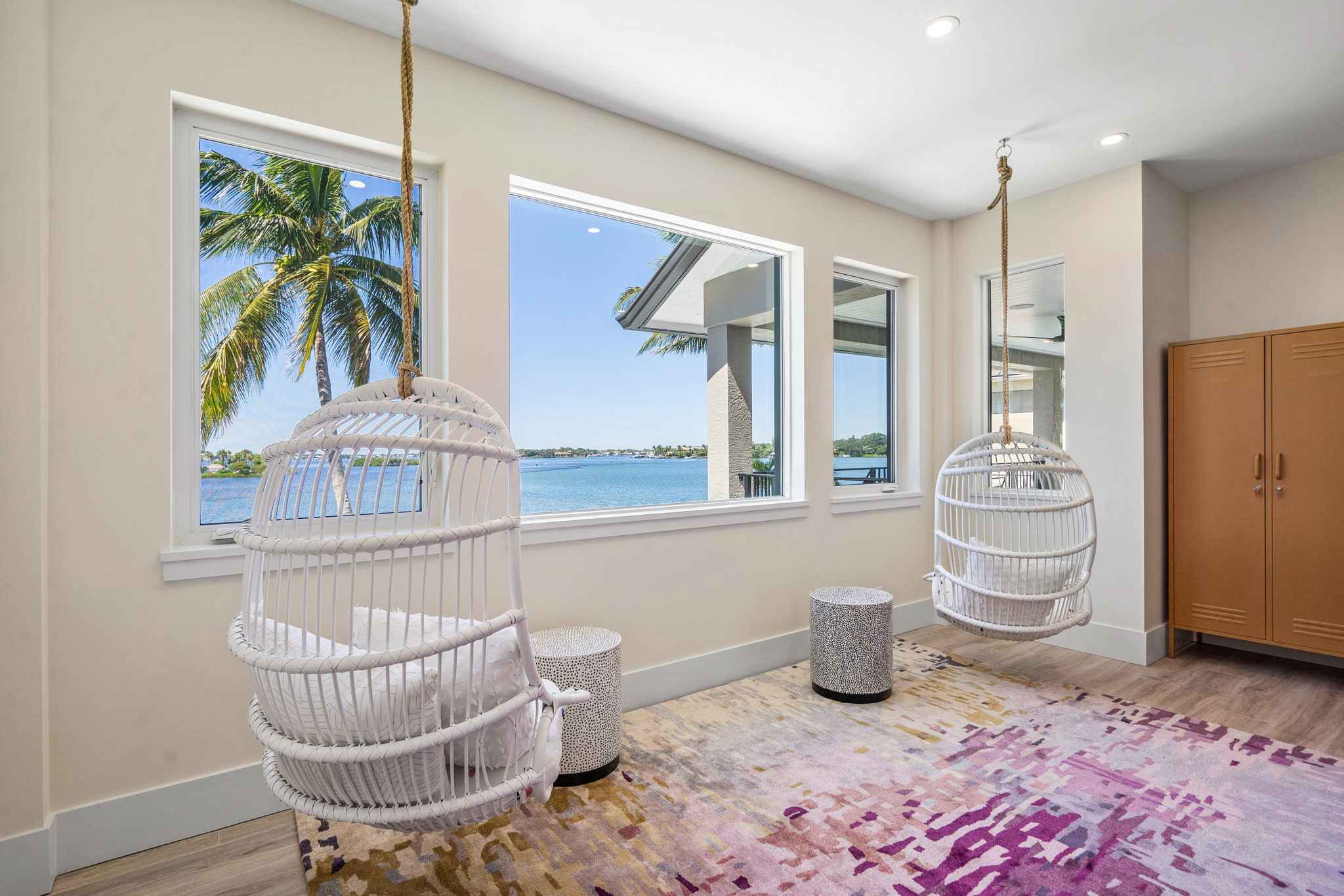
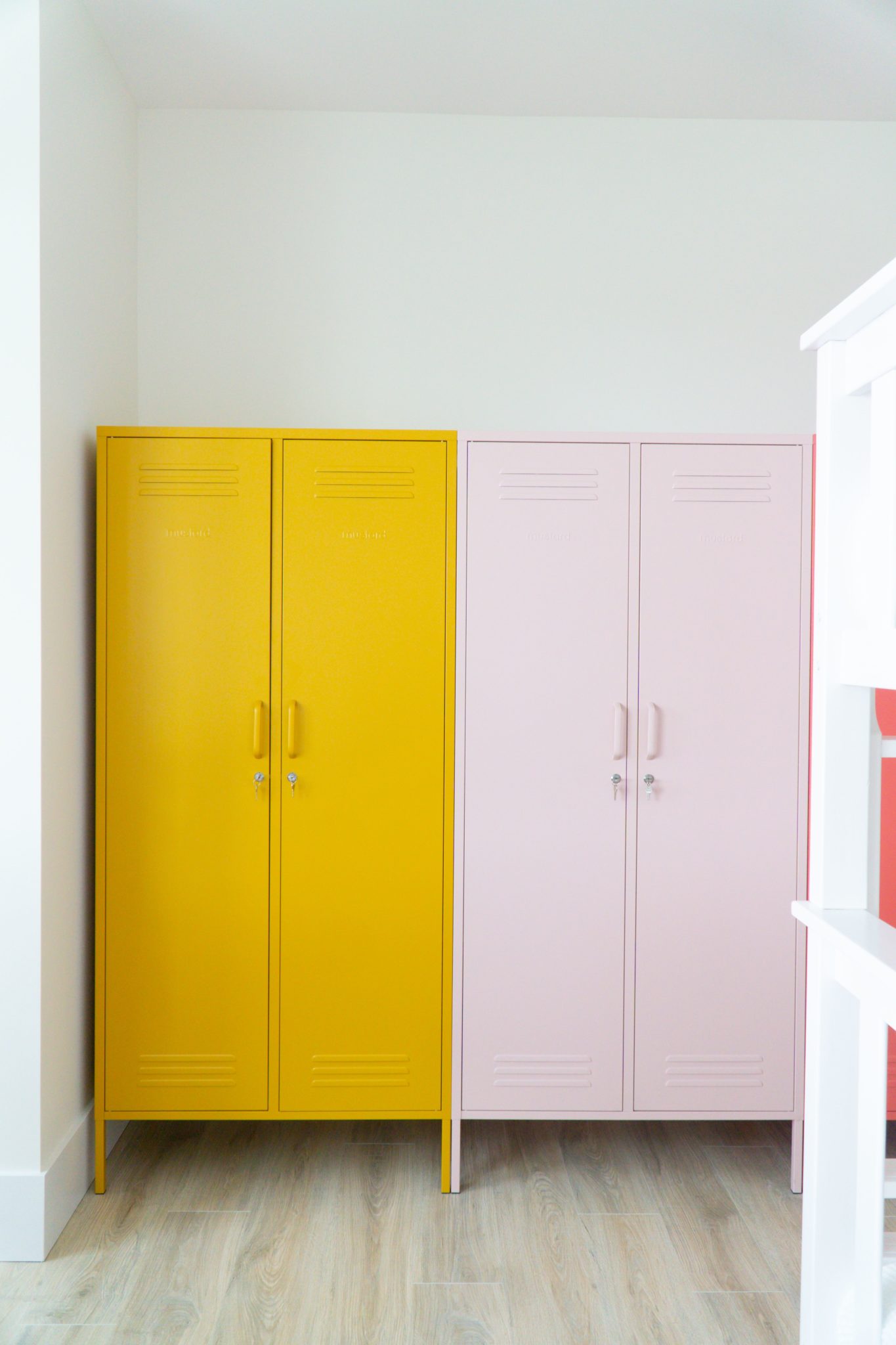
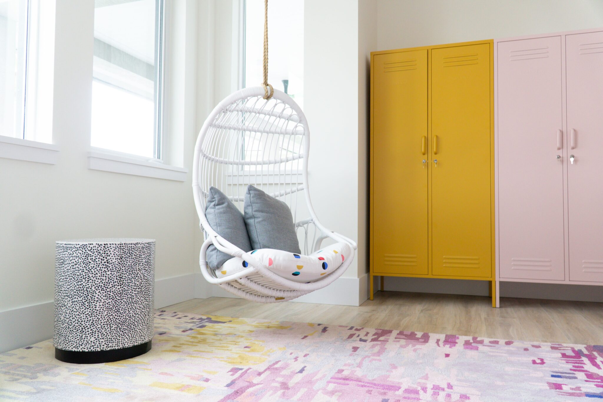
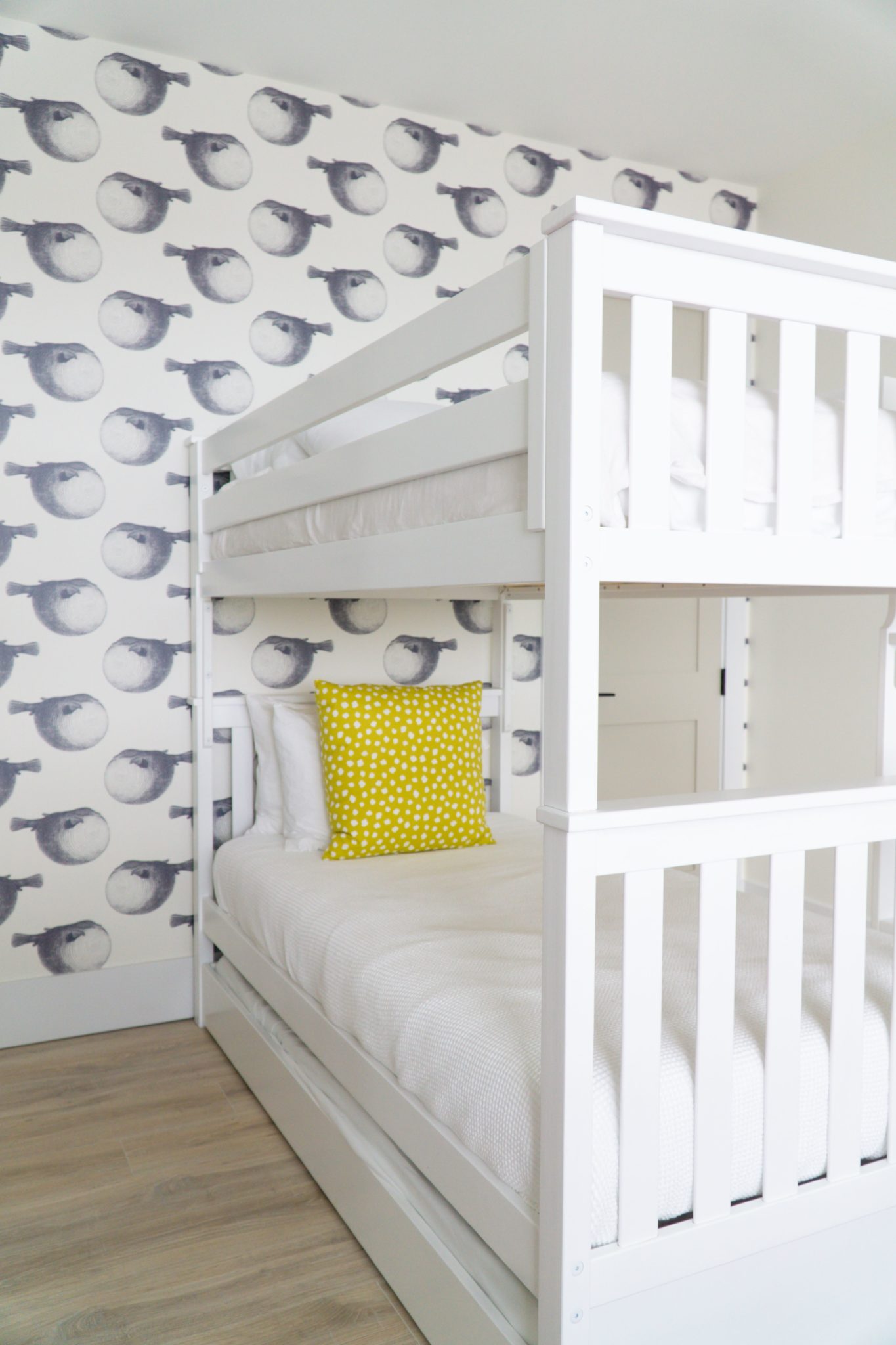
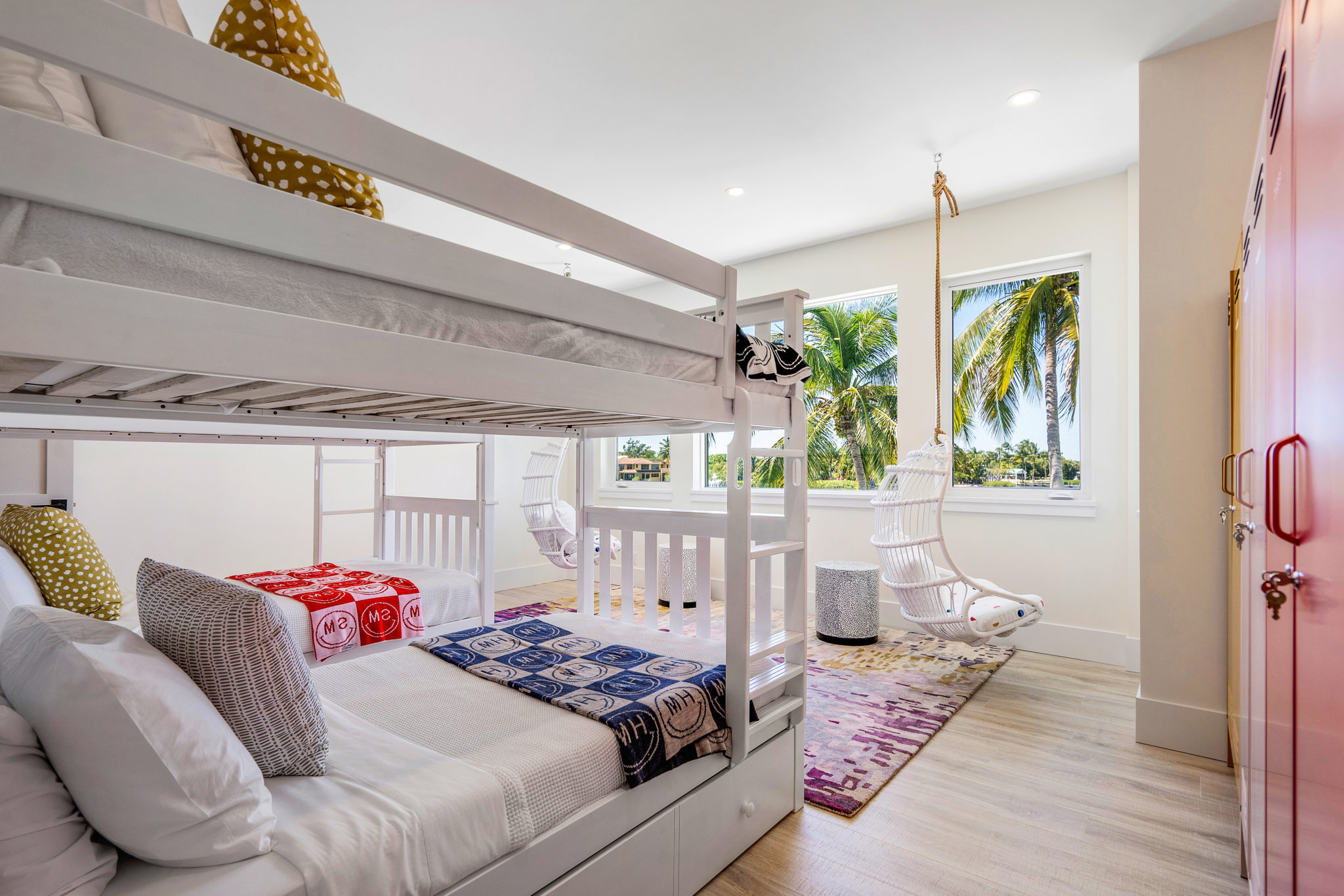
I created this fbunk room for a fun family who spends holidays and vacations in Jupiter, Florida. Since they were going to be using this waterfront space as a beach house, I thought it would be fun to create some cute storage with colorful lockers! I also selected a modern rug and placed two hanging rattan swings directly by the windows. How fun is that? They can sit and read and watch the boats go by. Finally, I chose some coastal fabulous wallpaper by Abnormal Anonymous for an accent wall. The kids (and their parents) really love how the space turned out!
15 Years of Design
Our interior design firm is celebrating 15 years in business this month! It really feels like a great milestone for our company and I am so proud of everything we have accomplished. Looking back, there were highs and lows, but I would not trade a moment. Everything led to this point in time, where we have a thriving and successful design firm in South Florida. It took time and careful care to find the right team and the best practices and procedures for our company, but we did it! I am so proud of what we have created. Here are a few highlights of Krista + Home through the years.
2008 – NYC
I was designing in New York City from 2008-2010. It was fun to try to maximize the space in all of those small condos and a great way to learn after getting my degree from Parsons School of Design. I was also working in television as the host of an HGTV series! I should also mention that I was pregnant with my son and appeared on the cover of Pregnancy magazine.
Interior Design by Krista W. Alterman, Photography by Jessica Glynn
2010 – Ice, Ice Baby!
A move to paradise was in order! I relocated to Palm Beach, Florida with my husband and two babies. We moved into an office and began designing homes throughout Palm Beach county, while continuing my television work. I appeared on several episodes of The Food Network’s “Restaurant Impossible” and landed a local gig on Discovery Channel’s “The Vanilla Ice Project”. It was fun helping Ice flip houses throughout South Florida. I appeared on this show for nine seasons!
Interior Design by Krista W. Alterman, Photography by Jessica Glynn
2012 – Designing in Paradise
In 2012 I started to really hit my stride as a designer in the Palm Beaches. I hired a team and began doing full-scale luxury home projects. One of my favorites was a large home we designed in Wellington, Florida’s Equestrian Club that year. The client LOVED orange, which is not a color I gravitate to. We made it work! My work was featured in many magazines, including Better Homes & Gardens and Redbook .
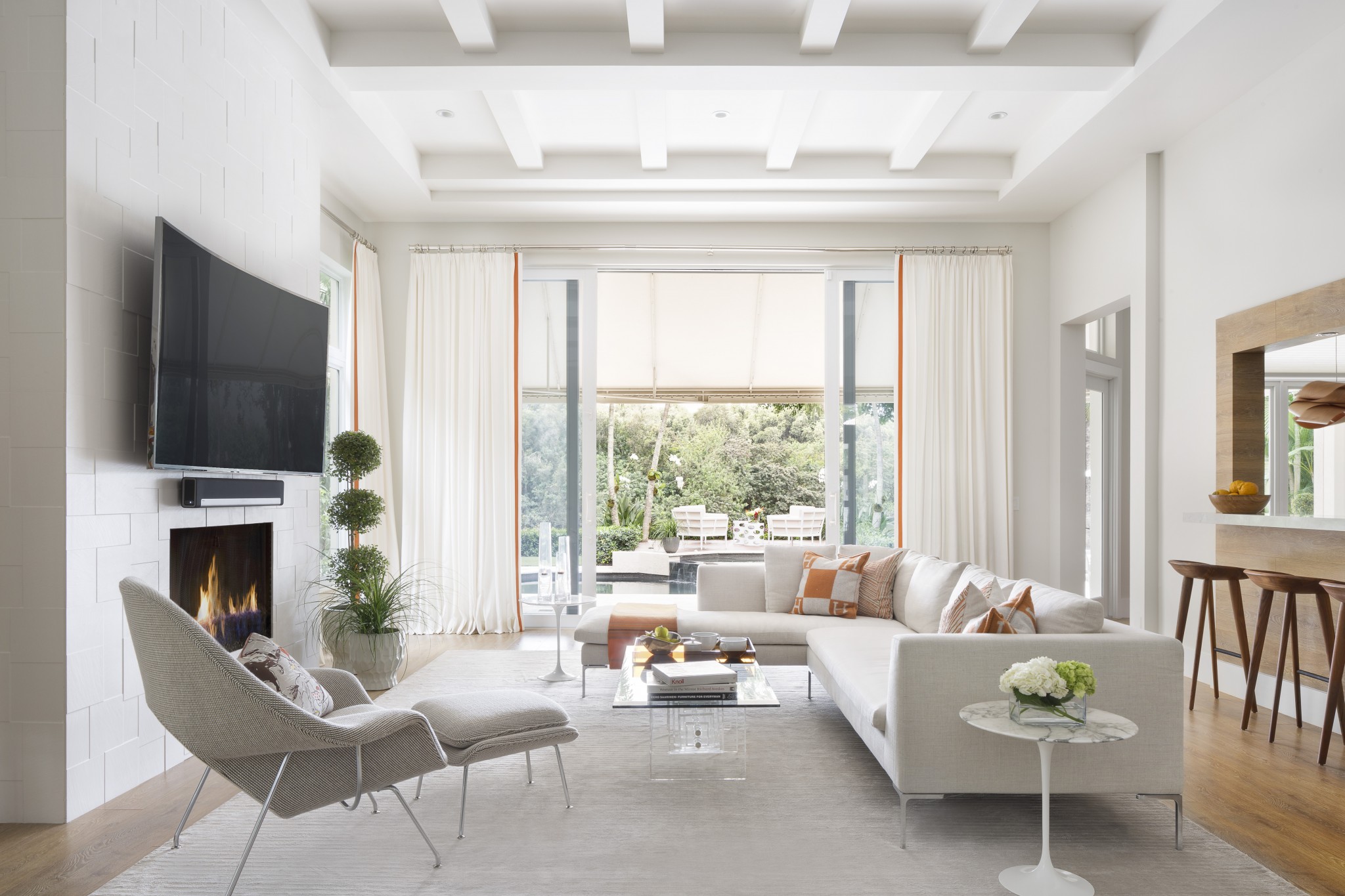
Interior Design by Krista W. Alterman, Photography by Jessica Glynn
2015 – Finding Our Stride
This was a year of steadily building our portfolio. We designed many full-scale large luxury homes throughout the Palm Beaches. I was also chosen to participate in the Red Cross Decorator’s Show House in Palm Beach, Florida. We added a couple of members to our team and started to strengthen partnerships with our favorite vendors and local contractors.

Interior Design by Krista W. Alterman, Photography by Jessica Glynn
2017 – Award-Winning Design
In 2017 we won our first big design awards! The American Association of Interior Designers (ASID) honored us with three Residential Excellence Awards in the Modern/Contemporary Design, Traditional Design and Kitchen Design categories. We were so excited and traveled to Miami to accept the awards in a fun ceremony complete with Red Carpet!
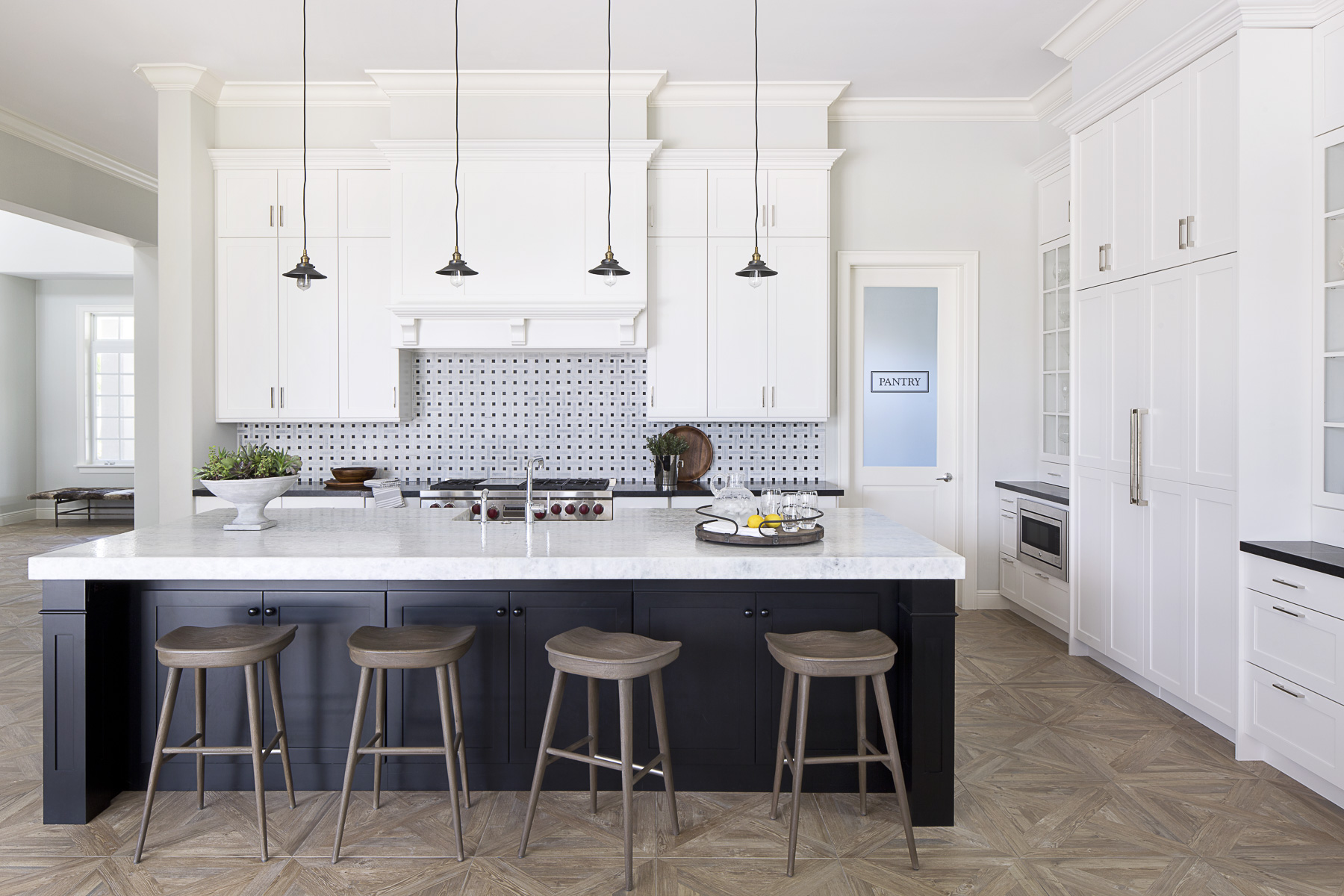
Interior Design by Krista W. Alterman, Photography by Jessica Glynn
2018 – Growing Our Team
In 2018 we were in hiring mode and our focus was on tightening up our processes and systems. I hired a chief operating officer, which was one of the best moves I have made for KRISTA + HOME. Hiring Fran Sachs allowed me to focus on the creative elements of the company, while she focused on the business and financials. Having Fran onboard made a huge difference for the company and she became my trusted partner. We won several more awards this year, including a Luxe RED (Residential Excellence in Design) Award.
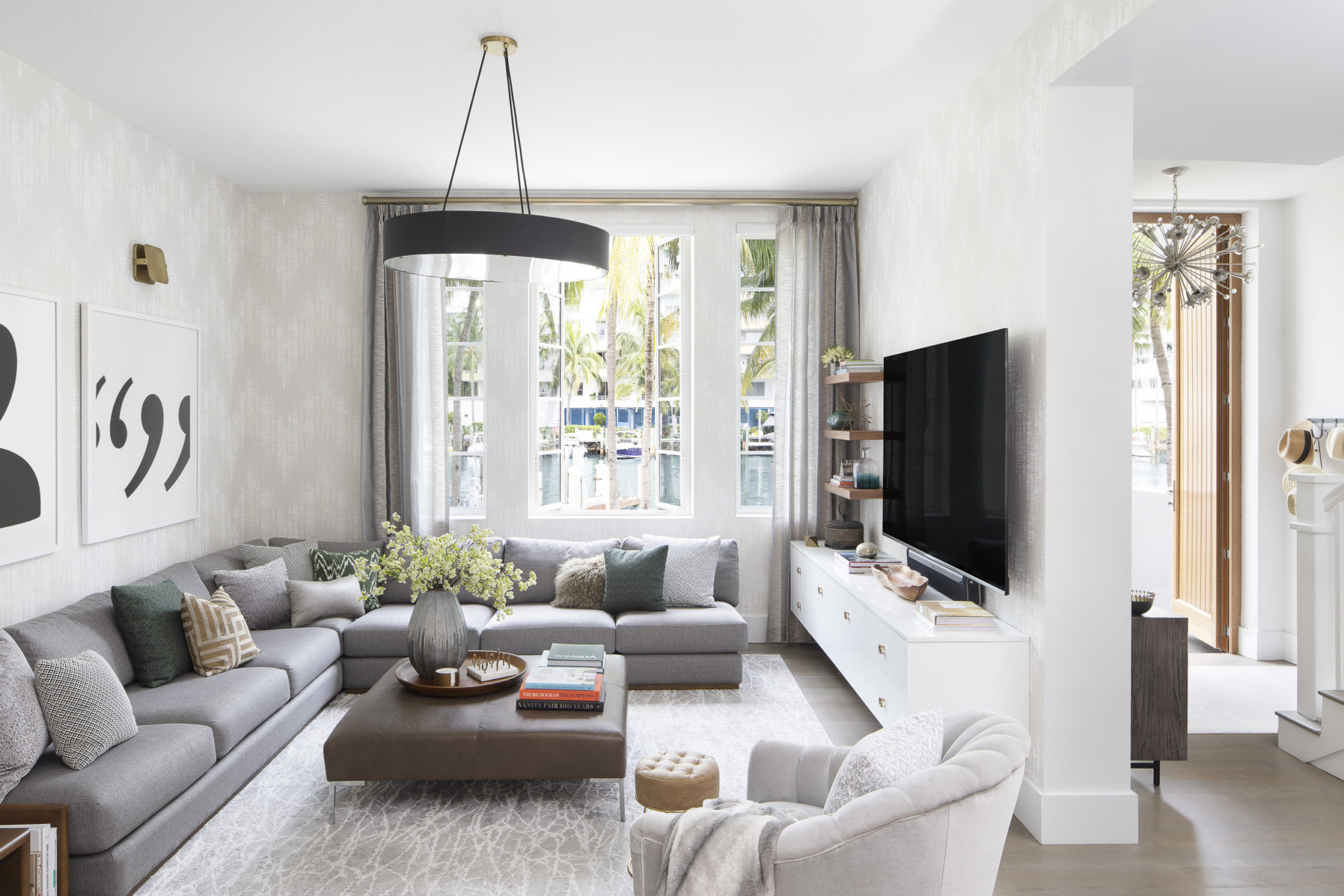
Interior Design by Krista W. Alterman, Photography by Jessica Glynn
2019 – Kips Bay Show House
In 2019 I had the extreme honor of being chosen as one of the designers for the prestigious Kips Bay Show House in Palm Beach, Florida. What an honor! It was a challenging project with very tight timeframes, but I loved every minute. The best part was the charity element of the project, as it benefitted the Boys & Girls Club of America. We created a showstopping master bathroom dubbed “Le Bubble Lounj” with the sexiest piece of book matched marble and a luxurious Kohler infinity tub. This year brought lots of press features in magazines like Veranda, House Beautiful and
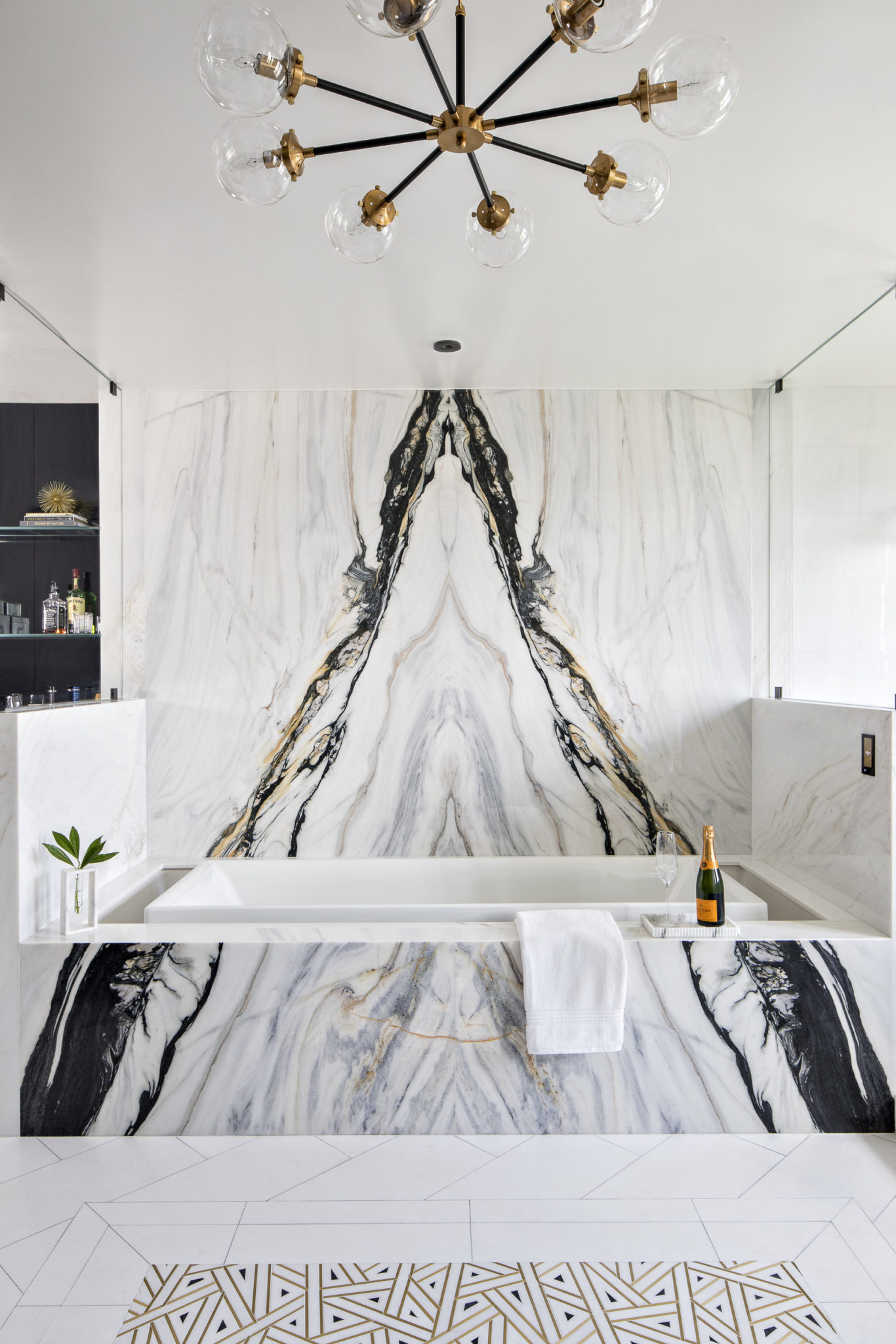
Interior Design by Krista W. Alterman, Photography by Jessica Glynn
2020 – Global Pandemic
2020 was such a challenging year for us all. But taking the time to reflect and stretch myself (with a much smaller team) proved to be rewarding when the vaccines came out and life started up again. I worked on a beautiful beach house in Juno Beach during quarantine that I was so proud of. Most of the work was done solo – I spend many hours in my office alone making selections and hours of zoom calls with the clients who were at their winter house in Rhode Island. It was truly a labor of love and I am so proud of how it came out. In 2020, we also moved into a new retail workspace in Palm Beach Gardens, where we happily reside today. We won two Luxe RED Awards this year, for one of my favorite homes that I designed in Parkland, FL. We were also named one of the “Top 50 Women-Led Businesses in Florida” by the Commonwealth Institute.
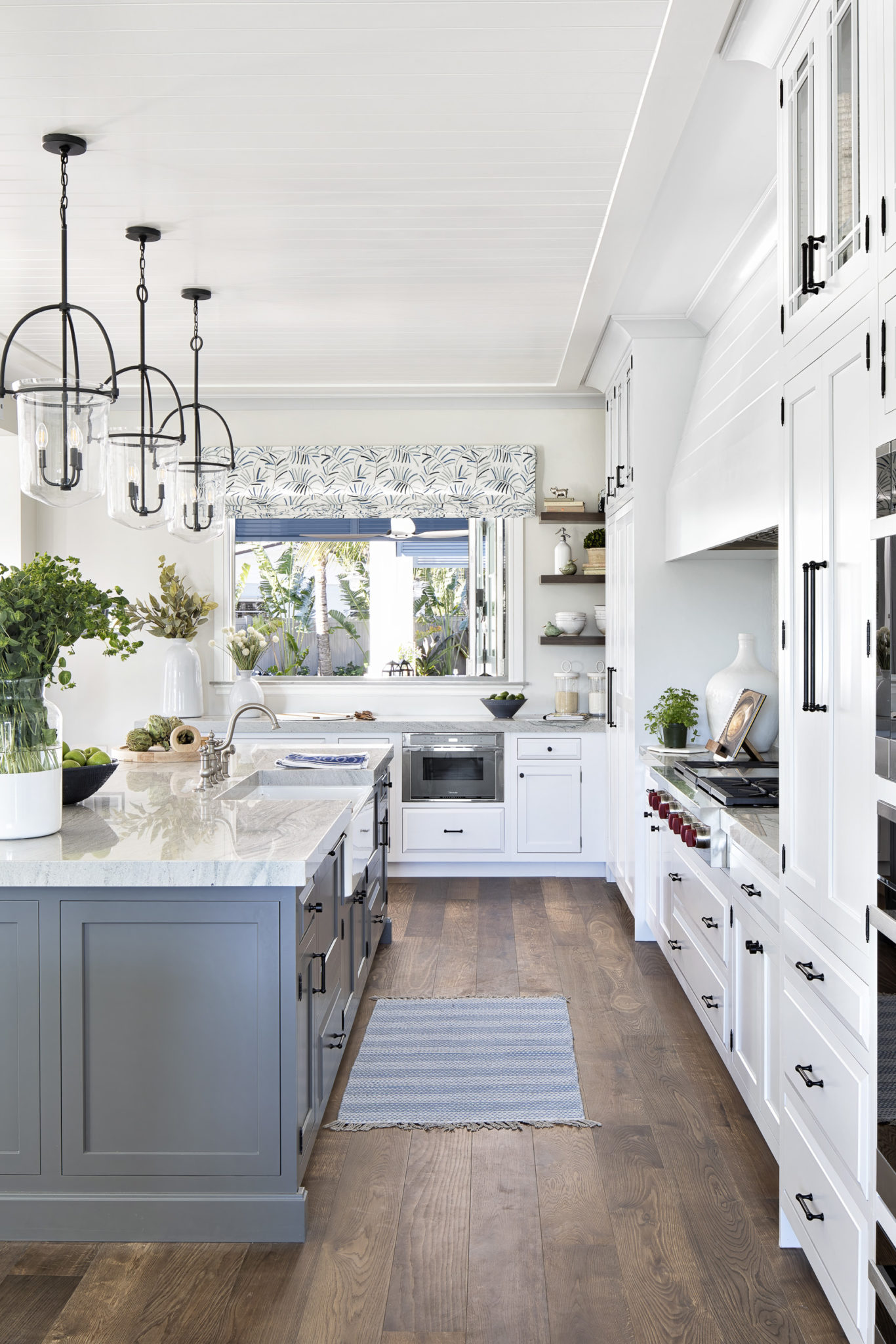
Interior Design by Krista W. Alterman, Photography by Jessica Glynn
2021 – Business is Booming! (But pipeline issues and delays…)
After being in our homes for so long, everyone decided that they either wanted to buy a new home or renovate/refresh the home they had! This was happening throughout the country, but most especially in South Florida. Our phone was ringing off the hook and our client roster kept growing. We added people to our team and worked on so many exciting projects throughout the Palm Beaches. This year had it’s challenges as the industry tried to catch up with the huge demand. We came up with creative ways to make sure our clients received the best possible service, but changing around some of our vendors and procuring product made locally or at least in the US. We were pleased to win many awards this year, including Design Excellence Award-First Place Bathroom, American Society of Interior Designers (ASID), Best of Palm Beach-Home Decorating, Palm Beach Post, Best of Design, Modern Luxury Interiors, Top Women-Led Business in Florida, The Commonwealth Instituteand Best of Houzz for Design and Service.
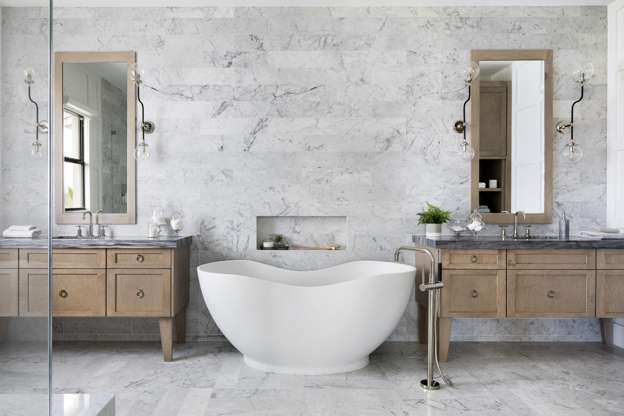
Interior Design by Krista W. Alterman, Photography by Jessica Glynn
2022 – We are growing!
2020 was such a challenging year for us all. But taking the time to reflect and stretch myself (with a much smaller team) proved to be rewarding when the vaccines came out and life started up again. I worked on a beautiful beach house in Juno Beach during quarantine that I was so proud of. Most of the work was done solo – I spend many hours in my office alone making selections and hours of zoom calls with the clients who were at their winter house in Rhode Island. It was truly a labor of love and I am so proud of how it came out. This was a special year for us, as we were awarded First Place in the “Best of Palm Beach” awards (sponsored by The Palm Beach Post) for Interior Decorating. In addition, we were featured as one of the top designers in Florida in the “Best of Design” issue of Modern Luxury Interiors magazine.
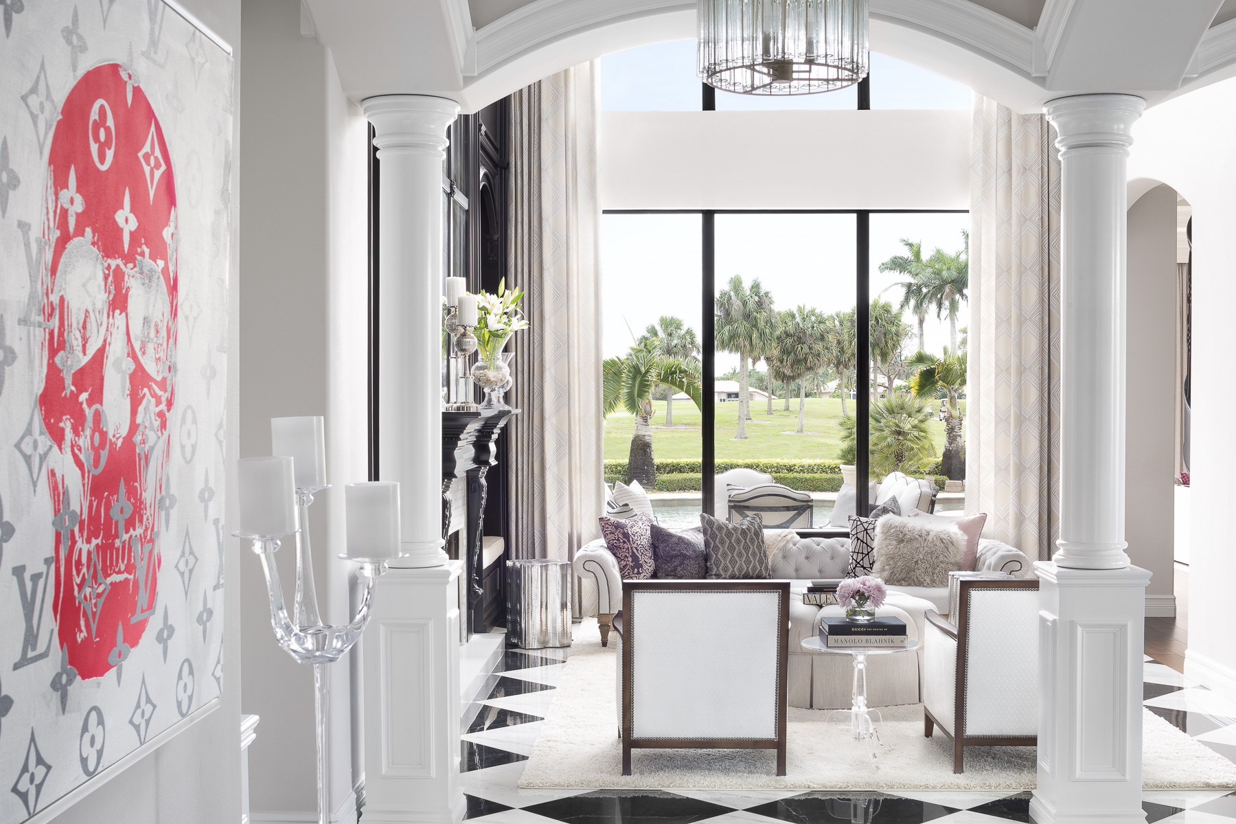
Interior Design by Krista W. Alterman, Photography by Jessica Glynn
2023 – Time To Celebrate And Reflect…
This brings us to the present. We are so excited to celebrate 15 incredible years of success at KRISTA + HOME! We have come such a long way since our humble beginnings and we thank all of you for helping us reach this milestone. We invite you to join us in celebrating 15 years of excellence. Together we have achieved amazing feats and we look forward to many more years of creating beautiful homes.
To our employees, clients, partners, and friends: Thank you for making our dreams possible and supporting us along the way. We can’t wait to see what the future holds for KRISTA + HOME!
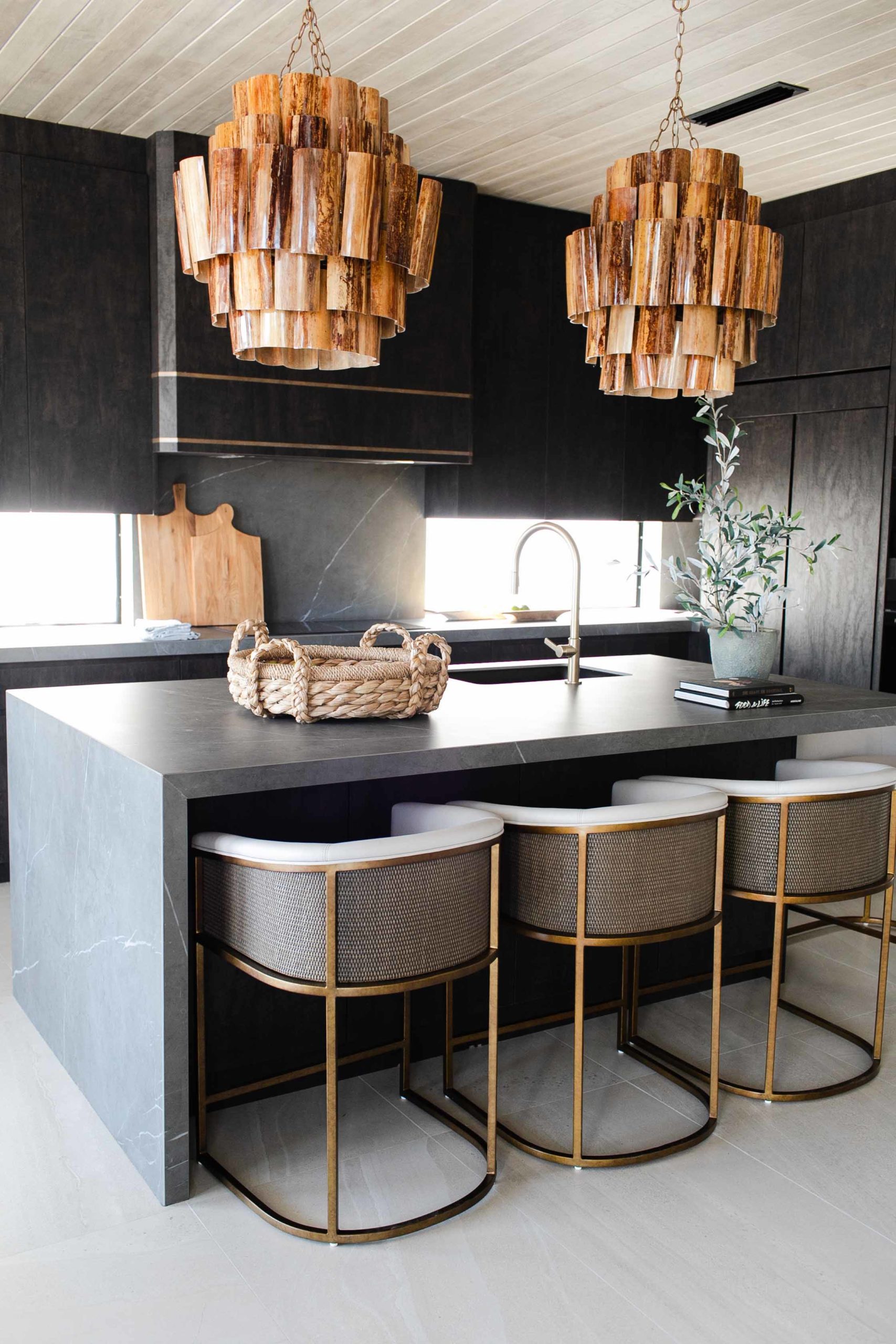
Interior Design by Krista W. Alterman, Photography by Jessica Glynn

Interior Design by Krista W. Alterman. Photography by Jessica Glynn
WALL SCONCES 101
Ah, how I love wall sconces! A wall sconce is a type of light that is mounted from the wall instead of from the ceiling. It is quite practical as it is a great space saver, with no pesky cords to worry about, and I love the traditional look that a sconce gives on the wall. Balance is an important part of interior design, and adding sconces to a room can give the perfect finishing touch to a space after all of the pendants and surface mount lighting is selected. The goal is to evenly light a room. To do this, place the sconces slightly above your direct eye line.
One of my favorite areas for sconces is the bedroom! I love the look and functionality of having a sconces flanking a bed. For nighttime reading, you’ll want to make sure the sconces are intentionally placed so that you can read comfortably. It is important to consider the bed height. I love to do a variety of lights in the bedroom, from sconces to table lamps to a gorgeous chandelier. Always put your bedroom lighting on dimmers to create a calming mood.

Interior design by KRISTA + HOME, Photo by Jessica Glynn
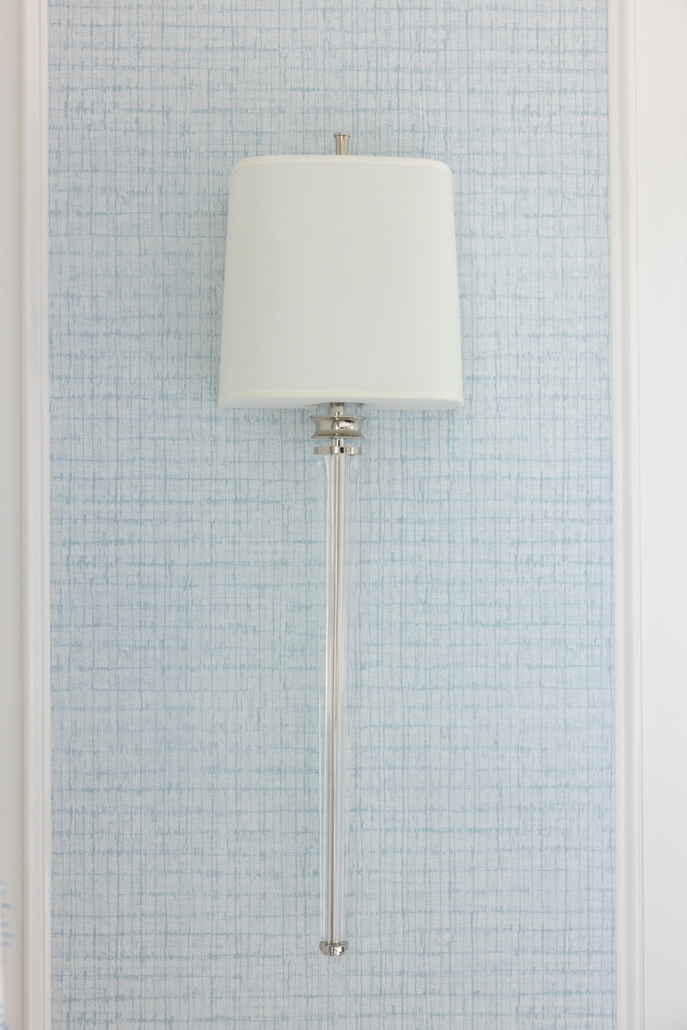
Interior design by KRISTA + HOME, Photo by Jessica Glynn
I also like to add a sconce or two in the entryway as a beautiful decorative and functional element. Make sure these are hung properly. Generally, wall sconces are installed between 60”-72” from the finished floor. When it comes to horizontal spacing, sconces are traditionally 6’ apart. But keep in mind that the six-foot rule may not always apply. Placement depends on how long your hallway is and whether there are architectural features to consider.
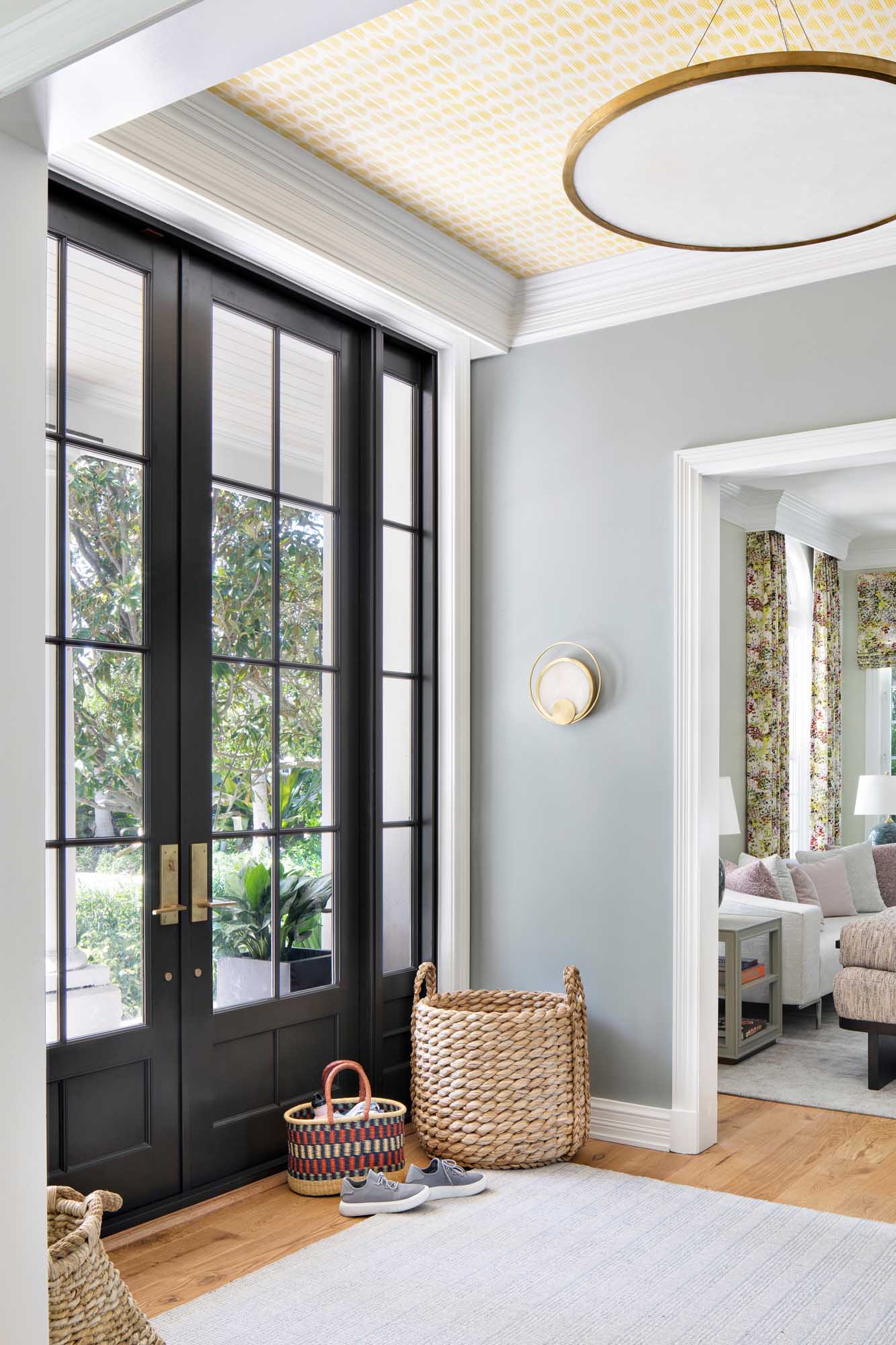
Interior design by KRISTA + HOME, Photo by Jessica Glynn
In the bathroom, sconces can be hung at the vanity or even by the tub, as in the photo below. When it comes to the bathroom, the more lighting the better! When installing sconces on either side of the vanity, it’s best to install bathroom sconces between 60”-65” from the floor. The height of the sconce should land around the eye level, preventing unflattering shadows or harsh glares.

Interior design by KRISTA + HOME, Photo by Jessica Glynn
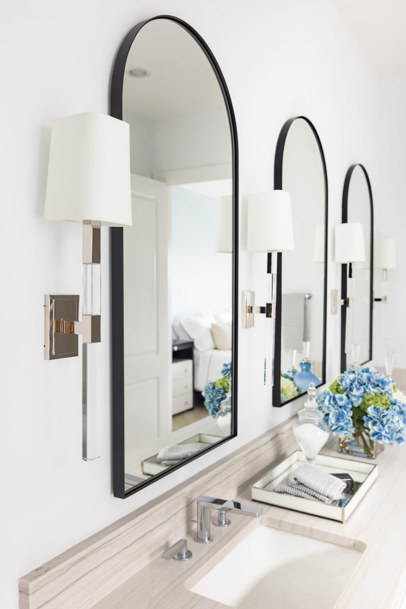
Interior design by KRISTA + HOME, Photo by Jessica Glynn
Pro tip: If you are renovating it really helps to pick out the fixtures BEFORE you place the junction box. This way you can more accurately decide the proper height and get exactly what you want. Otherwise, you will have to choose a sconce based on the placement of the box.
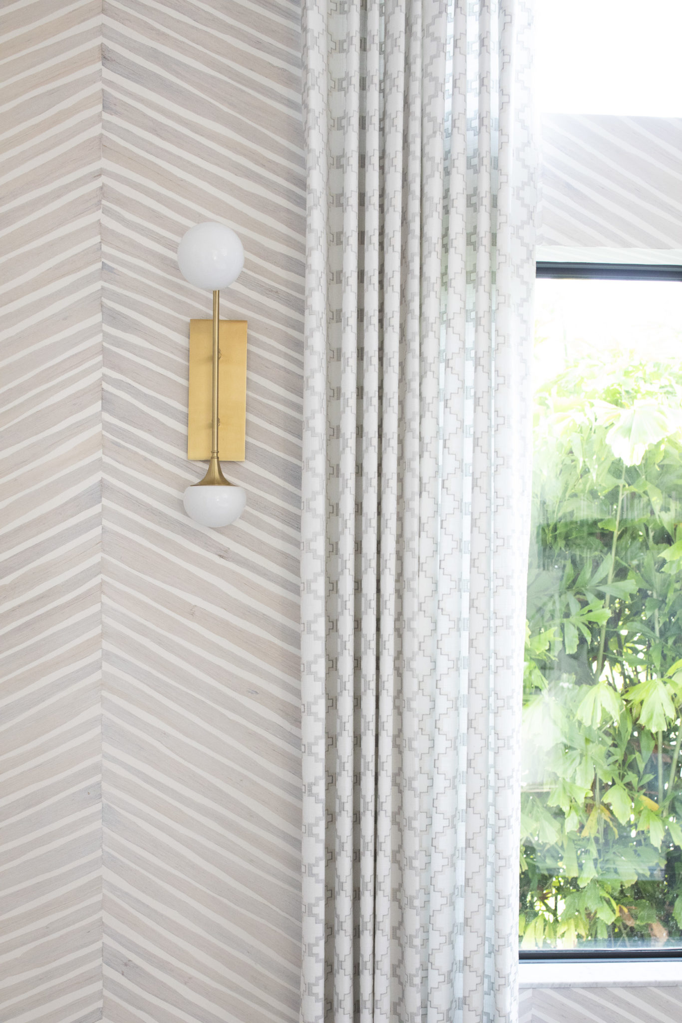
Interior design by KRISTA + HOME, Photo by Jessica Glynn
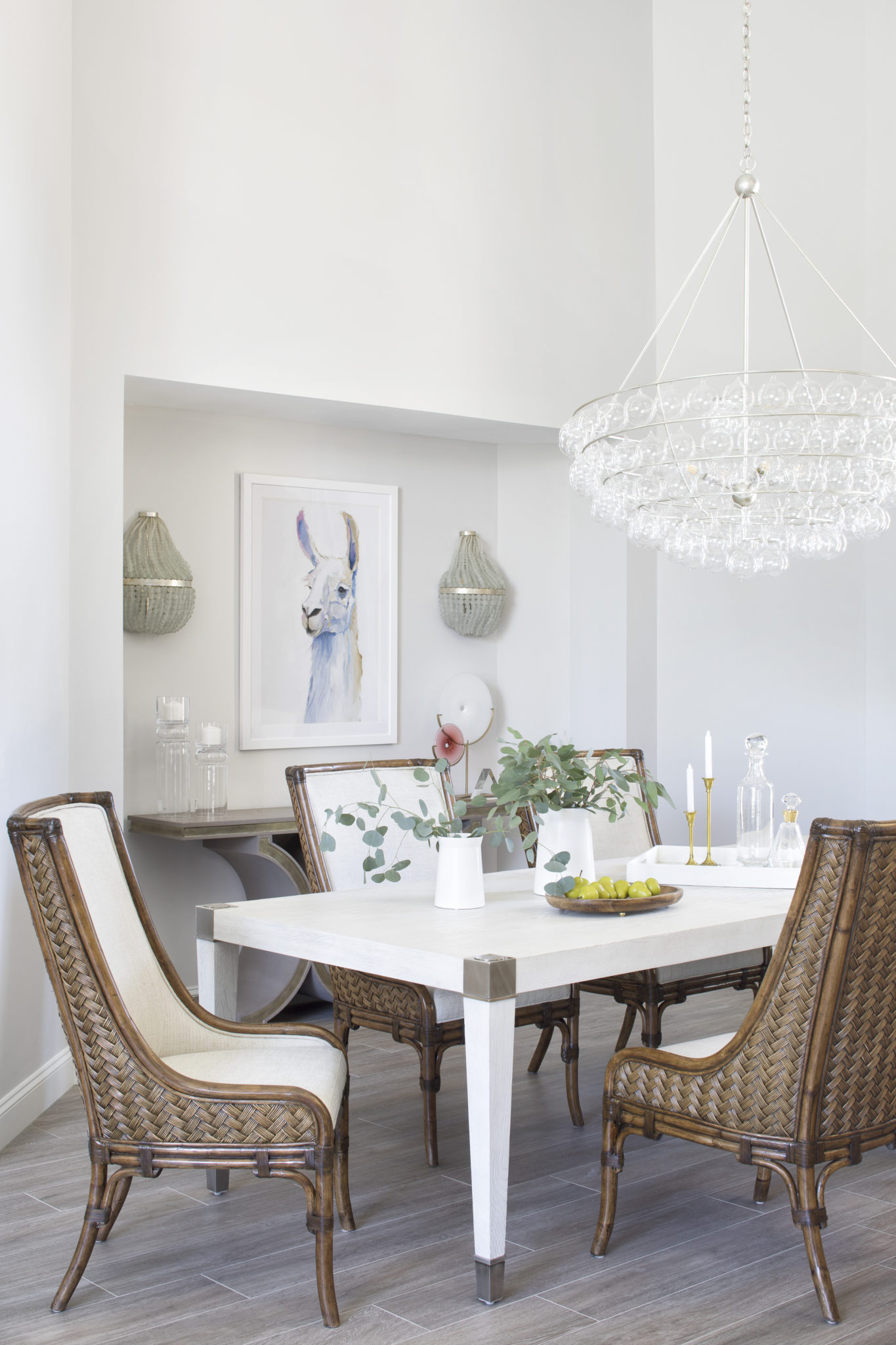
Interior Design by KRISTA + HOME. Photo by Jessica Glynn
Creating Timelines For Your Custom Build
Embarking on a custom build journey is an exciting chapter, and at KRISTA + HOME, we understand the importance of turning dreams into reality with precision and care. Today, we’re sharing insights into the art of creating timelines for your custom build, featuring our dedicated project management team and cutting-edge software that ensure every detail is meticulously planned and executed. Join us as we unravel the secrets to a seamless construction journey and offer additional tips for creating timelines that exceed expectations.
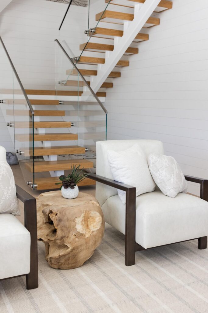
Interior Design by KRISTA + HOME, Photo by Eve Greendale
Dreams to Plans: Collaborating for Success: The journey of a custom build begins with dreams and we believe in translating those dreams into actionable plans. Collaborating closely with our clients, our design and project management teams work hand in hand to understand visions, preferences, and priorities. This collaborative approach ensures that the foundation of your timeline is rooted in your unique aspirations.
Tip Start with a vision board or mood board to articulate your aesthetic preferences and functional requirements. This visual representation can be a great starting point for discussions with your design and project management teams.
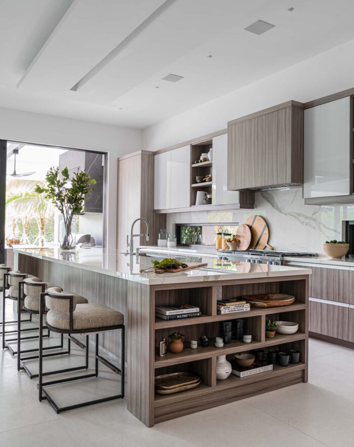
Interior Design by KRISTA + HOME, Photo by Jessica Glynn
Dedicated Project Management Team: Guardians of Your Timeline: At KRISTA + HOME we have a dedicated project management team that works closely with the contractors. These skilled professionals are the guardians of your timeline, overseeing every phase of the construction process. From coordinating with contractors to addressing unforeseen challenges, our project managers act as the crucial link that keeps your custom build on track.
Tip: Communication is key. Regular check-ins with your project manager can help identify any potential roadblocks early on and keep the construction process moving smoothly.
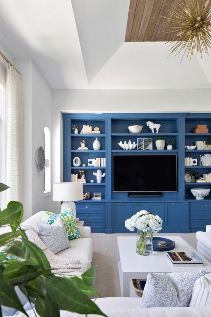
Interior Design by KRISTA + HOME, Photo by Jessica Glynn
Cutting-Edge Software: Powering Precision and Flexibility: In the digital age, we leverage cutting-edge software to enhance our project management capabilities. This software provides real-time collaboration, transparent project tracking, and flexibility to adapt to changes. The result is a dynamic timeline that evolves with your vision, ensuring that deadlines are not just met but exceeded.
Tip : Consider using project management software or apps to create a visual timeline. This can be an effective way to keep everyone involved in the construction process informed and aligned with the project milestones.
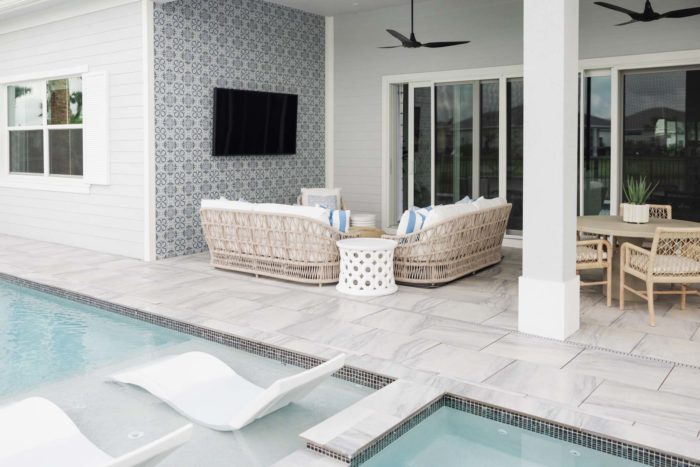
Interior Design by KRISTA + HOME, Photo by Eve Greendale
Setting Realistic Milestones: Creating a timeline is an art that involves setting realistic milestones. While it’s natural to be ambitious with your goals, it’s crucial to strike a balance between pushing boundaries and ensuring achievability. Our project management team excels at breaking down the construction process into manageable phases, setting milestones that motivate progress without compromising quality.
Tip: Work with your project manager to establish a timeline that accommodates potential delays or unexpected challenges. Building in a buffer can help manage expectations and ensure a smoother construction journey.
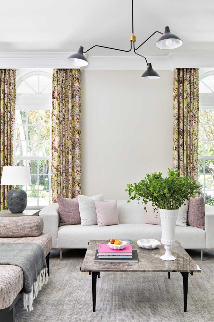
Interior Design by KRISTA + HOME, Photo by Jessica Glynn
Regular Reviews and Adjustments: Adapting to Evolving Visions: A successful custom build timeline is not a static document—it’s a living, breathing plan that evolves with your vision. Regular reviews with your project management team provide an opportunity to assess progress, discuss any adjustments, and ensure that the timeline aligns with your evolving preferences.
Tip: Schedule regular walkthroughs with your project manager to physically inspect the construction site. This hands-on approach allows you to see progress firsthand and address any concerns promptly.
Meet the Artist – MEGAN JAMES
We love supporting local artists and are so excited about our collaboration with Megan James, who is based in Jupiter, Florida. Megan created a collection for us of Krista’s favorite pieces and her paintings are available for purchase on our website. We recently sat down with artist Megan James to discuss her work.
When did you first realize you wanted to become an artist?
My mother and grandmother, who both have artistic talents, began telling me around 5 years old: “Meggie, you are an artist!” Whenever I had an opportunity, I always gravitated towards making things and drawing. My father even built a wood art table for me right in the living room, so I could do what I loved while everyone else watched television or hung out. Over the years, I tried some other career paths but naturally found my way back to art in everything I did! In 2016, I decided to finally develop a career as a full time artist/creative director.
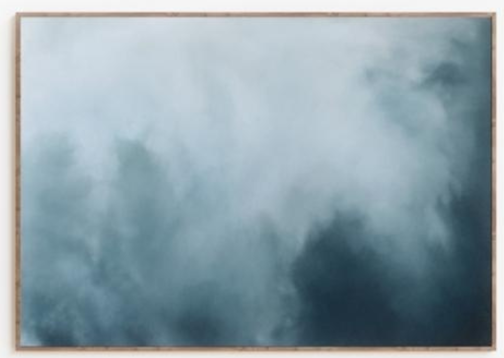
What inspires your artwork?
The natural world is my main source of inspiration. In many ways, my paintings are a journal of the places that have moved me, given me perspective or changed my inner landscape. I find myself studying organic textures ,patterns, movement, light and shapes all found in nature and how they translate as a feeling. I noticed that I’m often trying to transmit the same ideas of wild beauty, grace and serenity but in my own visual languages, by changing the colors or materials. I also look for parallels in the natural world that can help me relate to my own life and then distill the message in my work.
Are there any artists that have influenced your style?
Lately, I’ve been enjoying the works of Jules Olitski, James Perkins and Zaria Foreman.
But my artistic influences often come from other forms of creativity, like music! I pose a question like “If this painting of the desert was a Jeff Buckley song, what would it look like?” Music helps me set a tone for a collection.
What was the creative process behind the pieces in our collection?
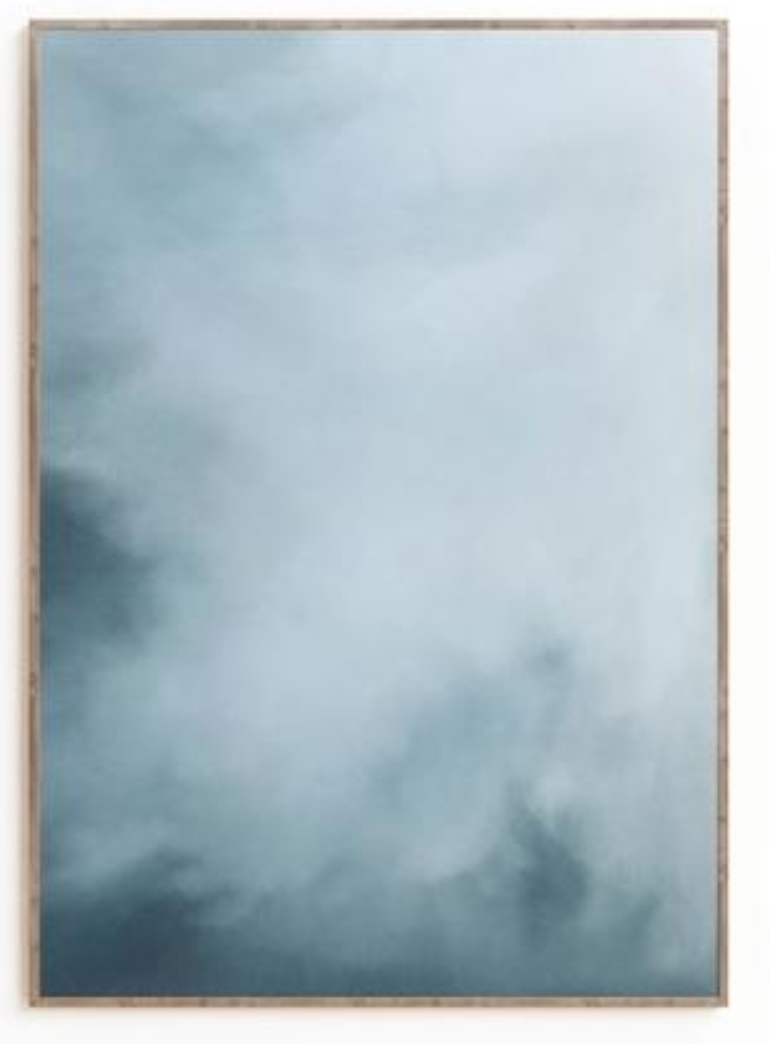
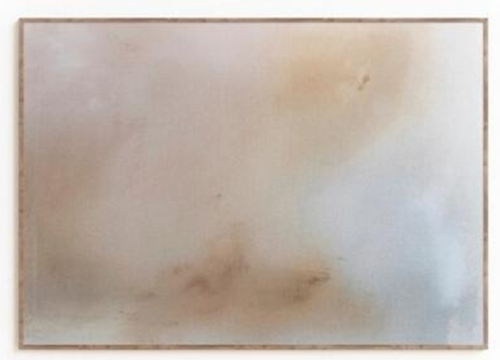
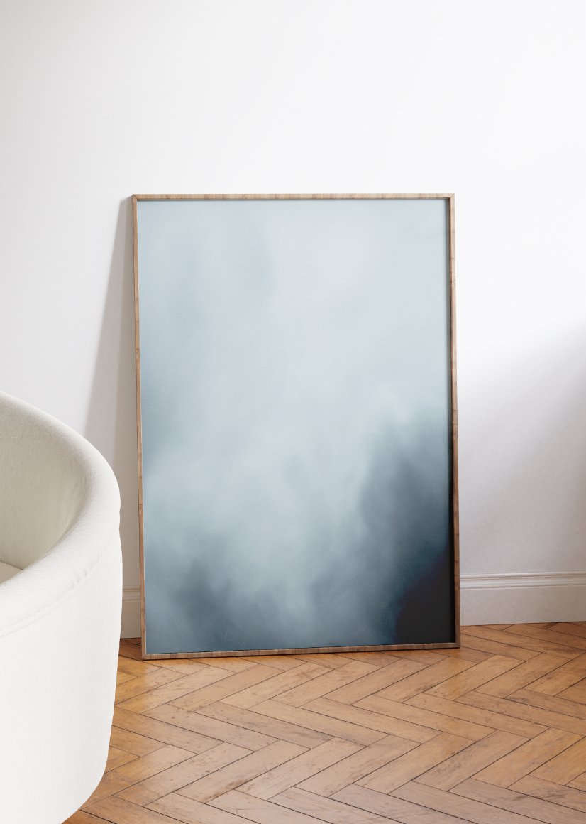
This collection is all about travel and capturing the essence of a place. The Indigo Water paintings are all snapshots of moments with water here in South Florida and the Mediterranean Sea from the coast of Santorini. The water takes on different energy and colors based on the backdrops of the environment around it. But no matter where I visit water, it feels like a familiar friend and a through line in who I am. I wanted to focus on the graduation of deep blue, the depths of the water and the rhythmic patterns. All of the desert pieces were inspired by a trip that my boyfriend surprised me with to the Mojave Desert and Death Valley in 2021. I was able to take on an abstract interpretation with the desert pieces because the scenery is so out of this world, wild and raw. “The Warmest Sounds” shows that It can be encapsulated as a feeling so well with just one subdued color.
What do you want collectors to take away from your art?
I hope collectors find pieces of who they are in relation to the natural world when they see my work. I hope it anchors them to the feelings associated with natural elements like the flow and rhythm of water or the feelings of stability in a warm rock formation. I also hope my work serves as an invitation outside! Adventure!
What do you enjoy doing when you’re not painting?
I have two daughters, so I enjoy doing creative things and cooking with them. We love going to the Norton and exploring local art. When I’m alone, I love running and adventuring by foot. I live in downtown West Palm Beach, so I can go in any direction and find beauty, nature and gorgeous architecture, which makes exercising outside so fun. I wrote an article last year and mentioned that running is how I paint when I’m not painting and that really rings true for me because it shows me how to push past the hard parts, like mental doubts and physical fatigue in order to reach the flow state. I have learned that on the other side of a challenging run and a finished painting is a new version of me, it’s very rewarding.
Are you an early bird or a night owl?
I am a proud member of the 5 am club! I adopted early rising two years ago and it has been the best, non-negotiable form of self-care for me! Waking up early upped my game as a mother and an artist, by allowing me to “wake up before the world.” I have a carved out moment to plan my day, work on something creative or exercise. By the time I start working, I’m lit up and ready to go!
Favorite colors?
Tans, and white! I love a good monochromatic look too!
What are your goals as an artist?
I look at my goals as an artist from a few different standpoints.
Personally, my goal is to always honor the hunger I have within me to create. It’s an urge inside me that makes me who I am and feel totally alive. Creatively, I hope to continue growing my skills and work practice. As a mother, I love to be able to show my daughters behind the scenes of a working artist and I can see the positive impact it has on their creativity. From a business perspective, I have been penetrating new arenas with my work in the past year by becoming more bold and thinking BIGGER! My goals are to keep expanding my reach with designers, galleries and collectors.
4 Perfect Bathrooms
We just finished up a fun waterfront beach house in Jupiter, Florida and one of my favorite parts of the design was….the BATHROOMS! I really love all four of these spaces. The bathroom is an often neglected space where you can really get creative with your tile, hardware and wallpaper selections. I always say, take some risks if you want a designer look. Choose some fun and expected elements. I love how these turned out and the clients did too!
BUNK BATH
This bathroom was attached to a super fabulous girly bunk room we created for the family’s girls. It has just the right amount of girly flair while still keeping a chic and understated vibe. The palette for the space was pink, white and gray with pops of gold where we used brass fixtures by Kohler. The countertops are white calcutta marble and the walls are painted Peppermint by Benjamin Moore. The flooring is my favorite part – I love the gray glass petals and gray subway tile with white grout to make it pop.
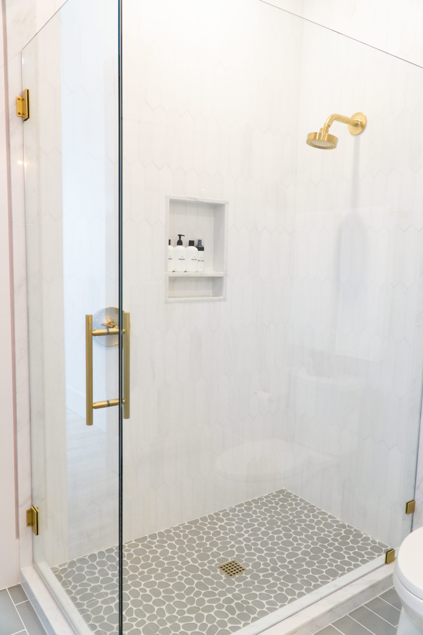
Interior Design by KRISTA + HOME / Photo by Jerrica Catania
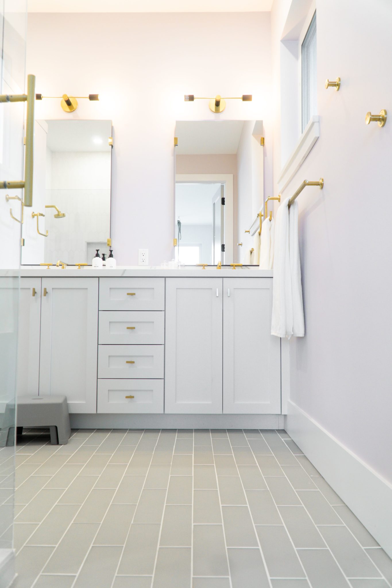
Interior Design by KRISTA + HOME / Photo by Jerrica Catania
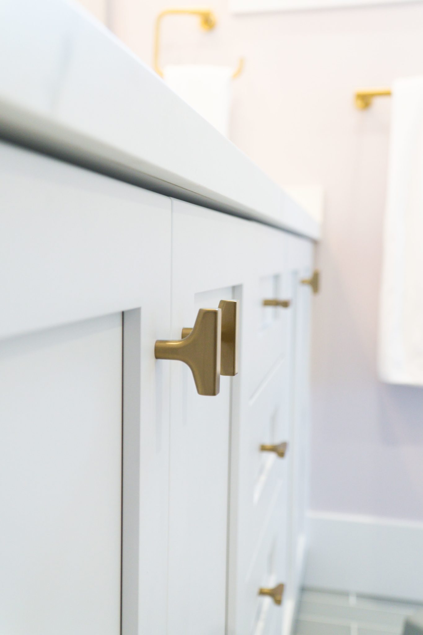
Interior Design by KRISTA + HOME / Photo by Jerrica Catania
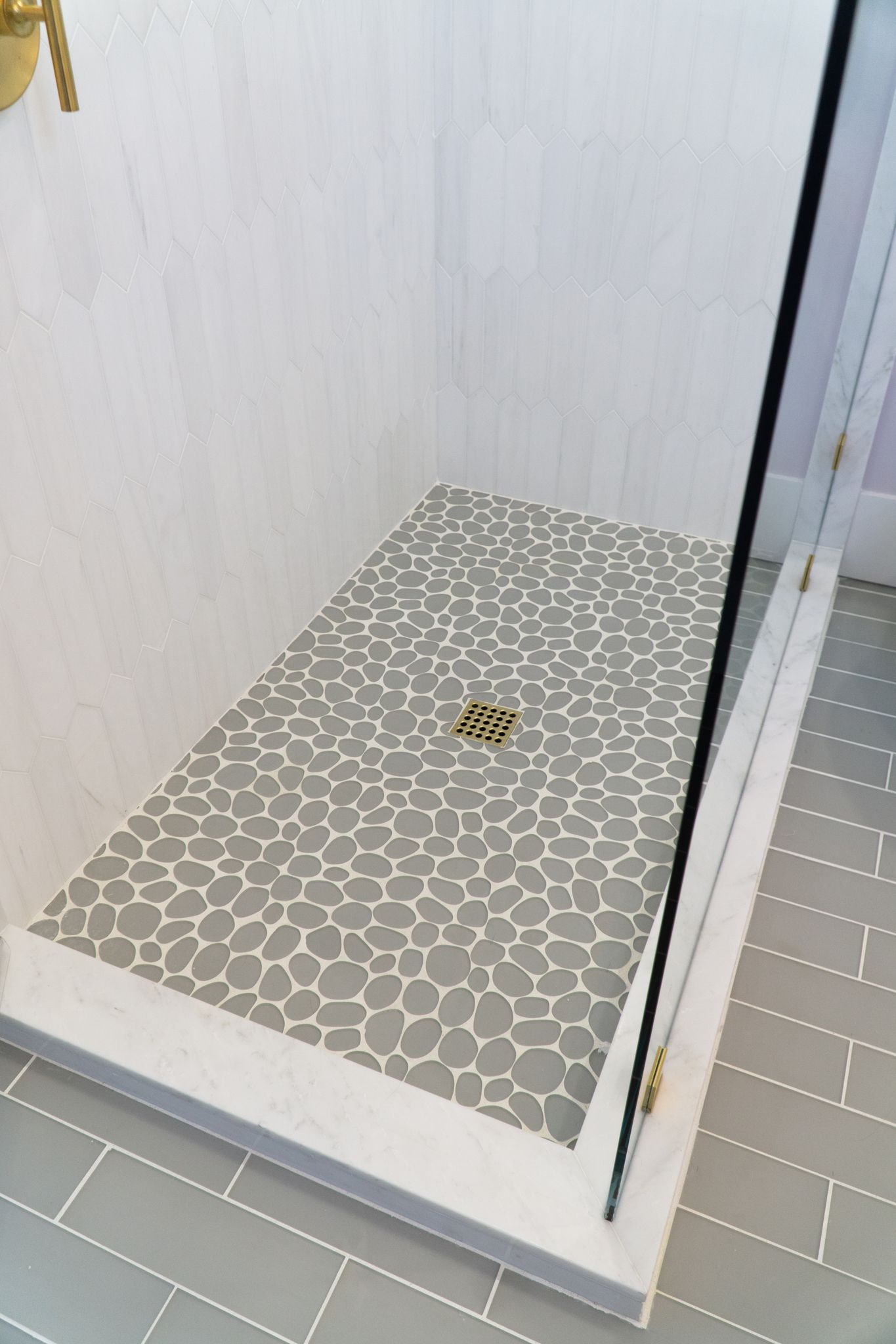
Interior Design by KRISTA + HOME / Photo by Jerrica Catania
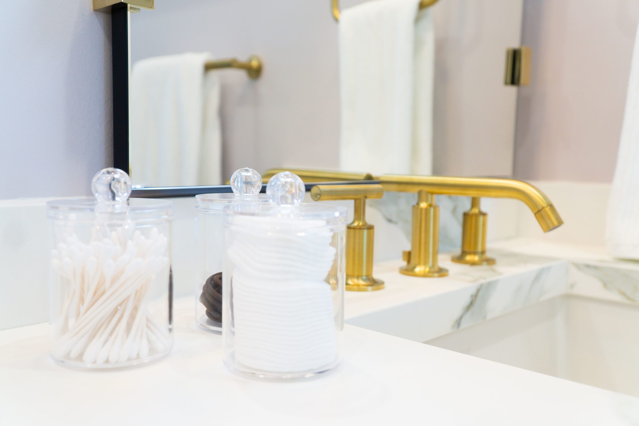
Interior Design by KRISTA + HOME / Photo by Jerrica Catania
GUEST BATH
The guest room palette is a bold black and white with statement wallpaper by Schumacher. This paper is called “Queen of Spain”. Isn’t it fabulous? The countertops are Calcutta Michelangelo and the cabinetry is painted with in Benjamin Moore’s Gray Horse. The Towner 3-light sconce is by Generation Lighting and the oblong mirror is by Arteriors. The tile in the shower, which is laid in a herringbone pattern, is by New Ravenna. The sleek black fixtures and knobs are by Kohler.
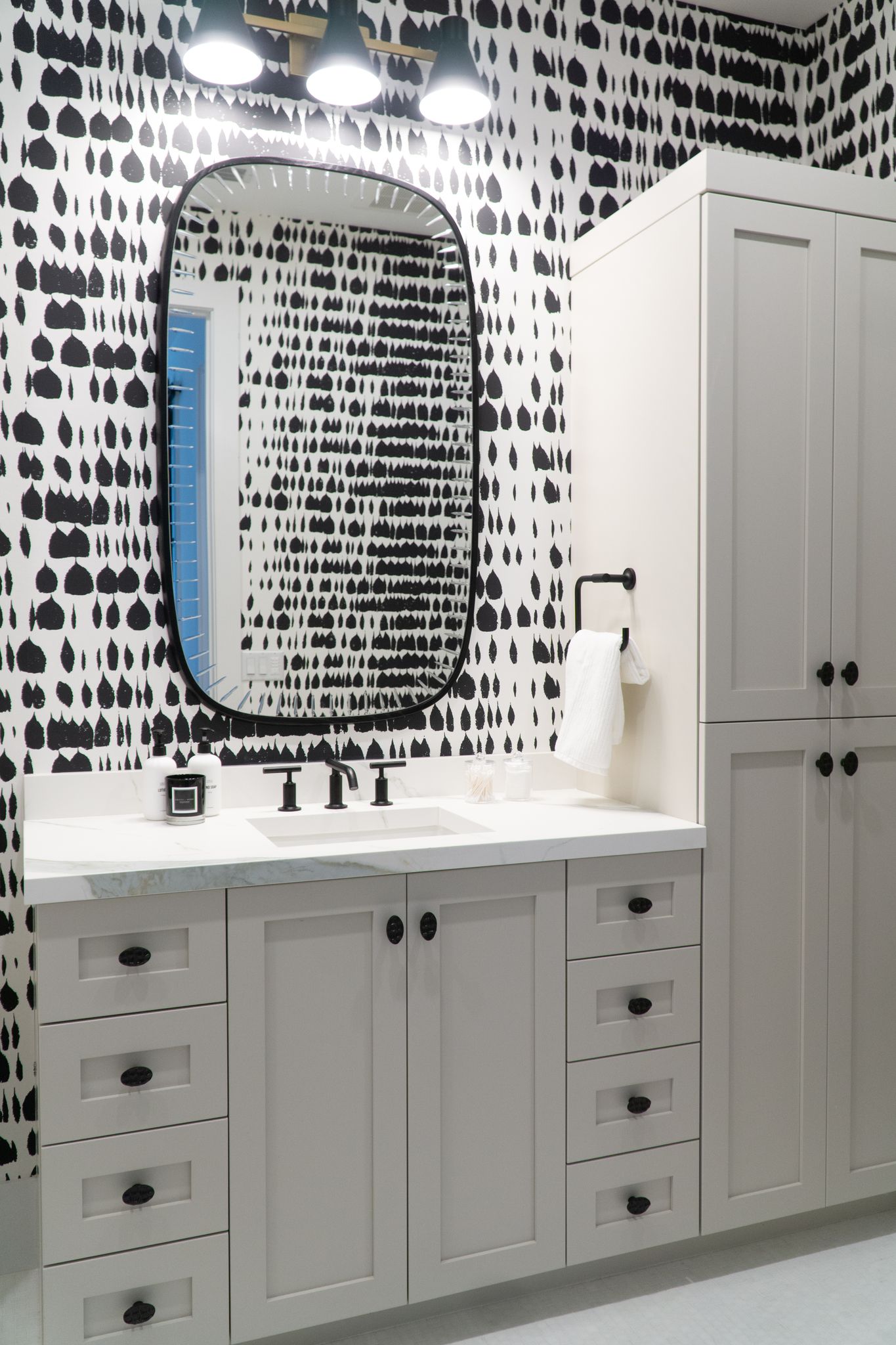
Interior Design by KRISTA + HOME / Photo by Jerrica Catania
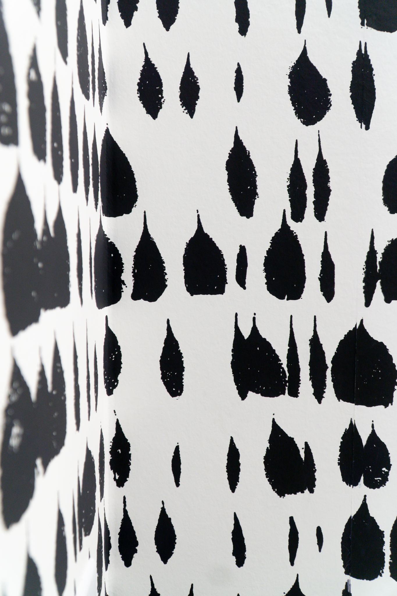
Interior Design by KRISTA + HOME / Photo by Jerrica Catania
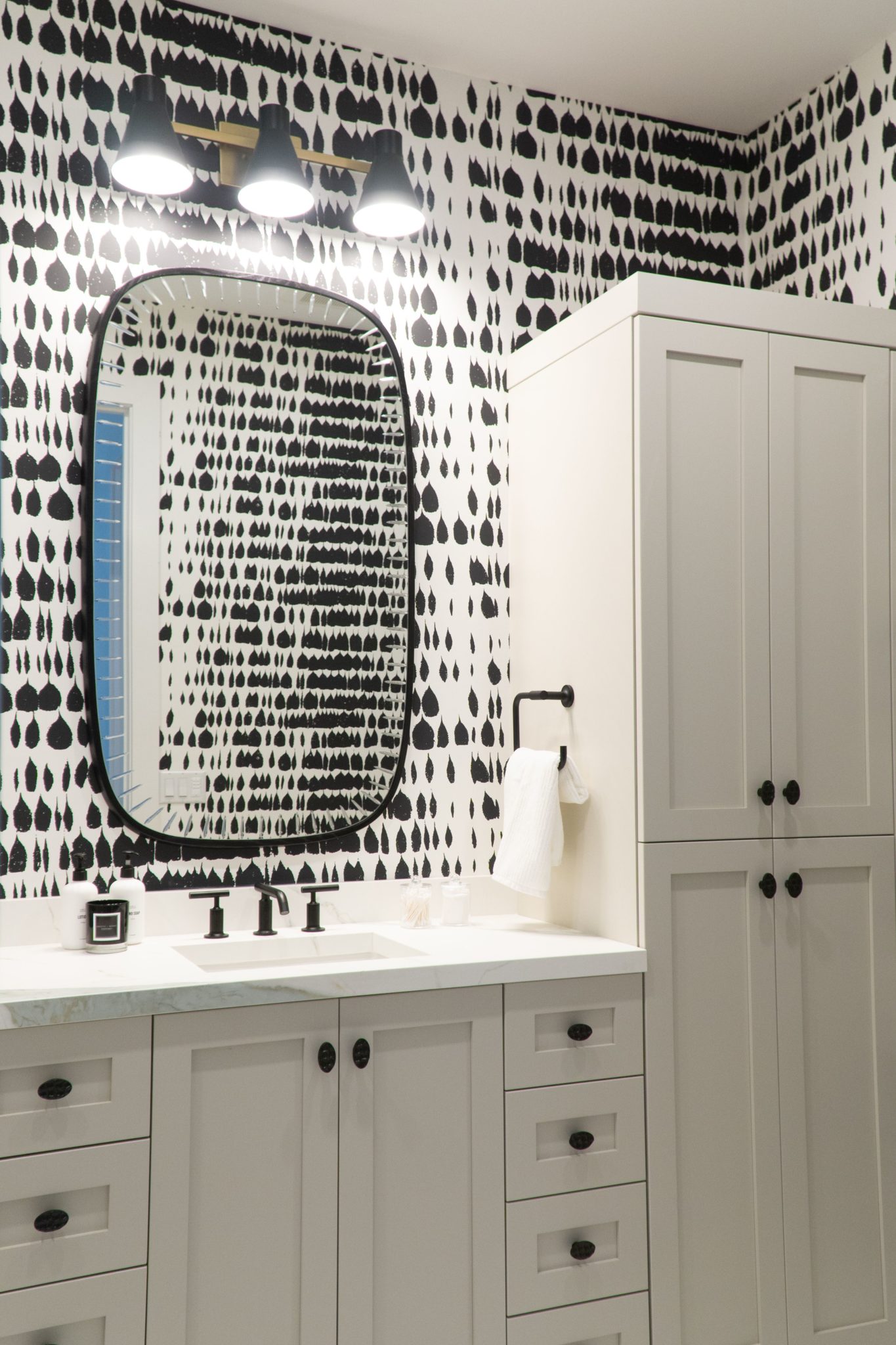
Interior Design by KRISTA + HOME / Photo by Jerrica Catania
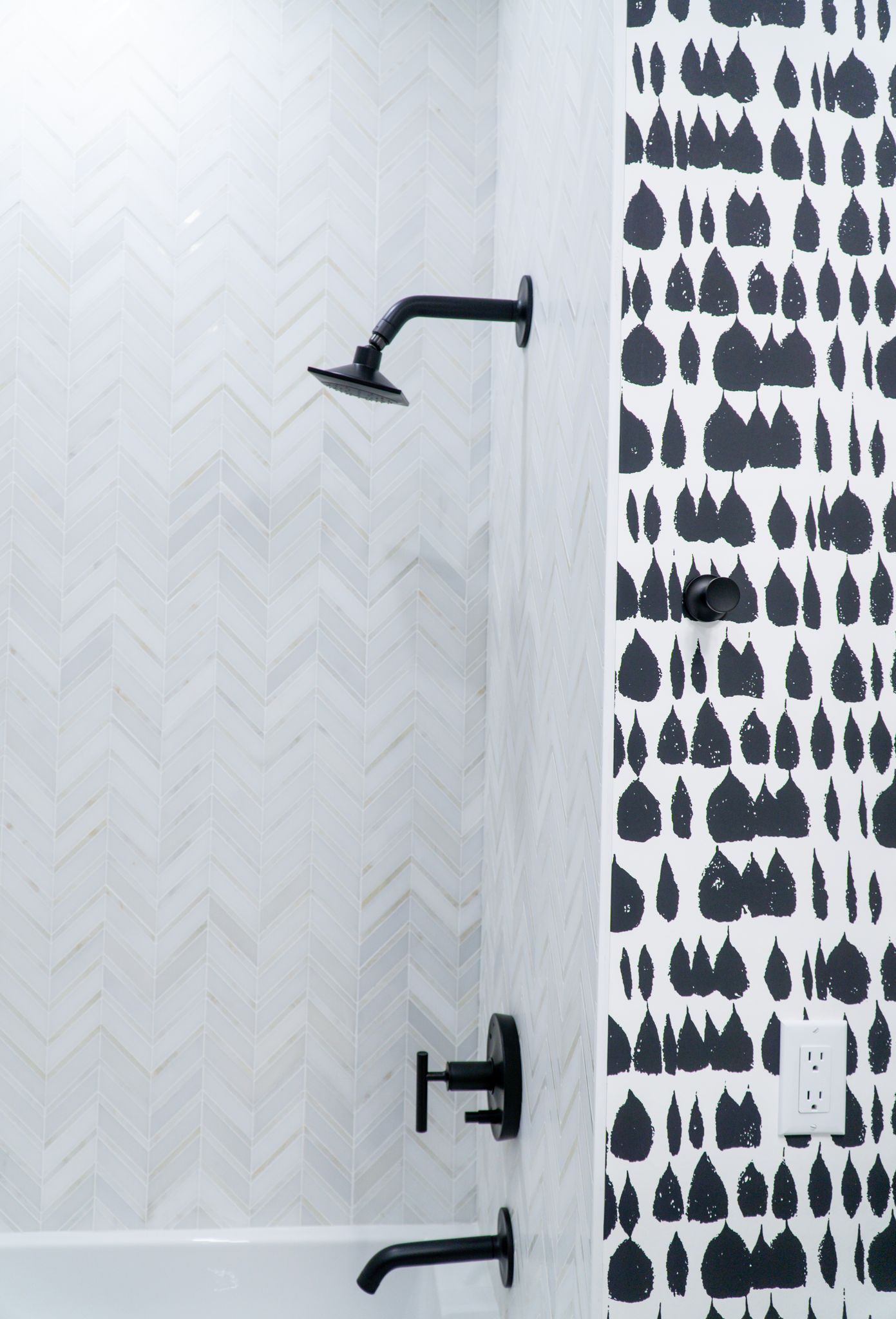
Interior Design by KRISTA + HOME / Photo by Jerrica Catania
PRIMARY BATH
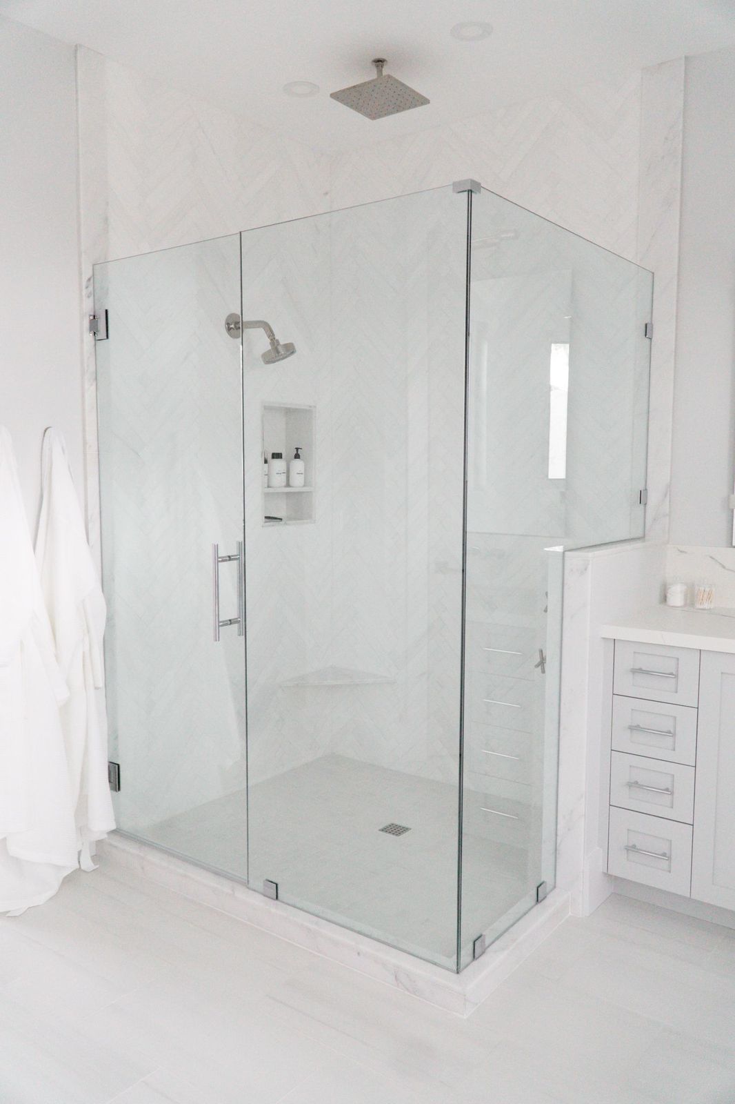
In the Primary Bath, I tried to create a spa-like feel and kept everything very neutral with lots of organic materials. The statement tub is a freestanding soak tub by Kohler with a chrome tub filler. We repeated the New Ravenna herringbone tile in the shower for continuity, and the shaker cabinets are painted in Benjamin Moore Alaskan Husky.
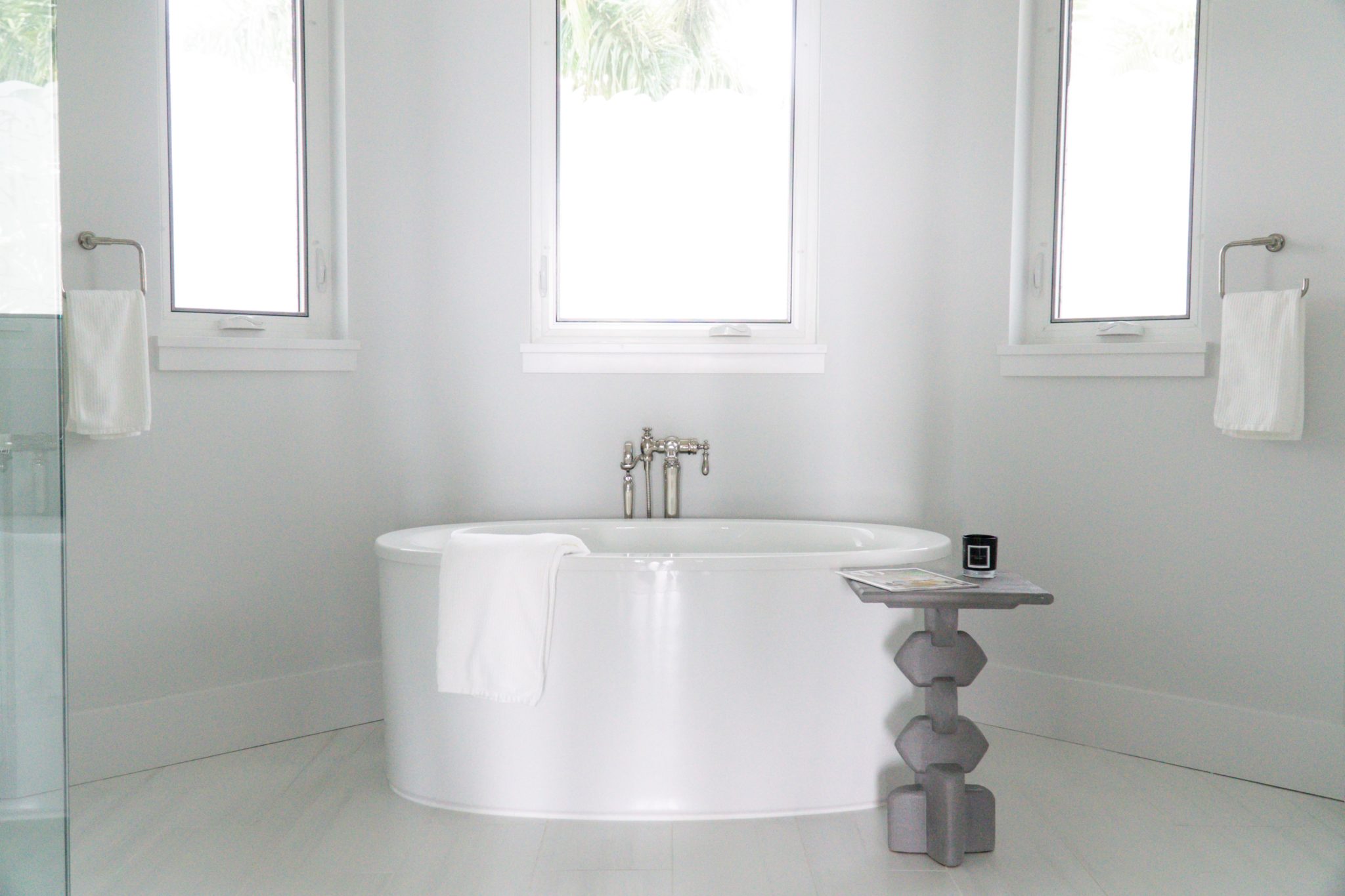
Interior Design by KRISTA + HOME / Photo by Jerrica Catania
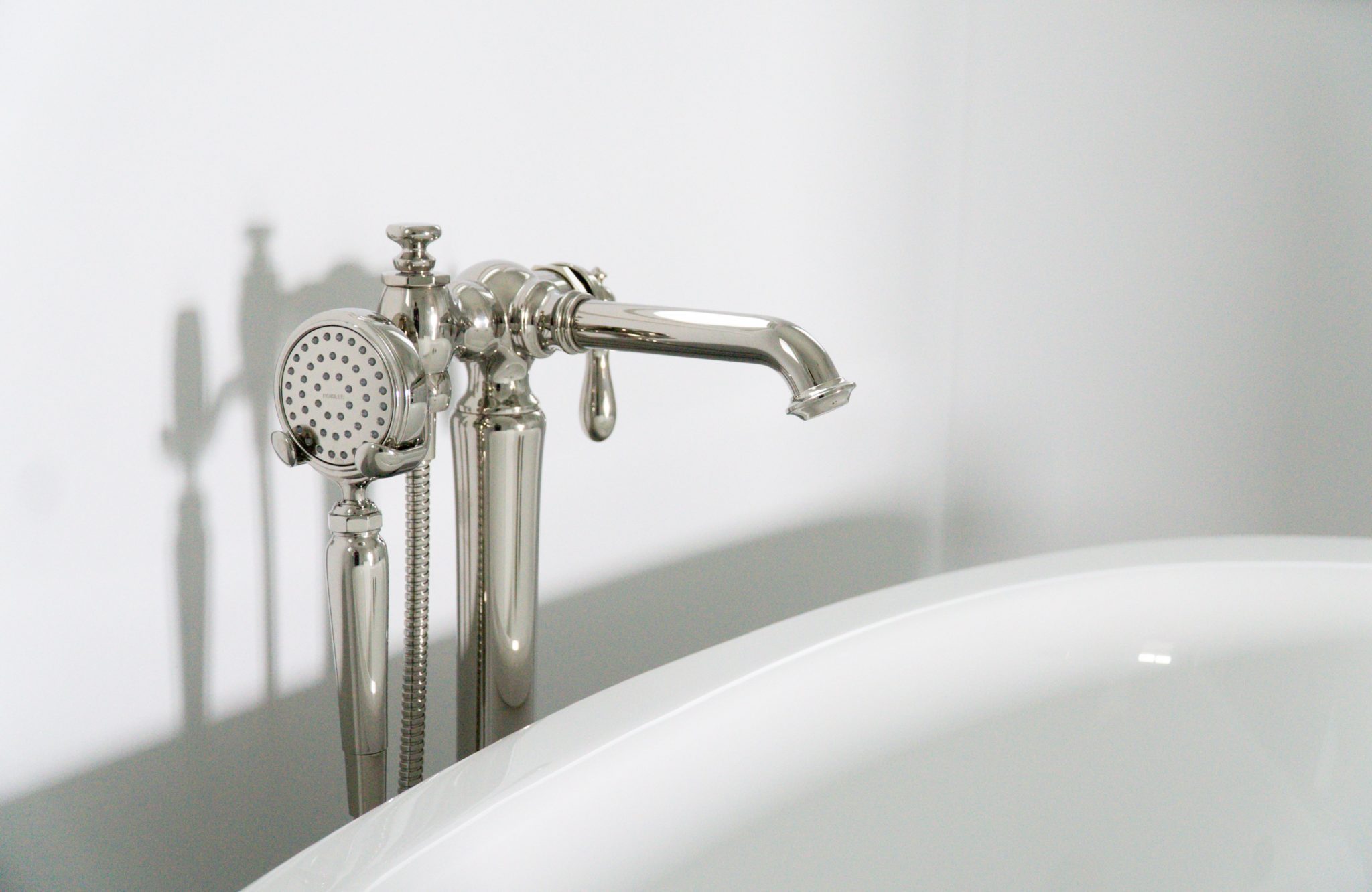
Interior Design by KRISTA + HOME / Photo by Jerrica Catania
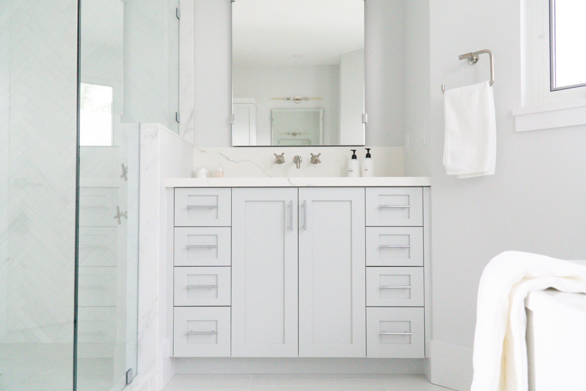
Interior Design by KRISTA + HOME / Photo by Jerrica Catania
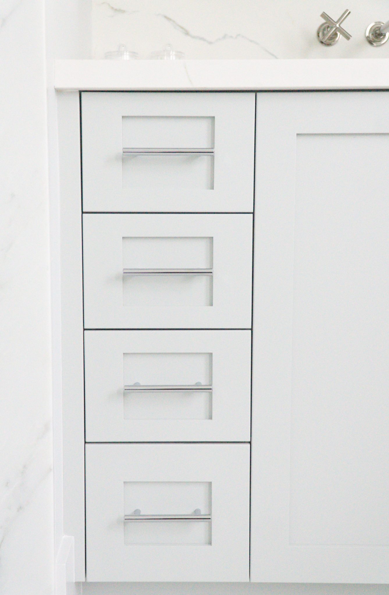
Interior Design by KRISTA + HOME / Photo by Jerrica Catania
Interior Design by KRISTA + HOME / Photo by Jerrica Catania
CABANA BATH
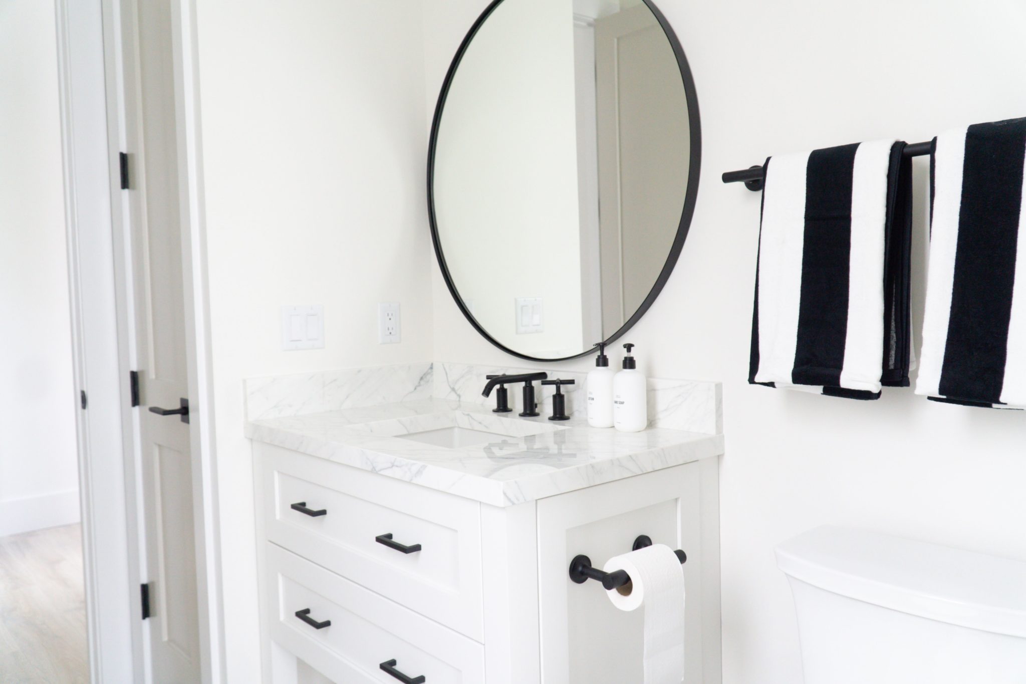
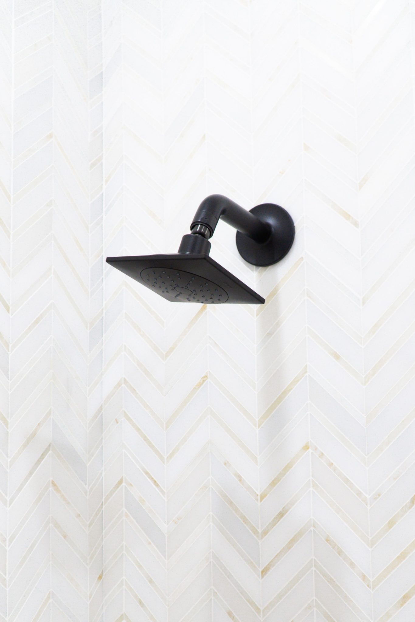
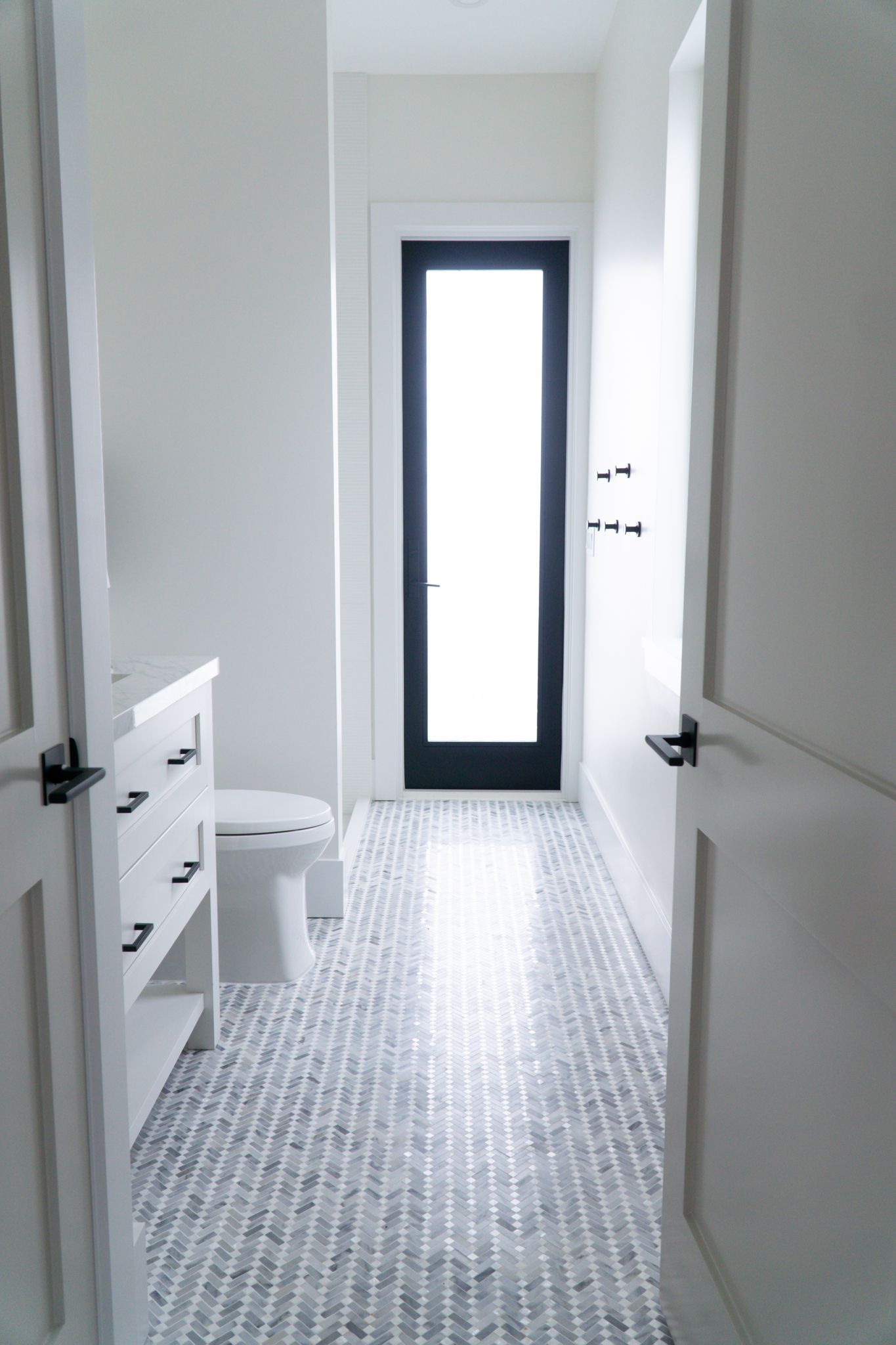
The cabana bath, which is just off the pool and area is a mix of crisp blacks and whites, with Benjamin Moore Revere Pewter on the cabinets. I love the black fixtures by Kohler, and we hung some extra hooks for bathing suits and towels right by the door.
Interior Design by KRISTA + HOME / Photo by Jerrica Catania
Interior Design by KRISTA + HOME / Photo by Jerrica Catania
Interior Design by KRISTA + HOME / Photo by Jerrica Catania
I hope you enjoyed this photo tour of four beach house bathrooms! Which one is your favorite? Let us know what you think in the comments.
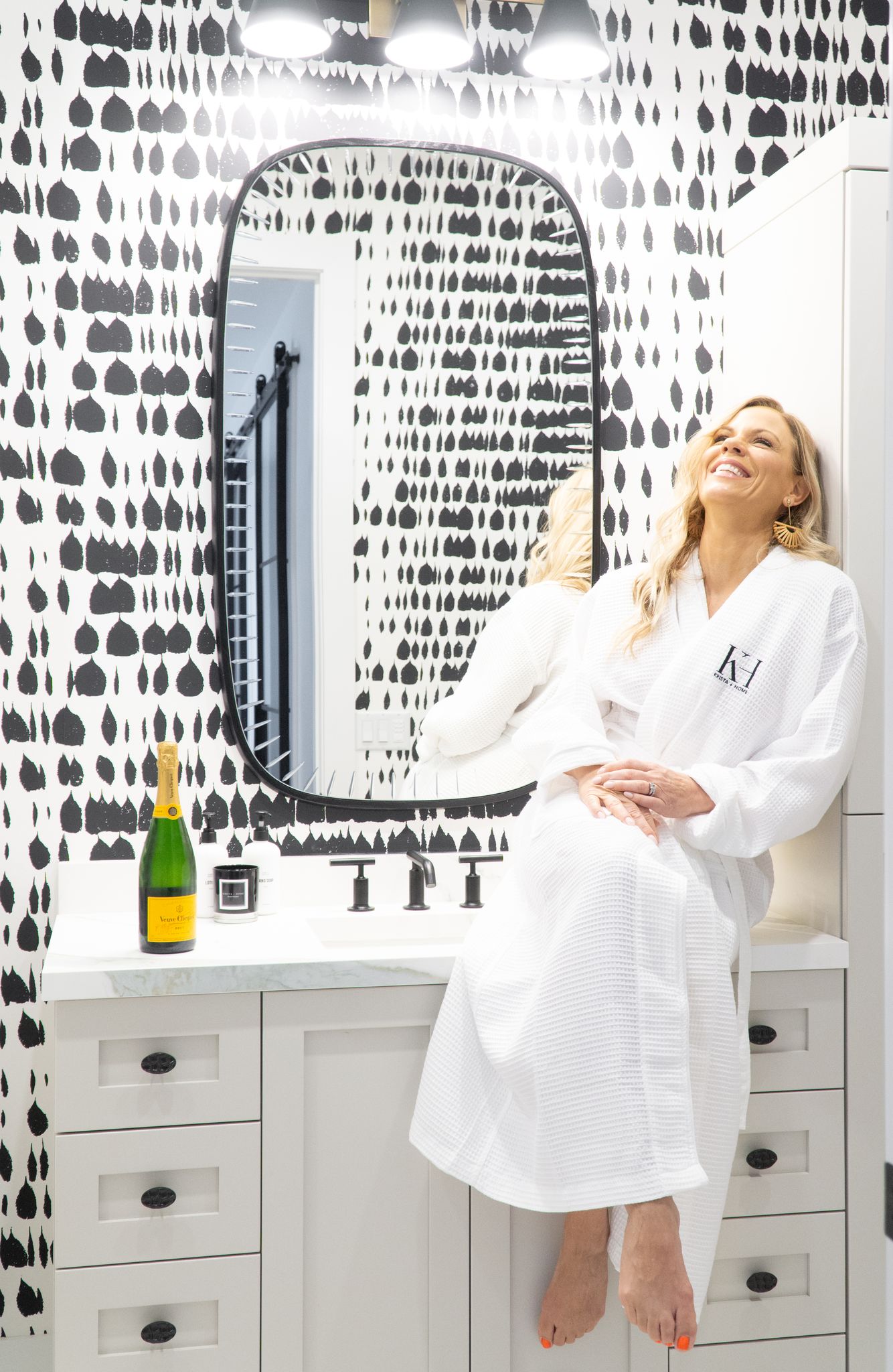
Photo by Jerrica Catania

