Design Soiree
Last week I had the pleasure of attending a special event at The Design Center of America (DCOTA) in Dania Beach, Florida. It was a magical evening sponsored by furniture designer Janus et Cie to celebrate Clinton Smith, the Editor and Chief of Veranda magazine.

I attended the dinner with my Business Manager, Timm Dolley. The evening was a gathering of movers and shakers from the south Florida design world, and we were honored to be included. We even had premium seating right next to Clinton Smith! The divine menu was prepared by the award-winning celebrity chef Michelle Bernstein.

Smith recently launched his book “Veranda: The Romance of Flowers”, which is currently #3 on Amazon’s bestseller list for Home & Design publications. The book illustrates how flowers have played a central role in the magazine’s history. It is a sophisticated collection of stunning photographs of interiors and flowers.

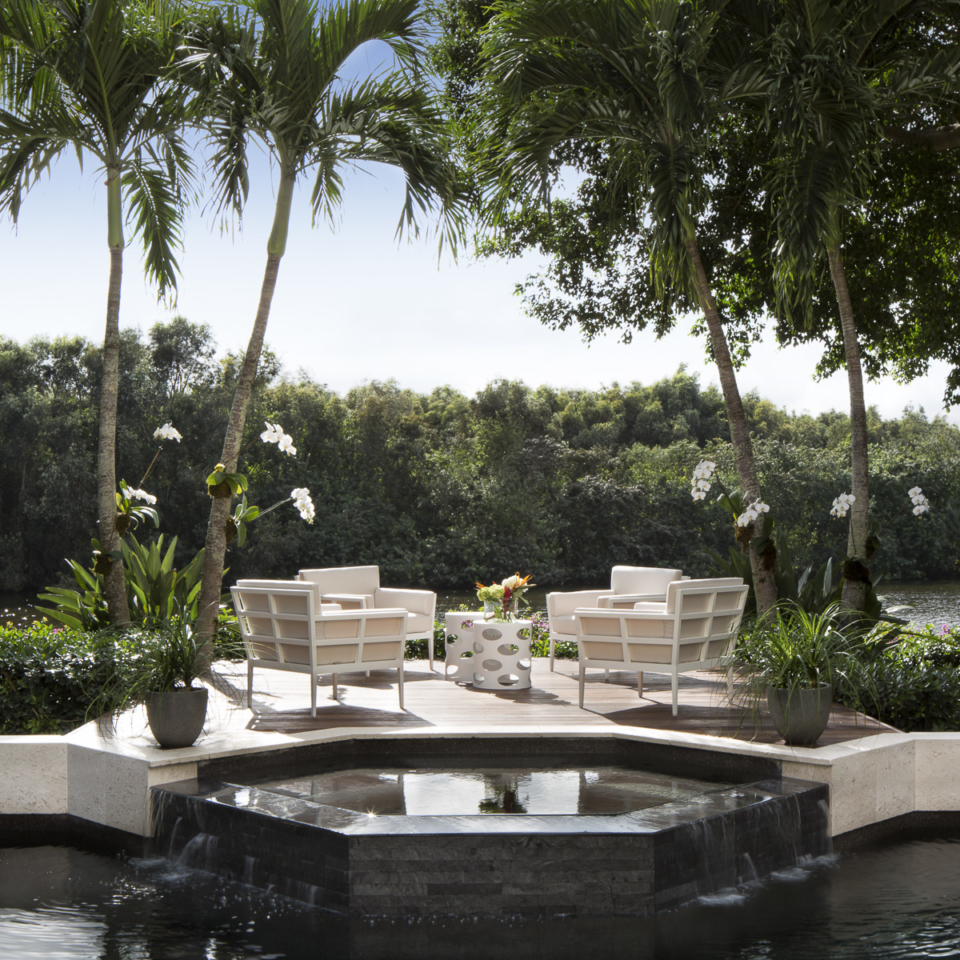
Special thanks to Janus et Cie for the invitation to our event. Below is a Janus et Cie patio I designed for Equestrian Club in Wellington, Florida.

Halloween Entertaining
Halloween is one of my favorite holidays! I love the idea of donning a costume and embracing a new persona for one night a year. We host a big party every Halloween, and I love planning it! Costumes are required for all attendees (kid-friendly, of course). Read below for some helpful tips for planning your next party!

Love this table from HowToFurnish.com, it’s festive yet upscale!
When planning a menu, try to be mindful of your guests’ dietary restrictions. I look for tasty dishes and treats that are appetizing for all palettes, but are gluten and dairy free, like this delicious curried pumpkin and bacon soup, that I served in shot glasses. I always create a fun, inviting tablescape for the buffet…the kids love it!
For the bar, it’s fun to relabel the liquor and wine bottles to match your theme. I actually bought the labels from the photo below at Michael’s craft store. It’s all in the details, baby!
Overall, for a sophisticated Halloween party, try to think a bit outside of the box with décor. Don’t go for the obvious. Try to mix up the usual decorations, like ghosts, ghouls, pumpkins, and witches with abstract details that still bring in recognizable Halloween colors. I made the centerpiece below out of leftover tissue paper from Christmas. I wanted to create an abstract black cat. It turned out super cool!
Happy Halloween!
Hugs,
K
Designing Spaces For Children
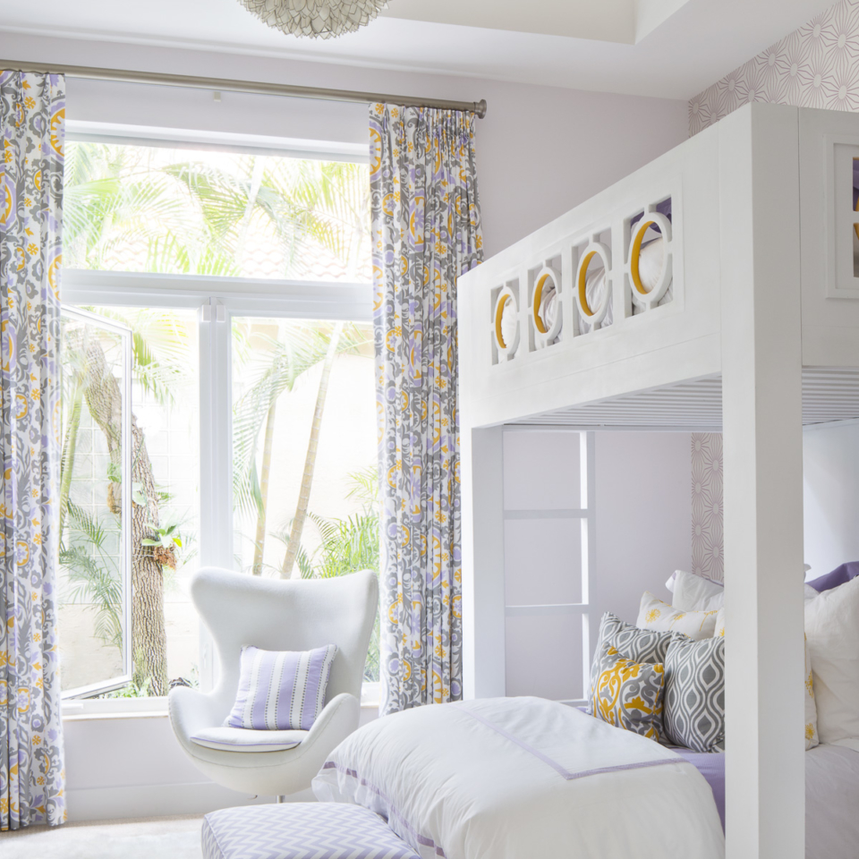
Now that the kids are officially back in school I’ve started designing a small dressing area for my daughter’s room. It’s been a lot of fun! One of the biggest challenges I encounter when designing children’s spaces is they know what they want and, trust me, my daughter has not been shy with her opinion!
 The key to designing for children is creating a space that is both personal and functional. Storage is essential and it must be stylish yet practical.
A new trend for interiors is wallpaper, which can add a great pop of texture and pattern to a child’s bedroom or play space. Many fabric companies are now developing lines of coordinated wallpapers and fabrics, and they are fun and fresh.
One of the biggest mistakes homeowners make when designing children’s spaces is choosing bright and overwhelming paint colors. Take time to choose the right hue for your space. You can test out the color by purchasing a sample can and paint a small section of the wall before you commit.
Finally, personalization is key. I had my son’s artwork framed and hung it in his room. It makes him feel proud to see his masterpiece on display, and it was a great way to bring his personality and spirit to the space.
Hotel Life
Staying in a hotel always feels like a luxurious treat. Pampering, plush bedding, room service…and I always get an amazing night’s sleep!
One of my favorite hotels is The Surrey in New York City. Nestled on the upper east side of Manhattan, just a block from Central Park, it has a sleek, yet cozy design. The hotel has a residential feel and a private rooftop garden with butler service.
Another favorite is Eau Palm Beach Resort & Spa, which we are lucky to have nearby in Manalapan, Florida. The hotel was recently refurbished by Jonathan Adler in coastal tones with playful and personal touches. I adore Jonathan Adler’s irreverent style of design…he always adds a touch of whimsy to his work. He is a trendsetter who takes risks, which I love!

Photo courtesy of The Eau Palm Beach Resort & Spa

Photo courtesy of The Eau Palm Beach Resort & Spa
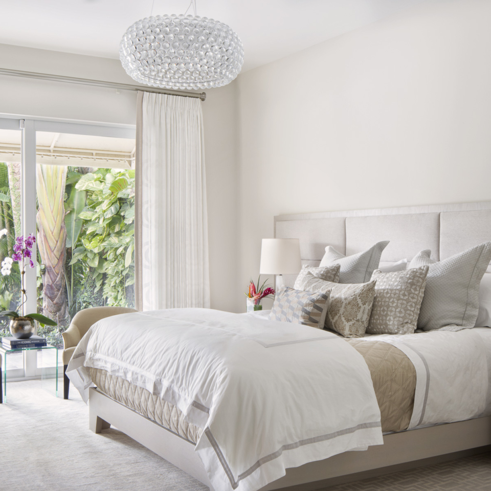
When I design bedrooms, I think about the elements that make hotel rooms inviting. Here are a few tips to think about when choosing décor for your master or guest bedroom. The bed is so important. Buy the most expensive mattress you can afford, and do not skimp on bedding! Luxurious sheets and a duvet are a must. Motauk Linens are great, and fabrics like Fortuny, and Cowan & Tout are my go-to’s.
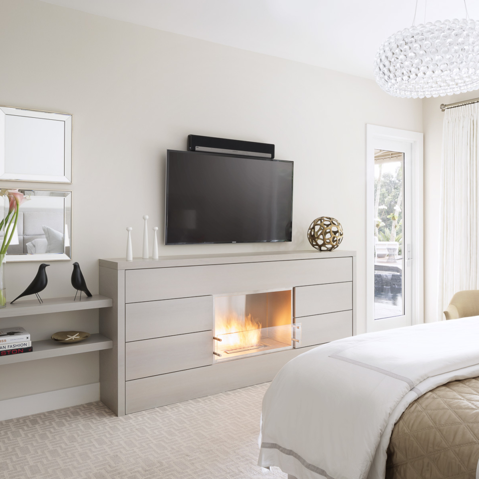
 Install dimmers on your lights for a soft, romantic feel and create a cozy seating area where you can cuddle up with a soft thrown blanket to read or have your morning coffee. Hide the technology! The red light from my Blue-ray player gives me nightmares. Enclose TVs in beautiful cabinetry and keep the iPhone & iPad downstairs.
 Finally, try to limit the clutter in your bedroom. One of the things that makes hotel rooms so appealing is the conservative and professional selection of accessories. Try to keep your nightstand neat and tidy. Now, if we could somehow arrange for daily maid service…
Krista’s Team Visits the Kohler Factory
Krista’s team recently visited the Kohler factory in Kohler, WI courtesy of Wool Plumbing Supply. What an experience!
First things first: Kohler is a diverse company, making products ranging from plumbing hardware to generators to… chocolate! Not kidding. Hold the presses! Kohler makes their own chocolate, and it’s amazing. One of our first stops in Kohler was the chocolate factory.

What, you ask, does chocolate have to do with interior design? Absolutely nothing. But it does deserve special attention. Just look at those scrumptious truffles!
Okay, okay… moving on…
We stayed at the American Club, a 5 star resort hotel and spa.
And the piece de resistance! This bed… tucked away inside a cozy dormer-style nook. Simply adorable!

We took a tour of the Kohler factory where all of the magic and production takes place. We saw large kilns heating hundreds of ceramic toilets, sinks, etc. at one time. We saw the glassblowing factory where talented artisans literally poured heated glass into molds and created the most beautiful of sinks. We saw custom appliques used to decorate the interiors of sinks, bathtubs, and toilet tanks. It was a truly remarkable experience. The only downside: NO PHOTOS ALLOWED!
The entire town of Kohler was beautifully manicured and designed to attract skilled manufacturers to come and work for the factory and to raise a family in a safe, comfortable environment.
Artistic sculptures from Kohler’s many talented designers line the streets.

The Kohler Design Center houses an interactive museum exhibit and displays of hundreds of types of Kohler products. They also have 25 or so small bathrooms that were designed by nationally-recognized designers, such as Bunny Williams and Jonathan Adler.

The museum divided Kohler’s designs by decades. The bathroom fixtures in the 60s and 70s were far out, man! Avocado green, canary yellow!

Jonathan Adler’s bathroom design! Love him! We imagine he was inspired by A Clockwork Orange!

The back-lit oasis was designed by Nikki Blustin. Soothing and over-the-top all at the same time!

A stark contrast to the dutch colonial vibe of much of Kohler’s buildings and houses was their communications building, a modern monolith that housed even more modern approaches to communications, product development, and advertising. We weren’t able to photograph many places inside this building, but Kohler’s marketing team is top-notch! They had one room dedicated to trending social media with several televisions flashing any and all mentions of Kohler (or their competitors) across the screen in real time!

An interior shot of the communications building lobby:

Large bookcases ran endlessly down interiors, filled with magazines from all over the world to help the marketing team identify trends in each of their international markets! So cool and so overwhelming to think about!

We had a blast! Thanks so much to Wool Plumbing Supply for financing the trip. Such an amazing experience. We did finish our chocolate, unfortunately. So happy they accept online orders!
Krista Featured Designer on Christopher Knight Home
Featured Designer: Krista Watterworth
How would you describe your design aesthetic?
I define my style as classic contemporary. I love using timeless materials, such as natural stone and wood, in combination with modern-day fabrics, finishes, and silhouettes. Rooms that are too traditional feel heavy to me. Conversely, minimalist modern spaces can sometimes feel empty. I like to walk the line between classical beauty and bright open space. I like my clients to have a design package which stands the test of time.
Who are your greatest style influencers?
One of my favorite interior designers is Kelly Wearstler — I’m inspired by her bold, unique approach. To me she represents modern day glam at its finest. I’m also inspired by fashion. For me textile weaves and patterns transcend the boundaries of both interior and fashion design. A smart designer takes contemporary style and uses it to create his/her own sense of beauty.
What do you think is the single most important element of interior design for the home?
Balance and repetition. Even though a designer look is achieved with careful and thoughtful planning it shouldn’t be predictable. Each room ought to flow seamlessly into the next with slight variances in color, finish, and texture. If a client has a bold sense of style I go bold or go home! The entire home needs to reflect that sensibility, not just one room. If not, the home feels disjointed and unfocused. Repeating certain colors, wood tones and patterns help one room flow effortlessly into the next. Every room in the house should feel like it has a right to be there.
What was the greatest compliment a client gave you?
A wonderful Montreal couple bought a winter home here in South Florida and they called on me to design it. They are both physicians and have been married for forty years. During the design process, they trusted my style and allowed me to have free reign with their project. The result was a beautiful home and they were very gracious. Before they left for their Spring home up north, I got a letter from them that said, “we now have a home, different from anything we have had before…a home and refuge for us and for our children and their children”. That was a thoughtful, beautiful comment. This makes my stressful job worthwhile!
What is your favorite spot in your home and why?
The heart of everyone’s home: my kitchen! It’s where everything seems to happen. Our friends gather there for weekend BBQs, my children create their artwork and craft projects, we bake or make breakfast as a family, and my husband sneaks in nightly for late evening snacks. I also love to cook and entertain so when I’m not tending to my clients and my business, I’m a mad culinary scientist in my kitchen. The irony is my kitchen is in need of a major overhaul so I’m planning to start a renovation in August. Wish me luck!
Krista and Her Team at ICFF
Krista and her team flew to New York on May 13th to attend the 27th Annual International Contemporary Furniture Festival (ICFF), a celebration of all things modern and contemporary in the fields of interior design and architecture.

Krista and team at ICFF
The sheer size of ICFF was overwhelming. There were thousands of vendors providing a variety of products anywhere from bathtubs and plumbing hardware to sectional sofas to murphy beds! It was an intense couple of days to say the least, but so much fun!
Take a look at some of the amazing vendors we saw below:
Pelle

Are you kidding? This lighting manufacturer wowed us with their modern blingy light fixtures! The ethereal glass bubbles are simply gorgeous. And guess what? Brass is back in a big way! Not your grandmother’s brass, let’s be clear! The new brass is more subdued, typically in a brushed or satin finish as opposed to polished. It’s too sexy for words. Can we please take this home?
Cool Kids Company

How cute are these children’s wardrobes? These come in a variety of colors and exterior styles to make your child’s storage look like a sweet little city! These melted our hearts at ICFF.
Missoni Home

Bohemian chic! Missoni Home is such a fun brand, and what a cool mixture of pattern and color. Love!
TileBar

Our main reason for attending ICFF (apart from the major furniture eye candy) was because of TileBar, the company that collaborated with me to create a line of tile. Not all of these mosaics are my design (the top row and the two to the left and right of my photo). Eighty by Krista is the name of the line! Such an awesome feeling to have a line of tile!
Krista Watterworth is One of the Best Interior Designers in Palm Beach
Krista Watterworth is featured on Build Direct’s blog as one of the best interior designers in Palm Beach. Fans of Krista Watterworth have the opportunity to vote to make Krista number one! Please head over to Build Direct and vote for Krista!

Krista Watterworth Alterman
Krista earned her MFA from one of the finest art programs in the country, the famous New School in Manhattan. She continued her studies at the highly-ranked Parsons School of Interior Design. New to the business in 2007, Krista made her on-screen debut in HGTV’s “Save My Bath.” Her television work continues as she designs restaurants with Robert Irvine on the Food Network’s “Restaurant: Impossible” and her fourth consecutive season on DIY Network’s “The Vanilla Ice Project.”
For more information about Krista Watterworth and her team check out our about page.
Photo Shoot
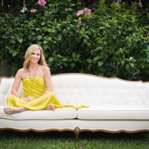
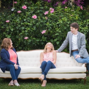
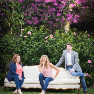
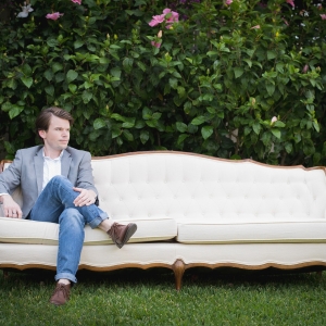
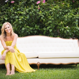
Krista’s design team had a blast shooting promotional photos at the Four Arts Gardens on Palm Beach. Check out some of our favorite images below.
Photography by Kristen Stephens.
If you’ve never visited the Four Arts Gardens, you’re missing out! The landscaping and lush greenery was simply beautiful. We shot most of our photography in front of pink Bougainvillea hanging from tall lattice adjacent to the main gardens. The sun was sweltering hot and the air was thick and humid, but we enjoyed every minute.
For more information about the Four Arts Gardens, check out their website here!
For more information about my team, see our About page.
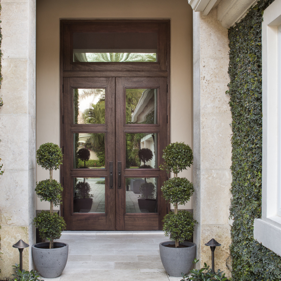
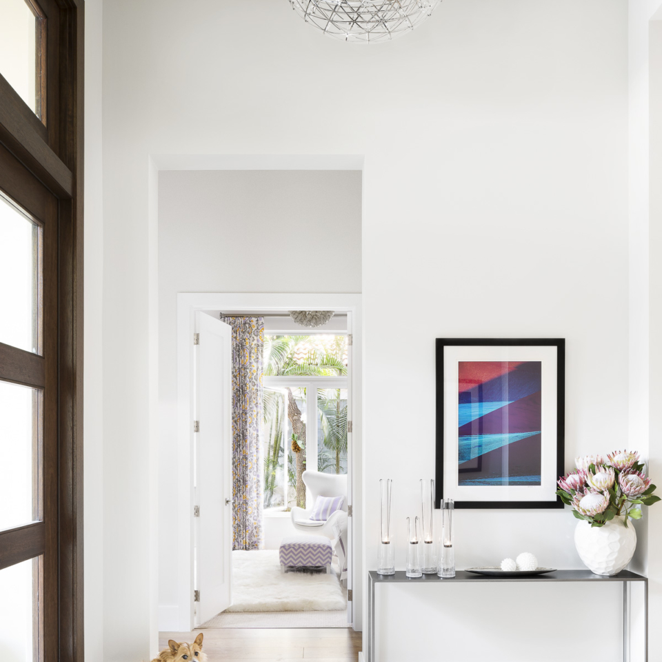
Equestrian Club
Photography by Jessica Glynn.
KWDS on Joss & Main!
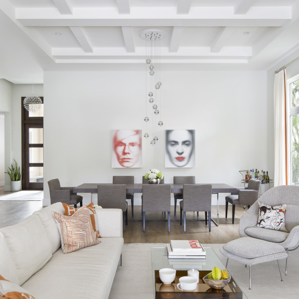
A fun feature of one of my designs on the fabulous JOSS & MAIN!!
“This room is located in Palm Beach Gardens, Florida on the intracoastal waterway. My clients are a young boating family that wanted an updated, chic coastal look minus the coastal kitsch. This is the great room where dining, entertaining, and everyday living occurs. There were many focal points in this room including television watching, a fireplace, and the spectacular water view, and we tried to cover all those needs with an unconventional furniture plan. The house is appealing for its openness therefore furniture and finishes needed to flow and coordinate throughout the entire home.”

An Amazing Client Review
One of our clients in North Palm wrote a glowing review. It made me feel so good that I had to share it with everyone. Read on and smile with me! Some iPhone photos for your enjoyment.
To whom it may concern:
Krista Watterworth and her team to helped us create our new home in North Palm Beach and what good luck and good fortune we won when we selected them!
Creating a new home is never easy. Creating a new one, when you are older and have lived your life in different periods and different places, is hard because you want to open up to the new, but hold on to what you have been and who you think you are. You do not want to sacrifice and compromise because this should be the time you do not need to sacrifice and compromise. But there is never any such time- not at least for most of us. Creating a new home is about managing expectations and trying to marry and multiply imagination and expertise to create a space and an environment that is you, not just buying a bunch of things or telling someone to fix it up and returning to discover what they have done. A home is about you not about them.
The site of the condo we chose is nice, but not grand, a ground floor condominium in one of multiple 3 or 4 story buildings, arranged around an inland waterways, each side by side, each pretty much indistinguishable from the others. But a good enough locale nonetheless and in any event it is not the outside looking in that matters, but the inside looking out. The development was a product of the 1980’s and so the size and layout were more generous than most recent products. That was a big advantage. On the down side, however, our condo had several previous owners, each of whom seem to have added bits and pieces to the walls and ceilings as if to mark the property as their own, the net result was- well you can imagine. Or at least you can imagine what it might have looked like; the trick- the skill, the expertise- was imagining what it could look like and how to get from here to there.
We were relocating from Chicago but before Chicago we had been elsewhere. We were bringing most of the furniture, some of which we had purchased over the years, but much of which went back several generations. A few pieces from England were truly beautiful, but almost all of what we called our ‘art’ were inexpensive pieces- treasures to us however-from many of the countries and cultures we had been privileged to visit as part of our professional lives.
We chose Krista based on a Google search for Palm Beach Interior Designers. Her work looked light and bright and all the things within a room seemed to belong with all the other things is a room. There was a completeness and continuity to the appearance. But these were pictures of other people’s rooms and would she be right for us given the raw materials- our rooms, our furnishings and our budget- that she was starting with?
She was! From start to finish, she and her colleagues have been superb professionals. Krista looked at the challenge and laid out how she would work for us and with us at our first meeting. The plan she outlined, the commitments she made, the sequences she outlined- everything happened just as she promised.
They organized and supervised. But we were a team. They did not dominate. They supported us. They took the suggestions we made and either implemented them or improved them so that they more closely represented what we wanted than we had been able to express.
We selected the contractor based on personal recommendations from friends and Krista and he worked perfectly together. The specialists that Krista selected were all excellent. Krista does not have to be in charge of everything. Just make everything work and everyone feel valued and involved.
Much of our furniture had to be recovered and some reconstructed to create the overall sense of space and comfort and quiet elegance we were looking for. The results were beyond anything I hoped for. Our classic and her Florida greens and whites were made for each other.
She identified suppliers and supplies and all the bits and pieces that we needed. She and Timm were our hands, eyes, and ears while we were elsewhere. But they never went off on a tangent and they were great about staying in touch.
The costs were almost exactly as estimated. Of course, choices had to be made while we were underway but these were legitimate and we were the ones who made them. Krista and her team were financially responsible and prudent.
And so, we have our place- on time and on budget. A home, different from anything we have had before, yet with so many of the things from before, a home we can enjoy together, a home and refuge for us and for our children and their children.
We recommend Krista Wattersworth and her team without reservation and we would be pleased to confirm this personally.
Allan Sniderman
Edwards Professor of Cardiology
McGill University


December 2014 Newsletter
Happy Holidays from Krista Watterworth Design Studio!
Interview with rd+d
Thank you Restaurant Development & Design and Valerie Killifer for a very cool interview! I love your magazine and I’m so excited to be a part of it!
Krista Watterworth Alterman of Krista Watterworth Design Studio in Jupiter, Fla., was the star of two HGTV shows and recently teamed up with host Robert Irvine to provide design solutions on Restaurant: Impossible. rd+d asked this restaurant design pro to share a few kid-friendly ideas.
rd+d: What should operators consider when looking to design a child-friendly restaurant concept (both architecturally and from an interior design POV)?
KW: Comfort and safety are keys. Various seating options are a must, the cooler the better. Fun, brightly colored high chairs or boosters will appeal to even a stubborn child. Booths, upholstered seating, and round or square tables with soft edges are real life savers. Furnishings laminated in vibrant hues will appeal to the youthful eye and create an overall happy mood. Adequate seating in reception is an absolute necessity! Parents with children waiting for tables need a place to relax especially with infants and toddlers. I waited for a table at a boutique restaurant with a screaming baby while I lived in Manhattan. My husband was out of town and I was on my own. If I had a place to sit and feed her a bottle the whole ordeal could have been avoided. Changing tables in the bathrooms and storage for strollers are also important elements when laying out the new design. Restaurant owners, designers and architects should give these features similar credence as ADA requirements if they want families as repeat customers. Trust me, if a family likes a certain restaurant they will return again and again. Our lives are based on consistency. Sound design is important (and often overlooked). My kids love to be in a bustling environment but want to leave ASAP if a restaurant is too loud. A good sound designer (or a little Google research) can help determine which areas of the restaurant need sound absorption or reflection. Carpeting, cork flooring, or sound absorbing acoustical tiles are a good place to start.  rd+d: What are some easy changes that operators can make to existing locations to appeal to more families with children?
KW: A new branding strategy is a great jumping off point. When I design restaurants for Restaurant: Impossible, I create a brand that incorporates a new logo in line with the new color scheme. Don’t sacrifice chic for kid friendly! Keep the branding fresh and modern to appeal to parents too. Fun elements throughout can be easy fixes. Think organic shapes, geometric patterns, and interesting textures. I designed a restaurant in Connecticut and incorporated a cool wood slatted wall with an integrated fish tank. If you don’t have a children’s menu, create one! That’s probably the easiest change to make. Include fun options for kids with food allergies such as grilled chicken nuggets or sliders with gluten free buns. Oh what I would do for a restaurant that offers carrot sticks, grapes or apple slices! Families will dine out during the week so it’s a great opportunity to take advantage of slow nights. Offer fun kid activities like balloon animals, face painting, or discounts on kids’ meals. Distractions are key and can come in many forms, but coloring and activity books are amazing and relatively easy to incorporate. A restaurant I designed in Florida had a jar filled with large shells and sea stars, each kid was allowed to take one when they came through the door. I also find that restaurants with open kitchens are just mesmerizing to kids. My children are transfixed on the kitchen madness. Some parents may disagree with me but a television with Nick Jr. playing non-stop would make many parents with young children ecstatic. Just sayin’.
rd+d: Do you recommend color changes to walls, etc. to appeal to younger diners and their parents?
KW: Definitely but only if done tastefully and in moderation. Using color properly is not for the novice, so I recommend hiring a professional to consult on color palette. The best color palettes for bold accents are: 1) Primary colors, your basic blue, red, yellow, and green; 2) Jewel tones, such as sapphire, ruby, and emerald, and; 3) Neon which is certainly on trend. Doing lighter tones of these hues with a gray base would be more in tune with modern style.
rd+d: What’s on your “top five” list of priorities for kid-friendly restaurant design?
KW: My five key priorities would be: 1. Comfort. You must have seating 2. Activities. Distracted kids are happy kids. 3. Entertainment. I love my children. You should too! 4. Color. No one likes boring décor, least of all kids. 5. Sound design. I like when I can hear myself think! 
November 2014 Newsletter
Photographer: Jessica Glynn; Designed by KWDS. Before the hustle and bustle of the holidays; before the endless gatherings; before gaining ten pounds, there is a brief period of respite. The nights are getting longer, the air chillier, and we find ourselves spending more time indoors. Reading. Dreaming. Creating. Spending quality time with our families, our children. It’s that peaceful calm before the impending holiday storm. We hope you enjoy it as much as we do.


